

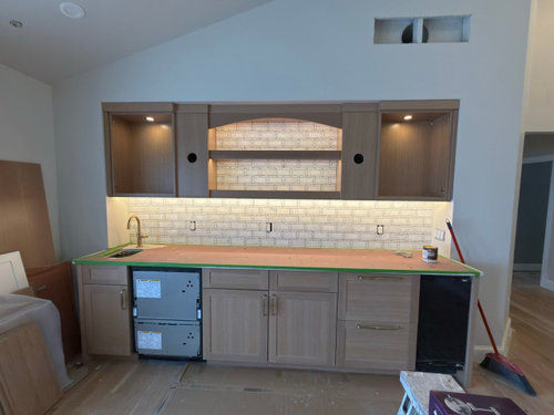
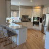
Opinion on backsplash please
8 months ago
Featured Answer
Sort by:Oldest
Comments (13)
 8 months ago
 8 months ago
Related Professionals
Fort Wayne Design-Build Firms · Hempstead Design-Build Firms · Oneonta Design-Build Firms · Lima Design-Build Firms · Little Rock Flooring Contractors · Columbia Flooring Contractors · Richmond Flooring Contractors · Olympia Interior Designers & Decorators · Chatham Interior Designers & Decorators · Sarnia Interior Designers & Decorators · Vancouver Architects & Building Designers · Casper Architects & Building Designers · Houston Kitchen & Bathroom Designers · Fredericksburg Kitchen & Bathroom Designers · Spokane Kitchen & Bathroom Designers- 8 months ago
 PRO8 months ago
 8 months ago
- 8 months ago
 PRO8 months agolast modified: 8 months ago
- 8 months ago
- 8 months ago
- PRO8 months ago
- PRO8 months ago
- 8 months ago

Related Stories
KITCHEN ISLANDSKitchen With Double Islands Pleases a Baker and a Smoothie Maker
With multiple refrigerators and ovens, this space easily accommodates a couple of cooks and their guests
Full Story
KITCHEN DESIGNHow to Add a Kitchen Backsplash
Great project: Install glass, tile or another decorative material for a gorgeous and protective backsplash
Full Story
KITCHEN BACKSPLASHESWhere to Start and Stop Your Backsplash
Consider these designer tricks to work around cabinets, windows and other features for a finished look in your kitchen
Full Story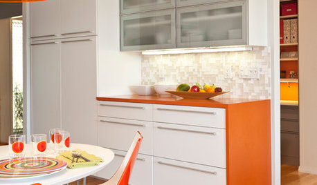
KITCHEN DESIGNCountertop and Backsplash: Making the Perfect Match
Zero in on a kitchen combo you'll love with these strategies and great countertop-backsplash mixes for inspiration
Full Story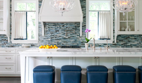
MOST POPULARBattle of the Backsplashes: Glass Mosaics vs. Natural Stone
Read about the pros and cons — and see great examples — of these two popular kitchen backsplash materials
Full Story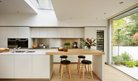
MATERIALSKitchen Ideas: How to Choose the Perfect Backsplash
Backsplashes not only protect your walls, they also add color, pattern and texture. Find out which material is right for you
Full Story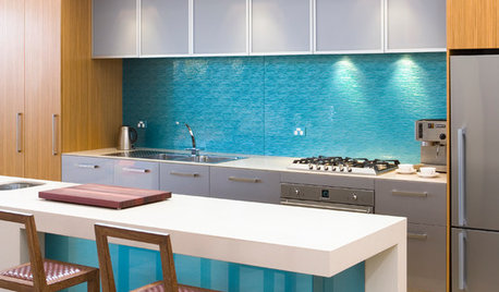
KITCHEN DESIGNHouzz Quiz: Which Kitchen Backsplash Material Is Right for You?
With so many options available, see if we can help you narrow down the selection
Full Story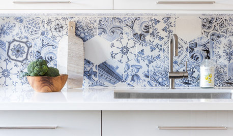
KITCHEN DESIGNBehold These Bold Kitchen Backsplashes
See how these 62 backsplashes bring beauty, personality and style to their kitchens
Full Story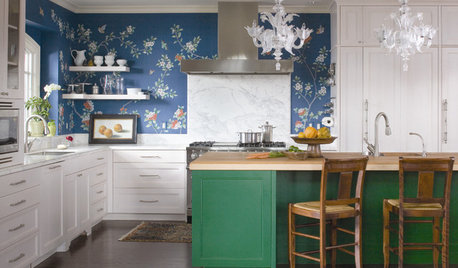
KITCHEN DESIGNTry a Shorter Kitchen Backsplash for Budget-Friendly Style
Shave costs on a kitchen remodel with a pared-down backsplash in one of these great materials
Full Story
DECORATING GUIDESNo Neutral Ground? Why the Color Camps Are So Opinionated
Can't we all just get along when it comes to color versus neutrals?
Full Story
bearbev