

Which lamp?
12 years ago
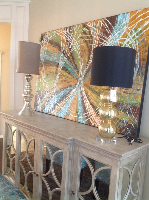
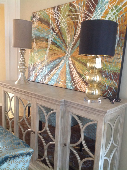
Featured Answer
Sort by:Oldest
Comments (52)
 12 years ago
 PRO12 years ago
Related Professionals
Crestview Interior Designers & Decorators · Shreveport Interior Designers & Decorators · Waco Interior Designers & Decorators · Worcester Interior Designers & Decorators · Superior Interior Designers & Decorators · Tucson Interior Designers & Decorators · Twin Falls Interior Designers & Decorators · Fredericksburg Architects & Building Designers · Edison Architects & Building Designers · Westerly Architects & Building Designers · Sterling Architects & Building Designers · Atlanta Kitchen & Bathroom Designers · Dayton Kitchen & Bathroom Designers · Waco Kitchen & Bathroom Designers · Davenport Kitchen & Bathroom Designers 12 years ago
 12 years ago
- 12 years ago
 12 years ago
- 12 years ago
 12 years agolast modified: 12 years ago
 12 years ago
 12 years ago
- 12 years ago
 12 years ago
- 12 years ago
 12 years ago
 12 years ago
- 12 years ago
- 12 years ago
- 12 years ago
 PRO12 years agolast modified: 12 years ago
- 12 years ago
- PRO12 years ago
- PRO12 years agolast modified: 12 years ago
 12 years ago
 PRO12 years ago
- 12 years ago
- 12 years ago
 12 years agolast modified: 12 years ago
- 12 years ago
 12 years ago
 12 years ago
 12 years ago
- 12 years ago
- 12 years ago
- 12 years ago
 12 years ago
- 12 years ago
- 12 years ago
- 12 years ago
- 12 years ago
- 12 years ago
- 12 years ago
- 12 years ago
 12 years ago
 12 years ago
 PRO12 years ago
- 12 years ago
- 12 years ago
 12 years ago
 12 years ago
- 9 years ago
Related Stories
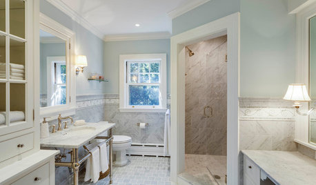
BATHROOM DESIGNWhich Bathroom Vanity Will Work for You?
Vanities can be smart centerpieces and offer tons of storage. See which design would best suit your bathroom
Full Story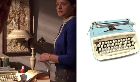
MIDCENTURY STYLEWhich ‘Mad Men’ Prop Would You Like for Your House?
Fancy a pair of Don Draper’s office chairs or Peggy’s blue typewriter? Vintage props from the TV show are up for auction
Full Story
KITCHEN DESIGN12 Great Kitchen Styles — Which One’s for You?
Sometimes you can be surprised by the kitchen style that really calls to you. The proof is in the pictures
Full Story
REMODELING GUIDESWhich Window for Your World?
The view and fresh air from your windows make a huge impact on the experience of being in your house
Full Story
DECORATING GUIDESTable + Lamp: 10 Perfect Pairings
No more dithering over scale and style. We take the guesswork out of matching lamps to credenzas, coffee tables, nightstands and more
Full Story
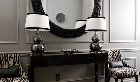
SHOP HOUZZShop Houzz: Gourd Lamps in Every Color
This simple yet sophisticated shape works in both traditional and modern interiors
Full Story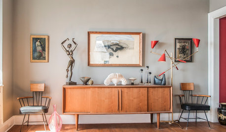
DECORATING GUIDES10 Ways a Red Lamp Shade Can Sass Up a Room
Energize a neutral palette, refine a rustic look ... where a red shade goes, liveliness is sure to follow
Full Story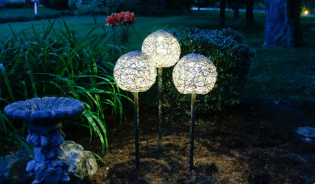
DIY PROJECTSMake a Mod Solar Lamp Trio for the Garden
What’s that hovering ethereally in the dark? A set of cool globe lights showing off your DIY ingenuity
Full Story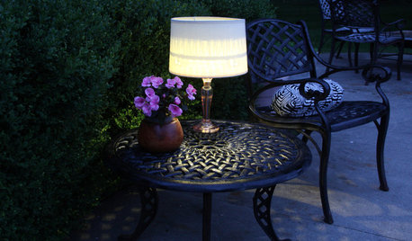
DIY PROJECTSLight Up Your Night With an Easy Outdoor Table Lamp
Hit up Goodwill and the hardware store to make this lamp for a deck or poolside patio in minutes
Full Story


International Bath and Tile