Software
Houzz Logo Print
kspouse

Kitchen remodel in Kirkland, Washington

12 years ago
last modified: 12 years ago
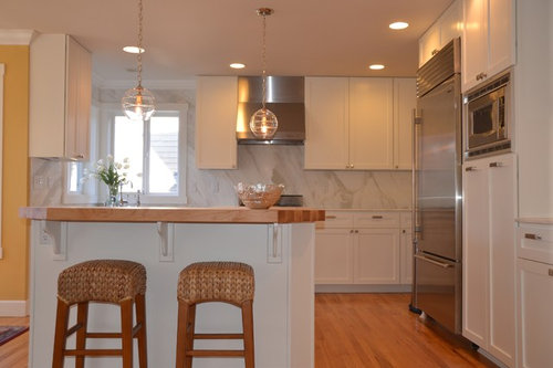
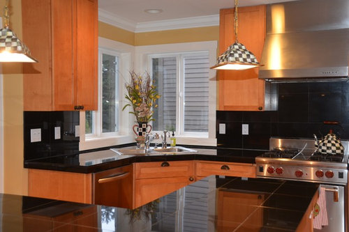
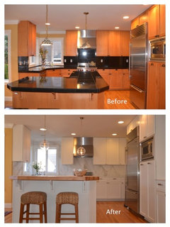
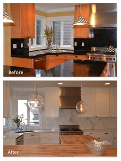
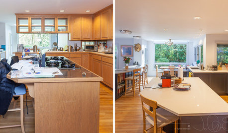
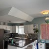
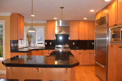
Before and After of our Kitchen makeover from tired late 90's to 2014 fresh. What do you think?
Check out additional photos: http://www.houzz.com/projects/229482/Downtown-Kirkland-Kitchen-Refresh

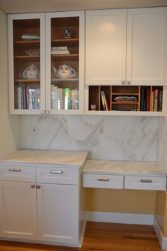
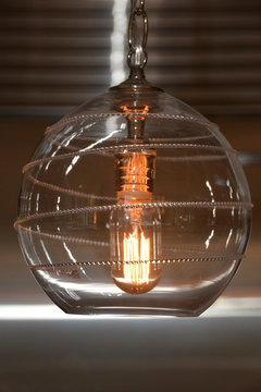
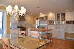
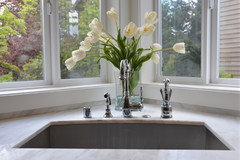
The AFTER photos are the WHITE kitchen. Our client wanted to refresh the worn cabinets and inexpensive black tile counters that were original from when the home was built in the 1990s. The new kitchen walls and counters are Calcutta slab marble. We painted the cabinets a crisp white to avoid cabinet replacement and keep costs lower while allowing to invest in other areas such as hardware, lighting, sink and faucets. The island counter is a beautiful custom John Boos maple wood. More details on the project can be seen at the following

Comments (75)

  • 12 years ago
    My kitchen from 1999 is very similar to the black one and I have been thinking of redoing it in light colors, but after viewing these pictures I think I will stay with my black granite and maple cabinets. So much more elegant.
  • PRO
    12 years ago
    I do like white cabinets, but this kitchen redo, doesn't look professionally done. The devil is in the details..... the walls look like those panels they used to put up in showers, the drawer handles and knobs look cheap and the brackets on the island look awkward.... on a positive note the lights and faucets look lovely.
  • 12 years ago
    If we are speaking strictly color, I think the update is warm but the before was much more elegant!
  • 12 years ago
    I like the white one.
    Kristi Spouse Interiors thanked bgfuqua
  • PRO
    12 years ago
    last modified: 12 years ago
    Thanks for your all your comments. To clarify, the AFTER photos are the WHITE kitchen. Our client wanted to refresh the worn cabinets and inexpensive black tile counters that were original from when the home was built in the 1990s. The new kitchen walls and counters are Calcutta slab marble. We painted the cabinets a crisp white to avoid cabinet replacement and keep costs lower while allowing to invest in other areas such as hardware, lighting, sink and faucets. The island counter is a beautiful custom John Boos maple wood. More details on the project can be seen at the following http://www.houzz.com/projects/229482/Downtown-Kirkland-Kitchen-Refresh
  • 12 years ago
    white on white is bland :( money down the drain.
  • 12 years ago
    It's a huge improvement, I like the white look so much more, it's fresh and happy. Well done!
    Kristi Spouse Interiors thanked katfon
  • PRO
    12 years ago
    Nice job. Love the pendants.
    Kristi Spouse Interiors thanked Design Elements of Brevard, Inc.
  • 12 years ago
    I think it's beautiful! Clean, crisp, light-filled, and calm. Perfect!
    Kristi Spouse Interiors thanked danawiehl
  • 12 years ago
    I can't figure out which one is the dated look?
  • 12 years ago
    I just read the comments & see the white one is the updated one. Liked the wood better- sorry.
  • 12 years ago
    I would just switched out counter & backsplash.- the window needs an interesting window treatment.
  • 12 years ago
    last modified: 12 years ago
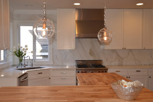
    I love both kitchens. I also love that the transformation used the same cabinets but were repainted, the appliances ssem to be the same so the major change is the backsplash, counter tops and door hardware. There is still warmth from the wood floors and butcherblock countertops. Good job.
  • 12 years ago
    Glad the white is the after, but all it needed was to update the counter and backsplash. Maybe the cabinets didn't look so good close up before? I'm not a fan of the new backsplash, to me it's too bland. But all that matters is the owner is happy with it.
  • 12 years ago
    The white is definitely the "after." very nice.
    Kristi Spouse Interiors thanked sweetescapades
  • PRO
    12 years ago
    Nice work Kristi!
    Kristi Spouse Interiors thanked Seating Innovations
  • 12 years ago
    The only key to which was the new version was the clear glass pendant lights.
  • 12 years ago
    I also prefer the older version. It seems much classier. The current trend is not, in itself, naturally better, unless its details are spectacular. I just don't see anything spectacular in the new version.
  • 12 years ago
    Sorry I like the older version, warm colors, and looks great up against the black. The white looks like a rent house redo and too sterile not inviting.
  • 12 years ago
    Before looked very nice but I really like the after. Did you paint the cabinets or replace them? Thanks
    Kristi Spouse Interiors thanked davidsway114
  • 12 years ago
    Like the white
  • PRO
    12 years ago
    davidsway114, The cabinets were painted, and thank you!
  • 12 years ago
    If you read up on it. It mentions that the white one is the after new kitchen. The client wanted a fresh new lighter look. They painted the cabinets with a coat of white paint.
    Kristi Spouse Interiors thanked Janine Skevington
  • 12 years ago
    Love it. It's amazing what a coat of paint and a new counter can do. Love the lights as well!
    Kristi Spouse Interiors thanked risa offit
  • 12 years ago
    It's nice but I love and prefer warmth in a kitchen ... would have kept the before cabinetry color and made a few alterations with upgraded countertop and backsplash materials, new pendants, wall paint and other decorative items to infuse some brightness.
  • PRO
    12 years ago
    I'm not sure which is the before because they are both nice - but I prefer the light and bright white one!
    Kristi Spouse Interiors thanked Urban Elements PDX
  • PRO
    12 years ago
    Thank you Urban Elements Interior Space. The After pictures are the White Kitchen.
  • 12 years ago
    I think the white kitchen is lacking depth. Consider removing the wood supports under the counter top overhang and replace with supports made of stainless steel. Also consider changing the stain on the floor. Look for a stain that will bring out the dark and black tones of the wood. Presently the floor is too warm for the stone that is on the walls.
  • 12 years ago
    Both are nice, but the butcher block counter is odd looking. I think the direction of the grain should match, this looks not well thought out.
  • 12 years ago
    I guess someone was board and had money to waist... because which ever was the before was just fine.
  • 12 years ago
    I like the before much better, I think this trend of white,white,white is soooo boring!
  • 12 years ago
    I like the before better.
  • 12 years ago
    The black and wood is BEYOND awful, looks fantastic now
    Kristi Spouse Interiors thanked slowloper
  • 12 years ago
    I think that both are gorgeous. I do like the white because you can use any colors you love for accents. I think that if you would show the after pictures with some color accent pieces then you would not get so many negative remarks here. But....I do understand why your client wanted to change. One can take just so much wood look. I have beautiful oak cabinets in my kitchen, but I hate them. I want to paint so bad a light color, but I will mess it up for sure and cannot afford to have it done professionally. I am sure it is very expensive. Try to add some pictures to show some color accents. Even a vase of flowers or bowl of fruits and veggies would make a difference. Just my humble opinion. Nice job.
    Kristi Spouse Interiors thanked Kathy Fry
  • PRO
    12 years ago
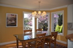
    Thanks Kathy Fry. Here are some additional photos of the larger space. This was really about keeping the costs down and working around what is in the room. Our client did not want to repaint the main floor and did not want to refinish the wood floors - both of which would have added considerable cost. So white works well with the yellow walls and the floor color. Lots of comments on the board about liking the before :-) Unfortunately, the damage 15 year old kitchen cabinets is not really noticeable in the photos and painting was the most affordable update and the most dramatic transformation. The reality is that light maple cabinets and black granite tiles are no longer heavily utilized in new homes - that was a trend from the 1990's.
  • 12 years ago
    Love the wall color. I could so live with this kitchen.
    Kristi Spouse Interiors thanked Kathy Fry
  • 12 years ago
    The full space, with the yellow paint, looks so much nicer than the first picture at the top. I think it was just an unfortunate crop.
    Kristi Spouse Interiors thanked redpoint
  • 12 years ago
    I have the same mango color in my dining room and hallways. The pendant lights are gorgeous!
    Kristi Spouse Interiors thanked Susan
  • 12 years ago
    Everyone sure has pretty firm opinions one way or the other on this one. Considering it from a pro view I think it is a nice transformation. Remember that we are hired to guide our clients to their final vision for their space. While we offer suggestions and guidance and keep proper function when working with clients, the end product must be a space that they love. And in this case - on a tight budget! Good job Kristi Spouse Interiors.
    Kristi Spouse Interiors thanked User
  • PRO
    12 years ago
    Pamela of Vision Design, you hit the nail on the head! Offering advice, holding the hand of the client through the process and giving them the vision that THEY ask for is our job. And in the end the client was thrilled with it, so that was most important! Thank you!
  • 12 years ago
    Kristi Sprouse: Can you tell me the name of that great yellow paint?
  • 12 years ago
    White kitchen is lovely. Lucky client they could afford an update. What this posting has demonstrated is Houzzers can't read!
    Kristi Spouse Interiors thanked Joy
  • PRO
    12 years ago
    Wow- lovely! Looks beautiful. Very nice work!!
    Kristi Spouse Interiors thanked HX Home Solutions and North Star Stone
  • 12 years ago
    The new kitchen is gorgeous. The lighting is stunning. The flooring in the before was lost and now it's come to life. Even though I'm a Mackenzie Childs fan, I don't miss the old Courtly Check accents. Excellent job!
    Kristi Spouse Interiors thanked crashkitchen
  • 12 years ago
    Very nice. Love the lighting. And marble. Great job.
    Kristi Spouse Interiors thanked Nancy Travisinteriors
  • 12 years ago
    The after is the white.
  • PRO
    12 years ago
    Oh dear! At first I thought "finally someone did something besides painting it white to update their kitchen" but I guess I was wrong. The colored kitchen is so much more interesting!
    The lack of detail in the kitchen makes the Calacatta slab look pretentious. A white kitchen depends on interesting shadow lines that this kitchen doesn't have.
  • 12 years ago
    I like the after. Maybe add some bits of color.
  • 12 years ago
    I think your white kitchen is beautiful. I prefer the white because it's airy, bright, opens it up. Much better than what you had before. Your updated kitchen looks so cheerful, welcoming, relaxed. Can picture family & friends hanging out there. Forget about all the criticism. You got a new kitchen! Appreciate now lucky you are & enjoy it. It's lovely!
    Kristi Spouse Interiors thanked dogmom5