Software
Houzz Logo Print
northstarbath

Carlsbad Kitchen Remodel

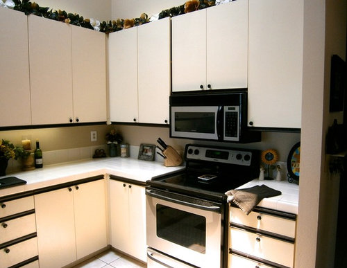
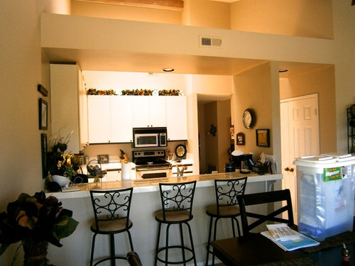
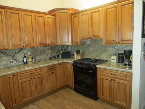
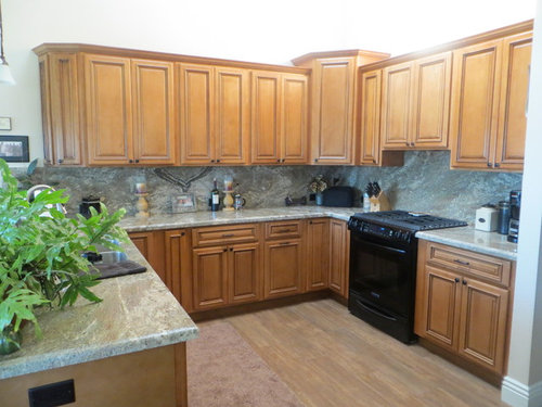
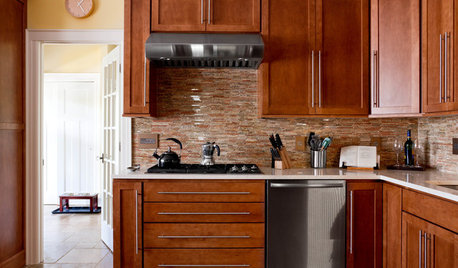
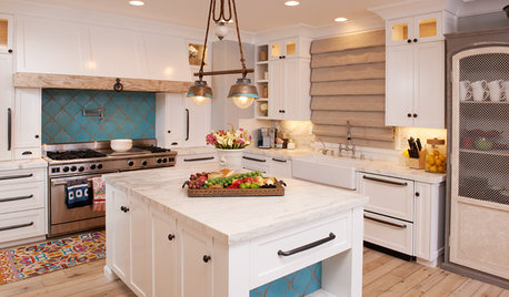
Complete kitchen remodel done to this Carlsbad kitchen. We used Maple Glazed cabinets and Neptuno Bordeaux granite for the countertop.

Comments (51)

  • PRO
    12 years ago
    No thanks!
  • 12 years ago
    I have to be honest, that backsplash is frightening. Also, I really think that those cabinets are in no way compatible with the colour of the flooring. It is such a sleek and modern space in terms of architecture (note the tall and slanted ceiling). I would have preferred something a tad cleaner and brighter. I do love the counter tops, however, the cabinetry and backsplash looks off.
  • 12 years ago
    Sorry, not liking it at all :(
  • 12 years ago
    It went from an 80s kitchen to a 90s kitchen.
  • PRO
    12 years ago
    Lovely cabinets and countertops. The stools look out of place as the overhang isn't large enough to eat at. I would purchased a dining set rather than use the cabinets and granite. I would have used a tile instead of the granite as a backsplash (reminds me of the faux stone panels they used to put up in showers), still a major improvement!
  • 12 years ago
    Very nice. I like how the kitchen was opened up to the living room. Is there storage under the open space? My oak cabinets are similar in color and I plan to replace my counter tops in the near future. This is a pleasing combination.
  • PRO
    12 years ago
    last modified: 12 years ago
    Great renovation. You could even add some cabinet underlights to reduce those dark shadows on the backsplash (especially in the corner). Keep us posted!
  • 12 years ago
    YUK!! It was probably expensive but there's not one thing I like about it! SORRY
  • 12 years ago
    I used to really like those 80s style cabinets, and the black/white variant was pretty cool here. I've always been fond of white tile counters, too. But, I do think the new cabinets and granite are much warmer looking. Moving the heavy overhang and the dividing wall at the end of the counter that overlooks the family/dining area is a huge improvement. Before it looked a lot like an apartment or condo kitchen. Now, it's much more homey - very nice job.
  • 12 years ago
    Courtney.....why do you think it's a 90s kitchen? Because they didn't use white cabinets? Not everyone loves white.......
  • PRO
    12 years ago
    last modified: 12 years ago
    Wow, nice effort, but it's dated - I've just refreshed my 14 year old kitchen - and, no, I didn't use white cabinetry, but I did put in white countertops. Today's styles are clean, fresh - our lives are so busy and we're overloaded with information - to put in a dark kitchen is a thing of the past - you need to add light, Keep it bright, fresh and inviting. I would definitely add both undermount lighting and top lighting on the top row of cabinetry like I did! Good Luck...
  • 12 years ago
    So…which one is the after and which one is the before??
  • 12 years ago
    Wow these comments are brutal! Please don't hold back!
  • 12 years ago
    Beauty is in the eye of the beholder..... I do like the cabinets, and i noticed you used the same style in the dining table but not in the peninsula. Is there any reason why you didnt use the same style of the door to cover the peninsula. Thanks.
  • 12 years ago
    I couldn't tell the before and after..sorry, i don't care for this
  • 12 years ago
    Everyone has a different taste, a big change, and for those who have a low opinion keep please for self..Kitchen looks nice.bravo .........
  • 12 years ago
    Gorgeous! I am not a fan of cold white kitchens and they will go out too. But wood is timeless and you did a great job. Very pretty.
  • 12 years ago
    It's not that dark, it's medium. You can like clean and fresh all you want, but some of us have kids and pets and we need something that doesn't need spot cleaning every five minutes! I think it looks classic and would easily move your place if you needed to sell.
  • 12 years ago
    Some of these comments are so unnecessary. I figured it was only a matter of time before this site went as negative as everything else on line. It's quite the improvement. I like the cabinets and granite. I have white cabinets and they're a pain. Since when does everybody want the same color cabinets? I do agree that some under cabinet lighting would really be nice in this space.
  • PRO
    12 years ago
    Agree with SLL above - if you have nothing nice or helpful to say, move on to the next post.
  • 12 years ago
    Don't post photos of your house on a public forum if you don't want to hear the bad sling with the good. I remodeled my own kitchen 9 months ago and did not put photos here because I LOVE my kitchen and I don't need the validation of strangers.
  • 12 years ago
    I don't agree with those who say that we should only post positive comments. It would suggest that everyone liked it, which they didn't. We all have different tastes, so there will always be those who like and those who don't. Not to mention that Houzz' Facebook posts ask us yay or nay. Having said that, there is a way to offer criticism tactfully. Some of these comments are downright hurtful, and that's not appropriate IMHO.
  • 12 years ago
    I agree, hate negativity. I think it's beautiful. Nice job!
  • 12 years ago
    What's with the big black range? Do they still make those????
  • PRO
    12 years ago
    There's a difference between posting "No thanks" or "Not my style" and "YUK!! It was probably expensive but there's not one thing I like about it".
  • PRO
    12 years ago
    I feel even a negative view can be framed positively as a critique rather than a criticism.
  • 12 years ago
    Nothing in the renovation's design ties into the house's existing modern architecture. The kitchen looks good, the building looks good. But IMHO, they just don't really look good together. Stylistically, they're going in different directions. The maple cabinets don't match the floors, the black range and wall outlets contrasts with the white walls and ceiling. The frosted glass used as accents in the lighting has little in common with the granite used as a dominate stone element in the renovation. The original kitchen may have been dated, but it's plain white cabinetry and black hardware flowed with the room's architecture and the appliances' design. There was cohesiveness in all of the original elements. Not much so in the newer kitchen and room. To bring back some cohesiveness and flow while maintaining the owner's desire for wood cabinets and granite countertops, I'd replace the black appliances and AC outlets with white ones. Matching colors this way would tie the appliances into not just the walls and ceilings, but even with the frosted glass used in the lighting. I'd also reduce or eliminate the use of granite as the backsplash. Sometimes less is more, and by using granite mainly as a countertop material, having some restraint on its use will help heighten its exclusive and premium feel. A white or tan-colored material could be used instead for the backsplash, and this may help to bridge the natural wood color of the cabinets with the white/frost found in the architecture, lighting and white appliances. On a practical level, a lighter and neutral colored backsplash will help brighten the areas darkened by the corner wall cabinet.
  • 12 years ago
    last modified: 12 years ago
    Everyone seems to be responding to the critical comments as if this is a post from a private homeowner of their own kitchen. Do you think it makes a difference that this is, instead, a post from a professional kitchen design firm showing off their work? To me that makes a difference. I agree with ASVInteriors that criticism can and should be framed productively rather than dismissively, and that there is a place for it in a design forum.
  • 12 years ago
    Well, the products are better than what was there; but the overall but they are not "design elements" that I would have selected to go together.
  • 12 years ago
    Is that laminate in the kitchen? I cannot tell what flooring was used. FYI..Do not put laminate in a kitchen. Water will ruin that floor.
  • PRO
    12 years ago
    Much better. I'm a fan of natural wood anyway, and the layout is so much better.
  • PRO
    12 years ago
    Looks too much like a developer got involved… I think the 'before' was better. Sorry, but I think this is awful.
  • 12 years ago
    Ouff non merci
  • PRO
    12 years ago
    Thank you all for your comments and concerns, they are appreciated . This was a complete renovation done a few years ago. The important part is that the customer was very happy with what they picked out and with what their idea of a dream kitchen is to them. There is no laminate flooring used.
  • 12 years ago
    North Star.....and isn't that what's important? THEY love it, they live there, and the opinion of some random decorator doesn't matter in the least! For those of you who say it looks awful, that's your opinion. I have seen much worse kitchens in the photo section of Houzz!
  • 12 years ago
    I am so sick of seeing white kitchens, that this was a welcome change. Maybe a cleaner line to the cabinets would fit the home design, but then again, maybe it softens the contemporary lines of the home.
  • 12 years ago
    As for the negative comments I usually abide by the "if you can't say anything nice...." saying. When someone posts a picture of a kitchen that is finished and they have spent thousands on, it is not constructive to tell them how bad it looks (in your opinion). They are living with it and most likely happy with it....mean comments would take away from that. It's different if they are in the selection process and looking for feedback or say something like "How can I improve this?" Maybe designers have a thicker skin because they are still bound by what the homeowner wants....it's not all their vision.

    When your friend gets a new haircut, you would never say "Yuk, there is nothing I like about that haircut!" ;)
  • 12 years ago
    Was the microwave relocated or eliminated?
  • 12 years ago
    Looks like the homeowners have a more classic/old-school taste towards decor, which is probably what some of the people are criticizing in these comments. On the other hand, I do agree that the cabinets, floor, and countertops don't seem to match -- but then again that could be the lighting in the photo. For all we know, the colours look different in person.
  • PRO
    12 years ago
    The island/table in the dining room: is it movable or stationary? I like the idea of extra storage there.
  • 12 years ago
    still looks like the before to me
  • 12 years ago
    This was posted by a PRO, apparently. It is a hot mess. I wouldn't hire them. This might even be a joke posting.
  • 12 years ago
    In the 1st thumbnail i see the 'before' . I like the backsplash in thumbnail pic #4. Good renovation. Period
  • 12 years ago
    I agree with Jordan, this is the kitchen I have and I also have cathedral ceilings.,I would dearly love to rip it out. Think they got it wrong with the cabinetry. Fasionanle in the 1990s
  • 12 years ago
    And replace it with boring white cabinets like the entire rest of the country has, I suppose? I have to laugh....in a few years all those people with white cabinets will be wanting to rip them out when the decor industry tells you that something else will be in style and white is so the 2010 decade. There will always be new trends because that's how they make money. These people like their kitchen, that's ALL that matters.
  • PRO
    12 years ago
    The island is moveable.
  • 12 years ago
    If everyone went with what was trending we'd all have the same kitchens. I bet the majority of ideabooks are filled with white shaker doors and a different color painted island... how creative, never seen that before. You should create your kitchen on what you like, what energy you have and who you are. Not everyone cares about whats trending. Some people still like old style country kitchens, some people like modern sleek kitchens. Some people still like 90's hair styles, some people straighten their hair like the rest of the world just to fit in. If you don't like it then don't look at it. No need to write words like "Yuck", "I'd rip it out" or "Id never hire them" just because you don't like it. People are on this site for a number of different reasons, the contractor did great work, it's the homeowner that says what they want and how they want it done.
  • 12 years ago
    Agreed, Amanda.. I only did the white kitchen because it's a 1920's farmhouse and it's what I had always envisioned. I waited 10 yrs to put in this kitchen! Funny that ppl think I did it 'cause it's "trendy". When I visited Florence and stayed in this amazing villa, that's where I fell in love with white marble. Not because of trends.
  • 12 years ago
    I don't think this kitchen is "trendy" at all! lol