Software
Houzz Logo Print
kerrierf

Please help with paint colours!

12 years ago
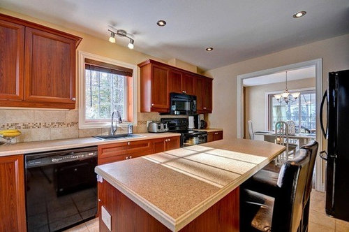
We just bought our first house and I'm really struggling with choosing paint colours for the first floor. I'm drawn to a transitional style, but my fiance loves using bright colours (ex. the walls in our old basement was a bright tangerine). I love the look, but struggle with planning with such bright colours.

Comments (22)

  • PRO
    12 years ago
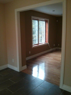
    Go bold. I love the mustard in the other room. Kitchen is too bland now so perhaps there's a middle ground like a warm grey that has color, weight but not too much color. Cabinets are heavy feeling with the wood finish. You need a color with weight on the walls to pull the kitchen together. Ceiling can stay white.
    kerrierf thanked Suzette Sherman Design
  • PRO
    12 years ago
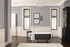
    Meet in the middle with a neutral that offers rich, bold color. Gray is incredibly versatile and gorgeous. You can create with it using an assortment of undertones: green, blue, mauve, taupe, brown...

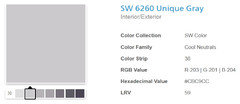
    I chose a plum undertone because I believe it's a color that will be stunning with your cabinets, which have a cherry hue to them. It's light enough to give brightness to your kitchen and rich enough to give it a contemporary look.

    It's Sherwin Williams Unique Gray

    Christi, on behalf of Thos. Baker
    kerrierf thanked Thos. Baker
  • 12 years ago
    Thanks for the feedback!

    kmkane, the entrance/hallway is already blue, so I'm concerned about it clashing/being overwhelmingly blue.

    Suzette, I've attached a picture of the fabric of my sofas. I'm concerned with the pattern and the mustard it will make the room look too "old".
  • 12 years ago
    Thanks Christi! I love how clean the room looks.
  • 12 years ago
    last modified: 12 years ago
    Perhaps you could play off the blue by going into a lighter shade of it, reaching into the grey with an undertone of blue. Nothing wrong with having the house the same tones. I"m beginning to like that. Wonder what the designers think ???
  • PRO
    12 years ago
    last modified: 12 years ago
    kerrierf - The great thing about gray is that it transitions beautifully from room to room. Each room can have it's own color, but with subtle changes in the undertones and careful selection of the changing of grays, the colors don't scream out as you move from room to room. They kinda sneak up on you and after glancing around, you realize you're in a room that's an entirely different color, when actually it's just a different hue of gray.

    Christi, on behalf of Thos. Baker
    kerrierf thanked Thos. Baker
  • 12 years ago
    Any particular colours that you think would help make the room "pop"? We had a wall in our last kitchen that was a bright lime colour that really made the room stand out :)
  • PRO
    12 years ago
    Kerrierf -- I've seen some beautiful photos of walls done in lime, but I can't claim having a lot of personal experience! :)

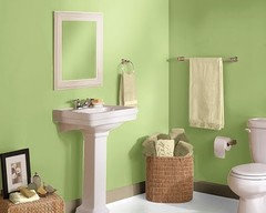
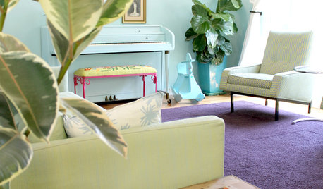
    I think choosing lime depends on how much "pop" you want, because lime has plenty of pop! I'd go with a lighter shades and try to achieve some level of softness, but still get the rich feeling of lime. Here's a couple of photos that show fairly light shades in Sherwin Williams colors.

    Top photos: Lime Granita (darker/brighter)
    Bottom photos: Citrine (lighter/softer)

    Christi. on behalf of Thos. Baker
  • 12 years ago
    Any suggestions for brightening the living room?
  • PRO
    12 years ago
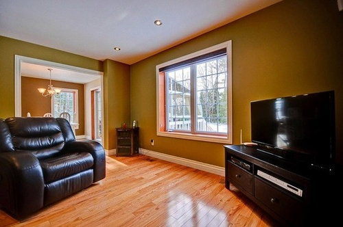
    The photo of the living room with the black leather chair, mustard walls and black entertainment center, along with the close up of the fabric of your sofa doesn't provide enough of a visual to fairly recommend a paint color for the walls. Can you post more information or photos on what other components you will be putting in your living room, so we can get a more well-rounded idea?

    Christi, on behalf of Thos. Baker
  • 12 years ago
    Sure thing! We finally got possession of the house yesterday so I was able to get more pictures. We have a flat screen TV that will go on one of the walls, and I have 2 love seats that are quite fluffy (I don't really have pictures of them that don't have people sitting on them). I'm not quite sure what else will go in, but we'll definitely need to go out and buy a few new pieces (end tables, coffee table, etc.)
  • 12 years ago
    Wall colour and couch photo
  • PRO
    12 years ago
    last modified: 12 years ago
    I think the rich, bold colors in the fabric of your sofa should be the focal point and the wall color should be the back drop. Wall color should enhance the furniture, fabrics and setting, not drown them out.

    For the living room, I would recommend Benjamin Moore Taupe Gray. Since you do like bolder colors -- this is a bold, sophisticated, modern color that doesn't take over the whole room and would be a great back ground color for the fabric on your sofa.

    Christi, on behalf of Thos. Baker
    kerrierf thanked Thos. Baker
  • PRO
    12 years ago
    Hi Kerrierf,
    The nice thing about transitional is you can add pops of non traditional colors even if you don't have a lot of contemporary furnishings.
    For your kitchen, I recommend a color that plays off the back splash. Maybe a medium cleaner buttery yellow; timeless, clean but not country and not crazy bright.

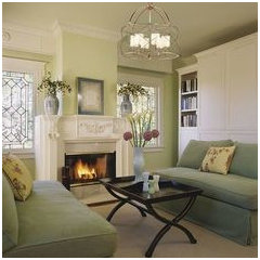
    I would use the greens in the sofa to change the red accent to a fresh green as a way to tie the dining and living rooms together.
    kerrierf thanked Jill J. Wallace, Color Redesign
  • 12 years ago
    Thanks Jill! I love the suggestion of the green for the living room. Since my furniture is so traditional I like finding ways to make the room still look modern
  • 12 years ago
    Hi Kerrierf, We remodeled a home in Florida in 2013 and used one of the palettes from Sherwin Williams's HGTV paint collection. They offer bright palettes, neutral palettes, earth tones, gray tones etc. All the colors in each palette are designed to complement and match each other. We get many compliments on how the paint colors flow in our remodel. You may consider stopping in to Sherwin Williams and taking a look at the palettes.
    kerrierf thanked mittens5123
  • 12 years ago
    I would go BM Calla Lilly or Fresh Butter in the kitchen, or perhaps a gated out blue (more blue than gray). I don't think it would be too much blue. Either would go nicely with your darker cabinets. Still too hard to see sofa material, but a soft green (perhaps sage) might work.
  • 12 years ago
    Or maybe BM Maidenhair Fern or Lilly Pad for the living room. Best to get or make some large samples to see in your light, different times of day. The wrong colour could make your sofa look older or dirty. Also, you don't want too many colours. Continuity needed. I'm sure you'll find the right balance. Have fun choosing, and take your time. You'll probably be there awhile. Lovely home, BTW.
  • PRO
    12 years ago
    i love bright colors, I think all you need is fabric to balance it out. Window treatments, rug and artwork will really make this room sing. If you have trouble finding a color scheme for your home, find something that has the colors in it you do like, either a photo, painting, fabric, maybe something in your closet you love. Take the colors from that piece and use them throughout the house in different doses. One room it might be the main color and in another just an accent. Not all of the rooms need to be bright or saturated, the carrying through of the colors used room to room will give you a cohesive look. I am not sure if the original photos have your furniture or the sellers furniture. If you think the livingroom makes the floral/tropical fabric look to old, change to a green with less yellow, if you go beige or white your sofa will start to look old, so bring out one of the colors in it, even the red though I think green is more soothing. Benjamin Moore's Sherwood green HC-118 or Georgian green HC-115 are both beautiful on the walls and would go well with your fabric. Then I would put a stripe at the windows in either a drape or roman shade, making sure as many of the colors from the sofa are included as possible. In the dinning room use something like BenMoore Rouge 2084-30 and in the entry and hallway use Vanilla ice cream 2154-70. All your trim should be bright white semi-gloss.
    kerrierf thanked KM&M Designs
  • 12 years ago
    I agree with KM&M on all but the Rouge (it comes off a bit pink for me). The greens are gorgeous and hopefully work with your sofa and your light. I re-read my comment and it sounds like I don't think you should have lots of colour in your home. I meant the very opposite (after all, I have BM Dance du Soleil throughout most of my main floor). I meant what KM said: Create continuity by bringing in colours from favourite pieces in your various rooms. White trim will make your colours pop. (I'm personally not a fan of gray, beige or greige in most cases, but it's your home.)
    kerrierf thanked lepstein
  • 12 years ago
    Thanks for the feedback everyone!

    We inherited the couches (there are 2 matching ones) and while the pattern is not one that I would have chosen, they are extremely comfortable!