
Search results for "Offset dining room" in Dining Photos
Refine by:
Budget
Sort by:Relevance
1 - 20 of 323 photos
Item 1 of 2
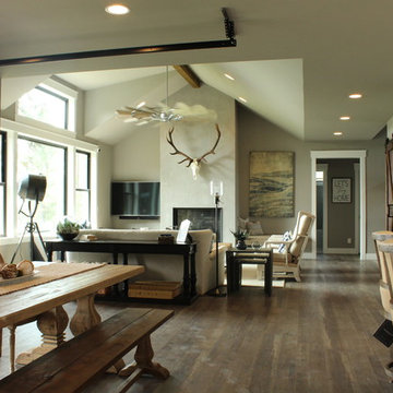
 The Tin Roof-Interior Design & Fine Furniture
"I have always loved farmhouses, but not the kitchy design that often comes with them. I knew I wanted to have a house that mixed all of my design styles while keeping to my roots. I chose to update the exterior with metal accents and modern garage doors to offset the barn looking shop. The interior follows much of the same design principles in order to keep the flow consistent. You will see many different styles used throughout the home. I love seeing how all of my design choices have come together, and couldn’t be happier." -- Kristina, homeowner and owner of Nest Designs
Photography by Shannon Osborn
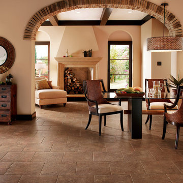
 Direct Hardwood Flooring
Example of a mid-sized transitional slate floor great room design in Charlotte with beige walls and a standard fireplace
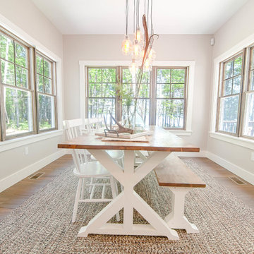
 Jessica Meister
Custom farmhouse table and bench designed and built by Rowe Station Woodworks of New Gloucester, Maine. We tied everything together with some white, Windsor-style chairs, a neutral braided rug from L.L. Bean, and a beautiful offset glass chandelier.
Paint Color: Revere Pewter by Benjamin Moore
Trim: White Dove by Benjamin Moore
Windows: Anderson 400 series with pine casings stained in minwax jacobean
Find the right local pro for your project
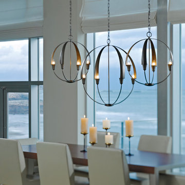
 Lights Beautiful
Mid-sized transitional enclosed dining room photo in Santa Barbara with white walls and no fireplace
 Susan Yeley Homes
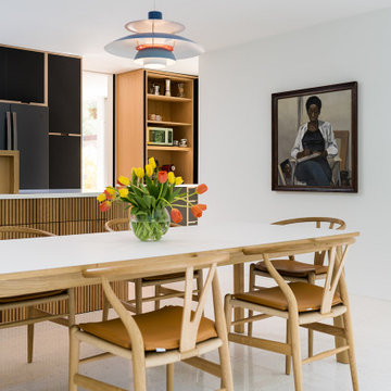
Nearly two decades ago now, Susan and her husband put a letter in the mailbox of this eastside home: "If you have any interest in selling, please reach out." But really, who would give up a Flansburgh House?
Fast forward to 2020, when the house went on the market! By then it was clear that three children and a busy home design studio couldn't be crammed into this efficient footprint. But what's second best to moving into your dream home? Being asked to redesign the functional core for the family that was.
In this classic Flansburgh layout, all the rooms align tidily in a square around a central hall and open air atrium. As such, all the spaces are both connected to one another and also private; and all allow for visual access to the outdoors in two directions—toward the atrium and toward the exterior. All except, in this case, the utilitarian galley kitchen. That space, oft-relegated to second class in midcentury architecture, got the shaft, with narrow doorways on two ends and no good visual access to the atrium or the outside. Who spends time in the kitchen anyway?
As is often the case with even the very best midcentury architecture, the kitchen at the Flansburgh House needed to be modernized; appliances and cabinetry have come a long way since 1970, but our culture has evolved too, becoming more casual and open in ways we at SYH believe are here to stay. People (gasp!) do spend time—lots of time!—in their kitchens! Nonetheless, our goal was to make this kitchen look as if it had been designed this way by Earl Flansburgh himself.
The house came to us full of bold, bright color. We edited out some of it (along with the walls it was on) but kept and built upon the stunning red, orange and yellow closet doors in the family room adjacent to the kitchen. That pop was balanced by a few colorful midcentury pieces that our clients already owned, and the stunning light and verdant green coming in from both the atrium and the perimeter of the house, not to mention the many skylights. Thus, the rest of the space just needed to quiet down and be a beautiful, if neutral, foil. White terrazzo tile grounds custom plywood and black cabinetry, offset by a half wall that offers both camouflage for the cooking mess and also storage below, hidden behind seamless oak tambour.
Contractor: Rusty Peterson
Cabinetry: Stoll's Woodworking
Photographer: Sarah Shields
 ZeroEnergy Design
OVERVIEW
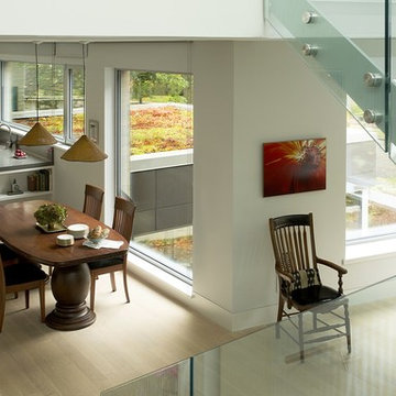
Set into a mature Boston area neighborhood, this sophisticated 2900SF home offers efficient use of space, expression through form, and myriad of green features.
MULTI-GENERATIONAL LIVING
Designed to accommodate three family generations, paired living spaces on the first and second levels are architecturally expressed on the facade by window systems that wrap the front corners of the house. Included are two kitchens, two living areas, an office for two, and two master suites.
CURB APPEAL
The home includes both modern form and materials, using durable cedar and through-colored fiber cement siding, permeable parking with an electric charging station, and an acrylic overhang to shelter foot traffic from rain.
FEATURE STAIR
An open stair with resin treads and glass rails winds from the basement to the third floor, channeling natural light through all the home’s levels.
LEVEL ONE
The first floor kitchen opens to the living and dining space, offering a grand piano and wall of south facing glass. A master suite and private ‘home office for two’ complete the level.
LEVEL TWO
The second floor includes another open concept living, dining, and kitchen space, with kitchen sink views over the green roof. A full bath, bedroom and reading nook are perfect for the children.
LEVEL THREE
The third floor provides the second master suite, with separate sink and wardrobe area, plus a private roofdeck.
ENERGY
The super insulated home features air-tight construction, continuous exterior insulation, and triple-glazed windows. The walls and basement feature foam-free cavity & exterior insulation. On the rooftop, a solar electric system helps offset energy consumption.
WATER
Cisterns capture stormwater and connect to a drip irrigation system. Inside the home, consumption is limited with high efficiency fixtures and appliances.
TEAM
Architecture & Mechanical Design – ZeroEnergy Design
Contractor – Aedi Construction
Photos – Eric Roth Photography
 Traci Connell Interiors
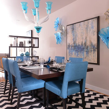
By using a bold color, and bouncing it around the space, this dining room is one of a kind. The turquoise chandelier brings in the turquoise wall plates and allows the blue to pop. We offset the bright turquoise with black and white to help balance the space.
 Living Stone Design + Build
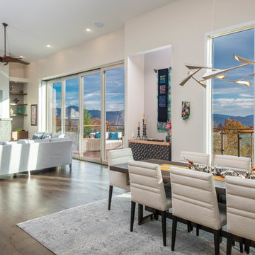
The midcentury modern dining room at the Sennett Residence in Asheville, NC offers a harmonious blend of elegance and comfort, designed by Living Stone Design + Build. Featuring expansive windows that invite natural light and showcase breathtaking mountain views, this inviting space showcases modern furnishings and warm materials, making it the perfect setting for memorable gatherings and meals with loved ones.
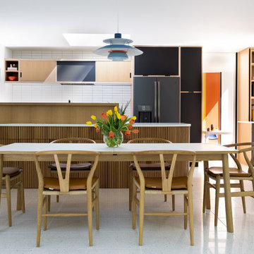 Susan Yeley Homes
Nearly two decades ago now, Susan and her husband put a letter in the mailbox of this eastside home: "If you have any interest in selling, please reach out." But really, who would give up a Flansburgh House?
Fast forward to 2020, when the house went on the market! By then it was clear that three children and a busy home design studio couldn't be crammed into this efficient footprint. But what's second best to moving into your dream home? Being asked to redesign the functional core for the family that was.
In this classic Flansburgh layout, all the rooms align tidily in a square around a central hall and open air atrium. As such, all the spaces are both connected to one another and also private; and all allow for visual access to the outdoors in two directions—toward the atrium and toward the exterior. All except, in this case, the utilitarian galley kitchen. That space, oft-relegated to second class in midcentury architecture, got the shaft, with narrow doorways on two ends and no good visual access to the atrium or the outside. Who spends time in the kitchen anyway?
As is often the case with even the very best midcentury architecture, the kitchen at the Flansburgh House needed to be modernized; appliances and cabinetry have come a long way since 1970, but our culture has evolved too, becoming more casual and open in ways we at SYH believe are here to stay. People (gasp!) do spend time—lots of time!—in their kitchens! Nonetheless, our goal was to make this kitchen look as if it had been designed this way by Earl Flansburgh himself.
The house came to us full of bold, bright color. We edited out some of it (along with the walls it was on) but kept and built upon the stunning red, orange and yellow closet doors in the family room adjacent to the kitchen. That pop was balanced by a few colorful midcentury pieces that our clients already owned, and the stunning light and verdant green coming in from both the atrium and the perimeter of the house, not to mention the many skylights. Thus, the rest of the space just needed to quiet down and be a beautiful, if neutral, foil. White terrazzo tile grounds custom plywood and black cabinetry, offset by a half wall that offers both camouflage for the cooking mess and also storage below, hidden behind seamless oak tambour.
Contractor: Rusty Peterson
Cabinetry: Stoll's Woodworking
Photographer: Sarah Shields
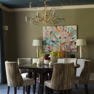
 User
UserThe Tony Duquette Splashing Water Chandelier makes a huge splash and impact and is the focal point of the dining room. The use of two different grasscloths adds texture to the entire space. F. Schumacher Greek Key ceiling wallpaper in an ink blue adds geometry and a two dimensional effect, offset by the subtle glam grasscloth from Philip Jeffries. It adds a bit of sparkle and glamor to the space.
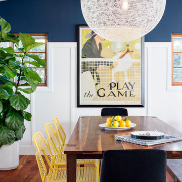
 Corine Maggio Design
This adorable beach cottage is in the heart of the village of La Jolla in San Diego. The goals were to brighten up the space and be the perfect beach get-away for the client whose permanent residence is in Arizona. Some of the ways we achieved the goals was to place an extra high custom board and batten in the great room and by refinishing the kitchen cabinets (which were in excellent shape) white. We created interest through extreme proportions and contrast. Though there are a lot of white elements, they are all offset by a smaller portion of very dark elements. We also played with texture and pattern through wallpaper, natural reclaimed wood elements and rugs. This was all kept in balance by using a simplified color palate minimal layering.
I am so grateful for this client as they were extremely trusting and open to ideas. To see what the space looked like before the remodel you can go to the gallery page of the website www.cmnaturaldesigns.com
Photography by: Chipper Hatter
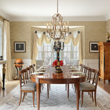
 Jamieson Design
Large elegant medium tone wood floor enclosed dining room photo in St Louis with yellow walls
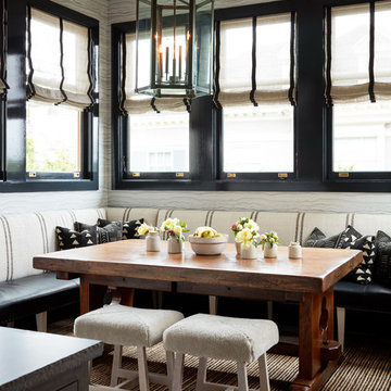
 Fireclay Tile
In the 10th annual House Beautiful Kitchen of the Year, our Glazed Thin Brick in Meteorite takes the stage with Designer Jon De La Cruz's bold take on the offset pattern.
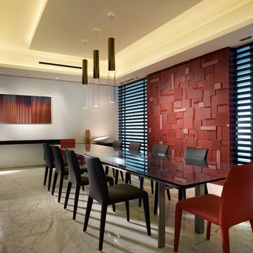
 Pepe Calderin Design- Modern Interior Design
Inspiration for a contemporary dining room remodel in New York with white walls
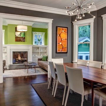
 Board & Vellum
The Dining Room offsets the table into the bay windows to allow open circulation between the three main rooms.
John Wilbanks Photography
Inspiration for a craftsman enclosed dining room remodel in Seattle
Inspiration for a craftsman enclosed dining room remodel in Seattle
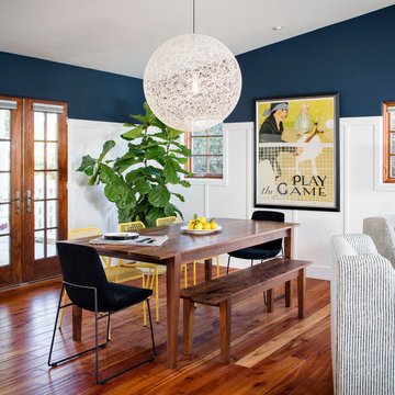 Corine Maggio Design
This adorable beach cottage is in the heart of the village of La Jolla in San Diego. The goals were to brighten up the space and be the perfect beach get-away for the client whose permanent residence is in Arizona. Some of the ways we achieved the goals was to place an extra high custom board and batten in the great room and by refinishing the kitchen cabinets (which were in excellent shape) white. We created interest through extreme proportions and contrast. Though there are a lot of white elements, they are all offset by a smaller portion of very dark elements. We also played with texture and pattern through wallpaper, natural reclaimed wood elements and rugs. This was all kept in balance by using a simplified color palate minimal layering.
I am so grateful for this client as they were extremely trusting and open to ideas. To see what the space looked like before the remodel you can go to the gallery page of the website www.cmnaturaldesigns.com
Photography by: Chipper Hatter
 John Bynum Custom Homes, Inc.
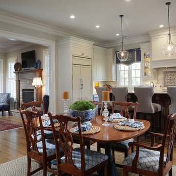
Example of a mid-sized classic medium tone wood floor enclosed dining room design in Atlanta with gray walls and no fireplace
 Tricia Fortin Interiors
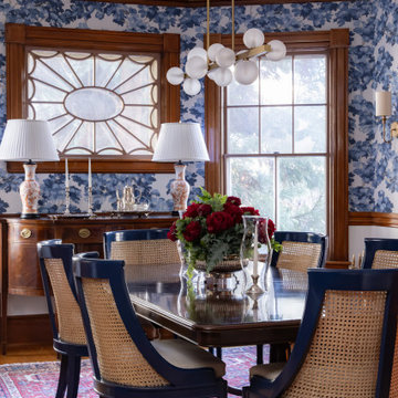
The dining room is layered with vibrant blues and reds mixed with traditional antiques accented punctuated with some contemporary pieces. An antique dining table is offset by modern lacquered chairs in a rich blue. More of our client's antique china collection takes center stage around an antique French mirror. The original woodwork and fireplace were preserved.
 Wabimoss
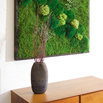
This green living wall art is actually preserved moss in a burned pine frame. It is accented by a glass vase that is made to look opaque and down. The reeds in the vase offset the green of the vertical garden. The green wall really pops out against the white background and mid-century cabinet.
 User
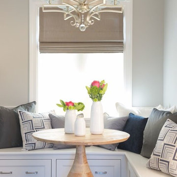
UserCustom breakfast nook with additional under bench storage and a light wood round table offset by decorative throw pillows to create a cozy feel. Neutral tones in the chandelier and roman blinds tie the space together.
1