
Search results for "Liberal arts" in Home Design Ideas
 Katie Rosenfeld Design
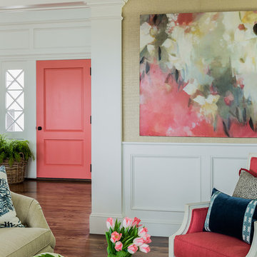
This ocean-front shingled Gambrel style house is home to a young family with little kids who lead an active, outdoor lifestyle. My goal was to create a bespoke, colorful and eclectic interior that looked sophisticated and fresh, but that was tough enough to withstand salt, sand and wet kids galore. The palette of coral and blue is an obvious choice, but we tried to translate it into a less expected, slightly updated way, hence the front door! Liberal use of indoor-outdoor fabrics created a seamless appearance while preserving the utility needed for this full time seaside residence.
photo: Michael J Lee Photography
 Donald Lococo Architects
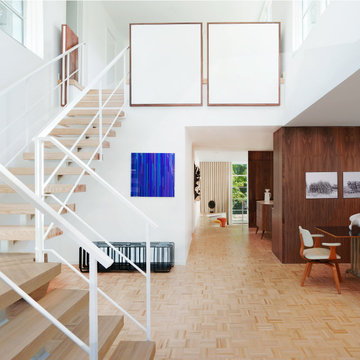
Designed in 1970 for an art collector, the existing referenced 70’s architectural principles. With its cadence of ‘70’s brick masses punctuated by a garage and a 4-foot-deep entrance recess. This recess, however, didn’t convey to the interior, which was occupied by disjointed service spaces. To solve, service spaces are moved and reorganized in open void in the garage. (See plan) This also organized the home: Service & utility on the left, reception central, and communal living spaces on the right.
To maintain clarity of the simple one-story 70’s composition, the second story add is recessive. A flex-studio/extra bedroom and office are designed ensuite creating a slender form and orienting them front to back and setting it back allows the add recede. Curves create a definite departure from the 70s home and by detailing it to "hover like a thought" above the first-floor roof and mentally removable sympathetic add.Existing unrelenting interior walls and a windowless entry, although ideal for fine art was unconducive for the young family of three. Added glass at the front recess welcomes light view and the removal of interior walls not only liberate rooms to communicate with each other but also reinform the cleared central entry space as a hub.
Even though the renovation reinforms its relationship with art, the joy and appreciation of art was not dismissed. A metal sculpture lost in the corner of the south side yard bumps the sculpture at the front entrance to the kitchen terrace over an added pedestal. (See plans) Since the roof couldn’t be railed without compromising the one-story '70s composition, the sculpture garden remains physically inaccessible however mirrors flanking the chimney allow the sculptures to be appreciated in three dimensions. The mirrors also afford privacy from the adjacent Tudor's large master bedroom addition 16-feet away.
 Coffey & Co. House of Interiors
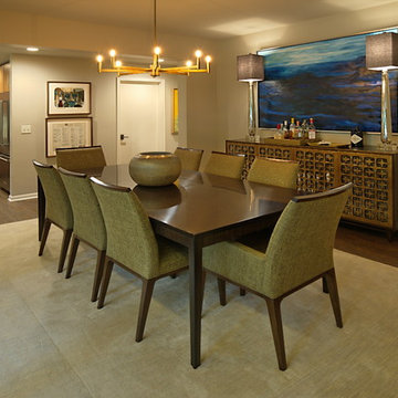
This project is best described in one word: Fun – Oh wait, and bold! This homes mid-century modern construction style was inspiration that married nicely to our clients request to also have a home with a glamorous and lux vibe. We have a long history of working together and the couple was very open to concepts but she had one request: she loved blue, in any and all forms, and wanted it to be used liberally throughout the house. This new-to-them home was an original 1966 ranch in the Calvert area of Lincoln, Nebraska and was begging for a new and more open floor plan to accommodate large family gatherings. The house had been so loved at one time but was tired and showing her age and an allover change in lighting, flooring, moldings as well as development of a new and more open floor plan, lighting and furniture and space planning were on our agenda. This album is a progression room to room of the house and the changes we made. We hope you enjoy it! This was such a fun and rewarding project and In the end, our Musician husband and glamorous wife had their forever dream home nestled in the heart of the city.
Find the right local pro for your project
 Katie Rosenfeld Design
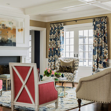
This ocean-front shingled Gambrel style house is home to a young family with little kids who lead an active, outdoor lifestyle. My goal was to create a bespoke, colorful and eclectic interior that looked sophisticated and fresh, but that was tough enough to withstand salt, sand and wet kids galore. The palette of coral and blue is an obvious choice, but we tried to translate it into a less expected, slightly updated way, hence the front door! Liberal use of indoor-outdoor fabrics created a seamless appearance while preserving the utility needed for this full time seaside residence.
photo: Michael J Lee Photography
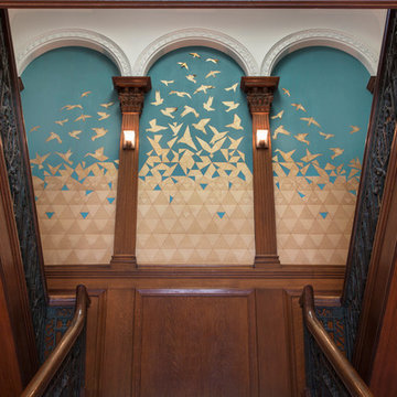
 Margot Hartford Photography
Photo: Margot Hartford © 2017 Houzz
Stair Landing: Deconstructed Delight
Designer: Elan Evans
Example of an entryway design in San Francisco
Example of an entryway design in San Francisco
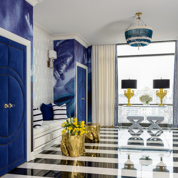
 Tobi Fairley Interior Design
Paint is Sherwin-Williams Snowbound, wallpaper is Black Crow Studios, console is Plexi-Craft, Sconces are Robert Abbey, Doors and banquette are custom. Chandelier is RoShamBeaux. Stools are Phillips Collection
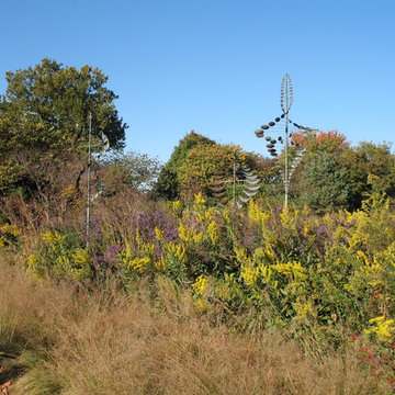
 Missouri Botanical Garden
Courtesy Missouri Botanical Garden PlantFinder
Photo credit: Lisa Francis
New England aster and Goldenrod
Symphyotrichum novae-angliae and Solidago speciosa
Kemper - Lopata Prairie Garden
Sponsored
Columbus, OH

Snider & Metcalf Interior Design, LTD
Leading Interior Designers in Columbus, Ohio & Ponte Vedra, Florida
 Donald Lococo Architects
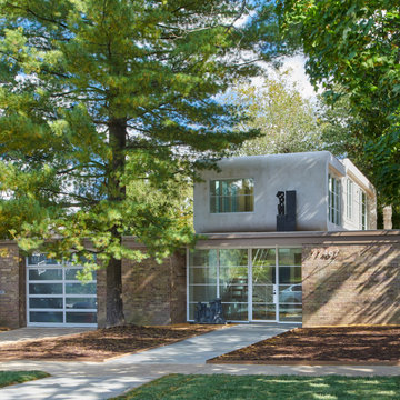
Designed in 1970 for an art collector, the existing referenced 70’s architectural principles. With its cadence of ‘70’s brick masses punctuated by a garage and a 4-foot-deep entrance recess. This recess, however, didn’t convey to the interior, which was occupied by disjointed service spaces. To solve, service spaces are moved and reorganized in open void in the garage. (See plan) This also organized the home: Service & utility on the left, reception central, and communal living spaces on the right.
To maintain clarity of the simple one-story 70’s composition, the second story add is recessive. A flex-studio/extra bedroom and office are designed ensuite creating a slender form and orienting them front to back and setting it back allows the add recede. Curves create a definite departure from the 70s home and by detailing it to "hover like a thought" above the first-floor roof and mentally removable sympathetic add.Existing unrelenting interior walls and a windowless entry, although ideal for fine art was unconducive for the young family of three. Added glass at the front recess welcomes light view and the removal of interior walls not only liberate rooms to communicate with each other but also reinform the cleared central entry space as a hub.
Even though the renovation reinforms its relationship with art, the joy and appreciation of art was not dismissed. A metal sculpture lost in the corner of the south side yard bumps the sculpture at the front entrance to the kitchen terrace over an added pedestal. (See plans) Since the roof couldn’t be railed without compromising the one-story '70s composition, the sculpture garden remains physically inaccessible however mirrors flanking the chimney allow the sculptures to be appreciated in three dimensions. The mirrors also afford privacy from the adjacent Tudor's large master bedroom addition 16-feet away.

 Donald Lococo Architects
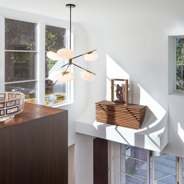
Designed in 1970 for an art collector, the existing referenced 70’s architectural principles. With its cadence of ‘70’s brick masses punctuated by a garage and a 4-foot-deep entrance recess. This recess, however, didn’t convey to the interior, which was occupied by disjointed service spaces. To solve, service spaces are moved and reorganized in open void in the garage. (See plan) This also organized the home: Service & utility on the left, reception central, and communal living spaces on the right.
To maintain clarity of the simple one-story 70’s composition, the second story add is recessive. A flex-studio/extra bedroom and office are designed ensuite creating a slender form and orienting them front to back and setting it back allows the add recede. Curves create a definite departure from the 70s home and by detailing it to "hover like a thought" above the first-floor roof and mentally removable sympathetic add.Existing unrelenting interior walls and a windowless entry, although ideal for fine art was unconducive for the young family of three. Added glass at the front recess welcomes light view and the removal of interior walls not only liberate rooms to communicate with each other but also reinform the cleared central entry space as a hub.
Even though the renovation reinforms its relationship with art, the joy and appreciation of art was not dismissed. A metal sculpture lost in the corner of the south side yard bumps the sculpture at the front entrance to the kitchen terrace over an added pedestal. (See plans) Since the roof couldn’t be railed without compromising the one-story '70s composition, the sculpture garden remains physically inaccessible however mirrors flanking the chimney allow the sculptures to be appreciated in three dimensions. The mirrors also afford privacy from the adjacent Tudor's large master bedroom addition 16-feet away.
 Coffey & Co. House of Interiors
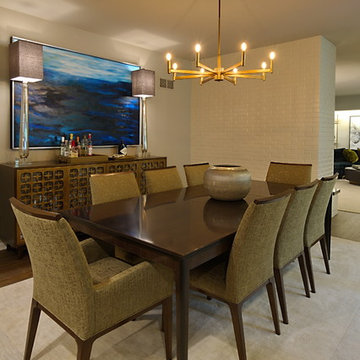
This project is best described in one word: Fun – Oh wait, and bold! This homes mid-century modern construction style was inspiration that married nicely to our clients request to also have a home with a glamorous and lux vibe. We have a long history of working together and the couple was very open to concepts but she had one request: she loved blue, in any and all forms, and wanted it to be used liberally throughout the house. This new-to-them home was an original 1966 ranch in the Calvert area of Lincoln, Nebraska and was begging for a new and more open floor plan to accommodate large family gatherings. The house had been so loved at one time but was tired and showing her age and an allover change in lighting, flooring, moldings as well as development of a new and more open floor plan, lighting and furniture and space planning were on our agenda. This album is a progression room to room of the house and the changes we made. We hope you enjoy it! This was such a fun and rewarding project and In the end, our Musician husband and glamorous wife had their forever dream home nestled in the heart of the city.
 Laura Lee Home
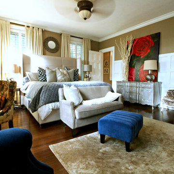
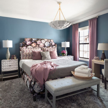
This guest bedroom was designed with the client's mother in mind. A bold floral on a black background sets the stage for the space. Lavender is the occupant's favorite color and it was used liberally in the space. The tall headboard creates a focal point and an oversized piece of abstract art adds drama. A narrow console table provides a place for guests to work.
 Laura Lee Home
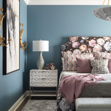
This guest bedroom was designed with the client's mother in mind. A bold floral on a black background sets the stage for the space. Lavender is the occupant's favorite color and it was used liberally in the space. The tall headboard creates a focal point and an oversized piece of abstract art adds drama.
Sponsored
Columbus, OH

Wannemacher Interiors
Customized Award-Winning Interior Design Solutions in Franklin Cnty OH
 Donald Lococo Architects
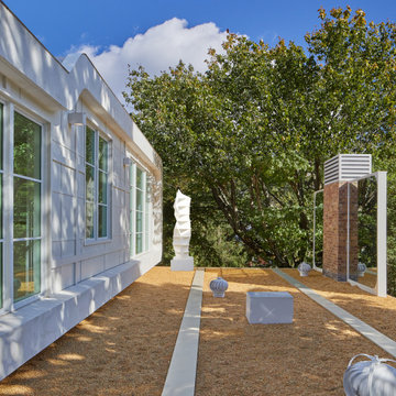
Designed in 1970 for an art collector, the existing referenced 70’s architectural principles. With its cadence of ‘70’s brick masses punctuated by a garage and a 4-foot-deep entrance recess. This recess, however, didn’t convey to the interior, which was occupied by disjointed service spaces. To solve, service spaces are moved and reorganized in open void in the garage. (See plan) This also organized the home: Service & utility on the left, reception central, and communal living spaces on the right.
To maintain clarity of the simple one-story 70’s composition, the second story add is recessive. A flex-studio/extra bedroom and office are designed ensuite creating a slender form and orienting them front to back and setting it back allows the add recede. Curves create a definite departure from the 70s home and by detailing it to "hover like a thought" above the first-floor roof and mentally removable sympathetic add.Existing unrelenting interior walls and a windowless entry, although ideal for fine art was unconducive for the young family of three. Added glass at the front recess welcomes light view and the removal of interior walls not only liberate rooms to communicate with each other but also reinform the cleared central entry space as a hub.
Even though the renovation reinforms its relationship with art, the joy and appreciation of art was not dismissed. A metal sculpture lost in the corner of the south side yard bumps the sculpture at the front entrance to the kitchen terrace over an added pedestal. (See plans) Since the roof couldn’t be railed without compromising the one-story '70s composition, the sculpture garden remains physically inaccessible however mirrors flanking the chimney allow the sculptures to be appreciated in three dimensions. The mirrors also afford privacy from the adjacent Tudor's large master bedroom addition 16-feet away.
 Donald Lococo Architects
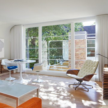
Designed in 1970 for an art collector, the existing referenced 70’s architectural principles. With its cadence of ‘70’s brick masses punctuated by a garage and a 4-foot-deep entrance recess. This recess, however, didn’t convey to the interior, which was occupied by disjointed service spaces. To solve, service spaces are moved and reorganized in open void in the garage. (See plan) This also organized the home: Service & utility on the left, reception central, and communal living spaces on the right.
To maintain clarity of the simple one-story 70’s composition, the second story add is recessive. A flex-studio/extra bedroom and office are designed ensuite creating a slender form and orienting them front to back and setting it back allows the add recede. Curves create a definite departure from the 70s home and by detailing it to "hover like a thought" above the first-floor roof and mentally removable sympathetic add.Existing unrelenting interior walls and a windowless entry, although ideal for fine art was unconducive for the young family of three. Added glass at the front recess welcomes light view and the removal of interior walls not only liberate rooms to communicate with each other but also reinform the cleared central entry space as a hub.
Even though the renovation reinforms its relationship with art, the joy and appreciation of art was not dismissed. A metal sculpture lost in the corner of the south side yard bumps the sculpture at the front entrance to the kitchen terrace over an added pedestal. (See plans) Since the roof couldn’t be railed without compromising the one-story '70s composition, the sculpture garden remains physically inaccessible however mirrors flanking the chimney allow the sculptures to be appreciated in three dimensions. The mirrors also afford privacy from the adjacent Tudor's large master bedroom addition 16-feet away.
 Donald Lococo Architects
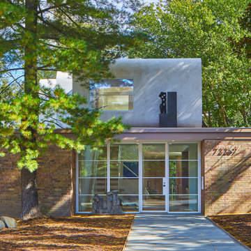
Designed in 1970 for an art collector, the existing referenced 70’s architectural principles. With its cadence of ‘70’s brick masses punctuated by a garage and a 4-foot-deep entrance recess. This recess, however, didn’t convey to the interior, which was occupied by disjointed service spaces. To solve, service spaces are moved and reorganized in open void in the garage. (See plan) This also organized the home: Service & utility on the left, reception central, and communal living spaces on the right.
To maintain clarity of the simple one-story 70’s composition, the second story add is recessive. A flex-studio/extra bedroom and office are designed ensuite creating a slender form and orienting them front to back and setting it back allows the add recede. Curves create a definite departure from the 70s home and by detailing it to "hover like a thought" above the first-floor roof and mentally removable sympathetic add.Existing unrelenting interior walls and a windowless entry, although ideal for fine art was unconducive for the young family of three. Added glass at the front recess welcomes light view and the removal of interior walls not only liberate rooms to communicate with each other but also reinform the cleared central entry space as a hub.
Even though the renovation reinforms its relationship with art, the joy and appreciation of art was not dismissed. A metal sculpture lost in the corner of the south side yard bumps the sculpture at the front entrance to the kitchen terrace over an added pedestal. (See plans) Since the roof couldn’t be railed without compromising the one-story '70s composition, the sculpture garden remains physically inaccessible however mirrors flanking the chimney allow the sculptures to be appreciated in three dimensions. The mirrors also afford privacy from the adjacent Tudor's large master bedroom addition 16-feet away.
 Donald Lococo Architects
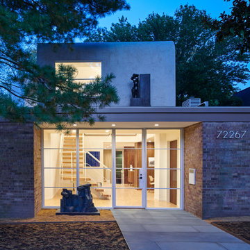
Designed in 1970 for an art collector, the existing referenced 70’s architectural principles. With its cadence of ‘70’s brick masses punctuated by a garage and a 4-foot-deep entrance recess. This recess, however, didn’t convey to the interior, which was occupied by disjointed service spaces. To solve, service spaces are moved and reorganized in open void in the garage. (See plan) This also organized the home: Service & utility on the left, reception central, and communal living spaces on the right.
To maintain clarity of the simple one-story 70’s composition, the second story add is recessive. A flex-studio/extra bedroom and office are designed ensuite creating a slender form and orienting them front to back and setting it back allows the add recede. Curves create a definite departure from the 70s home and by detailing it to "hover like a thought" above the first-floor roof and mentally removable sympathetic add.Existing unrelenting interior walls and a windowless entry, although ideal for fine art was unconducive for the young family of three. Added glass at the front recess welcomes light view and the removal of interior walls not only liberate rooms to communicate with each other but also reinform the cleared central entry space as a hub.
Even though the renovation reinforms its relationship with art, the joy and appreciation of art was not dismissed. A metal sculpture lost in the corner of the south side yard bumps the sculpture at the front entrance to the kitchen terrace over an added pedestal. (See plans) Since the roof couldn’t be railed without compromising the one-story '70s composition, the sculpture garden remains physically inaccessible however mirrors flanking the chimney allow the sculptures to be appreciated in three dimensions. The mirrors also afford privacy from the adjacent Tudor's large master bedroom addition 16-feet away.

Sponsored
Sunbury, OH

J.Holderby - Renovations
Franklin County's Leading General Contractors - 2X Best of Houzz!
 Donald Lococo Architects
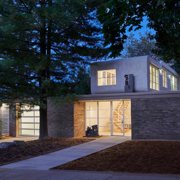
Designed in 1970 for an art collector, the existing referenced 70’s architectural principles. With its cadence of ‘70’s brick masses punctuated by a garage and a 4-foot-deep entrance recess. This recess, however, didn’t convey to the interior, which was occupied by disjointed service spaces. To solve, service spaces are moved and reorganized in open void in the garage. (See plan) This also organized the home: Service & utility on the left, reception central, and communal living spaces on the right.
To maintain clarity of the simple one-story 70’s composition, the second story add is recessive. A flex-studio/extra bedroom and office are designed ensuite creating a slender form and orienting them front to back and setting it back allows the add recede. Curves create a definite departure from the 70s home and by detailing it to "hover like a thought" above the first-floor roof and mentally removable sympathetic add.Existing unrelenting interior walls and a windowless entry, although ideal for fine art was unconducive for the young family of three. Added glass at the front recess welcomes light view and the removal of interior walls not only liberate rooms to communicate with each other but also reinform the cleared central entry space as a hub.
Even though the renovation reinforms its relationship with art, the joy and appreciation of art was not dismissed. A metal sculpture lost in the corner of the south side yard bumps the sculpture at the front entrance to the kitchen terrace over an added pedestal. (See plans) Since the roof couldn’t be railed without compromising the one-story '70s composition, the sculpture garden remains physically inaccessible however mirrors flanking the chimney allow the sculptures to be appreciated in three dimensions. The mirrors also afford privacy from the adjacent Tudor's large master bedroom addition 16-feet away.
 Almesedoors
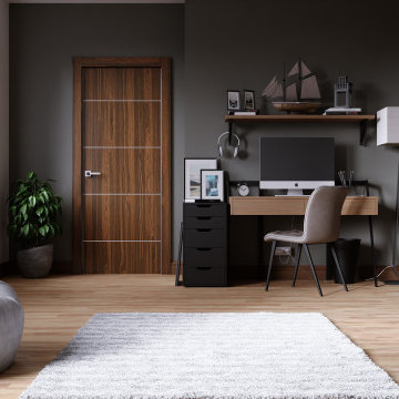
THE DOOR NAME ORIGIN - "ALLUMINIO ELIVIA VERTICAL WOOD GRAIN 4HS"
Of all the interior door models in the Elivia collection, this one is perhaps the most unapologetically elegant. Why? Hmm … That which is self-evident can be the most difficult to explain. Is it because it is built using the latest breakthroughs in interior door making technology? Look at the finish: the process of applying it utilizes something called “stretching” by professionals, which is to say that instead of simply slapping the finish on top of the interior door’s surface, our company fuses (for lack of a better word) the materials (on molecular level, no less), the result being that the finished product is more warp-resistant, scratch-resistant, and fade-proof than any interior door put together in the past. This is especially important in climates known for their high humidity levels. Yes, but this has more to do with engineering than aesthetics, right? Okay, so, is this interior door super-elegant because ... Show more!
FINISH: WALNUT
When it comes to interior door finishes, walnut may not be king per se, since “different folk have different views,” as the poet said, and it behooves a proper collection of finishes to be thoroughly democratic; but, but … you could view walnut as an important majority leader descended from royalty – like, say, Louis Napoleon back when he was still an elected official and not, as he eventually came to style himself, Napoleon III.
Strictly speaking, a walnut is the seed of a drupaceous nut, and not a true nut in the botanical sense. It is native to Persia (walnut oil is a staple in Iranian cuisine to this day) and North America, even though approximately one half of the world’s production today is done in China.
That said, one of its more historically curious uses would be the production of ink and dyes. Those are made, or used to be made, at least, from the husk surrounding the nut. The ink could be used to produce drawings – or darken paper to make it look older. It has (as it turned out by the by) excellent archival properties. It was used liberally by many capable and honest artists in the past.
A keen observer of the human condition, a Florentine named Leonardo da Vinci never left his house (which featured some pretty interesting interior doors, but that’s a story for another day) … never left it without a vial – and a sketch book.
As he took leisurely strolls around the streets and piazzas, he observed folks – socializing, arguing, fighting, striking bargains, and gossiping. Let us mention in passing – and this is merely an opinion, mind you – that his sketches seem to be a great deal livelier than his portraits, which for the most part adhere to the epoch’s somewhat mawkish standards and the algebraic, rather than harmonious, approach to depicting humans. The perpetual beguiling mystery of Mona Lisa’s smile is undoubtedly magnificent, but it is the Tuscan polymath’s quick yet amazingly insightful drawings that give us an idea – oftentimes a very comprehensive one – of what everyday life was truly like in Florence in the Sixteenth Century. An old man gloating at someone’s misfortune, two passionate merchants arguing over the price of some highly important delivery, a young woman lamenting the lack of decent men whom a reasonable person could view as husband material, and on and on – it’s all there in Leonardo’s sketches characterized by masterful lines and elegant shading despite the obvious – and necessary – impetuosity of each sketch. So precious and brilliant are those casual masterpieces that, had the scientifically inclined fellow eliminated the need for outdoor sketching by inventing photography, it would have been an historian’s immeasurable gain, certainly, but also an art lover’s great loss.
The idea behind our Walnut Finish is to invoke in the interior door owner a feeling of timeless historicity. Some things change, but others are forever. Stability is an important quality in an interior door, is it not?
Rembrandt van Rijn, who also used walnut ink extensively, was a studio artist, with only a few outdoor paintings in his legacy. Truth be told, he was a better draftsman than Leonardo, at least as far as technique goes (don’t let this get around). Well. He lived a century later and had the benefit of all the development art had undergone since the great Italian master. Just like these interior doors – your interior doors – are a huge improvement on anything that was available only twenty years ago, never mind a hundred years ago.
The “oscillation” of Rembrandt’s line, the delightful shift from the descriptive to the aesthetic stroke, makes his production in that category quite unique. Upon reaching artistic maturity, the stubborn Dutch master began to shun the unbroken contour line, which caused a lot of trouble for his drawings a century later, when dealers and collectors who wished to “update” his sketches to fit the current fashion had the audacity to “complete” Rembrandt’s pen-and-inks. Fortunately, some of the sketches escaped this sorry fate and have been preserved in their original glorious state to this day. Rembrandt’s mastery is yet another thing this interior door finish might remind you of each time you look at your doors.
 Donald Lococo Architects
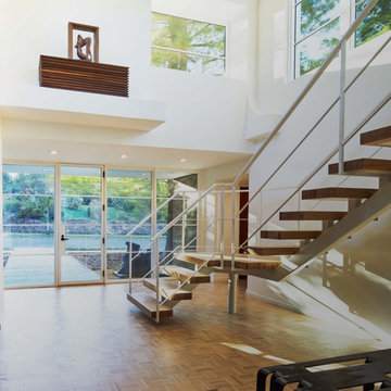
Designed in 1970 for an art collector, the existing referenced 70’s architectural principles. With its cadence of ‘70’s brick masses punctuated by a garage and a 4-foot-deep entrance recess. This recess, however, didn’t convey to the interior, which was occupied by disjointed service spaces. To solve, service spaces are moved and reorganized in open void in the garage. (See plan) This also organized the home: Service & utility on the left, reception central, and communal living spaces on the right.
To maintain clarity of the simple one-story 70’s composition, the second story add is recessive. A flex-studio/extra bedroom and office are designed ensuite creating a slender form and orienting them front to back and setting it back allows the add recede. Curves create a definite departure from the 70s home and by detailing it to "hover like a thought" above the first-floor roof and mentally removable sympathetic add.Existing unrelenting interior walls and a windowless entry, although ideal for fine art was unconducive for the young family of three. Added glass at the front recess welcomes light view and the removal of interior walls not only liberate rooms to communicate with each other but also reinform the cleared central entry space as a hub.
Even though the renovation reinforms its relationship with art, the joy and appreciation of art was not dismissed. A metal sculpture lost in the corner of the south side yard bumps the sculpture at the front entrance to the kitchen terrace over an added pedestal. (See plans) Since the roof couldn’t be railed without compromising the one-story '70s composition, the sculpture garden remains physically inaccessible however mirrors flanking the chimney allow the sculptures to be appreciated in three dimensions. The mirrors also afford privacy from the adjacent Tudor's large master bedroom addition 16-feet away.
1