
Search results for "Primary fractions" in Home Design Ideas

 TKS Design Group
Download our free ebook, Creating the Ideal Kitchen. DOWNLOAD NOW
This client was referred to us from a past client. They are a busy 2-career household with young children and enjoy entertaining friends and family in their home. They have a beautiful open concept home but unfortunately the kitchen was not fitting for the rest of the home. They were not quite sure what to do with the space. We talked about trying to refresh it or do more of a minor remodel, but in the end they decided a full gut would get them to where they wanted to be.
One problem was there was no place for guests to hang out other than the large and awkward banquette area. The brick wall and tiled hood area were feeling a bit dated and tired. The space was just not functional for their lifestyle. There was no prep space near the cooktop and no landing area for items coming out of the ovens or refrigerator, plus a big dead zone in the center of the room.
Banquettes, like the one they previously had in the space, are great for small spaces, but when they get really large like this one, it makes getting in and out of the seating area awkward and uncomfortable. Plus, there was room for a large table, so we eliminated the awkward built in.
We started by removing the faux brick wall between the kitchen and back entry. We relocated the entry to the garage over a couple feet in order to get every last inch out of the new kitchen. We also made the decision to close up the primary window that faced the pretty ho hum brick wall of the neighbor’s house. There was plenty of light coming in from the seating area, so we just didn’t feel the window was adding much to the room.
Construction went smoothy. There was a bit of rework with electrical, flooring and HVAC, but in the end, we think it was well worth it.
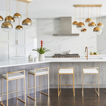
The clients really wanted a sleek contemporary look, and we originally had planned for a full height slab backsplash, but due to it’s size, it was a budget buster. Instead, we got creative and settled on large format porcelain tiles that have a similar feel but were a fraction of the cost. We made sure the wall was plumb and level so that the fit and finish would mimic that of slab material.
The final space was quite a change. A large prep sink sits directly across from the new pro-style range with plenty additional prep space on the large island. The refrigerator and ovens now have miles of landing space, and a nice tight work triangle makes cooking a breeze.
Since we wanted a more contemporary feel, not many wall cabinets were included. Instead, we outfitted some of the drawers for dish storage with a peg system. Two large pantries flanking the refrigerator hold baking supplies and small appliances. Large drawers by the cooktop hold pots and pans, and an appliance garage tucked away to the left of the range hides away miscellaneous items. The large island also houses a microwave drawer and tons of storage, most of which is drawers offering maximum convenience.
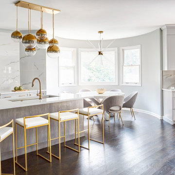
The island now seats 5-6 people comfortably along with the new table in the seating area which can seat up to 8. Entertaining will be a breeze in this space. With such a clean backdrop, we knew we would need some drama with the lighting, so we chose two sets of staggered pendants, which we adjusted for the right visual balance above the island.
We also included a small coffee station to the right of the main kitchen, which helps keep the coffee clutter out of the kitchen proper. Two tones of complimentary gray are featured in this kitchen. The perimeter is a light gray that reads almost white. The island is a gray stain that adds some depth and interest with the visible wood texture. The countertops are clean white quartz, and the hardware, barstools and light fixtures add warm brass tones. I see lots of cooking and entertaining with family and friends in the near future in this bright and airy new space.
Designed by: Susan Klimala, CKD, CBD
Photography by: Michael Kaskel
For more information on kitchen and bath design ideas go to: www.kitchenstudio-ge.com

 TKS Design Group
Download our free ebook, Creating the Ideal Kitchen. DOWNLOAD NOW
This client was referred to us from a past client. They are a busy 2-career household with young children and enjoy entertaining friends and family in their home. They have a beautiful open concept home but unfortunately the kitchen was not fitting for the rest of the home. They were not quite sure what to do with the space. We talked about trying to refresh it or do more of a minor remodel, but in the end they decided a full gut would get them to where they wanted to be.
One problem was there was no place for guests to hang out other than the large and awkward banquette area. The brick wall and tiled hood area were feeling a bit dated and tired. The space was just not functional for their lifestyle. There was no prep space near the cooktop and no landing area for items coming out of the ovens or refrigerator, plus a big dead zone in the center of the room.
Banquettes, like the one they previously had in the space, are great for small spaces, but when they get really large like this one, it makes getting in and out of the seating area awkward and uncomfortable. Plus, there was room for a large table, so we eliminated the awkward built in.
We started by removing the faux brick wall between the kitchen and back entry. We relocated the entry to the garage over a couple feet in order to get every last inch out of the new kitchen. We also made the decision to close up the primary window that faced the pretty ho hum brick wall of the neighbor’s house. There was plenty of light coming in from the seating area, so we just didn’t feel the window was adding much to the room.
Construction went smoothy. There was a bit of rework with electrical, flooring and HVAC, but in the end, we think it was well worth it.
The clients really wanted a sleek contemporary look, and we originally had planned for a full height slab backsplash, but due to it’s size, it was a budget buster. Instead, we got creative and settled on large format porcelain tiles that have a similar feel but were a fraction of the cost. We made sure the wall was plumb and level so that the fit and finish would mimic that of slab material.
The final space was quite a change. A large prep sink sits directly across from the new pro-style range with plenty additional prep space on the large island. The refrigerator and ovens now have miles of landing space, and a nice tight work triangle makes cooking a breeze.
Since we wanted a more contemporary feel, not many wall cabinets were included. Instead, we outfitted some of the drawers for dish storage with a peg system. Two large pantries flanking the refrigerator hold baking supplies and small appliances. Large drawers by the cooktop hold pots and pans, and an appliance garage tucked away to the left of the range hides away miscellaneous items. The large island also houses a microwave drawer and tons of storage, most of which is drawers offering maximum convenience.
The island now seats 5-6 people comfortably along with the new table in the seating area which can seat up to 8. Entertaining will be a breeze in this space. With such a clean backdrop, we knew we would need some drama with the lighting, so we chose two sets of staggered pendants, which we adjusted for the right visual balance above the island.
We also included a small coffee station to the right of the main kitchen, which helps keep the coffee clutter out of the kitchen proper. Two tones of complimentary gray are featured in this kitchen. The perimeter is a light gray that reads almost white. The island is a gray stain that adds some depth and interest with the visible wood texture. The countertops are clean white quartz, and the hardware, barstools and light fixtures add warm brass tones. I see lots of cooking and entertaining with family and friends in the near future in this bright and airy new space.
Designed by: Susan Klimala, CKD, CBD
Photography by: Michael Kaskel
For more information on kitchen and bath design ideas go to: www.kitchenstudio-ge.com
Find the right local pro for your project
 TKS Design Group
Download our free ebook, Creating the Ideal Kitchen. DOWNLOAD NOW
This client was referred to us from a past client. They are a busy 2-career household with young children and enjoy entertaining friends and family in their home. They have a beautiful open concept home but unfortunately the kitchen was not fitting for the rest of the home. They were not quite sure what to do with the space. We talked about trying to refresh it or do more of a minor remodel, but in the end they decided a full gut would get them to where they wanted to be.
One problem was there was no place for guests to hang out other than the large and awkward banquette area. The brick wall and tiled hood area were feeling a bit dated and tired. The space was just not functional for their lifestyle. There was no prep space near the cooktop and no landing area for items coming out of the ovens or refrigerator, plus a big dead zone in the center of the room.
Banquettes, like the one they previously had in the space, are great for small spaces, but when they get really large like this one, it makes getting in and out of the seating area awkward and uncomfortable. Plus, there was room for a large table, so we eliminated the awkward built in.
We started by removing the faux brick wall between the kitchen and back entry. We relocated the entry to the garage over a couple feet in order to get every last inch out of the new kitchen. We also made the decision to close up the primary window that faced the pretty ho hum brick wall of the neighbor’s house. There was plenty of light coming in from the seating area, so we just didn’t feel the window was adding much to the room.
Construction went smoothy. There was a bit of rework with electrical, flooring and HVAC, but in the end, we think it was well worth it.
The clients really wanted a sleek contemporary look, and we originally had planned for a full height slab backsplash, but due to it’s size, it was a budget buster. Instead, we got creative and settled on large format porcelain tiles that have a similar feel but were a fraction of the cost. We made sure the wall was plumb and level so that the fit and finish would mimic that of slab material.
The final space was quite a change. A large prep sink sits directly across from the new pro-style range with plenty additional prep space on the large island. The refrigerator and ovens now have miles of landing space, and a nice tight work triangle makes cooking a breeze.
Since we wanted a more contemporary feel, not many wall cabinets were included. Instead, we outfitted some of the drawers for dish storage with a peg system. Two large pantries flanking the refrigerator hold baking supplies and small appliances. Large drawers by the cooktop hold pots and pans, and an appliance garage tucked away to the left of the range hides away miscellaneous items. The large island also houses a microwave drawer and tons of storage, most of which is drawers offering maximum convenience.
The island now seats 5-6 people comfortably along with the new table in the seating area which can seat up to 8. Entertaining will be a breeze in this space. With such a clean backdrop, we knew we would need some drama with the lighting, so we chose two sets of staggered pendants, which we adjusted for the right visual balance above the island.
We also included a small coffee station to the right of the main kitchen, which helps keep the coffee clutter out of the kitchen proper. Two tones of complimentary gray are featured in this kitchen. The perimeter is a light gray that reads almost white. The island is a gray stain that adds some depth and interest with the visible wood texture. The countertops are clean white quartz, and the hardware, barstools and light fixtures add warm brass tones. I see lots of cooking and entertaining with family and friends in the near future in this bright and airy new space.
Designed by: Susan Klimala, CKD, CBD
Photography by: Michael Kaskel
For more information on kitchen and bath design ideas go to: www.kitchenstudio-ge.com
 MATHISON | MATHISON ARCHITECTS
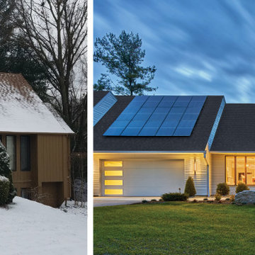
With a desire to stay close to friends and family, the owners of this 1984 home spent several years searching for property near their neighborhood to build a new, more modern, energy-conscious home tailored to their empty-nest lifestyle. They eventually concluded that their current site was the perfect location for them, but the home needed to be updated and reorganized to create fresh, open, unified spaces to comfortably welcome gatherings of family, friends, and guests.
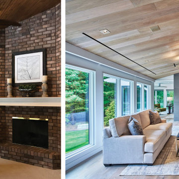
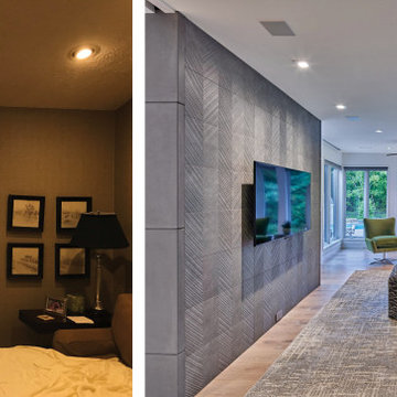
Before renovation, the floor plan included small rooms, dedicated hallways, a step-down living room, a heavy and dark corner fireplace, and limited opportunities for natural light and visual connections from space to space. Exterior deck areas were narrow, long, and used infrequently.
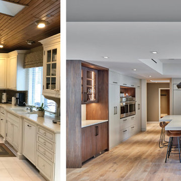
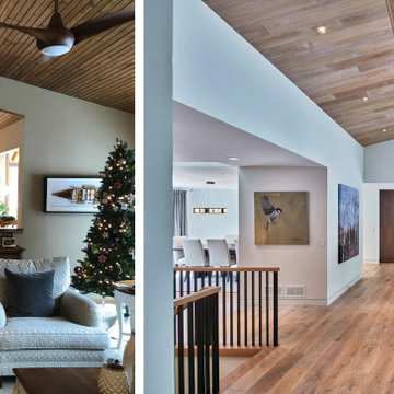
Primary goals of this project included accessibility of space, more natural light, better connectivity between spaces, and a focus on sustainable performance. The updated main floor plan included the selective removal of walls to reallocate dedicated hall space to usable, open living area. The step-down living room was leveled for full accessibility, safety, furniture flexibility and overall space use. The removal of a half-height wall between the living area and the kitchen created continuity between the spaces. Reorganizing the primary entry and stair and eliminating walls between the entry and dining room created new visual connections between the kitchen and the entry. The new central concrete hearth and fireplace provides a strong, modern focal point for the living area. Large sliding glass doors on each side of the fireplace allow the TV area beyond to be separated from the living area as needed.
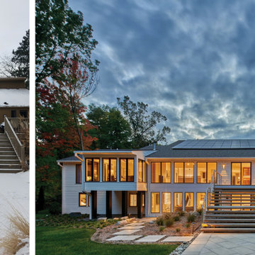
In several strategic locations, the footprint of the house was expanded to enhance function and flow at the kitchen, dining room, and mudroom. The new outdoor deck area is now large and singular and includes a grille area, dining space and open seating overlooking the newly landscaped pool below.
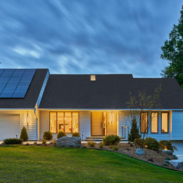
The exterior envelope of the house includes new insulation, siding, and energy-efficient windows, as well as two large roof-mounted solar arrays, to increase thermal performance and to offset energy costs. Inside, the new HVAC system maximizes energy efficiency while using a fraction of its former footprint. As a result, a portion of the former mechanical space was added back to the lower level family room area and expands into a cozy library nook.
MMA partnered with the owner’s interior designer and kitchen designer to achieve a softer, contemporary palette of finishes that complement this newly configured, light-filled home.
 MATHISON | MATHISON ARCHITECTS
With a desire to stay close to friends and family, the owners of this 1984 home spent several years searching for property near their neighborhood to build a new, more modern, energy-conscious home tailored to their empty-nest lifestyle. They eventually concluded that their current site was the perfect location for them, but the home needed to be updated and reorganized to create fresh, open, unified spaces to comfortably welcome gatherings of family, friends, and guests.
Before renovation, the floor plan included small rooms, dedicated hallways, a step-down living room, a heavy and dark corner fireplace, and limited opportunities for natural light and visual connections from space to space. Exterior deck areas were narrow, long, and used infrequently.
Primary goals of this project included accessibility of space, more natural light, better connectivity between spaces, and a focus on sustainable performance. The updated main floor plan included the selective removal of walls to reallocate dedicated hall space to usable, open living area. The step-down living room was leveled for full accessibility, safety, furniture flexibility and overall space use. The removal of a half-height wall between the living area and the kitchen created continuity between the spaces. Reorganizing the primary entry and stair and eliminating walls between the entry and dining room created new visual connections between the kitchen and the entry. The new central concrete hearth and fireplace provides a strong, modern focal point for the living area. Large sliding glass doors on each side of the fireplace allow the TV area beyond to be separated from the living area as needed.
In several strategic locations, the footprint of the house was expanded to enhance function and flow at the kitchen, dining room, and mudroom. The new outdoor deck area is now large and singular and includes a grille area, dining space and open seating overlooking the newly landscaped pool below.
The exterior envelope of the house includes new insulation, siding, and energy-efficient windows, as well as two large roof-mounted solar arrays, to increase thermal performance and to offset energy costs. Inside, the new HVAC system maximizes energy efficiency while using a fraction of its former footprint. As a result, a portion of the former mechanical space was added back to the lower level family room area and expands into a cozy library nook.
MMA partnered with the owner’s interior designer and kitchen designer to achieve a softer, contemporary palette of finishes that complement this newly configured, light-filled home.
 MATHISON | MATHISON ARCHITECTS
With a desire to stay close to friends and family, the owners of this 1984 home spent several years searching for property near their neighborhood to build a new, more modern, energy-conscious home tailored to their empty-nest lifestyle. They eventually concluded that their current site was the perfect location for them, but the home needed to be updated and reorganized to create fresh, open, unified spaces to comfortably welcome gatherings of family, friends, and guests.
Before renovation, the floor plan included small rooms, dedicated hallways, a step-down living room, a heavy and dark corner fireplace, and limited opportunities for natural light and visual connections from space to space. Exterior deck areas were narrow, long, and used infrequently.
Primary goals of this project included accessibility of space, more natural light, better connectivity between spaces, and a focus on sustainable performance. The updated main floor plan included the selective removal of walls to reallocate dedicated hall space to usable, open living area. The step-down living room was leveled for full accessibility, safety, furniture flexibility and overall space use. The removal of a half-height wall between the living area and the kitchen created continuity between the spaces. Reorganizing the primary entry and stair and eliminating walls between the entry and dining room created new visual connections between the kitchen and the entry. The new central concrete hearth and fireplace provides a strong, modern focal point for the living area. Large sliding glass doors on each side of the fireplace allow the TV area beyond to be separated from the living area as needed.
In several strategic locations, the footprint of the house was expanded to enhance function and flow at the kitchen, dining room, and mudroom. The new outdoor deck area is now large and singular and includes a grille area, dining space and open seating overlooking the newly landscaped pool below.
The exterior envelope of the house includes new insulation, siding, and energy-efficient windows, as well as two large roof-mounted solar arrays, to increase thermal performance and to offset energy costs. Inside, the new HVAC system maximizes energy efficiency while using a fraction of its former footprint. As a result, a portion of the former mechanical space was added back to the lower level family room area and expands into a cozy library nook.
MMA partnered with the owner’s interior designer and kitchen designer to achieve a softer, contemporary palette of finishes that complement this newly configured, light-filled home.
 MATHISON | MATHISON ARCHITECTS
With a desire to stay close to friends and family, the owners of this 1984 home spent several years searching for property near their neighborhood to build a new, more modern, energy-conscious home tailored to their empty-nest lifestyle. They eventually concluded that their current site was the perfect location for them, but the home needed to be updated and reorganized to create fresh, open, unified spaces to comfortably welcome gatherings of family, friends, and guests.
Before renovation, the floor plan included small rooms, dedicated hallways, a step-down living room, a heavy and dark corner fireplace, and limited opportunities for natural light and visual connections from space to space. Exterior deck areas were narrow, long, and used infrequently.
Primary goals of this project included accessibility of space, more natural light, better connectivity between spaces, and a focus on sustainable performance. The updated main floor plan included the selective removal of walls to reallocate dedicated hall space to usable, open living area. The step-down living room was leveled for full accessibility, safety, furniture flexibility and overall space use. The removal of a half-height wall between the living area and the kitchen created continuity between the spaces. Reorganizing the primary entry and stair and eliminating walls between the entry and dining room created new visual connections between the kitchen and the entry. The new central concrete hearth and fireplace provides a strong, modern focal point for the living area. Large sliding glass doors on each side of the fireplace allow the TV area beyond to be separated from the living area as needed.
In several strategic locations, the footprint of the house was expanded to enhance function and flow at the kitchen, dining room, and mudroom. The new outdoor deck area is now large and singular and includes a grille area, dining space and open seating overlooking the newly landscaped pool below.
The exterior envelope of the house includes new insulation, siding, and energy-efficient windows, as well as two large roof-mounted solar arrays, to increase thermal performance and to offset energy costs. Inside, the new HVAC system maximizes energy efficiency while using a fraction of its former footprint. As a result, a portion of the former mechanical space was added back to the lower level family room area and expands into a cozy library nook.
MMA partnered with the owner’s interior designer and kitchen designer to achieve a softer, contemporary palette of finishes that complement this newly configured, light-filled home.
 MATHISON | MATHISON ARCHITECTS
With a desire to stay close to friends and family, the owners of this 1984 home spent several years searching for property near their neighborhood to build a new, more modern, energy-conscious home tailored to their empty-nest lifestyle. They eventually concluded that their current site was the perfect location for them, but the home needed to be updated and reorganized to create fresh, open, unified spaces to comfortably welcome gatherings of family, friends, and guests.
Before renovation, the floor plan included small rooms, dedicated hallways, a step-down living room, a heavy and dark corner fireplace, and limited opportunities for natural light and visual connections from space to space. Exterior deck areas were narrow, long, and used infrequently.
Primary goals of this project included accessibility of space, more natural light, better connectivity between spaces, and a focus on sustainable performance. The updated main floor plan included the selective removal of walls to reallocate dedicated hall space to usable, open living area. The step-down living room was leveled for full accessibility, safety, furniture flexibility and overall space use. The removal of a half-height wall between the living area and the kitchen created continuity between the spaces. Reorganizing the primary entry and stair and eliminating walls between the entry and dining room created new visual connections between the kitchen and the entry. The new central concrete hearth and fireplace provides a strong, modern focal point for the living area. Large sliding glass doors on each side of the fireplace allow the TV area beyond to be separated from the living area as needed.
In several strategic locations, the footprint of the house was expanded to enhance function and flow at the kitchen, dining room, and mudroom. The new outdoor deck area is now large and singular and includes a grille area, dining space and open seating overlooking the newly landscaped pool below.
The exterior envelope of the house includes new insulation, siding, and energy-efficient windows, as well as two large roof-mounted solar arrays, to increase thermal performance and to offset energy costs. Inside, the new HVAC system maximizes energy efficiency while using a fraction of its former footprint. As a result, a portion of the former mechanical space was added back to the lower level family room area and expands into a cozy library nook.
MMA partnered with the owner’s interior designer and kitchen designer to achieve a softer, contemporary palette of finishes that complement this newly configured, light-filled home.
 MATHISON | MATHISON ARCHITECTS
With a desire to stay close to friends and family, the owners of this 1984 home spent several years searching for property near their neighborhood to build a new, more modern, energy-conscious home tailored to their empty-nest lifestyle. They eventually concluded that their current site was the perfect location for them, but the home needed to be updated and reorganized to create fresh, open, unified spaces to comfortably welcome gatherings of family, friends, and guests.
Before renovation, the floor plan included small rooms, dedicated hallways, a step-down living room, a heavy and dark corner fireplace, and limited opportunities for natural light and visual connections from space to space. Exterior deck areas were narrow, long, and used infrequently.
Primary goals of this project included accessibility of space, more natural light, better connectivity between spaces, and a focus on sustainable performance. The updated main floor plan included the selective removal of walls to reallocate dedicated hall space to usable, open living area. The step-down living room was leveled for full accessibility, safety, furniture flexibility and overall space use. The removal of a half-height wall between the living area and the kitchen created continuity between the spaces. Reorganizing the primary entry and stair and eliminating walls between the entry and dining room created new visual connections between the kitchen and the entry. The new central concrete hearth and fireplace provides a strong, modern focal point for the living area. Large sliding glass doors on each side of the fireplace allow the TV area beyond to be separated from the living area as needed.
In several strategic locations, the footprint of the house was expanded to enhance function and flow at the kitchen, dining room, and mudroom. The new outdoor deck area is now large and singular and includes a grille area, dining space and open seating overlooking the newly landscaped pool below.
The exterior envelope of the house includes new insulation, siding, and energy-efficient windows, as well as two large roof-mounted solar arrays, to increase thermal performance and to offset energy costs. Inside, the new HVAC system maximizes energy efficiency while using a fraction of its former footprint. As a result, a portion of the former mechanical space was added back to the lower level family room area and expands into a cozy library nook.
MMA partnered with the owner’s interior designer and kitchen designer to achieve a softer, contemporary palette of finishes that complement this newly configured, light-filled home.
 MATHISON | MATHISON ARCHITECTS
With a desire to stay close to friends and family, the owners of this 1984 home spent several years searching for property near their neighborhood to build a new, more modern, energy-conscious home tailored to their empty-nest lifestyle. They eventually concluded that their current site was the perfect location for them, but the home needed to be updated and reorganized to create fresh, open, unified spaces to comfortably welcome gatherings of family, friends, and guests.
Before renovation, the floor plan included small rooms, dedicated hallways, a step-down living room, a heavy and dark corner fireplace, and limited opportunities for natural light and visual connections from space to space. Exterior deck areas were narrow, long, and used infrequently.
Primary goals of this project included accessibility of space, more natural light, better connectivity between spaces, and a focus on sustainable performance. The updated main floor plan included the selective removal of walls to reallocate dedicated hall space to usable, open living area. The step-down living room was leveled for full accessibility, safety, furniture flexibility and overall space use. The removal of a half-height wall between the living area and the kitchen created continuity between the spaces. Reorganizing the primary entry and stair and eliminating walls between the entry and dining room created new visual connections between the kitchen and the entry. The new central concrete hearth and fireplace provides a strong, modern focal point for the living area. Large sliding glass doors on each side of the fireplace allow the TV area beyond to be separated from the living area as needed.
In several strategic locations, the footprint of the house was expanded to enhance function and flow at the kitchen, dining room, and mudroom. The new outdoor deck area is now large and singular and includes a grille area, dining space and open seating overlooking the newly landscaped pool below.
The exterior envelope of the house includes new insulation, siding, and energy-efficient windows, as well as two large roof-mounted solar arrays, to increase thermal performance and to offset energy costs. Inside, the new HVAC system maximizes energy efficiency while using a fraction of its former footprint. As a result, a portion of the former mechanical space was added back to the lower level family room area and expands into a cozy library nook.
MMA partnered with the owner’s interior designer and kitchen designer to achieve a softer, contemporary palette of finishes that complement this newly configured, light-filled home.
 Harold Leidner Landscape Architects
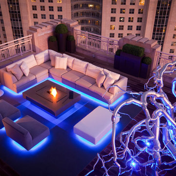
Example of a trendy rooftop rooftop deck design in Dallas with a fire pit
 TKS Design Group
Download our free ebook, Creating the Ideal Kitchen. DOWNLOAD NOW
This client was referred to us from a past client. They are a busy 2-career household with young children and enjoy entertaining friends and family in their home. They have a beautiful open concept home but unfortunately the kitchen was not fitting for the rest of the home. They were not quite sure what to do with the space. We talked about trying to refresh it or do more of a minor remodel, but in the end they decided a full gut would get them to where they wanted to be.
One problem was there was no place for guests to hang out other than the large and awkward banquette area. The brick wall and tiled hood area were feeling a bit dated and tired. The space was just not functional for their lifestyle. There was no prep space near the cooktop and no landing area for items coming out of the ovens or refrigerator, plus a big dead zone in the center of the room.
Banquettes, like the one they previously had in the space, are great for small spaces, but when they get really large like this one, it makes getting in and out of the seating area awkward and uncomfortable. Plus, there was room for a large table, so we eliminated the awkward built in.
We started by removing the faux brick wall between the kitchen and back entry. We relocated the entry to the garage over a couple feet in order to get every last inch out of the new kitchen. We also made the decision to close up the primary window that faced the pretty ho hum brick wall of the neighbor’s house. There was plenty of light coming in from the seating area, so we just didn’t feel the window was adding much to the room.
Construction went smoothy. There was a bit of rework with electrical, flooring and HVAC, but in the end, we think it was well worth it.
The clients really wanted a sleek contemporary look, and we originally had planned for a full height slab backsplash, but due to it’s size, it was a budget buster. Instead, we got creative and settled on large format porcelain tiles that have a similar feel but were a fraction of the cost. We made sure the wall was plumb and level so that the fit and finish would mimic that of slab material.
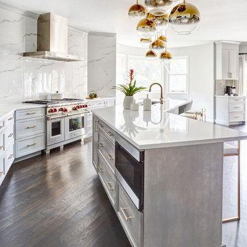
The final space was quite a change. A large prep sink sits directly across from the new pro-style range with plenty additional prep space on the large island. The refrigerator and ovens now have miles of landing space, and a nice tight work triangle makes cooking a breeze.
Since we wanted a more contemporary feel, not many wall cabinets were included. Instead, we outfitted some of the drawers for dish storage with a peg system. Two large pantries flanking the refrigerator hold baking supplies and small appliances. Large drawers by the cooktop hold pots and pans, and an appliance garage tucked away to the left of the range hides away miscellaneous items. The large island also houses a microwave drawer and tons of storage, most of which is drawers offering maximum convenience.
The island now seats 5-6 people comfortably along with the new table in the seating area which can seat up to 8. Entertaining will be a breeze in this space. With such a clean backdrop, we knew we would need some drama with the lighting, so we chose two sets of staggered pendants, which we adjusted for the right visual balance above the island.
We also included a small coffee station to the right of the main kitchen, which helps keep the coffee clutter out of the kitchen proper. Two tones of complimentary gray are featured in this kitchen. The perimeter is a light gray that reads almost white. The island is a gray stain that adds some depth and interest with the visible wood texture. The countertops are clean white quartz, and the hardware, barstools and light fixtures add warm brass tones. I see lots of cooking and entertaining with family and friends in the near future in this bright and airy new space.
Designed by: Susan Klimala, CKD, CBD
Photography by: Michael Kaskel
For more information on kitchen and bath design ideas go to: www.kitchenstudio-ge.com
 MATHISON | MATHISON ARCHITECTS
With a desire to stay close to friends and family, the owners of this 1984 home spent several years searching for property near their neighborhood to build a new, more modern, energy-conscious home tailored to their empty-nest lifestyle. They eventually concluded that their current site was the perfect location for them, but the home needed to be updated and reorganized to create fresh, open, unified spaces to comfortably welcome gatherings of family, friends, and guests.
Before renovation, the floor plan included small rooms, dedicated hallways, a step-down living room, a heavy and dark corner fireplace, and limited opportunities for natural light and visual connections from space to space. Exterior deck areas were narrow, long, and used infrequently.
Primary goals of this project included accessibility of space, more natural light, better connectivity between spaces, and a focus on sustainable performance. The updated main floor plan included the selective removal of walls to reallocate dedicated hall space to usable, open living area. The step-down living room was leveled for full accessibility, safety, furniture flexibility and overall space use. The removal of a half-height wall between the living area and the kitchen created continuity between the spaces. Reorganizing the primary entry and stair and eliminating walls between the entry and dining room created new visual connections between the kitchen and the entry. The new central concrete hearth and fireplace provides a strong, modern focal point for the living area. Large sliding glass doors on each side of the fireplace allow the TV area beyond to be separated from the living area as needed.
In several strategic locations, the footprint of the house was expanded to enhance function and flow at the kitchen, dining room, and mudroom. The new outdoor deck area is now large and singular and includes a grille area, dining space and open seating overlooking the newly landscaped pool below.
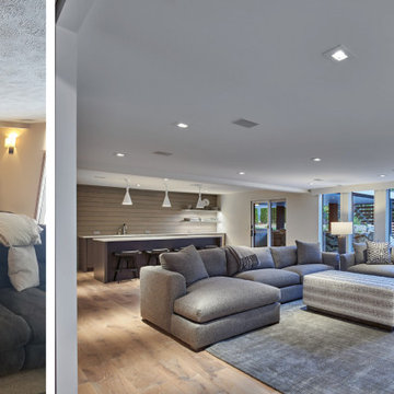
The exterior envelope of the house includes new insulation, siding, and energy-efficient windows, as well as two large roof-mounted solar arrays, to increase thermal performance and to offset energy costs. Inside, the new HVAC system maximizes energy efficiency while using a fraction of its former footprint. As a result, a portion of the former mechanical space was added back to the lower level family room area and expands into a cozy library nook.
MMA partnered with the owner’s interior designer and kitchen designer to achieve a softer, contemporary palette of finishes that complement this newly configured, light-filled home.
1