
Search results for "Activity improves" in Home Design Ideas


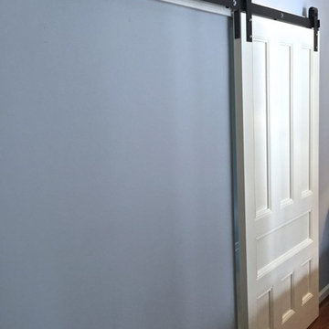
 Harpeth River Woodworks
Harpeth River Woodworks
Example of a mid-sized country master medium tone wood floor bedroom design in Nashville with blue walls
Example of a mid-sized country master medium tone wood floor bedroom design in Nashville with blue walls
 STUDIO TASHIMA
Keyes Road is a two-storey, semi-detached red brick house dating to around 1890-1910. The focus of our work was on the ground floor where we were asked to improve the layout and use of the main living areas of the house, for an active family of four. Important to the design was to maximise the quality and amount of light as well as connection to the garden and flow to the rest of the house.
Our proposal introduces three single storey extensions, comprising a central, large space that extends the main outrigger of the house. To each side are smaller volumes, affording a full width kitchen. While defining a series of discrete volumes, it was important for us to ensure that the kitchen, living, family and dining rooms that are interconnecting and continuous. The result is a big space punctuated by a series of differently sized arches, defining spaces to ensure their intimacy.
It was important for our client to have a sense of warmth and comfort - perhaps not dissimilar to the qualities of a hotel lobby. The colour scheme of the rooms are warm white painted plaster, natural wood flooring with black, bronze and brass accents. Indirect and carefully placed light fittings pulls together the atmosphere of the rooms - particularly in the evenings.
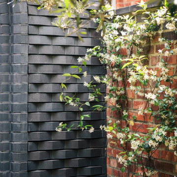
Externally, we felt it important to differentiate the extensions from the main house by using a dark, charcoal grey brick. This sets up a contrasting yet complimentary relationship to the rich red coloured brick house. The facets of the brick play with light and depth as do the graduated brick arches.
During the design process, we grappled with floor levels, the direction of sunlight, and care to not encroach on the neighbouring properties. As the house is in a conservation area, we worked closely with our trusted planning advisor. Throughout, we pursued a sensitive design strategy, using pitched roofs, matching materials and careful detailing. Internally, many of the original details are intact. This has enabled us to create an eclectic ensemble of elements, colours and materials varying in age and period.
Find the right local pro for your project
 Alcon Lighting
Lighting at home is mainly tied to user preference, but research shows there are steps everyone can take to create a calm, pleasing environment.
“At night, lower light levels and warmer color temperatures – those that fall in the 2,700 to 3,000 Kelvin range – emulate the outside environment’s evening light and help us get ready for sleep by reducing our blood pressure and creating a restful feel,” said Rebecca Hadley, manager of Eaton’s SOURCE lighting education center. “If you’re cooking or entertaining guests in the evening, you may find that higher light levels and color temperatures are beneficial. However, people generally tend to prefer warmer light at home.
Flexibility is one natural benefit of smart lighting design. New advancements in Lighting Controls have made lighting for mood easier than ever.
“Studies show that wall color can affect heart rate and irritability levels, but you can adjust your light more readily than the paint on your walls,” said Hadley. “For example, you can use high-intensity light to complete a craft activity at the kitchen table; an hour later, you can serve dinner to your family at that same table beneath a warmer, lower-intensity light.”
When it comes to designing for mood, advanced controls have the most room to develop. Controls will become more personalized in environments ranging from the home to offices, hospitality settings and health care facilities. Controls that were once accessed via a wall switch are already making the jump to app-based technology. And as LED technology improves at lightning speed, adaptability – and energy savings – will only continue to grow.
 STUDIO TASHIMA
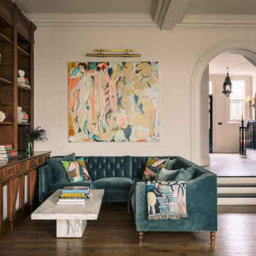
Keyes Road is a two-storey, semi-detached red brick house dating to around 1890-1910. The focus of our work was on the ground floor where we were asked to improve the layout and use of the main living areas of the house, for an active family of four. Important to the design was to maximise the quality and amount of light as well as connection to the garden and flow to the rest of the house.
Our proposal introduces three single storey extensions, comprising a central, large space that extends the main outrigger of the house. To each side are smaller volumes, affording a full width kitchen. While defining a series of discrete volumes, it was important for us to ensure that the kitchen, living, family and dining rooms that are interconnecting and continuous. The result is a big space punctuated by a series of differently sized arches, defining spaces to ensure their intimacy.
It was important for our client to have a sense of warmth and comfort - perhaps not dissimilar to the qualities of a hotel lobby. The colour scheme of the rooms are warm white painted plaster, natural wood flooring with black, bronze and brass accents. Indirect and carefully placed light fittings pulls together the atmosphere of the rooms - particularly in the evenings.
Externally, we felt it important to differentiate the extensions from the main house by using a dark, charcoal grey brick. This sets up a contrasting yet complimentary relationship to the rich red coloured brick house. The facets of the brick play with light and depth as do the graduated brick arches.
During the design process, we grappled with floor levels, the direction of sunlight, and care to not encroach on the neighbouring properties. As the house is in a conservation area, we worked closely with our trusted planning advisor. Throughout, we pursued a sensitive design strategy, using pitched roofs, matching materials and careful detailing. Internally, many of the original details are intact. This has enabled us to create an eclectic ensemble of elements, colours and materials varying in age and period.
 Michael Nash Design, Build & Homes
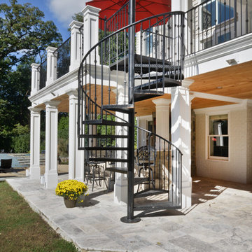
This secluded single-family home in Great Falls, had a beautiful backyard setting. The owners recently built a gorgeous pool and surround deck on the right side of the house in their backyard. They inherited a rundown deck off of the kitchen patio doors.
Our team designed a two-story outdoor living addition which offers the family everything that they can hope for in outdoor living.
Our massive plan required excavation to make the lower level patio both attractive and functional for all kinds of outdoor activity. We excavated down two feet to create a nine-foot high patio, cut concrete walls to add French doors from to dark and unused side of the basement bringing improved use for the basement.
The entire back wall was covered with matching brick veneer to entire front and side elevations.
The roof of this patio was covered with EPDM roofing rolls to make the lower patio stay dry and protected.
Steps away from pool sun deck, this flagstone covered patio turned into a prime space for entertainment.
The built-in middle bar equipped with under counter beverage fridge and beer tab to make gatherings more exciting. The side steps built in with matching solid stone threads offered access to driveway and the second floor covered porch.
The second floor is finished with porcelain floor tiles, stain grade ceiling panels, wrought iron rails, decorative recessed panel columns, hanging gorgeous ceiling fans steps away from the kitchen.
Just outside of this covered porch, there is a deck with the same tile floor facing the pool area offering a breath taking view.
Carefully selection of soft toned wood looking plank porcelain tiles compliment the knotty soft grey stain ceiling panels making this project one that shines even on rainy days.
The custom-made spiral rod iron staircase offers an elegant second set of steps so that the upper level deck can reach into backyard and pool deck.
 STUDIO TASHIMA
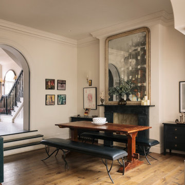
Keyes Road is a two-storey, semi-detached red brick house dating to around 1890-1910. The focus of our work was on the ground floor where we were asked to improve the layout and use of the main living areas of the house, for an active family of four. Important to the design was to maximise the quality and amount of light as well as connection to the garden and flow to the rest of the house.
Our proposal introduces three single storey extensions, comprising a central, large space that extends the main outrigger of the house. To each side are smaller volumes, affording a full width kitchen. While defining a series of discrete volumes, it was important for us to ensure that the kitchen, living, family and dining rooms that are interconnecting and continuous. The result is a big space punctuated by a series of differently sized arches, defining spaces to ensure their intimacy.
It was important for our client to have a sense of warmth and comfort - perhaps not dissimilar to the qualities of a hotel lobby. The colour scheme of the rooms are warm white painted plaster, natural wood flooring with black, bronze and brass accents. Indirect and carefully placed light fittings pulls together the atmosphere of the rooms - particularly in the evenings.
Externally, we felt it important to differentiate the extensions from the main house by using a dark, charcoal grey brick. This sets up a contrasting yet complimentary relationship to the rich red coloured brick house. The facets of the brick play with light and depth as do the graduated brick arches.
During the design process, we grappled with floor levels, the direction of sunlight, and care to not encroach on the neighbouring properties. As the house is in a conservation area, we worked closely with our trusted planning advisor. Throughout, we pursued a sensitive design strategy, using pitched roofs, matching materials and careful detailing. Internally, many of the original details are intact. This has enabled us to create an eclectic ensemble of elements, colours and materials varying in age and period.
Sponsored
Columbus, OH

EverHome Improvement & Design
Top Choice for Reliable Tile & Stone | Franklin County, Ohio
 Michael Nash Design, Build & Homes
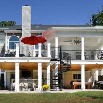
This secluded single-family home in Great Falls, had a beautiful backyard setting. The owners recently built a gorgeous pool and surround deck on the right side of the house in their backyard. They inherited a rundown deck off of the kitchen patio doors.
Our team designed a two-story outdoor living addition which offers the family everything that they can hope for in outdoor living.
Our massive plan required excavation to make the lower level patio both attractive and functional for all kinds of outdoor activity. We excavated down two feet to create a nine-foot high patio, cut concrete walls to add French doors from to dark and unused side of the basement bringing improved use for the basement.
The entire back wall was covered with matching brick veneer to entire front and side elevations.
The roof of this patio was covered with EPDM roofing rolls to make the lower patio stay dry and protected.
Steps away from pool sun deck, this flagstone covered patio turned into a prime space for entertainment.
The built-in middle bar equipped with under counter beverage fridge and beer tab to make gatherings more exciting. The side steps built in with matching solid stone threads offered access to driveway and the second floor covered porch.
The second floor is finished with porcelain floor tiles, stain grade ceiling panels, wrought iron rails, decorative recessed panel columns, hanging gorgeous ceiling fans steps away from the kitchen.
Just outside of this covered porch, there is a deck with the same tile floor facing the pool area offering a breath taking view.
Carefully selection of soft toned wood looking plank porcelain tiles compliment the knotty soft grey stain ceiling panels making this project one that shines even on rainy days.
The custom-made spiral rod iron staircase offers an elegant second set of steps so that the upper level deck can reach into backyard and pool deck.
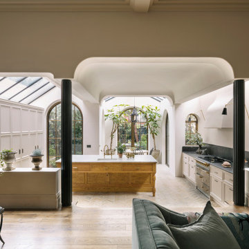 STUDIO TASHIMA
Keyes Road is a two-storey, semi-detached red brick house dating to around 1890-1910. The focus of our work was on the ground floor where we were asked to improve the layout and use of the main living areas of the house, for an active family of four. Important to the design was to maximise the quality and amount of light as well as connection to the garden and flow to the rest of the house.
Our proposal introduces three single storey extensions, comprising a central, large space that extends the main outrigger of the house. To each side are smaller volumes, affording a full width kitchen. While defining a series of discrete volumes, it was important for us to ensure that the kitchen, living, family and dining rooms that are interconnecting and continuous. The result is a big space punctuated by a series of differently sized arches, defining spaces to ensure their intimacy.
It was important for our client to have a sense of warmth and comfort - perhaps not dissimilar to the qualities of a hotel lobby. The colour scheme of the rooms are warm white painted plaster, natural wood flooring with black, bronze and brass accents. Indirect and carefully placed light fittings pulls together the atmosphere of the rooms - particularly in the evenings.
Externally, we felt it important to differentiate the extensions from the main house by using a dark, charcoal grey brick. This sets up a contrasting yet complimentary relationship to the rich red coloured brick house. The facets of the brick play with light and depth as do the graduated brick arches.
During the design process, we grappled with floor levels, the direction of sunlight, and care to not encroach on the neighbouring properties. As the house is in a conservation area, we worked closely with our trusted planning advisor. Throughout, we pursued a sensitive design strategy, using pitched roofs, matching materials and careful detailing. Internally, many of the original details are intact. This has enabled us to create an eclectic ensemble of elements, colours and materials varying in age and period.
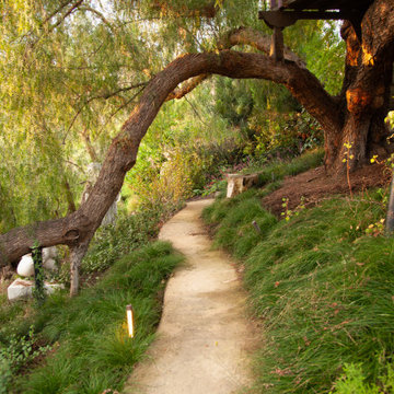
 Native By Design Landscapes
California native woodland garden.
Design ideas for a large contemporary drought-tolerant and shade hillside garden path in Los Angeles for fall.
Design ideas for a large contemporary drought-tolerant and shade hillside garden path in Los Angeles for fall.
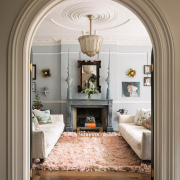 STUDIO TASHIMA
Keyes Road is a two-storey, semi-detached red brick house dating to around 1890-1910. The focus of our work was on the ground floor where we were asked to improve the layout and use of the main living areas of the house, for an active family of four. Important to the design was to maximise the quality and amount of light as well as connection to the garden and flow to the rest of the house.
Our proposal introduces three single storey extensions, comprising a central, large space that extends the main outrigger of the house. To each side are smaller volumes, affording a full width kitchen. While defining a series of discrete volumes, it was important for us to ensure that the kitchen, living, family and dining rooms that are interconnecting and continuous. The result is a big space punctuated by a series of differently sized arches, defining spaces to ensure their intimacy.
It was important for our client to have a sense of warmth and comfort - perhaps not dissimilar to the qualities of a hotel lobby. The colour scheme of the rooms are warm white painted plaster, natural wood flooring with black, bronze and brass accents. Indirect and carefully placed light fittings pulls together the atmosphere of the rooms - particularly in the evenings.
Externally, we felt it important to differentiate the extensions from the main house by using a dark, charcoal grey brick. This sets up a contrasting yet complimentary relationship to the rich red coloured brick house. The facets of the brick play with light and depth as do the graduated brick arches.
During the design process, we grappled with floor levels, the direction of sunlight, and care to not encroach on the neighbouring properties. As the house is in a conservation area, we worked closely with our trusted planning advisor. Throughout, we pursued a sensitive design strategy, using pitched roofs, matching materials and careful detailing. Internally, many of the original details are intact. This has enabled us to create an eclectic ensemble of elements, colours and materials varying in age and period.
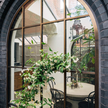 STUDIO TASHIMA
Keyes Road is a two-storey, semi-detached red brick house dating to around 1890-1910. The focus of our work was on the ground floor where we were asked to improve the layout and use of the main living areas of the house, for an active family of four. Important to the design was to maximise the quality and amount of light as well as connection to the garden and flow to the rest of the house.
Our proposal introduces three single storey extensions, comprising a central, large space that extends the main outrigger of the house. To each side are smaller volumes, affording a full width kitchen. While defining a series of discrete volumes, it was important for us to ensure that the kitchen, living, family and dining rooms that are interconnecting and continuous. The result is a big space punctuated by a series of differently sized arches, defining spaces to ensure their intimacy.
It was important for our client to have a sense of warmth and comfort - perhaps not dissimilar to the qualities of a hotel lobby. The colour scheme of the rooms are warm white painted plaster, natural wood flooring with black, bronze and brass accents. Indirect and carefully placed light fittings pulls together the atmosphere of the rooms - particularly in the evenings.
Externally, we felt it important to differentiate the extensions from the main house by using a dark, charcoal grey brick. This sets up a contrasting yet complimentary relationship to the rich red coloured brick house. The facets of the brick play with light and depth as do the graduated brick arches.
During the design process, we grappled with floor levels, the direction of sunlight, and care to not encroach on the neighbouring properties. As the house is in a conservation area, we worked closely with our trusted planning advisor. Throughout, we pursued a sensitive design strategy, using pitched roofs, matching materials and careful detailing. Internally, many of the original details are intact. This has enabled us to create an eclectic ensemble of elements, colours and materials varying in age and period.
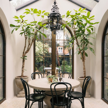 STUDIO TASHIMA
Keyes Road is a two-storey, semi-detached red brick house dating to around 1890-1910. The focus of our work was on the ground floor where we were asked to improve the layout and use of the main living areas of the house, for an active family of four. Important to the design was to maximise the quality and amount of light as well as connection to the garden and flow to the rest of the house.
Our proposal introduces three single storey extensions, comprising a central, large space that extends the main outrigger of the house. To each side are smaller volumes, affording a full width kitchen. While defining a series of discrete volumes, it was important for us to ensure that the kitchen, living, family and dining rooms that are interconnecting and continuous. The result is a big space punctuated by a series of differently sized arches, defining spaces to ensure their intimacy.
It was important for our client to have a sense of warmth and comfort - perhaps not dissimilar to the qualities of a hotel lobby. The colour scheme of the rooms are warm white painted plaster, natural wood flooring with black, bronze and brass accents. Indirect and carefully placed light fittings pulls together the atmosphere of the rooms - particularly in the evenings.
Externally, we felt it important to differentiate the extensions from the main house by using a dark, charcoal grey brick. This sets up a contrasting yet complimentary relationship to the rich red coloured brick house. The facets of the brick play with light and depth as do the graduated brick arches.
During the design process, we grappled with floor levels, the direction of sunlight, and care to not encroach on the neighbouring properties. As the house is in a conservation area, we worked closely with our trusted planning advisor. Throughout, we pursued a sensitive design strategy, using pitched roofs, matching materials and careful detailing. Internally, many of the original details are intact. This has enabled us to create an eclectic ensemble of elements, colours and materials varying in age and period.

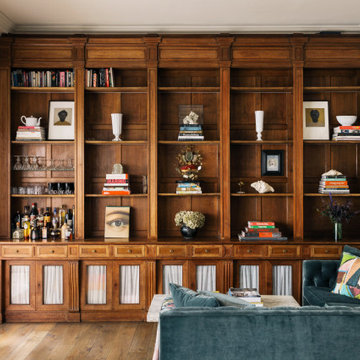 STUDIO TASHIMA
Keyes Road is a two-storey, semi-detached red brick house dating to around 1890-1910. The focus of our work was on the ground floor where we were asked to improve the layout and use of the main living areas of the house, for an active family of four. Important to the design was to maximise the quality and amount of light as well as connection to the garden and flow to the rest of the house.
Our proposal introduces three single storey extensions, comprising a central, large space that extends the main outrigger of the house. To each side are smaller volumes, affording a full width kitchen. While defining a series of discrete volumes, it was important for us to ensure that the kitchen, living, family and dining rooms that are interconnecting and continuous. The result is a big space punctuated by a series of differently sized arches, defining spaces to ensure their intimacy.
It was important for our client to have a sense of warmth and comfort - perhaps not dissimilar to the qualities of a hotel lobby. The colour scheme of the rooms are warm white painted plaster, natural wood flooring with black, bronze and brass accents. Indirect and carefully placed light fittings pulls together the atmosphere of the rooms - particularly in the evenings.
Externally, we felt it important to differentiate the extensions from the main house by using a dark, charcoal grey brick. This sets up a contrasting yet complimentary relationship to the rich red coloured brick house. The facets of the brick play with light and depth as do the graduated brick arches.
During the design process, we grappled with floor levels, the direction of sunlight, and care to not encroach on the neighbouring properties. As the house is in a conservation area, we worked closely with our trusted planning advisor. Throughout, we pursued a sensitive design strategy, using pitched roofs, matching materials and careful detailing. Internally, many of the original details are intact. This has enabled us to create an eclectic ensemble of elements, colours and materials varying in age and period.
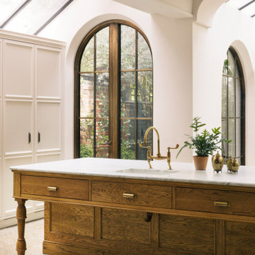 STUDIO TASHIMA
Keyes Road is a two-storey, semi-detached red brick house dating to around 1890-1910. The focus of our work was on the ground floor where we were asked to improve the layout and use of the main living areas of the house, for an active family of four. Important to the design was to maximise the quality and amount of light as well as connection to the garden and flow to the rest of the house.
Our proposal introduces three single storey extensions, comprising a central, large space that extends the main outrigger of the house. To each side are smaller volumes, affording a full width kitchen. While defining a series of discrete volumes, it was important for us to ensure that the kitchen, living, family and dining rooms that are interconnecting and continuous. The result is a big space punctuated by a series of differently sized arches, defining spaces to ensure their intimacy.
It was important for our client to have a sense of warmth and comfort - perhaps not dissimilar to the qualities of a hotel lobby. The colour scheme of the rooms are warm white painted plaster, natural wood flooring with black, bronze and brass accents. Indirect and carefully placed light fittings pulls together the atmosphere of the rooms - particularly in the evenings.
Externally, we felt it important to differentiate the extensions from the main house by using a dark, charcoal grey brick. This sets up a contrasting yet complimentary relationship to the rich red coloured brick house. The facets of the brick play with light and depth as do the graduated brick arches.
During the design process, we grappled with floor levels, the direction of sunlight, and care to not encroach on the neighbouring properties. As the house is in a conservation area, we worked closely with our trusted planning advisor. Throughout, we pursued a sensitive design strategy, using pitched roofs, matching materials and careful detailing. Internally, many of the original details are intact. This has enabled us to create an eclectic ensemble of elements, colours and materials varying in age and period.
 STUDIO TASHIMA
Keyes Road is a two-storey, semi-detached red brick house dating to around 1890-1910. The focus of our work was on the ground floor where we were asked to improve the layout and use of the main living areas of the house, for an active family of four. Important to the design was to maximise the quality and amount of light as well as connection to the garden and flow to the rest of the house.
Our proposal introduces three single storey extensions, comprising a central, large space that extends the main outrigger of the house. To each side are smaller volumes, affording a full width kitchen. While defining a series of discrete volumes, it was important for us to ensure that the kitchen, living, family and dining rooms that are interconnecting and continuous. The result is a big space punctuated by a series of differently sized arches, defining spaces to ensure their intimacy.
It was important for our client to have a sense of warmth and comfort - perhaps not dissimilar to the qualities of a hotel lobby. The colour scheme of the rooms are warm white painted plaster, natural wood flooring with black, bronze and brass accents. Indirect and carefully placed light fittings pulls together the atmosphere of the rooms - particularly in the evenings.
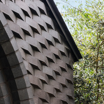
Externally, we felt it important to differentiate the extensions from the main house by using a dark, charcoal grey brick. This sets up a contrasting yet complimentary relationship to the rich red coloured brick house. The facets of the brick play with light and depth as do the graduated brick arches.
During the design process, we grappled with floor levels, the direction of sunlight, and care to not encroach on the neighbouring properties. As the house is in a conservation area, we worked closely with our trusted planning advisor. Throughout, we pursued a sensitive design strategy, using pitched roofs, matching materials and careful detailing. Internally, many of the original details are intact. This has enabled us to create an eclectic ensemble of elements, colours and materials varying in age and period.
 Magikflame
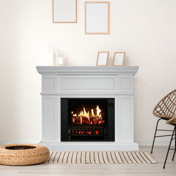
Stay cozy and comfortable with the Artemis white electric fireplace inspired by MagikFlame. Its customizable temperature settings and realistic flame effects create a warm and inviting atmosphere in any room, making it perfect for any homeowner. Discover MagikFlame electric fireplaces: https://magikflame.com/product-category/buy-electric-fireplaces/
Our patented technology is a real game-changer. Others use a mechanical means to recreate the look of fire. Instead, we use actual video of real fire which we then project onto a physical log set making it look like those logs are actually burning.
Therefore, you get all the details you would with real fire like wispy smoke and even burning embers which other fireplaces are not capable of producing. We spent 5 years of R&D to produce this cutting edge technology.
The Artemis mantel package is a fantastic choice for luxurious homes. This mantel is pure bright white. The Artemis features an elegant arry of rectangular and square-shaped details framed in by crown molding on the front center piece and on the side posts. A perfect fit for a modern home. The Artemis is made from high-quality woods and is a premium piece of furniture.
At MagikFlame, our goal is to create the most realistic electric fireplaces ever made. We also believe in improving quality of life by providing people with the best possible cozy and relaxing environment every night. Using our patented holoflame technology, we've innovated the electric fireplace to bring you effortless cozy with friends and family. Because quality family time and relaxation after a hard workday or activity is life changing.
Experience 30 Flames. Built-In Heater. Sound.
Subscribe to our channel for tips on how to enhance your interior design, accessories, and focal points. Learn more about fireplace technology and the cozy, relaxation, and family atmosphere improvements to your home. We have everything you need to guide you on a journey to forge the American home and better living atmosphere.
Shop With Us Online: https://magikflame.com
Like MagikFlame on Facebook: https://www.facebook.com/MagikFlame
Follow MagikFlame on Instagram: https://www.instagram.com/magikflamefireplaces/
Tweet With Us: https://twitter.com/MagikFlameFire
Pin With Us: https://www.pinterest.com/MagikFlameElectricFireplaces
We attempt to be as accurate as possible. However, MagikFlame cannot guarantee that product descriptions, images or other content of products or services are 100% accurate, complete, reliable, current, or error-free. Some items may appear slightly larger or smaller than the actual size due to screen defaults and photography techniques. This also includes any momentary stutters or artifacts in frames of the flame video loop. Other items may be represented at a larger than the actual size in order to clearly show details, or smaller than the actual size to show the entire item.
Sponsored
Delaware County, OH

Whisler Home Improvement
Franklin County's Committed Home Improvement Professionals
 STUDIO TASHIMA
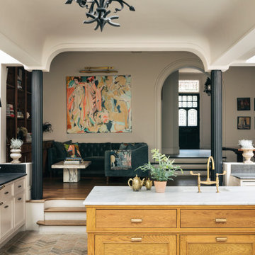
Keyes Road is a two-storey, semi-detached red brick house dating to around 1890-1910. The focus of our work was on the ground floor where we were asked to improve the layout and use of the main living areas of the house, for an active family of four. Important to the design was to maximise the quality and amount of light as well as connection to the garden and flow to the rest of the house.
Our proposal introduces three single storey extensions, comprising a central, large space that extends the main outrigger of the house. To each side are smaller volumes, affording a full width kitchen. While defining a series of discrete volumes, it was important for us to ensure that the kitchen, living, family and dining rooms that are interconnecting and continuous. The result is a big space punctuated by a series of differently sized arches, defining spaces to ensure their intimacy.
It was important for our client to have a sense of warmth and comfort - perhaps not dissimilar to the qualities of a hotel lobby. The colour scheme of the rooms are warm white painted plaster, natural wood flooring with black, bronze and brass accents. Indirect and carefully placed light fittings pulls together the atmosphere of the rooms - particularly in the evenings.
Externally, we felt it important to differentiate the extensions from the main house by using a dark, charcoal grey brick. This sets up a contrasting yet complimentary relationship to the rich red coloured brick house. The facets of the brick play with light and depth as do the graduated brick arches.
During the design process, we grappled with floor levels, the direction of sunlight, and care to not encroach on the neighbouring properties. As the house is in a conservation area, we worked closely with our trusted planning advisor. Throughout, we pursued a sensitive design strategy, using pitched roofs, matching materials and careful detailing. Internally, many of the original details are intact. This has enabled us to create an eclectic ensemble of elements, colours and materials varying in age and period.
 Drury Design
THE SETUP
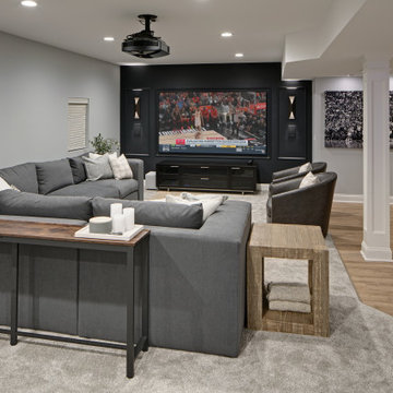
When we first encountered this basement for a family with three boys, we saw a space with untapped potential. Though previously remodeled, it lacked a cohesive design strategy. The expansive area housed various entertainment pieces (a shuffleboard table, air hockey, foosball, etc.) scattered haphazardly throughout the space.
While the basement included a workout room and a rudimentary kitchen area, it lacked a dedicated game room or proper bar. Excessive storage closets along the back wall consumed valuable real estate that could be repurposed for more engaging uses.
In essence, the basement was spacious but disjointed—functional for family use but falling short as an entertainment hub. It didn’t align with the sophistication of the rest of the home. Our clients envisioned a transformation: a fresh, organized space that would not only serve their family’s needs but also shine as an inviting arena for entertaining friends and hosting gatherings – especially sports-focused gatherings!
Design Objectives:
Reimagine the basement layout, creating distinct zones for varied activities.
Expand the workout area to accommodate new equipment, including a Smith machine.
Implement a multi-screen setup inspired by high-end sports bars, allowing guests to follow multiple games while socializing.
Enhance existing features while developing new areas:
Optimize a workout space for all equipment needs
Establish a dedicated children’s space with guest room capabilities
Create an integrated bar and entertainment area
Retain and incorporate the existing projector setup
Design Challenges:
Navigate layout constraints in the new workout room due to fixed utility areas.
Carve out a distinct space for kids within the open plan.
Revitalize an underutilized section of the basement.
Elevate the existing big screen area with purposeful design elements.
Develop a full-fledged bar area while maintaining kitchen functions applicable for hangout snacking.
Work around immovable structural elements (soffits, load-bearing support columns)
THE RENEWED SPACE
Design Solutions:
Install a stylish barn door for the utility area of the new workout space, improving aesthetics and accessibility.
Repurpose the former workout room into a dedicated game room for kids, utilizing couches with pull-out beds so the area can double as overflow guest accommodations.
Transform the unused area into a vibrant pub-style area for card and table games.
Enhance the big screen area with elegant wainscoting and ambient theatre-style lighting.
Design a multi-functional wet bar area featuring varied seating, prep areas, and a microwave.
Base the bar sink area width off the soffit above it.
In the big screen area, use the soffit to inform the width of a wainscoting section.
For the immovable support columns, dress one up to match the wainscoting of the nearby big screen wall. Hide the other one in a new wall.
Final Thoughts:
The reimagined basement has exceeded our clients’ expectations, evolving into the ultimate entertainment hub. With seven strategically placed screens, it’s perfect for gatherings focused on major sporting events and casual gatherings, as well. The space strikes a balance between adult sophistication and family-friendly functionality, featuring distinct zones for various activities.
The new design not only maximizes functionality for modern, multi-screen entertainment but also elevates the aesthetic appeal. It integrates flawlessly with the rest of the home’s transitional style while allowing each basement section to maintain its unique character. The result is a versatile space that caters to both intimate family time and large-scale entertaining.
 STUDIO TASHIMA
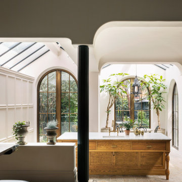
Keyes Road is a two-storey, semi-detached red brick house dating to around 1890-1910. The focus of our work was on the ground floor where we were asked to improve the layout and use of the main living areas of the house, for an active family of four. Important to the design was to maximise the quality and amount of light as well as connection to the garden and flow to the rest of the house.
Our proposal introduces three single storey extensions, comprising a central, large space that extends the main outrigger of the house. To each side are smaller volumes, affording a full width kitchen. While defining a series of discrete volumes, it was important for us to ensure that the kitchen, living, family and dining rooms that are interconnecting and continuous. The result is a big space punctuated by a series of differently sized arches, defining spaces to ensure their intimacy.
It was important for our client to have a sense of warmth and comfort - perhaps not dissimilar to the qualities of a hotel lobby. The colour scheme of the rooms are warm white painted plaster, natural wood flooring with black, bronze and brass accents. Indirect and carefully placed light fittings pulls together the atmosphere of the rooms - particularly in the evenings.
Externally, we felt it important to differentiate the extensions from the main house by using a dark, charcoal grey brick. This sets up a contrasting yet complimentary relationship to the rich red coloured brick house. The facets of the brick play with light and depth as do the graduated brick arches.
During the design process, we grappled with floor levels, the direction of sunlight, and care to not encroach on the neighbouring properties. As the house is in a conservation area, we worked closely with our trusted planning advisor. Throughout, we pursued a sensitive design strategy, using pitched roofs, matching materials and careful detailing. Internally, many of the original details are intact. This has enabled us to create an eclectic ensemble of elements, colours and materials varying in age and period.
27