
Search results for "Aesthetic potentialities" in Home Design Ideas
 Tom Meaney Architect, AIA
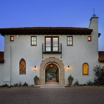
This 6000 square foot residence sits on a hilltop overlooking rolling hills and distant mountains beyond. The hacienda style home is laid out around a central courtyard. The main arched entrance opens through to the main axis of the courtyard and the hillside views. The living areas are within one space, which connects to the courtyard one side and covered outdoor living on the other through large doors. The outdoor living space has a fireplace, TV, BBQ, and amazing views over the pool. The bedroom wing ends with the master suite oriented towards the most private part of the property. A rustic car barn completes the site development.
 Axis Mundi Design
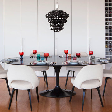
It wasn’t necessary to overthink things when Axis Mundi designed interiors for an apartment at Brooklyn’s glass-sheathed 1 Grand Army Plaza, the luxury building by Richard Meier already endowed with all the “starchitect” bells and whistles, as well as drop-dead stunning views of Brooklyn, the harbor and Prospect Park. What did require considerable aptitude was to strike the right balance between respect for these assets, particularly the panoramas, and livability. The all-white scheme doesn’t just complement Meier’s own aesthetic devotion to this purest of pure hues; it serves as a cool backdrop for the views, affording comfortable vantage points from which to enjoy them, yet not drawing attention away from the splendors of one of the world’s most distinctive boroughs. Sleek, low-lying Italian seating avoids distracting interruptions on the horizon line. But minimal color accents and pattern also sidestep what could have been a potentially antiseptic environment, making it tactile, human and luxurious.
2,200 sf
Design Team: John Beckmann, Richard Rosenbloom and Nick Messerlian
Photography: Adriana Buffi and Fran Parente
© Axis Mundi Design LLC
 The Cultural Landscape Foundation
Saturday, August 22, 9:00 to 10:30am | Aspen | Stillwater by Valerie Yaw and Jane Lanter of Bluegreen
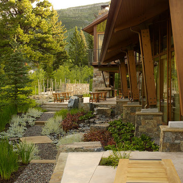
Bounded by the natural beauty of the great Rocky Mountains, this landscape complements the wild aesthetic of the surrounding environment. Taking a design cue from nature, this property represents the extraordinary potential of a visionary design process and close working relationship between the property owners and design team. Enclosed by stone walls and designed for artistic contrast with the home’s architecture, a spacious patio provides room for outdoor entertaining and relaxation. Nearby, a collection of stainless steel rods designed to varying heights define an outdoor spa area, adding artistry to the site. The airy aesthetic of the mountainous landscape is emulated in the emphasis of openness and perspective. A recirculating stream and basin formed of stone slabs unifies the property in a common plan, with just a hint of Western ruggedness. Views of the picturesque landscape stretching far beyond the edges of the property combine to paint a truly inspiring scene.
Photo by Jason Dewey Photography, courtesy Bluegreen
Find the right local pro for your project

 Axis Mundi Design
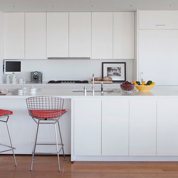
It wasn’t necessary to overthink things when Axis Mundi designed interiors for an apartment at Brooklyn’s glass-sheathed 1 Grand Army Plaza, the luxury building by Richard Meier already endowed with all the “starchitect” bells and whistles, as well as drop-dead stunning views of Brooklyn, the harbor and Prospect Park. What did require considerable aptitude was to strike the right balance between respect for these assets, particularly the panoramas, and livability. The all-white scheme doesn’t just complement Meier’s own aesthetic devotion to this purest of pure hues; it serves as a cool backdrop for the views, affording comfortable vantage points from which to enjoy them, yet not drawing attention away from the splendors of one of the world’s most distinctive boroughs. Sleek, low-lying Italian seating avoids distracting interruptions on the horizon line. But minimal color accents and pattern also sidestep what could have been a potentially antiseptic environment, making it tactile, human and luxurious.
2,200 sf
Design Team: John Beckmann, Richard Rosenbloom and Nick Messerlian
Photography: Adriana Buffi and Fran Parente
© Axis Mundi Design LLC
 Axis Mundi Design
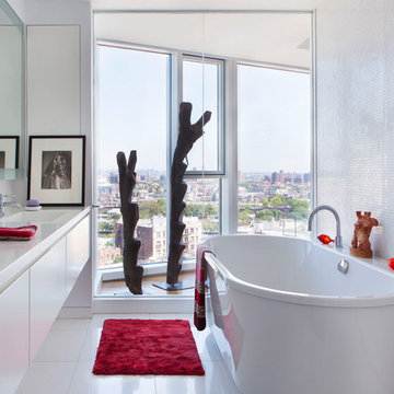
It wasn’t necessary to overthink things when Axis Mundi designed interiors for an apartment at Brooklyn’s glass-sheathed 1 Grand Army Plaza, the luxury building by Richard Meier already endowed with all the “starchitect” bells and whistles, as well as drop-dead stunning views of Brooklyn, the harbor and Prospect Park. What did require considerable aptitude was to strike the right balance between respect for these assets, particularly the panoramas, and livability. The all-white scheme doesn’t just complement Meier’s own aesthetic devotion to this purest of pure hues; it serves as a cool backdrop for the views, affording comfortable vantage points from which to enjoy them, yet not drawing attention away from the splendors of one of the world’s most distinctive boroughs. Sleek, low-lying Italian seating avoids distracting interruptions on the horizon line. But minimal color accents and pattern also sidestep what could have been a potentially antiseptic environment, making it tactile, human and luxurious.
2,200 sf
Design Team: John Beckmann, Richard Rosenbloom and Nick Messerlian
Photography: Adriana Buffi and Fran Parente
© Axis Mundi Design LLC
 Craftsman Design and Renovation
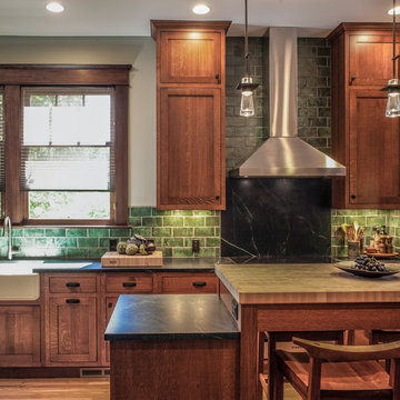
 This craftsman home needed a kitchen update that maximized the storage potential of this home while maintaining the historic character of the era. We installed new DeWils custom cabinetry that extends all the way to the ceiling as well as creating new mudroom storage and built in seating. We installed beautiful soapstone countertops with an undermount farmhouse sink. The show stopper of the kitchen though is the green glazed terracotta backsplash tile. Unique but in line with the craftsman aesthetic.
Photo: Pete Eckert

 Benvenuti and Stein
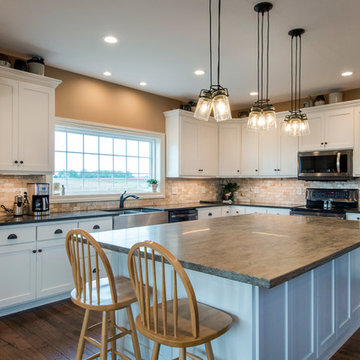
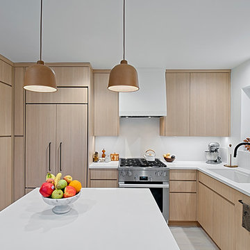
Cleverly designed kitchen with minimalist style has hidden pantry with touch latch doors next to the refrigerator . Custom cabinetry made in the Benvenuti and Stein Evanston cabinet shop.
Norman Sizemore-Photographer
 Axis Mundi | SF
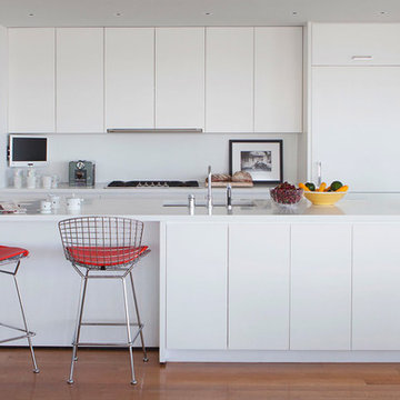
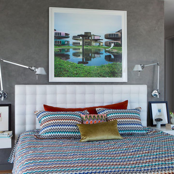
It wasn’t necessary to overthink things when Axis Mundi designed interiors for an apartment at Brooklyn’s glass-sheathed 1 Grand Army Plaza, the luxury building by Richard Meier already endowed with all the “starchitect” bells and whistles, as well as drop-dead stunning views of Brooklyn, the harbor and Prospect Park. What did require considerable aptitude was to strike the right balance between respect for these assets, particularly the panoramas, and livability. The all-white scheme doesn’t just complement Meier’s own aesthetic devotion to this purest of pure hues; it serves as a cool backdrop for the views, affording comfortable vantage points from which to enjoy them, yet not drawing attention away from the splendors of one of the world’s most distinctive boroughs. Sleek, low-lying Italian seating avoids distracting interruptions on the horizon line. But minimal color accents and pattern also sidestep what could have been a potentially antiseptic environment, making it tactile, human and luxurious.
2,200 sf
Design Team: John Beckmann, Richard Rosenbloom and Nick Messerlian
Vintage photography courtesy of the Ubu Gallery, New York
Photography: Adriana Buffi and Fran Parente
© Axis Mundi Design LLC
 Axis Mundi Design
It wasn’t necessary to overthink things when Axis Mundi designed interiors for an apartment at Brooklyn’s glass-sheathed 1 Grand Army Plaza, the luxury building by Richard Meier already endowed with all the “starchitect” bells and whistles, as well as drop-dead stunning views of Brooklyn, the harbor and Prospect Park. What did require considerable aptitude was to strike the right balance between respect for these assets, particularly the panoramas, and livability. The all-white scheme doesn’t just complement Meier’s own aesthetic devotion to this purest of pure hues; it serves as a cool backdrop for the views, affording comfortable vantage points from which to enjoy them, yet not drawing attention away from the splendors of one of the world’s most distinctive boroughs. Sleek, low-lying Italian seating avoids distracting interruptions on the horizon line. But minimal color accents and pattern also sidestep what could have been a potentially antiseptic environment, making it tactile, human and luxurious.
2,200 sf
Design Team: John Beckmann, Richard Rosenbloom and Nick Messerlian
Photography: Adriana Buffi and Fran Parente
© Axis Mundi Design LLC

 The Artisans Group, Inc.
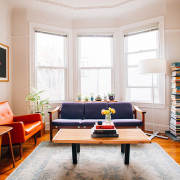
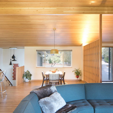
Winner of the 2018 Tour of Homes Best Remodel, this whole house re-design of a 1963 Bennet & Johnson mid-century raised ranch home is a beautiful example of the magic we can weave through the application of more sustainable modern design principles to existing spaces.
We worked closely with our client on extensive updates to create a modernized MCM gem.
Extensive alterations include:
- a completely redesigned floor plan to promote a more intuitive flow throughout
- vaulted the ceilings over the great room to create an amazing entrance and feeling of inspired openness
- redesigned entry and driveway to be more inviting and welcoming as well as to experientially set the mid-century modern stage
- the removal of a visually disruptive load bearing central wall and chimney system that formerly partitioned the homes’ entry, dining, kitchen and living rooms from each other
- added clerestory windows above the new kitchen to accentuate the new vaulted ceiling line and create a greater visual continuation of indoor to outdoor space
- drastically increased the access to natural light by increasing window sizes and opening up the floor plan
- placed natural wood elements throughout to provide a calming palette and cohesive Pacific Northwest feel
- incorporated Universal Design principles to make the home Aging In Place ready with wide hallways and accessible spaces, including single-floor living if needed
- moved and completely redesigned the stairway to work for the home’s occupants and be a part of the cohesive design aesthetic
- mixed custom tile layouts with more traditional tiling to create fun and playful visual experiences
- custom designed and sourced MCM specific elements such as the entry screen, cabinetry and lighting
- development of the downstairs for potential future use by an assisted living caretaker
- energy efficiency upgrades seamlessly woven in with much improved insulation, ductless mini splits and solar gain

Sponsored
Westerville, OH

Custom Home Works
Franklin County's Award-Winning Design, Build and Remodeling Expert
 The Artisans Group, Inc.
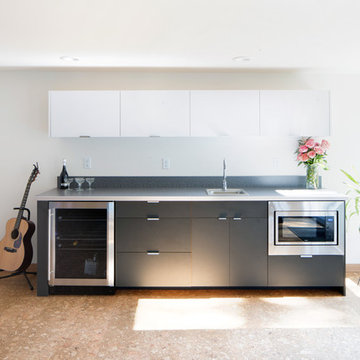
Winner of the 2018 Tour of Homes Best Remodel, this whole house re-design of a 1963 Bennet & Johnson mid-century raised ranch home is a beautiful example of the magic we can weave through the application of more sustainable modern design principles to existing spaces.
We worked closely with our client on extensive updates to create a modernized MCM gem.
Extensive alterations include:
- a completely redesigned floor plan to promote a more intuitive flow throughout
- vaulted the ceilings over the great room to create an amazing entrance and feeling of inspired openness
- redesigned entry and driveway to be more inviting and welcoming as well as to experientially set the mid-century modern stage
- the removal of a visually disruptive load bearing central wall and chimney system that formerly partitioned the homes’ entry, dining, kitchen and living rooms from each other
- added clerestory windows above the new kitchen to accentuate the new vaulted ceiling line and create a greater visual continuation of indoor to outdoor space
- drastically increased the access to natural light by increasing window sizes and opening up the floor plan
- placed natural wood elements throughout to provide a calming palette and cohesive Pacific Northwest feel
- incorporated Universal Design principles to make the home Aging In Place ready with wide hallways and accessible spaces, including single-floor living if needed
- moved and completely redesigned the stairway to work for the home’s occupants and be a part of the cohesive design aesthetic
- mixed custom tile layouts with more traditional tiling to create fun and playful visual experiences
- custom designed and sourced MCM specific elements such as the entry screen, cabinetry and lighting
- development of the downstairs for potential future use by an assisted living caretaker
- energy efficiency upgrades seamlessly woven in with much improved insulation, ductless mini splits and solar gain
 KDO KITCHENS & REMODELING
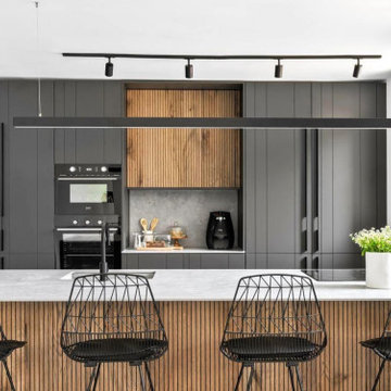
The look of black and wood is never disappointing, they go very well together, we design the island to match our client preferences and her vision.
Danish kitchen photo in Atlanta
Danish kitchen photo in Atlanta
 Axis Mundi | New York
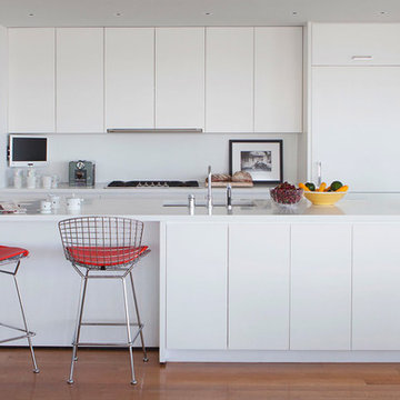
It wasn’t necessary to overthink things when Axis Mundi designed interiors for an apartment at Brooklyn’s glass-sheathed 1 Grand Army Plaza, the luxury building by Richard Meier already endowed with all the “starchitect” bells and whistles, as well as drop-dead stunning views of Brooklyn, the harbor and Prospect Park. What did require considerable aptitude was to strike the right balance between respect for these assets, particularly the panoramas, and livability. The all-white scheme doesn’t just complement Meier’s own aesthetic devotion to this purest of pure hues; it serves as a cool backdrop for the views, affording comfortable vantage points from which to enjoy them, yet not drawing attention away from the splendors of one of the world’s most distinctive boroughs. Sleek, low-lying Italian seating avoids distracting interruptions on the horizon line. But minimal color accents and pattern also sidestep what could have been a potentially antiseptic environment, making it tactile, human and luxurious.
2,200 sf
Design Team: John Beckmann, Richard Rosenbloom and Nick Messerlian
Vintage photography coursety of the Ubu Gallery, New York
Photography: Adriana Buffi and Fran Parente
© Axis Mundi Design LLC

Sponsored
Delaware, OH

Buckeye Basements, Inc.
Central Ohio's Basement Finishing ExpertsBest Of Houzz '13-'21

 Gallery KBNY
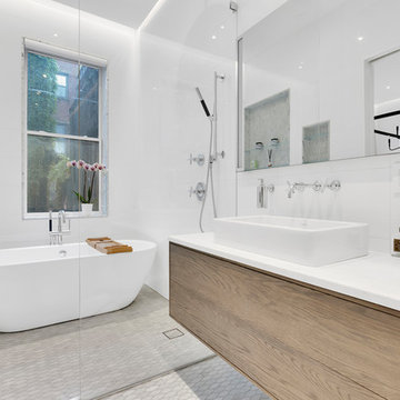
The owner of this historic and landmarked town-home renovation in Hudson Square, originally built in 1826, hired Gallery Kitchen and Bath to fully gut-renovate this 3-unit row-home. The scope of work included a full-scale renovation of the owners unit, including the renovation of the kitchen, one 4-piece master ensuite bathroom, one 3-piece bathroom with a walk-in steam shower, and a beautiful powder room. Additional work in the owners unit also included flooring, electrical upgrade, major plumbing work, new HVAC system, restoration of a fireplace, installation of a fully integrated smart home system and landmarked approved windows.
CELLAR RENOVATION IN NYC LANDMARKED TOWN-HOME
Rounding out the owners unit we renovated the cellar, which was converted into an entertainment space and featured a custom glass curtain wall, along with a custom staircase with an exposed brick wall. During the demolition phase of the cellar, our team discovered 56 wine jugs filled with wine from the prohibition era, leading us to name this project the prohibition house. For the two tenant units, Gallery Kitchen and Bath undertook the renovation of 2 kitchens, 4 bathrooms, new hardwood flooring throughout, along with detailed carpentry work in the entire home.
WHY GALLERY KITCHEN AND BATH
After interviewing multiple contractors, our client decided on Gallery Kitchen and Bath primarily because of our turnkey design, selection, and build process. In a renovation of this magnitude it is crucial to have a centralized full service contractor under one roof to handle all of the aspects and simultaneous moving parts of the project. Decentralizing the entire process by having multiple unaffiliated vendors handle various parts of the process can easily become chaotic, time consuming, and costly.
Because Gallery Kitchen and Bath undertook the entire process, from the design of the entire space to the selection and procurement of all finishes and fixtures, down to the procurement of all permits and LPC filings, it made a seemingly chaotic project a’lot more manageable.
PHASE 1: DESIGN, SELECTION, PROCUREMENT
Our client wanted the renovation to incorporate a fully modern design into his Hudson Square town-house. Being that this is a landmarked property, the exterior facade had to be restored and kept with the original aesthetic, the interior of the home however was a whole different story.
In keeping up with the modern aesthetic, our designers went to work to design a custom kitchen that included fully custom flat panel base cabinets in a white high gloss finish and an absolute matte black appliance/pantry wall. The kitchen design also included a white quartz countertop and backsplash with a waterfall edge island. To bring warmth to the modern kitchen, our designers incorporated a rifted and quartered select oak wood floor in a herringbone pattern, and custom blended stain with matte polyurethane finish. For continuity, the wood floor was also extended throughout the entire owners unit.
In the ensuite bathroom we created a “wet area” which houses a standalone soaking tub as well as a beautiful rainfall shower, completely leveled with the rest of the floor in the bathroom. Some highlights within this space include a tiled square drain, large niche cutouts with a carrera marble accents. Once again, to bring warmth to this modern bathroom, our designers incorporated a floating rustic oak vanity and carrera marble mosaic floor tile.
Last on the list on the owners unit floor was the cellar, which our client wanted to utilize as an entertainment space for his friends and family. During the design phase, we incorporated an open concept layout, wedding the indoor and outdoor space with a custom glass curtain wall. The design also included custom walnut built-ins that serve as a custom wet bar and storage piece.
With the design approved and selections made our office liaisons moved to procure all of the material selections and finishes.
PHASE 2: DEMO
Because this home is almost two centuries old, we had to take extra precaution during the interior demolition phase of the project. One specific area that we had to pay special attention to was the existing brick. Over time the mortar in old brick homes deteriorates and turns into dust – for this reason it was extremely important that a thorough and ongoing inspection of the exteriors and interior walls took place during the demolition of the space.
After 14 30-yard debris containers and 56 wine filled jugs from the prohibition era later , the demolition of this historic Hudson Square town-home came to an end. If you are wondering whether we tried the wine? After notifying the owner we agreed to open one of the jugs and try them together – nothing but vinegar.
PHASE 3: BUILD
One of the challenges in a renovation project of this scope is nailing down the logistics and delivery of fixtures and finish material. Adding to this challenge was a narrow entry door that required us to use a boom truck in order to deliver some of the larger materials on site. To ensure a succinct time schedule, we boomed all of the materials through the 3rd floor for the entire project and worked our renovation work from top floor to cellar. This technique also insured that any unexpected water issues during the renovation process would not damage a finished floor.
With all roughing and framing complete, the Gallery KBNY team proceeded to execute on the design plan.
THE REVEAL
From what was once a dilapidated town-home with nothing but potential, to a glamorous and luxurious modern interior space – the prohibition house was complete. Ready to speak with us about your renovation project? Contact us to schedule your free consultation and let Gallery KBNY show you why our all-inclusive approach to your renovation is the smartest way to renovating in NYC.
 A. Perry Homes
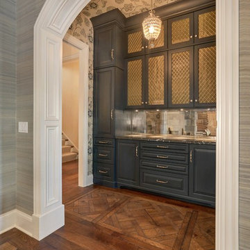
The butler's pantry located off the dining room with wire mesh cabinet doors, black cabinets, and floral print wallpaper
Enclosed dining room - traditional medium tone wood floor enclosed dining room idea in Chicago with gray walls
Enclosed dining room - traditional medium tone wood floor enclosed dining room idea in Chicago with gray walls
5