
Search results for "Apologists" in Home Design Ideas


 iCoat Emerald Coast
Gorgeous, hand textured weathered wood-look flooring!
Country bedroom photo in Miami
Country bedroom photo in Miami


Find the right local pro for your project

 Lite4 Outdoor Lighting
This home is nestled back into a nice woodsy setting. The homeowner didn't like how pitch black the place was once the sun set and she wanted to add an elegant look to place as you come up the driveway. We added a combination of up lighting on the brick architecture as well as some thoughtfully placed down lighting from the large trees that will accentuate her perennial beds come spring and summer. This home has nice limestone window arches and coins that reflect that light well and and call attention to these specific details that sometimes get lost during the day. The light colored gables reelect the light as well, outlining the tall roof detail and making the home feel taller overall.


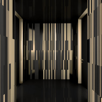
 KURV Architecture DPC (Alex Hughes Architects)
Located in the heart of Manhattan’s Lower East Side, the building was erected on a shallow commercial lot between two 120 year old masonry buildings and a new residential rental building. 330 Grand Street is a mix of 725 SF 1BRs and 1050 SF 2BR apartments. It also contains a 1100 SF two story duplex as well as private and public rooftop space, large private balconies for most units and two large private terraces for the ground floor units.
330 Grand Street was originally designed and approved at the NYC DOB as a prefabricated modular building. During the pandemic, as shipping costs skyrocketed putting the project at risk, we suggested redesigning the building as a reinforced cast-in-place concrete structure. Concrete was readily available and prices had not been affected by the demand increase that many other materials suffered in the pandemic. We took this opportunity to raise floor to ceiling heights, enlarge high performance windows and redistribute the buildings MEPFS and Structural Systems to create very open floor plans.
The challenge was to create a luxurious sensorial living experience with very limited means. In a city with very high construction costs, low cost residential buildings in the area are usually devoid of good quality, design and character. Our approach was to aim high for the end user, prioritizing natural light, open space with long visual perspectives, high ceilings and as always, rejecting the use of predefined building templates.
Our biggest challenge was to ensure that the small spaces feel as clean cut, large and bright as possible. Several unique design decisions were made to ensure low cost and high quality;
Floor plans were laid out so that spaces were wide open and free of clutter from mechanical or structural interruptions. Therefore all infrastructure was placed in lateral demising walls, which in turn act as the unit’s storage and kitchen. The apartments feel wide open, are super quiet and have more storage space than any other comparable apartment in the city.
To solve the problem of the site’s shallow commercial lot which is typically prone to dark interior spaces we focused our attention on the building’s envelope. Instead of the usual small punched window openings, oversized high performance windows were designed to ensure that light penetrated as far as possible into the units. In the smaller 1BR units, the full 50’ depth of the lot is perceived by partitioning spaces with sliding pocket doors that can be retracted to allow deep visual perspectives, making the sight lines in the space feel longer, larger, more ample than normal. In addition to the full height glazing, each unit above the 2nd floor receives a 7 foot covered balcony, adding 120 to 240 sf to each apartment, something unusual in New York City buildings. The space is large enough for a full size dining table, when the weather permits being outside.
We also worked hard to ensure modularity. For example, all kitchen units are all identical throughout the building. The idea of modularity and the economy of the repetitive unit is exercised to the maximum through the building.
Hardware, appliances, flooring, wall coverings and material finishes are all carefully selected to feel bespoke, high quality and unique.
It was important to KURV that the result of this work manifest into something that would deeply connect with the end user and sustain relationships with the consumers of this space.
All images by KURV Architecture ©



 Designer Drains
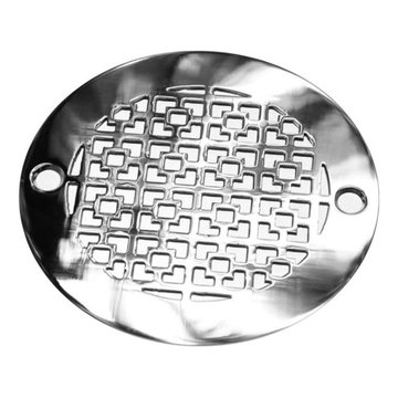
Enhance your bathroom with the exquisite Geometric Squares No. 1 Round Shower Drain, a 4.00-inch replacement compatible with Oatey 42211, AB&A 5000, and other leading brands. Elevate your space with this designer drain, meticulously crafted to bring both style and functionality to your shower.
Immerse yourself in the modern allure of our Geometric Squares No. 1. This round shower drain is not just a replacement; it's a statement piece that seamlessly integrates into your bathroom's aesthetic. With compatibility across renowned brands, including Oatey and AB&A, this versatile drain ensures a perfect fit and a sleek, cohesive look.
Crafted with precision, our designer drain blends geometric elegance with durability. Upgrade your bathroom effortlessly and discover the perfect balance of form and function. Explore the wide compatibility and design excellence of our Geometric Squares No. 1 Round Shower Drain on HOUZZ, where quality meets style.
Revitalize your shower experience and redefine your bathroom aesthetics with this exceptional designer drain. Invest in sophistication and performance – choose Geometric Squares No. 1 for a shower drain that reflects your commitment to quality and design.




 Specialized Stair and Rail
Ryan Patrick Kelly Photographs
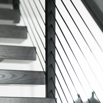
Inspiration for an industrial metal curved open staircase remodel in Edmonton
Inspiration for an industrial metal curved open staircase remodel in Edmonton

 Flavor Paper
If you’re on the prowl for some seriously salacious wallpaper that celebrates eroticism, masculinity and sexual liberation, then Tom of Finland is for you! A collaboration two years in the works, this carnal creation comprises two designs—TAME and XXX—both conceived by Michael Reynolds, Hoffman Creative and the Tom of Finland Foundation. A bold and ballsy tribute to the dynamic graphite and pencil drawings of Touko Laaksonen (aka Tom of Finland), the famed renegade Finnish artist known for his stylized homoerotic art and its profound effect on late twentieth century gay culture and fetish lifestyle. From cops, cowboys and bikers, to sailors, lumberjacks and leather men — there’s a little something (and then some) for everyone. That-a-boy!
Michael Reynolds is a New York-based creative director, curator, editorial stylist, book editor and design consultant. He is the US Editor of Wallpaper* Magazine and Editor at Large for Architectural Digest USA. His first book, TOM HOUSE – Tom of Finland in Los Angeles, is available through Rizzoli Publications.
Eric Hoffman founded Hoffman Creative a decade ago in New York, a firm creating brand identities for a range of clients with an ethos rooted in psychology and emotional intelligence.
Tom of Finland Foundation maintains the archive and former Los Angeles home of the 20th-century artist, known for his graphic, highly stylized illustrations. Dedicated to protecting and preserving erotic art and erotic arts education, the foundation continues to advocate the artist’s significant influence on gay and LGBT culture.

 Neolithic Materials
 specializes in rare reclaimed and newly quarried limestone architectural elements sourced from across the Mediterranean. Our Southern California collection includes fireplaces, fountains, flooring, pavers, sinks, tubs, benches, antique tiles, wall cladding, and custom-made stone pieces.
For inquiries, contact us at (310) 289-0414 or info@neolithicmaterials.com

 Heritage Home Rugs
Our Chelsea collection is perfect for any casual room. (Livingroom, bedroom, basement). Modern style patterns make it easy to match any room décor. Machine made of 100% polypropylene for excellent durability, stain resistance and colorfastness.

 Jessica Dauray Interiors/Elements Of Style
Aubergine Silk velvet drapes with ivory wood tassels
Dining room - traditional dining room idea in Raleigh
Dining room - traditional dining room idea in Raleigh

 Carol Ashton Interiors
New Media Art
All works reflect the work of the artist, Carol Ashton, with each piece anchored in acrylic on canvas then further investigated with digital media. Carol draws on her experience as Digital Literacy Specialist with the Los Angeles County Museum of Art to continue her exploration with digital technologies as a relevant and robust means of expressing beauty in the digital age.
Significant in her work is the desire to validate the union of art and function, recognizing the role of beauty in the internal conversations we have with our home and work environment.
46