
Search results for "Argument" in Home Design Ideas


 Ky-Kan Coatings
Concrete can be made to look like any substance. Tile, stone, wood, brick, etc. With unlimited color options, Ky-Kan Coatings can transform any room in your home or business using lightweight, beautiful concrete.

 Zelaya Properties LLC
We used: Custom cherry cabinetry in Arts & Crafts Shaker style by Kabinart in Boulder and Espresso stains. Liberty Hardware Venetian bronze 1-1/2" cabinet knobs. KitchenAid Architect II Series 22 CF counter-depth French door refrigerator. KitchenAid Architect Series II 27" convection single wall oven. KitchenAid 36" 6-burner dual fuel freestanding commercial-style range. KitchenAid Architect II Series 24" dishwasher. Sharp Insight Pro Series 24" built-in microwave drawer (Model #KB6524PS). Crystorama Solaris 12" wide pendant lights in English bronze. Granite countertops in Brown Fantasy. 3"x6" polished marble backsplash.
Paint colors:
Walls: Glidden Silver Cloud 30YY 63/024
Ceilings/Trims/Doors: Glidden Swan White GLC23
Robert B. Narod Photography
Find the right local pro for your project

 Detail Kitchens
Inspiration for a large eclectic medium tone wood floor kitchen pantry remodel in Chicago with a farmhouse sink, flat-panel cabinets, green cabinets, marble countertops, stainless steel appliances and an island
 aplusdesign
Designing the space impels a décor that needs to appeal to varied tastes. This apartment in Surat, Gujarat redefines the concept of a designer home, using color accents in otherwise light interior décor. It’s a simple functional house with all minimal requirements and less maintenance house.
As a part of interest our client was fond of paintings to be displayed so it played major role in designing aspect.
As we enter the passage area the use of wooden slatted main door with Smoke grey PU finished walls, soft finishes and clean lines dominate these, with metallic gold text ‘MODI’S” representing with iconic design symbol carved in MDF with touch of green makes it more welcoming.
Living space has an overpowering feature as the wooden cladded wall which highlights the space and marks the continuation into the dining area.
The palette of the project is simple, defining the three main elements that make it up: Italian marble flooring changing as per the functionality of the space, Ash Wood defining the objects, and grey finish.
The materials hold the space strongly with a particular color palette. On skinny metal legs, the furniture in this living room seems to be floating above the floor, bringing a sense of weightlessness to the space. This unique living space features Ash wood slatted panels on walls with a velvety finish rug matching the center table just right.
The design of the furniture in wood and metal is tradition but is executed in a modern minimalist way. The Indian swing seating makes it as divider to the space between informal seating and dining area yet comprising the space equally.
Bespoke furniture elements kept according to the client’s need.The furniture is a mix of contemporary with different design elements by our studio, which creates a classic and cozy atmosphere. The ash wood and the grey hue finish become the leaders of the colours and textures palette. The curved shaped edge ceiling designed according to functionality & also plays aesthetic role.The importance of them, almost visible from every spot.
The deep sea velvety sofa makes an argument to this palette by focusing attention to it.
A nonchalant elegance best describes the soul of the house. In order to make a dialogue between the contemporary with different textures, patterns and uniform colors have been used throughout the house.
The parallel shaped kitchen with a high spec modern technologies and artificial stone counter top with fresh furniture in white and grey and sleek open breakfast counter is designed to be a light space that beautifully blends in.
This volume integrates the access to the private area –bedroom, wash area and bathroom-, segregating this way the day area living and dining area.
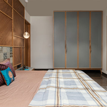
The Master Bedroom layout remodeled in accordance with contemporary trends and the client’s needs. The paintings which is inspired from the well-known artist and as strong believer in vaastu by the clients it has been displayed in right position which reflects good vibes.
The seamless panel running through bed back having grooves on them which forms symmetrical pattern on wood. Using the same material by forming the side tables in circular pattern with round shaped metal supports.
The Son’s bedroom is integrated with closet, TV unit and dressing table. The entire ceiling is connected with wood stripes panels running on the walls which starts from main door of the room and ends on the full height closet and subdivided by lime plaster in grey with grooves on it.
The graphics now a days plays major role in every design aspect, so we tried customized different athlete position in game play captured in frames and be part of the focal point in room.
Each details speaks the entire space is crafted with a confluence of contemporary art presented in a modern palette. You’ll find them throughout the home, right from the color, furniture selection, to the wall paneling style teamed up with modern artworks and artefacts.
Each bedroom has a character of its own based on the user. This room was designed with a picturesque composition was made to create a backdrop to compliment the minimalistic furniture in entire space.
The backdrop of the bed panel is veneer cladded in frame box placed in the form of Tetris. The geometric patchwork mosaic tiles placed in between the cladding so that it’s easy to maintain.
Sleek handle details with full height closet and fine thin leg supports makes it more classic and modern.
Thus, the apartment gained a contemporary atmosphere and it is ready to receive a new lifestyle, of a new generation and new values.
 Neumann & Rudy Architecture
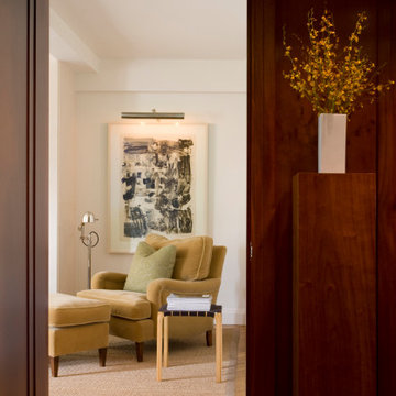
The photograph is constructed as a deliberate act of framing — an enfilade view captured through a threshold, in which the aperture of a doorway becomes both proscenium and compositional device. The image is organized around a strong vertical tripartite division: a dark stile of paneled millwork at the left edge, the luminous rectangle of the adjacent sitting room at center, and a substantial pier of figured hardwood joinery at right, terminating in a plinth-like pedestal. This asymmetrical clamping of the bright volume between two dark masses produces a pronounced sense of compression and release, a Wrightian sequencing in which the constricted, wood-lined passage funnels the eye toward the softer, higher-key room beyond. The architectural vocabulary within that inner volume is restrained and orthogonal: crisp painted plaster planes, a shallow soffit or dropped beam crossing the ceiling to modulate the overhead datum, and a simple flat-stock baseboard that reads as a quiet ground line rather than an ornamental flourish. The sightline is layered and telescopic — foreground jamb, mid-ground seating group, background artwork on the far wall — establishing depth through overlapping planes rather than perspectival theatrics. Underfoot, a herringbone-laid oak parquet in the passage gives way to a large-format sisal rug bound in linen tape, its rectilinear geometry reinforcing the axis while softening the transition between circulation and repose.
The material argument here is one of calibrated opposition: dense, saturated hardwood against pale, absorptive plaster and textile. The framing joinery — most plausibly a rich mahogany or stained cherry, its cathedral grain and ribbon figure fully legible under raking light — carries a deep oxblood-to-umber tonality and a satin, hand-rubbed sheen that lends the passage a library-like gravity. Against this, the interior room is rendered in a warm off-white with distinctly yellow-ochre undertones, avoiding the clinical chill of a true cool white and instead reading as parchment or unbleached linen. The upholstery — a rolled-arm wing chair and matching ottoman in a camel or buff-toned cotton velvet — supplies the tactile fulcrum of the composition: a napped, light-absorbing pile that contrasts against the coarse, tightly woven boucle of the sisal below and the smooth lacquer of the vertical joinery. Accent notes are sparing and precise: a pale celadon embroidered cushion introduces the only cool chromatic interruption; a rectilinear bench in blond ash with a woven black leather strap deck delivers a graphic, near-Nordic counterpoint; and a monolithic white ceramic vessel atop the pedestal provides a hard, matte punctuation. The abstract work on paper — a gestural monochrome in charcoal, ink and Payne's grey, generously matted behind glass — functions as the room's tonal anchor, its cool achromatics preventing the warm palette from tipping into sentimentality. Sprays of yellow oncidium orchid supply the single high-chroma gesture, echoing the ochre undertone of the walls.
The lighting strategy is layered, low-lumen and unapologetically warm, eschewing ambient wash in favor of discrete pools of illumination. A slim linear picture light, bronze-finished and cantilevered from the wall, grazes the artwork with a scalloped throw that reveals the tooth of the paper and establishes the far wall as the room's luminous terminus. A chrome-shaded articulating floor lamp — a modernist task fixture with a distinctly mid-century pedigree — provides a secondary, reflective glint and introduces the only cool metallic in the palette. Daylight enters obliquely and unseen from the left, softly modeling the plaster and the velvet nap without ever flattening the composition; the foreground joinery, meanwhile, sits in deep shadow, its grain caught only in a slow, specular gradient. The cumulative atmosphere is one of hushed, crepuscular intimacy — a room calibrated for reading and retreat rather than reception. Stylistically, the project resolves into a form of Transitional Warm Modernism: the classical proportioning, paneled millwork and rolled-arm seating are drawn from a traditional American vocabulary, yet they are stripped of applied ornament, edited to essentials, and disciplined by the graphic austerity of the abstract art and the blond-and-black bench. It is a sensibility best characterized as quiet luxury — tonal, textural, and materially honest, deriving its authority from the resonance of grain, nap and light rather than from any declarative gesture.


 Neumann & Rudy Architecture
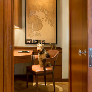
This image performs an act of deliberate spatial framing: we are positioned as intruders in a threshold, the photograph's foreground bracketed by two monumental slabs of mahogany-toned door leaf and jamb that compress the visual field into a portal roughly one-third the width of the frame. The composition is therefore a study in *enfilade* logic — a controlled, telescoping sightline that draws the eye through a narrow aperture into a recessed alcove, a purpose-built writing niche carved from what appears to be a corridor or dressing-room vestibule. The niche itself is architecturally modest in footprint but generous in vertical proportion; the ceiling reads as a plain plastered plane, unadorned save for a surface-mounted linear picture light on a slender drop stem, and the wall is treated as a full-height field for a single dominant object. The joinery is the true architecture here: a continuous run of casework establishes a horizontal datum at desk height, with a cantilevered writing surface returning perpendicular to the left-hand wall and a lower bank of drawers and a shallow ledge running right. That ledge functions as a *cimaise* or picture shelf, resolving the base of the framed nautical chart and giving the composition a plinth. Above, an integrated soffit or upper cabinet with concealed under-lighting terminates the left elevation, reinforcing the sense of an inhabited, tailored recess rather than a room. The herringbone parquet in the foreground introduces a diagonal geometry that runs counter to the orthogonal grid of doors, casework and picture frame, and this friction — chevron against rectilinear — animates what would otherwise be a static, axial composition. The single chair, canted slightly off-axis and pulled away from the desk, is the compositional pivot: it breaks the symmetry, occupies the exact center of the aperture, and converts an architectural vignette into a narrative one.
The palette is a disciplined exercise in the warm end of the spectrum, essentially monochromatic in hue and differentiated almost entirely by value, sheen and grain. The dominant material is timber, deployed in at least three distinct registers: the foreground door and jamb in a deeply saturated, red-brown mahogany or sapele with a high-build lacquer or French-polish sheen that catches light in long vertical highlights; the desk and casework in a lighter, honeyed figured wood — quartered cherry or anigre — finished to a satin rather than gloss, so that the eye reads it as a working surface rather than a ceremonial one; and finally the pale, blond oak of the herringbone floor, cerused or naturally oxidized to a straw tonality that lifts the lower register of the frame. Against this timber triad, the walls provide a chalky, low-saturation ground: a limewashed or flat-emulsion cream with a distinctly yellow-warm undertone that absorbs rather than reflects. The upholstery is the room's chromatic keynote — a saddle-tan or cognac leather, semi-aniline, already developing patina and slight slouch at the seat, its edge articulated by a close-set brass or antique-nickel nailhead trim that reads as a stitched seam of tiny metallic points. Metals are used sparingly and with historical precision: the polished chrome rosette and knob of the door with its heavy escutcheon and mortise strike plate, the slim brushed housing of the picture light. Texturally, the room stages a dialogue between the hard, reflective and the soft, absorbent: lacquer against limewash, taut leather against the friable, foxed paper of the antique chart. That chart — a hydrographic survey rendered in ochre, sepia and faded aqua, its ebonized frame supplying the composition's only true black — is the material anchor, its aged paper introducing a granular, time-worn texture that no new surface in the room could supply. The terrier, coincidentally or not, participates in this material scheme: a wiry tan-and-black coat that reads as a textile in its own right, tonally identical to the leather beneath it.
The lighting design is layered, warm-Kelvin and almost entirely artificial in its narrative effect, though the scene depends on a critical unseen source. A shaft of low, raking daylight enters from the right — presumably a window outside the frame — and lands as a hard-edged parallelogram across the parquet and the chair's front rail, creating the image's strongest contrast and lending the floor a sense of temporal specificity: late afternoon, low sun. Against this, three artificial layers operate. The surface-mounted picture light washes the nautical chart in an even, slightly amber flood, functioning as accent lighting that establishes the chart as the room's hierarchical focus. Concealed strip lighting beneath the upper casework grazes the left-hand desk return, providing task illumination and articulating the millwork's shadow line. Ambient fill is minimal and deliberately so; the corners of the niche fall into soft, unresolved shadow, and the whole tableau is rendered in a narrow tonal band of amber and umber that suppresses cool light almost entirely. The resulting atmosphere is one of burnished interiority — hushed, crepuscular, protective. Stylistically, the room resists easy categorization but sits most comfortably within a contemporary *Warm Traditionalism* or refined **Anglo-American Modern Classic** idiom: the vocabulary is unmistakably tailored-traditional (nailhead-trimmed leather, mortise hardware, framed cartography, a Deco-inflected barrel-back desk chair), yet the detailing is stripped of ornament — no cornice, no panel molding, no applied millwork profile — and the casework is resolved with the flush, planar minimalism of a mid-century yacht interior. It is, in essence, a *cabinet de travail* reimagined through the discipline of modern joinery: a room that borrows the emotional register of the club library while adopting the reductive geometry of contemporary architecture. The dog, unhurried and centrally enthroned, is the final aesthetic argument — evidence that the space is not a set piece but a lived, occupied, and evidently affectionate interior.

 Leicht Westchester-Greenwich
Example of a minimalist u-shaped concrete floor home design design in New York with an integrated sink, flat-panel cabinets, dark wood cabinets, quartzite countertops, stainless steel appliances and an island

 Bridgewater
The new owners were looking forward to living in their new home with an open floor plan, tall vaulted ceilings, and great views. It featured a large Great Room with two big French Doors separating the Dining Room from the Master Bedroom.
But after only a few months they identified a major design flaw: Each of the French Doors had ten glass windows with two large windows above each door. (Check out our before and after designs, traffic flow diagrams and photos of this project.) Glass windows and doors allowed sound and light from guests or the TV in the great room to easily sneak into the bedroom. With unique work and sleep schedules (he’s a pilot, she’s a registered nurse) this design wasn’t working.
Then there was a traffic flow design flaw: The Master Bedroom had a second entrance from a hallway. To get into the bedroom from the hallway you needed to walk down another claustrophobic hallway.
To get from the Master Bedroom to the Master Bath begin at the most remote corner of the bedroom and down a hallway between two closets. Once inside the bath, a huge triangular Jacuzzi dominating the space.
So, from a privacy and traffic flow perspective, this home had some major design issues.
When Craig Weber first met with the owners, he listened to their ideas and concerns. The owners trusted Craig to come up with the most efficient and most effective solution to this design dilemma. He offered a solution that resolved the bed-bath traffic flow problem, offered some bedroom room privacy, and updated the bath.
First, the two French Doors and windows were removed. A new wall was built with sound-absorbing materials, making the Great Room and Dining Room more comfortable spaces for entertaining while creating the bedroom privacy the owners craved.
Solving the Bedroom/Bath traffic flow problem began with removing the two existing closets. The bath door was relocated next to the hall entrance, and then a new walk-in closet was added adjacent to the hallway entrance. The solution offered easy access to and from the bath, closet and hallway without a hint of claustrophobia.
The Master Bath underwent a major transformation designed for convenience and comfort – especially during long, cold Minnesota winters.
Most everything from the former bath was torn out, beginning with the giant Jacuzzi.
A new bathtub that is wider and deeper than the standard size was installed with brushed Nickel fixtures. It’s the perfect place to relax with a glass of wine and candles.
Warm floors are a Minnesota “must have.” The bath’s new ceramic floor features in-floor electric heat. Getting in and out of the tub is easy and comfortable.
The new walk-in shower again features in-floor heating and a place to sit. The most interesting feature of this shower may the custom ceramic tile installed with unique patterns.
A new vanity Cambria Bradshaw countertops features two under-hung ceramic sinks with matching brushed Nickel fixtures.
Tall ceilings and three glass windows near the ceiling flood the room with natural light. A new energy-efficient window frames an ornamental stained glass window created by the owner’s father – a great personal touch.
A quiet place to sleep. A private dining room for entertaining. A Master Bath to die for. And easy traffic flow. The owners couldn’t have been more delighted with the outcome. And Lilly, their cat, loves it too.

 GS Construction
Example of a small classic 3/4 white tile and stone tile mosaic tile floor alcove shower design in Chicago with an undermount sink, recessed-panel cabinets, black cabinets, quartzite countertops, a two-piece toilet and gray walls


 Interior Pros - Design Studio
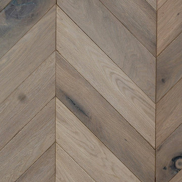
The grey trend has evolved in the last twelve months. Nowadays browns, beige and a touch of grey are in demand. Greige is the new buzzword.
Heavier hand scraped or contoured products, the rage that started around 2005 has taken a back seat in most areas, while a softer wire brushed "ceruse effect" seen mostly on White Oak has been remarkably strong showing no effects of becoming “dated” like the others mentioned.
Ceruse Color Possibilities
There are numerous color combinations to the "cerused" process with the most popular being white or off white. This design trend in hardwood flooring can have darker gray white oak with a mild ceruse off white effect.
There are limitless possibilities in either a prefinished hardwood floor or with what we can create for you in a custom on-site finished hardwood floor.
If something suits your fancy, contact us and we can work on creating just the look and sense of style you are looking for.

 Village Home Stores
Full-overlay Rustic Beech cabinets in the "Charleston" door style and "Briarwood" finish.
Village Home Stores
Example of a large mountain style kitchen design in Chicago
Example of a large mountain style kitchen design in Chicago


 Bloomington Carpet One
Beautiful custom runner to match the unique measurements of this staircase.
Small wooden curved staircase photo in Minneapolis with wooden risers
Small wooden curved staircase photo in Minneapolis with wooden risers

 JM Carpets
Large country u-shaped medium tone wood floor kitchen photo in Milwaukee with white cabinets and a peninsula

 Ehrlich Yanai Rhee Chaney Architects
The ground floor volumes wrapped in an elongated hand-fired brick, emphasizing the horizontality of the architecture that lays solidly on the land.
(Photography by: Matthew Millman)

 Cherry City Interiors & Design
Materials and interior paint selected by Cherry City Interiors & Design
Freestanding bathtub - mid-sized contemporary master beige tile and ceramic tile porcelain tile freestanding bathtub idea in Portland with shaker cabinets, dark wood cabinets, white walls, a drop-in sink and tile countertops
Freestanding bathtub - mid-sized contemporary master beige tile and ceramic tile porcelain tile freestanding bathtub idea in Portland with shaker cabinets, dark wood cabinets, white walls, a drop-in sink and tile countertops

 European Landscapes & Design
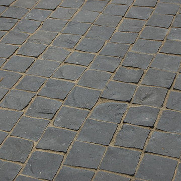
This is one our longest running projects, developed in phases over ten years. Cobblestone driveway, old world craftsmanship, one of a kind elements.
Inspiration for a large timeless backyard patio remodel in Baltimore with no cover
Inspiration for a large timeless backyard patio remodel in Baltimore with no cover
9