
Search results for "Attorney client relationship" in Home Design Ideas
 Twelve Stones Designs, LLC
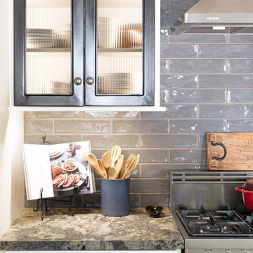
The owners of this kitchen had spent the money to upgrade the finishes in their kitchen upon building the home 12 years ago, but after living in the space for several years they realized how nonfunctional the layout really was. The (then) two preschool aged children had grown into busy, hungry teenagers with many friends who also liked to hang out at the house. So the family needed a more functional kitchen with better traffic flow, space for daily activities revolving around the kitchen at different times of day, and a kitchen that could accommodate cooking for and serving large groups. Furthermore, the dark, traditional finishes no longer reflected the homeowners’ style. They requested a brighter, more relaxed, coastal style that reflected their love of the seaside cities they like to visit.
Originally, the kitchen was U-shaped with a narrow island in the middle. The island created narrow aisles that bottle-necked at the dishwasher, refrigerator, and cooktop areas. There was a pass-through from the foyer into the kitchen, but the owners never liked that the pass-through was also located so close to the powder room. The awkward proximity was unappealing and made guests feel uncomfortable.
The kitchen’s storage was made up of lots of narrow cabinets, apothecary drawers, clipped corner units, and very few drawers. It lacked useful storage for the larger items the family used on a daily basis. And the kitchen’s only pantry was small closet that had only builder-grade, narrow shelving with no illumination to be able to see the contents inside.
Overall, the kitchen’s lighting plan was poorly executed. Only six recessed cans illuminated the entire kitchen and nook areas. The under cabinet lighting was not evenly distributed either. In fact, the builder had mis-placed the under cabinet lighting around the decorative pilasters which made for choppy, dark cubbies. Further, the builder didn’t include any lighting over the sink or the bar area, which meant whoever was doing the dishes was always in their own shadow. That, coupled with the steep overhang of the game room above made the bar area feel like a dim, cavernous space that wasn’t inviting or task oriented. The kitchen looked out into the main living space, but the raised bar and a narrow wall (which held the only large cabinet in the kitchen) created more of a barrier than a relationship to the living room or breakfast nook. In fact, one couldn’t even see the breakfast nook from the cooktop or sink areas due to its orientation. The raised bar top was too narrow to comfortably sit to either dine at or chat from due to the lack of knee space. The the homeowners confided that the kitchen felt more like a dark, dirty prison than place where the family, or their guests, wanted to gather and commune.
The clients' needs and desires were:
➢ to create a kitchen that would be a space the family loved to be in; to relate to the adjacent spaces all around, and to have better flow for entertaining large groups
➢ to remove the walls between the breakfast nook and living area and to be able to utilize the natural light from the windows in both those areas
➢ to incorporate a functional chopping block for prepping fresh food for home cooked meals, an island with a large sink and drain board, 2 pull out trash cans, and seating for at least the 2 teens to eat or do homework
➢ to design a kitchen and breakfast nook with an airy, coastal, relaxed vibe that blended with the rest of the house's coastal theme
➢ to integrate a layered lighting plan which would include ample general illumination, specific task lighting, decorative lighting, and lots of illuminated storage
➢ to design a kitchen with not only more storage for all the husband’s kitchen gadgets and collection of oils and spices, but smart storage, including a coffee/breakfast bar and a place to store and conceal the toaster oven and microwave
➢ to find a way to utilize the large open space between the kitchen, pantry area, and breakfast nook
Twelve Stones Designs achieved the owner's goals by:
➢ removing the walls between the kitchen and living room to allow the natural light to filter in from the adjacent rooms and to create a connection between the kitchen, nook, and living spaces for a sense of unity and communion
➢ removing the existing pantry and designing 3 large pantry style cabinets with LED tape lights and rollout drawers to house lots of kitchen appliances, gadgets, and tons of groceries. We also took the cabinets all the way up to the 9’ ceiling for additional storage for seasonal items and bulk storage.
➢ designing 2 islands - 1 with a gorgeous black walnut chopping block that houses a drawer for chopping and carving knives and a custom double pull out trash unit for point of use utilization - and 1 that houses the dishwasher, a large Blanco Gourmet sink with integrated drain board, woven baskets for fresh root vegetables and kitchen towels, plenty of drawer storage for kitchen items, and bar seating for up to 4 diners.
➢ closing off the space between the kitchen and the powder room to create a beautiful new private alcove for the powder room as well as adding some decorative storage. This also gave us space to include more tall storage near the new range for precision placement of the husband’s extensive oil and spice collection as well as a location for a combo-steam oven the wife wanted for baking and cooking healthy meals.
The project is enhanced functionally by:
➢ incorporated USB and standard receptacles for the kids’ laptops and phone charging in the large island
➢ designing the small island to include additional open shelving for items used on a daily basis such as a variety of bowls, plates, and colanders. This set up also works well for the husband who prefers to “plate” his dinners in restaurant-style fashion before presenting them to the table.
➢ the integration of specific storage units, such as double stacked cutlery drawers, a custom spice pull-out, a Kuerig coffee and tea pod drawer, and custom double stacked utensil drawers
➢ moving the refrigerator to the old oven location - this eliminated the bottle neck as well as created a better relationship to the eating table. It also utilizes the floor space between the pantry, nook, and kitchen
➢ creating a banquet style breakfast nook - this banquette seating not only doubles the amount of seating for large gatherings but it better utilizes the odd space between the kitchen and the previous nook area. It also helps to create a distinct pathway from the mudroom room through the pantry area, kitchen, nook, and living room.
➢ the coffee/breakfast bar area which includes the perfect location for the concealed microwave and toaster oven, convenient storage for the coffee pods and tea accoutrements. Roll-out drawers below also house the smoothie maker, hot water kettle, and a plethora of smoothie-making ingredients such as protein powders, smoothie additives, etc. Furthermore, the drawers below the Keurig house measuring utensil, cutlery, baking supplies and tupperware storage.
➢ incorporating lots of wide drawers and pullouts to accommodate large cookware.
➢ utilizing as much vertical space as possible by building storage to the ceiling which accommodates the family’s abundant amount of serving platters, baking sheets, bakeware, casserole dishes, and additional cutting boards.
The project is enhanced aesthetically by:
➢ new 5-piece Versailles pattern porcelain tile that now seamlessly joins the entire down stairs area together creating a bright, cohesiveness feeling instead of choppy separated spaces - it also adds a coastal feeling
➢ designing a cabinet to conceal the microwave and toaster oven
➢ the coastal influenced light fixtures over the nook table and island
➢ the sandy colors of the Langdon Cambria countertops. The swirling pattern and sparkling quartz pieces remind the homeowner of black-and-tan sandy beaches
➢ the striped banquet seating whose creamy white background and blue-green stripes were the inspiration for the cabinet and wall colors.
➢ All the interior doors were painted black to coordinate with the blacks and grays in the backsplash tile and countertop. This also adds a hint of tailored formality to an otherwise casual space.
➢ the use of WAC's Oculux small aperture LED units for the overhead lighting complimented with Diode LED strips for task lighting under the cabinets and inside the pantry and glass wall cabinets. All of the lighting applications are on separate dimmer switches.
Innovative uses of materials or construction methods by Realty Restoration LLC:
➢ Each 1-1/2” x 3” block of reclaimed end-grain black walnut that makes up the center island chopping block was hand milled and built in the shop. It was designed to look substantial and proportional to the surrounding elements, executed by creating the 4 inch tall top with a solid wood chamfered edge band.
➢ The metal doors on either side of the vent hood were also custom designed for this project and built in the Realty Restoration LLC shop. They are made 1x2, 11-gauge mild steel with ribbed glass. Weighing 60 lbs a piece, heavy duty cabinet hinges were added to support the weight of the door and keep them from sagging.
➢ Under-cabinet receptacles were added along the range wall in order to have a clean, uninterrupted backsplash.
Design obstacles to overcome:
➢ Because we were removing the demising walls between the kitchen and living room, we had to find a way to plumb and vent the new island. We did this by tunneling through the slab (the slab had post tension cables which prevented us from just trenching) to run a new wet vent through a nearby structural wall. We pulled the existing hot and cold lines between upper floor joists and ran them down the structural wall as well and up through a conduit in the tunnel.
➢ Since we were converting from wall overs to a gas range it allowed us to utilize the 220 feed for the wall ovens to provide a new sub panel for all the new kitchen circuits
➢ Due to framing deficiencies inherited from the original build there was a 1-1/2” differential in the floor-to-ceiling height over a 20 foot span; by utilizing the process of cutting and furring coupled with the crown moulding details on the cabinet elevations we were able to mask the problem and provide seamless transitions between the cabinet components.
Evidence of superior craftsmanship:
➢ uniquely designed, one-of-a-kind metal “X” end panels on the large island. The end panels were custom made in the Realty Restoration LLC shop and fitted to the exact dimensions of the island. The welding seams are completely indistinguishable - the posts look like they are cut from a single sheet of metal
➢ square metal posts on the small island were also custom made and designed to compliment and carry through the metal element s throughout the kitchen
➢ the beautiful, oversized end panels on the pantry cabinets which give the breakfast nook a tailored look
➢ integrating a large format 5 piece Versailles tile pattern to seamlessly flow from the existing spaces into the new kitchen space
➢ By constructing a custom cabinet that jogged around a corner we could not remodel (housing the entry way coat closet) we were able to camouflage the adjacent wall offset within the upper and lower cabinets. By designing around the existing jog in the structural walls we accomplished a few things: we were able to find the space to house, and hide, the microwave and toaster oven yet still have a clean cohesive appearance from the kitchen side. Additionally, the owners were able to keep their much needed coat closet and we didn’t have to increase the budget with unnecessary structural work.

 STUDIO TASHIMA
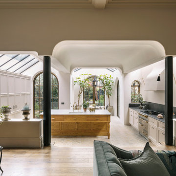
Keyes Road is a two-storey, semi-detached red brick house dating to around 1890-1910. The focus of our work was on the ground floor where we were asked to improve the layout and use of the main living areas of the house, for an active family of four. Important to the design was to maximise the quality and amount of light as well as connection to the garden and flow to the rest of the house.
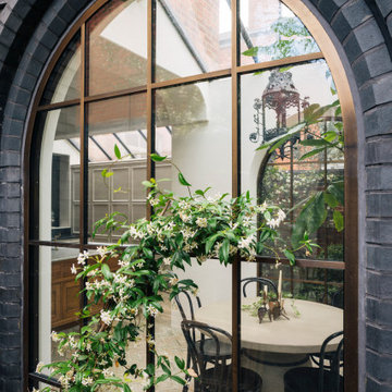
Our proposal introduces three single storey extensions, comprising a central, large space that extends the main outrigger of the house. To each side are smaller volumes, affording a full width kitchen. While defining a series of discrete volumes, it was important for us to ensure that the kitchen, living, family and dining rooms that are interconnecting and continuous. The result is a big space punctuated by a series of differently sized arches, defining spaces to ensure their intimacy.
It was important for our client to have a sense of warmth and comfort - perhaps not dissimilar to the qualities of a hotel lobby. The colour scheme of the rooms are warm white painted plaster, natural wood flooring with black, bronze and brass accents. Indirect and carefully placed light fittings pulls together the atmosphere of the rooms - particularly in the evenings.
Externally, we felt it important to differentiate the extensions from the main house by using a dark, charcoal grey brick. This sets up a contrasting yet complimentary relationship to the rich red coloured brick house. The facets of the brick play with light and depth as do the graduated brick arches.
During the design process, we grappled with floor levels, the direction of sunlight, and care to not encroach on the neighbouring properties. As the house is in a conservation area, we worked closely with our trusted planning advisor. Throughout, we pursued a sensitive design strategy, using pitched roofs, matching materials and careful detailing. Internally, many of the original details are intact. This has enabled us to create an eclectic ensemble of elements, colours and materials varying in age and period.
Find the right local pro for your project

 Cantoni Irvine
Designed By: Sarah Buehlman
Marc and Mandy Maister were clients and fans of Cantoni before they purchased this harbor home on Balboa Island. The South African natives originally met designer Sarah Buehlman and Cantoni’s Founder and CEO Michael Wilkov at a storewide sale, and quickly established a relationship as they bought furnishings for their primary residence in Newport Beach.
So, when the couple decided to invest in this gorgeous second home, in one of the ritziest enclaves in North America, they sought Sarah’s help in transforming the outdated 1960’s residence into a modern marvel. “It’s now the ultimate beach house,” says Sarah, “and finished in Cantoni from top to bottom—including new custom cabinetry installed throughout.”
But let’s back up. This project began when Mandy contacted Sarah in the midst of the remodel process (in December 2010), asking if she could come take a look and help with the overall design.
“The plans were being drawn up with an architect, and they opted not to move anything major. Instead, they updated everything—as in the small carpeted staircase that became a gorgeous glass and metal sculpture,” Sarah explains. She took photographs and measurements, and then set to work creating the scaled renderings. “Marc and Mandy were drawn to the One and Only Collection. It features a high-gloss brown and white color scheme which served as inspiration for the project,” says Sarah.
Primary pieces in the expansive living area include the Mondrian leather sectional, the Involution sculpture, and a pair of Vladimir Kagan Corkscrew swivel chairs. The Maisters needed a place to house all their electronics but didn’t want a typical entertainment center. The One and Only buffet was actually modified by our skilled shop technicians, in our distribution center, so it could accommodate all the couple’s media equipment. “These artisans are another one of our hidden strengths—in addition to the design tools, inventory and extensive resources we have to get a job done,” adds Sarah. Marc and Mandy also fell in love with the exotic Makassar ebony wood in the Ritz Collection, which Sarah combined in the master bedroom with the Ravenna double chaise to provide an extra place to sit and enjoy the beautiful harbor views.
Beyond new furnishings, the Maisters also decided to completely redo their kitchen. And though Marc and Mandy did not have a chance to actually see our kitchen displays, having worked with Sarah over the years, they had immense trust in our commitment to craftsmanship and quality. In fact, they opted for new cabinetry in four bathrooms as well as the laundry room based on our 3D renderings and lacquer samples alone—without ever opening a drawer. “Their trust in my expertise and Cantoni’s reputation were a major deciding factor,” says Sarah.
This plush second home, complete with a private boat dock right out back, counts as one of Sarah’s proudest accomplishments. “These long-time clients are great. They love Cantoni and appreciate high quality Italian furnishings in particular. The home is so gorgeous that once you are inside and open the Nano doors, you simply don’t want to leave.” The job took almost two years to complete, but everyone seems quite happy with the results, proving that large or small—and in cases necessitating a quick turnaround or execution of a long-term vision—Cantoni has the resources to come through for all clients.
 STUDIO TASHIMA
Keyes Road is a two-storey, semi-detached red brick house dating to around 1890-1910. The focus of our work was on the ground floor where we were asked to improve the layout and use of the main living areas of the house, for an active family of four. Important to the design was to maximise the quality and amount of light as well as connection to the garden and flow to the rest of the house.
Our proposal introduces three single storey extensions, comprising a central, large space that extends the main outrigger of the house. To each side are smaller volumes, affording a full width kitchen. While defining a series of discrete volumes, it was important for us to ensure that the kitchen, living, family and dining rooms that are interconnecting and continuous. The result is a big space punctuated by a series of differently sized arches, defining spaces to ensure their intimacy.
It was important for our client to have a sense of warmth and comfort - perhaps not dissimilar to the qualities of a hotel lobby. The colour scheme of the rooms are warm white painted plaster, natural wood flooring with black, bronze and brass accents. Indirect and carefully placed light fittings pulls together the atmosphere of the rooms - particularly in the evenings.
Externally, we felt it important to differentiate the extensions from the main house by using a dark, charcoal grey brick. This sets up a contrasting yet complimentary relationship to the rich red coloured brick house. The facets of the brick play with light and depth as do the graduated brick arches.
During the design process, we grappled with floor levels, the direction of sunlight, and care to not encroach on the neighbouring properties. As the house is in a conservation area, we worked closely with our trusted planning advisor. Throughout, we pursued a sensitive design strategy, using pitched roofs, matching materials and careful detailing. Internally, many of the original details are intact. This has enabled us to create an eclectic ensemble of elements, colours and materials varying in age and period.
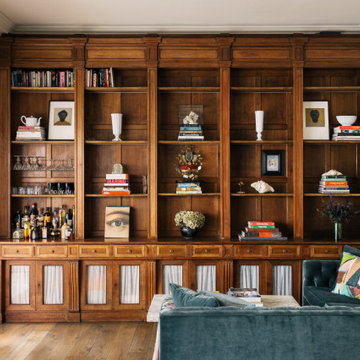 STUDIO TASHIMA
Keyes Road is a two-storey, semi-detached red brick house dating to around 1890-1910. The focus of our work was on the ground floor where we were asked to improve the layout and use of the main living areas of the house, for an active family of four. Important to the design was to maximise the quality and amount of light as well as connection to the garden and flow to the rest of the house.
Our proposal introduces three single storey extensions, comprising a central, large space that extends the main outrigger of the house. To each side are smaller volumes, affording a full width kitchen. While defining a series of discrete volumes, it was important for us to ensure that the kitchen, living, family and dining rooms that are interconnecting and continuous. The result is a big space punctuated by a series of differently sized arches, defining spaces to ensure their intimacy.
It was important for our client to have a sense of warmth and comfort - perhaps not dissimilar to the qualities of a hotel lobby. The colour scheme of the rooms are warm white painted plaster, natural wood flooring with black, bronze and brass accents. Indirect and carefully placed light fittings pulls together the atmosphere of the rooms - particularly in the evenings.
Externally, we felt it important to differentiate the extensions from the main house by using a dark, charcoal grey brick. This sets up a contrasting yet complimentary relationship to the rich red coloured brick house. The facets of the brick play with light and depth as do the graduated brick arches.
During the design process, we grappled with floor levels, the direction of sunlight, and care to not encroach on the neighbouring properties. As the house is in a conservation area, we worked closely with our trusted planning advisor. Throughout, we pursued a sensitive design strategy, using pitched roofs, matching materials and careful detailing. Internally, many of the original details are intact. This has enabled us to create an eclectic ensemble of elements, colours and materials varying in age and period.
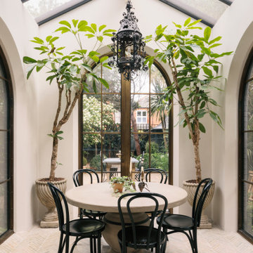 STUDIO TASHIMA
Keyes Road is a two-storey, semi-detached red brick house dating to around 1890-1910. The focus of our work was on the ground floor where we were asked to improve the layout and use of the main living areas of the house, for an active family of four. Important to the design was to maximise the quality and amount of light as well as connection to the garden and flow to the rest of the house.
Our proposal introduces three single storey extensions, comprising a central, large space that extends the main outrigger of the house. To each side are smaller volumes, affording a full width kitchen. While defining a series of discrete volumes, it was important for us to ensure that the kitchen, living, family and dining rooms that are interconnecting and continuous. The result is a big space punctuated by a series of differently sized arches, defining spaces to ensure their intimacy.
It was important for our client to have a sense of warmth and comfort - perhaps not dissimilar to the qualities of a hotel lobby. The colour scheme of the rooms are warm white painted plaster, natural wood flooring with black, bronze and brass accents. Indirect and carefully placed light fittings pulls together the atmosphere of the rooms - particularly in the evenings.
Externally, we felt it important to differentiate the extensions from the main house by using a dark, charcoal grey brick. This sets up a contrasting yet complimentary relationship to the rich red coloured brick house. The facets of the brick play with light and depth as do the graduated brick arches.
During the design process, we grappled with floor levels, the direction of sunlight, and care to not encroach on the neighbouring properties. As the house is in a conservation area, we worked closely with our trusted planning advisor. Throughout, we pursued a sensitive design strategy, using pitched roofs, matching materials and careful detailing. Internally, many of the original details are intact. This has enabled us to create an eclectic ensemble of elements, colours and materials varying in age and period.
Sponsored
Columbus, OH

Snider & Metcalf Interior Design, LTD
Leading Interior Designers in Columbus, Ohio & Ponte Vedra, Florida
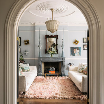 STUDIO TASHIMA
Keyes Road is a two-storey, semi-detached red brick house dating to around 1890-1910. The focus of our work was on the ground floor where we were asked to improve the layout and use of the main living areas of the house, for an active family of four. Important to the design was to maximise the quality and amount of light as well as connection to the garden and flow to the rest of the house.
Our proposal introduces three single storey extensions, comprising a central, large space that extends the main outrigger of the house. To each side are smaller volumes, affording a full width kitchen. While defining a series of discrete volumes, it was important for us to ensure that the kitchen, living, family and dining rooms that are interconnecting and continuous. The result is a big space punctuated by a series of differently sized arches, defining spaces to ensure their intimacy.
It was important for our client to have a sense of warmth and comfort - perhaps not dissimilar to the qualities of a hotel lobby. The colour scheme of the rooms are warm white painted plaster, natural wood flooring with black, bronze and brass accents. Indirect and carefully placed light fittings pulls together the atmosphere of the rooms - particularly in the evenings.
Externally, we felt it important to differentiate the extensions from the main house by using a dark, charcoal grey brick. This sets up a contrasting yet complimentary relationship to the rich red coloured brick house. The facets of the brick play with light and depth as do the graduated brick arches.
During the design process, we grappled with floor levels, the direction of sunlight, and care to not encroach on the neighbouring properties. As the house is in a conservation area, we worked closely with our trusted planning advisor. Throughout, we pursued a sensitive design strategy, using pitched roofs, matching materials and careful detailing. Internally, many of the original details are intact. This has enabled us to create an eclectic ensemble of elements, colours and materials varying in age and period.
 Cantoni Irvine
Designed By: Sarah Buehlman
Marc and Mandy Maister were clients and fans of Cantoni before they purchased this harbor home on Balboa Island. The South African natives originally met designer Sarah Buehlman and Cantoni’s Founder and CEO Michael Wilkov at a storewide sale, and quickly established a relationship as they bought furnishings for their primary residence in Newport Beach.
So, when the couple decided to invest in this gorgeous second home, in one of the ritziest enclaves in North America, they sought Sarah’s help in transforming the outdated 1960’s residence into a modern marvel. “It’s now the ultimate beach house,” says Sarah, “and finished in Cantoni from top to bottom—including new custom cabinetry installed throughout.”
But let’s back up. This project began when Mandy contacted Sarah in the midst of the remodel process (in December 2010), asking if she could come take a look and help with the overall design.
“The plans were being drawn up with an architect, and they opted not to move anything major. Instead, they updated everything—as in the small carpeted staircase that became a gorgeous glass and metal sculpture,” Sarah explains. She took photographs and measurements, and then set to work creating the scaled renderings. “Marc and Mandy were drawn to the One and Only Collection. It features a high-gloss brown and white color scheme which served as inspiration for the project,” says Sarah.
Primary pieces in the expansive living area include the Mondrian leather sectional, the Involution sculpture, and a pair of Vladimir Kagan Corkscrew swivel chairs. The Maisters needed a place to house all their electronics but didn’t want a typical entertainment center. The One and Only buffet was actually modified by our skilled shop technicians, in our distribution center, so it could accommodate all the couple’s media equipment. “These artisans are another one of our hidden strengths—in addition to the design tools, inventory and extensive resources we have to get a job done,” adds Sarah. Marc and Mandy also fell in love with the exotic Makassar ebony wood in the Ritz Collection, which Sarah combined in the master bedroom with the Ravenna double chaise to provide an extra place to sit and enjoy the beautiful harbor views.
Beyond new furnishings, the Maisters also decided to completely redo their kitchen. And though Marc and Mandy did not have a chance to actually see our kitchen displays, having worked with Sarah over the years, they had immense trust in our commitment to craftsmanship and quality. In fact, they opted for new cabinetry in four bathrooms as well as the laundry room based on our 3D renderings and lacquer samples alone—without ever opening a drawer. “Their trust in my expertise and Cantoni’s reputation were a major deciding factor,” says Sarah.
This plush second home, complete with a private boat dock right out back, counts as one of Sarah’s proudest accomplishments. “These long-time clients are great. They love Cantoni and appreciate high quality Italian furnishings in particular. The home is so gorgeous that once you are inside and open the Nano doors, you simply don’t want to leave.” The job took almost two years to complete, but everyone seems quite happy with the results, proving that large or small—and in cases necessitating a quick turnaround or execution of a long-term vision—Cantoni has the resources to come through for all clients.
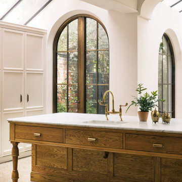 STUDIO TASHIMA
Keyes Road is a two-storey, semi-detached red brick house dating to around 1890-1910. The focus of our work was on the ground floor where we were asked to improve the layout and use of the main living areas of the house, for an active family of four. Important to the design was to maximise the quality and amount of light as well as connection to the garden and flow to the rest of the house.
Our proposal introduces three single storey extensions, comprising a central, large space that extends the main outrigger of the house. To each side are smaller volumes, affording a full width kitchen. While defining a series of discrete volumes, it was important for us to ensure that the kitchen, living, family and dining rooms that are interconnecting and continuous. The result is a big space punctuated by a series of differently sized arches, defining spaces to ensure their intimacy.
It was important for our client to have a sense of warmth and comfort - perhaps not dissimilar to the qualities of a hotel lobby. The colour scheme of the rooms are warm white painted plaster, natural wood flooring with black, bronze and brass accents. Indirect and carefully placed light fittings pulls together the atmosphere of the rooms - particularly in the evenings.
Externally, we felt it important to differentiate the extensions from the main house by using a dark, charcoal grey brick. This sets up a contrasting yet complimentary relationship to the rich red coloured brick house. The facets of the brick play with light and depth as do the graduated brick arches.
During the design process, we grappled with floor levels, the direction of sunlight, and care to not encroach on the neighbouring properties. As the house is in a conservation area, we worked closely with our trusted planning advisor. Throughout, we pursued a sensitive design strategy, using pitched roofs, matching materials and careful detailing. Internally, many of the original details are intact. This has enabled us to create an eclectic ensemble of elements, colours and materials varying in age and period.
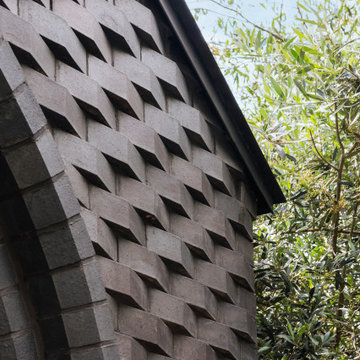 STUDIO TASHIMA
Keyes Road is a two-storey, semi-detached red brick house dating to around 1890-1910. The focus of our work was on the ground floor where we were asked to improve the layout and use of the main living areas of the house, for an active family of four. Important to the design was to maximise the quality and amount of light as well as connection to the garden and flow to the rest of the house.
Our proposal introduces three single storey extensions, comprising a central, large space that extends the main outrigger of the house. To each side are smaller volumes, affording a full width kitchen. While defining a series of discrete volumes, it was important for us to ensure that the kitchen, living, family and dining rooms that are interconnecting and continuous. The result is a big space punctuated by a series of differently sized arches, defining spaces to ensure their intimacy.
It was important for our client to have a sense of warmth and comfort - perhaps not dissimilar to the qualities of a hotel lobby. The colour scheme of the rooms are warm white painted plaster, natural wood flooring with black, bronze and brass accents. Indirect and carefully placed light fittings pulls together the atmosphere of the rooms - particularly in the evenings.
Externally, we felt it important to differentiate the extensions from the main house by using a dark, charcoal grey brick. This sets up a contrasting yet complimentary relationship to the rich red coloured brick house. The facets of the brick play with light and depth as do the graduated brick arches.
During the design process, we grappled with floor levels, the direction of sunlight, and care to not encroach on the neighbouring properties. As the house is in a conservation area, we worked closely with our trusted planning advisor. Throughout, we pursued a sensitive design strategy, using pitched roofs, matching materials and careful detailing. Internally, many of the original details are intact. This has enabled us to create an eclectic ensemble of elements, colours and materials varying in age and period.
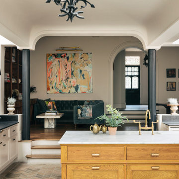 STUDIO TASHIMA
Keyes Road is a two-storey, semi-detached red brick house dating to around 1890-1910. The focus of our work was on the ground floor where we were asked to improve the layout and use of the main living areas of the house, for an active family of four. Important to the design was to maximise the quality and amount of light as well as connection to the garden and flow to the rest of the house.
Our proposal introduces three single storey extensions, comprising a central, large space that extends the main outrigger of the house. To each side are smaller volumes, affording a full width kitchen. While defining a series of discrete volumes, it was important for us to ensure that the kitchen, living, family and dining rooms that are interconnecting and continuous. The result is a big space punctuated by a series of differently sized arches, defining spaces to ensure their intimacy.
It was important for our client to have a sense of warmth and comfort - perhaps not dissimilar to the qualities of a hotel lobby. The colour scheme of the rooms are warm white painted plaster, natural wood flooring with black, bronze and brass accents. Indirect and carefully placed light fittings pulls together the atmosphere of the rooms - particularly in the evenings.
Externally, we felt it important to differentiate the extensions from the main house by using a dark, charcoal grey brick. This sets up a contrasting yet complimentary relationship to the rich red coloured brick house. The facets of the brick play with light and depth as do the graduated brick arches.
During the design process, we grappled with floor levels, the direction of sunlight, and care to not encroach on the neighbouring properties. As the house is in a conservation area, we worked closely with our trusted planning advisor. Throughout, we pursued a sensitive design strategy, using pitched roofs, matching materials and careful detailing. Internally, many of the original details are intact. This has enabled us to create an eclectic ensemble of elements, colours and materials varying in age and period.
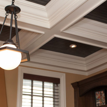
 MILLER + MILLER Architectural Photography
Globe pendant light fixture on two toned white painted and dark walnut bead board wood coffered ceiling.
Custom Home Builder and General Contractor for this Home:
Leinster Construction, Inc., Chicago, IL
www.leinsterconstruction.com
Miller + Miller Architectural Photography
Sponsored
Columbus, OH

Wannemacher Interiors
Customized Award-Winning Interior Design Solutions in Franklin Cnty OH
 Cantoni Irvine
Designed By: Sarah Buehlman
Marc and Mandy Maister were clients and fans of Cantoni before they purchased this harbor home on Balboa Island. The South African natives originally met designer Sarah Buehlman and Cantoni’s Founder and CEO Michael Wilkov at a storewide sale, and quickly established a relationship as they bought furnishings for their primary residence in Newport Beach.
So, when the couple decided to invest in this gorgeous second home, in one of the ritziest enclaves in North America, they sought Sarah’s help in transforming the outdated 1960’s residence into a modern marvel. “It’s now the ultimate beach house,” says Sarah, “and finished in Cantoni from top to bottom—including new custom cabinetry installed throughout.”
But let’s back up. This project began when Mandy contacted Sarah in the midst of the remodel process (in December 2010), asking if she could come take a look and help with the overall design.
“The plans were being drawn up with an architect, and they opted not to move anything major. Instead, they updated everything—as in the small carpeted staircase that became a gorgeous glass and metal sculpture,” Sarah explains. She took photographs and measurements, and then set to work creating the scaled renderings. “Marc and Mandy were drawn to the One and Only Collection. It features a high-gloss brown and white color scheme which served as inspiration for the project,” says Sarah.
Primary pieces in the expansive living area include the Mondrian leather sectional, the Involution sculpture, and a pair of Vladimir Kagan Corkscrew swivel chairs. The Maisters needed a place to house all their electronics but didn’t want a typical entertainment center. The One and Only buffet was actually modified by our skilled shop technicians, in our distribution center, so it could accommodate all the couple’s media equipment. “These artisans are another one of our hidden strengths—in addition to the design tools, inventory and extensive resources we have to get a job done,” adds Sarah. Marc and Mandy also fell in love with the exotic Makassar ebony wood in the Ritz Collection, which Sarah combined in the master bedroom with the Ravenna double chaise to provide an extra place to sit and enjoy the beautiful harbor views.
Beyond new furnishings, the Maisters also decided to completely redo their kitchen. And though Marc and Mandy did not have a chance to actually see our kitchen displays, having worked with Sarah over the years, they had immense trust in our commitment to craftsmanship and quality. In fact, they opted for new cabinetry in four bathrooms as well as the laundry room based on our 3D renderings and lacquer samples alone—without ever opening a drawer. “Their trust in my expertise and Cantoni’s reputation were a major deciding factor,” says Sarah.
This plush second home, complete with a private boat dock right out back, counts as one of Sarah’s proudest accomplishments. “These long-time clients are great. They love Cantoni and appreciate high quality Italian furnishings in particular. The home is so gorgeous that once you are inside and open the Nano doors, you simply don’t want to leave.” The job took almost two years to complete, but everyone seems quite happy with the results, proving that large or small—and in cases necessitating a quick turnaround or execution of a long-term vision—Cantoni has the resources to come through for all clients.
 Cantoni Irvine
Designed By: Sarah Buehlman
Marc and Mandy Maister were clients and fans of Cantoni before they purchased this harbor home on Balboa Island. The South African natives originally met designer Sarah Buehlman and Cantoni’s Founder and CEO Michael Wilkov at a storewide sale, and quickly established a relationship as they bought furnishings for their primary residence in Newport Beach.
So, when the couple decided to invest in this gorgeous second home, in one of the ritziest enclaves in North America, they sought Sarah’s help in transforming the outdated 1960’s residence into a modern marvel. “It’s now the ultimate beach house,” says Sarah, “and finished in Cantoni from top to bottom—including new custom cabinetry installed throughout.”
But let’s back up. This project began when Mandy contacted Sarah in the midst of the remodel process (in December 2010), asking if she could come take a look and help with the overall design.
“The plans were being drawn up with an architect, and they opted not to move anything major. Instead, they updated everything—as in the small carpeted staircase that became a gorgeous glass and metal sculpture,” Sarah explains. She took photographs and measurements, and then set to work creating the scaled renderings. “Marc and Mandy were drawn to the One and Only Collection. It features a high-gloss brown and white color scheme which served as inspiration for the project,” says Sarah.
Primary pieces in the expansive living area include the Mondrian leather sectional, the Involution sculpture, and a pair of Vladimir Kagan Corkscrew swivel chairs. The Maisters needed a place to house all their electronics but didn’t want a typical entertainment center. The One and Only buffet was actually modified by our skilled shop technicians, in our distribution center, so it could accommodate all the couple’s media equipment. “These artisans are another one of our hidden strengths—in addition to the design tools, inventory and extensive resources we have to get a job done,” adds Sarah. Marc and Mandy also fell in love with the exotic Makassar ebony wood in the Ritz Collection, which Sarah combined in the master bedroom with the Ravenna double chaise to provide an extra place to sit and enjoy the beautiful harbor views.
Beyond new furnishings, the Maisters also decided to completely redo their kitchen. And though Marc and Mandy did not have a chance to actually see our kitchen displays, having worked with Sarah over the years, they had immense trust in our commitment to craftsmanship and quality. In fact, they opted for new cabinetry in four bathrooms as well as the laundry room based on our 3D renderings and lacquer samples alone—without ever opening a drawer. “Their trust in my expertise and Cantoni’s reputation were a major deciding factor,” says Sarah.
This plush second home, complete with a private boat dock right out back, counts as one of Sarah’s proudest accomplishments. “These long-time clients are great. They love Cantoni and appreciate high quality Italian furnishings in particular. The home is so gorgeous that once you are inside and open the Nano doors, you simply don’t want to leave.” The job took almost two years to complete, but everyone seems quite happy with the results, proving that large or small—and in cases necessitating a quick turnaround or execution of a long-term vision—Cantoni has the resources to come through for all clients.

 ODS Architecture
Atherton has many large substantial homes - our clients purchased an existing home on a one acre flag-shaped lot and asked us to design a new dream home for them. The result is a new 7,000 square foot four-building complex consisting of the main house, six-car garage with two car lifts, pool house with a full one bedroom residence inside, and a separate home office /work out gym studio building. A fifty-foot swimming pool was also created with fully landscaped yards.
Given the rectangular shape of the lot, it was decided to angle the house to incoming visitors slightly so as to more dramatically present itself. The house became a classic u-shaped home but Feng Shui design principals were employed directing the placement of the pool house to better contain the energy flow on the site. The main house entry door is then aligned with a special Japanese red maple at the end of a long visual axis at the rear of the site. These angles and alignments set up everything else about the house design and layout, and views from various rooms allow you to see into virtually every space tracking movements of others in the home.
The residence is simply divided into two wings of public use, kitchen and family room, and the other wing of bedrooms, connected by the living and dining great room. Function drove the exterior form of windows and solid walls with a line of clerestory windows which bring light into the middle of the large home. Extensive sun shadow studies with 3D tree modeling led to the unorthodox placement of the pool to the north of the home, but tree shadow tracking showed this to be the sunniest area during the entire year.
Sustainable measures included a full 7.1kW solar photovoltaic array technically making the house off the grid, and arranged so that no panels are visible from the property. A large 16,000 gallon rainwater catchment system consisting of tanks buried below grade was installed. The home is California GreenPoint rated and also features sealed roof soffits and a sealed crawlspace without the usual venting. A whole house computer automation system with server room was installed as well. Heating and cooling utilize hot water radiant heated concrete and wood floors supplemented by heat pump generated heating and cooling.
A compound of buildings created to form balanced relationships between each other, this home is about circulation, light and a balance of form and function.
Photo by John Sutton Photography.
 Cantoni Irvine
Designed By: Sarah Buehlman
Marc and Mandy Maister were clients and fans of Cantoni before they purchased this harbor home on Balboa Island. The South African natives originally met designer Sarah Buehlman and Cantoni’s Founder and CEO Michael Wilkov at a storewide sale, and quickly established a relationship as they bought furnishings for their primary residence in Newport Beach.
So, when the couple decided to invest in this gorgeous second home, in one of the ritziest enclaves in North America, they sought Sarah’s help in transforming the outdated 1960’s residence into a modern marvel. “It’s now the ultimate beach house,” says Sarah, “and finished in Cantoni from top to bottom—including new custom cabinetry installed throughout.”
But let’s back up. This project began when Mandy contacted Sarah in the midst of the remodel process (in December 2010), asking if she could come take a look and help with the overall design.
“The plans were being drawn up with an architect, and they opted not to move anything major. Instead, they updated everything—as in the small carpeted staircase that became a gorgeous glass and metal sculpture,” Sarah explains. She took photographs and measurements, and then set to work creating the scaled renderings. “Marc and Mandy were drawn to the One and Only Collection. It features a high-gloss brown and white color scheme which served as inspiration for the project,” says Sarah.
Primary pieces in the expansive living area include the Mondrian leather sectional, the Involution sculpture, and a pair of Vladimir Kagan Corkscrew swivel chairs. The Maisters needed a place to house all their electronics but didn’t want a typical entertainment center. The One and Only buffet was actually modified by our skilled shop technicians, in our distribution center, so it could accommodate all the couple’s media equipment. “These artisans are another one of our hidden strengths—in addition to the design tools, inventory and extensive resources we have to get a job done,” adds Sarah. Marc and Mandy also fell in love with the exotic Makassar ebony wood in the Ritz Collection, which Sarah combined in the master bedroom with the Ravenna double chaise to provide an extra place to sit and enjoy the beautiful harbor views.
Beyond new furnishings, the Maisters also decided to completely redo their kitchen. And though Marc and Mandy did not have a chance to actually see our kitchen displays, having worked with Sarah over the years, they had immense trust in our commitment to craftsmanship and quality. In fact, they opted for new cabinetry in four bathrooms as well as the laundry room based on our 3D renderings and lacquer samples alone—without ever opening a drawer. “Their trust in my expertise and Cantoni’s reputation were a major deciding factor,” says Sarah.
This plush second home, complete with a private boat dock right out back, counts as one of Sarah’s proudest accomplishments. “These long-time clients are great. They love Cantoni and appreciate high quality Italian furnishings in particular. The home is so gorgeous that once you are inside and open the Nano doors, you simply don’t want to leave.” The job took almost two years to complete, but everyone seems quite happy with the results, proving that large or small—and in cases necessitating a quick turnaround or execution of a long-term vision—Cantoni has the resources to come through for all clients.
Sponsored
Columbus, OH
Wannemacher Interiors
Customized Award-Winning Interior Design Solutions in Franklin Cnty OH
 Klopf Architecture
The Roger Lee designed house from 1962 was purchased by the current homeowners in almost original condition, as the previous owners elected to defer most maintenance projects over the years. The clients were able to see beyond the dated materials and finishes, single-paned glass and uninsulated walls and they approached Klopf Architecture to help them expand and update the entire home, one the family could settle into and enjoy for years to come. It was important that the new designs were aligned with Lee's original intent not only because of the client's appreciation for mid-century modern architecture, but also because the house was deemed historical. The Stanford Real Estate Office requires a stringent design review which safeguards the integrity of the community, which Klopf Architecture was happy to oblige going into their updated designs.
As with many original mid-century modern homes, the house was scaled to the 1960s lifestyle where rooms were smaller and openings to views were limited and tightly framed. The original conditions defined the direction the family of four would take in updating the house and making it comfortable for their modern lifestyle. Klopf designed a full gut remodel and major addition to bring the house into the 21st century and provide the living area needed for the client's family. The newly expanded house added just about 1,100 sf to create an airy, comfortable and family friendly house, taking full advantage of the beautiful southwestern views that extend out to the hills beyond. The enclosed garage created an additional 240 sf of covered space for long-term storage.
A cracked swimming pool created an eyesore taking up a majority of the backyard landscape, so it was one of the first elements to go during the transformation. Working with Outer Space Landscape Architects, the family asked for a mix of relaxing outdoor patio spaces that eventually blend into the native landscaping, extending their views outward toward the natural greenery of the trees beyond their property. Filling in the old pool was a smart way to expand the living spaces outward. The orientation of the house was designed to enjoy the views, but the original architecture provided the first homeowners with mere glimpses of the landscape outside.
Klopf was able to broaden those views, continuing and extending on the original architecture to take full advantage of the unobstructed natural views across the rear facade of the house. Small horizontal openings in the primary bedroom and office were replaced with much taller windows that now follow the angled roof line upward, extending across almost all of the facade. We worked with Western Windows, whose designs included an oblique-shaped, operable casement that allowed our design to rise with the slope. A new corner office added to the primary suite, offers a bright and functional work-from-home solution that looks out at the distant views and added natural light from the expanded window configuration that now wraps around the corner.
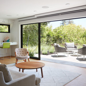
The existing lower level was designed by Lee as a utilitarian space, serving as a wet pool room with a drain in the center of the floor, bathroom, laundry and storage areas. Without the need for a pool room, Klopf was able to convert the area into a much more comfortable and functional living space with a new family room and guest suite. The new spaces enjoy easy access to a new outdoor patio through floor to ceiling, full-width glass sliders.
Continuing along the rear facade, a previously exposed deck extending from the living room and hallway provided access to the backyard through a single set of stairs leading toward the side of the house which made sense when the pool was in place. The new deck was re-envisioned as an extension of the main living room and now serves as a second outdoor living room. A new slatted pergola above provides the homeowners welcome relief from the hot afternoon sun. A second set of stairs now creates a better connection to the redesigned lower level. Klopf was able to reconfigure the spaces, extending the living room outward toward the views, where the family now claims it as the heart of the home, spending a large majority of their time outdoors.
Back inside, the original wood-burning Malm fireplace was beautifully restored and a gas burner installed to comply with California's strict air standards. It now rests in front of a wall of Heath accent tiles where a dated red brick wall used to stand. A new taller window brings more light and views into the refreshed interior living room. The original glass doors opposite the fireplace were replaced by larger sliders that when fully opened, create a seamless transition to the new outdoor living area so the two spaces feel like one connected space. The original utilitarian kitchen was needlessly tucked into the far back corner and closed-off, out of sight from the living room, so the clients asked Klopf to open it up and expand the kitchen forward so it felt more connected. Today the much larger kitchen is connected to the living area where a short wall with a cutout offers a visual glimpse into the kitchen and a handy pass-through counter for serving guests. A new breakfast nook was also added to create another spot where the family can gather for casual meals. Just outside, a new built-in outdoor grill and prep area extends the kitchen outside and connects to a new outdoor dining spot nestled amongst the trees, taking advantage of the views out back.
Klopf was able to expand the other two bedrooms, add a new laundry room and half-bath and convert the carport to an enclosed garage to add more storage areas which was lost when the pool house was converted to the family and guest room.
To maintain a historical connection to the original designs, the exterior siding was repeated on all exterior walls, a full-height stained glass window at the front entryway restored, and an interior slatted screen element repeated outside at the exterior entry courtyard and over the new outdoor living room to create a shade trellis. The new house stands proudly and shines against it's new landscaping features, while respecting and expanding on the original intent of Roger Lee's designs epitomizing the comforts of indoor-outdoor living in Northern California.
Completion year: 2020
Klopf Architecture project team: John Klopf, Klara Kevane, Noel Andrade
Contractor: ORB Construction, Brendan O'Reilly
Structural engineer: Sezen and Moon
Landscape architect: Outer space
Furnishings and decoration: Urbanism Designs
Photographer: Mariko Reed
 STUDIO TASHIMA
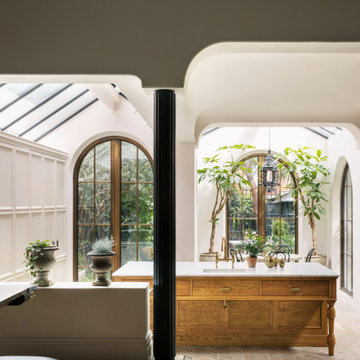
Keyes Road is a two-storey, semi-detached red brick house dating to around 1890-1910. The focus of our work was on the ground floor where we were asked to improve the layout and use of the main living areas of the house, for an active family of four. Important to the design was to maximise the quality and amount of light as well as connection to the garden and flow to the rest of the house.
Our proposal introduces three single storey extensions, comprising a central, large space that extends the main outrigger of the house. To each side are smaller volumes, affording a full width kitchen. While defining a series of discrete volumes, it was important for us to ensure that the kitchen, living, family and dining rooms that are interconnecting and continuous. The result is a big space punctuated by a series of differently sized arches, defining spaces to ensure their intimacy.
It was important for our client to have a sense of warmth and comfort - perhaps not dissimilar to the qualities of a hotel lobby. The colour scheme of the rooms are warm white painted plaster, natural wood flooring with black, bronze and brass accents. Indirect and carefully placed light fittings pulls together the atmosphere of the rooms - particularly in the evenings.
Externally, we felt it important to differentiate the extensions from the main house by using a dark, charcoal grey brick. This sets up a contrasting yet complimentary relationship to the rich red coloured brick house. The facets of the brick play with light and depth as do the graduated brick arches.
During the design process, we grappled with floor levels, the direction of sunlight, and care to not encroach on the neighbouring properties. As the house is in a conservation area, we worked closely with our trusted planning advisor. Throughout, we pursued a sensitive design strategy, using pitched roofs, matching materials and careful detailing. Internally, many of the original details are intact. This has enabled us to create an eclectic ensemble of elements, colours and materials varying in age and period.
 Cantoni Irvine
Designed By: Sarah Buehlman
Marc and Mandy Maister were clients and fans of Cantoni before they purchased this harbor home on Balboa Island. The South African natives originally met designer Sarah Buehlman and Cantoni’s Founder and CEO Michael Wilkov at a storewide sale, and quickly established a relationship as they bought furnishings for their primary residence in Newport Beach.
So, when the couple decided to invest in this gorgeous second home, in one of the ritziest enclaves in North America, they sought Sarah’s help in transforming the outdated 1960’s residence into a modern marvel. “It’s now the ultimate beach house,” says Sarah, “and finished in Cantoni from top to bottom—including new custom cabinetry installed throughout.”
But let’s back up. This project began when Mandy contacted Sarah in the midst of the remodel process (in December 2010), asking if she could come take a look and help with the overall design.
“The plans were being drawn up with an architect, and they opted not to move anything major. Instead, they updated everything—as in the small carpeted staircase that became a gorgeous glass and metal sculpture,” Sarah explains. She took photographs and measurements, and then set to work creating the scaled renderings. “Marc and Mandy were drawn to the One and Only Collection. It features a high-gloss brown and white color scheme which served as inspiration for the project,” says Sarah.
Primary pieces in the expansive living area include the Mondrian leather sectional, the Involution sculpture, and a pair of Vladimir Kagan Corkscrew swivel chairs. The Maisters needed a place to house all their electronics but didn’t want a typical entertainment center. The One and Only buffet was actually modified by our skilled shop technicians, in our distribution center, so it could accommodate all the couple’s media equipment. “These artisans are another one of our hidden strengths—in addition to the design tools, inventory and extensive resources we have to get a job done,” adds Sarah. Marc and Mandy also fell in love with the exotic Makassar ebony wood in the Ritz Collection, which Sarah combined in the master bedroom with the Ravenna double chaise to provide an extra place to sit and enjoy the beautiful harbor views.
Beyond new furnishings, the Maisters also decided to completely redo their kitchen. And though Marc and Mandy did not have a chance to actually see our kitchen displays, having worked with Sarah over the years, they had immense trust in our commitment to craftsmanship and quality. In fact, they opted for new cabinetry in four bathrooms as well as the laundry room based on our 3D renderings and lacquer samples alone—without ever opening a drawer. “Their trust in my expertise and Cantoni’s reputation were a major deciding factor,” says Sarah.
This plush second home, complete with a private boat dock right out back, counts as one of Sarah’s proudest accomplishments. “These long-time clients are great. They love Cantoni and appreciate high quality Italian furnishings in particular. The home is so gorgeous that once you are inside and open the Nano doors, you simply don’t want to leave.” The job took almost two years to complete, but everyone seems quite happy with the results, proving that large or small—and in cases necessitating a quick turnaround or execution of a long-term vision—Cantoni has the resources to come through for all clients.
186