
Search results for "Avoiding last minute" in Home Design Ideas
 George Ocampo
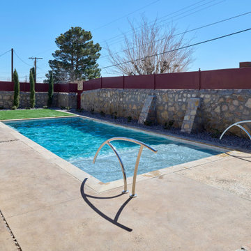
Central El Paso Backyard Renovation:
Fifteen years is a long time for a backyard to quietly wait.
At first, it was full of intention—a pool that promised summers, laughter, and long evenings. But time has a way of settling in. The water turned still, then green. Edges cracked. The space became less of a destination and more of something you looked past. Life moved forward, but the backyard stayed behind.
Then came the decision: it was time.
Not a patch job. Not a quick fix. A complete reset.
The transformation didn’t begin beautifully—it began with demolition. The old pool was drained, exposing years of neglect etched into its surface. Crews stepped in, breaking, clearing, reshaping. What once held stagnant water became an open cavity of possibility. Steel rebar formed a new skeleton, precise and intentional. Every line measured. Every elevation reconsidered.
This wasn’t just construction—it was rethinking how the space should live.
The shell was rebuilt. Surfaces were refined. Plumbing, structure, and flow were corrected at their core. What had once been outdated and failing was now engineered to last.
Then the shift happened.
Hardscape came in—clean, warm-toned concrete replacing worn decking. Stone walls, once just boundaries, were elevated into features. Subtle textures, intentional lines. A visual language that matched the architecture of the home instead of competing with it.
The pool returned—but not as it was.
Now it was sharp, modern, and inviting. A long, clean body of water with a shallow tanning ledge that catches the sun just right. Stainless steel scuppers arc water into the pool—movement, sound, life. Steps are crisp, geometry is balanced, and the water reflects clarity instead of neglect.
Around it, the yard found purpose.
Artificial turf introduced contrast—green, controlled, low-maintenance. A pergola structure rose in the corner, creating a destination within the destination. Beneath it, a built-in outdoor kitchen turned the backyard into a place to gather, not just pass through. Lighting stitched everything together, making the space just as alive at dusk as it is under the midday sun.
By the end, nothing felt accidental.
What was once forgotten is now deliberate. What was once avoided is now the center of attention.
Fifteen years later, the backyard didn’t just come back—it finally became what it was always supposed to be.
 GMI Design Group
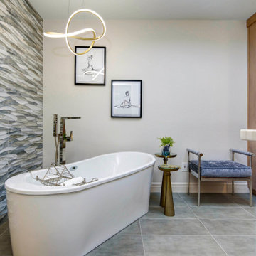
In this primary bathroom, the lighting scheme was key to achieve the client’s goals and create a space where the client would enjoy being. The bathroom felt cramped, dark, visually heavy. The client was also claustrophobic, making the use of the space uncomfortable.
The goal was to transform this space into a relaxed modern spa-like atmosphere, rethink and simplify the floorplan avoiding visual clutter, access natural light, add efficient lighting, and create more visual space.
The lighting plan was crucial to increase visual space. My first thought was to add a skylight to access natural light that is so effective in enlarging the feel of a space.
After looking at the attic and roof lines it became clear that this was not an option. After some research I found the perfect solution: a smart light fixture that mimics a window. It is installed between studs or ceiling joists. The fixture replicates the light of the sun during the day. It goes from soft morning light - to bright noon - to soft dawn light. By recessing the fixture into the ceiling, the skylight-look and extra height was achieved.
The benefits of this light go beyond beautiful design. The fixture is sustainable, energy efficient, and made to last for decades. It regulates the body’s circadian rhythm, helping against sleeping problems and seasonal affective disorder. It also integrates biophilic design, creating connections to nature and benefiting people that spend hours indoors.
The use of mood lighting was also key, creating a cozy, welcoming feel to this home-spa. All the lights are dimmable, and plenty of indirect light sources, like the gorgeous vanity pendants and LED mirrors, create the perfect setting. Not forgetting to mention the soft curves of the bathtub chandelier. This is the perfect place to relax in the bubbly bathtub!
 George Ocampo
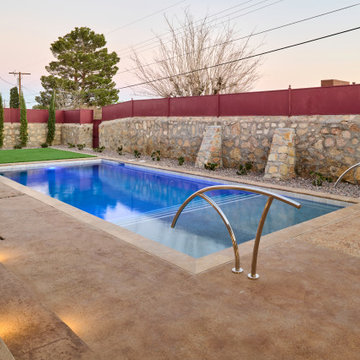
Central El Paso Backyard Renovation:
Fifteen years is a long time for a backyard to quietly wait.
At first, it was full of intention—a pool that promised summers, laughter, and long evenings. But time has a way of settling in. The water turned still, then green. Edges cracked. The space became less of a destination and more of something you looked past. Life moved forward, but the backyard stayed behind.
Then came the decision: it was time.
Not a patch job. Not a quick fix. A complete reset.
The transformation didn’t begin beautifully—it began with demolition. The old pool was drained, exposing years of neglect etched into its surface. Crews stepped in, breaking, clearing, reshaping. What once held stagnant water became an open cavity of possibility. Steel rebar formed a new skeleton, precise and intentional. Every line measured. Every elevation reconsidered.
This wasn’t just construction—it was rethinking how the space should live.
The shell was rebuilt. Surfaces were refined. Plumbing, structure, and flow were corrected at their core. What had once been outdated and failing was now engineered to last.
Then the shift happened.
Hardscape came in—clean, warm-toned concrete replacing worn decking. Stone walls, once just boundaries, were elevated into features. Subtle textures, intentional lines. A visual language that matched the architecture of the home instead of competing with it.
The pool returned—but not as it was.
Now it was sharp, modern, and inviting. A long, clean body of water with a shallow tanning ledge that catches the sun just right. Stainless steel scuppers arc water into the pool—movement, sound, life. Steps are crisp, geometry is balanced, and the water reflects clarity instead of neglect.
Around it, the yard found purpose.
Artificial turf introduced contrast—green, controlled, low-maintenance. A pergola structure rose in the corner, creating a destination within the destination. Beneath it, a built-in outdoor kitchen turned the backyard into a place to gather, not just pass through. Lighting stitched everything together, making the space just as alive at dusk as it is under the midday sun.
By the end, nothing felt accidental.
What was once forgotten is now deliberate. What was once avoided is now the center of attention.
Fifteen years later, the backyard didn’t just come back—it finally became what it was always supposed to be.
Find the right local pro for your project
 Paintzen, Inc.
When we imagine the homes of our favorite actors, we often think of picturesque kitchens, artwork hanging on the walls, luxurious furniture, and pristine conditions 24/7. But for celebrities with children, sometimes that last one isn’t always accurate! Kids will be kids – which means there may be messy bedrooms, toys strewn across their play area, and maybe even some crayon marks or finger-paints on walls or floors.
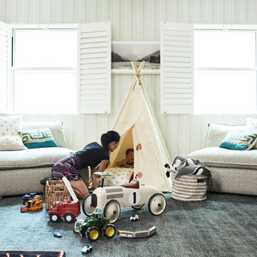
Lucy Liu recently partnered with One Kings Lane and Paintzen to redesign her son Rockwell’s playroom in their Manhattan apartment for that reason. Previously, Lucy had decided not to focus too much on the layout or color of the space – it was simply a room to hold all of Rockwell’s toys. There wasn’t much of a design element to it and very little storage.
Lucy was ready to change that – and transform the room into something more sophisticated and tranquil for both Rockwell and for guests (especially those with kids!). And to really bring that transformation to life, one of the things that needed to change was the lack of color and texture on the walls.
When selecting the color palette, Lucy and One Kings Lane designer Nicole Fisher decided on a more neutral, contemporary style. They chose to avoid the primary colors, which are too often utilized in children’s rooms and playrooms.
Instead, they chose to have Paintzen paint the walls in a cozy gray with warm beige undertones. (Try PPG ‘Slate Pebble’ for a similar look!) It created a perfect backdrop for the decor selected for the room, which included a tepee for Rockwell, some Tribal-inspired artwork, Moroccan woven baskets, and some framed artwork.
To add texture to the space, Paintzen also installed wallpaper on two of the walls. The wallpaper pattern involved muted blues and grays to add subtle color and a slight contrast to the rest of the walls. Take a closer look at this smartly designed space, featuring a beautiful neutral color palette and lots of exciting textures!
 Mindy Khan
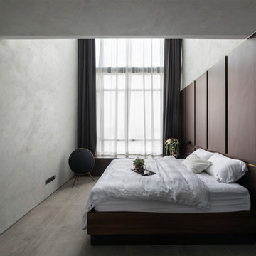
A renovation project doesn’t come cheap. Even if you have a lot of money, it is still considered practical that you set a budget when giving your landed house a makeover. The question is, what should you keep and what should you restore when doing a renovation project?
If you are keen on giving your landed house interior design an upgrade, planning early is considered crucial. That means you need to figure out the right budget, employ the right team, and identify a timeline for completion ahead of time.
During the planning stage, it is also vital that you identify which areas in your house to keep as is and which ones to repair and restore. If you need some beneficial guidance, here’s what some experts have to say:
Retain the existing flooring when it doesn’t have major cracks or damage
In landed house interior design, floors are not only considered the foundation of every landed home, they are also expected to be the most resilient. While it can be tempting to add floor embellishments like tiles to enhance your home’s aesthetic value, it shouldn’t be a priority if it does not have any massive damage or cracks.
This is especially true if you’re trying to keep your spending to a minimum. If anything, there are other options you can look into to keep your flooring attractive. For instance, ensure they are cleaned and polished regularly. You will not only make them look well-maintained, you will also help boost their longevity.
Replace plumbing fixtures when needed
Plumbing fixtures belong to a list of items in the house that are most exposed to wear and tear. Even when not in use, water passes through the pipes, faucets, and other bathroom and kitchen plumbing accessories.
Hard water also passes through plumbing fixtures. When the water has high mineral content, dried up water might create mineral deposits such as limestone, mildew, and rust.
These minerals are not only difficult to remove, they can also eventually eat into the metal and steel pipes. That being said, plumbing fixtures need to be replaced on a routine basis.
Also, a broken faucet or a leaking pipe will not only cause a possible disruption in the household, they can also cause some damage if not attended to right away. Save yourself from the headache by having them checked regularly and replaced right away when needed.
Always check the doors
Among the most underrated parts of the house are the doors. We open and close them several times a day. We sometimes bang them shut, leave them ajar, or let the breeze close them with a loud thud.
While they are often made to last for years, doors and their fixtures are also prone to warping. So it shouldn’t come as a surprise if one day you’ll discover you cannot close the door anymore because the door itself no longer fits and locks. To avoid a similar scenario, check your doors every now and then.
If the door itself doesn’t fit anymore, then ensure you include it in your renovation list. In addition, knobs and handles, including hinges, that are already deformed or no longer functional should be immediately replaced as well. Also, if your doorknob is prone to jamming or if your key no longer fits and turns, consider it your cue to have them replaced.
 Convenience Concepts
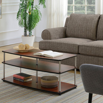
A must-have contemporary piece with a minimalist twist, the Designs2Go No Tools Coffee Table from Convenience Concepts is sure to satisfy all your display and storage needs. Crafted from particle board, melamine veneer, stainless steel round poles and black PVC edge banding, the Designs2Go No Tools Coffee Table is built to last. It features three ample shelves for all your living room essentials. With its plastic feet and net weight of 33 pounds, you have the ease to place anywhere in your home with the peace of mind that it will protect your flooring. In just three easy steps and no tools required for assembly, you will be able to enjoy this table in a matter of minutes. Complete this timeless look with more items from the Designs2Go No Tools Collection, each sold separately.
 KEYWAY INC
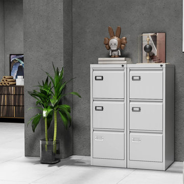
【Maximize Your Storage】 - With 3 spacious drawers that each drawer can hold up to 150 hanging folders, this filing cabinet is perfect for organizing your home office. Each drawer also comes with 2 adjustable hanging rails to fit legal and A4 size folders.
【Built to Last】- Made with high-strength cold-rolled steel and coated with an electrostatic phosphorus-free epoxy spray layer, this file cabinet is strong, corrosion-resistant, and rust-proof. Each drawer can hold up to 60 lbs, for a total of 180 lbs.
【Easy to Assemble】- With only 5 simple steps, this vertical file cabinet can be assembled in just 30 minutes. We've included a clear installation manual and labeled all parts to make the process as easy as possible.
【Secure Your Documents】- This metal file cabinet features an interlock device and external anti-tilt mechanism to ensure that only one drawer can be opened at a time. This provides added safety and security for your important documents.
【Smooth and Quiet】- Equipped with full-extendable drawer runners and high-quality ball bearing glides, this file cabinet opens and closes smoothly and quietly. It also features 4 anti-collision reinforcements to protect the cabinet and keep it quiet.
 Cure Design Group
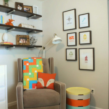
BABY BOY NURSERY // HE’S ONE HAPPY CAMPER
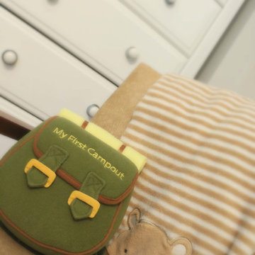
When we found out our second child is a boy, it took me a minute to get going on his nursery plans. For those who know me, this is very unusual. Why? Because I one-hundred-and-ten-percent thought I was having a girl. (I still can’t believe I have a boy!) I know, I know, statistically there’s a fifty-fifty percent chance; but I had NO DOUBT in my mind this baby was going to be a girl. I mean, I had 3 Pinterest boards created with different girl themes, and NONE for a boy! So, once I wrapped my head around the gender of our new family member, I just needed to find my piece of passion: the design inspiration that would set the wheels in motion… I was looking for a print, a color, a piece of art or something to inspire the rest of the room. For me, it’s usually fabric or a rug, and in this case it was the former. And I should’ve known, the Land of Nod did it again! When I came across their “Nature Trail” bedding collection, I was a smitten kitten. Heart-shaped pupils and all. This is a perfect theme for our new little man’s room because our family (on my husband’s dad’s side) goes camping for a week at the end of July e v e r y . s i n g l e . y e a r . for over the last 50 years. It’s kind of a big deal and this bedding couldn’t be more spot-on.
Moving our daughter to a different bedroom and reusing her old nursery as his new nursery should have been an easy switch. But (ask my husband), I make nothing easy. Regardless of how we got there and how long it took – we got it done before baby arrived and I think it turned out adorable (ah hem, if I don’t say so myself). It certainly takes the sting out of rocking a screaming newborn back to sleep at 3 am, that’s for sure.
 Cure Design Group
BABY BOY NURSERY // HE’S ONE HAPPY CAMPER
When we found out our second child is a boy, it took me a minute to get going on his nursery plans. For those who know me, this is very unusual. Why? Because I one-hundred-and-ten-percent thought I was having a girl. (I still can’t believe I have a boy!) I know, I know, statistically there’s a fifty-fifty percent chance; but I had NO DOUBT in my mind this baby was going to be a girl. I mean, I had 3 Pinterest boards created with different girl themes, and NONE for a boy! So, once I wrapped my head around the gender of our new family member, I just needed to find my piece of passion: the design inspiration that would set the wheels in motion… I was looking for a print, a color, a piece of art or something to inspire the rest of the room. For me, it’s usually fabric or a rug, and in this case it was the former. And I should’ve known, the Land of Nod did it again! When I came across their “Nature Trail” bedding collection, I was a smitten kitten. Heart-shaped pupils and all. This is a perfect theme for our new little man’s room because our family (on my husband’s dad’s side) goes camping for a week at the end of July e v e r y . s i n g l e . y e a r . for over the last 50 years. It’s kind of a big deal and this bedding couldn’t be more spot-on.
Moving our daughter to a different bedroom and reusing her old nursery as his new nursery should have been an easy switch. But (ask my husband), I make nothing easy. Regardless of how we got there and how long it took – we got it done before baby arrived and I think it turned out adorable (ah hem, if I don’t say so myself). It certainly takes the sting out of rocking a screaming newborn back to sleep at 3 am, that’s for sure.
 Cure Design Group
BABY BOY NURSERY // HE’S ONE HAPPY CAMPER
When we found out our second child is a boy, it took me a minute to get going on his nursery plans. For those who know me, this is very unusual. Why? Because I one-hundred-and-ten-percent thought I was having a girl. (I still can’t believe I have a boy!) I know, I know, statistically there’s a fifty-fifty percent chance; but I had NO DOUBT in my mind this baby was going to be a girl. I mean, I had 3 Pinterest boards created with different girl themes, and NONE for a boy! So, once I wrapped my head around the gender of our new family member, I just needed to find my piece of passion: the design inspiration that would set the wheels in motion… I was looking for a print, a color, a piece of art or something to inspire the rest of the room. For me, it’s usually fabric or a rug, and in this case it was the former. And I should’ve known, the Land of Nod did it again! When I came across their “Nature Trail” bedding collection, I was a smitten kitten. Heart-shaped pupils and all. This is a perfect theme for our new little man’s room because our family (on my husband’s dad’s side) goes camping for a week at the end of July e v e r y . s i n g l e . y e a r . for over the last 50 years. It’s kind of a big deal and this bedding couldn’t be more spot-on.
Moving our daughter to a different bedroom and reusing her old nursery as his new nursery should have been an easy switch. But (ask my husband), I make nothing easy. Regardless of how we got there and how long it took – we got it done before baby arrived and I think it turned out adorable (ah hem, if I don’t say so myself). It certainly takes the sting out of rocking a screaming newborn back to sleep at 3 am, that’s for sure.
 Newland Construction Inc
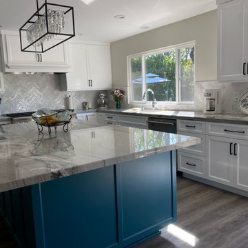
Quality materials: A modern kitchen should be built to last, with high-quality materials like stainless steel, natural stone, and engineered wood. These materials not only look great, but they're also durable and easy to maintain.
Clean lines: Modern kitchens are all about clean lines and minimalist design. This means avoiding ornate details and focusing on simplicity and functionality. Think flat-panel cabinets, simple hardware, and a streamlined layout.
Smart storage: Storage is key in any kitchen, but it's especially important in a modern kitchen where clutter can quickly detract from the clean, minimalist look. Consider built-in storage solutions like pull-out drawers and cabinets that maximize space and keep everything organized.
Statement backsplash: A bold, eye-catching backsplash can be a great way to add visual interest to a modern kitchen. Consider using patterned tiles or textured stone to create a statement piece that ties the whole room together.
 Renovators Supply Manufacturing
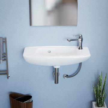
MATERIAL - Tiny Juniper wall mount sink is built using heavy-duty Grade A Vitreous China ceramic material coated with stain and scratch resistant glossy porcelain to give a sleek glazed look to your home, making it glide right in with your style.
DIMENSIONS - Measures 17-1/8 In. Wide x 5-3/4 In. High x 10-1/2 In. Proj. Compact space-saving sink is perfect for small bathrooms. Unique oval pattern is an attractive charm to have - Pretty and Practical Porcelain Sinks!
LAVATORY SINK SPECS- Floating wall mount sink includes overflow to avoid water damage and a pre-drilled faucet single hole towards the left. The package does not include faucet, drain and P-Trap, these are sold separately.
JUNIPER WALL HUNG SINKS - Skillfully designed semicircular floating vessel sink is sure to add style and beauty to your place without occupying much space - Perfect for your small bathroom, half bathroom or for kids washroom.
LAG BOLT SLIP ON INSTALLATION - It includes a Lag Bolt Slip-On installation design. You can easily install within minutes and mount the sink on two bolts without needing any bracket.
 ESF Home Textile LLC.
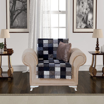
Chiara Rose Anti-slip Armless Sofa Cover Furniture Protector Chair Size Acacia
Dimensions: 29 Inch X 70 Inch
BEST SOFA PROTECTOR - This Slipcover is Extremely Sturdy, as well as an Instant, Magical Solution to Renew your Old Furniture with an Elegant Look! Ultrasonically welded seams prevent ripping apart and unraveling. The Edges are Laser-Cut to give a Chenille Trim Effect. Its Velvety Texture is Soft and also functions like a Warm Pet Bed giving a Sense of Security while your Pet is Resting. Our Covers are absolutely Pet-Friendly.
PROTECTIVE! Best Protection for ANIMAL SCRATCHES FUR SHED-HAIR DIRT FOOD SPILLS WEAR TEAR! STAIN PROOF! Perfect Guard against Cats Dogs Kids Children!
DECORATIVE! Great Stylish Coverage and Luxury Decoration in Living, Sitting Room with Full Solid Colors and Beautiful Printed, Patterned Designs, Extra Deluxe Décor, Nice Plush Texture! New Modern Look! CUSTOM-FIT! Relaxed fitted in Wing-back, Club, Rocker, Single Chair and a Half, one two three Pillow Coach, 1 2 Seaters, Box, T cushion, L, U shape Seaters! Big Large Long Wide Couches! Leather Velour Denim Twill Linen Sofas!
NON SLIDE! Slid-Resistant with PLASTIC DROP BACKING! No More Slipping Off / Sliding Over! Plastic Dots firmly Grip Upholstery! Stays in Place! No Zipper, Mat, Elastic Strap! No Pads under!
EASY CARE & WASH, DURABLE, DETERRENT! Machine Washable! Easily Removable Ready Made Furniture Throws! Cheap and Inexpensive! Heavy Duty Fabric! Stretch Enough to Cloth up Perfectly and Look Form Fit! NO ARMS! Slipcovers with Armrests DON’T properly FIT IN the Armrests and always create Fitting Problems. You know, they also have an Ugly Look. But with Chiara Rose no Need to Worry about Armrests anymore!
• PLEASE MAKE SURE TO READ DETAILED PRODUCT INFORMATION BELOW!
________________________________________
Product Description
WHY CHIARA ROSE SOFA COVERS?
Kids and Pets; We love them but we also love our furniture. Cleaning furniture is one of the most difficult chores and that’s why you need to protect it from dirt. The easiest and economical way of preserving your furniture is Chiara Rose Sofa Protector. Just put the sofa protector on your sofas (futon or couch) and stop worrying about stains and spills. It is perfect for homes with kids and pets. Pets love to scratch upholstery of the furniture. The enduring 220 gsm polyester fabric of Chiara Rose Sofa Protectors prevents tears and any kind of debris on your sofas. Its sturdy texture doesn’t let any spill and dirt penetrate the upholstery.
Besides being durable, Chiara Rose Sofa Cover is suitable to all types of decoration. To express your own personal style, you can choose from a variety of color and design options that fit perfectly to your home décor. With brilliant colors and attractive patterns, Chiara Rose Sofa Covers will give your room a completely new outlook. Unlike other covers, you don’t need to remove Chiara Rose Sofa Protector when you have guests. It will both protect your furniture and become a part of your home decoration.
WHY CHIARA ROSE SOFA PROTECTOR IS DURABLE?
The most common problem with traditional sofa covers is that after a short time of use the stitches come apart. The edges of Chiara Rose Sofa Cover are manufactured with ultrasonic laser cut technology. This technology prevents the edges from unraveling. What’s more, the 220 gsm polyester knitted fabric is the most long lasting fabric used in furniture protectors. While being durable, this fabric gives a warm sense
of touch and pleasure to sit upon.
WHY CHIARA ROSE IS THE BEST ANTI-SLIP SOFA PROTECTOR?
We always use the most contemporary technology to develop our products. That’s why we decided to use the patented plastic drop design on the back side of our covers to create the anti slip effect. These plastic drops firmly grip the upholstery of furniture so that the cover doesn’t slip off the seat easily. Even after your kids and pets jump on the sofa, Chiara Rose Sofa Cover holds on to your furniture. A quick adjustment is all it takes to get it back to look smooth. Chiara Rose Sofa Cover is the only sofa protector that uses this new technology.
WHY IT IS EASY TO USE CHIARA ROSE SOFA PROTECTORS?
No zippers, no elastic straps, no metal hooks!!! The anti-slip drops will take care of everything! , As shown on the image, just lay Chiara Rose Sofa Cover on your sofa, and tuck it between the cushion and the arms of the sofa. That’s all you need to do to put it on.
Chiara Rose Sofa Protector doesn’t allow everyday dirt, pet hair and food spills reach your sofa. The pattern of the fabric prevents accumulation of dirt on it. You can easily take off this dirt. In order to get best results, use a vacuum cleaner or shake your cover off before machine wash.
Chiara Rose Sofa Protector is easy care. It can be machine washed on max. 30°C or 85°F water temperature. Don’t use bleacher. Machine dryer can be used on low heat setting. To avoid wrinkles, use gentle cycle on washing machine and hang from a line while drying. If necessary, iron at low temperature.
 Aeris Home
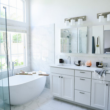
My client decided to sell his house. Fantastic location, best schools in the area, minutes away from the ocean... All that was missing were signs of life and updated finishes. We instantly agreed on whites & greys; a free standing tub, double vanity, and long-lasting / easy-maintenance tile. We now have a clean white space that can be molded into anyone's perfect bath. White canvas gives opportunity to add color and drama. I call this "Baltic White" because sky reflections and tint in the shower glass cast just enough blue to remind me of snowy winters in Scandinavia. To demonstrate character, I staged with black accessories, a tribal rug and added warmth via walnut tub shelf. Candles and salt rock ground the airy feel and leave us with a balanced space that is as welcoming as it is elegant.
Photos - Hale Production Studios

 One Stop Quality Construction LLC
Want to avoid a costly re-paving project? You may want to look into getting your asphalt sealed to help combat erosion.
Seal coating a driveway will not only give your asphalt the rich, black color it had when it was new, but it can also make your existing asphalt last up to 4 years longer.
Give us a call at 908-249-3519 for a free quote or to find out more about our expertise in construction services we offer.
 GMI Design Group
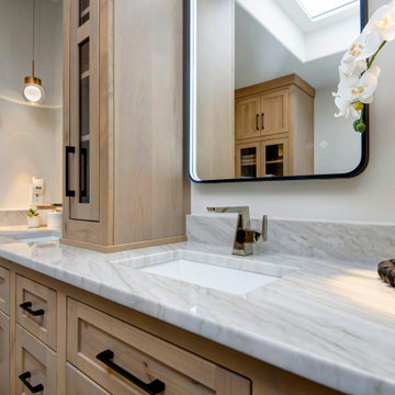
In this primary bathroom, the lighting scheme was key to achieve the client’s goals and create a space where the client would enjoy being. The bathroom felt cramped, dark, visually heavy. The client was also claustrophobic, making the use of the space uncomfortable.
The goal was to transform this space into a relaxed modern spa-like atmosphere, rethink and simplify the floorplan avoiding visual clutter, access natural light, add efficient lighting, and create more visual space.
The lighting plan was crucial to increase visual space. My first thought was to add a skylight to access natural light that is so effective in enlarging the feel of a space.
After looking at the attic and roof lines it became clear that this was not an option. After some research I found the perfect solution: a smart light fixture that mimics a window. It is installed between studs or ceiling joists. The fixture replicates the light of the sun during the day. It goes from soft morning light - to bright noon - to soft dawn light. By recessing the fixture into the ceiling, the skylight-look and extra height was achieved.
The benefits of this light go beyond beautiful design. The fixture is sustainable, energy efficient, and made to last for decades. It regulates the body’s circadian rhythm, helping against sleeping problems and seasonal affective disorder. It also integrates biophilic design, creating connections to nature and benefiting people that spend hours indoors.
The use of mood lighting was also key, creating a cozy, welcoming feel to this home-spa. All the lights are dimmable, and plenty of indirect light sources, like the gorgeous vanity pendants and LED mirrors, create the perfect setting. Not forgetting to mention the soft curves of the bathtub chandelier. This is the perfect place to relax in the bubbly bathtub!
 S & S Homes, Inc.
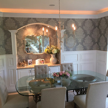
This room encompasses one of the most technical examples of woodwork we’ve seen in a long time. Normally, to create a raised panel wainscot wall, pieces of 1x wood are cut and used to create the boxes, and panel moldings are installed inside the frames to finish off the look. This can be done by typical finish carpenters. The problem is that over time, the numerous joints separate and look bad. In the case of this project, we wanted to avoid that pitfall and do something exquisite AND long-lasting. Over several days, each section of the wall was laid out to determine the appropriate size of each panel. Electrical outlets or switch plates that weren’t centered were moved. Each panel was then specially made at the shop out of 3/4” MDF because its smooth surface is ideal for painting. The raised panels (the pieces that go into each square opening) as well as the panel mouldings (the pieces that frame out each interior panel) were fabricated off site at the shop. Between the set-up, fabrication and the installation, two skilled craftsmen required three solid weeks to make each aspect absolutely perfect. Other finishing details including using a “Back Band” moulding to cap the top of the wainscot and using matching moldings (base, window casings and crown moldings) in areas that needed it for continuity of design.
This room’s woodwork is an exquisite example of true craftsmanship. Words and pictures cannot describe the level of skill required for this project. Once everything was completed, it was sprayed with white enamel paint and wallpaper was installed above the wood wainscot to finish off the room. In a nutshell, each wall panel was constructed like a custom made high end cabinet. Literally.
 GMI Design Group
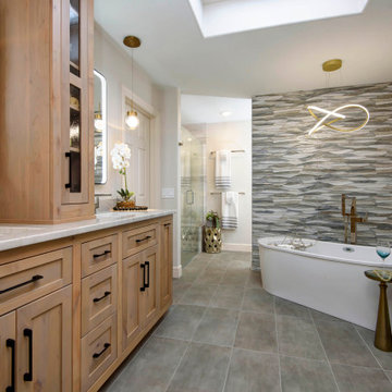
In this primary bathroom, the lighting scheme was key to achieve the client’s goals and create a space where the client would enjoy being. The bathroom felt cramped, dark, visually heavy. The client was also claustrophobic, making the use of the space uncomfortable.
The goal was to transform this space into a relaxed modern spa-like atmosphere, rethink and simplify the floorplan avoiding visual clutter, access natural light, add efficient lighting, and create more visual space.
The lighting plan was crucial to increase visual space. My first thought was to add a skylight to access natural light that is so effective in enlarging the feel of a space.
After looking at the attic and roof lines it became clear that this was not an option. After some research I found the perfect solution: a smart light fixture that mimics a window. It is installed between studs or ceiling joists. The fixture replicates the light of the sun during the day. It goes from soft morning light - to bright noon - to soft dawn light. By recessing the fixture into the ceiling, the skylight-look and extra height was achieved.
The benefits of this light go beyond beautiful design. The fixture is sustainable, energy efficient, and made to last for decades. It regulates the body’s circadian rhythm, helping against sleeping problems and seasonal affective disorder. It also integrates biophilic design, creating connections to nature and benefiting people that spend hours indoors.
The use of mood lighting was also key, creating a cozy, welcoming feel to this home-spa. All the lights are dimmable, and plenty of indirect light sources, like the gorgeous vanity pendants and LED mirrors, create the perfect setting. Not forgetting to mention the soft curves of the bathtub chandelier. This is the perfect place to relax in the bubbly bathtub!
 Modern Citi Group: Renovations & Remodeling
What Is Modern Style?
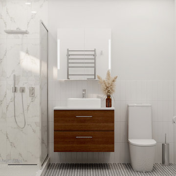
Modern style has its roots in the modernist movement of the early and mid-20th century. Modern architecture and furnishings emphasize form and structure rather than surface ornamentation — think of large expanses of glass; smooth surfaces like concrete, steel, stone and wood; and accents of chrome and black leather.
Modern style is:
- Clean. Excess embellishment is considered a distraction and to be avoided. Think crisp, clean and sculptural. Shapes are strong, with clearly defined lines and planes.
- Architectural. Furnishings echo rather than distract attention from the architecture for a seamless look.
- Minimal. Modern style embraces negative space with spare furnishings and little color or pattern.
Modern style is not:
- Ornamented. A reaction against heavily ornamented traditional styles, this look embraces simplicity of form.
- Trendy. Unlike contemporary style, which taps into up-to-the-minute changes in the design world, modern design feels more securely rooted.
- Cluttered. Furnishings are chosen with care, and accessories are kept to a minimum for a clean, spacious look.
 Diehl Concrete
Decorative Concrete Walkways for Great Curb Appeal
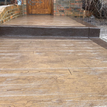
When navigating around a property and creating a pathway, a concrete walk will do a great job. Concrete is often used for walkways as it is the perfect solution to provide a contoured, conforming surface to the ground while blending in with it’s surroundings. Concrete walkways are a popular choice when a solid consistent surface is desired. Concrete will help to avoid weeds growth as well as offer a smooth surface without any trip hazards that are common with shifting concrete pavers or brick walkways. Concrete is also ideal if you want to include concrete steps, curves or ramps as it can be formed and poured into any shape or curvature.
Decorative concrete can blend seamlessly into the surroundings as it has limitless design possibilities, options and color choices. Concrete walks can be customized to suit your needs and landscape decor. Stamped concrete is an ideal way to add a textured pattern or design to a freshly placed concrete slab walkway.
Concrete can add a lot of curb appeal to your Denver home and the best part is that concrete walkways can be a cost effective solutions when compared to other hard surface materials, while providing a long lasting solution.
Even though concrete is recognized as a grey boring surface, Colored Concrete will add the much needed flare that makes your concrete walkway or pathway stand out from the rest while offering a great way to get wherever it is you’re going around your property.
30