
Search results for "Being care workers" in Home Design Ideas
 Rocky Tops Granite & Marble LLC
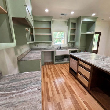
This one covered the whole house, or close to it. A kitchen and the bathrooms all done in Fantasy Brown dolomite with a leathered finish, out near Orangeburg. The photos catch it mid-install with Lowe's floor protection still down, so you can see the tops going in before the space gets dressed up. There's an island, a farmhouse apron sink, some open shelving, and undermount bowls in the baths. It's the kind of job we like, where one stone carries through the whole home and ties everything together.
Fantasy Brown is a dolomite, and that matters. People see the soft browns and grays and the flowing veins and assume it's a marble, but dolomite sits a step harder and holds up better in a working kitchen. The movement in it runs long and watery, brown and taupe drifting through a lighter background. No two slabs are the same, so a big part of the job is laying out the material and deciding which piece goes where. On the island we want the veining to feel like it belongs, and across a corner we do our best to keep the flow moving instead of stopping cold at the seam.
The farmhouse apron sink is where the extra work shows. That kind of sink needs the front edge of the stone cut just right, and the reveal has to be even the whole way across. The undermount bowls in the bathrooms get polished on the inside edge so there's nothing rough to catch on. We template tight, cut to the template, and set the seams where they're least likely to bother you. An eased edge keeps it simple and easy to wipe down, which fits a house that's actually lived in.
Dolomite likes to be sealed and it likes to be wiped up after acidic things like lemon or wine, but treated with a little sense it wears beautifully for years. It takes heat better than a lot of people expect, though we still say use a trivet. In a kitchen and baths that get daily use, it's a stone that looks high-end without being fussy to the point of stress.
Orangeburg's a bit of a drive for us, but we go where the work is, and this was a repeat customer we think a lot of. Running the same dolomite through the kitchen and the bathrooms gave the whole place one voice. That's the payoff on a job like this, one material, careful layout, and a finish that reads the same room to room.
 Modern Citi Group: Renovations & Remodeling
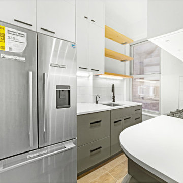
We helped Miki and David successfully execute a bathroom and kitchen remodel for their Co-op in New York City. The primary objective was to enhance the sense of space, functionality, and style while keeping the project on track and on budget.
To kickstart the project, Anna, the highly skilled project planner, conducted a thorough walkthrough with Miki and David. During the meeting, she captured their vision, outlined a realistic timeline, and carefully considered their budgetary restrictions.
Anna made sure to grasp their aspirations of modernizing the kitchen and bathroom, aiming to elevate both the aesthetics and practicality while incorporating a bespoke design tailored to their desires.
The design challenge was to modernize the outdated kitchen and bathroom while maintaining a budget-friendly approach. The clients opted for a Scandinavian style, featuring neutral olive green colors, stone, and natural wood materials. The designers explored various layouts to maximize functionality and accommodate the clients' preferences, providing Miki and David with multiple options. Eventually, the family made their design choices and felt assured as they entered the construction phase.
During the building phase, the construction team completed a gut renovation of the kitchen and bathroom, replacing ceilings, walls, floors, and all fixtures. The result was a stunning custom kitchen designed in the Scandinavian style featuring matte grey-green cabinetry, natural wood open shelving, a built-in pantry and appliances, and Vivid White Quartz countertops. The combination of sage base cabinets with grey undertones and modern, natural wood structures created a neutral and earthy impression, while the smooth white wall cabinets and countertops added a sleek and airy touch to the space.
The bathroom renovation encompassed a full remodel, with all fixtures being replaced. A custom-ordered vanity in a matching grey-green shade was installed, along with the Maiolica White Polished Ceramic Wall Tile and Kohler and Delta fixtures. Within a few short weeks, Miki and David's new kitchen and bathroom were transformed to align perfectly with their style and vision, while significantly enhancing functionality.
 Rocky Tops Granite & Marble LLC
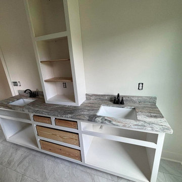
This one covered the whole house, or close to it. A kitchen and the bathrooms all done in Fantasy Brown dolomite with a leathered finish, out near Orangeburg. The photos catch it mid-install with Lowe's floor protection still down, so you can see the tops going in before the space gets dressed up. There's an island, a farmhouse apron sink, some open shelving, and undermount bowls in the baths. It's the kind of job we like, where one stone carries through the whole home and ties everything together.
Fantasy Brown is a dolomite, and that matters. People see the soft browns and grays and the flowing veins and assume it's a marble, but dolomite sits a step harder and holds up better in a working kitchen. The movement in it runs long and watery, brown and taupe drifting through a lighter background. No two slabs are the same, so a big part of the job is laying out the material and deciding which piece goes where. On the island we want the veining to feel like it belongs, and across a corner we do our best to keep the flow moving instead of stopping cold at the seam.
The farmhouse apron sink is where the extra work shows. That kind of sink needs the front edge of the stone cut just right, and the reveal has to be even the whole way across. The undermount bowls in the bathrooms get polished on the inside edge so there's nothing rough to catch on. We template tight, cut to the template, and set the seams where they're least likely to bother you. An eased edge keeps it simple and easy to wipe down, which fits a house that's actually lived in.
Dolomite likes to be sealed and it likes to be wiped up after acidic things like lemon or wine, but treated with a little sense it wears beautifully for years. It takes heat better than a lot of people expect, though we still say use a trivet. In a kitchen and baths that get daily use, it's a stone that looks high-end without being fussy to the point of stress.
Orangeburg's a bit of a drive for us, but we go where the work is, and this was a repeat customer we think a lot of. Running the same dolomite through the kitchen and the bathrooms gave the whole place one voice. That's the payoff on a job like this, one material, careful layout, and a finish that reads the same room to room.
Find the right local pro for your project
 Rocky Tops Granite & Marble LLC
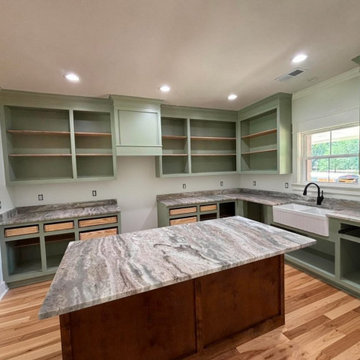
This one covered the whole house, or close to it. A kitchen and the bathrooms all done in Fantasy Brown dolomite with a leathered finish, out near Orangeburg. The photos catch it mid-install with Lowe's floor protection still down, so you can see the tops going in before the space gets dressed up. There's an island, a farmhouse apron sink, some open shelving, and undermount bowls in the baths. It's the kind of job we like, where one stone carries through the whole home and ties everything together.
Fantasy Brown is a dolomite, and that matters. People see the soft browns and grays and the flowing veins and assume it's a marble, but dolomite sits a step harder and holds up better in a working kitchen. The movement in it runs long and watery, brown and taupe drifting through a lighter background. No two slabs are the same, so a big part of the job is laying out the material and deciding which piece goes where. On the island we want the veining to feel like it belongs, and across a corner we do our best to keep the flow moving instead of stopping cold at the seam.
The farmhouse apron sink is where the extra work shows. That kind of sink needs the front edge of the stone cut just right, and the reveal has to be even the whole way across. The undermount bowls in the bathrooms get polished on the inside edge so there's nothing rough to catch on. We template tight, cut to the template, and set the seams where they're least likely to bother you. An eased edge keeps it simple and easy to wipe down, which fits a house that's actually lived in.
Dolomite likes to be sealed and it likes to be wiped up after acidic things like lemon or wine, but treated with a little sense it wears beautifully for years. It takes heat better than a lot of people expect, though we still say use a trivet. In a kitchen and baths that get daily use, it's a stone that looks high-end without being fussy to the point of stress.
Orangeburg's a bit of a drive for us, but we go where the work is, and this was a repeat customer we think a lot of. Running the same dolomite through the kitchen and the bathrooms gave the whole place one voice. That's the payoff on a job like this, one material, careful layout, and a finish that reads the same room to room.
 Sosna Inc
This young couple, busy raising two young boys (plus a playful cat), had always planned to renovate—it was just a matter of finding the right people for the job.
Their biggest concern? Hiring a contractor they could truly rely on to bring their vision to life without added stress.
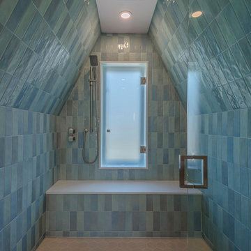
The master ensuite simply wasn’t working. A large, unused deck-mount tub dominated the space, while the tiny, dim shower made daily routines uncomfortable. The layout didn’t make sense for how they actually used the room, which ended up being mostly for the toilet and vanity. On top of that, the master bedroom sat in an open loft without proper walls or a door, making privacy nearly impossible.
Our solution involved a thoughtful reconfiguration of the ensuite. We removed the oversized tub and replaced it with a spacious walk-in shower. The old, cramped shower space became the perfect spot for a relocated vanity, allowing for better flow and use of the room. Up in the loft, we built a new wall with a door to give the bedroom the privacy it was missing. The stairway was also refreshed with new oak treads and a stained handrail to match the existing flooring.
One challenge during construction was installing the custom shower glass and tile within the sloped ceilings and angled walls—but our team carefully managed every detail to ensure a precise and polished finish.
The new master ensuite now feels like a retreat.
Handmade-style blue subway tiles add a calming pop of colour in the shower, paired with crème porcelain floor tiles. A prefabricated solid wood vanity with quartz countertop, brushed nickel fixtures, and an electric towel warmer complete the space—bringing comfort and functionality together beautifully.
A fun moment during the design phase? We used stools, tables, and even a piano to mock up the future layout—helping the homeowners get a real feel for the spacing between the new vanity and toilet. It was a creative, hands-on way to ensure everyone felt confident moving forward.
Now, the ensuite functions exactly as it should: a fully usable and relaxing 3-piece bathroom, styled just the way they wanted. And with the new loft wall and door, the bedroom finally feels like a true primary suite—private, peaceful, and made for them.
 7 Day Kitchens
This charming family home in Belmont was in dire need of some tender loving care. The original builder-grade cabinetry and countertops were outdated and in need of an upgrade.
The kitchen was once isolated from the dining room and living room, making entertaining guests a real chore. Cooking in the kitchen meant being cut off from the rest of the household, leading to a disconnect during family time. So, we decided to make some sweeping changes.
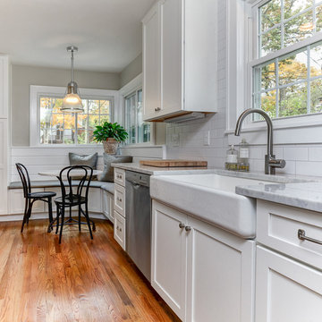
The most transformative change was the removal of the load bearing wall separating the kitchen and living room. This created a spacious open-concept kitchen with a massive island, perfect for hosting and socializing. We upgraded the cabinets to reflect a contemporary aesthetic and added a stunning hood vent. The built-in hutch was replaced by a refrigerator and beverage center, providing ample storage space and more practical usage. The kitchen was also equipped with modern features such as roll-out trays, a trash can pull-out, spice racks, and utensil organizers. We replaced the older-style double door base cabinets with modern drawer bases for easy access, and increased the height of the cabinets from 30 inches to 36 inches, giving the kitchen a fresh, airy look and additional storage space.
The laundry room also received a makeover, with new cabinets above the washer and dryer and a tall linen/storage closet, making it more functional and storage-friendly. The small pantry closet was transformed into a sprawling 12 foot deep walk-in pantry with new shelves, cabinetry and lighting, providing ample space for all your pantry essentials. We also upgraded the flooring on the first floor with durable LVP flooring, elevating the overall aesthetic and feel of the home. All of these changes were completed in a mere 21 days, from start to finish.
 Designs by KS
Project: Pelton Avenue - Coquitlam
Builder: Furtado Contracting
About this Project
We partnered up with Furtado Contracting to transform the main floor and foyer of this Greater Vancouver classic home. Also referred to as the “Vancouver Special” this style of home was popular in the 60’s-80’s and has been re-decorated and renovated ever since.
Layout Details:
By eliminating the wall between the dining room and kitchen, and reducing the length of the hallway wall, we were able to create a large open concept space.
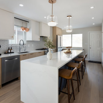
The previous u-shape kitchen turned into a large galley kitchen, which allowed us to incorporate an island with seating for four.
With the major appliances being housed on the window wall, we designed a large pantry space spanning from wall-to-wall to store all the necessities from food to cleaning supplies. Its niche not only breaks up the cabinets to add some personality but can be used as a wine/coffee area. On the far end of the kitchen, the pantry wall extends to a narrow cabinet that has been designed to act as a mudroom; a place for shoes and jackets near the back door. At the back of the kitchen you will also find a working space, that has been tied into the fridge area with some careful space planning.
Material Details:
The living room and foyer received an upgrade with new flooring, light fixtures, paint, and a converted fireplace to A/V wall with a rustic wooden mantle.
In the kitchen, woodgrain cabinets made from durable laminate are paired with painted materials. A 1” shaker door painted in our favourite Benjamin Moore “Silver Satin” is seen on the upper cabinets only. This special detail is complimented with bronze knobs by Marathon Hardware. The same colour is seen on the pantry wall in a slab door, making it sleeker. The island is painted in Benjamin Moore “Black Pepper”, is paired with bronze hardware by Marathon Hardware and is clad in quartz, Silestone’s “Calcatta Gold” to be specific. Quartz is a go-to material if maintenance is not your thing!
Special Mentions:
There are so many amazing things about this project. All the light fixtures were supplied by Robinson Lighting, and include Canadian company Kuzco Lighting, as seen in the kitchen, entry and foyer. The black accents on the sink by Blanco and faucet by Grohe added some contrast against the backsplash by Julian Tile.
Sponsored
Columbus, OH

Hope Restoration & General Contracting
Columbus Design-Build, Kitchen & Bath Remodeling, Historic Renovations

 AYDIN Hides
KEY FEATURES
• Hand Made in Europe
• Hand-Made by 3rd. generation of Aydin family.
• Premium Quality
• Hand lined bottom
• Hand stitching
• 100% genuine cowhide leather
• European (Balkan) breed animals
• Each product is BRANDED with serial number and Craftsmanship seal.
• Hides used for making Patchworks are sourced ethically and humanely and 100% as byproduct of meat production
• Animals are free-range raised, sustainable sourced mainly on mountain pastures of Eastern Europe.
• Animal skins are endemic to breeds specific for Eastern European region.
• Skins ARE NOT processed by mass processing facility, but rather family owned business with "Old Craft" certificate. This means that such business falls in "tradition" category of business, since third family generation takes care of business.
• All skins are hand processed using solutions with the P.H value of drinking water (7)! We have been assured into that by being present inside the workshop during skin processing
• Skins are processed in small batches, usually 5-10 at the time, in order for skin to preserve, to the greatest extend, its natural distinctions and quality.
• NOTE: The photo on this page represents design and style of this rug and IT IS AN IMAGE OF ACTUAL product you will receive. All rug sizes are approximate. Due to the difference of monitor colors, some rug colors may vary slightly.
• NOTE: Few products may contain some natural flaws due to conditions inherent to natural animal products (scratches, insect bites, wrinkles, cuts, etc.) that will be discretely repaired. Please note that we do not wedge our cowhides but we rather discretely stitch and repair. Such flaws are acceptable for this type of product, since it represents the life of the animal to the fullest possible extent.
SQ21
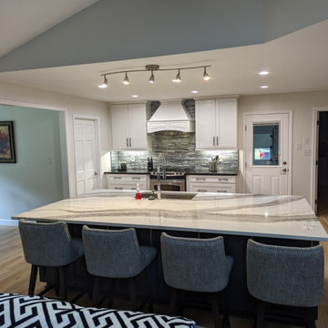 7 Day Kitchens
This charming family home in Belmont was in dire need of some tender loving care. The original builder-grade cabinetry and countertops were outdated and in need of an upgrade.
The kitchen was once isolated from the dining room and living room, making entertaining guests a real chore. Cooking in the kitchen meant being cut off from the rest of the household, leading to a disconnect during family time. So, we decided to make some sweeping changes.
The most transformative change was the removal of the load bearing wall separating the kitchen and living room. This created a spacious open-concept kitchen with a massive island, perfect for hosting and socializing. We upgraded the cabinets to reflect a contemporary aesthetic and added a stunning hood vent. The built-in hutch was replaced by a refrigerator and beverage center, providing ample storage space and more practical usage. The kitchen was also equipped with modern features such as roll-out trays, a trash can pull-out, spice racks, and utensil organizers. We replaced the older-style double door base cabinets with modern drawer bases for easy access, and increased the height of the cabinets from 30 inches to 36 inches, giving the kitchen a fresh, airy look and additional storage space.
The laundry room also received a makeover, with new cabinets above the washer and dryer and a tall linen/storage closet, making it more functional and storage-friendly. The small pantry closet was transformed into a sprawling 12 foot deep walk-in pantry with new shelves, cabinetry and lighting, providing ample space for all your pantry essentials. We also upgraded the flooring on the first floor with durable LVP flooring, elevating the overall aesthetic and feel of the home. All of these changes were completed in a mere 21 days, from start to finish.

 Kathleen Jennison
An Arts & Crafts Bungalow is one of my favorite styles of homes. We have quite a few of them in our Stockton Mid-Town area. And when C&L called us to help them remodel their 1923 American Bungalow, I was beyond thrilled.
As per usual, when we get a new inquiry, we quickly Google the project location while we are talking to you on the phone. My excitement escalated when I saw the Google Earth Image of the sweet Sage Green bungalow in Mid-Town Stockton. "Yes, we would be interested in working with you," I said trying to keep my cool.
But what made it even better was meeting C&L and touring their home, because they are the nicest young couple, eager to make their home period perfect. Unfortunately, it had been slightly molested by some bad house-flippers, and we needed to bring the bathroom back to it "roots."
We knew we had to banish the hideous brown tile and cheap vanity quickly. But C&L complained about the condensation problems and the constant fight with mold. This immediately told me that improper remodeling had occurred and we needed to remedy that right away.
The Before: Frustrations with a Botched Remodel
The bathroom needed to be brought back to period appropriate design with all the functionality of a modern bathroom. We thought of things like marble countertop, white mosaic floor tiles, white subway tile, board and batten molding, and of course a fabulous wallpaper.
This small (and only) bathroom on a tight budget required a little bit of design sleuthing to figure out how we could get the proper look and feel. Our goal was to determine where to splurge and where to economize and how to complete the remodel as quickly as possible because C&L would have to move out while construction was going on.
The Process: Hard Work to Remedy Design and Function
During our initial design study, (which included 2 hours in the owners’ home), we noticed framed images of William Morris Arts and Crafts textile patterns and knew this would be our design inspiration. We presented C&L with three options and they quickly selected the Pimpernel Design Concept.
We had originally selected the Black and Olive colors with a black vanity, mirror, and black and white floor tile. C&L liked it but weren’t quite sure about the black, We went back to the drawing board and decided the William & Co Pimpernel Wallpaper in Bayleaf and Manilla color with a softer gray painted vanity and mirror and white floor tile was more to their liking.
After the Design Concept was approved, we went to work securing the building permit, procuring all the elements, and scheduling our trusted tradesmen to perform the work.
We did uncover some shoddy work by the flippers such as live electrical wires hidden behind the wall, plumbing venting cut-off and buried in the walls (hence the constant dampness), the tub barely balancing on two fence boards across the floor joist, and no insulation on the exterior wall.
All of the previous blunders were fixed and the bathroom put back to its previous glory. We could feel the house thanking us for making it pretty again.
The After Reveal: Cohesive Design Decisions
We selected a simple white subway tile for the tub/shower. This is always classic and in keeping with the style of the house.
We selected a pre-fab vanity and mirror, but they look rich with the quartz countertop. There is much more storage in this small vanity than you would think.
The Transformation: A Period Perfect Refresh
We began the remodel just as the pandemic reared and stay-in-place orders went into effect. As C&L were already moved out and living with relatives, we got the go-ahead from city officials to get the work done (after all, how can you shelter in place without a bathroom?).
All our tradesmen were scheduled to work so that only one crew was on the job site at a time. We stayed on the original schedule with only a one week delay.
The end result is the sweetest little bathroom I've ever seen (and I can't wait to start work on C&L's kitchen next).
Thank you for joining me in this project transformation. I hope this inspired you to think about being creative with your design projects, determining what works best in keeping with the architecture of your space, and carefully assessing how you can have the best life in your home.
 Frederick Cooke Architecture, LLC
Welcome home to this luxe, modern, and inviting townhome in the heart of downtown Jersey City! We are ecstatic to see this project completed.
This 4-story multifamily underwent a major renovation and was transformed into a spacious and functional family home for our clients. Careful consideration of our client’s lifestyle and plans for the future dictated every design decision. They needed a space that would function well now that they are a young professional couple and a space that would nicely accommodate a growing family in the future. Greater emphasis was placed on common family spaces and bedrooms were designed exclusively for sleep with minimal room for work or study and without TV connections to discourage those activities from taking place in these spaces. Instead, common places such as the family room and the kitchen are inviting and foster those activities.
Due to sagging floors in need of extensive repair, it made more financial sense to replace them entirely. We took this historic house and by re-pitching the roof in an inverted form we were able to gain an overall 36” which we used for raising the floors. This, in turn, allowed us to bring the ground level up to code and be suitable for living space and gave us additional ceiling room on the upper floors. The ground floor was designed to be used as a rental unit and can be reincorporated into the home later when more space is needed.
Both front and back facades were replaced with timeless brick and vertical wood siding and all windows and front doors were replaced. The ground floor features a one-bedroom suite, living room, and open kitchen-dining area. On the first floor, we achieved a more effective entry sequence to the living room, an open-concept design leading to the kitchen. The interior is bright and airy, and the kitchen opens up to the deck in the back and the patio, making entertaining indoors and outdoors seamless. The design works in a way to accommodate the addition of a stair leading to the ground level when the rental unit is incorporated back into the house.
Up on the second floor, a suite with a bathroom was designed with grandparents or guests in mind. Also, two additional bedrooms are now being used as an exercise room and a zoom-worthy office but can later be used as kids’ rooms.
Last but not least, the third floor features the master suite with his and hers walk-in closets, a master bath, and a library.
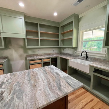 Rocky Tops Granite & Marble LLC
This one covered the whole house, or close to it. A kitchen and the bathrooms all done in Fantasy Brown dolomite with a leathered finish, out near Orangeburg. The photos catch it mid-install with Lowe's floor protection still down, so you can see the tops going in before the space gets dressed up. There's an island, a farmhouse apron sink, some open shelving, and undermount bowls in the baths. It's the kind of job we like, where one stone carries through the whole home and ties everything together.
Fantasy Brown is a dolomite, and that matters. People see the soft browns and grays and the flowing veins and assume it's a marble, but dolomite sits a step harder and holds up better in a working kitchen. The movement in it runs long and watery, brown and taupe drifting through a lighter background. No two slabs are the same, so a big part of the job is laying out the material and deciding which piece goes where. On the island we want the veining to feel like it belongs, and across a corner we do our best to keep the flow moving instead of stopping cold at the seam.
The farmhouse apron sink is where the extra work shows. That kind of sink needs the front edge of the stone cut just right, and the reveal has to be even the whole way across. The undermount bowls in the bathrooms get polished on the inside edge so there's nothing rough to catch on. We template tight, cut to the template, and set the seams where they're least likely to bother you. An eased edge keeps it simple and easy to wipe down, which fits a house that's actually lived in.
Dolomite likes to be sealed and it likes to be wiped up after acidic things like lemon or wine, but treated with a little sense it wears beautifully for years. It takes heat better than a lot of people expect, though we still say use a trivet. In a kitchen and baths that get daily use, it's a stone that looks high-end without being fussy to the point of stress.
Orangeburg's a bit of a drive for us, but we go where the work is, and this was a repeat customer we think a lot of. Running the same dolomite through the kitchen and the bathrooms gave the whole place one voice. That's the payoff on a job like this, one material, careful layout, and a finish that reads the same room to room.
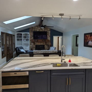 7 Day Kitchens
This charming family home in Belmont was in dire need of some tender loving care. The original builder-grade cabinetry and countertops were outdated and in need of an upgrade.
The kitchen was once isolated from the dining room and living room, making entertaining guests a real chore. Cooking in the kitchen meant being cut off from the rest of the household, leading to a disconnect during family time. So, we decided to make some sweeping changes.
The most transformative change was the removal of the load bearing wall separating the kitchen and living room. This created a spacious open-concept kitchen with a massive island, perfect for hosting and socializing. We upgraded the cabinets to reflect a contemporary aesthetic and added a stunning hood vent. The built-in hutch was replaced by a refrigerator and beverage center, providing ample storage space and more practical usage. The kitchen was also equipped with modern features such as roll-out trays, a trash can pull-out, spice racks, and utensil organizers. We replaced the older-style double door base cabinets with modern drawer bases for easy access, and increased the height of the cabinets from 30 inches to 36 inches, giving the kitchen a fresh, airy look and additional storage space.
The laundry room also received a makeover, with new cabinets above the washer and dryer and a tall linen/storage closet, making it more functional and storage-friendly. The small pantry closet was transformed into a sprawling 12 foot deep walk-in pantry with new shelves, cabinetry and lighting, providing ample space for all your pantry essentials. We also upgraded the flooring on the first floor with durable LVP flooring, elevating the overall aesthetic and feel of the home. All of these changes were completed in a mere 21 days, from start to finish.
Sponsored
Columbus, OH
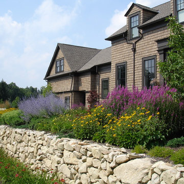
Free consultation for landscape design!

Peabody Landscape Group
Franklin County's Reliable Landscape Design & Contracting
 Sosna Inc
This young couple, busy raising two young boys (plus a playful cat), had always planned to renovate—it was just a matter of finding the right people for the job.
Their biggest concern? Hiring a contractor they could truly rely on to bring their vision to life without added stress.
The master ensuite simply wasn’t working. A large, unused deck-mount tub dominated the space, while the tiny, dim shower made daily routines uncomfortable. The layout didn’t make sense for how they actually used the room, which ended up being mostly for the toilet and vanity. On top of that, the master bedroom sat in an open loft without proper walls or a door, making privacy nearly impossible.
Our solution involved a thoughtful reconfiguration of the ensuite. We removed the oversized tub and replaced it with a spacious walk-in shower. The old, cramped shower space became the perfect spot for a relocated vanity, allowing for better flow and use of the room. Up in the loft, we built a new wall with a door to give the bedroom the privacy it was missing. The stairway was also refreshed with new oak treads and a stained handrail to match the existing flooring.
One challenge during construction was installing the custom shower glass and tile within the sloped ceilings and angled walls—but our team carefully managed every detail to ensure a precise and polished finish.
The new master ensuite now feels like a retreat.
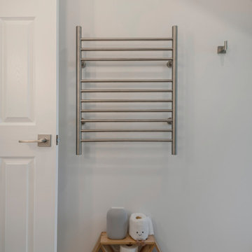
Handmade-style blue subway tiles add a calming pop of colour in the shower, paired with crème porcelain floor tiles. A prefabricated solid wood vanity with quartz countertop, brushed nickel fixtures, and an electric towel warmer complete the space—bringing comfort and functionality together beautifully.
A fun moment during the design phase? We used stools, tables, and even a piano to mock up the future layout—helping the homeowners get a real feel for the spacing between the new vanity and toilet. It was a creative, hands-on way to ensure everyone felt confident moving forward.
Now, the ensuite functions exactly as it should: a fully usable and relaxing 3-piece bathroom, styled just the way they wanted. And with the new loft wall and door, the bedroom finally feels like a true primary suite—private, peaceful, and made for them.
 Designs by KS
Project: Pelton Avenue - Coquitlam
Builder: Furtado Contracting
About this Project
We partnered up with Furtado Contracting to transform the main floor and foyer of this Greater Vancouver classic home. Also referred to as the “Vancouver Special” this style of home was popular in the 60’s-80’s and has been re-decorated and renovated ever since.
Layout Details:
By eliminating the wall between the dining room and kitchen, and reducing the length of the hallway wall, we were able to create a large open concept space.
The previous u-shape kitchen turned into a large galley kitchen, which allowed us to incorporate an island with seating for four.
With the major appliances being housed on the window wall, we designed a large pantry space spanning from wall-to-wall to store all the necessities from food to cleaning supplies. Its niche not only breaks up the cabinets to add some personality but can be used as a wine/coffee area. On the far end of the kitchen, the pantry wall extends to a narrow cabinet that has been designed to act as a mudroom; a place for shoes and jackets near the back door. At the back of the kitchen you will also find a working space, that has been tied into the fridge area with some careful space planning.
Material Details:
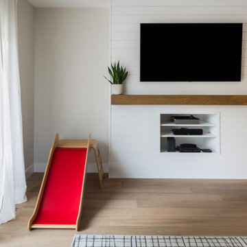
The living room and foyer received an upgrade with new flooring, light fixtures, paint, and a converted fireplace to A/V wall with a rustic wooden mantle.
In the kitchen, woodgrain cabinets made from durable laminate are paired with painted materials. A 1” shaker door painted in our favourite Benjamin Moore “Silver Satin” is seen on the upper cabinets only. This special detail is complimented with bronze knobs by Marathon Hardware. The same colour is seen on the pantry wall in a slab door, making it sleeker. The island is painted in Benjamin Moore “Black Pepper”, is paired with bronze hardware by Marathon Hardware and is clad in quartz, Silestone’s “Calcatta Gold” to be specific. Quartz is a go-to material if maintenance is not your thing!
Special Mentions:
There are so many amazing things about this project. All the light fixtures were supplied by Robinson Lighting, and include Canadian company Kuzco Lighting, as seen in the kitchen, entry and foyer. The black accents on the sink by Blanco and faucet by Grohe added some contrast against the backsplash by Julian Tile.
 Tile Doctor Ltd
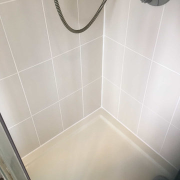
I was asked by a Chelford homeowner (near Alderley Edge) to renovate their Ceramic Tiled Shower Cubicle which had an unsightly mould problem. They say pictures speak louder than words, so I’ve added some photos on this page which show how the grout and silicone sealant had become discoloured with mould over the ten years since it was installed.
Mould likes damp warm areas and shower cubicles make a perfect habitat for it, grout especially can be a problem due to its cementitious rough surface that mould can get a grip on. In this case the ventilation in the ensuite was inadequate and ideally there should have been an extraction vent over the cubicle itself. My advice in these situations is to leave doors and windows open after showering and to run the cold water afterwards.
To renovate the Tile and Grout I sprayed on Tile Doctor Duo-Clean which was left to soak into the grout line for ten minutes before being scrubbed in by hand. The Ceramic tiles cleaned quite easily but the grout had to be scrubbed hard and needed several applications before I was satisfied.
The whole shower needed treating in this fashion and once rinsed and dried I set about stripping out all the old silicone sealant that had also been badly affected by mould. This is done carefully using a sharp knife. I removed the debris and moved onto applying a fresh mould resistant silicone sealant.
Last step before leaving was to spray the Ceramic tile and especially the Grout and Silicone with a can of Tile Doctor Aerosol Grout Sealer. This doesn’t last as long as other sealants in the Tile Doctor range but its quick to apply, especially on wall tiles. The sealer ensures water will run straight off the walls into the shower tray and it also makes the shower easier to clean later.
The shower looked like a new installation by the time I had finished, and my client was delighted with the transformation. He was also thankful that I had replaced the silicone, this was something he had considered doing himself but applying it does take practice and you can get yourself into a mess.
Kamila Logonzy
East Cheshire Tile Doctor
 Frederick Cooke Architecture, LLC
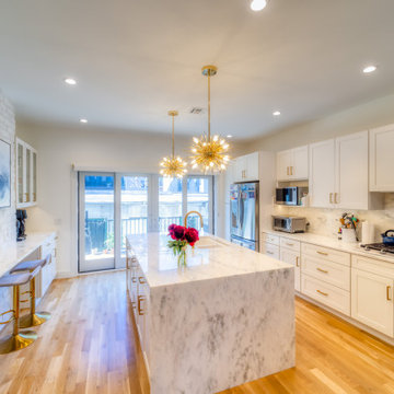
Welcome home to this luxe, modern, and inviting townhome in the heart of downtown Jersey City! We are ecstatic to see this project completed.
This 4-story multifamily underwent a major renovation and was transformed into a spacious and functional family home for our clients. Careful consideration of our client’s lifestyle and plans for the future dictated every design decision. They needed a space that would function well now that they are a young professional couple and a space that would nicely accommodate a growing family in the future. Greater emphasis was placed on common family spaces and bedrooms were designed exclusively for sleep with minimal room for work or study and without TV connections to discourage those activities from taking place in these spaces. Instead, common places such as the family room and the kitchen are inviting and foster those activities.
Due to sagging floors in need of extensive repair, it made more financial sense to replace them entirely. We took this historic house and by re-pitching the roof in an inverted form we were able to gain an overall 36” which we used for raising the floors. This, in turn, allowed us to bring the ground level up to code and be suitable for living space and gave us additional ceiling room on the upper floors. The ground floor was designed to be used as a rental unit and can be reincorporated into the home later when more space is needed.
Both front and back facades were replaced with timeless brick and vertical wood siding and all windows and front doors were replaced. The ground floor features a one-bedroom suite, living room, and open kitchen-dining area. On the first floor, we achieved a more effective entry sequence to the living room, an open-concept design leading to the kitchen. The interior is bright and airy, and the kitchen opens up to the deck in the back and the patio, making entertaining indoors and outdoors seamless. The design works in a way to accommodate the addition of a stair leading to the ground level when the rental unit is incorporated back into the house.
Up on the second floor, a suite with a bathroom was designed with grandparents or guests in mind. Also, two additional bedrooms are now being used as an exercise room and a zoom-worthy office but can later be used as kids’ rooms.
Last but not least, the third floor features the master suite with his and hers walk-in closets, a master bath, and a library.

Sponsored
Sunbury, OH

J.Holderby - Renovations
Franklin County's Leading General Contractors - 2X Best of Houzz!

 Mack Allen
Comprehensive Pest Control Solutions for Your Peace of Mind
Pests can quickly turn your living or working space into an uncomfortable and unhygienic environment. At Pest Control - skadedyr-kontroll.no, we offer reliable and effective pest control services to protect your property and ensure your well-being.
Silverfish consuming poisonous bait/Photo skadedyrkontroll1
The skadedyr-kontroll.no Advantage
Choosing the right pest control service can make all the difference. With our years of expertise and commitment to excellence, we provide:
Tailored Solutions: Each pest problem is unique, and so are our solutions.
Eco-Friendly Methods: We prioritize methods that are safe for your family, pets, and the environment.
Expert Team: Our professionals are trained to handle all types of pest issues with precision and care.
Our Key Services
Rodent Control
Rodents can wreak havoc by damaging property and spreading diseases. Our comprehensive rodent control services ensure thorough removal and long-term prevention strategies to keep your property safe.
Silverfish Treatment
Silverfish are not just unsightly but can also damage valuable items. Learn more about our specialized silverfish control methods at Silverfish - skadedyr-kontroll.no/skjeggkre-alt-du-trenger-a-vite/.
Droplet size/Photo Skadedyrkontroll1
Insect Management
Insects such as ants, cockroaches, and wasps can disrupt your peace. Our targeted treatments eradicate these pests efficiently and prevent future infestations.
Our Approach to Pest Management
Thorough Inspection: We identify the type and extent of the pest problem on your property.
Customized Plan: A detailed plan is crafted to address your specific pest issue.
Effective Execution: Using advanced tools and methods, we eliminate pests swiftly and safely.
Preventive Guidance: Our team provides tips and solutions to prevent pests from returning.
Why Regular Pest Control Matters
Pest control is not just about elimination; it’s about prevention and maintaining a healthy environment. At skadedyr-kontroll.no, we empower our clients with knowledge and solutions to ensure long-term protection against pests.
Placement of bait/Photo Skadedyrkontroll1 AS
Get Started Today
Don’t let pests compromise your comfort and safety. Whether you’re dealing with rodents, silverfish, or other pests, Pest Control - skadedyr-kontroll.no is your trusted partner for comprehensive pest management. Contact us now and take the first step toward a pest-free environment.
 Modern Citi Group: Renovations & Remodeling
We helped Miki and David successfully execute a bathroom and kitchen remodel for their Co-op in New York City. The primary objective was to enhance the sense of space, functionality, and style while keeping the project on track and on budget.
To kickstart the project, Anna, the highly skilled project planner, conducted a thorough walkthrough with Miki and David. During the meeting, she captured their vision, outlined a realistic timeline, and carefully considered their budgetary restrictions.
Anna made sure to grasp their aspirations of modernizing the kitchen and bathroom, aiming to elevate both the aesthetics and practicality while incorporating a bespoke design tailored to their desires.
The design challenge was to modernize the outdated kitchen and bathroom while maintaining a budget-friendly approach. The clients opted for a Scandinavian style, featuring neutral olive green colors, stone, and natural wood materials. The designers explored various layouts to maximize functionality and accommodate the clients' preferences, providing Miki and David with multiple options. Eventually, the family made their design choices and felt assured as they entered the construction phase.
During the building phase, the construction team completed a gut renovation of the kitchen and bathroom, replacing ceilings, walls, floors, and all fixtures. The result was a stunning custom kitchen designed in the Scandinavian style featuring matte grey-green cabinetry, natural wood open shelving, a built-in pantry and appliances, and Vivid White Quartz countertops. The combination of sage base cabinets with grey undertones and modern, natural wood structures created a neutral and earthy impression, while the smooth white wall cabinets and countertops added a sleek and airy touch to the space.
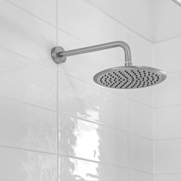
The bathroom renovation encompassed a full remodel, with all fixtures being replaced. A custom-ordered vanity in a matching grey-green shade was installed, along with the Maiolica White Polished Ceramic Wall Tile and Kohler and Delta fixtures. Within a few short weeks, Miki and David's new kitchen and bathroom were transformed to align perfectly with their style and vision, while significantly enhancing functionality.
 Designs by KS
Project: Pelton Avenue - Coquitlam
Builder: Furtado Contracting
About this Project
We partnered up with Furtado Contracting to transform the main floor and foyer of this Greater Vancouver classic home. Also referred to as the “Vancouver Special” this style of home was popular in the 60’s-80’s and has been re-decorated and renovated ever since.
Layout Details:
By eliminating the wall between the dining room and kitchen, and reducing the length of the hallway wall, we were able to create a large open concept space.
The previous u-shape kitchen turned into a large galley kitchen, which allowed us to incorporate an island with seating for four.
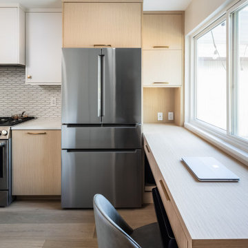
With the major appliances being housed on the window wall, we designed a large pantry space spanning from wall-to-wall to store all the necessities from food to cleaning supplies. Its niche not only breaks up the cabinets to add some personality but can be used as a wine/coffee area. On the far end of the kitchen, the pantry wall extends to a narrow cabinet that has been designed to act as a mudroom; a place for shoes and jackets near the back door. At the back of the kitchen you will also find a working space, that has been tied into the fridge area with some careful space planning.
Material Details:
The living room and foyer received an upgrade with new flooring, light fixtures, paint, and a converted fireplace to A/V wall with a rustic wooden mantle.
In the kitchen, woodgrain cabinets made from durable laminate are paired with painted materials. A 1” shaker door painted in our favourite Benjamin Moore “Silver Satin” is seen on the upper cabinets only. This special detail is complimented with bronze knobs by Marathon Hardware. The same colour is seen on the pantry wall in a slab door, making it sleeker. The island is painted in Benjamin Moore “Black Pepper”, is paired with bronze hardware by Marathon Hardware and is clad in quartz, Silestone’s “Calcatta Gold” to be specific. Quartz is a go-to material if maintenance is not your thing!
Special Mentions:
There are so many amazing things about this project. All the light fixtures were supplied by Robinson Lighting, and include Canadian company Kuzco Lighting, as seen in the kitchen, entry and foyer. The black accents on the sink by Blanco and faucet by Grohe added some contrast against the backsplash by Julian Tile.
115