
Search results for "Belongs" in Home Design Ideas


 The POOL ARTIST | Brian T. Stratton
Award winning pool designer Brian T. Stratton | The Pool Artist designed this beautiful custom concrete / gunite swimming pool. Luxury pool designer nj, international pool design, new jersey swimming pool designer, pool artist, swimming pool engineer, swimming pool architect nj, water designer, eleuthera Bahamas pool designer, infinity edge pool design, custom spa design, California pool designer, Mississippi pool designer, south Carolina pool designer, new York pool designer, Pennsylvania pool designer


Find the right local pro for your project


 Renovisions
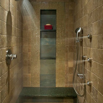
The owners of this 1980’s built-home wanted to create a completely new look for their outdated master bath and turned to Renovisions for design and build services. Having perused Renovisions website, they were confident they made the right choice to help them transform their ordinary space into something truly extraordinary. The design team created several configurations for the homeowners review until they nailed down one particular design that would create that wow factor.
The main challenges were creating an open, spacious feel and maximizing natural light and ventilation with plenty of storage and customizations. The addition of a second window allows ample light into the space throughout the day along with the recessed and sconce lights which were perfectly placed. Storage, which was a key element of this design, includes two separate vanity cabinets (his and hers) with plenty of space for needed toiletries, a matching framed medicine cabinet for her and a custom built cubby for him. Built on site was a linen closet with both roll out and stationary shelves for towels and shower supplies. The spacious walk-in, all tiled shower boasts ‘no door’ access with lineal drain, traditional fixed and hand-held shower heads and a rounded shower seat. Polished black granite was used inside the cubby and topping both the threshold and seat creating a nice contrast to and tying in with the floor. The decorative grab bar ensures safety for these homeowners while showering. The heated floors added throughout the bath take the edge off when stepping out of the warm shower and are conveniently operated by a 24 hour programmable thermostat. Classic white subway tile and chair rail trims adorne all walls and tie in nicely to each vanity station. Carrera look quartz was the perfect choice for countertops creating a clean fresh look. Stunning marble basket-weave mosaic floor tile set the stage in this exquisite bath as the beautiful white painted cabinetry softened the overall feel of the space.
These homeowners are not saving spa retreats for once-a-year vacations anymore, they now enjoy a relaxing spa-like shower experience every day in their own home!
 Swatch Design Group
As a part of a larger transformation, the kitchen served as an anchor for rethinking how the home could feel and function. The goal was to create a space that felt truly integrated, flowed naturally within itself, and connected seamlessly to the outdoors. Storage was a top priority, with an emphasis on keeping countertops clean and the space feeling calm and open. Flow was equally important. What began as a layout optimized for entertaining evolved into a more intentional approach, where every sightline and transition was thoughtfully considered. The clients also needed the kitchen to work hard for their lifestyle, with a commercial-size refrigerator and freezer, generous prep space, and room to gather. The challenge was to bring purpose and polish to a space that didn’t quite feel like it belonged. The result is a kitchen that’s not only highly functional but finally feels like part of the home.
Project challenges:
- Maximizing storage was a primary challenge, especially with the inclusion of a commercial-sized fridge and freezer that occupied valuable cabinetry space.
- The need for clean, uninterrupted lines throughout the kitchen required thoughtful detailing, especially around cabinetry transitions and appliance integration.
- The oversized island design required two stone slabs and waterfall edges on both sides which posed both visual and logistical challenges.
- Incorporating electrical outlets into the island in a way that felt intentional and unobtrusive demanded creative problem-solving.
- The unique rooflines created strong visual angles that required a considered design approach to ensure the space felt cohesive rather than disjointed.
- Balancing symmetry and flow in a kitchen with structural constraints required precise layout planning to maintain a cohesive visual rhythm.
- Creating an intentional indoor/outdoor living flow, especially in the transitional space between the sliding doors to the backyard and the kitchen.
Project solutions:
- To balance the visual weight of the commercial-grade fridge and freezer, we flanked the range and hood with full-height pocket cabinetry, which created symmetry while reclaiming storage space. We also took a look into internal organization and carefully mapped out where every kitchen item would live. This allowed us to make informed decisions about drawer versus door configurations, and when to incorporate features like roll-out shelving to maximize accessibility and function.
- Linear light fixtures above the island were chosen for their low visual impact, allowing sightlines to remain clear and emphasizing the thoughtful spatial layout.
- The oversized island was carefully executed using two coordinated slabs, with a subtle brass inlay detail between them to turn a logistical challenge into a design feature.
- Pop-up electrical outlets were integrated into the island to keep surfaces clutter-free while maintaining easy access, which combined form and function seamlessly.
- With multiple focal points and a peaked vaulted ceiling, layout precision was key. The island, hood, and adjacent staircase were all perfectly centered on the vault, creating a sense of alignment across the open space.
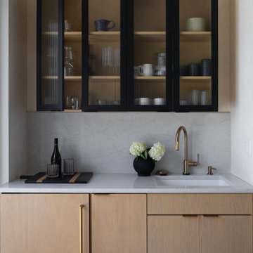
- In the transitional area between kitchen and backyard, we added a wet bar that visually and functionally connects the indoor space with the outdoors. This addition provides extra storage and creates a dedicated entertainment spot for guests, enhancing the overall flow and usability of the home.

 Tile Trends, Inc.
Subway Tile-Herringbone
Inspiration for a mid-sized rustic l-shaped dark wood floor and brown floor eat-in kitchen remodel with a farmhouse sink, raised-panel cabinets, dark wood cabinets, quartz countertops, white backsplash, subway tile backsplash, stainless steel appliances, an island and beige countertops
Inspiration for a mid-sized rustic l-shaped dark wood floor and brown floor eat-in kitchen remodel with a farmhouse sink, raised-panel cabinets, dark wood cabinets, quartz countertops, white backsplash, subway tile backsplash, stainless steel appliances, an island and beige countertops

 Simply Perfect
With Pinterest, Houzz and HGTV, homeowners have more sources for inspiration than ever before. You may have found, however, that replicating what you see online or on TV isn’t always that simple. Mastering proportion and scale can be especially challenging.
Let’s say you fall in love with an oversized vase which looks like it will fit with the colors and textures in your living room. But once it’s there, the vase doesn’t look the way you expected and you don’t know now to make it work.
Fortunately, designers are experienced not only in dealing with proportion and scale, but in handling multiple elements at once.
In the meantime, here are a few tips to help you understand some of the considerations regarding size.
Proportion Tips
1. Less is more
In the home shown here, the rooms are on the smaller side, where it would seem counterintuitive to use oversized pieces. But using smaller pieces can look busy—and can actually make the rooms feel smaller, especially when you add personal belongings to the space.
2. Keep it simple
Several oversized pieces can create clean, simple lines. We put this principle to work using oversized items as anchors on both sides of the fireplace in the living room.
On one side, we have two oversized blown-glass vases with amber, silver and purple tones. The irregular shapes in these beautiful pieces create interest and contrast; you can see through them and you can see the room reflected in them.
On the other side of the fireplace sit two oversized brass lanterns filled with driftwood and greenery; the contents can be switched out seasonally, as well.
The vases on one side and lanterns on the other side establish pattern (two of each, in descending order), balance and simplicity.
3. Embrace the unexpected
On the mantle above the fireplace rests another oversized piece—a painting of a barn. Its neutral colors pick up the tones in the stone behind it and again, it works to bring simplicity to the space, rather than overly fussy detail.
Nearby, just up the stairs, is an unusually spacious landing. A bench and pillows transform it into a special reading or conversation spot. The pair of hammered nickel vases on the window sill repeats the pattern established on either side of the fireplace. Using oversized vases in lieu of a window treatment is unexpected—as is incorporating sleek, modern-shaped vases like these in a farmhouse-style home. Yet because of the other oversized objects nearby, the vases feel distinctive and delightful.
4. Coordinate pattern and rhythm
Another oversized item is the table lamp in the living room. It’s a powerful light; aside from the overhead can lights, it’s the room’s only light source. The ridges on its ceramic base echo the pieces of wicker in the stunning basket behind the sofa.
This oversized wicker basket, which we’re a bit in love with, features a very large weave along with elegant leather straps. It’s ideal for storing throws, cushions, board games or anything else you want out of sight.
5. Proximity matters
This home’s dining room is just to the right of the entry. An immense floor mirror—double-framed in weathered wood—is placed opposite the front windows. Measuring seven feet high, it’s a bold piece. And it works perfectly in this space to reflect light and make the room feel larger.
An oversized ceramic vase, with a porous, matte-stone finish, sits atop a table next to the mirror. Other regular-sized items share the small table, including a bottle of wine and a glass vase. But because of the enormous mirror, it was important to have one oversized item on that table, for balance.
 Simply Perfect
With Pinterest, Houzz and HGTV, homeowners have more sources for inspiration than ever before. You may have found, however, that replicating what you see online or on TV isn’t always that simple. Mastering proportion and scale can be especially challenging.
Let’s say you fall in love with an oversized vase which looks like it will fit with the colors and textures in your living room. But once it’s there, the vase doesn’t look the way you expected and you don’t know now to make it work.
Fortunately, designers are experienced not only in dealing with proportion and scale, but in handling multiple elements at once.
In the meantime, here are a few tips to help you understand some of the considerations regarding size.
Proportion Tips
1. Less is more
In the home shown here, the rooms are on the smaller side, where it would seem counterintuitive to use oversized pieces. But using smaller pieces can look busy—and can actually make the rooms feel smaller, especially when you add personal belongings to the space.
2. Keep it simple
Several oversized pieces can create clean, simple lines. We put this principle to work using oversized items as anchors on both sides of the fireplace in the living room.
On one side, we have two oversized blown-glass vases with amber, silver and purple tones. The irregular shapes in these beautiful pieces create interest and contrast; you can see through them and you can see the room reflected in them.
On the other side of the fireplace sit two oversized brass lanterns filled with driftwood and greenery; the contents can be switched out seasonally, as well.
The vases on one side and lanterns on the other side establish pattern (two of each, in descending order), balance and simplicity.
3. Embrace the unexpected
On the mantle above the fireplace rests another oversized piece—a painting of a barn. Its neutral colors pick up the tones in the stone behind it and again, it works to bring simplicity to the space, rather than overly fussy detail.
Nearby, just up the stairs, is an unusually spacious landing. A bench and pillows transform it into a special reading or conversation spot. The pair of hammered nickel vases on the window sill repeats the pattern established on either side of the fireplace. Using oversized vases in lieu of a window treatment is unexpected—as is incorporating sleek, modern-shaped vases like these in a farmhouse-style home. Yet because of the other oversized objects nearby, the vases feel distinctive and delightful.
4. Coordinate pattern and rhythm
Another oversized item is the table lamp in the living room. It’s a powerful light; aside from the overhead can lights, it’s the room’s only light source. The ridges on its ceramic base echo the pieces of wicker in the stunning basket behind the sofa.
This oversized wicker basket, which we’re a bit in love with, features a very large weave along with elegant leather straps. It’s ideal for storing throws, cushions, board games or anything else you want out of sight.
5. Proximity matters
This home’s dining room is just to the right of the entry. An immense floor mirror—double-framed in weathered wood—is placed opposite the front windows. Measuring seven feet high, it’s a bold piece. And it works perfectly in this space to reflect light and make the room feel larger.
An oversized ceramic vase, with a porous, matte-stone finish, sits atop a table next to the mirror. Other regular-sized items share the small table, including a bottle of wine and a glass vase. But because of the enormous mirror, it was important to have one oversized item on that table, for balance.
 Swatch Design Group
As a part of a larger transformation, the kitchen served as an anchor for rethinking how the home could feel and function. The goal was to create a space that felt truly integrated, flowed naturally within itself, and connected seamlessly to the outdoors. Storage was a top priority, with an emphasis on keeping countertops clean and the space feeling calm and open. Flow was equally important. What began as a layout optimized for entertaining evolved into a more intentional approach, where every sightline and transition was thoughtfully considered. The clients also needed the kitchen to work hard for their lifestyle, with a commercial-size refrigerator and freezer, generous prep space, and room to gather. The challenge was to bring purpose and polish to a space that didn’t quite feel like it belonged. The result is a kitchen that’s not only highly functional but finally feels like part of the home.
Project challenges:
- Maximizing storage was a primary challenge, especially with the inclusion of a commercial-sized fridge and freezer that occupied valuable cabinetry space.
- The need for clean, uninterrupted lines throughout the kitchen required thoughtful detailing, especially around cabinetry transitions and appliance integration.
- The oversized island design required two stone slabs and waterfall edges on both sides which posed both visual and logistical challenges.
- Incorporating electrical outlets into the island in a way that felt intentional and unobtrusive demanded creative problem-solving.
- The unique rooflines created strong visual angles that required a considered design approach to ensure the space felt cohesive rather than disjointed.
- Balancing symmetry and flow in a kitchen with structural constraints required precise layout planning to maintain a cohesive visual rhythm.
- Creating an intentional indoor/outdoor living flow, especially in the transitional space between the sliding doors to the backyard and the kitchen.
Project solutions:
- To balance the visual weight of the commercial-grade fridge and freezer, we flanked the range and hood with full-height pocket cabinetry, which created symmetry while reclaiming storage space. We also took a look into internal organization and carefully mapped out where every kitchen item would live. This allowed us to make informed decisions about drawer versus door configurations, and when to incorporate features like roll-out shelving to maximize accessibility and function.
- Linear light fixtures above the island were chosen for their low visual impact, allowing sightlines to remain clear and emphasizing the thoughtful spatial layout.
- The oversized island was carefully executed using two coordinated slabs, with a subtle brass inlay detail between them to turn a logistical challenge into a design feature.
- Pop-up electrical outlets were integrated into the island to keep surfaces clutter-free while maintaining easy access, which combined form and function seamlessly.
- With multiple focal points and a peaked vaulted ceiling, layout precision was key. The island, hood, and adjacent staircase were all perfectly centered on the vault, creating a sense of alignment across the open space.
- In the transitional area between kitchen and backyard, we added a wet bar that visually and functionally connects the indoor space with the outdoors. This addition provides extra storage and creates a dedicated entertainment spot for guests, enhancing the overall flow and usability of the home.
 Swatch Design Group
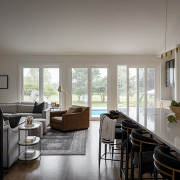
As a part of a larger transformation, the kitchen served as an anchor for rethinking how the home could feel and function. The goal was to create a space that felt truly integrated, flowed naturally within itself, and connected seamlessly to the outdoors. Storage was a top priority, with an emphasis on keeping countertops clean and the space feeling calm and open. Flow was equally important. What began as a layout optimized for entertaining evolved into a more intentional approach, where every sightline and transition was thoughtfully considered. The clients also needed the kitchen to work hard for their lifestyle, with a commercial-size refrigerator and freezer, generous prep space, and room to gather. The challenge was to bring purpose and polish to a space that didn’t quite feel like it belonged. The result is a kitchen that’s not only highly functional but finally feels like part of the home.
Project challenges:
- Maximizing storage was a primary challenge, especially with the inclusion of a commercial-sized fridge and freezer that occupied valuable cabinetry space.
- The need for clean, uninterrupted lines throughout the kitchen required thoughtful detailing, especially around cabinetry transitions and appliance integration.
- The oversized island design required two stone slabs and waterfall edges on both sides which posed both visual and logistical challenges.
- Incorporating electrical outlets into the island in a way that felt intentional and unobtrusive demanded creative problem-solving.
- The unique rooflines created strong visual angles that required a considered design approach to ensure the space felt cohesive rather than disjointed.
- Balancing symmetry and flow in a kitchen with structural constraints required precise layout planning to maintain a cohesive visual rhythm.
- Creating an intentional indoor/outdoor living flow, especially in the transitional space between the sliding doors to the backyard and the kitchen.
Project solutions:
- To balance the visual weight of the commercial-grade fridge and freezer, we flanked the range and hood with full-height pocket cabinetry, which created symmetry while reclaiming storage space. We also took a look into internal organization and carefully mapped out where every kitchen item would live. This allowed us to make informed decisions about drawer versus door configurations, and when to incorporate features like roll-out shelving to maximize accessibility and function.
- Linear light fixtures above the island were chosen for their low visual impact, allowing sightlines to remain clear and emphasizing the thoughtful spatial layout.
- The oversized island was carefully executed using two coordinated slabs, with a subtle brass inlay detail between them to turn a logistical challenge into a design feature.
- Pop-up electrical outlets were integrated into the island to keep surfaces clutter-free while maintaining easy access, which combined form and function seamlessly.
- With multiple focal points and a peaked vaulted ceiling, layout precision was key. The island, hood, and adjacent staircase were all perfectly centered on the vault, creating a sense of alignment across the open space.
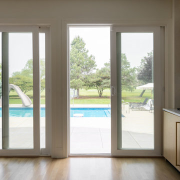
- In the transitional area between kitchen and backyard, we added a wet bar that visually and functionally connects the indoor space with the outdoors. This addition provides extra storage and creates a dedicated entertainment spot for guests, enhancing the overall flow and usability of the home.
 Swatch Design Group
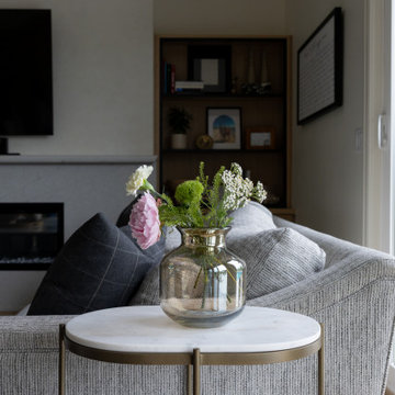
As a part of a larger transformation, the kitchen served as an anchor for rethinking how the home could feel and function. The goal was to create a space that felt truly integrated, flowed naturally within itself, and connected seamlessly to the outdoors. Storage was a top priority, with an emphasis on keeping countertops clean and the space feeling calm and open. Flow was equally important. What began as a layout optimized for entertaining evolved into a more intentional approach, where every sightline and transition was thoughtfully considered. The clients also needed the kitchen to work hard for their lifestyle, with a commercial-size refrigerator and freezer, generous prep space, and room to gather. The challenge was to bring purpose and polish to a space that didn’t quite feel like it belonged. The result is a kitchen that’s not only highly functional but finally feels like part of the home.
Project challenges:
- Maximizing storage was a primary challenge, especially with the inclusion of a commercial-sized fridge and freezer that occupied valuable cabinetry space.
- The need for clean, uninterrupted lines throughout the kitchen required thoughtful detailing, especially around cabinetry transitions and appliance integration.
- The oversized island design required two stone slabs and waterfall edges on both sides which posed both visual and logistical challenges.
- Incorporating electrical outlets into the island in a way that felt intentional and unobtrusive demanded creative problem-solving.
- The unique rooflines created strong visual angles that required a considered design approach to ensure the space felt cohesive rather than disjointed.
- Balancing symmetry and flow in a kitchen with structural constraints required precise layout planning to maintain a cohesive visual rhythm.
- Creating an intentional indoor/outdoor living flow, especially in the transitional space between the sliding doors to the backyard and the kitchen.
Project solutions:
- To balance the visual weight of the commercial-grade fridge and freezer, we flanked the range and hood with full-height pocket cabinetry, which created symmetry while reclaiming storage space. We also took a look into internal organization and carefully mapped out where every kitchen item would live. This allowed us to make informed decisions about drawer versus door configurations, and when to incorporate features like roll-out shelving to maximize accessibility and function.
- Linear light fixtures above the island were chosen for their low visual impact, allowing sightlines to remain clear and emphasizing the thoughtful spatial layout.
- The oversized island was carefully executed using two coordinated slabs, with a subtle brass inlay detail between them to turn a logistical challenge into a design feature.
- Pop-up electrical outlets were integrated into the island to keep surfaces clutter-free while maintaining easy access, which combined form and function seamlessly.
- With multiple focal points and a peaked vaulted ceiling, layout precision was key. The island, hood, and adjacent staircase were all perfectly centered on the vault, creating a sense of alignment across the open space.
- In the transitional area between kitchen and backyard, we added a wet bar that visually and functionally connects the indoor space with the outdoors. This addition provides extra storage and creates a dedicated entertainment spot for guests, enhancing the overall flow and usability of the home.
 Swatch Design Group
As a part of a larger transformation, the kitchen served as an anchor for rethinking how the home could feel and function. The goal was to create a space that felt truly integrated, flowed naturally within itself, and connected seamlessly to the outdoors. Storage was a top priority, with an emphasis on keeping countertops clean and the space feeling calm and open. Flow was equally important. What began as a layout optimized for entertaining evolved into a more intentional approach, where every sightline and transition was thoughtfully considered. The clients also needed the kitchen to work hard for their lifestyle, with a commercial-size refrigerator and freezer, generous prep space, and room to gather. The challenge was to bring purpose and polish to a space that didn’t quite feel like it belonged. The result is a kitchen that’s not only highly functional but finally feels like part of the home.
Project challenges:
- Maximizing storage was a primary challenge, especially with the inclusion of a commercial-sized fridge and freezer that occupied valuable cabinetry space.
- The need for clean, uninterrupted lines throughout the kitchen required thoughtful detailing, especially around cabinetry transitions and appliance integration.
- The oversized island design required two stone slabs and waterfall edges on both sides which posed both visual and logistical challenges.
- Incorporating electrical outlets into the island in a way that felt intentional and unobtrusive demanded creative problem-solving.
- The unique rooflines created strong visual angles that required a considered design approach to ensure the space felt cohesive rather than disjointed.
- Balancing symmetry and flow in a kitchen with structural constraints required precise layout planning to maintain a cohesive visual rhythm.
- Creating an intentional indoor/outdoor living flow, especially in the transitional space between the sliding doors to the backyard and the kitchen.
Project solutions:
- To balance the visual weight of the commercial-grade fridge and freezer, we flanked the range and hood with full-height pocket cabinetry, which created symmetry while reclaiming storage space. We also took a look into internal organization and carefully mapped out where every kitchen item would live. This allowed us to make informed decisions about drawer versus door configurations, and when to incorporate features like roll-out shelving to maximize accessibility and function.
- Linear light fixtures above the island were chosen for their low visual impact, allowing sightlines to remain clear and emphasizing the thoughtful spatial layout.
- The oversized island was carefully executed using two coordinated slabs, with a subtle brass inlay detail between them to turn a logistical challenge into a design feature.
- Pop-up electrical outlets were integrated into the island to keep surfaces clutter-free while maintaining easy access, which combined form and function seamlessly.
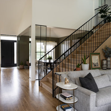
- With multiple focal points and a peaked vaulted ceiling, layout precision was key. The island, hood, and adjacent staircase were all perfectly centered on the vault, creating a sense of alignment across the open space.
- In the transitional area between kitchen and backyard, we added a wet bar that visually and functionally connects the indoor space with the outdoors. This addition provides extra storage and creates a dedicated entertainment spot for guests, enhancing the overall flow and usability of the home.
 Swatch Design Group
As a part of a larger transformation, the kitchen served as an anchor for rethinking how the home could feel and function. The goal was to create a space that felt truly integrated, flowed naturally within itself, and connected seamlessly to the outdoors. Storage was a top priority, with an emphasis on keeping countertops clean and the space feeling calm and open. Flow was equally important. What began as a layout optimized for entertaining evolved into a more intentional approach, where every sightline and transition was thoughtfully considered. The clients also needed the kitchen to work hard for their lifestyle, with a commercial-size refrigerator and freezer, generous prep space, and room to gather. The challenge was to bring purpose and polish to a space that didn’t quite feel like it belonged. The result is a kitchen that’s not only highly functional but finally feels like part of the home.
Project challenges:
- Maximizing storage was a primary challenge, especially with the inclusion of a commercial-sized fridge and freezer that occupied valuable cabinetry space.
- The need for clean, uninterrupted lines throughout the kitchen required thoughtful detailing, especially around cabinetry transitions and appliance integration.
- The oversized island design required two stone slabs and waterfall edges on both sides which posed both visual and logistical challenges.
- Incorporating electrical outlets into the island in a way that felt intentional and unobtrusive demanded creative problem-solving.
- The unique rooflines created strong visual angles that required a considered design approach to ensure the space felt cohesive rather than disjointed.
- Balancing symmetry and flow in a kitchen with structural constraints required precise layout planning to maintain a cohesive visual rhythm.
- Creating an intentional indoor/outdoor living flow, especially in the transitional space between the sliding doors to the backyard and the kitchen.
Project solutions:
- To balance the visual weight of the commercial-grade fridge and freezer, we flanked the range and hood with full-height pocket cabinetry, which created symmetry while reclaiming storage space. We also took a look into internal organization and carefully mapped out where every kitchen item would live. This allowed us to make informed decisions about drawer versus door configurations, and when to incorporate features like roll-out shelving to maximize accessibility and function.
- Linear light fixtures above the island were chosen for their low visual impact, allowing sightlines to remain clear and emphasizing the thoughtful spatial layout.
- The oversized island was carefully executed using two coordinated slabs, with a subtle brass inlay detail between them to turn a logistical challenge into a design feature.
- Pop-up electrical outlets were integrated into the island to keep surfaces clutter-free while maintaining easy access, which combined form and function seamlessly.
- With multiple focal points and a peaked vaulted ceiling, layout precision was key. The island, hood, and adjacent staircase were all perfectly centered on the vault, creating a sense of alignment across the open space.
- In the transitional area between kitchen and backyard, we added a wet bar that visually and functionally connects the indoor space with the outdoors. This addition provides extra storage and creates a dedicated entertainment spot for guests, enhancing the overall flow and usability of the home.
 STUDIO KONDE | Konrad Idaszewski Architect
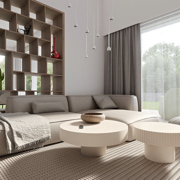
Modbarn house interior designed by STUDIO KONDE Konrad Idaszewski Architekt, an interior architecture project from Poznań focused on a contemporary interpretation of the modern barn, combining generous proportions, natural materials and carefully composed details.
Project details: https://conde.pl/portfolio/gotowy-projekt-wnetrz-nowoczesnej-stodoly-modbarn/
Modbarn belongs to the Modelowedomy collection of three individually configurable houses, developed to offer different approaches to contemporary residential architecture and interior design. Its high living room and dining area create an open, spacious setting, while the kitchen is partially separated from the living space by a custom-designed openwork shelving unit.
Contemporary living room designed as part of a modern house interior project in Poland, combining soft neutral tones, warm timber, sculptural furniture and large glazed surfaces. The generous lounge area is arranged around a comfortable sectional sofa and rounded coffee tables, with the extensive glazing opening the interior towards the garden and allowing natural light to emphasize the calm, refined character of the space.
A large L-shaped sofa upholstered in warm beige fabric forms the centre of the living area, with its generous proportions creating an inviting place for relaxation. Soft cushions and a textured throw add layers of tactile detail, while the rounded edges of the upholstery echo the curved forms used throughout the furniture arrangement. In front of the sofa, a large circular coffee table with a smooth white top and cylindrical base is paired with a smaller fluted table, creating a composition of contrasting textures and proportions. A natural wooden bowl provides a restrained decorative accent on the main tabletop.
Underneath the seating group, a large textured rug introduces a subtle geometric pattern in shades of cream and beige, visually defining the lounge zone against the herringbone timber floor. Beside the sofa, a generously padded round ottoman with a quilted finish continues the soft, rounded language of the interior. The combination of natural oak flooring, light upholstery and tactile fabrics gives the living room a warm character while maintaining the minimalist aesthetic of the Modbarn house interior.
Behind the sofa, a substantial openwork shelving unit in natural wood acts as a partially transparent architectural divider between the living and dining areas. Its vertical structure and varied rectangular compartments provide both storage and space for decorative objects without closing off the adjoining zone. Carefully selected accessories, including a striking red sculptural vase and a green cactus-shaped ornament, introduce subtle colour accents against the warm timber background.
The considerable height of the living room is reinforced by a series of slim white pendant lights suspended at different levels, adding rhythm to the upper part of the interior. Large floor-to-ceiling glazing occupies the side of the room, framed by long grey curtains and light vertical blinds. Mature trees, lawn and the garden visible beyond the glass become part of the composition, strengthening the relationship between the interior and its surroundings. This combination of high-volume architecture, custom timber detailing, comfortable contemporary furniture and natural finishes reflects the approach of STUDIO KONDE, an interior architect studio from Poznań creating distinctive residential interiors within the Modelowedomy collection.
 Swatch Design Group
As a part of a larger transformation, the kitchen served as an anchor for rethinking how the home could feel and function. The goal was to create a space that felt truly integrated, flowed naturally within itself, and connected seamlessly to the outdoors. Storage was a top priority, with an emphasis on keeping countertops clean and the space feeling calm and open. Flow was equally important. What began as a layout optimized for entertaining evolved into a more intentional approach, where every sightline and transition was thoughtfully considered. The clients also needed the kitchen to work hard for their lifestyle, with a commercial-size refrigerator and freezer, generous prep space, and room to gather. The challenge was to bring purpose and polish to a space that didn’t quite feel like it belonged. The result is a kitchen that’s not only highly functional but finally feels like part of the home.
Project challenges:
- Maximizing storage was a primary challenge, especially with the inclusion of a commercial-sized fridge and freezer that occupied valuable cabinetry space.
- The need for clean, uninterrupted lines throughout the kitchen required thoughtful detailing, especially around cabinetry transitions and appliance integration.
- The oversized island design required two stone slabs and waterfall edges on both sides which posed both visual and logistical challenges.
- Incorporating electrical outlets into the island in a way that felt intentional and unobtrusive demanded creative problem-solving.
- The unique rooflines created strong visual angles that required a considered design approach to ensure the space felt cohesive rather than disjointed.
- Balancing symmetry and flow in a kitchen with structural constraints required precise layout planning to maintain a cohesive visual rhythm.
- Creating an intentional indoor/outdoor living flow, especially in the transitional space between the sliding doors to the backyard and the kitchen.
Project solutions:
- To balance the visual weight of the commercial-grade fridge and freezer, we flanked the range and hood with full-height pocket cabinetry, which created symmetry while reclaiming storage space. We also took a look into internal organization and carefully mapped out where every kitchen item would live. This allowed us to make informed decisions about drawer versus door configurations, and when to incorporate features like roll-out shelving to maximize accessibility and function.
- Linear light fixtures above the island were chosen for their low visual impact, allowing sightlines to remain clear and emphasizing the thoughtful spatial layout.
- The oversized island was carefully executed using two coordinated slabs, with a subtle brass inlay detail between them to turn a logistical challenge into a design feature.
- Pop-up electrical outlets were integrated into the island to keep surfaces clutter-free while maintaining easy access, which combined form and function seamlessly.
- With multiple focal points and a peaked vaulted ceiling, layout precision was key. The island, hood, and adjacent staircase were all perfectly centered on the vault, creating a sense of alignment across the open space.
- In the transitional area between kitchen and backyard, we added a wet bar that visually and functionally connects the indoor space with the outdoors. This addition provides extra storage and creates a dedicated entertainment spot for guests, enhancing the overall flow and usability of the home.



 Story Barns
Inspiration for a mid-sized rustic carpeted straight cable railing staircase remodel in Denver with carpeted risers

 Mark Mobley Architecture
Mid-sized arts and crafts front porch idea in Baltimore with decking and a roof extension

 Custom Surface Solutions
 (www.css-tile.com) - Owner Craig Thompson (512) 430-1215. This project shows the remodel of a master bathroom with before and after pictures of the project. 32" x 16" tile was used on the walls and 32 x 8" tile on the floor. The accent and shower pan tile is flat pebble stones. The faucets are Delta.
240