
Search results for "Brief's search language" in Home Design Ideas

 Mary Anne Smiley Interiors
Photographer: Dan Piassick
Large elegant formal and open concept porcelain tile living room photo in Dallas with blue walls and a standard fireplace
Large elegant formal and open concept porcelain tile living room photo in Dallas with blue walls and a standard fireplace

 Christopher Simmonds Architect
The client’s brief was to create a space reminiscent of their beloved downtown Chicago industrial loft, in a rural farm setting, while incorporating their unique collection of vintage and architectural salvage. The result is a custom designed space that blends life on the farm with an industrial sensibility.
The new house is located on approximately the same footprint as the original farm house on the property. Barely visible from the road due to the protection of conifer trees and a long driveway, the house sits on the edge of a field with views of the neighbouring 60 acre farm and creek that runs along the length of the property.
The main level open living space is conceived as a transparent social hub for viewing the landscape. Large sliding glass doors create strong visual connections with an adjacent barn on one end and a mature black walnut tree on the other.
The house is situated to optimize views, while at the same time protecting occupants from blazing summer sun and stiff winter winds. The wall to wall sliding doors on the south side of the main living space provide expansive views to the creek, and allow for breezes to flow throughout. The wrap around aluminum louvered sun shade tempers the sun.
The subdued exterior material palette is defined by horizontal wood siding, standing seam metal roofing and large format polished concrete blocks.
The interiors were driven by the owners’ desire to have a home that would properly feature their unique vintage collection, and yet have a modern open layout. Polished concrete floors and steel beams on the main level set the industrial tone and are paired with a stainless steel island counter top, backsplash and industrial range hood in the kitchen. An old drinking fountain is built-in to the mudroom millwork, carefully restored bi-parting doors frame the library entrance, and a vibrant antique stained glass panel is set into the foyer wall allowing diffused coloured light to spill into the hallway. Upstairs, refurbished claw foot tubs are situated to view the landscape.
The double height library with mezzanine serves as a prominent feature and quiet retreat for the residents. The white oak millwork exquisitely displays the homeowners’ vast collection of books and manuscripts. The material palette is complemented by steel counter tops, stainless steel ladder hardware and matte black metal mezzanine guards. The stairs carry the same language, with white oak open risers and stainless steel woven wire mesh panels set into a matte black steel frame.
The overall effect is a truly sublime blend of an industrial modern aesthetic punctuated by personal elements of the owners’ storied life.
Photography: James Brittain
 Mark English Architects, AIA
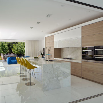
The Atherton House is a family compound for a professional couple in the tech industry, and their two teenage children. After living in Singapore, then Hong Kong, and building homes there, they looked forward to continuing their search for a new place to start a life and set down roots.
The site is located on Atherton Avenue on a flat, 1 acre lot. The neighboring lots are of a similar size, and are filled with mature planting and gardens. The brief on this site was to create a house that would comfortably accommodate the busy lives of each of the family members, as well as provide opportunities for wonder and awe. Views on the site are internal. Our goal was to create an indoor- outdoor home that embraced the benign California climate.
The building was conceived as a classic “H” plan with two wings attached by a double height entertaining space. The “H” shape allows for alcoves of the yard to be embraced by the mass of the building, creating different types of exterior space. The two wings of the home provide some sense of enclosure and privacy along the side property lines. The south wing contains three bedroom suites at the second level, as well as laundry. At the first level there is a guest suite facing east, powder room and a Library facing west.
The north wing is entirely given over to the Primary suite at the top level, including the main bedroom, dressing and bathroom. The bedroom opens out to a roof terrace to the west, overlooking a pool and courtyard below. At the ground floor, the north wing contains the family room, kitchen and dining room. The family room and dining room each have pocketing sliding glass doors that dissolve the boundary between inside and outside.
Connecting the wings is a double high living space meant to be comfortable, delightful and awe-inspiring. A custom fabricated two story circular stair of steel and glass connects the upper level to the main level, and down to the basement “lounge” below. An acrylic and steel bridge begins near one end of the stair landing and flies 40 feet to the children’s bedroom wing. People going about their day moving through the stair and bridge become both observed and observer.
The front (EAST) wall is the all important receiving place for guests and family alike. There the interplay between yin and yang, weathering steel and the mature olive tree, empower the entrance. Most other materials are white and pure.
The mechanical systems are efficiently combined hydronic heating and cooling, with no forced air required.
Find the right local pro for your project
 Christopher Simmonds Architect
The client’s brief was to create a space reminiscent of their beloved downtown Chicago industrial loft, in a rural farm setting, while incorporating their unique collection of vintage and architectural salvage. The result is a custom designed space that blends life on the farm with an industrial sensibility.
The new house is located on approximately the same footprint as the original farm house on the property. Barely visible from the road due to the protection of conifer trees and a long driveway, the house sits on the edge of a field with views of the neighbouring 60 acre farm and creek that runs along the length of the property.
The main level open living space is conceived as a transparent social hub for viewing the landscape. Large sliding glass doors create strong visual connections with an adjacent barn on one end and a mature black walnut tree on the other.
The house is situated to optimize views, while at the same time protecting occupants from blazing summer sun and stiff winter winds. The wall to wall sliding doors on the south side of the main living space provide expansive views to the creek, and allow for breezes to flow throughout. The wrap around aluminum louvered sun shade tempers the sun.
The subdued exterior material palette is defined by horizontal wood siding, standing seam metal roofing and large format polished concrete blocks.
The interiors were driven by the owners’ desire to have a home that would properly feature their unique vintage collection, and yet have a modern open layout. Polished concrete floors and steel beams on the main level set the industrial tone and are paired with a stainless steel island counter top, backsplash and industrial range hood in the kitchen. An old drinking fountain is built-in to the mudroom millwork, carefully restored bi-parting doors frame the library entrance, and a vibrant antique stained glass panel is set into the foyer wall allowing diffused coloured light to spill into the hallway. Upstairs, refurbished claw foot tubs are situated to view the landscape.
The double height library with mezzanine serves as a prominent feature and quiet retreat for the residents. The white oak millwork exquisitely displays the homeowners’ vast collection of books and manuscripts. The material palette is complemented by steel counter tops, stainless steel ladder hardware and matte black metal mezzanine guards. The stairs carry the same language, with white oak open risers and stainless steel woven wire mesh panels set into a matte black steel frame.
The overall effect is a truly sublime blend of an industrial modern aesthetic punctuated by personal elements of the owners’ storied life.
Photography: James Brittain

 Patterson Custom Homes
Living room - 1950s walk-out light wood floor living room idea in Los Angeles with white walls

 Mittendorf Quality Construction
Inspiration for a rustic brown one-story wood gable roof remodel in Seattle

 LLG Residential Design LLC
Looking for a nice clean crown molding, but what something different? These homeowners did just that with a simple clean flat molding applied to the wall and ceiling to create this look.
 Lincoln Lighthill Architect
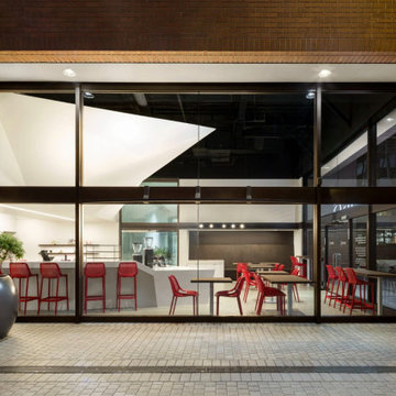
How do you make an impact within a familiar project typology? For our first cafe for Spro Coffee Lab, and their flagship location, we combined a long-held vision of a cafe with a faceted ceiling, their red & white material palette, and the building owner’s desire for an iconic street presence into a unified, minimalist language of angles and facets that extends throughout the cafe.
Overhead, a faceted soffit juts out dramatically over the service bar, the two objects mirroring each other’s footprints and satisfying Health Code requirements for a smooth, cleanable surface overhead. Concealing an egress corridor above that bisects the space, the soffit presents a bold visual gesture through the floor-to-ceiling glass walls of this corner space, beckoning passersby inside.
The service bar points toward the entry, with a minimalist espresso-tap system as the focal point, and angled sections branching off in both directions to create seating and service areas and direct customer flow.
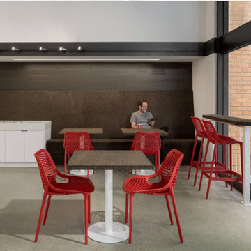
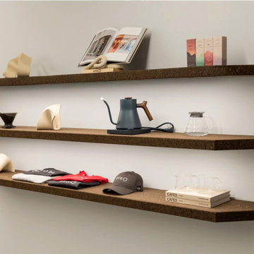
Throughout the space, surfaces customers interact with are clad in chocolate-colored cork, providing a highly textured, tactile contrast to the smooth, white primary materials and complementing the bronze window system, red logos, and customer seating. The unfinished cork is durable and stain-resistant, resilient to the touch, provides acoustic dampening, and is highly sustainable.
The result is a cafe that goes far beyond the project brief, creating a memorable experience and an iconic presence for the brand.
 Lincoln Lighthill Architect
How do you make an impact within a familiar project typology? For our first cafe for Spro Coffee Lab, and their flagship location, we combined a long-held vision of a cafe with a faceted ceiling, their red & white material palette, and the building owner’s desire for an iconic street presence into a unified, minimalist language of angles and facets that extends throughout the cafe.
Overhead, a faceted soffit juts out dramatically over the service bar, the two objects mirroring each other’s footprints and satisfying Health Code requirements for a smooth, cleanable surface overhead. Concealing an egress corridor above that bisects the space, the soffit presents a bold visual gesture through the floor-to-ceiling glass walls of this corner space, beckoning passersby inside.
The service bar points toward the entry, with a minimalist espresso-tap system as the focal point, and angled sections branching off in both directions to create seating and service areas and direct customer flow.
Throughout the space, surfaces customers interact with are clad in chocolate-colored cork, providing a highly textured, tactile contrast to the smooth, white primary materials and complementing the bronze window system, red logos, and customer seating. The unfinished cork is durable and stain-resistant, resilient to the touch, provides acoustic dampening, and is highly sustainable.
The result is a cafe that goes far beyond the project brief, creating a memorable experience and an iconic presence for the brand.
 Lincoln Lighthill Architect
How do you make an impact within a familiar project typology? For our first cafe for Spro Coffee Lab, and their flagship location, we combined a long-held vision of a cafe with a faceted ceiling, their red & white material palette, and the building owner’s desire for an iconic street presence into a unified, minimalist language of angles and facets that extends throughout the cafe.
Overhead, a faceted soffit juts out dramatically over the service bar, the two objects mirroring each other’s footprints and satisfying Health Code requirements for a smooth, cleanable surface overhead. Concealing an egress corridor above that bisects the space, the soffit presents a bold visual gesture through the floor-to-ceiling glass walls of this corner space, beckoning passersby inside.
The service bar points toward the entry, with a minimalist espresso-tap system as the focal point, and angled sections branching off in both directions to create seating and service areas and direct customer flow.
Throughout the space, surfaces customers interact with are clad in chocolate-colored cork, providing a highly textured, tactile contrast to the smooth, white primary materials and complementing the bronze window system, red logos, and customer seating. The unfinished cork is durable and stain-resistant, resilient to the touch, provides acoustic dampening, and is highly sustainable.
The result is a cafe that goes far beyond the project brief, creating a memorable experience and an iconic presence for the brand.

 WalkThru Garage Doors Inc.
Custom colour Fullview WalkThru Garage Door protecting a private automobile collection in Phoenix, Arizona WalkThru Garage Doors Inc.
Garage - mid-sized contemporary attached one-car garage idea in Toronto
Garage - mid-sized contemporary attached one-car garage idea in Toronto

 User
UserPhoto: Ten Ten Creative
Wet bar - transitional single-wall dark wood floor and brown floor wet bar idea in Dallas with shaker cabinets, black cabinets, black backsplash, subway tile backsplash and gray countertops
Wet bar - transitional single-wall dark wood floor and brown floor wet bar idea in Dallas with shaker cabinets, black cabinets, black backsplash, subway tile backsplash and gray countertops
 Lola Cwikowski Studio
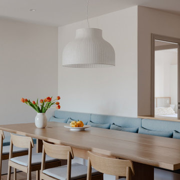
An Ohio family in search of a place to enjoy the Portuguese coast acquired a four-bedroom apartment just outside the center of Cascais. Our studio was engaged to turn a compartmented interior into a holiday residence for a household that gathers in numbers: one that could seat everyone at once and still hold the ease and lightness of a home by the beach.
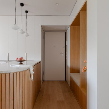
The original plan included a kitchen and laundry room sealed off from the living room, floor finishes and levels that changed from threshold to threshold, and bathrooms in varying styles. Work began by redefining the alignments and circulation. The principal transformation was the opening of the kitchen, creating a more generous social setting centered on a bespoke island fitted with storage and seating.
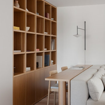
The interior takes its cues from the building’s geometric façade, which projects and recedes in volumes and voids. Bespoke joinery in oak and lacquer carries continuity and order through the apartment. Concealed storage runs throughout: at the entrance, in the dining area, along the living area, and beneath built-in benches. The laundry is merged into the kitchen behind perforated doors for ventilation while keeping the service area discreet. Behind the sofa, a console slips a workspace into the living area without conceding its openness.
Curved elements answer the rectilinear architecture; artisanal glazed vertical tiles repeat from the backsplashes onto custom side tables. The palette stays deliberately narrow; the muted oak and lacquer are joined by a softened timber floor, Portuguese Lioz stone, and walls painted to the color of bare plaster. Existing doors and baseboards were repainted in a warm light gray that draws the original elements into the language of the new interior. Upholstery and decorative accents hint at the terracotta, sky blue, and yellow of the façade.
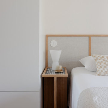
The bedrooms are set with upholstered headboards on oak frames, bedside tables that extend those outlines, and wardrobes fit for a long stay. Locally made rugs, bedcovers, and throw pillows soften the composition. In the bathrooms, the plans were reorganized and the showers enlarged. Lioz was used for the counters and sinks, shelves, shower bases, and bathtub surround, with microcement bringing a soothing warmth to the walls, and storage in floating cabinets. Deeper in tone than the rest of the apartment yet never dim, they are quietly elegant rooms made for lingering — taking one’s time getting ready, or unwinding at the end of a day.
PHOTOGRAPHY: © ALEXANDER BOGORODSKIY

 Floor Specialists of Wellington, Inc.
Example of a mid-sized transitional medium tone wood floor family room design in Miami with gray walls and no tv
 Lola Cwikowski Studio
An Ohio family in search of a place to enjoy the Portuguese coast acquired a four-bedroom apartment just outside the center of Cascais. Our studio was engaged to turn a compartmented interior into a holiday residence for a household that gathers in numbers: one that could seat everyone at once and still hold the ease and lightness of a home by the beach.
The original plan included a kitchen and laundry room sealed off from the living room, floor finishes and levels that changed from threshold to threshold, and bathrooms in varying styles. Work began by redefining the alignments and circulation. The principal transformation was the opening of the kitchen, creating a more generous social setting centered on a bespoke island fitted with storage and seating.
The interior takes its cues from the building’s geometric façade, which projects and recedes in volumes and voids. Bespoke joinery in oak and lacquer carries continuity and order through the apartment. Concealed storage runs throughout: at the entrance, in the dining area, along the living area, and beneath built-in benches. The laundry is merged into the kitchen behind perforated doors for ventilation while keeping the service area discreet. Behind the sofa, a console slips a workspace into the living area without conceding its openness.
Curved elements answer the rectilinear architecture; artisanal glazed vertical tiles repeat from the backsplashes onto custom side tables. The palette stays deliberately narrow; the muted oak and lacquer are joined by a softened timber floor, Portuguese Lioz stone, and walls painted to the color of bare plaster. Existing doors and baseboards were repainted in a warm light gray that draws the original elements into the language of the new interior. Upholstery and decorative accents hint at the terracotta, sky blue, and yellow of the façade.
The bedrooms are set with upholstered headboards on oak frames, bedside tables that extend those outlines, and wardrobes fit for a long stay. Locally made rugs, bedcovers, and throw pillows soften the composition. In the bathrooms, the plans were reorganized and the showers enlarged. Lioz was used for the counters and sinks, shelves, shower bases, and bathtub surround, with microcement bringing a soothing warmth to the walls, and storage in floating cabinets. Deeper in tone than the rest of the apartment yet never dim, they are quietly elegant rooms made for lingering — taking one’s time getting ready, or unwinding at the end of a day.
PHOTOGRAPHY: © ALEXANDER BOGORODSKIY
 Lola Cwikowski Studio
An Ohio family in search of a place to enjoy the Portuguese coast acquired a four-bedroom apartment just outside the center of Cascais. Our studio was engaged to turn a compartmented interior into a holiday residence for a household that gathers in numbers: one that could seat everyone at once and still hold the ease and lightness of a home by the beach.
The original plan included a kitchen and laundry room sealed off from the living room, floor finishes and levels that changed from threshold to threshold, and bathrooms in varying styles. Work began by redefining the alignments and circulation. The principal transformation was the opening of the kitchen, creating a more generous social setting centered on a bespoke island fitted with storage and seating.
The interior takes its cues from the building’s geometric façade, which projects and recedes in volumes and voids. Bespoke joinery in oak and lacquer carries continuity and order through the apartment. Concealed storage runs throughout: at the entrance, in the dining area, along the living area, and beneath built-in benches. The laundry is merged into the kitchen behind perforated doors for ventilation while keeping the service area discreet. Behind the sofa, a console slips a workspace into the living area without conceding its openness.
Curved elements answer the rectilinear architecture; artisanal glazed vertical tiles repeat from the backsplashes onto custom side tables. The palette stays deliberately narrow; the muted oak and lacquer are joined by a softened timber floor, Portuguese Lioz stone, and walls painted to the color of bare plaster. Existing doors and baseboards were repainted in a warm light gray that draws the original elements into the language of the new interior. Upholstery and decorative accents hint at the terracotta, sky blue, and yellow of the façade.
The bedrooms are set with upholstered headboards on oak frames, bedside tables that extend those outlines, and wardrobes fit for a long stay. Locally made rugs, bedcovers, and throw pillows soften the composition. In the bathrooms, the plans were reorganized and the showers enlarged. Lioz was used for the counters and sinks, shelves, shower bases, and bathtub surround, with microcement bringing a soothing warmth to the walls, and storage in floating cabinets. Deeper in tone than the rest of the apartment yet never dim, they are quietly elegant rooms made for lingering — taking one’s time getting ready, or unwinding at the end of a day.
PHOTOGRAPHY: © ALEXANDER BOGORODSKIY
 Lola Cwikowski Studio
An Ohio family in search of a place to enjoy the Portuguese coast acquired a four-bedroom apartment just outside the center of Cascais. Our studio was engaged to turn a compartmented interior into a holiday residence for a household that gathers in numbers: one that could seat everyone at once and still hold the ease and lightness of a home by the beach.
The original plan included a kitchen and laundry room sealed off from the living room, floor finishes and levels that changed from threshold to threshold, and bathrooms in varying styles. Work began by redefining the alignments and circulation. The principal transformation was the opening of the kitchen, creating a more generous social setting centered on a bespoke island fitted with storage and seating.
The interior takes its cues from the building’s geometric façade, which projects and recedes in volumes and voids. Bespoke joinery in oak and lacquer carries continuity and order through the apartment. Concealed storage runs throughout: at the entrance, in the dining area, along the living area, and beneath built-in benches. The laundry is merged into the kitchen behind perforated doors for ventilation while keeping the service area discreet. Behind the sofa, a console slips a workspace into the living area without conceding its openness.
Curved elements answer the rectilinear architecture; artisanal glazed vertical tiles repeat from the backsplashes onto custom side tables. The palette stays deliberately narrow; the muted oak and lacquer are joined by a softened timber floor, Portuguese Lioz stone, and walls painted to the color of bare plaster. Existing doors and baseboards were repainted in a warm light gray that draws the original elements into the language of the new interior. Upholstery and decorative accents hint at the terracotta, sky blue, and yellow of the façade.
The bedrooms are set with upholstered headboards on oak frames, bedside tables that extend those outlines, and wardrobes fit for a long stay. Locally made rugs, bedcovers, and throw pillows soften the composition. In the bathrooms, the plans were reorganized and the showers enlarged. Lioz was used for the counters and sinks, shelves, shower bases, and bathtub surround, with microcement bringing a soothing warmth to the walls, and storage in floating cabinets. Deeper in tone than the rest of the apartment yet never dim, they are quietly elegant rooms made for lingering — taking one’s time getting ready, or unwinding at the end of a day.
PHOTOGRAPHY: © ALEXANDER BOGORODSKIY
 Lola Cwikowski Studio
An Ohio family in search of a place to enjoy the Portuguese coast acquired a four-bedroom apartment just outside the center of Cascais. Our studio was engaged to turn a compartmented interior into a holiday residence for a household that gathers in numbers: one that could seat everyone at once and still hold the ease and lightness of a home by the beach.
The original plan included a kitchen and laundry room sealed off from the living room, floor finishes and levels that changed from threshold to threshold, and bathrooms in varying styles. Work began by redefining the alignments and circulation. The principal transformation was the opening of the kitchen, creating a more generous social setting centered on a bespoke island fitted with storage and seating.
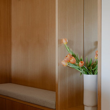
The interior takes its cues from the building’s geometric façade, which projects and recedes in volumes and voids. Bespoke joinery in oak and lacquer carries continuity and order through the apartment. Concealed storage runs throughout: at the entrance, in the dining area, along the living area, and beneath built-in benches. The laundry is merged into the kitchen behind perforated doors for ventilation while keeping the service area discreet. Behind the sofa, a console slips a workspace into the living area without conceding its openness.
Curved elements answer the rectilinear architecture; artisanal glazed vertical tiles repeat from the backsplashes onto custom side tables. The palette stays deliberately narrow; the muted oak and lacquer are joined by a softened timber floor, Portuguese Lioz stone, and walls painted to the color of bare plaster. Existing doors and baseboards were repainted in a warm light gray that draws the original elements into the language of the new interior. Upholstery and decorative accents hint at the terracotta, sky blue, and yellow of the façade.
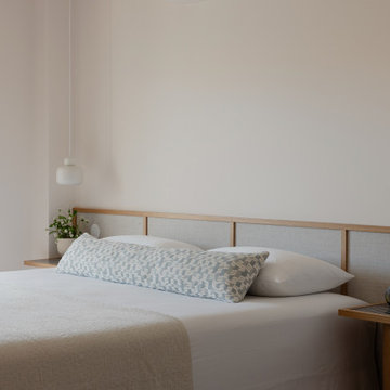
The bedrooms are set with upholstered headboards on oak frames, bedside tables that extend those outlines, and wardrobes fit for a long stay. Locally made rugs, bedcovers, and throw pillows soften the composition. In the bathrooms, the plans were reorganized and the showers enlarged. Lioz was used for the counters and sinks, shelves, shower bases, and bathtub surround, with microcement bringing a soothing warmth to the walls, and storage in floating cabinets. Deeper in tone than the rest of the apartment yet never dim, they are quietly elegant rooms made for lingering — taking one’s time getting ready, or unwinding at the end of a day.
PHOTOGRAPHY: © ALEXANDER BOGORODSKIY
 Lola Cwikowski Studio
An Ohio family in search of a place to enjoy the Portuguese coast acquired a four-bedroom apartment just outside the center of Cascais. Our studio was engaged to turn a compartmented interior into a holiday residence for a household that gathers in numbers: one that could seat everyone at once and still hold the ease and lightness of a home by the beach.
The original plan included a kitchen and laundry room sealed off from the living room, floor finishes and levels that changed from threshold to threshold, and bathrooms in varying styles. Work began by redefining the alignments and circulation. The principal transformation was the opening of the kitchen, creating a more generous social setting centered on a bespoke island fitted with storage and seating.
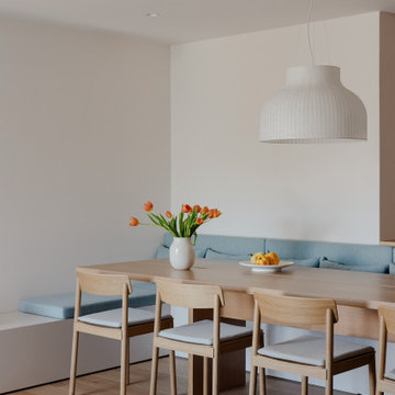
The interior takes its cues from the building’s geometric façade, which projects and recedes in volumes and voids. Bespoke joinery in oak and lacquer carries continuity and order through the apartment. Concealed storage runs throughout: at the entrance, in the dining area, along the living area, and beneath built-in benches. The laundry is merged into the kitchen behind perforated doors for ventilation while keeping the service area discreet. Behind the sofa, a console slips a workspace into the living area without conceding its openness.
Curved elements answer the rectilinear architecture; artisanal glazed vertical tiles repeat from the backsplashes onto custom side tables. The palette stays deliberately narrow; the muted oak and lacquer are joined by a softened timber floor, Portuguese Lioz stone, and walls painted to the color of bare plaster. Existing doors and baseboards were repainted in a warm light gray that draws the original elements into the language of the new interior. Upholstery and decorative accents hint at the terracotta, sky blue, and yellow of the façade.
The bedrooms are set with upholstered headboards on oak frames, bedside tables that extend those outlines, and wardrobes fit for a long stay. Locally made rugs, bedcovers, and throw pillows soften the composition. In the bathrooms, the plans were reorganized and the showers enlarged. Lioz was used for the counters and sinks, shelves, shower bases, and bathtub surround, with microcement bringing a soothing warmth to the walls, and storage in floating cabinets. Deeper in tone than the rest of the apartment yet never dim, they are quietly elegant rooms made for lingering — taking one’s time getting ready, or unwinding at the end of a day.
PHOTOGRAPHY: © ALEXANDER BOGORODSKIY
 Lola Cwikowski Studio
An Ohio family in search of a place to enjoy the Portuguese coast acquired a four-bedroom apartment just outside the center of Cascais. Our studio was engaged to turn a compartmented interior into a holiday residence for a household that gathers in numbers: one that could seat everyone at once and still hold the ease and lightness of a home by the beach.
The original plan included a kitchen and laundry room sealed off from the living room, floor finishes and levels that changed from threshold to threshold, and bathrooms in varying styles. Work began by redefining the alignments and circulation. The principal transformation was the opening of the kitchen, creating a more generous social setting centered on a bespoke island fitted with storage and seating.
The interior takes its cues from the building’s geometric façade, which projects and recedes in volumes and voids. Bespoke joinery in oak and lacquer carries continuity and order through the apartment. Concealed storage runs throughout: at the entrance, in the dining area, along the living area, and beneath built-in benches. The laundry is merged into the kitchen behind perforated doors for ventilation while keeping the service area discreet. Behind the sofa, a console slips a workspace into the living area without conceding its openness.
Curved elements answer the rectilinear architecture; artisanal glazed vertical tiles repeat from the backsplashes onto custom side tables. The palette stays deliberately narrow; the muted oak and lacquer are joined by a softened timber floor, Portuguese Lioz stone, and walls painted to the color of bare plaster. Existing doors and baseboards were repainted in a warm light gray that draws the original elements into the language of the new interior. Upholstery and decorative accents hint at the terracotta, sky blue, and yellow of the façade.
The bedrooms are set with upholstered headboards on oak frames, bedside tables that extend those outlines, and wardrobes fit for a long stay. Locally made rugs, bedcovers, and throw pillows soften the composition. In the bathrooms, the plans were reorganized and the showers enlarged. Lioz was used for the counters and sinks, shelves, shower bases, and bathtub surround, with microcement bringing a soothing warmth to the walls, and storage in floating cabinets. Deeper in tone than the rest of the apartment yet never dim, they are quietly elegant rooms made for lingering — taking one’s time getting ready, or unwinding at the end of a day.
PHOTOGRAPHY: © ALEXANDER BOGORODSKIY
1