
Search results for "Brings" in Home Design Ideas
 Shelter Interiors LLC
Sequined Asphault Studio
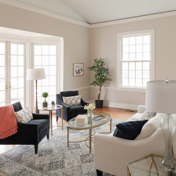
Example of a mid-sized transitional formal and enclosed light wood floor living room design in Bridgeport with white walls
Example of a mid-sized transitional formal and enclosed light wood floor living room design in Bridgeport with white walls
 ZeroEnergy Design
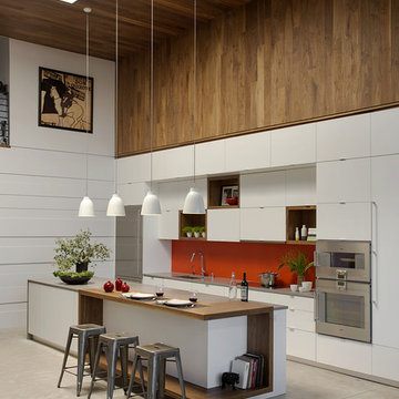
Modern family loft renovation. A young couple starting a family in the city purchased this two story loft in Boston's South End. Built in the 1990's, the loft was ready for updates. ZED transformed the space, creating a fresh new look and greatly increasing its functionality to accommodate an expanding family within an urban setting. Improvement were made to the aesthetics, scale, and functionality for the growing family to enjoy.
Photos by Eric Roth.
Construction by Ralph S. Osmond Company.
Green architecture by ZeroEnergy Design.

Find the right local pro for your project
 Hoskins Interior Design
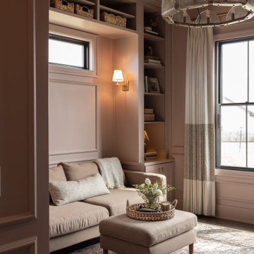
Color drench, Pink Office, Salmon Office, Moody Office, Sleeper Sofa Guest Bedroom Office Combination, Color Block Drapery, Built-ins around Sofa
Inspiration for a transitional living room remodel in Indianapolis
Inspiration for a transitional living room remodel in Indianapolis
 kelly mcguill home
Photo Credit: Tamara Flanagan
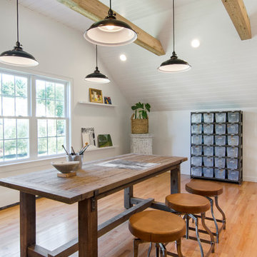
Example of a large country freestanding desk medium tone wood floor home studio design in Boston with white walls
Example of a large country freestanding desk medium tone wood floor home studio design in Boston with white walls
 Closed
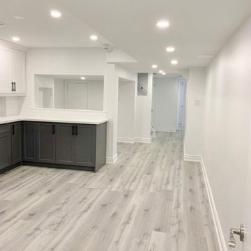
We really enjoyed consulting and designing this basement project design and I’m very pleased with how it turned out! We did a complimenting color scheme between the wall and base cabinets by using a grey for the base and white for the wall. We did black handle pulls for all the cabinets to bring the two colors together. We went with a white oak style for the floor to really bring the light through the entire basement. This helps carry the light through the space which is always a good idea when you don’t have many windows to play with. For the backsplash we chose a glossy textured/wavy subway tile to add some depth and texture to the kitchens character.I really enjoyed consulting this basement project design and I’m very pleased with how it turned out! We did a complimenting color scheme between the wall and base cabinets by using a grey for the base and white for the wall. We did black handle pulls for all the cabinets to bring the two colors together. We went with a white oak style for the floor to really bring the light through the entire basement. This helps carry the light through the space which is always a good idea when you don’t have many windows to play with. For the backsplash we chose a glossy textured/wavy subway tile to add some depth and texture to the kitchens character.I really enjoyed consulting this basement project design and I’m very pleased with how it turned out! We did a complimenting color scheme between the wall and base cabinets by using a grey for the base and white for the wall. We did black handle pulls for all the cabinets to bring the two colors together. We went with a white oak style for the floor to really bring the light through the entire basement. This helps carry the light through the space which is always a good idea when you don’t have many windows to play with. For the backsplash we chose a glossy textured/wavy subway tile to add some depth and texture to the kitchens character.I really enjoyed consulting this basement project design and I’m very pleased with how it turned out! We did a complimenting color scheme between the wall and base cabinets by using a grey for the base and white for the wall. We did black handle pulls for all the cabinets to bring the two colors together. We went with a white oak style for the floor to really bring the light through the entire basement. This helps carry the light through the space which is always a good idea when you don’t have many windows to play with. For the backsplash we chose a glossy textured/wavy subway tile to add some depth and texture to the kitchens character.

Sponsored
Columbus, OH

Wannemacher Interiors
Customized Award-Winning Interior Design Solutions in Franklin Cnty OH
 Knapp Kitchens, Inc.
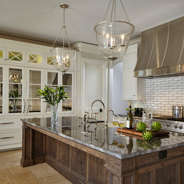
Elegant kitchen photo in Chicago with recessed-panel cabinets, white cabinets, white backsplash, subway tile backsplash, stainless steel appliances and an island
 SEN Creative
Photo: Lauren Andersen © 2017 Houzz
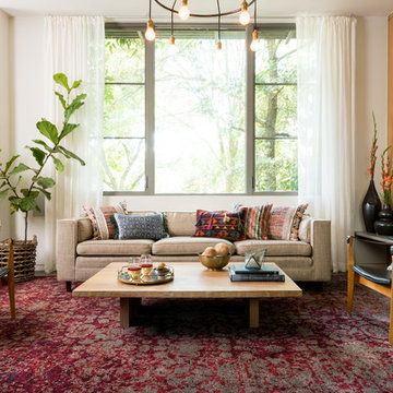
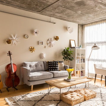
Living room - industrial medium tone wood floor and brown floor living room idea in San Francisco with beige walls
Living room - industrial medium tone wood floor and brown floor living room idea in San Francisco with beige walls
 Lauren Nelson Design
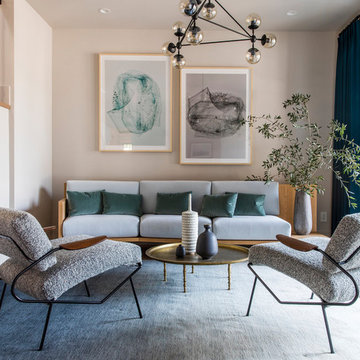
Trendy medium tone wood floor and brown floor living room photo in San Francisco with pink walls

 FineLine Kitchens, Inc.
Hi everyone, I'm Sarah and Ogun we are here with fine line kitchens. So we are a couple working together. I do the interior design and remodeling of the space material selection meeting with the clients. And I handled operations outside, you know meaning all the construction work that is taking place the inside. The houses that we work in. I handle all the aspects of the construction, so today's project is very special. We're in Vienna and the client had a very big family. It's a family of seven that lives here. So we had a few aspects that we needed to keep in mind while designing this one. Having everybody be able to sit on the island. So we wanted plenty of seating all the way around. We didn't want anybody standing or anything like that. So what we did is we maximize the space. The center island is the biggest part of the kitchen. We use a natural stone to kind of give it a beautiful texture versus quartz. It's kind of standard white or kind of fabricated, so I wanted something very natural. We did this because I took my inspiration from the outside, so the inspiration if you look at the view right in front of me is there are so many greens there's a lot of brass accents and I wanted to bring this. Into this kitchen while designing it for my clients. She is very warm very. She wanted a very homey, comfy kind of look for the kitchen. So that's what we did today. As you can see, the cabinets are sage green, very light, so I still think it's a neutral, but it's a lighter color that again brings the outside in and we combine that with the oak right behind me so it's a slightly warm oak. It's not very dark. It's not very light. It's a medium brown and the same color went on the island. To kind of tie these two in and the backsplash, my favorite part is where you can see a little bit of design. It is, in my opinion still classic, but includes a pattern so the outside part is as we said in the beginning, is handled by my husband. I'd like him to speak a little bit about that. Thanks, Sarah, I want to talk to you guys a little bit about the construction part of this project. Originally this kitchen was located mostly in this area. They had their stove there sing. It was more of a peninsula layout in Sarah's and the customer vision they wanted. They wanted to get rid of the peninsula and they want to be able to have a huge island that can at least sit seven people because they're familiar with seven. So we wanted to make sure that we can achieve this design and bring it to life so that they can be happy with this layout. Some of the challenges we had, the house, the home being, you know, old home. There were a lot of you know the older electrical and plumbing that had to be replaced. We had to relocate the stove from here to this area. Over here we had put a nice foot fan that we had to relocate all the ductwork and the plumbing. Was being on the peninsula area. We had to relocate it to the center islands. So we achieved all this and kind of like bring it to bring in this kitchen up to date it looks beautiful. That's true, so yes, the old layout did not function for my clients because everything was kind of gathered on one side of the kitchen. So there was like a peninsula right there. So the end of this island kind of continued straight. And that was just the L shape. Kind of where everything was and there used to be another big table here, so they were using only kind of half of the space. So like I said at the beginning, our vision was to kind of feed everybody at the island, create some symmetry. 'cause I love that. So as you can see behind me, this is kind of the focal point symmetrical. Everything is kind of even we wanted to also panel the fridge here so it mimics the pantry and another size. So when you're looking at it, it is bringing again that symmetry back again. I hope you enjoyed this kitchen and this video and I'll see you soon. So how do you think this project turned out? It's nice. I like the color. I think it turned out nice. It's kind of like a little bit different color than what we always do. So I realize. Are you giving me a little bit of credit here that I did something different? Are you proud? I'm so proud of you. Other than that I like it. That they have kind of like a two sink. So if this was our kitchen, if we ever like you can have your own. I can have mine if we ever get into a fight then this can be like my own kitchen. Why are we gonna bring in a fight right now? So I'm cooking anyway. You're grilling most of the time, So what are you even talking about? My kitchen? That's my kitchen. You can just take the small sink. That's fine. It's always good to have your own space right there, so anyways. Thank you guys for watching. We hope to see you soon and if you have any questions please click the link below. It'll lead you to our website, house, YouTube and all of the social media is so nice to have you guys. We'll see you soon. Thanks bye bye-bye.
 FineLine Kitchens, Inc.
Hi everyone, I'm Sarah and Ogun we are here with fine line kitchens. So we are a couple working together. I do the interior design and remodeling of the space material selection meeting with the clients. And I handled operations outside, you know meaning all the construction work that is taking place the inside. The houses that we work in. I handle all the aspects of the construction, so today's project is very special. We're in Vienna and the client had a very big family. It's a family of seven that lives here. So we had a few aspects that we needed to keep in mind while designing this one. Having everybody be able to sit on the island. So we wanted plenty of seating all the way around. We didn't want anybody standing or anything like that. So what we did is we maximize the space. The center island is the biggest part of the kitchen. We use a natural stone to kind of give it a beautiful texture versus quartz. It's kind of standard white or kind of fabricated, so I wanted something very natural. We did this because I took my inspiration from the outside, so the inspiration if you look at the view right in front of me is there are so many greens there's a lot of brass accents and I wanted to bring this. Into this kitchen while designing it for my clients. She is very warm very. She wanted a very homey, comfy kind of look for the kitchen. So that's what we did today. As you can see, the cabinets are sage green, very light, so I still think it's a neutral, but it's a lighter color that again brings the outside in and we combine that with the oak right behind me so it's a slightly warm oak. It's not very dark. It's not very light. It's a medium brown and the same color went on the island. To kind of tie these two in and the backsplash, my favorite part is where you can see a little bit of design. It is, in my opinion still classic, but includes a pattern so the outside part is as we said in the beginning, is handled by my husband. I'd like him to speak a little bit about that. Thanks, Sarah, I want to talk to you guys a little bit about the construction part of this project. Originally this kitchen was located mostly in this area. They had their stove there sing. It was more of a peninsula layout in Sarah's and the customer vision they wanted. They wanted to get rid of the peninsula and they want to be able to have a huge island that can at least sit seven people because they're familiar with seven. So we wanted to make sure that we can achieve this design and bring it to life so that they can be happy with this layout. Some of the challenges we had, the house, the home being, you know, old home. There were a lot of you know the older electrical and plumbing that had to be replaced. We had to relocate the stove from here to this area. Over here we had put a nice foot fan that we had to relocate all the ductwork and the plumbing. Was being on the peninsula area. We had to relocate it to the center islands. So we achieved all this and kind of like bring it to bring in this kitchen up to date it looks beautiful. That's true, so yes, the old layout did not function for my clients because everything was kind of gathered on one side of the kitchen. So there was like a peninsula right there. So the end of this island kind of continued straight. And that was just the L shape. Kind of where everything was and there used to be another big table here, so they were using only kind of half of the space. So like I said at the beginning, our vision was to kind of feed everybody at the island, create some symmetry. 'cause I love that. So as you can see behind me, this is kind of the focal point symmetrical. Everything is kind of even we wanted to also panel the fridge here so it mimics the pantry and another size. So when you're looking at it, it is bringing again that symmetry back again. I hope you enjoyed this kitchen and this video and I'll see you soon. So how do you think this project turned out? It's nice. I like the color. I think it turned out nice. It's kind of like a little bit different color than what we always do. So I realize. Are you giving me a little bit of credit here that I did something different? Are you proud? I'm so proud of you. Other than that I like it. That they have kind of like a two sink. So if this was our kitchen, if we ever like you can have your own. I can have mine if we ever get into a fight then this can be like my own kitchen. Why are we gonna bring in a fight right now? So I'm cooking anyway. You're grilling most of the time, So what are you even talking about? My kitchen? That's my kitchen. You can just take the small sink. That's fine. It's always good to have your own space right there, so anyways. Thank you guys for watching. We hope to see you soon and if you have any questions please click the link below. It'll lead you to our website, house, YouTube and all of the social media is so nice to have you guys. We'll see you soon. Thanks bye bye-bye.
 Studio Revolution
Designed by: Studio Revolution
Photography by: Thomas Kuoh
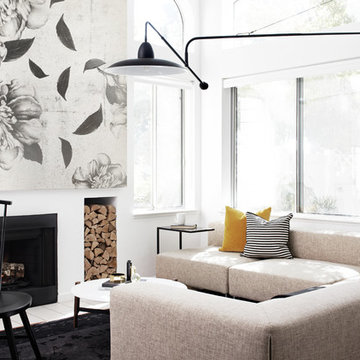
Inspiration for a scandinavian living room remodel in San Francisco with white walls
Inspiration for a scandinavian living room remodel in San Francisco with white walls

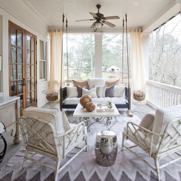
 Lindsey Hene
Christina Wedge
Inspiration for a large timeless back porch remodel in Atlanta with decking and a roof extension
Inspiration for a large timeless back porch remodel in Atlanta with decking and a roof extension
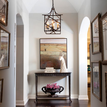
 Burnham Design
Inspiration for a transitional dark wood floor hallway remodel in Los Angeles with white walls
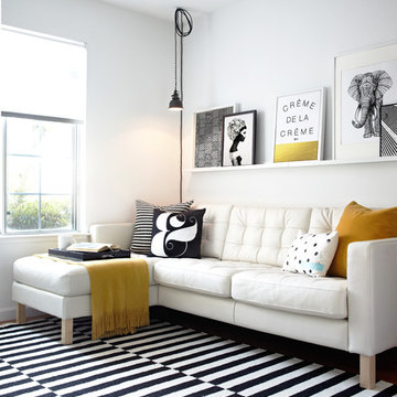 Studio Revolution
Designed by: Studio Revolution
Photography by: Thomas Kuoh
Family room - scandinavian carpeted family room idea in San Francisco with white walls
Family room - scandinavian carpeted family room idea in San Francisco with white walls
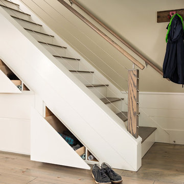
 b Architecture Studio
Dan Cutrona
Mid-sized beach style wooden straight cable railing staircase photo in Boston with painted risers
Mid-sized beach style wooden straight cable railing staircase photo in Boston with painted risers
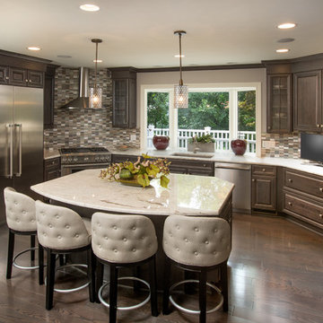

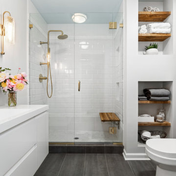
 360º Design, Valhalla, NY
An extreme renovation makeover for my clients teenagers bathroom. We expanded the footprint and upgraded all facets of the existing space. We selected a more mature, sophisticated, spa like vibe that fit her likes and needs, while maintaining a modern, subdued palette that was calming + inviting and showcased the sculptural elements in the room. There really was nowhere but up to go in this space.
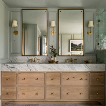

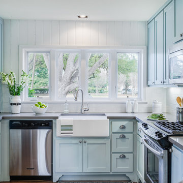
 J. Bryant Boyd, Design-Build
Elegant u-shaped kitchen photo in Austin with a farmhouse sink, shaker cabinets, blue cabinets, stainless steel appliances, no island, white backsplash, subway tile backsplash and solid surface countertops
1