
Search results for "Care fails" in Home Design Ideas
 SUPERIOR CHIMNEY SERVICES CORPORATION
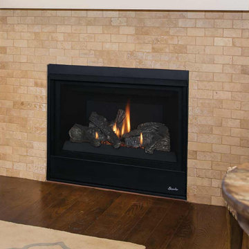
Is it necessary to clean gas fireplace? It’s intuitive that the dark black buildup of combustion needs to be cleaned from a typical wood burning fireplace, but is it needed to clean a gas fireplace? It’s gas…right? Gas fireplaces do not have a visible buildup of combustion, but should be cleaned at least once a year to prevent serious problems with the fireplace.
Gas vs. Wood Burning Fireplaces
When thinking of the inside of a family home, we think about the most comfortable room: the living room or family room. This is where the family meets, watches movies, and plays board games during rainy days, evenings and family time. It usually has a lofty, cozy couch and a wood burning fireplace. Nothing’s more comforting than falling asleep to the dim light of the fireplace and faint smell of burning wood. Nowadays, we have a close alternative to this old fashioned comfort: the gas fireplace. Gas fireplaces don’t leave much creosote behind, however gas fireplaces should be cleaned once a year, per the CSIA, due to dust, pet hair, insects, and other debris that can build up and cause performance problems. Chimney sweep are primarily for firewall worthiness assurance, cleaning and obstruction free assurance.
Gas fireplaces look similar to wood burning fireplaces, with a live flame. The logs inside the gas fireplace look real, but are not actually burning. Oftentimes, they are made of ceramic. A gas fireplace produces much less heat than a wood burning fireplace, but can retain more heat inside your home based on its type and configuration. Gas fireplaces can be low maintenance and energy friendly alternatives to a wood burning fireplace.
Some Signs to Clean Gas Fireplace
1. Buildup: Although gas fireplaces do not produce as much visible flammable and hazardous buildup, it does produce some corrosive substances and flue gasses that may settle inside your home without you knowing. Burning natural gas leaves a residue that must be cleaned annually. Failing to clean the residue may cause health risks if left untouched.
2. Technical Issues: There may be technical problems that are not visible, such as issues with the burner. Gas fireplaces are usually built to last long term but it’s imperative to check if there are any unnoticed technical issues at least once a year.
3. Gas Leaks: Over time, valves and pipes turn weaker and become corroded. It’s important to inspect these valves, as a gas leak is extremely hazardous. A certified chimney specialist must inspect and determine any damage or future damage to prevent this serious problem.
4. Condensation: Due to the high temperatures in the flue, there’s a buildup of condensation when the fireplace vapors are cooled. Natural gas exhaust also contains a high content of water vapor in emissions. The condensation reacts with byproducts and is acidic and corrosive, and must be cleaned at least once a year to not pose a potential health hazard.
It’s just as important to clean a gas fireplace at least once a year to prevent long term issues that could pose health risks if not cared for. A certified chimney professional from Superior Chimney will inspect and sweep the fireplace and ventilation system.
Contact us today to clean gas fireplace at 877-244-6349.
 Drury Design
THE SETUP
The original primary bathroom was characterized by a disjointed and segmented layout. The shower featured a bulky glass-block enclosure that overwhelmed the space visually. There was a considerable amount of open, unused space, and despite having a his and hers vanity, the arrangement lacked personal space for each user, as they shared the conjoined space between the sinks. The toilet was inconveniently located right by the door, with a half-wall partition meant to provide privacy but instead contributing to a cramped and unbalanced feel. Overall, the bathroom’s layout and design were fragmented, failing to make the most of the available space and lacking adequate storage solutions.
Design objectives:
- Reconfigure the layout to enhance functionality and flow.
- Create an elegant, upscale aesthetic that is light and bright.
- Incorporate specialized storage solutions for female hair care needs.
- Increase overall storage capacity.
- Develop a spa-like shower experience.
- Provide a significant wow factor to the space.
THE REMODEL
Design challenges to be solved:
- Repositioning the toilet to a more suitable location.
- Designing hair care storage solutions without cluttering the elegant space.
- Balancing an upscale, elegant design with a feminine touch in the color palette.
- Increasing the brightness of the room without adding windows.
- Completely replacing the existing shower to create a spa-like experience.
- Planning new storage solutions without adding bulkiness or clutter to the cabinetry.
THE RENEWED SPACE
Design solutions:
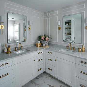
Toilet Relocation: Moved the toilet by the window, creating a better overall layout that also opened up two full walls for cabinetry and storage solutions.
Specialized Vanity Storage: The left side of the left vanity is the wife’s. Open shelves facing across the vanity can be used for decorative or daily needs items. Pull-out docking drawers with power outlets and metal basins handle hot hair appliances.
Bright and Elegant Color Scheme: White cabinets, countertops, floors, and shower walls keep the space bright. The just-off-white wall color with a hint of pink adds a feminine touch. Thin wainscoting with white trim offers traditional-leaning elegance.
Layered Lighting Strategy: Ceiling can lights, sconces, lighted mirrors, and toe-kick lighting were installed. Natural light-rated bulbs keep the space bright and natural-feeling.
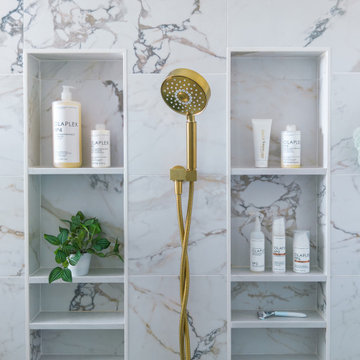
Spa-Like Shower: An extra-large shower was created using the same floor tile materials for continuity. Equipped with a Kohler Anthem system with a shower head, hand-held, and four body sprays. His and Hers niches for separate body care product storage.
Enhanced Storage Solutions: Added a linen cabinet within the vanity area for efficient storage of towels and bathroom essentials.
This elegant bathroom feels incredibly spacious now. The color palette and lights keep the room bright and cheery. Gold fixtures, the herringbone pattern on the floor, and exquisite trim work add an elegant touch. With the husband and wife having their own vanity wall sections joined at the corner, each user truly has their own space within the space. The clients are very happy with the final result.
 Design Group Three
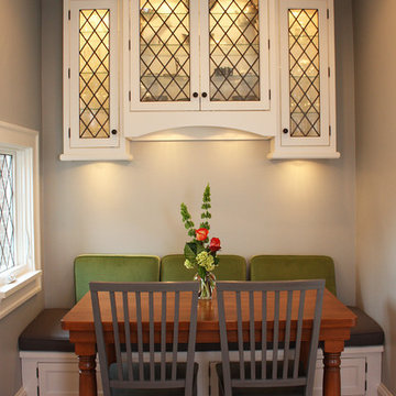
The 1990’s renovation of this kitchen failed to capture the home’s original character and architectural style. Major structural and mechanical changes, including the complete removal of a load-bearing wall, opened design solutions to improve function and sight lines within the first floor. An abandoned space hidden by the previous renovation was restored to create an intimate seating area.
The kitchen was completely rearranged, redesigned, and dramatically furnished to achieve ideal form, flow, and function. Architectural details were carefully duplicated throughout. Greenfield brand cabinetry, creative lighting, and natural stone countertops are just a few of the details that complement the home’s original character.
Find the right local pro for your project
 Design Group Three
The 1990’s renovation of this kitchen failed to capture the home’s original character and architectural style. Major structural and mechanical changes, including the complete removal of a load-bearing wall, opened design solutions to improve function and sight lines within the first floor. An abandoned space hidden by the previous renovation was restored to create an intimate seating area.
The kitchen was completely rearranged, redesigned, and dramatically furnished to achieve ideal form, flow, and function. Architectural details were carefully duplicated throughout. Greenfield brand cabinetry, creative lighting, and natural stone countertops are just a few of the details that complement the home’s original character.
 Drury Design
THE SETUP
The original primary bathroom was characterized by a disjointed and segmented layout. The shower featured a bulky glass-block enclosure that overwhelmed the space visually. There was a considerable amount of open, unused space, and despite having a his and hers vanity, the arrangement lacked personal space for each user, as they shared the conjoined space between the sinks. The toilet was inconveniently located right by the door, with a half-wall partition meant to provide privacy but instead contributing to a cramped and unbalanced feel. Overall, the bathroom’s layout and design were fragmented, failing to make the most of the available space and lacking adequate storage solutions.
Design objectives:
- Reconfigure the layout to enhance functionality and flow.
- Create an elegant, upscale aesthetic that is light and bright.
- Incorporate specialized storage solutions for female hair care needs.
- Increase overall storage capacity.
- Develop a spa-like shower experience.
- Provide a significant wow factor to the space.
THE REMODEL
Design challenges to be solved:
- Repositioning the toilet to a more suitable location.
- Designing hair care storage solutions without cluttering the elegant space.
- Balancing an upscale, elegant design with a feminine touch in the color palette.
- Increasing the brightness of the room without adding windows.
- Completely replacing the existing shower to create a spa-like experience.
- Planning new storage solutions without adding bulkiness or clutter to the cabinetry.
THE RENEWED SPACE
Design solutions:
Toilet Relocation: Moved the toilet by the window, creating a better overall layout that also opened up two full walls for cabinetry and storage solutions.
Specialized Vanity Storage: The left side of the left vanity is the wife’s. Open shelves facing across the vanity can be used for decorative or daily needs items. Pull-out docking drawers with power outlets and metal basins handle hot hair appliances.
Bright and Elegant Color Scheme: White cabinets, countertops, floors, and shower walls keep the space bright. The just-off-white wall color with a hint of pink adds a feminine touch. Thin wainscoting with white trim offers traditional-leaning elegance.
Layered Lighting Strategy: Ceiling can lights, sconces, lighted mirrors, and toe-kick lighting were installed. Natural light-rated bulbs keep the space bright and natural-feeling.
Spa-Like Shower: An extra-large shower was created using the same floor tile materials for continuity. Equipped with a Kohler Anthem system with a shower head, hand-held, and four body sprays. His and Hers niches for separate body care product storage.
Enhanced Storage Solutions: Added a linen cabinet within the vanity area for efficient storage of towels and bathroom essentials.
This elegant bathroom feels incredibly spacious now. The color palette and lights keep the room bright and cheery. Gold fixtures, the herringbone pattern on the floor, and exquisite trim work add an elegant touch. With the husband and wife having their own vanity wall sections joined at the corner, each user truly has their own space within the space. The clients are very happy with the final result.
 Craft Homes Northwest
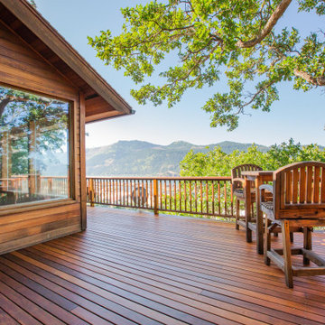
This home is remarkable in many ways. It features a simple but unique design that maximizes the site and breathtaking views. The home was originally built by a family who owned a local mill and who had choice selection of the wood used in its construction. We were brought in to restore the integrity of the 40-year-old deck, ensuring the new one preserved the precise aesthetic of the original.
The upper level features a cantilevered deck that wraps around the house without obscuring the view from the windows below. The structure of the deck was constructed of abnormally large rough-sawn fir joists milled to custom specifications. The joists run through the entire floor framing of the home and extend out as deck joists. Since the deck joists were so integral to the framing, preservation of the integrity of this structure was paramount.
The original cedar deck boards were failing, but the beautiful fir joists were well-preserved and could be fortified. After demoing the existing deck, we carefully removed all signs of dry rot, then tested the integrity of the fir joists. To ensure the longevity of the new deck, we added joists as needed to improve rigidity and weather-sealed the tops of each one with joist tape and metal flashing.
For the new decking, we decided on a very strong and durable solution, IPE wood, which we had milled to custom specifications to match the original boards. Working with this extremely hard wood has its challenges, but it was by far the best choice for this project.
We honored the design of the original railing by crafting a near replica. Admittedly, we tweaked a few dimensions, enhanced details of the assembly and added a few custom accents.
 Design Group Three
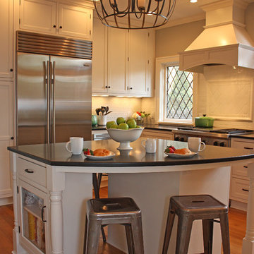
The 1990’s renovation of this kitchen failed to capture the home’s original character and architectural style. Major structural and mechanical changes, including the complete removal of a load-bearing wall, opened design solutions to improve function and sight lines within the first floor. An abandoned space hidden by the previous renovation was restored to create an intimate seating area.
The kitchen was completely rearranged, redesigned, and dramatically furnished to achieve ideal form, flow, and function. Architectural details were carefully duplicated throughout. Greenfield brand cabinetry, creative lighting, and natural stone countertops are just a few of the details that complement the home’s original character.
 Appalachian Air Care LLC
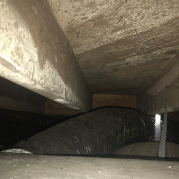
Bad mold growth on the crawlspace joists & girders and no vapor barrier caused this home to fail home inspections. Check out the before & After pics to see what we did to pass the inspections
 Craft Homes Northwest
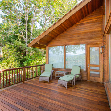
This home is remarkable in many ways. It features a simple but unique design that maximizes the site and breathtaking views. The home was originally built by a family who owned a local mill and who had choice selection of the wood used in its construction. We were brought in to restore the integrity of the 40-year-old deck, ensuring the new one preserved the precise aesthetic of the original.
The upper level features a cantilevered deck that wraps around the house without obscuring the view from the windows below. The structure of the deck was constructed of abnormally large rough-sawn fir joists milled to custom specifications. The joists run through the entire floor framing of the home and extend out as deck joists. Since the deck joists were so integral to the framing, preservation of the integrity of this structure was paramount.
The original cedar deck boards were failing, but the beautiful fir joists were well-preserved and could be fortified. After demoing the existing deck, we carefully removed all signs of dry rot, then tested the integrity of the fir joists. To ensure the longevity of the new deck, we added joists as needed to improve rigidity and weather-sealed the tops of each one with joist tape and metal flashing.
For the new decking, we decided on a very strong and durable solution, IPE wood, which we had milled to custom specifications to match the original boards. Working with this extremely hard wood has its challenges, but it was by far the best choice for this project.
We honored the design of the original railing by crafting a near replica. Admittedly, we tweaked a few dimensions, enhanced details of the assembly and added a few custom accents.
 Drury Design
THE SETUP
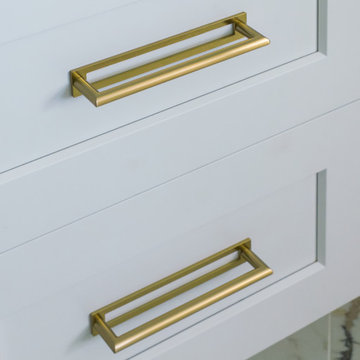
The original primary bathroom was characterized by a disjointed and segmented layout. The shower featured a bulky glass-block enclosure that overwhelmed the space visually. There was a considerable amount of open, unused space, and despite having a his and hers vanity, the arrangement lacked personal space for each user, as they shared the conjoined space between the sinks. The toilet was inconveniently located right by the door, with a half-wall partition meant to provide privacy but instead contributing to a cramped and unbalanced feel. Overall, the bathroom’s layout and design were fragmented, failing to make the most of the available space and lacking adequate storage solutions.
Design objectives:
- Reconfigure the layout to enhance functionality and flow.
- Create an elegant, upscale aesthetic that is light and bright.
- Incorporate specialized storage solutions for female hair care needs.
- Increase overall storage capacity.
- Develop a spa-like shower experience.
- Provide a significant wow factor to the space.
THE REMODEL
Design challenges to be solved:
- Repositioning the toilet to a more suitable location.
- Designing hair care storage solutions without cluttering the elegant space.
- Balancing an upscale, elegant design with a feminine touch in the color palette.
- Increasing the brightness of the room without adding windows.
- Completely replacing the existing shower to create a spa-like experience.
- Planning new storage solutions without adding bulkiness or clutter to the cabinetry.
THE RENEWED SPACE
Design solutions:
Toilet Relocation: Moved the toilet by the window, creating a better overall layout that also opened up two full walls for cabinetry and storage solutions.
Specialized Vanity Storage: The left side of the left vanity is the wife’s. Open shelves facing across the vanity can be used for decorative or daily needs items. Pull-out docking drawers with power outlets and metal basins handle hot hair appliances.
Bright and Elegant Color Scheme: White cabinets, countertops, floors, and shower walls keep the space bright. The just-off-white wall color with a hint of pink adds a feminine touch. Thin wainscoting with white trim offers traditional-leaning elegance.
Layered Lighting Strategy: Ceiling can lights, sconces, lighted mirrors, and toe-kick lighting were installed. Natural light-rated bulbs keep the space bright and natural-feeling.
Spa-Like Shower: An extra-large shower was created using the same floor tile materials for continuity. Equipped with a Kohler Anthem system with a shower head, hand-held, and four body sprays. His and Hers niches for separate body care product storage.
Enhanced Storage Solutions: Added a linen cabinet within the vanity area for efficient storage of towels and bathroom essentials.
This elegant bathroom feels incredibly spacious now. The color palette and lights keep the room bright and cheery. Gold fixtures, the herringbone pattern on the floor, and exquisite trim work add an elegant touch. With the husband and wife having their own vanity wall sections joined at the corner, each user truly has their own space within the space. The clients are very happy with the final result.
 Design Group Three
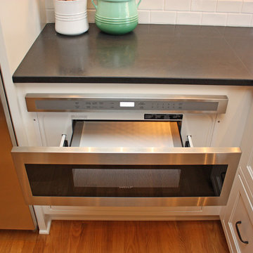
The 1990’s renovation of this kitchen failed to capture the home’s original character and architectural style. Major structural and mechanical changes, including the complete removal of a load-bearing wall, opened design solutions to improve function and sight lines within the first floor. An abandoned space hidden by the previous renovation was restored to create an intimate seating area.
The kitchen was completely rearranged, redesigned, and dramatically furnished to achieve ideal form, flow, and function. Architectural details were carefully duplicated throughout. Greenfield brand cabinetry, creative lighting, and natural stone countertops are just a few of the details that complement the home’s original character.

 Medieval Restaurant Equipment
Starting a new restaurant can be expensive. There are many things you need to get for your kitchen. First there is all the restaurant equipment, appliances and supplies too. It is a lot that you need for your kitchen to be fully functional. Likewise, when you buy any equipment, you need to make sure it is from the best quality. After all, what you want is to give an excellent service and food to your consumers. That is the reason why we want to inform you all about the best places to find restaurant equipment in Chicago.
Once you have completed all business formalities in Chicago, the next thing to take care of is purchasing the kitchen equipment. In order to do this the right way, it’s important for you to know where to find the best kitchen equipment. Here, we’ll show when you can find these places, and how you know they are from the best quality.
Resale Stores
the best places to find
Of course, almost everyone wants state-of-the-art kitchen equipment. People are used to think that only new equipment works at it best. Then, why bother to buy second-handed one? Well, let us tell you that used kitchen equipment can work as a new one, if you know where to look at. In this matter, resale stores are a good option. These items are usually used equipment for restaurant that was donated by restaurants and hotels. Do not think that because these are used, they don’t work well. You just need to go to resale stores that have accreditation and good reviews. Plus, these places usually have used restaurant equipment in Chicago Illinois. So, you will know when to take any of your equipment in case something starts failing (which will eventually happen, with new and used equipment).
 Drury Design
THE SETUP
The original primary bathroom was characterized by a disjointed and segmented layout. The shower featured a bulky glass-block enclosure that overwhelmed the space visually. There was a considerable amount of open, unused space, and despite having a his and hers vanity, the arrangement lacked personal space for each user, as they shared the conjoined space between the sinks. The toilet was inconveniently located right by the door, with a half-wall partition meant to provide privacy but instead contributing to a cramped and unbalanced feel. Overall, the bathroom’s layout and design were fragmented, failing to make the most of the available space and lacking adequate storage solutions.
Design objectives:
- Reconfigure the layout to enhance functionality and flow.
- Create an elegant, upscale aesthetic that is light and bright.
- Incorporate specialized storage solutions for female hair care needs.
- Increase overall storage capacity.
- Develop a spa-like shower experience.
- Provide a significant wow factor to the space.
THE REMODEL
Design challenges to be solved:
- Repositioning the toilet to a more suitable location.
- Designing hair care storage solutions without cluttering the elegant space.
- Balancing an upscale, elegant design with a feminine touch in the color palette.
- Increasing the brightness of the room without adding windows.
- Completely replacing the existing shower to create a spa-like experience.
- Planning new storage solutions without adding bulkiness or clutter to the cabinetry.
THE RENEWED SPACE
Design solutions:
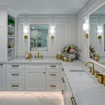
Toilet Relocation: Moved the toilet by the window, creating a better overall layout that also opened up two full walls for cabinetry and storage solutions.
Specialized Vanity Storage: The left side of the left vanity is the wife’s. Open shelves facing across the vanity can be used for decorative or daily needs items. Pull-out docking drawers with power outlets and metal basins handle hot hair appliances.
Bright and Elegant Color Scheme: White cabinets, countertops, floors, and shower walls keep the space bright. The just-off-white wall color with a hint of pink adds a feminine touch. Thin wainscoting with white trim offers traditional-leaning elegance.
Layered Lighting Strategy: Ceiling can lights, sconces, lighted mirrors, and toe-kick lighting were installed. Natural light-rated bulbs keep the space bright and natural-feeling.
Spa-Like Shower: An extra-large shower was created using the same floor tile materials for continuity. Equipped with a Kohler Anthem system with a shower head, hand-held, and four body sprays. His and Hers niches for separate body care product storage.
Enhanced Storage Solutions: Added a linen cabinet within the vanity area for efficient storage of towels and bathroom essentials.
This elegant bathroom feels incredibly spacious now. The color palette and lights keep the room bright and cheery. Gold fixtures, the herringbone pattern on the floor, and exquisite trim work add an elegant touch. With the husband and wife having their own vanity wall sections joined at the corner, each user truly has their own space within the space. The clients are very happy with the final result.
 The Galante Architecture Studio, Inc.
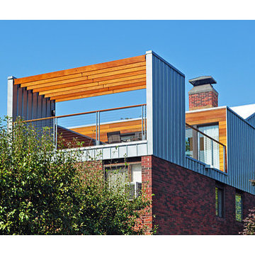
Originally built in 1972, these eight interlocked residential units and the accompanying House Master’s Residence won an AIA award for their unique spatial complexity, balancing standard units of construction with volumetric interplay, all while bringing natural light into living spaces. However, nearly 40 years later
These 1970’s era, interlocked faculty housing units won an AIA award when first completed. They were unique in spatial complexity, By early 2,000’s they were showing signs of age, and had become outdated on many levels. Working with project management for the Faculty of Arts & Sciences, we prepared one prototype design to bring the buildings into the 21st century. New insulated skylights, standing seam metal siding, cedar decks and trellises, exchanging black roofs for well insulated white roofs, were all part of a larger planning program to renovate all nine units. The prototype was implemented in 2012, to great approval and result. In 2013 a few more units were done. In 2014 the “House Masters” unit was done, with the remaining four units planned for future budgets.
Sustainable features include re-use of most materials on site, (former siding was able to become sheathing below metal panels), implementing the Stretch Energy Code for insulation, and putting new white roof membranes in place. Using FSC certified wood for decks and trellises, and using Rheinzink siding, a “200 year material” according to the manufacturer.
After nearly 40 years, Ronald Gourley’s AIA award winning Faculty Housing (1972) was beginning to show its age – plywood siding was delaminating, wooden decks splintering, and custom windows failing. Therefore, the opportunity to reinvent a piece of Mid-Century Modernism presented itself when two of the building’s eight alternating rooftop designs were to be rebuilt as prototypes for the remainder of the structure.
The strength of the original design was its rectilinear and symmetrical arrangement of internal and external spaces, but the difference between the two had become blurred over the decades. New zinc siding, mahogany decking, and stainless steel railings accentuate the defining elements and more clearly articulate the living spaces, breathing new life into the building and reinvigorating the surrounding campus.
Furthermore, the renovation also provided a chance to bring the structure up to modern energy standards and help meet Harvard’s lofty environmental goals. Insulation within the ceilings was more than tripled, white TPO roofing reduces the heat island effect, construction waste was minimized by recasting the siding as sheathing, and materials were selected not only for aesthetics, but for their longevity and ability to be recycled as well.
Harvard’s energy standards brought an uncharacteristic level of environmental care to this building. Roof structures are triple insulated, allowing separating interior from exterior in the most thermally efficient manner. North facing triple insulated skylights and white TPO roofing reduces the heat gain, but allows natural light to pour in. Materials were selected not only for aesthetics, but for their longevity. Zinc, for example, is made of 100% recycled material, and has duration of 200 years. Uncharacteristic levels of environmental care were common on this project.
 Care Free Homes, Inc.
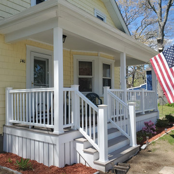
CertainTeed vinyl siding, GAF roofing, and a TimberTech AZEK farmer’s porch look great on this New Bedford, MA home!
The homeowner chose to use a combination of CertainTeed Cedar Impressions and Restoration Classic vinyl siding in the color, Autumn Yellow. Cedar Impressions, installed on the front of the home, are molded to match the shape and texture of real cedar shingles. Restoration Classic vinyl siding replicates the look of painted cedar clapboard siding. Both collections of vinyl siding styles are offered in CertainTeed’s industry-leading, fade-resistant color collection. From deep hues of blue and red to subtle shades of gray and taupe, homeowners can find a siding color that suits their personal style. With custom vinyl siding, homeowners will eliminate worries about rot, insect damage, peeling, chipping, and the expensive costs associated with painting their home every 5-7 years! We’re proud to be a CertainTeed 5 Star Contractor who can offer CertainTeed’s limited lifetime warranty plus our own 10 year workmanship guarantee.
We’re the area’s only Platinum TimberTech AZEK Contractor! The home’s original porch was dated and failing structurally so the homeowner chose to rebuild with a AZEK farmer’s porch with white rails and decking in the color, Slate Gray. This capped polymer decking has a realistic wood grain texture and is rot, insect, fade, dent, and scratch resistant! No more sanding, staining, and splintering wood boards! Slate Gray is a popular color choice for homeowners because it offers classic style and is up to 30 degrees cooler and has 40% better slip resistance than other competitive composite decking products.
We stripped the original roof and replaced it with a North America’s top-selling GAF Timberline HDZ roofing system in the color, Hunter Green. These architectural shingles come in a gorgeous collection of color blends and 130 mph wind rating. GAF’s newest engineering also gives homeowners the opportunity to upgrade to their WindProven Limited Wind Warranty which is the industry’s only wind warranty with no maximum wind speed limitation. Thanks to our award-winning GAF MasterElite Contractor status, our customers also enjoy a GAF factory-registered, 50 Year non-prorated, transferable roof warranty. This industry-leading warranty adds value to the home because it can be transfered to the next homeowner!
Give your home a top to bottom makeover with CertainTeed vinyl siding, GAF Roofing, and TimberTech AZEK Decking! Trust your home to a professional home improvement contractor with over 40 years of satisfied customers. In addition to an extensive list of industry awards and credentials, we’ve been an A+ accredited member of the Better Business Bureau for over 25 years! We ask for no money down until your project is completed and offer financing options to qualified homeowners. Get your free quote by calling 508-997-1111 or by filling out our online form. Make your house a Care Free home!

 Reflections Water Gardens
After two years of fighting with a failing pond liner, the resident decided to replace the liner in the pond. This 150’ x 115’pond sat above and flowed into a larger pond which was lined with PVC liner. We were replacing this with a 45 mil epdm fishsafe rubber liner. This presented a problem: there is no way to adhere the new rubber liner to the existing PVC liner in the lower pond. The solution was to pour a cement 18” wide x 2’ deep footing next to the wier damn between the two ponds in order to connect the two liners together. The old liner was placed on the top of the footing and a water-block sealant was used. The new rubber liner was placed on top and another layer of sealant along with stainless steel bars were laid atop the two materials in order to press them together to maintain a water-tight junction. A drain tile system was installed beneath the liner to relieve ground water pressure and vent off any gasses. Water tight seals also had to be provided for multiple plumbing penetrations through the liner. Non-woven geotextile planting media bags were used to prevent erosion around the perimeter of the pond. As the pond was landscaped with lawn and perennials, these had to be removed and preserved and maintained throughout the project in order to return them upon completion of the lining. All trenching work and removal of plant material was done by hand in order to maintain the surrounding landscape; great care was taken throughout the project in order to protect existing hard and softscape, so that upon completion, the area appeared almost exactly as it had been before work began.
Photo by Larry Carnes
 Nautilus Architects
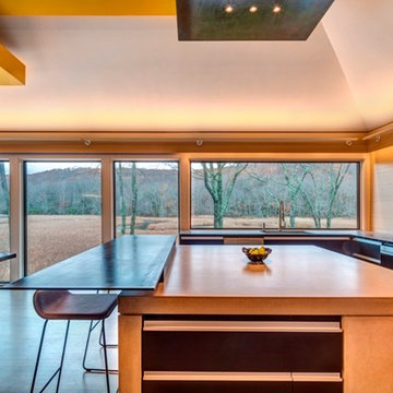
Located on a marsh in the upper reaches of the Lieutenant River in Old Lyme, the existing house was well-sited and well-built, but the design failed to exploit the views and more importantly was a confused combination of contemporary and traditional elements. The new homeowners, a successful businesswoman and an accomplished artist and photographer, were interested in creating a fully-contemporary environment to open up space, connect indoors with outdoors, display artwork and showcase the husband’s distinctive photographs.
One glaring deficiency was the curb appeal and approach sequence: the grade sloped down and the path to the house followed, but this led to an uncomfortable dip and abrupt rise to the front door. By creating a virtual “moat,” occupied by a grid of raised-bed grasses contained in aluminum-clad boxes, and spanning the moat with an ipe bridge, the approach becomes level and engaging. The façade of the existing house was blank and bland, and with no cover. Adding a deep overhang with a wide porch creates a welcoming, covered condition, accentuated by a 6’ wide pivoting front door that feels more like a moving piece of wall.
Another deficiency was the connection to the outdoors. By adding glass to the front and back of the house, and removing interior walls selectively, the house takes on a diaphanous quality that allows one to see through to the marsh beyond, even when in the driveway. The raised-bed grasses act as abstract, geometric versions of the marsh beyond. A large, pyramidal skylight establishes a spatial hierarchy around which the rooms revolve.
The house featured several tray-ceilinged spaces – living room, kitchen, and master bedroom – that were poorly-proportioned and with panels at the top that resembled inset flat panel doors. The solution was to use a different strategy for each: the bedroom turns the ceiling into an eggshell through the use of a creative trim detail; the living room has an oversized sculptural, backlit lighting element; and the kitchen has a collage of painted rectangular forms that support or include lighting pieces.
A palette of concrete, blackened steel, stainless steel and colors carefully chosen by homeowner and architect create an interior and exterior environment punctuated by moments that are as artistic as the featured works in the black-ceilinged gallery.
 Drury Design
THE SETUP
The original primary bathroom was characterized by a disjointed and segmented layout. The shower featured a bulky glass-block enclosure that overwhelmed the space visually. There was a considerable amount of open, unused space, and despite having a his and hers vanity, the arrangement lacked personal space for each user, as they shared the conjoined space between the sinks. The toilet was inconveniently located right by the door, with a half-wall partition meant to provide privacy but instead contributing to a cramped and unbalanced feel. Overall, the bathroom’s layout and design were fragmented, failing to make the most of the available space and lacking adequate storage solutions.
Design objectives:
- Reconfigure the layout to enhance functionality and flow.
- Create an elegant, upscale aesthetic that is light and bright.
- Incorporate specialized storage solutions for female hair care needs.
- Increase overall storage capacity.
- Develop a spa-like shower experience.
- Provide a significant wow factor to the space.
THE REMODEL
Design challenges to be solved:
- Repositioning the toilet to a more suitable location.
- Designing hair care storage solutions without cluttering the elegant space.
- Balancing an upscale, elegant design with a feminine touch in the color palette.
- Increasing the brightness of the room without adding windows.
- Completely replacing the existing shower to create a spa-like experience.
- Planning new storage solutions without adding bulkiness or clutter to the cabinetry.
THE RENEWED SPACE
Design solutions:
Toilet Relocation: Moved the toilet by the window, creating a better overall layout that also opened up two full walls for cabinetry and storage solutions.
Specialized Vanity Storage: The left side of the left vanity is the wife’s. Open shelves facing across the vanity can be used for decorative or daily needs items. Pull-out docking drawers with power outlets and metal basins handle hot hair appliances.
Bright and Elegant Color Scheme: White cabinets, countertops, floors, and shower walls keep the space bright. The just-off-white wall color with a hint of pink adds a feminine touch. Thin wainscoting with white trim offers traditional-leaning elegance.
Layered Lighting Strategy: Ceiling can lights, sconces, lighted mirrors, and toe-kick lighting were installed. Natural light-rated bulbs keep the space bright and natural-feeling.
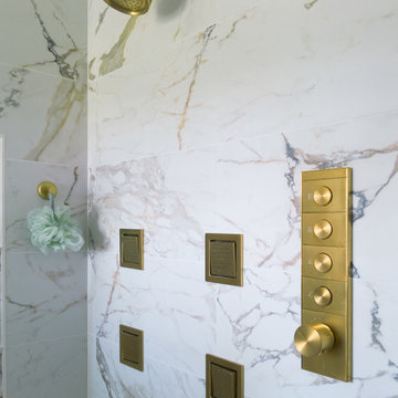
Spa-Like Shower: An extra-large shower was created using the same floor tile materials for continuity. Equipped with a Kohler Anthem system with a shower head, hand-held, and four body sprays. His and Hers niches for separate body care product storage.
Enhanced Storage Solutions: Added a linen cabinet within the vanity area for efficient storage of towels and bathroom essentials.
This elegant bathroom feels incredibly spacious now. The color palette and lights keep the room bright and cheery. Gold fixtures, the herringbone pattern on the floor, and exquisite trim work add an elegant touch. With the husband and wife having their own vanity wall sections joined at the corner, each user truly has their own space within the space. The clients are very happy with the final result.
 Design Group Three
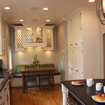
The 1990’s renovation of this kitchen failed to capture the home’s original character and architectural style. Major structural and mechanical changes, including the complete removal of a load-bearing wall, opened design solutions to improve function and sight lines within the first floor. An abandoned space hidden by the previous renovation was restored to create an intimate seating area.
The kitchen was completely rearranged, redesigned, and dramatically furnished to achieve ideal form, flow, and function. Architectural details were carefully duplicated throughout. Greenfield brand cabinetry, creative lighting, and natural stone countertops are just a few of the details that complement the home’s original character.
 Design Group Three
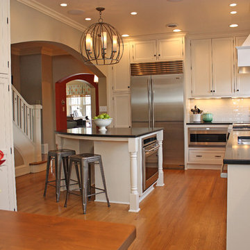
The 1990’s renovation of this kitchen failed to capture the home’s original character and architectural style. Major structural and mechanical changes, including the complete removal of a load-bearing wall, opened design solutions to improve function and sight lines within the first floor. An abandoned space hidden by the previous renovation was restored to create an intimate seating area.
The kitchen was completely rearranged, redesigned, and dramatically furnished to achieve ideal form, flow, and function. Architectural details were carefully duplicated throughout. Greenfield brand cabinetry, creative lighting, and natural stone countertops are just a few of the details that complement the home’s original character.
5