
Search results for "Characters typically" in Home Design Ideas
 Kyra Construction
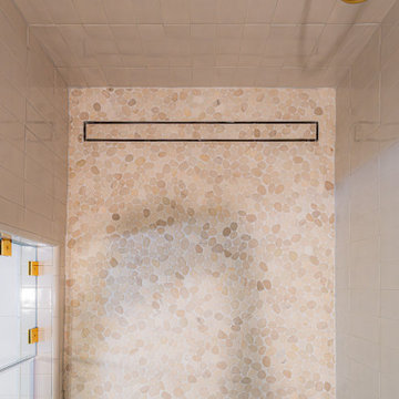
This master bathroom remodeling project began with a former laundry room and was transformed into a warm, modern retreat designed for comfort and functionality. Despite the compact footprint, thoughtful layout planning and material selection helped create a space that feels open, airy, and inviting.
To visually expand the room, we used light-toned floor and wall tiles, paired with a custom frameless glass shower enclosure that keeps the design clean and seamless. The shower features handmade tiles in soft, warm brown tones, adding subtle texture and a refined, artisanal character to the space.
Brass plumbing fixtures introduce warmth and contrast beautifully with the neutral palette, bringing a touch of understated luxury. A custom wood vanity was designed to complement the tile tones, offering generous storage with a honed stone countertop for a timeless finish.
Recessed lighting and integrated vanity lighting complete the design, creating a soft and relaxing atmosphere. What was once a small laundry area is now a cozy, spa-inspired master bathroom built with careful craftsmanship and attention to detail.
 Paver House
This Tampa Bay homeowner was looking into complete change his backyard. Most pools in Tampa are built with a connected spa. To increase his pool size, he ended up deciding for not to build spa, however, he still wanted an appealing focal point to his pool. To contrast with the beautiful green landscape around the backyard, our customer wanted to add color and movement to his outdoor area.
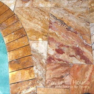
For the main pool deck area, our customer felt in love with the french pattern autumn blend tumbled travertine pavers. French Pattern Tumbled Autumn Blend Travertine Pavers contain a mixture of mostly red and gold, with some white, dark and light brown tones. Autumn Blend added the perfect amount of color and movement our customer wanted.
Travertine pavers offer a few unique color mixtures that make any outdoor space pops up from others.
A great accent color solution for the coping was the Desert Gold color on the 4×9 tumbled travertine copings. The beautifully blended Desert Gold may be bright and striking but does not lack for warmth and richness as well. To not compete with the strong colors of the pool deck, we advised our customer to add a lighter and more neutral pool tile: 2×2 autumn blend tumbled travertine tiles brought the perfect combination of contrast and harmony we were looking to achieve.
CREATIVITY ON YOUR POOL REMODEL WITH TRAVERTINE PAVER.
Pool remodel with travertine paver does not need to represent neutral colors only. Different than what most people believe, travertine pavers offer a few unique color mixtures that make any outdoor space pop up from others. Don’t be afraid of mixing different patterns, colors and textures to add more character to your outdoor space. Remember that, travertine pavers will display better their color when sealed, like the pictures from this pool remodel. If you are not sure if you would like your paver with the enhanced color, spray the sample with water first.
PREMIUM TRAVERTINE FRENCH PATTERN PAVERS
Pool remodel with travertine paver
POOL REMODEL WITH TRAVERTINE PAVERS
This Tampa Bay homeowner was looking into complete change his backyard. Most pools in Tampa are built with a connected spa. To increase his pool size, he ended up deciding for not to build spa, however, he still wanted an appealing focal point to his pool. To contrast with the beautiful green landscape around the backyard, our customer wanted to add color and movement to his outdoor area.
For the main pool deck area, our customer felt in love with the french pattern autumn blend tumbled travertine pavers. French Pattern Tumbled Autumn Blend Travertine Pavers contain a mixture of mostly red and gold, with some white, dark and light brown tones. Autumn Blend added the perfect amount of color and movement our customer wanted.
pool remodel with travertine paverpool remodel with travertine paverpool remodel with travertine paverpool remodel with travertine paverpool remodel with travertine paver
Previous
Next
Travertine pavers offer a few unique color mixtures that make any outdoor space pops up from others.
A great accent color solution for the coping was the Desert Gold color on the 4×9 tumbled travertine copings. The beautifully blended Desert Gold may be bright and striking but does not lack for warmth and richness as well. To not compete with the strong colors of the pool deck, we advised our customer to add a lighter and more neutral pool tile: 2×2 autumn blend tumbled travertine tiles brought the perfect combination of contrast and harmony we were looking to achieve.
CREATIVITY ON YOUR POOL REMODEL WITH TRAVERTINE PAVER.
Pool remodel with travertine paver does not need to represent neutral colors only. Different than what most people believe, travertine pavers offer a few unique color mixtures that make any outdoor space pop up from others. Don’t be afraid of mixing different patterns, colors and textures to add more character to your outdoor space. Remember that, travertine pavers will display better their color when sealed, like the pictures from this pool remodel. If you are not sure if you would like your paver with the enhanced color, spray the sample with water first.
PREMIUM TRAVERTINE FRENCH PATTERN PAVERS
On this pool remodel project, our customer preferred to use the French Pattern design, which is a good way to break up the monotony of the typical geometric or square appearance of large areas. Just like this outstanding pool deck remodel, patios and walkways will appear more fluid and mosaic by eliminating grout lines and the usual linear effect as well as the need for constant maintenance of the typical square or rectangular paver.
A French Pattern or a Versailles pattern is a paver pattern made up of four different sized tiles. Most French patterns are laid in stone, and nearly all are sold in “bundles” of tile that will cover 16 square feet.
Travertine pavers on your pool deck will reflect heat on hot days, remaining cool to the touch, unlike concrete surface options. Travertine does not discolor or become chalky after installation. The texture of travertine ensures that the stone remains slip resistant for wet feet, while its cool feel prevents burns. Another great advantage of travertine pavers is that there will be no visible grout lines; grout can be a source of both installation problems and added cost for future removal / replacement or up-keep.
 Tile Doctor Ltd
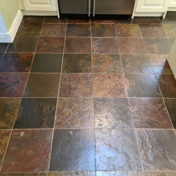
The pictures above are of a 12 metre squared Chinese slate floor in the kitchen of a property in Harrogate which had been laid ten years prior. You can see from the photographs that the grout had darkened and the slate itself had lost a lot of its character and colour.
Sealers typically last between three to five years so by now there was little protection left and so dirt had become trapped in the pores of the stone and grout making it difficult to keep clean. It was now overdue a deep clean and the application of a fresh seal.
I went over to survey the floor and provide a quote for stripping off what was left of the original sealer, cleaning the floor, and then resealing. I had been recommended by a previous customer so happy with my track record and the price I quoted, they asked me to do the work. They had received a quote from another firm which as it turned out was a lot more expensive than mine.
Given there was little sealer left to remove I decided to start by scrubbing the floor with a strong concentration of Tile Doctor Pro-Clean which was left to soak into the slate for ten minutes. Then I worked the solution in with a rotary machine fitted with a black scrubbing pad. Pro-Clean is a very versatile product that will strip the sealer off a floor when used in a strong dilution with water, it will also remove deep seated dirt too.
Due to the riven nature of the tiles however I found the black pad was struggling to reach into the crevices of the tile so to achieve the desired result I resorted to scrubbing the floor on my hands and knees with a scrubbing brush. Its important that the floor is as clean as it possibly can be before sealing otherwise you simply lock the dirt in and it will never look clean.
The floor was left to dry off overnight and I returned the next day to apply the new sealer. First, I checked to ensure that the floor was fully dry using a damp meter. The sealer would not cure properly if the floor damp and this can detract from the finished appearance.
I was happy with the readings, so I started to apply the first coat of Tile Doctor Seal and Go which I felt was the best product sealing Slate. The stone needed four coats; each one being left to dry before applying the next. Seal and Go is a stain resistant sealer which results in a low sheen silky appearance, it is good on surfaces such as the Chinese Slate which tend to be more porous and being water based it does not leave a smell as it dries.
The client was very happy with the result and mentioned to me that it had never looked that good even when new.
For aftercare cleaning I recommended the use of Tile Doctor Neutral Tile Cleaner which will keep the floor in the best condition. This is a pH neutral cleaner which can be used daily and won’t compromise the newly laid sealer like many of the stronger products you find in supermarkets.
Nigel Stoker
North West Yorkshire Tile Doctor
Find the right local pro for your project
 Paver House
This Tampa Bay homeowner was looking into complete change his backyard. Most pools in Tampa are built with a connected spa. To increase his pool size, he ended up deciding for not to build spa, however, he still wanted an appealing focal point to his pool. To contrast with the beautiful green landscape around the backyard, our customer wanted to add color and movement to his outdoor area.
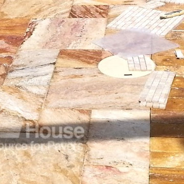
For the main pool deck area, our customer felt in love with the french pattern autumn blend tumbled travertine pavers. French Pattern Tumbled Autumn Blend Travertine Pavers contain a mixture of mostly red and gold, with some white, dark and light brown tones. Autumn Blend added the perfect amount of color and movement our customer wanted.
Travertine pavers offer a few unique color mixtures that make any outdoor space pops up from others.
A great accent color solution for the coping was the Desert Gold color on the 4×9 tumbled travertine copings. The beautifully blended Desert Gold may be bright and striking but does not lack for warmth and richness as well. To not compete with the strong colors of the pool deck, we advised our customer to add a lighter and more neutral pool tile: 2×2 autumn blend tumbled travertine tiles brought the perfect combination of contrast and harmony we were looking to achieve.
CREATIVITY ON YOUR POOL REMODEL WITH TRAVERTINE PAVER.
Pool remodel with travertine paver does not need to represent neutral colors only. Different than what most people believe, travertine pavers offer a few unique color mixtures that make any outdoor space pop up from others. Don’t be afraid of mixing different patterns, colors and textures to add more character to your outdoor space. Remember that, travertine pavers will display better their color when sealed, like the pictures from this pool remodel. If you are not sure if you would like your paver with the enhanced color, spray the sample with water first.
PREMIUM TRAVERTINE FRENCH PATTERN PAVERS
Pool remodel with travertine paver
POOL REMODEL WITH TRAVERTINE PAVERS
This Tampa Bay homeowner was looking into complete change his backyard. Most pools in Tampa are built with a connected spa. To increase his pool size, he ended up deciding for not to build spa, however, he still wanted an appealing focal point to his pool. To contrast with the beautiful green landscape around the backyard, our customer wanted to add color and movement to his outdoor area.
For the main pool deck area, our customer felt in love with the french pattern autumn blend tumbled travertine pavers. French Pattern Tumbled Autumn Blend Travertine Pavers contain a mixture of mostly red and gold, with some white, dark and light brown tones. Autumn Blend added the perfect amount of color and movement our customer wanted.
pool remodel with travertine paverpool remodel with travertine paverpool remodel with travertine paverpool remodel with travertine paverpool remodel with travertine paver
Previous
Next
Travertine pavers offer a few unique color mixtures that make any outdoor space pops up from others.
A great accent color solution for the coping was the Desert Gold color on the 4×9 tumbled travertine copings. The beautifully blended Desert Gold may be bright and striking but does not lack for warmth and richness as well. To not compete with the strong colors of the pool deck, we advised our customer to add a lighter and more neutral pool tile: 2×2 autumn blend tumbled travertine tiles brought the perfect combination of contrast and harmony we were looking to achieve.
CREATIVITY ON YOUR POOL REMODEL WITH TRAVERTINE PAVER.
Pool remodel with travertine paver does not need to represent neutral colors only. Different than what most people believe, travertine pavers offer a few unique color mixtures that make any outdoor space pop up from others. Don’t be afraid of mixing different patterns, colors and textures to add more character to your outdoor space. Remember that, travertine pavers will display better their color when sealed, like the pictures from this pool remodel. If you are not sure if you would like your paver with the enhanced color, spray the sample with water first.
PREMIUM TRAVERTINE FRENCH PATTERN PAVERS
On this pool remodel project, our customer preferred to use the French Pattern design, which is a good way to break up the monotony of the typical geometric or square appearance of large areas. Just like this outstanding pool deck remodel, patios and walkways will appear more fluid and mosaic by eliminating grout lines and the usual linear effect as well as the need for constant maintenance of the typical square or rectangular paver.
A French Pattern or a Versailles pattern is a paver pattern made up of four different sized tiles. Most French patterns are laid in stone, and nearly all are sold in “bundles” of tile that will cover 16 square feet.
Travertine pavers on your pool deck will reflect heat on hot days, remaining cool to the touch, unlike concrete surface options. Travertine does not discolor or become chalky after installation. The texture of travertine ensures that the stone remains slip resistant for wet feet, while its cool feel prevents burns. Another great advantage of travertine pavers is that there will be no visible grout lines; grout can be a source of both installation problems and added cost for future removal / replacement or up-keep.
 Inhabit | Space
Whon Photography
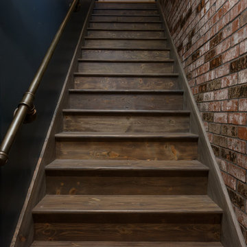
Large urban underground carpeted staircase photo in Indianapolis with gray walls and no fireplace
Large urban underground carpeted staircase photo in Indianapolis with gray walls and no fireplace
 ZeroEnergy Design
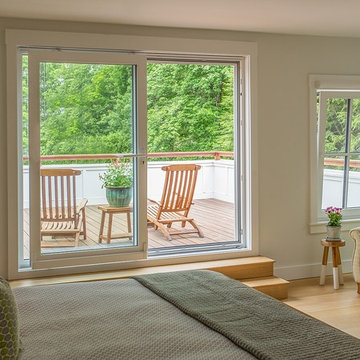
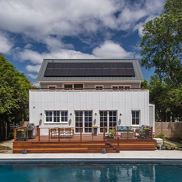
This LEED Platinum certified house reflects the homeowner's desire for an exceptionally healthy and comfortable living environment, within a traditional neighborhood.
INFILL SITE. The family, who moved from another area of Wellesley, sought out this property to be within walking distance of the high school and downtown area. An existing structure on the tight lot was removed to make way for the new home. 84% of the construction waste, from both the previous structure and the new home, was diverted from a landfill. ZED designed to preserve the existing mature trees on the perimeter of the property to minimize site impacts, and to maintain the character of the neighborhood as well as privacy on the site.
EXTERIOR EXPRESSION. The street facade of the home relates to the local New England vernacular. The rear uses contemporary language, a nod to the family’s Californian roots, to incorporate a roof deck, solar panels, outdoor living space, and the backyard swimming pool. ZED’s careful planning avoided to the need to face the garage doors towards the street, a common syndrome of a narrow lot.
THOUGHTFUL SPACE. Homes with dual entries can often result in duplicate and unused spaces. In this home, the everyday and formal entry areas are one and the same; the front and garage doors share the entry program of coat closets, mudroom storage with bench for removing your shoes, and a laundry room with generous closets for the children's sporting equipment. The entry area leads directly to the living space, encompassing the kitchen, dining and sitting area areas in an L-shaped open plan arrangement. The kitchen is placed at the south-west corner of the space to allow for a strong connection to the dining, sitting and outdoor living spaces. A fire pit on the deck satisfies the family’s desire for an open flame while a sealed gas fireplace is used indoors - ZED’s preference after omitting gas burning appliances completely from an airtight home. A small study, with a window seat, is conveniently located just off of the living space. A first floor guest bedroom includes an accessible bathroom for aging visitors and can be used as a master suite to accommodate aging in place.
HEALTHY LIVING. The client requested a home that was easy to clean and would provide a respite from seasonal allergies and common contaminants that are found in many indoor spaces. ZED selected easy to clean solid surface flooring throughout, provided ample space for cleaning supplies on each floor, and designed a mechanical system with ventilation that provides a constant supply of fresh outdoor air. ZED selected durable materials, finishes, cabinetry, and casework with low or no volatile organic compounds (VOCs) and no added urea formaldehyde.
YEAR-ROUND COMFORT. The home is super insulated and air-tight, paired with high performance triple-paned windows, to ensure it is draft-free throughout the winter (even when in front of the large windows and doors). ZED designed a right-sized heating and cooling system to pair with the thermally improved building enclosure to ensure year-round comfort. The glazing on the home maximizes passive solar gains, and facilitates cross ventilation and daylighting.
ENERGY EFFICIENT. As one of the most energy efficient houses built to date in Wellesley, the home highlights a practical solution for Massachusetts. First, the building enclosure reduces the largest energy requirement for typical houses (heating). Super-insulation, exceptional air sealing, a thermally broken wall assembly, triple pane windows, and passive solar gain combine for a sizable heating load reduction. Second, within the house only efficient systems consume energy. These include an air source heat pump for heating & cooling, a heat pump hot water heater, LED lighting, energy recovery ventilation, and high efficiency appliances. Lastly, photovoltaics provide renewable energy help offset energy consumption. The result is an 89% reduction in energy use compared to a similar brand new home built to code requirements.
RESILIENT. The home will fare well in extreme weather events. During a winter power outage, heat loss will be very slow due to the super-insulated and airtight envelope– taking multiple days to drop to 60 degrees even with no heat source. An engineered drainage system, paired with careful the detailing of the foundation, will help to keep the finished basement dry. A generator will provide full operation of the all-electric house during a power outage.
OVERALL. The home is a reflection of the family goals and an expression of their values, beautifully enabling health, comfort, safety, resilience, and utility, all while respecting the planet.
ZED - Architect & Mechanical Designer
Bevilacqua Builders Inc - Contractor
Creative Land & Water Engineering - Civil Engineering
Barbara Peterson Landscape - Landscape Design
Nest & Company - Interior Furnishings
Eric Roth Photography - Photography
 Simply Perfect
Advice on interior design is available everywhere—from TV shows and websites to books, magazines and apps.
We love seeing people become engaged in design and educated on the wide range of possibilities. But we hope you’ll proceed with caution.
It’s not that style errors are a matter of life and death. It’s just that it’s easy to choose designs that aren’t necessarily reflective of your own personality and character. And since you’re typically stuck with your interior design decisions for years, styles that don’t quite fit can tend to grate on you.
Interiors that give one person comfort may unleash chaos in someone else. This goes beyond favorite colors or hot trends, right to the heart of interior design, where you find questions of composition, balance, repetition, space and more.
The goal is to find that unique combination of design elements that gives you comfort, support and balance.
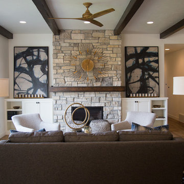
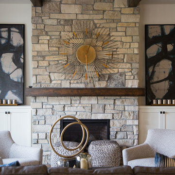
In one home, that perfect balance was struck through the use of symmetry. A pair of comfortable swivel chairs sit beneath matching indigo patterned paintings. Matching bookcases below the paintings contain similar, but not identical, arrangements of books, vases and bowls. Woods and bronzes help warm up the simple white bookcase shelving.
Two matching poufs in front of the fireplace provide additional seating. The sofa is accented with a pair of pillows with a blue pattern that echoes the artwork.
The effect of the symmetry is to achieve order and simplicity, which I promote at every opportunity. After all, your home interiors should be the setting or the backdrop of your life—not center stage.
Antique bronze and blue are complementary colors. Together, they offer a rich palette of richness and depth, which brings out the beauty of wood and stone.
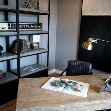
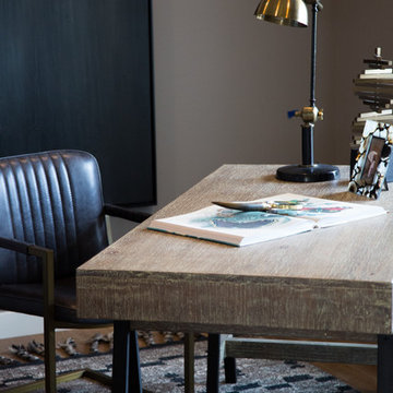
In the home office, a unique, whitewash-stained wooden desk rests on metal, Sawhorse-inspired legs for a warm, rustic look. The black leather chair features a contemporary silhouette with an antique brass frame. An adjustable desk lamp has bronze accents.
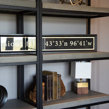
The bookcase combines a sleek, black metal frame with concrete shelves, for another unusual pairing. It’s kept uncluttered for an orderly, peaceful look. Items on the shelves include a bronze-accented lamp and a pair
of high gloss-finished wooden bookends.
The elegant artwork behind the desk is a simple midnight-blue and bronze with mottled white. Deep blues are again picked up in the rug, which adds a stately vibe with a modern pattern and satisfying texture.
Within the framework of symmetry, the living room repeats the blue-and-bronze color scheme.
A large midcentury brass clock above the fireplace keeps the natural stone visible, rather than hidden behind a painting or television, while its straight lines and color create a beautiful contrast.
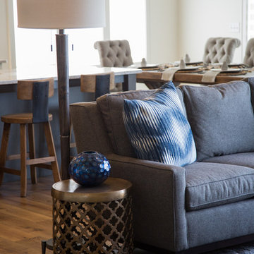
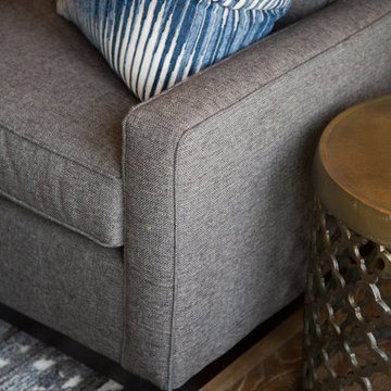
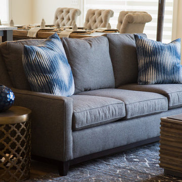
The sofa is a soft, neutral blue. The pattern on the round brass side table features echoes the darker blue-patterned rug, as well as the rug in the office, tying the rooms together.
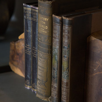
Indigo blue books adjacent to bronze vases on the shelves repeat the color scheme. The soapstone-topped coffee table echoes the shape of the fireplace. A pair of tall, matching floor lamps with long wooden bases, brass pulls and simple linen shades combine both the colors and symmetry found throughout the home.
 Montana Timber Products
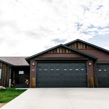
Where: South Dakota
What: Private residence
Product: ranchwood™ colors: Tackroom, Eastern, Southern
Solution: Prefinished, kiln dried, Circle Sawn, ship lap, Douglas fir rough #2 siding
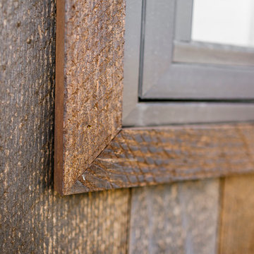
Today's highlight features Montana Timber Products prefinished and refined ranchwood™ siding as applied to this gorgeous private residence located in South Dakota.
ranchwood's™ beautiful, environmentally friendly, rustic natural wood siding adds class and character to an already splendid home.
As for the long, harsh South Dakota winters? Kept in check by ranchwood's™ Seal-Once technology. All of Montana Timber Products natural wood reclaimed barn wood and reclaimed barn wood alternatives are sealed with Seal-Once, a 100% NO VOC waterproofer with a 10 year limited warranty against water ingress and safe for interior and exterior use, pets and children.
ranchwood kiln dried, circle saw, ship lap, tackroom, douglas fir rough #2
This fine example utilizes Montana Timber Products prefinished ranchwood™ rustic, reclaimed barn wood alternative siding, our flagship product. ranchwood™ is a reclaimed barn wood alternative that it is milled from new, rough stock, kiln dried, chemical free wood.
ranchwood™ is put through a texturizing and coloring process to create the aesthetic beauty of vintage, rustic wood siding. Authentic reclaimed barn wood and reclaimed barn wood alternatives are both great choices for your next home project.
Typically less expensive than authentic reclaimed barn wood, ranchwood™ offers an uncompromising rustic wood beauty.
ranchwood kiln dried, circle saw, ship lap, tackroom, douglas fir rough #2
Vintage wood, reclaimed barn wood and reclaimed barn wood alternatives are very popular building materials due to their aesthetic beauty, traditional look, and chemical free finish.
If the environmentally friendly and renewable aspect of natural wood siding is important to you, be sure to do your homework when choosing your siding, interior accents, trim, timbers, or other wood siding products. Some companies choose to use degenerative chemicals to achieve the desired look and texture of rustic wood siding. This is not the case with Montana Timber Products.
Montana Timber Products' most commonly seen rustic siding texture options are Circle Sawn and Wire Brushed.
The Circle Sawn texture commonly seen on rustic reclaimed barn wood is created from the large circular saw blades used in more traditional milling practices. The Wire Brushed option, like the Circle Sawn, adds physical and aesthetic depth to the wood grain. In addition to the aesthetic beauty added from the texturing process, greater surface area is created, which allows the Seal-Once, 100% NO VOC waterproofer to more effectively penetrate the wood.
ranchwood kiln dried, circle saw, ship lap, tackroom, douglas fir rough #2
Whether you are looking for siding, beams, flooring, or interior accents, Montana Timber Products offers a solution for your rustic needs. All Montana Timber Products’ prefinished wood siding utilizes Seal-Once, a 100% NO VOC waterproofer with a 10 year limited warranty against water ingress.
 ZeroEnergy Design
This LEED Platinum certified house reflects the homeowner's desire for an exceptionally healthy and comfortable living environment, within a traditional neighborhood.
INFILL SITE. The family, who moved from another area of Wellesley, sought out this property to be within walking distance of the high school and downtown area. An existing structure on the tight lot was removed to make way for the new home. 84% of the construction waste, from both the previous structure and the new home, was diverted from a landfill. ZED designed to preserve the existing mature trees on the perimeter of the property to minimize site impacts, and to maintain the character of the neighborhood as well as privacy on the site.
EXTERIOR EXPRESSION. The street facade of the home relates to the local New England vernacular. The rear uses contemporary language, a nod to the family’s Californian roots, to incorporate a roof deck, solar panels, outdoor living space, and the backyard swimming pool. ZED’s careful planning avoided to the need to face the garage doors towards the street, a common syndrome of a narrow lot.
THOUGHTFUL SPACE. Homes with dual entries can often result in duplicate and unused spaces. In this home, the everyday and formal entry areas are one and the same; the front and garage doors share the entry program of coat closets, mudroom storage with bench for removing your shoes, and a laundry room with generous closets for the children's sporting equipment. The entry area leads directly to the living space, encompassing the kitchen, dining and sitting area areas in an L-shaped open plan arrangement. The kitchen is placed at the south-west corner of the space to allow for a strong connection to the dining, sitting and outdoor living spaces. A fire pit on the deck satisfies the family’s desire for an open flame while a sealed gas fireplace is used indoors - ZED’s preference after omitting gas burning appliances completely from an airtight home. A small study, with a window seat, is conveniently located just off of the living space. A first floor guest bedroom includes an accessible bathroom for aging visitors and can be used as a master suite to accommodate aging in place.
HEALTHY LIVING. The client requested a home that was easy to clean and would provide a respite from seasonal allergies and common contaminants that are found in many indoor spaces. ZED selected easy to clean solid surface flooring throughout, provided ample space for cleaning supplies on each floor, and designed a mechanical system with ventilation that provides a constant supply of fresh outdoor air. ZED selected durable materials, finishes, cabinetry, and casework with low or no volatile organic compounds (VOCs) and no added urea formaldehyde.
YEAR-ROUND COMFORT. The home is super insulated and air-tight, paired with high performance triple-paned windows, to ensure it is draft-free throughout the winter (even when in front of the large windows and doors). ZED designed a right-sized heating and cooling system to pair with the thermally improved building enclosure to ensure year-round comfort. The glazing on the home maximizes passive solar gains, and facilitates cross ventilation and daylighting.
ENERGY EFFICIENT. As one of the most energy efficient houses built to date in Wellesley, the home highlights a practical solution for Massachusetts. First, the building enclosure reduces the largest energy requirement for typical houses (heating). Super-insulation, exceptional air sealing, a thermally broken wall assembly, triple pane windows, and passive solar gain combine for a sizable heating load reduction. Second, within the house only efficient systems consume energy. These include an air source heat pump for heating & cooling, a heat pump hot water heater, LED lighting, energy recovery ventilation, and high efficiency appliances. Lastly, photovoltaics provide renewable energy help offset energy consumption. The result is an 89% reduction in energy use compared to a similar brand new home built to code requirements.
RESILIENT. The home will fare well in extreme weather events. During a winter power outage, heat loss will be very slow due to the super-insulated and airtight envelope– taking multiple days to drop to 60 degrees even with no heat source. An engineered drainage system, paired with careful the detailing of the foundation, will help to keep the finished basement dry. A generator will provide full operation of the all-electric house during a power outage.
OVERALL. The home is a reflection of the family goals and an expression of their values, beautifully enabling health, comfort, safety, resilience, and utility, all while respecting the planet.
ZED - Architect & Mechanical Designer
Bevilacqua Builders Inc - Contractor
Creative Land & Water Engineering - Civil Engineering
Barbara Peterson Landscape - Landscape Design
Nest & Company - Interior Furnishings
Eric Roth Photography - Photography
 Simply Perfect
Advice on interior design is available everywhere—from TV shows and websites to books, magazines and apps.
We love seeing people become engaged in design and educated on the wide range of possibilities. But we hope you’ll proceed with caution.
It’s not that style errors are a matter of life and death. It’s just that it’s easy to choose designs that aren’t necessarily reflective of your own personality and character. And since you’re typically stuck with your interior design decisions for years, styles that don’t quite fit can tend to grate on you.
Interiors that give one person comfort may unleash chaos in someone else. This goes beyond favorite colors or hot trends, right to the heart of interior design, where you find questions of composition, balance, repetition, space and more.
The goal is to find that unique combination of design elements that gives you comfort, support and balance.
In one home, that perfect balance was struck through the use of symmetry. A pair of comfortable swivel chairs sit beneath matching indigo patterned paintings. Matching bookcases below the paintings contain similar, but not identical, arrangements of books, vases and bowls. Woods and bronzes help warm up the simple white bookcase shelving.
Two matching poufs in front of the fireplace provide additional seating. The sofa is accented with a pair of pillows with a blue pattern that echoes the artwork.
The effect of the symmetry is to achieve order and simplicity, which I promote at every opportunity. After all, your home interiors should be the setting or the backdrop of your life—not center stage.
Antique bronze and blue are complementary colors. Together, they offer a rich palette of richness and depth, which brings out the beauty of wood and stone.
In the home office, a unique, whitewash-stained wooden desk rests on metal, Sawhorse-inspired legs for a warm, rustic look. The black leather chair features a contemporary silhouette with an antique brass frame. An adjustable desk lamp has bronze accents.
The bookcase combines a sleek, black metal frame with concrete shelves, for another unusual pairing. It’s kept uncluttered for an orderly, peaceful look. Items on the shelves include a bronze-accented lamp and a pair
of high gloss-finished wooden bookends.
The elegant artwork behind the desk is a simple midnight-blue and bronze with mottled white. Deep blues are again picked up in the rug, which adds a stately vibe with a modern pattern and satisfying texture.
Within the framework of symmetry, the living room repeats the blue-and-bronze color scheme.
A large midcentury brass clock above the fireplace keeps the natural stone visible, rather than hidden behind a painting or television, while its straight lines and color create a beautiful contrast.
The sofa is a soft, neutral blue. The pattern on the round brass side table features echoes the darker blue-patterned rug, as well as the rug in the office, tying the rooms together.
Indigo blue books adjacent to bronze vases on the shelves repeat the color scheme. The soapstone-topped coffee table echoes the shape of the fireplace. A pair of tall, matching floor lamps with long wooden bases, brass pulls and simple linen shades combine both the colors and symmetry found throughout the home.
 Montana Timber Products
Where: South Dakota
What: Private residence
Product: ranchwood™ colors: Tackroom, Eastern, Southern
Solution: Prefinished, kiln dried, Circle Sawn, ship lap, Douglas fir rough #2 siding
Today's highlight features Montana Timber Products prefinished and refined ranchwood™ siding as applied to this gorgeous private residence located in South Dakota.
ranchwood's™ beautiful, environmentally friendly, rustic natural wood siding adds class and character to an already splendid home.
As for the long, harsh South Dakota winters? Kept in check by ranchwood's™ Seal-Once technology. All of Montana Timber Products natural wood reclaimed barn wood and reclaimed barn wood alternatives are sealed with Seal-Once, a 100% NO VOC waterproofer with a 10 year limited warranty against water ingress and safe for interior and exterior use, pets and children.
ranchwood kiln dried, circle saw, ship lap, tackroom, douglas fir rough #2
This fine example utilizes Montana Timber Products prefinished ranchwood™ rustic, reclaimed barn wood alternative siding, our flagship product. ranchwood™ is a reclaimed barn wood alternative that it is milled from new, rough stock, kiln dried, chemical free wood.
ranchwood™ is put through a texturizing and coloring process to create the aesthetic beauty of vintage, rustic wood siding. Authentic reclaimed barn wood and reclaimed barn wood alternatives are both great choices for your next home project.
Typically less expensive than authentic reclaimed barn wood, ranchwood™ offers an uncompromising rustic wood beauty.
ranchwood kiln dried, circle saw, ship lap, tackroom, douglas fir rough #2
Vintage wood, reclaimed barn wood and reclaimed barn wood alternatives are very popular building materials due to their aesthetic beauty, traditional look, and chemical free finish.
If the environmentally friendly and renewable aspect of natural wood siding is important to you, be sure to do your homework when choosing your siding, interior accents, trim, timbers, or other wood siding products. Some companies choose to use degenerative chemicals to achieve the desired look and texture of rustic wood siding. This is not the case with Montana Timber Products.
Montana Timber Products' most commonly seen rustic siding texture options are Circle Sawn and Wire Brushed.
The Circle Sawn texture commonly seen on rustic reclaimed barn wood is created from the large circular saw blades used in more traditional milling practices. The Wire Brushed option, like the Circle Sawn, adds physical and aesthetic depth to the wood grain. In addition to the aesthetic beauty added from the texturing process, greater surface area is created, which allows the Seal-Once, 100% NO VOC waterproofer to more effectively penetrate the wood.
ranchwood kiln dried, circle saw, ship lap, tackroom, douglas fir rough #2
Whether you are looking for siding, beams, flooring, or interior accents, Montana Timber Products offers a solution for your rustic needs. All Montana Timber Products’ prefinished wood siding utilizes Seal-Once, a 100% NO VOC waterproofer with a 10 year limited warranty against water ingress.
 Simply Perfect
Advice on interior design is available everywhere—from TV shows and websites to books, magazines and apps.
We love seeing people become engaged in design and educated on the wide range of possibilities. But we hope you’ll proceed with caution.
It’s not that style errors are a matter of life and death. It’s just that it’s easy to choose designs that aren’t necessarily reflective of your own personality and character. And since you’re typically stuck with your interior design decisions for years, styles that don’t quite fit can tend to grate on you.
Interiors that give one person comfort may unleash chaos in someone else. This goes beyond favorite colors or hot trends, right to the heart of interior design, where you find questions of composition, balance, repetition, space and more.
The goal is to find that unique combination of design elements that gives you comfort, support and balance.
In one home, that perfect balance was struck through the use of symmetry. A pair of comfortable swivel chairs sit beneath matching indigo patterned paintings. Matching bookcases below the paintings contain similar, but not identical, arrangements of books, vases and bowls. Woods and bronzes help warm up the simple white bookcase shelving.
Two matching poufs in front of the fireplace provide additional seating. The sofa is accented with a pair of pillows with a blue pattern that echoes the artwork.
The effect of the symmetry is to achieve order and simplicity, which I promote at every opportunity. After all, your home interiors should be the setting or the backdrop of your life—not center stage.
Antique bronze and blue are complementary colors. Together, they offer a rich palette of richness and depth, which brings out the beauty of wood and stone.
In the home office, a unique, whitewash-stained wooden desk rests on metal, Sawhorse-inspired legs for a warm, rustic look. The black leather chair features a contemporary silhouette with an antique brass frame. An adjustable desk lamp has bronze accents.
The bookcase combines a sleek, black metal frame with concrete shelves, for another unusual pairing. It’s kept uncluttered for an orderly, peaceful look. Items on the shelves include a bronze-accented lamp and a pair
of high gloss-finished wooden bookends.
The elegant artwork behind the desk is a simple midnight-blue and bronze with mottled white. Deep blues are again picked up in the rug, which adds a stately vibe with a modern pattern and satisfying texture.
Within the framework of symmetry, the living room repeats the blue-and-bronze color scheme.
A large midcentury brass clock above the fireplace keeps the natural stone visible, rather than hidden behind a painting or television, while its straight lines and color create a beautiful contrast.
The sofa is a soft, neutral blue. The pattern on the round brass side table features echoes the darker blue-patterned rug, as well as the rug in the office, tying the rooms together.
Indigo blue books adjacent to bronze vases on the shelves repeat the color scheme. The soapstone-topped coffee table echoes the shape of the fireplace. A pair of tall, matching floor lamps with long wooden bases, brass pulls and simple linen shades combine both the colors and symmetry found throughout the home.
 Simply Perfect
Advice on interior design is available everywhere—from TV shows and websites to books, magazines and apps.
We love seeing people become engaged in design and educated on the wide range of possibilities. But we hope you’ll proceed with caution.
It’s not that style errors are a matter of life and death. It’s just that it’s easy to choose designs that aren’t necessarily reflective of your own personality and character. And since you’re typically stuck with your interior design decisions for years, styles that don’t quite fit can tend to grate on you.
Interiors that give one person comfort may unleash chaos in someone else. This goes beyond favorite colors or hot trends, right to the heart of interior design, where you find questions of composition, balance, repetition, space and more.
The goal is to find that unique combination of design elements that gives you comfort, support and balance.
In one home, that perfect balance was struck through the use of symmetry. A pair of comfortable swivel chairs sit beneath matching indigo patterned paintings. Matching bookcases below the paintings contain similar, but not identical, arrangements of books, vases and bowls. Woods and bronzes help warm up the simple white bookcase shelving.
Two matching poufs in front of the fireplace provide additional seating. The sofa is accented with a pair of pillows with a blue pattern that echoes the artwork.
The effect of the symmetry is to achieve order and simplicity, which I promote at every opportunity. After all, your home interiors should be the setting or the backdrop of your life—not center stage.
Antique bronze and blue are complementary colors. Together, they offer a rich palette of richness and depth, which brings out the beauty of wood and stone.
In the home office, a unique, whitewash-stained wooden desk rests on metal, Sawhorse-inspired legs for a warm, rustic look. The black leather chair features a contemporary silhouette with an antique brass frame. An adjustable desk lamp has bronze accents.
The bookcase combines a sleek, black metal frame with concrete shelves, for another unusual pairing. It’s kept uncluttered for an orderly, peaceful look. Items on the shelves include a bronze-accented lamp and a pair
of high gloss-finished wooden bookends.
The elegant artwork behind the desk is a simple midnight-blue and bronze with mottled white. Deep blues are again picked up in the rug, which adds a stately vibe with a modern pattern and satisfying texture.
Within the framework of symmetry, the living room repeats the blue-and-bronze color scheme.
A large midcentury brass clock above the fireplace keeps the natural stone visible, rather than hidden behind a painting or television, while its straight lines and color create a beautiful contrast.
The sofa is a soft, neutral blue. The pattern on the round brass side table features echoes the darker blue-patterned rug, as well as the rug in the office, tying the rooms together.
Indigo blue books adjacent to bronze vases on the shelves repeat the color scheme. The soapstone-topped coffee table echoes the shape of the fireplace. A pair of tall, matching floor lamps with long wooden bases, brass pulls and simple linen shades combine both the colors and symmetry found throughout the home.
 Simply Perfect
Advice on interior design is available everywhere—from TV shows and websites to books, magazines and apps.
We love seeing people become engaged in design and educated on the wide range of possibilities. But we hope you’ll proceed with caution.
It’s not that style errors are a matter of life and death. It’s just that it’s easy to choose designs that aren’t necessarily reflective of your own personality and character. And since you’re typically stuck with your interior design decisions for years, styles that don’t quite fit can tend to grate on you.
Interiors that give one person comfort may unleash chaos in someone else. This goes beyond favorite colors or hot trends, right to the heart of interior design, where you find questions of composition, balance, repetition, space and more.
The goal is to find that unique combination of design elements that gives you comfort, support and balance.
In one home, that perfect balance was struck through the use of symmetry. A pair of comfortable swivel chairs sit beneath matching indigo patterned paintings. Matching bookcases below the paintings contain similar, but not identical, arrangements of books, vases and bowls. Woods and bronzes help warm up the simple white bookcase shelving.
Two matching poufs in front of the fireplace provide additional seating. The sofa is accented with a pair of pillows with a blue pattern that echoes the artwork.
The effect of the symmetry is to achieve order and simplicity, which I promote at every opportunity. After all, your home interiors should be the setting or the backdrop of your life—not center stage.
Antique bronze and blue are complementary colors. Together, they offer a rich palette of richness and depth, which brings out the beauty of wood and stone.
In the home office, a unique, whitewash-stained wooden desk rests on metal, Sawhorse-inspired legs for a warm, rustic look. The black leather chair features a contemporary silhouette with an antique brass frame. An adjustable desk lamp has bronze accents.
The bookcase combines a sleek, black metal frame with concrete shelves, for another unusual pairing. It’s kept uncluttered for an orderly, peaceful look. Items on the shelves include a bronze-accented lamp and a pair
of high gloss-finished wooden bookends.
The elegant artwork behind the desk is a simple midnight-blue and bronze with mottled white. Deep blues are again picked up in the rug, which adds a stately vibe with a modern pattern and satisfying texture.
Within the framework of symmetry, the living room repeats the blue-and-bronze color scheme.
A large midcentury brass clock above the fireplace keeps the natural stone visible, rather than hidden behind a painting or television, while its straight lines and color create a beautiful contrast.
The sofa is a soft, neutral blue. The pattern on the round brass side table features echoes the darker blue-patterned rug, as well as the rug in the office, tying the rooms together.
Indigo blue books adjacent to bronze vases on the shelves repeat the color scheme. The soapstone-topped coffee table echoes the shape of the fireplace. A pair of tall, matching floor lamps with long wooden bases, brass pulls and simple linen shades combine both the colors and symmetry found throughout the home.
 Zelaya Properties LLC
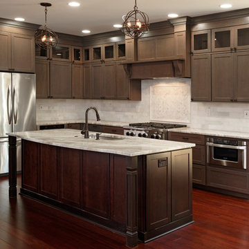
We used: Custom cherry cabinetry in Arts & Crafts Shaker style by Kabinart in Boulder and Espresso stains. Liberty Hardware Venetian bronze 1-1/2" cabinet knobs. KitchenAid Architect II Series 22 CF counter-depth French door refrigerator. KitchenAid Architect Series II 27" convection single wall oven. KitchenAid 36" 6-burner dual fuel freestanding commercial-style range. KitchenAid Architect II Series 24" dishwasher. Sharp Insight Pro Series 24" built-in microwave drawer (Model #KB6524PS). Crystorama Solaris 12" wide pendant lights in English bronze. Granite countertops in Brown Fantasy. 3"x6" polished marble backsplash.
Paint colors:
Walls: Glidden Silver Cloud 30YY 63/024
Ceilings/Trims/Doors: Glidden Swan White GLC23
Robert B. Narod Photography
 Simply Perfect
Advice on interior design is available everywhere—from TV shows and websites to books, magazines and apps.
We love seeing people become engaged in design and educated on the wide range of possibilities. But we hope you’ll proceed with caution.
It’s not that style errors are a matter of life and death. It’s just that it’s easy to choose designs that aren’t necessarily reflective of your own personality and character. And since you’re typically stuck with your interior design decisions for years, styles that don’t quite fit can tend to grate on you.
Interiors that give one person comfort may unleash chaos in someone else. This goes beyond favorite colors or hot trends, right to the heart of interior design, where you find questions of composition, balance, repetition, space and more.
The goal is to find that unique combination of design elements that gives you comfort, support and balance.
In one home, that perfect balance was struck through the use of symmetry. A pair of comfortable swivel chairs sit beneath matching indigo patterned paintings. Matching bookcases below the paintings contain similar, but not identical, arrangements of books, vases and bowls. Woods and bronzes help warm up the simple white bookcase shelving.
Two matching poufs in front of the fireplace provide additional seating. The sofa is accented with a pair of pillows with a blue pattern that echoes the artwork.
The effect of the symmetry is to achieve order and simplicity, which I promote at every opportunity. After all, your home interiors should be the setting or the backdrop of your life—not center stage.
Antique bronze and blue are complementary colors. Together, they offer a rich palette of richness and depth, which brings out the beauty of wood and stone.
In the home office, a unique, whitewash-stained wooden desk rests on metal, Sawhorse-inspired legs for a warm, rustic look. The black leather chair features a contemporary silhouette with an antique brass frame. An adjustable desk lamp has bronze accents.
The bookcase combines a sleek, black metal frame with concrete shelves, for another unusual pairing. It’s kept uncluttered for an orderly, peaceful look. Items on the shelves include a bronze-accented lamp and a pair
of high gloss-finished wooden bookends.
The elegant artwork behind the desk is a simple midnight-blue and bronze with mottled white. Deep blues are again picked up in the rug, which adds a stately vibe with a modern pattern and satisfying texture.
Within the framework of symmetry, the living room repeats the blue-and-bronze color scheme.
A large midcentury brass clock above the fireplace keeps the natural stone visible, rather than hidden behind a painting or television, while its straight lines and color create a beautiful contrast.
The sofa is a soft, neutral blue. The pattern on the round brass side table features echoes the darker blue-patterned rug, as well as the rug in the office, tying the rooms together.
Indigo blue books adjacent to bronze vases on the shelves repeat the color scheme. The soapstone-topped coffee table echoes the shape of the fireplace. A pair of tall, matching floor lamps with long wooden bases, brass pulls and simple linen shades combine both the colors and symmetry found throughout the home.
 Moderne Builders
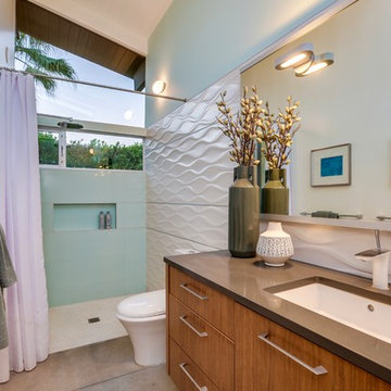
Gorgeous master bath with dramatic retro "wave" tile. Peak Photography
Example of a 1950s bathroom design in Los Angeles
Example of a 1950s bathroom design in Los Angeles
 Simply Perfect
Advice on interior design is available everywhere—from TV shows and websites to books, magazines and apps.
We love seeing people become engaged in design and educated on the wide range of possibilities. But we hope you’ll proceed with caution.
It’s not that style errors are a matter of life and death. It’s just that it’s easy to choose designs that aren’t necessarily reflective of your own personality and character. And since you’re typically stuck with your interior design decisions for years, styles that don’t quite fit can tend to grate on you.
Interiors that give one person comfort may unleash chaos in someone else. This goes beyond favorite colors or hot trends, right to the heart of interior design, where you find questions of composition, balance, repetition, space and more.
The goal is to find that unique combination of design elements that gives you comfort, support and balance.
In one home, that perfect balance was struck through the use of symmetry. A pair of comfortable swivel chairs sit beneath matching indigo patterned paintings. Matching bookcases below the paintings contain similar, but not identical, arrangements of books, vases and bowls. Woods and bronzes help warm up the simple white bookcase shelving.
Two matching poufs in front of the fireplace provide additional seating. The sofa is accented with a pair of pillows with a blue pattern that echoes the artwork.
The effect of the symmetry is to achieve order and simplicity, which I promote at every opportunity. After all, your home interiors should be the setting or the backdrop of your life—not center stage.
Antique bronze and blue are complementary colors. Together, they offer a rich palette of richness and depth, which brings out the beauty of wood and stone.
In the home office, a unique, whitewash-stained wooden desk rests on metal, Sawhorse-inspired legs for a warm, rustic look. The black leather chair features a contemporary silhouette with an antique brass frame. An adjustable desk lamp has bronze accents.
The bookcase combines a sleek, black metal frame with concrete shelves, for another unusual pairing. It’s kept uncluttered for an orderly, peaceful look. Items on the shelves include a bronze-accented lamp and a pair
of high gloss-finished wooden bookends.
The elegant artwork behind the desk is a simple midnight-blue and bronze with mottled white. Deep blues are again picked up in the rug, which adds a stately vibe with a modern pattern and satisfying texture.
Within the framework of symmetry, the living room repeats the blue-and-bronze color scheme.
A large midcentury brass clock above the fireplace keeps the natural stone visible, rather than hidden behind a painting or television, while its straight lines and color create a beautiful contrast.
The sofa is a soft, neutral blue. The pattern on the round brass side table features echoes the darker blue-patterned rug, as well as the rug in the office, tying the rooms together.
Indigo blue books adjacent to bronze vases on the shelves repeat the color scheme. The soapstone-topped coffee table echoes the shape of the fireplace. A pair of tall, matching floor lamps with long wooden bases, brass pulls and simple linen shades combine both the colors and symmetry found throughout the home.
 Simply Perfect
Advice on interior design is available everywhere—from TV shows and websites to books, magazines and apps.
We love seeing people become engaged in design and educated on the wide range of possibilities. But we hope you’ll proceed with caution.
It’s not that style errors are a matter of life and death. It’s just that it’s easy to choose designs that aren’t necessarily reflective of your own personality and character. And since you’re typically stuck with your interior design decisions for years, styles that don’t quite fit can tend to grate on you.
Interiors that give one person comfort may unleash chaos in someone else. This goes beyond favorite colors or hot trends, right to the heart of interior design, where you find questions of composition, balance, repetition, space and more.
The goal is to find that unique combination of design elements that gives you comfort, support and balance.
In one home, that perfect balance was struck through the use of symmetry. A pair of comfortable swivel chairs sit beneath matching indigo patterned paintings. Matching bookcases below the paintings contain similar, but not identical, arrangements of books, vases and bowls. Woods and bronzes help warm up the simple white bookcase shelving.
Two matching poufs in front of the fireplace provide additional seating. The sofa is accented with a pair of pillows with a blue pattern that echoes the artwork.
The effect of the symmetry is to achieve order and simplicity, which I promote at every opportunity. After all, your home interiors should be the setting or the backdrop of your life—not center stage.
Antique bronze and blue are complementary colors. Together, they offer a rich palette of richness and depth, which brings out the beauty of wood and stone.
In the home office, a unique, whitewash-stained wooden desk rests on metal, Sawhorse-inspired legs for a warm, rustic look. The black leather chair features a contemporary silhouette with an antique brass frame. An adjustable desk lamp has bronze accents.
The bookcase combines a sleek, black metal frame with concrete shelves, for another unusual pairing. It’s kept uncluttered for an orderly, peaceful look. Items on the shelves include a bronze-accented lamp and a pair
of high gloss-finished wooden bookends.
The elegant artwork behind the desk is a simple midnight-blue and bronze with mottled white. Deep blues are again picked up in the rug, which adds a stately vibe with a modern pattern and satisfying texture.
Within the framework of symmetry, the living room repeats the blue-and-bronze color scheme.
A large midcentury brass clock above the fireplace keeps the natural stone visible, rather than hidden behind a painting or television, while its straight lines and color create a beautiful contrast.
The sofa is a soft, neutral blue. The pattern on the round brass side table features echoes the darker blue-patterned rug, as well as the rug in the office, tying the rooms together.
Indigo blue books adjacent to bronze vases on the shelves repeat the color scheme. The soapstone-topped coffee table echoes the shape of the fireplace. A pair of tall, matching floor lamps with long wooden bases, brass pulls and simple linen shades combine both the colors and symmetry found throughout the home.
 Simply Perfect
Advice on interior design is available everywhere—from TV shows and websites to books, magazines and apps.
We love seeing people become engaged in design and educated on the wide range of possibilities. But we hope you’ll proceed with caution.
It’s not that style errors are a matter of life and death. It’s just that it’s easy to choose designs that aren’t necessarily reflective of your own personality and character. And since you’re typically stuck with your interior design decisions for years, styles that don’t quite fit can tend to grate on you.
Interiors that give one person comfort may unleash chaos in someone else. This goes beyond favorite colors or hot trends, right to the heart of interior design, where you find questions of composition, balance, repetition, space and more.
The goal is to find that unique combination of design elements that gives you comfort, support and balance.
In one home, that perfect balance was struck through the use of symmetry. A pair of comfortable swivel chairs sit beneath matching indigo patterned paintings. Matching bookcases below the paintings contain similar, but not identical, arrangements of books, vases and bowls. Woods and bronzes help warm up the simple white bookcase shelving.
Two matching poufs in front of the fireplace provide additional seating. The sofa is accented with a pair of pillows with a blue pattern that echoes the artwork.
The effect of the symmetry is to achieve order and simplicity, which I promote at every opportunity. After all, your home interiors should be the setting or the backdrop of your life—not center stage.
Antique bronze and blue are complementary colors. Together, they offer a rich palette of richness and depth, which brings out the beauty of wood and stone.
In the home office, a unique, whitewash-stained wooden desk rests on metal, Sawhorse-inspired legs for a warm, rustic look. The black leather chair features a contemporary silhouette with an antique brass frame. An adjustable desk lamp has bronze accents.
The bookcase combines a sleek, black metal frame with concrete shelves, for another unusual pairing. It’s kept uncluttered for an orderly, peaceful look. Items on the shelves include a bronze-accented lamp and a pair
of high gloss-finished wooden bookends.
The elegant artwork behind the desk is a simple midnight-blue and bronze with mottled white. Deep blues are again picked up in the rug, which adds a stately vibe with a modern pattern and satisfying texture.
Within the framework of symmetry, the living room repeats the blue-and-bronze color scheme.
A large midcentury brass clock above the fireplace keeps the natural stone visible, rather than hidden behind a painting or television, while its straight lines and color create a beautiful contrast.
The sofa is a soft, neutral blue. The pattern on the round brass side table features echoes the darker blue-patterned rug, as well as the rug in the office, tying the rooms together.
Indigo blue books adjacent to bronze vases on the shelves repeat the color scheme. The soapstone-topped coffee table echoes the shape of the fireplace. A pair of tall, matching floor lamps with long wooden bases, brass pulls and simple linen shades combine both the colors and symmetry found throughout the home.
34