
Search results for "Children pay" in Home Design Ideas
 CHRISTOPHER STROM ARCHITECTS
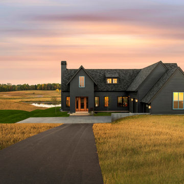
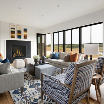
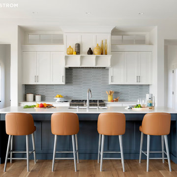
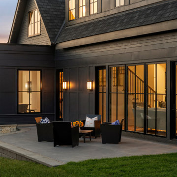
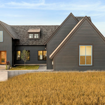
Eye-Land: Named for the expansive white oak savanna views, this beautiful 5,200-square foot family home offers seamless indoor/outdoor living with five bedrooms and three baths, and space for two more bedrooms and a bathroom.
The site posed unique design challenges. The home was ultimately nestled into the hillside, instead of placed on top of the hill, so that it didn’t dominate the dramatic landscape. The openness of the savanna exposes all sides of the house to the public, which required creative use of form and materials. The home’s one-and-a-half story form pays tribute to the site’s farming history. The simplicity of the gable roof puts a modern edge on a traditional form, and the exterior color palette is limited to black tones to strike a stunning contrast to the golden savanna.
The main public spaces have oversized south-facing windows and easy access to an outdoor terrace with views overlooking a protected wetland. The connection to the land is further strengthened by strategically placed windows that allow for views from the kitchen to the driveway and auto court to see visitors approach and children play. There is a formal living room adjacent to the front entry for entertaining and a separate family room that opens to the kitchen for immediate family to gather before and after mealtime.
 CHRISTOPHER STROM ARCHITECTS
Eye-Land: Named for the expansive white oak savanna views, this beautiful 5,200-square foot family home offers seamless indoor/outdoor living with five bedrooms and three baths, and space for two more bedrooms and a bathroom.
The site posed unique design challenges. The home was ultimately nestled into the hillside, instead of placed on top of the hill, so that it didn’t dominate the dramatic landscape. The openness of the savanna exposes all sides of the house to the public, which required creative use of form and materials. The home’s one-and-a-half story form pays tribute to the site’s farming history. The simplicity of the gable roof puts a modern edge on a traditional form, and the exterior color palette is limited to black tones to strike a stunning contrast to the golden savanna.
The main public spaces have oversized south-facing windows and easy access to an outdoor terrace with views overlooking a protected wetland. The connection to the land is further strengthened by strategically placed windows that allow for views from the kitchen to the driveway and auto court to see visitors approach and children play. There is a formal living room adjacent to the front entry for entertaining and a separate family room that opens to the kitchen for immediate family to gather before and after mealtime.
 CHRISTOPHER STROM ARCHITECTS
Eye-Land: Named for the expansive white oak savanna views, this beautiful 5,200-square foot family home offers seamless indoor/outdoor living with five bedrooms and three baths, and space for two more bedrooms and a bathroom.
The site posed unique design challenges. The home was ultimately nestled into the hillside, instead of placed on top of the hill, so that it didn’t dominate the dramatic landscape. The openness of the savanna exposes all sides of the house to the public, which required creative use of form and materials. The home’s one-and-a-half story form pays tribute to the site’s farming history. The simplicity of the gable roof puts a modern edge on a traditional form, and the exterior color palette is limited to black tones to strike a stunning contrast to the golden savanna.
The main public spaces have oversized south-facing windows and easy access to an outdoor terrace with views overlooking a protected wetland. The connection to the land is further strengthened by strategically placed windows that allow for views from the kitchen to the driveway and auto court to see visitors approach and children play. There is a formal living room adjacent to the front entry for entertaining and a separate family room that opens to the kitchen for immediate family to gather before and after mealtime.
Find the right local pro for your project
 CHRISTOPHER STROM ARCHITECTS
Eye-Land: Named for the expansive white oak savanna views, this beautiful 5,200-square foot family home offers seamless indoor/outdoor living with five bedrooms and three baths, and space for two more bedrooms and a bathroom.
The site posed unique design challenges. The home was ultimately nestled into the hillside, instead of placed on top of the hill, so that it didn’t dominate the dramatic landscape. The openness of the savanna exposes all sides of the house to the public, which required creative use of form and materials. The home’s one-and-a-half story form pays tribute to the site’s farming history. The simplicity of the gable roof puts a modern edge on a traditional form, and the exterior color palette is limited to black tones to strike a stunning contrast to the golden savanna.
The main public spaces have oversized south-facing windows and easy access to an outdoor terrace with views overlooking a protected wetland. The connection to the land is further strengthened by strategically placed windows that allow for views from the kitchen to the driveway and auto court to see visitors approach and children play. There is a formal living room adjacent to the front entry for entertaining and a separate family room that opens to the kitchen for immediate family to gather before and after mealtime.
 Thinkterior LLC
THEME There are two priorities in this
room: Hockey (in this case, Washington
Capitals hockey) and FUN.
FOCUS The room is broken into two
main sections (one for kids and one
for adults); and divided by authentic
hockey boards, complete with yellow
kickplates and half-inch plexiglass. Like
a true hockey arena, the room pays
homage to star players with two fully
autographed team jerseys preserved in
cases, as well as team logos positioned
throughout the room on custom-made
pillows, accessories and the floor.
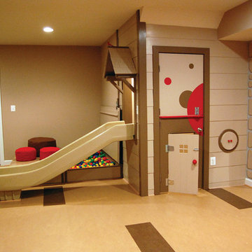
The back half of the room is made just
for kids. Swings, a dart board, a ball
pit, a stage and a hidden playhouse
under the stairs ensure fun for all.
STORAGE A large storage unit at
the rear of the room makes use of an
odd-shaped nook, adds support and
accommodates large shelves, toys and
boxes. Storage space is cleverly placed
near the ballpit, and will eventually
transition into a full storage area once
the pit is no longer needed. The back
side of the hockey boards hold two
small refrigerators (one for adults and
one for kids), as well as the base for the
audio system.
GROWTH The front half of the room
lasts as long as the family’s love for the
team. The back half of the room grows
with the children, and eventually will
provide a useable, wide open space as
well as storage.
SAFETY A plexiglass wall separates the
two main areas of the room, minimizing
the noise created by kids playing and
hockey fans cheering. It also protects
the big screen TV from balls, pucks and
other play objects that occasionally fly
by. The ballpit door has a double safety
lock to ensure supervised use.
 Delicious Kitchens & Interiors, LLC
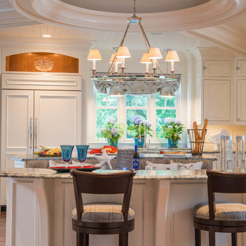
This lovely home features an open concept space with the kitchen at its heart. Built in the late 1990's the prior kitchen was cherry, but dark, and the new family needed a fresh update.
The back of the raised counter shown here is supported by custom corbels with room for four stools.The center section features and oval wood-topped table with banquette bench seating on two sides. Six can sit on the benches, chairs at the end add two more places... There is plenty of room for the family of five... even with the children's friends or team-mates dropping by; room for 12 if you are keeping count.
The show-stopping coffered ceiling was custom designed and features a highlighted central area in a circular design. It's painted in the center section but the outside portions have beaded boards, recessed can lighting and dramatic crown molding.
The prior cherry kitchen with Corian counters and appliances was re-invented as a entertainment/auxiliary kitchen in the lower level of the house.
This great space was a collaboration between many talented folks including but not limited to the team at Delicious Kitchens & Interiors, LLC, L. Newman and Associates/Paul Mansback, Inc with Leslie Rifkin and Emily Shakra, along with contributions from the homeowners and Belisle Granite.
John C. Hession Photographer
 The Design Studio of Wendy Harper
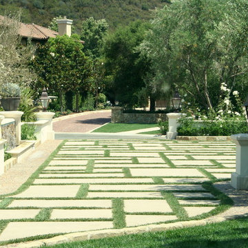
California Spanish Colonial motor court entry and gated driveway with sport court was designed in 2007. We pay meticulous attention to details during construction.
The main courtyard entry allows guests to be let off at the front door and the cars valeted for parties. The grass insets soften and warm the homes grand entrance. American Gas lamps adorn the columns and front entry. The paving is natural cobble banding with Santa Barbara stone curbing. The motor court pads and driveway are sand finished colored concrete. The grand staircase to the main front door is cut limestone paving.
Mature Olive trees frame the entrance and a two sided weeping wall water feature adds a focal point from inside the courtyard, as well as, from the street view. Two full grown California Live Oaks were craned in to frame each corner of the house.
The main driveway to the garages has double Custom Wood gates with a side pedestrian entrance, all connected to the security system and cameras. The safe gated driveway also doubles as a bike/trike area for the children and is adjacent to the half-court Sport Court and in-ground trampoline for family fun.
Photos by: Ken Palmer


 Leib Designs
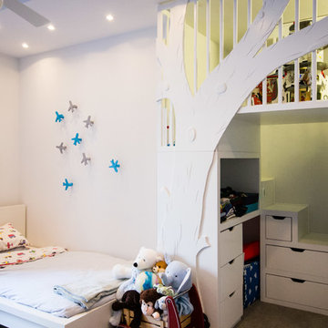
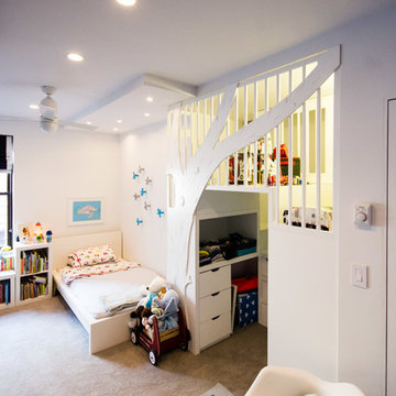
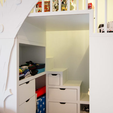
 We designed a play area suited especially for the child. The tree cutout demonstrates our ability to design custom components that serve both a purpose and unique scenery within the confines of a persons home.
The tree cutout quietly blends with the custom made play area that also functions as a storage unit. The color palette used on the walls match the various furnishings perfectly. The hue of the walls and tree cutout pay homage to fairy tales and the art of storytelling. This bedroom is essentially, a page right out of a children’s book.
 Linda Stotts Interiors
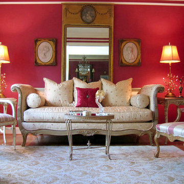
Mid-sized elegant formal and enclosed living room photo with red walls, no fireplace and no tv
 Leib Designs
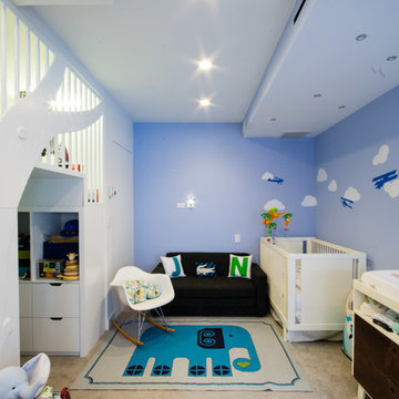
 We designed a play area suited especially for the child. The tree cutout demonstrates our ability to design custom components that serve both a purpose and unique scenery within the confines of a persons home.
The tree cutout quietly blends with the custom made play area that also functions as a storage unit. The color palette used on the walls match the various furnishings perfectly. The hue of the walls and tree cutout pay homage to fairy tales and the art of storytelling. This bedroom is essentially, a page right out of a children’s book.
 Michael Nash Design, Build & Homes
2011 NARI CAPITAL COTY MERIT AWARD WINNER
This couple lived in their colonial home in Burke, Virginia, for more than 20 years. Now that their children were grown and gone, it was time for them to pay more attention to their home. First on their list was to renovate their master bathroom. Tight and dysfunctional is how they described the existing space.
The homeowners always dreamed of having a whirlpool, a large steam shower and a private toilet area. Importantly, they wanted to use the latest products and materials to bring the bathroom into the 21st Century.
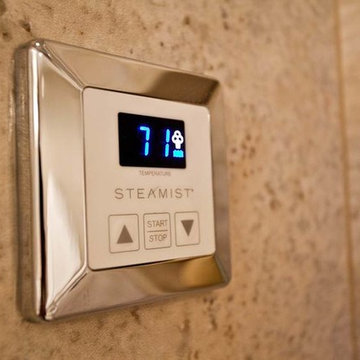
Starting with exotic granite and porcelain tile from floor to ceiling, the new design does just that. Then, a highly sophisticated steam shower using granite benches, a heavy glass enclosure, chrome faucets and a rain shower head was installed. Modern body spray heads are embedded in the wall tiles. The shower is complemented by a bubble, jetted whirlpool tub with granite surrounds.
A modern double vanity with vessel sinks, a granite countertop, high end cabinets and stylish faucets rest along one wall. Custom-built, recessed mirrored medicine cabinets provide storage for necessities.
In the end, the homeowners are thrilled with the outcome and never imagined that their old and dark looking small bath could ever be transformed into such beautiful bathroom.
 Barbara Stock Interior Design
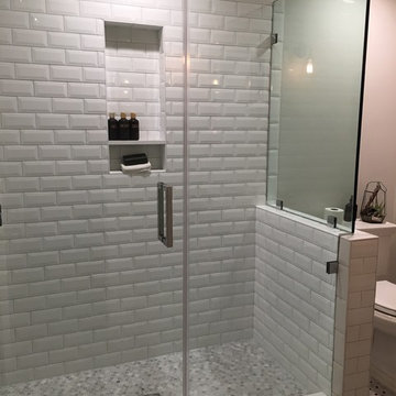
Beveled white subway tile, frameless shower doors, and a simple niche create a contemporary, modern farmhouse vibe in this guest bath.
Mid-sized country kids' white tile mosaic tile floor bathroom photo in Los Angeles with gray walls and a pedestal sink
Mid-sized country kids' white tile mosaic tile floor bathroom photo in Los Angeles with gray walls and a pedestal sink

 safe ZOnea
Ask a kitchen designer in Chicago which countertop question comes up most and you will hear the same answer: white or off-white quartz, and which shade. Homeowners walk into showrooms with a photo saved on their phone, usually a bright, veined slab from a magazine spread, and leave an hour later realizing there are a dozen versions of that same look. The confusion is not about taste. It is about the fact that "white quartz" covers a huge range of patterns, undertones, and price points, and nobody explains the differences before the sale.
Older bungalows and newer builds alike are getting stripped of their dated laminate and butcher block in favor of quartz, and the reasons are practical rather than trendy. Quartz does not need sealing, resists the kind of staining that granite can suffer over decades, and holds up to the freeze-thaw humidity swings that Chicago basements and kitchens go through every year. Once a homeowner commits to quartz, though, the real decision starts: which white, and does the pattern justify the difference in cost.
This piece walks through three specific slabs that keep showing up in Chicago renovation projects, why designers reach for them in different rooms, and what actually separates a flat white surface from one with real depth. None of this requires a design background to follow. It is mostly about paying attention to how a slab behaves under kitchen lighting, how busy the vending gets, and how it photographs versus how it looks in person.
Why White Quartz Took Over Chicago Kitchens
Ten years ago, granite dominated Chicago kitchen remodels almost by default. It was durable, it looked expensive, and every fabricator in the metro area carried a wide range of colors. Quartz has since taken over that position, and the shift happened faster than most contractors expected. Engineered stone gave homeowners a more predictable surface, since natural granite varies slab to slab while quartz is manufactured to a consistent pattern batch after batch.
The other driver is light. Chicago winters are long and gray, and a lot of kitchens, especially in older two-flats and courtyard buildings, do not get much direct sun. A dark granite countertop in a dim kitchen can make the whole room feel smaller. White and light-toned quartz reflects what little natural light comes through the windows, and it makes a galley kitchen or a north-facing space feel noticeably brighter without touching the cabinetry or the layout.
There is also a resale argument that local real estate agents bring up constantly. White quartz photographs well for listings, reads as updated and low-maintenance to buyers touring in person, and does not compete visually with whatever cabinet color the next owner might prefer. It is a safer bet than a bold veined marble look or a colored quartz that might feel dated in five years.
Arctic White and the Cost Question
Among the flatter, more uniform whites, arctic white quartz price comes up constantly in budget conversations because the slab sits at a more approachable point than the heavily veined Italian-marble-inspired patterns. It reads as clean and bright without the busy movement that some homeowners find overwhelming in a small kitchen. Fabricators in the Chicago area tend to keep it in stock precisely because demand stays steady across both new construction and remodel projects.
Part of what keeps this slab affordable relative to its heavily patterned cousins comes down to manufacturing complexity. A quartz surface with minimal veining and a consistent white base is simpler to produce at scale than one that mimics the irregular, high-contrast movement of natural Calacatta marble. That production difference shows up directly in what a homeowner pays per square foot, and it is worth asking a fabricator to walk through that pricing before assuming every white quartz costs the same.
Homeowners planning a full kitchen, including an island, backsplash, and perimeter counters, often use a flatter white like this specifically because it lets other elements carry the visual interest. A patterned tile backsplash or a bold cabinet color reads more clearly against a calm countertop than against one already fighting for attention with heavy veining. Designers frequently pair simpler whites with statement lighting fixtures for exactly this reason.
What Makes Calacatta Patterns Different
Calacatta refers to a family of marble originally quarried in Italy, known for a bright white background broken up by bold, often gold-toned veining that moves in thick, dramatic streaks rather than thin gray lines. Natural Calacatta marble is soft, porous, and expensive to maintain, which is exactly why quartz manufacturers spent years developing engineered versions that replicate the look without the upkeep headaches.
The challenge with any Calacatta-style quartz is getting the veining to look organic instead of printed. Early generations of engineered stone struggled with repetitive patterns that gave away the fact the slab was manufactured rather than cut from actual marble. Modern digital printing and layering techniques have closed that gap considerably, and the better Calacatta-inspired quartz lines now vary the veining across each slab batch so two counters in the same kitchen do not look identical.
Chicago designers gravitate toward Calacatta patterns for kitchens that function as the visual centerpiece of an open floor plan, which describes a large share of the gut renovations happening in neighborhoods like Lincoln Park, Roscoe Village, and the North Shore suburbs. When the kitchen island is visible from the living room and dining area, a dramatic veined surface becomes part of the home's overall design language rather than a purely functional work surface.
Calacatta Arno Under Kitchen Lighting
One of the more popular options in this category, calacatta arno quartz, balances a warm white base with soft gray and gold veining that avoids looking too stark under the cooler LED lighting common in newer Chicago builds. Homeowners touring showrooms sometimes make the mistake of judging a slab entirely under warm incandescent lighting, then get surprised when the same surface looks slightly different once installed under their kitchen's actual fixtures.
What separates this particular pattern from flatter competitors is how the veining clusters rather than spreading evenly across the slab. That clustering mimics the way real quarried marble forms, with denser mineral deposits in some sections and cleaner stretches in others. Fabricators cutting a large island slab from a single piece will often orient the pattern intentionally so the busiest veining lands somewhere visually interesting rather than getting cut off at an edge.
Because the background reads warmer than a stark white, this pattern tends to pair well with brass or matte gold hardware, a combination that has been showing up repeatedly in Chicago kitchen remodels over the past few renovation seasons. Cabinet painters report a similar trend, with more clients requesting warm white or greige cabinet colors specifically because they complement this kind of veined quartz better than a cooler, blue-toned white would.
Silestone's Version of the Calacatta Look
Manufacturers compete directly in this Calacatta-inspired category, and silestone eternal calacatta gold represents one brand's specific take on the pattern, distinguished by richer gold veining set against a brighter white base than some competing slabs in the same family. Silestone has built a reputation around anti-bacterial surface treatments in addition to the standard quartz durability, a detail some homeowners specifically ask about for kitchens used heavily by families with young children.
The veining in this particular slab tends to run in longer, more continuous lines compared to the clustered pattern found in some other Calacatta-style options, which gives large island surfaces a sense of visual flow from one end to the other. Fabricators working with bigger islands, the kind increasingly common in open-concept Chicago remodels, often favor patterns like this because there is less need to worry about seams interrupting a busy, disconnected pattern.
Price positioning for this slab tends to sit toward the upper end of the engineered quartz category, reflecting both the brand's manufacturing process and the complexity of replicating that continuous gold veining consistently across production batches. Homeowners weighing this option against other Calacatta-style quartz should ask their fabricator directly about batch availability, since premium patterns sometimes have longer lead times than standard stock colors.
Living With Quartz Day to Day
Beyond how a slab looks in a showroom or a listing photo, the daily experience of owning quartz countertops matters more once the renovation dust settles. Quartz resists scratching far better than laminate and holds up to the acidic spills, hot pans, and general abuse of an active kitchen without the sealing maintenance that natural stone requires every year or two. That low-maintenance reputation is a large part of why quartz overtook granite in the first place.
Heat resistance is a detail that gets less attention than it should. While quartz handles moderate heat well, manufacturers generally recommend using a trivet or pad for very hot pots straight off the stove, since sudden temperature shock can occasionally cause stress marks in the resin binder that holds the engineered stone together. This is a minor precaution rather than a major limitation, but it is worth mentioning to anyone assuming quartz is entirely indestructible.
Cleaning routines stay simple across almost every pattern in this category. A damp cloth and mild soap handle daily messes, and the nonporous surface means wine, coffee, and tomato-based sauces do not soak in the way they can with unsealed granite or marble. Homeowners moving from an older stone counter often mention how much less they worry about everyday spills once quartz is installed, which is a quality-of-life change that rarely makes it into the initial design conversation.
Choosing Between the Three
There is no single correct answer among these three slabs, and that is exactly why they keep coming up together in the same design conversations across Chicago renovation projects. A flatter white with minimal veining suits kitchens where other elements need to carry the visual interest, while a bolder Calacatta-inspired pattern makes sense when the countertop itself is meant to be the centerpiece of an open floor plan.
Budget matters too, and it is worth having a direct conversation with a fabricator about where each option lands before falling in love with a specific slab in a showroom. Lighting, cabinet color, and how the kitchen connects to the rest of the home all play into which pattern will actually look right once installation is finished rather than just in a photo.
Whatever direction a homeowner leans, seeing a full slab in person under actual kitchen lighting remains the single most useful step before signing off. Photos only go so far once the countertop is sitting in the room it will live in for years.
 Leib Designs
 We designed a play area suited especially for the child. The tree cutout demonstrates our ability to design custom components that serve both a purpose and unique scenery within the confines of a persons home.
The tree cutout quietly blends with the custom made play area that also functions as a storage unit. The color palette used on the walls match the various furnishings perfectly. The hue of the walls and tree cutout pay homage to fairy tales and the art of storytelling. This bedroom is essentially, a page right out of a children’s book.
 Leib Designs
 We designed a play area suited especially for the child. The tree cutout demonstrates our ability to design custom components that serve both a purpose and unique scenery within the confines of a persons home.
The tree cutout quietly blends with the custom made play area that also functions as a storage unit. The color palette used on the walls match the various furnishings perfectly. The hue of the walls and tree cutout pay homage to fairy tales and the art of storytelling. This bedroom is essentially, a page right out of a children’s book.
 British Home Emporium
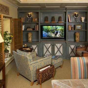
We named this space. "The Commander"s Nest". This compact space served as command central for the lady of the house who is both a creative force with international design projects, and a mother with children’s lives to organize bills to pay and a staff to maintain. With its custom crafted cabinetry and island it appears to be a charming cottage. But beneath this façade lies a well oiled machine enabling her to fulfill her roles in a creative atmosphere. In her sanctuary while lounging on plush upholstery she can relax, read and let her imagination wander.
The design inspiration for the room is the eclectic combination of rustic and contemporary design, custom crafted by British Home Emporium. Colorful finishes and natural materials are combined with touches of whimsical artistry. All custom furniture utilizes environmentally friendly materials and processes and draws in the nature and beauty of the gardens.

 CHRISTOPHER STROM ARCHITECTS
Eye-Land: Named for the expansive white oak savanna views, this beautiful 5,200-square foot family home offers seamless indoor/outdoor living with five bedrooms and three baths, and space for two more bedrooms and a bathroom.
The site posed unique design challenges. The home was ultimately nestled into the hillside, instead of placed on top of the hill, so that it didn’t dominate the dramatic landscape. The openness of the savanna exposes all sides of the house to the public, which required creative use of form and materials. The home’s one-and-a-half story form pays tribute to the site’s farming history. The simplicity of the gable roof puts a modern edge on a traditional form, and the exterior color palette is limited to black tones to strike a stunning contrast to the golden savanna.
The main public spaces have oversized south-facing windows and easy access to an outdoor terrace with views overlooking a protected wetland. The connection to the land is further strengthened by strategically placed windows that allow for views from the kitchen to the driveway and auto court to see visitors approach and children play. There is a formal living room adjacent to the front entry for entertaining and a separate family room that opens to the kitchen for immediate family to gather before and after mealtime.

 SabaRehman Abdulrehman
Bathrooms are no longer just functional spaces; they’re mini sanctuaries where we unwind, reset, and start or end the day. One of the biggest trends driving modern bathroom design is the move towards open, spacious layouts – and at the centre of that look is the wet room shower screen.
At BathroomNation, we’ve helped countless homeowners transform traditional bathrooms into sleek, practical wet rooms using high-quality wet room shower screens. In this blog, we’ll explain what a wet room shower screen is, why it’s such a smart choice, how to plan and style it, and what to look for when choosing the perfect one for your home.
What Is a Wet Room Shower Screen?
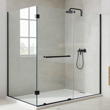
A wet room shower screen is a fixed or semi-fixed glass panel designed to separate your shower area from the rest of the bathroom floor, without enclosing it like a traditional cubicle. Instead of a full tray and door, you have:
- A level or gently sloped floor (often fully tiled)
- A walk-in, open shower space
- One or more glass panels providing splash protection
- Small bathrooms that feel cramped
- Rooms with limited or no natural light
- Long, narrow spaces where every inch counts
- Ideal for people with limited mobility
- Safer for older users and children
- More comfortable for everyday use
- Almost invisible glass boundaries
- Minimal metal hardware and framing
- A seamless link between shower and non-shower areas
- Quick to wipe down after a shower
- Simple to clean with standard glass cleaner
- Less prone to discoloured seals and hard-to-reach dirt
- The shower head is positioned sensibly to minimise overspray
- Your bathroom is medium or large in size
- You want an ultra‑open, walk‑in feel
- Extends coverage
- Helps keep more water inside the shower area
- Still keeps the openness of a walk‑in design
- Increase the effective width of protection during showering
- Fold the panel away slightly when not in use to open up the space
- 8mm toughened safety glass as standard
- 10mm toughened glass for an even more solid, premium feel
- Prevent water spots and mineral build-up
- Make daily and weekly cleaning quicker
- Keep your wet room shower screen looking clear and new for longer
- Taller screens (often 1900mm or more) provide better splash control
- Various widths let you create both compact and expansive walk-in areas
- Enhance rigidity and safety
- Are typically mounted at the top, near the ceiling or wall
- Can be designed in finishes that match your brassware (chrome, black, brass, etc.)
- Chrome
- Brushed nickel
- Matt black
- Brushed brass or gold tone
- Where the shower head will be placed (ceiling, wall‑mounted, or both)
- How water will naturally fall and drain
- How much splash you’re comfortable with elsewhere in the room
- The floor needs a gentle, even fall towards the drain
- You can use a central drain or linear (channel) drain
- Waterproofing (tanking) is essential beneath tiles or flooring
- Catch most of the spray from your shower head
- Shield the main walkway and dry areas
- Clear, frameless-style glass panel
- Large-format light grey or stone‑effect tiles
- Wall‑mounted rainfall shower head with matching controls
- Floating vanity and wall-hung toilet
- Wet room shower screen with black profile and support bar
- Concrete or stone-look tiles on floor and walls
- Black rainfall shower and matching mixer valve
- Simple timber stool or bench for warmth
- Ultra-clear glass wet room shower screen
- Natural stone or stone‑effect tiles in warm tones
- Brushed brass shower fittings
- Niche shelving built into the wall for toiletries
- Open, walk-in design
- Easier access, especially for mobility needs
- More airy look, less visual clutter
- Simpler to clean (fewer frames and corners)
- Fully enclosed, more contained water
- Usually involves a tray and door
- Can feel more “boxed in” in smaller rooms
4