
Search results for "Coherent visual" in Home Design Ideas
 Amos Goldreich Architecture
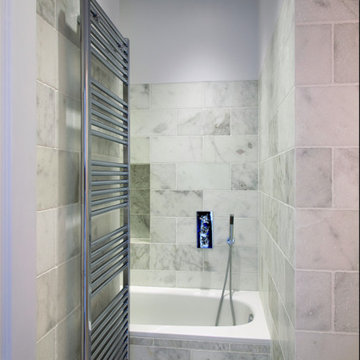
The apartment occupies the third floor of a prominent corner property originally constructed in 1860.
The building was formerly two neighbouring town houses, reconfigured in 1939 as a residential school for girls. In 1968, the State of Kuwait purchased the property which became their London Embassy until 2000 at which time the two houses were converted into 13 flats.
Amos Goldreich Architecture was appointed as lead architects to create a contemporary 3 bedroom home within this Grade II Listed Building.
AGA has sought to rationalise the formerly over-complex configuration, clarifying spatial sequences and creating a coherent visual palette. The apartment is finished to a high standard, with bespoke joinery and ingenious storage solutions.
 Amos Goldreich Architecture
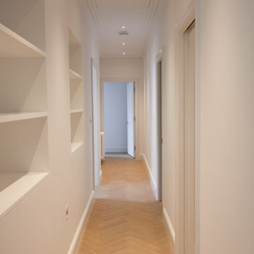
The apartment occupies the third floor of a prominent corner property originally constructed in 1860.
The building was formerly two neighbouring town houses, reconfigured in 1939 as a residential school for girls. In 1968, the State of Kuwait purchased the property which became their London Embassy until 2000 at which time the two houses were converted into 13 flats.
Amos Goldreich Architecture was appointed as lead architects to create a contemporary 3 bedroom home within this Grade II Listed Building.
AGA has sought to rationalise the formerly over-complex configuration, clarifying spatial sequences and creating a coherent visual palette. The apartment is finished to a high standard, with bespoke joinery and ingenious storage solutions.
 Amos Goldreich Architecture
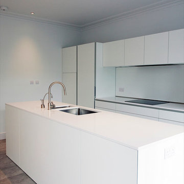
The apartment occupies the third floor of a prominent corner property originally constructed in 1860.
The building was formerly two neighbouring town houses, reconfigured in 1939 as a residential school for girls. In 1968, the State of Kuwait purchased the property which became their London Embassy until 2000 at which time the two houses were converted into 13 flats.
Amos Goldreich Architecture was appointed as lead architects to create a contemporary 3 bedroom home within this Grade II Listed Building.
AGA has sought to rationalise the formerly over-complex configuration, clarifying spatial sequences and creating a coherent visual palette. The apartment is finished to a high standard, with bespoke joinery and ingenious storage solutions.
Find the right local pro for your project
 Amos Goldreich Architecture
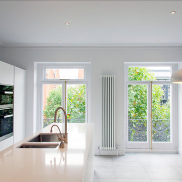
The apartment occupies the third floor of a prominent corner property originally constructed in 1860.
The building was formerly two neighbouring town houses, reconfigured in 1939 as a residential school for girls. In 1968, the State of Kuwait purchased the property which became their London Embassy until 2000 at which time the two houses were converted into 13 flats.
Amos Goldreich Architecture was appointed as lead architects to create a contemporary 3 bedroom home within this Grade II Listed Building.
AGA has sought to rationalise the formerly over-complex configuration, clarifying spatial sequences and creating a coherent visual palette. The apartment is finished to a high standard, with bespoke joinery and ingenious storage solutions.
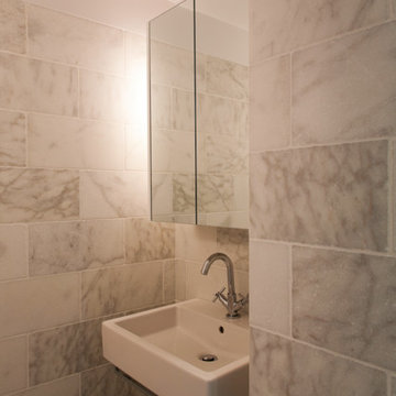 Amos Goldreich Architecture
The apartment occupies the third floor of a prominent corner property originally constructed in 1860.
The building was formerly two neighbouring town houses, reconfigured in 1939 as a residential school for girls. In 1968, the State of Kuwait purchased the property which became their London Embassy until 2000 at which time the two houses were converted into 13 flats.
Amos Goldreich Architecture was appointed as lead architects to create a contemporary 3 bedroom home within this Grade II Listed Building.
AGA has sought to rationalise the formerly over-complex configuration, clarifying spatial sequences and creating a coherent visual palette. The apartment is finished to a high standard, with bespoke joinery and ingenious storage solutions.
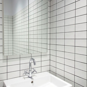 Amos Goldreich Architecture
The apartment occupies the third floor of a prominent corner property originally constructed in 1860.
The building was formerly two neighbouring town houses, reconfigured in 1939 as a residential school for girls. In 1968, the State of Kuwait purchased the property which became their London Embassy until 2000 at which time the two houses were converted into 13 flats.
Amos Goldreich Architecture was appointed as lead architects to create a contemporary 3 bedroom home within this Grade II Listed Building.
AGA has sought to rationalise the formerly over-complex configuration, clarifying spatial sequences and creating a coherent visual palette. The apartment is finished to a high standard, with bespoke joinery and ingenious storage solutions.
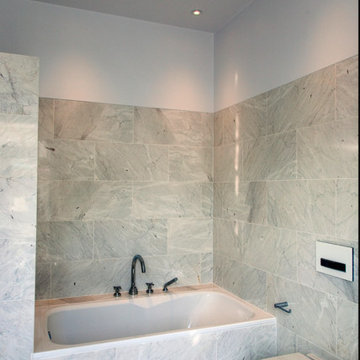 Amos Goldreich Architecture
The apartment occupies the third floor of a prominent corner property originally constructed in 1860.
The building was formerly two neighbouring town houses, reconfigured in 1939 as a residential school for girls. In 1968, the State of Kuwait purchased the property which became their London Embassy until 2000 at which time the two houses were converted into 13 flats.
Amos Goldreich Architecture was appointed as lead architects to create a contemporary 3 bedroom home within this Grade II Listed Building.
AGA has sought to rationalise the formerly over-complex configuration, clarifying spatial sequences and creating a coherent visual palette. The apartment is finished to a high standard, with bespoke joinery and ingenious storage solutions.


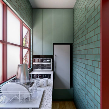
 SERGIO HALFON | Architecture & Interior Design
Apartment renovation in Mexico City focused on the comprehensive reorganization of the interior space to improve spatial clarity, functional efficiency, and architectural coherence throughout the residence. The project addressed the apartment as a complete architectural system, redefining the relationship between the kitchen, living areas, circulation, and private spaces.
The intervention included the full redesign of the kitchen and bathroom, as well as the development of custom-built storage elements integrated into the architectural envelope. These built-in components were conceived to maximize functionality while maintaining visual continuity and precise alignment with the overall spatial composition.
Beyond individual rooms, the project established a cohesive material and spatial language across the apartment, introducing new millwork, refined transitions between surfaces, and a more deliberate organization of space. Existing architectural elements, including exposed brick surfaces, were preserved and incorporated into the new design to create continuity between the original structure and the new interventions.
The design prioritizes proportion, restraint, and construction precision, treating interior design as an extension of architecture rather than a separate decorative layer. The result is a calm, coherent contemporary residential interior that integrates storage, materiality, and spatial organization into a unified architectural framework.
 George Group Cabinetry
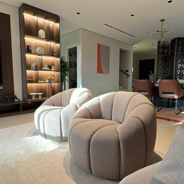
This perspective shows the natural visual connection between the casual living room and open dining area, highlighting the unified design language applied throughout the residence: the identical fish-scale hollow wood folding screens run through both zones to unify spatial style, realizing visual coherence while defining independent functional zones. Floor-to-ceiling customized illuminated display cabinets beside the TV wall continue the wood tone texture of the whole house, matching abstract wall art for subtle color echo with dining room decor. The open layout improves indoor ventilation and light transmission, creating a smooth, connected dynamic circulation for the entire public area of this private villa.
 SERGIO HALFON | Architecture & Interior Design
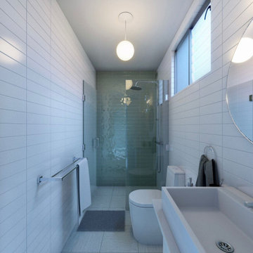
This project transformed a narrow and outdated bathroom into a bright, functional, and contemporary space. The design focused on improving spatial clarity, enhancing natural light, and creating visual continuity through a restrained material palette.
Light-toned wall tiles were used to visually expand the space, while a frameless glass shower enclosure preserves openness and allows light to flow throughout the room. Carefully selected fixtures and clean geometric forms reinforce a calm and timeless aesthetic.
The result is a bathroom that feels more spacious, coherent, and architecturally refined within the existing footprint.
Location: Oaxaca, Mexico
 Fabco Sanctuary
The architect and designer Guy Derwent was approached by his client with a clear and compelling brief: to completely transform a grand Victorian terrace house they were planning to renovate. The client envisioned something far beyond a standard renovation – this was to be a bold and dramatic reimagining of a family home that could grow with them over time.
With the property having remained largely untouched for more than fifty years, the architects saw an opportunity to unlock its potential and deliver a contemporary design that would contrast beautifully with its Victorian heritage.
The existing layout consisted of a series of small, disconnected rooms to the rear of the house. To respond to the client’s need for openness and flexibility, the architect proposed a radical restructuring of the ground floor:
The rear rooms were completely removed
Suspended timber floors were lowered by up to two metres to align with the garden
Two bold extensions were added
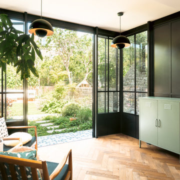
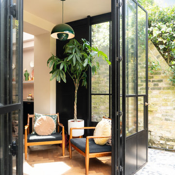
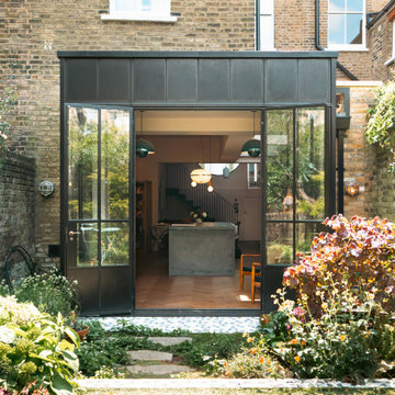
The first extension filled in the side return with a London stock brick facade and a glazed roof, while the second – a striking black steel and glass pavilion was glazed on three sides and placed along the garden elevation.
This new pavilion redefined the building’s relationship with the garden. Its steel-framed glazing created a seamless dialogue between interior and exterior, offering a sense of immersion in the surrounding landscape.
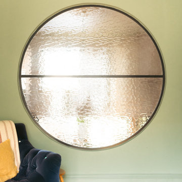
At the heart of the plan sits a dramatic, five-metre-tall dining space that acts as a transition from the original entrance hall into the new addition. A large, circular cast-glass window, framed in steel, provides a visual and spatial link between old and new, allowing light and movement to travel through the depth of the home.
Throughout the project, a series of black metal elements were introduced as sculptural interventions – each marking moments of transformation within the house. These included the bespoke steel framed circular window, a custom metal staircase, a cylindrical support column, and the striking steel and glass garden pavilion. Together, they formed a coherent architectural language that underscored the project’s bold intent.
Our steel windows and doors played a vital role in delivering the project’s vision. The architects chose steel for its refined sight lines and distinctive material character, which helped bridge the gap between the historical context of the building and the bold new additions.
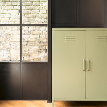
The black steel frames provided a crisp contrast to the pale London stock brick and added definition to the glazed pavilion, reinforcing the sense of architectural precision. In particular, the fine steel profiles of the garden room allowed the extension to feel both lightweight and immersive, blurring the boundary between the house and its garden.
The architect drew inspiration from the Bauhaus Movement, particularly the work of Walter Gropius, whose approach to functional beauty and industrial materials informed the design of the garden pavilion.
Here, our glazing system was used not just for transparency, but as an expressive architectural element. The carefully proportioned panels help to conceal the roof thickness and reinforce the pavilion’s industrial yet abstract character – a deliberate nod to product design and modernist detailing.
Sustainability was an important factor in the selection of materials. Our steel systems, made from 99% recycled content and 100% recyclable, aligned with the project’s broader environmental goals.
The architects noted that this commitment to material longevity and circularity was central to their decision to use steel. The durability and recyclability of the windows and doors ensured the project met both aesthetic and ethical criteria.
This London terrace house now stands as a celebration of contrast – between heritage and innovation, solidity and transparency, tradition and transformation. Our steel windows and doors were not simply components; they were essential tools in crafting a home that is as bold and expressive as it is functional.
The result is a home designed for modern family life, where light, space, and materiality come together in perfect harmony.
 Serapool Porselen
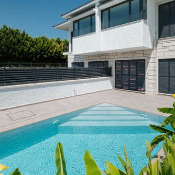
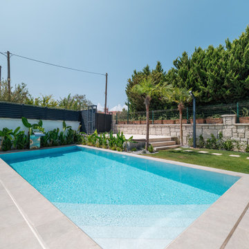
Rising amidst the unique natural beauty of Çeşme, this villa project complements its architectural simplicity with Serapool’s refined porcelain solutions. The Snow White series brings a refreshing and bright atmosphere to the pool surface with its pure white tone. Natural Mocha Outer Trim ensures seamless transitions and visual coherence. With a water absorption rate below 0.5%, the products offer enhanced durability and long-term performance. They also provide high resistance to UV rays, chemicals, and thermal shock. The surface, featuring a slip resistance rating of PTV ≥ 45, ensures safe usage in wet areas. By blending aesthetic details with advanced safety, this project offers not only a swimming experience but also a peaceful, comfortable, and luxurious living space.
 Fabco Sanctuary
The architect and designer Guy Derwent was approached by his client with a clear and compelling brief: to completely transform a grand Victorian terrace house they were planning to renovate. The client envisioned something far beyond a standard renovation – this was to be a bold and dramatic reimagining of a family home that could grow with them over time.
With the property having remained largely untouched for more than fifty years, the architects saw an opportunity to unlock its potential and deliver a contemporary design that would contrast beautifully with its Victorian heritage.
The existing layout consisted of a series of small, disconnected rooms to the rear of the house. To respond to the client’s need for openness and flexibility, the architect proposed a radical restructuring of the ground floor:
The rear rooms were completely removed
Suspended timber floors were lowered by up to two metres to align with the garden
Two bold extensions were added
The first extension filled in the side return with a London stock brick facade and a glazed roof, while the second – a striking black steel and glass pavilion was glazed on three sides and placed along the garden elevation.
This new pavilion redefined the building’s relationship with the garden. Its steel-framed glazing created a seamless dialogue between interior and exterior, offering a sense of immersion in the surrounding landscape.
At the heart of the plan sits a dramatic, five-metre-tall dining space that acts as a transition from the original entrance hall into the new addition. A large, circular cast-glass window, framed in steel, provides a visual and spatial link between old and new, allowing light and movement to travel through the depth of the home.
Throughout the project, a series of black metal elements were introduced as sculptural interventions – each marking moments of transformation within the house. These included the bespoke steel framed circular window, a custom metal staircase, a cylindrical support column, and the striking steel and glass garden pavilion. Together, they formed a coherent architectural language that underscored the project’s bold intent.
Our steel windows and doors played a vital role in delivering the project’s vision. The architects chose steel for its refined sight lines and distinctive material character, which helped bridge the gap between the historical context of the building and the bold new additions.
The black steel frames provided a crisp contrast to the pale London stock brick and added definition to the glazed pavilion, reinforcing the sense of architectural precision. In particular, the fine steel profiles of the garden room allowed the extension to feel both lightweight and immersive, blurring the boundary between the house and its garden.
The architect drew inspiration from the Bauhaus Movement, particularly the work of Walter Gropius, whose approach to functional beauty and industrial materials informed the design of the garden pavilion.
Here, our glazing system was used not just for transparency, but as an expressive architectural element. The carefully proportioned panels help to conceal the roof thickness and reinforce the pavilion’s industrial yet abstract character – a deliberate nod to product design and modernist detailing.
Sustainability was an important factor in the selection of materials. Our steel systems, made from 99% recycled content and 100% recyclable, aligned with the project’s broader environmental goals.
The architects noted that this commitment to material longevity and circularity was central to their decision to use steel. The durability and recyclability of the windows and doors ensured the project met both aesthetic and ethical criteria.
This London terrace house now stands as a celebration of contrast – between heritage and innovation, solidity and transparency, tradition and transformation. Our steel windows and doors were not simply components; they were essential tools in crafting a home that is as bold and expressive as it is functional.
The result is a home designed for modern family life, where light, space, and materiality come together in perfect harmony.

Sponsored
Columbus, OH

Snider & Metcalf Interior Design, LTD
Leading Interior Designers in Columbus, Ohio & Ponte Vedra, Florida
 Fabco Sanctuary
The architect and designer Guy Derwent was approached by his client with a clear and compelling brief: to completely transform a grand Victorian terrace house they were planning to renovate. The client envisioned something far beyond a standard renovation – this was to be a bold and dramatic reimagining of a family home that could grow with them over time.
With the property having remained largely untouched for more than fifty years, the architects saw an opportunity to unlock its potential and deliver a contemporary design that would contrast beautifully with its Victorian heritage.
The existing layout consisted of a series of small, disconnected rooms to the rear of the house. To respond to the client’s need for openness and flexibility, the architect proposed a radical restructuring of the ground floor:
The rear rooms were completely removed
Suspended timber floors were lowered by up to two metres to align with the garden
Two bold extensions were added
The first extension filled in the side return with a London stock brick facade and a glazed roof, while the second – a striking black steel and glass pavilion was glazed on three sides and placed along the garden elevation.
This new pavilion redefined the building’s relationship with the garden. Its steel-framed glazing created a seamless dialogue between interior and exterior, offering a sense of immersion in the surrounding landscape.
At the heart of the plan sits a dramatic, five-metre-tall dining space that acts as a transition from the original entrance hall into the new addition. A large, circular cast-glass window, framed in steel, provides a visual and spatial link between old and new, allowing light and movement to travel through the depth of the home.
Throughout the project, a series of black metal elements were introduced as sculptural interventions – each marking moments of transformation within the house. These included the bespoke steel framed circular window, a custom metal staircase, a cylindrical support column, and the striking steel and glass garden pavilion. Together, they formed a coherent architectural language that underscored the project’s bold intent.
Our steel windows and doors played a vital role in delivering the project’s vision. The architects chose steel for its refined sight lines and distinctive material character, which helped bridge the gap between the historical context of the building and the bold new additions.
The black steel frames provided a crisp contrast to the pale London stock brick and added definition to the glazed pavilion, reinforcing the sense of architectural precision. In particular, the fine steel profiles of the garden room allowed the extension to feel both lightweight and immersive, blurring the boundary between the house and its garden.
The architect drew inspiration from the Bauhaus Movement, particularly the work of Walter Gropius, whose approach to functional beauty and industrial materials informed the design of the garden pavilion.
Here, our glazing system was used not just for transparency, but as an expressive architectural element. The carefully proportioned panels help to conceal the roof thickness and reinforce the pavilion’s industrial yet abstract character – a deliberate nod to product design and modernist detailing.
Sustainability was an important factor in the selection of materials. Our steel systems, made from 99% recycled content and 100% recyclable, aligned with the project’s broader environmental goals.
The architects noted that this commitment to material longevity and circularity was central to their decision to use steel. The durability and recyclability of the windows and doors ensured the project met both aesthetic and ethical criteria.
This London terrace house now stands as a celebration of contrast – between heritage and innovation, solidity and transparency, tradition and transformation. Our steel windows and doors were not simply components; they were essential tools in crafting a home that is as bold and expressive as it is functional.
The result is a home designed for modern family life, where light, space, and materiality come together in perfect harmony.
 Serapool Porselen
Rising amidst the unique natural beauty of Çeşme, this villa project complements its architectural simplicity with Serapool’s refined porcelain solutions. The Snow White series brings a refreshing and bright atmosphere to the pool surface with its pure white tone. Natural Mocha Outer Trim ensures seamless transitions and visual coherence. With a water absorption rate below 0.5%, the products offer enhanced durability and long-term performance. They also provide high resistance to UV rays, chemicals, and thermal shock. The surface, featuring a slip resistance rating of PTV ≥ 45, ensures safe usage in wet areas. By blending aesthetic details with advanced safety, this project offers not only a swimming experience but also a peaceful, comfortable, and luxurious living space.
 Fabco Sanctuary
The architect and designer Guy Derwent was approached by his client with a clear and compelling brief: to completely transform a grand Victorian terrace house they were planning to renovate. The client envisioned something far beyond a standard renovation – this was to be a bold and dramatic reimagining of a family home that could grow with them over time.
With the property having remained largely untouched for more than fifty years, the architects saw an opportunity to unlock its potential and deliver a contemporary design that would contrast beautifully with its Victorian heritage.
The existing layout consisted of a series of small, disconnected rooms to the rear of the house. To respond to the client’s need for openness and flexibility, the architect proposed a radical restructuring of the ground floor:
The rear rooms were completely removed
Suspended timber floors were lowered by up to two metres to align with the garden
Two bold extensions were added
The first extension filled in the side return with a London stock brick facade and a glazed roof, while the second – a striking black steel and glass pavilion was glazed on three sides and placed along the garden elevation.
This new pavilion redefined the building’s relationship with the garden. Its steel-framed glazing created a seamless dialogue between interior and exterior, offering a sense of immersion in the surrounding landscape.
At the heart of the plan sits a dramatic, five-metre-tall dining space that acts as a transition from the original entrance hall into the new addition. A large, circular cast-glass window, framed in steel, provides a visual and spatial link between old and new, allowing light and movement to travel through the depth of the home.
Throughout the project, a series of black metal elements were introduced as sculptural interventions – each marking moments of transformation within the house. These included the bespoke steel framed circular window, a custom metal staircase, a cylindrical support column, and the striking steel and glass garden pavilion. Together, they formed a coherent architectural language that underscored the project’s bold intent.
Our steel windows and doors played a vital role in delivering the project’s vision. The architects chose steel for its refined sight lines and distinctive material character, which helped bridge the gap between the historical context of the building and the bold new additions.
The black steel frames provided a crisp contrast to the pale London stock brick and added definition to the glazed pavilion, reinforcing the sense of architectural precision. In particular, the fine steel profiles of the garden room allowed the extension to feel both lightweight and immersive, blurring the boundary between the house and its garden.
The architect drew inspiration from the Bauhaus Movement, particularly the work of Walter Gropius, whose approach to functional beauty and industrial materials informed the design of the garden pavilion.
Here, our glazing system was used not just for transparency, but as an expressive architectural element. The carefully proportioned panels help to conceal the roof thickness and reinforce the pavilion’s industrial yet abstract character – a deliberate nod to product design and modernist detailing.
Sustainability was an important factor in the selection of materials. Our steel systems, made from 99% recycled content and 100% recyclable, aligned with the project’s broader environmental goals.
The architects noted that this commitment to material longevity and circularity was central to their decision to use steel. The durability and recyclability of the windows and doors ensured the project met both aesthetic and ethical criteria.
This London terrace house now stands as a celebration of contrast – between heritage and innovation, solidity and transparency, tradition and transformation. Our steel windows and doors were not simply components; they were essential tools in crafting a home that is as bold and expressive as it is functional.
The result is a home designed for modern family life, where light, space, and materiality come together in perfect harmony.
 Fabco Sanctuary
The architect and designer Guy Derwent was approached by his client with a clear and compelling brief: to completely transform a grand Victorian terrace house they were planning to renovate. The client envisioned something far beyond a standard renovation – this was to be a bold and dramatic reimagining of a family home that could grow with them over time.
With the property having remained largely untouched for more than fifty years, the architects saw an opportunity to unlock its potential and deliver a contemporary design that would contrast beautifully with its Victorian heritage.
The existing layout consisted of a series of small, disconnected rooms to the rear of the house. To respond to the client’s need for openness and flexibility, the architect proposed a radical restructuring of the ground floor:
The rear rooms were completely removed
Suspended timber floors were lowered by up to two metres to align with the garden
Two bold extensions were added
The first extension filled in the side return with a London stock brick facade and a glazed roof, while the second – a striking black steel and glass pavilion was glazed on three sides and placed along the garden elevation.
This new pavilion redefined the building’s relationship with the garden. Its steel-framed glazing created a seamless dialogue between interior and exterior, offering a sense of immersion in the surrounding landscape.
At the heart of the plan sits a dramatic, five-metre-tall dining space that acts as a transition from the original entrance hall into the new addition. A large, circular cast-glass window, framed in steel, provides a visual and spatial link between old and new, allowing light and movement to travel through the depth of the home.
Throughout the project, a series of black metal elements were introduced as sculptural interventions – each marking moments of transformation within the house. These included the bespoke steel framed circular window, a custom metal staircase, a cylindrical support column, and the striking steel and glass garden pavilion. Together, they formed a coherent architectural language that underscored the project’s bold intent.
Our steel windows and doors played a vital role in delivering the project’s vision. The architects chose steel for its refined sight lines and distinctive material character, which helped bridge the gap between the historical context of the building and the bold new additions.
The black steel frames provided a crisp contrast to the pale London stock brick and added definition to the glazed pavilion, reinforcing the sense of architectural precision. In particular, the fine steel profiles of the garden room allowed the extension to feel both lightweight and immersive, blurring the boundary between the house and its garden.
The architect drew inspiration from the Bauhaus Movement, particularly the work of Walter Gropius, whose approach to functional beauty and industrial materials informed the design of the garden pavilion.
Here, our glazing system was used not just for transparency, but as an expressive architectural element. The carefully proportioned panels help to conceal the roof thickness and reinforce the pavilion’s industrial yet abstract character – a deliberate nod to product design and modernist detailing.
Sustainability was an important factor in the selection of materials. Our steel systems, made from 99% recycled content and 100% recyclable, aligned with the project’s broader environmental goals.
The architects noted that this commitment to material longevity and circularity was central to their decision to use steel. The durability and recyclability of the windows and doors ensured the project met both aesthetic and ethical criteria.
This London terrace house now stands as a celebration of contrast – between heritage and innovation, solidity and transparency, tradition and transformation. Our steel windows and doors were not simply components; they were essential tools in crafting a home that is as bold and expressive as it is functional.
The result is a home designed for modern family life, where light, space, and materiality come together in perfect harmony.


 Bee Design
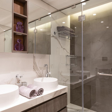
Renovating a new bathroom is quite a challenge when considering the importance of the performance and esthetics should be.
To keep all water stations in coherence and in function with each other while having that relaxing smooth feeling is the key substance for a successful new beautiful bathroom at your home.
Try Bee Design to renovate your bathroom.
Bee Design is a virtual interior design company.
It provides a selection of interior design packages from plan layout, mood board to visual images. The final outcome is a curated shopping list especially selected for the room with guidance to purchase and execute.
Bee Design is delegated to manage budget and time schedule to achieve better results and performance according to customer’s request.
It’s online collaboration with well-known brands and suppliers helps to enhance any space.
The website has an action button for a free consultation call with an email and portal tool for further communication.
Bee Design is across the U.K market making it possible for anyone to design their home through virtual communication.
www.beedesign.uk
#bathroomrenovation #bespokebathroom
#interiordesigncompaniesuk #virtualinterioirdesign #interiordesigninchiswick #moderninteriordesign #virtualdesignservices #bespokekitchendesign #bespokeinteriordesign #bespokebedroomdesignlondon #bespokeroomdesign #interiordesignservices #homeinteriordesignonline #roominteriordesignforairbnb #airbnbdecoratingservces #airbnbdecoratingservices #airbnbbedroomdesign #airbnbhomedecor #homedecorideas
 B.R.G. interior design limited
灣仔廈門街(286呎)
‘麻雀雖小,但五臟俱全’
今次設計是為一個超過40年樓齡的唐樓單位進行翻新,按照業主的要求,將原來的廚房及廁所擴大。由於地方有限,設計師將單位拆掉大部分的牆身,並用人體工學去計算每個空間。
利用電視櫃連接主人房升高地台,大幅提升儲物量。此外利用全高衣櫃代替磚牆區分睡房及客廳,節省空間和成本同時也有具有一定隔音的效果 (櫃內的被鋪及衣服作吸音)。
為了令細單位視覺上感覺更寬敞,中心點是客飯廳與電視之間的通道。同時設計師刻意在用色及物料上加強其連貫性。白色,米色水磨石,兩種楓木色及黏土色作基礎,並用深灰及黑色突顯大自然色的鮮明度。
緊記在安排空間時,除每個空間的燈光佈局外,窗也是主要考量之一。善用自然光,除了節省能源外,用家也能夠在享受每個早上的晨光
更多設計細節照片已在官網:
https://www.brginterior.com/amoystreet
Amoy St., WanChai (286 sq feet)
‘small but complete in every detail’
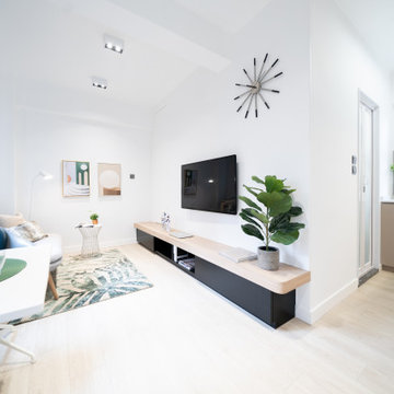
The design is to renovate a tenement building unit over 40 years old. Expanding the original kitchen and toilet in accordance with the owner's requirements. In order to make good use of 286 square feet, our designer had locked down most of walls in unit and calculated each space in ergonomic way.
The TV cabinet is connected to the raising platform in master room, which greatly increases the storage capacity. Meanwhile, a full-height wardrobe is used instead of a brick wall to distinguish bedrooms and living rooms. It is not only saving space and cost but also providing a certain sound insulation effect (Don’t forget the bedding and clothes in wardrobe are sound-absorbing too!).
In order to make small units visually more spacious, the focal point is the passage between dining area and TV. Meanwhile, our design deliberately strengthens their coherence in color and material. Using white, terrazzo in beige, two types of maple and clay color as the foundation (natural color), and highlighting its vividness by using color or material in dark gray, chrome and black.
And keep in mind that when arranging lighting layout of each space, windows are also one of the main considerations. Making good balance in use of natural light is not only helping to save energy and most importantly users also enjoy sunlight coming every morning.
More details photos have been on the official website:
https://www.brginterior.com/amoystreet

 STUDIO KONDE | Konrad Idaszewski Architect
Komfoo house interior designed by STUDIO KONDE Konrad Idaszewski Architekt, an interior architect from Poznań creating contemporary residential spaces that combine comfort, refined materials and a strong architectural character. Visit the full project: https://conde.pl/portfolio/gotowy-projekt-wnetrz-domu-komfoo/ Komfoo is part of the Modelowedomy collection of three individually configurable houses, conceived for different ways of living and distinct spatial arrangements. This comfortable house features a high living room with a mezzanine, while the kitchen and dining area are separated from the living space by a functional furniture wall.
Contemporary living room designed as part of a modern house interior project in Poland, combining warm natural wood, soft beige upholstery, dark accents and carefully selected architectural details. Generous glazing brings greenery and daylight into the interior, while the high ceiling and elevated opening visible above the living zone emphasize the spacious character of the Komfoo house.
The living area is centred around a large modular sectional sofa in a warm cream-beige fabric, composed of generously padded seats and broad chaise elements. Its soft, rounded profile creates a relaxed and comfortable seating arrangement, while several large cushions add to the informal character of the lounge. A textured light throw lies across the chaise, introducing another layer of softness and reinforcing the tactile quality of the neutral interior.
Two overlapping round coffee tables form the centre of the seating arrangement, both finished in a deep black tone with vertically ribbed cylindrical bases. Their dark colour creates a strong contrast against the pale sofa and textured rug, while the different diameters give the composition a more dynamic, layered appearance. A small stack of books provides a discreet everyday detail on the smaller table.
One of the strongest elements of this living room is the large feature wall finished with irregular natural timber panels. The individual pieces vary subtly in shape and orientation, creating a three-dimensional, textured surface that extends across the entire media wall. Set against this warm wood background, the large flat-screen television becomes a clearly defined focal point. Rather than being mounted directly to the wall, it stands on a slim black floor-supported structure, giving the media zone a lighter and more contemporary appearance.
Natural timber flooring continues throughout the room, complementing the warm tones of the feature wall while contrasting with the pale woven rug beneath the seating area. The rug introduces a pronounced looped texture and visually gathers the sofa and coffee tables into one coherent lounge zone. Above, a large white cylindrical pendant suspended from a curved floor-to-ceiling arc provides a sculptural lighting element and adds a distinctive vertical accent to the otherwise restrained composition.
Behind the seating area, a tall opening reveals the greenery outside and allows the garden to become part of the interior setting. The combination of the high living room, textured timber media wall, generous modular sofa, sculptural lighting and carefully balanced neutral palette gives the Komfoo interior a warm and sophisticated character. This approach reflects the work of STUDIO KONDE, an interior architect in Poznań developing contemporary, comfortable interiors as part of the Modelowedomy collection.
2