
Search results for "Competencies including" in Home Design Ideas
 Klopf Architecture
Built for the Bluff, A Sea Ranch Home is Remade from the Inside Out
The house had always been grounded, on an ocean bluff at The Sea Ranch. It sits unencumbered, adjacent to one of the most dramatic stretches of the Sonoma coast with protected commons meadow to the east, uninterrupted Pacific views to the west, and a bluff trail running alongside. What it lacked was the feeling of home, one that could hold up its own against the natural landscape.
The owners are entrepreneurs with deep involvement across tech, real estate, and development and they know how things are built. The Sea Ranch house had been in their lives for years, a second residence and a place for family to gather. Built for a different time, it felt more compromising than comfortable. Sitting in a closed off nook, the kitchen fit one cook at a time and turned its back on the rest of the house. The entry was dim and compressed, divided by a structural column that presented itself at exactly the wrong moment. The primary suite was small relative to the view outside it. A large rear bedroom sat behind a lowered ceiling with a bathroom that had never been added. The house was certainly worth the trouble of doing it right.
What followed was not one project but four, each with its own design challenge, each addressed over a period of time.
Where the House Meets the Ocean
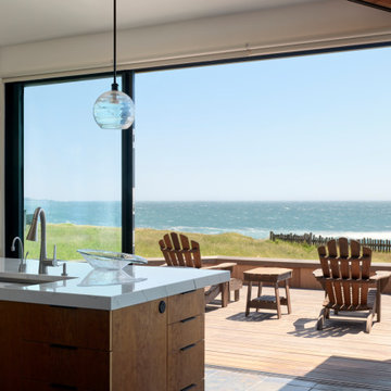
The most complex piece of the project, in both structural and spatial terms, was the kitchen expansion. The existing room was a single-person galley squeezed in as an afterthought with no meaningful connection to the dining room, the living space, or the deck outside. To make it useful for a family that cooks and gathers, it needed to grow outward into an existing patio and flow into the rooms around it.
A big challenge was the roofline. Several planes at different pitches and angles converged directly where additional volume was needed. A new form had to join that geometry without reading as a correction. The solution found the simplest possible connection between the existing angles, a roofline that from outside the structure, appears entirely original. From the bluff trail where the addition is visible, there is no discernible seam.
Inside, the kitchen is now open to the living and dining rooms without interruption. A large sliding glass door connects the space onto the rear deck. The deck itself was expanded and oriented so that the body of the house shields it from the coastal wind which is a common consideration that determines whether outdoor space at The Sea Ranch actually gets used. The result is a room that works for large family gatherings where no one feels cutoff, and one that makes the boundary between being inside and outside easy to ignore.
Welcoming Light
A structural column stood at the convergence of eight distinct roof planes in the entry. It was load-bearing, but it was also the reason the entry had always felt like a hallway rather than a welcoming arrival.
With the structural engineer, a custom steel connector was designed to receive beams from six separate directions, redistributing the load through a single new continuous beam. The column was surgically removed. Three triangular skylights were then cut into the roof above, their shapes drawn from the
existing geometry of the planes around them. The entry is now bright and open. The skylights feel native to the structure because they follow the logic already present in the roof.
Two Suites, Two Views
At opposite ends of the house, the two bedroom suites were each reconfigured, and each found a different way to introduce more of the landscape into the room.
An addition to the primary suite extended the structure outward to create a wraparound plan with a loop from the bedroom through bath and closet that had not been possible before. The expansion opened a slot view from the tub and shower toward the ocean. The view is precise and private. The ocean view is present and deliberate.
The rear bedroom absorbed an adjacent storage room to transform it into a full second suite with a vaulted ceiling, a large bathroom with a tub, a shower, and a sauna. A private fenced garden courtyard sits just beyond the glass bringing the outdoors inside. The tub was placed so that, looking past the courtyard and through the bedroom beyond, the ocean is visible at the far end. It is a long view and it makes the room feel larger and more settled than its footprint would suggest.
Glass on Four Sides, Fire at the Center
The main living and gathering room had always been caught between two competing facts: glass on four sides meant exceptional views but at The Sea Ranch, it also meant a cold room. A 360-degree cylindrical fireplace was added at the center on a raised stone base, providing radiant heat in every direction and giving the room a focal point around which a group naturally orients itself, whether that means two people at the end of the day or the whole family after dinner.
Owners Who Picked Up the Tools
The owner was not a passive client. they came with construction knowledge, specific ideas, and the desire to be an active part of the process, a dynamic that other architects may had found difficult, which Klopf Architecture accepted as an asset. They took it upon themselves to complete some of the work during construction, including the installation of a new radiant heating system beneath the floors.
The radiant system added to the older and less-desirable forced-air setup. At The Sea Ranch, that change matters as the house sits close enough to the ocean and moving air competes with the sound of it, where radiant heat does not. Solar panels were added to the roof as part of the new system. Insulation was upgraded throughout the walls, roof, and crawl space. The house that had always had the right setting now holds warmth the way a house on the bluff should.
They were also deeply involved in the design and selections throughout, and the finished house reflects both of them in ways that are specific rather than generic. The process took longer and moved through more iterations than a more arms-length relationship might have allowed. The result is more defined and personal because of it.
The Landscape Holds Priority
Every exterior decision was shaped by The Sea Ranch Design Standards, which require that buildings defer to the landscape around them rather than compete with it. Because this house sits on the bluff and is visible from the public trail, the additions faced a close review. Existing materials were matched. Geometries were resolved. The additions had to become indistinguishable from the original building.
From the trail, the house reads exactly as it always has — low, cedar-clad, secondary to the meadow and the water. The setting holds priority. Inside, the house has been remade.
Klopf Architecture Project Team: Geoff Campen and Trenton Jewett
Contractor: Shawn Bettega Construction
Photography: ©2025 Mariko Reed
Year Completed: 2023
Location: The Sea Ranch, CA
 Klopf Architecture
Built for the Bluff, A Sea Ranch Home is Remade from the Inside Out
The house had always been grounded, on an ocean bluff at The Sea Ranch. It sits unencumbered, adjacent to one of the most dramatic stretches of the Sonoma coast with protected commons meadow to the east, uninterrupted Pacific views to the west, and a bluff trail running alongside. What it lacked was the feeling of home, one that could hold up its own against the natural landscape.
The owners are entrepreneurs with deep involvement across tech, real estate, and development and they know how things are built. The Sea Ranch house had been in their lives for years, a second residence and a place for family to gather. Built for a different time, it felt more compromising than comfortable. Sitting in a closed off nook, the kitchen fit one cook at a time and turned its back on the rest of the house. The entry was dim and compressed, divided by a structural column that presented itself at exactly the wrong moment. The primary suite was small relative to the view outside it. A large rear bedroom sat behind a lowered ceiling with a bathroom that had never been added. The house was certainly worth the trouble of doing it right.
What followed was not one project but four, each with its own design challenge, each addressed over a period of time.
Where the House Meets the Ocean
The most complex piece of the project, in both structural and spatial terms, was the kitchen expansion. The existing room was a single-person galley squeezed in as an afterthought with no meaningful connection to the dining room, the living space, or the deck outside. To make it useful for a family that cooks and gathers, it needed to grow outward into an existing patio and flow into the rooms around it.
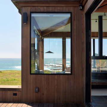
A big challenge was the roofline. Several planes at different pitches and angles converged directly where additional volume was needed. A new form had to join that geometry without reading as a correction. The solution found the simplest possible connection between the existing angles, a roofline that from outside the structure, appears entirely original. From the bluff trail where the addition is visible, there is no discernible seam.
Inside, the kitchen is now open to the living and dining rooms without interruption. A large sliding glass door connects the space onto the rear deck. The deck itself was expanded and oriented so that the body of the house shields it from the coastal wind which is a common consideration that determines whether outdoor space at The Sea Ranch actually gets used. The result is a room that works for large family gatherings where no one feels cutoff, and one that makes the boundary between being inside and outside easy to ignore.
Welcoming Light
A structural column stood at the convergence of eight distinct roof planes in the entry. It was load-bearing, but it was also the reason the entry had always felt like a hallway rather than a welcoming arrival.
With the structural engineer, a custom steel connector was designed to receive beams from six separate directions, redistributing the load through a single new continuous beam. The column was surgically removed. Three triangular skylights were then cut into the roof above, their shapes drawn from the
existing geometry of the planes around them. The entry is now bright and open. The skylights feel native to the structure because they follow the logic already present in the roof.
Two Suites, Two Views
At opposite ends of the house, the two bedroom suites were each reconfigured, and each found a different way to introduce more of the landscape into the room.
An addition to the primary suite extended the structure outward to create a wraparound plan with a loop from the bedroom through bath and closet that had not been possible before. The expansion opened a slot view from the tub and shower toward the ocean. The view is precise and private. The ocean view is present and deliberate.
The rear bedroom absorbed an adjacent storage room to transform it into a full second suite with a vaulted ceiling, a large bathroom with a tub, a shower, and a sauna. A private fenced garden courtyard sits just beyond the glass bringing the outdoors inside. The tub was placed so that, looking past the courtyard and through the bedroom beyond, the ocean is visible at the far end. It is a long view and it makes the room feel larger and more settled than its footprint would suggest.
Glass on Four Sides, Fire at the Center
The main living and gathering room had always been caught between two competing facts: glass on four sides meant exceptional views but at The Sea Ranch, it also meant a cold room. A 360-degree cylindrical fireplace was added at the center on a raised stone base, providing radiant heat in every direction and giving the room a focal point around which a group naturally orients itself, whether that means two people at the end of the day or the whole family after dinner.
Owners Who Picked Up the Tools
The owner was not a passive client. they came with construction knowledge, specific ideas, and the desire to be an active part of the process, a dynamic that other architects may had found difficult, which Klopf Architecture accepted as an asset. They took it upon themselves to complete some of the work during construction, including the installation of a new radiant heating system beneath the floors.
The radiant system added to the older and less-desirable forced-air setup. At The Sea Ranch, that change matters as the house sits close enough to the ocean and moving air competes with the sound of it, where radiant heat does not. Solar panels were added to the roof as part of the new system. Insulation was upgraded throughout the walls, roof, and crawl space. The house that had always had the right setting now holds warmth the way a house on the bluff should.
They were also deeply involved in the design and selections throughout, and the finished house reflects both of them in ways that are specific rather than generic. The process took longer and moved through more iterations than a more arms-length relationship might have allowed. The result is more defined and personal because of it.
The Landscape Holds Priority
Every exterior decision was shaped by The Sea Ranch Design Standards, which require that buildings defer to the landscape around them rather than compete with it. Because this house sits on the bluff and is visible from the public trail, the additions faced a close review. Existing materials were matched. Geometries were resolved. The additions had to become indistinguishable from the original building.
From the trail, the house reads exactly as it always has — low, cedar-clad, secondary to the meadow and the water. The setting holds priority. Inside, the house has been remade.
Klopf Architecture Project Team: Geoff Campen and Trenton Jewett
Contractor: Shawn Bettega Construction
Photography: ©2025 Mariko Reed
Year Completed: 2023
Location: The Sea Ranch, CA
 Klopf Architecture
Built for the Bluff, A Sea Ranch Home is Remade from the Inside Out
The house had always been grounded, on an ocean bluff at The Sea Ranch. It sits unencumbered, adjacent to one of the most dramatic stretches of the Sonoma coast with protected commons meadow to the east, uninterrupted Pacific views to the west, and a bluff trail running alongside. What it lacked was the feeling of home, one that could hold up its own against the natural landscape.
The owners are entrepreneurs with deep involvement across tech, real estate, and development and they know how things are built. The Sea Ranch house had been in their lives for years, a second residence and a place for family to gather. Built for a different time, it felt more compromising than comfortable. Sitting in a closed off nook, the kitchen fit one cook at a time and turned its back on the rest of the house. The entry was dim and compressed, divided by a structural column that presented itself at exactly the wrong moment. The primary suite was small relative to the view outside it. A large rear bedroom sat behind a lowered ceiling with a bathroom that had never been added. The house was certainly worth the trouble of doing it right.
What followed was not one project but four, each with its own design challenge, each addressed over a period of time.
Where the House Meets the Ocean
The most complex piece of the project, in both structural and spatial terms, was the kitchen expansion. The existing room was a single-person galley squeezed in as an afterthought with no meaningful connection to the dining room, the living space, or the deck outside. To make it useful for a family that cooks and gathers, it needed to grow outward into an existing patio and flow into the rooms around it.
A big challenge was the roofline. Several planes at different pitches and angles converged directly where additional volume was needed. A new form had to join that geometry without reading as a correction. The solution found the simplest possible connection between the existing angles, a roofline that from outside the structure, appears entirely original. From the bluff trail where the addition is visible, there is no discernible seam.
Inside, the kitchen is now open to the living and dining rooms without interruption. A large sliding glass door connects the space onto the rear deck. The deck itself was expanded and oriented so that the body of the house shields it from the coastal wind which is a common consideration that determines whether outdoor space at The Sea Ranch actually gets used. The result is a room that works for large family gatherings where no one feels cutoff, and one that makes the boundary between being inside and outside easy to ignore.
Welcoming Light
A structural column stood at the convergence of eight distinct roof planes in the entry. It was load-bearing, but it was also the reason the entry had always felt like a hallway rather than a welcoming arrival.
With the structural engineer, a custom steel connector was designed to receive beams from six separate directions, redistributing the load through a single new continuous beam. The column was surgically removed. Three triangular skylights were then cut into the roof above, their shapes drawn from the
existing geometry of the planes around them. The entry is now bright and open. The skylights feel native to the structure because they follow the logic already present in the roof.
Two Suites, Two Views
At opposite ends of the house, the two bedroom suites were each reconfigured, and each found a different way to introduce more of the landscape into the room.
An addition to the primary suite extended the structure outward to create a wraparound plan with a loop from the bedroom through bath and closet that had not been possible before. The expansion opened a slot view from the tub and shower toward the ocean. The view is precise and private. The ocean view is present and deliberate.
The rear bedroom absorbed an adjacent storage room to transform it into a full second suite with a vaulted ceiling, a large bathroom with a tub, a shower, and a sauna. A private fenced garden courtyard sits just beyond the glass bringing the outdoors inside. The tub was placed so that, looking past the courtyard and through the bedroom beyond, the ocean is visible at the far end. It is a long view and it makes the room feel larger and more settled than its footprint would suggest.
Glass on Four Sides, Fire at the Center
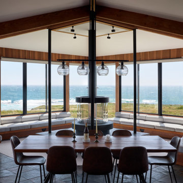
The main living and gathering room had always been caught between two competing facts: glass on four sides meant exceptional views but at The Sea Ranch, it also meant a cold room. A 360-degree cylindrical fireplace was added at the center on a raised stone base, providing radiant heat in every direction and giving the room a focal point around which a group naturally orients itself, whether that means two people at the end of the day or the whole family after dinner.
Owners Who Picked Up the Tools
The owner was not a passive client. they came with construction knowledge, specific ideas, and the desire to be an active part of the process, a dynamic that other architects may had found difficult, which Klopf Architecture accepted as an asset. They took it upon themselves to complete some of the work during construction, including the installation of a new radiant heating system beneath the floors.
The radiant system added to the older and less-desirable forced-air setup. At The Sea Ranch, that change matters as the house sits close enough to the ocean and moving air competes with the sound of it, where radiant heat does not. Solar panels were added to the roof as part of the new system. Insulation was upgraded throughout the walls, roof, and crawl space. The house that had always had the right setting now holds warmth the way a house on the bluff should.
They were also deeply involved in the design and selections throughout, and the finished house reflects both of them in ways that are specific rather than generic. The process took longer and moved through more iterations than a more arms-length relationship might have allowed. The result is more defined and personal because of it.
The Landscape Holds Priority
Every exterior decision was shaped by The Sea Ranch Design Standards, which require that buildings defer to the landscape around them rather than compete with it. Because this house sits on the bluff and is visible from the public trail, the additions faced a close review. Existing materials were matched. Geometries were resolved. The additions had to become indistinguishable from the original building.
From the trail, the house reads exactly as it always has — low, cedar-clad, secondary to the meadow and the water. The setting holds priority. Inside, the house has been remade.
Klopf Architecture Project Team: Geoff Campen and Trenton Jewett
Contractor: Shawn Bettega Construction
Photography: ©2025 Mariko Reed
Year Completed: 2023
Location: The Sea Ranch, CA
Find the right local pro for your project
 Klopf Architecture
Built for the Bluff, A Sea Ranch Home is Remade from the Inside Out
The house had always been grounded, on an ocean bluff at The Sea Ranch. It sits unencumbered, adjacent to one of the most dramatic stretches of the Sonoma coast with protected commons meadow to the east, uninterrupted Pacific views to the west, and a bluff trail running alongside. What it lacked was the feeling of home, one that could hold up its own against the natural landscape.
The owners are entrepreneurs with deep involvement across tech, real estate, and development and they know how things are built. The Sea Ranch house had been in their lives for years, a second residence and a place for family to gather. Built for a different time, it felt more compromising than comfortable. Sitting in a closed off nook, the kitchen fit one cook at a time and turned its back on the rest of the house. The entry was dim and compressed, divided by a structural column that presented itself at exactly the wrong moment. The primary suite was small relative to the view outside it. A large rear bedroom sat behind a lowered ceiling with a bathroom that had never been added. The house was certainly worth the trouble of doing it right.
What followed was not one project but four, each with its own design challenge, each addressed over a period of time.
Where the House Meets the Ocean
The most complex piece of the project, in both structural and spatial terms, was the kitchen expansion. The existing room was a single-person galley squeezed in as an afterthought with no meaningful connection to the dining room, the living space, or the deck outside. To make it useful for a family that cooks and gathers, it needed to grow outward into an existing patio and flow into the rooms around it.
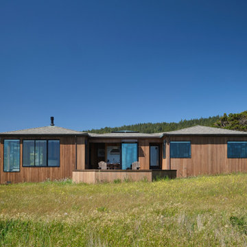
A big challenge was the roofline. Several planes at different pitches and angles converged directly where additional volume was needed. A new form had to join that geometry without reading as a correction. The solution found the simplest possible connection between the existing angles, a roofline that from outside the structure, appears entirely original. From the bluff trail where the addition is visible, there is no discernible seam.
Inside, the kitchen is now open to the living and dining rooms without interruption. A large sliding glass door connects the space onto the rear deck. The deck itself was expanded and oriented so that the body of the house shields it from the coastal wind which is a common consideration that determines whether outdoor space at The Sea Ranch actually gets used. The result is a room that works for large family gatherings where no one feels cutoff, and one that makes the boundary between being inside and outside easy to ignore.
Welcoming Light
A structural column stood at the convergence of eight distinct roof planes in the entry. It was load-bearing, but it was also the reason the entry had always felt like a hallway rather than a welcoming arrival.
With the structural engineer, a custom steel connector was designed to receive beams from six separate directions, redistributing the load through a single new continuous beam. The column was surgically removed. Three triangular skylights were then cut into the roof above, their shapes drawn from the
existing geometry of the planes around them. The entry is now bright and open. The skylights feel native to the structure because they follow the logic already present in the roof.
Two Suites, Two Views
At opposite ends of the house, the two bedroom suites were each reconfigured, and each found a different way to introduce more of the landscape into the room.
An addition to the primary suite extended the structure outward to create a wraparound plan with a loop from the bedroom through bath and closet that had not been possible before. The expansion opened a slot view from the tub and shower toward the ocean. The view is precise and private. The ocean view is present and deliberate.
The rear bedroom absorbed an adjacent storage room to transform it into a full second suite with a vaulted ceiling, a large bathroom with a tub, a shower, and a sauna. A private fenced garden courtyard sits just beyond the glass bringing the outdoors inside. The tub was placed so that, looking past the courtyard and through the bedroom beyond, the ocean is visible at the far end. It is a long view and it makes the room feel larger and more settled than its footprint would suggest.
Glass on Four Sides, Fire at the Center
The main living and gathering room had always been caught between two competing facts: glass on four sides meant exceptional views but at The Sea Ranch, it also meant a cold room. A 360-degree cylindrical fireplace was added at the center on a raised stone base, providing radiant heat in every direction and giving the room a focal point around which a group naturally orients itself, whether that means two people at the end of the day or the whole family after dinner.
Owners Who Picked Up the Tools
The owner was not a passive client. they came with construction knowledge, specific ideas, and the desire to be an active part of the process, a dynamic that other architects may had found difficult, which Klopf Architecture accepted as an asset. They took it upon themselves to complete some of the work during construction, including the installation of a new radiant heating system beneath the floors.
The radiant system added to the older and less-desirable forced-air setup. At The Sea Ranch, that change matters as the house sits close enough to the ocean and moving air competes with the sound of it, where radiant heat does not. Solar panels were added to the roof as part of the new system. Insulation was upgraded throughout the walls, roof, and crawl space. The house that had always had the right setting now holds warmth the way a house on the bluff should.
They were also deeply involved in the design and selections throughout, and the finished house reflects both of them in ways that are specific rather than generic. The process took longer and moved through more iterations than a more arms-length relationship might have allowed. The result is more defined and personal because of it.
The Landscape Holds Priority
Every exterior decision was shaped by The Sea Ranch Design Standards, which require that buildings defer to the landscape around them rather than compete with it. Because this house sits on the bluff and is visible from the public trail, the additions faced a close review. Existing materials were matched. Geometries were resolved. The additions had to become indistinguishable from the original building.
From the trail, the house reads exactly as it always has — low, cedar-clad, secondary to the meadow and the water. The setting holds priority. Inside, the house has been remade.
Klopf Architecture Project Team: Geoff Campen and Trenton Jewett
Contractor: Shawn Bettega Construction
Photography: ©2025 Mariko Reed
Year Completed: 2023
Location: The Sea Ranch, CA
 Klopf Architecture
Built for the Bluff, A Sea Ranch Home is Remade from the Inside Out
The house had always been grounded, on an ocean bluff at The Sea Ranch. It sits unencumbered, adjacent to one of the most dramatic stretches of the Sonoma coast with protected commons meadow to the east, uninterrupted Pacific views to the west, and a bluff trail running alongside. What it lacked was the feeling of home, one that could hold up its own against the natural landscape.
The owners are entrepreneurs with deep involvement across tech, real estate, and development and they know how things are built. The Sea Ranch house had been in their lives for years, a second residence and a place for family to gather. Built for a different time, it felt more compromising than comfortable. Sitting in a closed off nook, the kitchen fit one cook at a time and turned its back on the rest of the house. The entry was dim and compressed, divided by a structural column that presented itself at exactly the wrong moment. The primary suite was small relative to the view outside it. A large rear bedroom sat behind a lowered ceiling with a bathroom that had never been added. The house was certainly worth the trouble of doing it right.
What followed was not one project but four, each with its own design challenge, each addressed over a period of time.
Where the House Meets the Ocean
The most complex piece of the project, in both structural and spatial terms, was the kitchen expansion. The existing room was a single-person galley squeezed in as an afterthought with no meaningful connection to the dining room, the living space, or the deck outside. To make it useful for a family that cooks and gathers, it needed to grow outward into an existing patio and flow into the rooms around it.
A big challenge was the roofline. Several planes at different pitches and angles converged directly where additional volume was needed. A new form had to join that geometry without reading as a correction. The solution found the simplest possible connection between the existing angles, a roofline that from outside the structure, appears entirely original. From the bluff trail where the addition is visible, there is no discernible seam.
Inside, the kitchen is now open to the living and dining rooms without interruption. A large sliding glass door connects the space onto the rear deck. The deck itself was expanded and oriented so that the body of the house shields it from the coastal wind which is a common consideration that determines whether outdoor space at The Sea Ranch actually gets used. The result is a room that works for large family gatherings where no one feels cutoff, and one that makes the boundary between being inside and outside easy to ignore.
Welcoming Light
A structural column stood at the convergence of eight distinct roof planes in the entry. It was load-bearing, but it was also the reason the entry had always felt like a hallway rather than a welcoming arrival.
With the structural engineer, a custom steel connector was designed to receive beams from six separate directions, redistributing the load through a single new continuous beam. The column was surgically removed. Three triangular skylights were then cut into the roof above, their shapes drawn from the
existing geometry of the planes around them. The entry is now bright and open. The skylights feel native to the structure because they follow the logic already present in the roof.
Two Suites, Two Views
At opposite ends of the house, the two bedroom suites were each reconfigured, and each found a different way to introduce more of the landscape into the room.
An addition to the primary suite extended the structure outward to create a wraparound plan with a loop from the bedroom through bath and closet that had not been possible before. The expansion opened a slot view from the tub and shower toward the ocean. The view is precise and private. The ocean view is present and deliberate.
The rear bedroom absorbed an adjacent storage room to transform it into a full second suite with a vaulted ceiling, a large bathroom with a tub, a shower, and a sauna. A private fenced garden courtyard sits just beyond the glass bringing the outdoors inside. The tub was placed so that, looking past the courtyard and through the bedroom beyond, the ocean is visible at the far end. It is a long view and it makes the room feel larger and more settled than its footprint would suggest.
Glass on Four Sides, Fire at the Center
The main living and gathering room had always been caught between two competing facts: glass on four sides meant exceptional views but at The Sea Ranch, it also meant a cold room. A 360-degree cylindrical fireplace was added at the center on a raised stone base, providing radiant heat in every direction and giving the room a focal point around which a group naturally orients itself, whether that means two people at the end of the day or the whole family after dinner.
Owners Who Picked Up the Tools
The owner was not a passive client. they came with construction knowledge, specific ideas, and the desire to be an active part of the process, a dynamic that other architects may had found difficult, which Klopf Architecture accepted as an asset. They took it upon themselves to complete some of the work during construction, including the installation of a new radiant heating system beneath the floors.
The radiant system added to the older and less-desirable forced-air setup. At The Sea Ranch, that change matters as the house sits close enough to the ocean and moving air competes with the sound of it, where radiant heat does not. Solar panels were added to the roof as part of the new system. Insulation was upgraded throughout the walls, roof, and crawl space. The house that had always had the right setting now holds warmth the way a house on the bluff should.
They were also deeply involved in the design and selections throughout, and the finished house reflects both of them in ways that are specific rather than generic. The process took longer and moved through more iterations than a more arms-length relationship might have allowed. The result is more defined and personal because of it.
The Landscape Holds Priority
Every exterior decision was shaped by The Sea Ranch Design Standards, which require that buildings defer to the landscape around them rather than compete with it. Because this house sits on the bluff and is visible from the public trail, the additions faced a close review. Existing materials were matched. Geometries were resolved. The additions had to become indistinguishable from the original building.
From the trail, the house reads exactly as it always has — low, cedar-clad, secondary to the meadow and the water. The setting holds priority. Inside, the house has been remade.
Klopf Architecture Project Team: Geoff Campen and Trenton Jewett
Contractor: Shawn Bettega Construction
Photography: ©2025 Mariko Reed
Year Completed: 2023
Location: The Sea Ranch, CA


 Crowell + Co. Interiors
Brad + Jen Butcher
Example of a large trendy open concept medium tone wood floor living room library design in Nashville with gray walls and a stone fireplace
Example of a large trendy open concept medium tone wood floor living room library design in Nashville with gray walls and a stone fireplace

Sponsored
Sunbury, OH

J.Holderby - Renovations
Franklin County's Leading General Contractors - 2X Best of Houzz!

 Carole Carr Design
Staircase - large contemporary glass u-shaped glass railing and open staircase idea in Montreal

 Nar Design Group
Once a sunken living room closed off from the kitchen, we aimed to change the awkward accessibility of the space into an open and easily functional space that is cohesive. To open up the space even further, we designed a blackened steel structure with mirrorpane glass to reflect light and enlarge the room. Within the structure lives a previously existing lava rock wall. We painted this wall in glitter gold and enhanced the gold luster with built-in backlit LEDs.
Centered within the steel framing is a TV, which has the ability to be hidden when the mirrorpane doors are closed. The adjacent staircase wall is cladded with a large format white casework grid and seamlessly houses the wine refrigerator. The clean lines create a simplistic ornate design as a fresh backdrop for the repurposed crystal chandelier.
Nothing short of bold sophistication, this kitchen overflows with playful elegance — from the gold accents to the glistening crystal chandelier above the island. We took advantage of the large window above the 7’ galley workstation to bring in a great deal of natural light and a beautiful view of the backyard.
In a kitchen full of light and symmetrical elements, on the end of the island we incorporated an asymmetrical focal point finished in a dark slate. This four drawer piece is wrapped in safari brasilica wood that purposefully carries the warmth of the floor up and around the end piece to ground the space further. The wow factor of this kitchen is the geometric glossy gold tiles of the hood creating a glamourous accent against a marble backsplash above the cooktop.
This kitchen is not only classically striking but also highly functional. The versatile wall, opposite of the galley sink, includes an integrated refrigerator, freezer, steam oven, convection oven, two appliance garages, and tall cabinetry for pantry items. The kitchen’s layout of appliances creates a fluid circular flow in the kitchen. Across from the kitchen stands a slate gray wine hutch incorporated into the wall. The doors and drawers have a gilded diamond mesh in the center panels. This mesh ties in the golden accents around the kitchens décor and allows you to have a peek inside the hutch when the interior lights are on for a soft glow creating a beautiful transition into the living room. Between the warm tones of light flooring and the light whites and blues of the cabinetry, the kitchen is well-balanced with a bright and airy atmosphere.
The powder room for this home is gilded with glamor. The rich tones of the walnut wood vanity come forth midst the cool hues of the marble countertops and backdrops. Keeping the walls light, the ornate framed mirror pops within the space. We brought this mirror into the place from another room within the home to balance the window alongside it. The star of this powder room is the repurposed golden swan faucet extending from the marble countertop. We places a facet patterned glass vessel to create a transparent complement adjacent to the gold swan faucet. In front of the window hangs an asymmetrical pendant light with a sculptural glass form that does not compete with the mirror.
 Refresh and Build
DESCRIPTION:
Natural Texture Meets Modern Clean — San Francisco, CA | 2018 | $15,000–$20,000
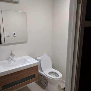
This full bathroom renovation in San Francisco brings together organic materials and contemporary design for a result that feels fresh, calm, and thoroughly considered. Though distinct from a typical tile-heavy remodel, this project stands out through its thoughtful layering of texture, tone, and carefully selected fixtures.
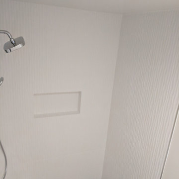
The walk-in shower makes a quiet but confident statement. The walls are clad in large-format white tiles with a subtle vertical ribbed texture, giving the space a soft, dimensional quality without competing with the other design elements. A full-height vertical accent column of mixed glass and stone mosaic — featuring elongated pieces in slate, taupe, gray, and warm brown — frames the shower entry and serves as the room's focal point. A generously sized recessed niche is built seamlessly into the back wall for clutter-free storage.
The shower floor is finished in a natural pebble mosaic tile in a warm mix of cream, blush, taupe, and gray — a grounding, spa-like touch that contrasts beautifully with the crisp white walls. A linear drain runs along one edge, keeping the floor visually clean and modern. The chrome shower system includes both a rain showerhead and a handheld unit on a slide bar for flexible use.
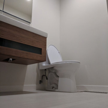
In the vanity area, a floating wood-grain cabinet with a white integrated countertop sink brings warmth and lightness to the room. A single-hole chrome faucet with a squared modern profile adds a refined detail. Above, a wide frameless mirror and a sleek multi-bulb vanity bar ensure the space is bright and functional. The floor throughout features large-format warm-toned tiles that unify the entire room. A streamlined one-piece toilet rounds out the clean, contemporary look.
KEY FEATURES:
Ribbed vertical-texture white large-format shower wall tile
Full-height glass & stone mosaic accent column
Natural pebble mosaic shower floor
Linear drain
Rain showerhead + handheld slide bar combo
Large recessed shower niche
Floating wood-grain vanity with integrated sink
Frameless mirror with multi-bulb vanity light
One-piece contemporary toilet
Warm large-format floor tile throughout
 Refresh and Build
DESCRIPTION:
Natural Texture Meets Modern Clean — San Francisco, CA | 2018 | $15,000–$20,000
This full bathroom renovation in San Francisco brings together organic materials and contemporary design for a result that feels fresh, calm, and thoroughly considered. Though distinct from a typical tile-heavy remodel, this project stands out through its thoughtful layering of texture, tone, and carefully selected fixtures.
The walk-in shower makes a quiet but confident statement. The walls are clad in large-format white tiles with a subtle vertical ribbed texture, giving the space a soft, dimensional quality without competing with the other design elements. A full-height vertical accent column of mixed glass and stone mosaic — featuring elongated pieces in slate, taupe, gray, and warm brown — frames the shower entry and serves as the room's focal point. A generously sized recessed niche is built seamlessly into the back wall for clutter-free storage.
The shower floor is finished in a natural pebble mosaic tile in a warm mix of cream, blush, taupe, and gray — a grounding, spa-like touch that contrasts beautifully with the crisp white walls. A linear drain runs along one edge, keeping the floor visually clean and modern. The chrome shower system includes both a rain showerhead and a handheld unit on a slide bar for flexible use.
In the vanity area, a floating wood-grain cabinet with a white integrated countertop sink brings warmth and lightness to the room. A single-hole chrome faucet with a squared modern profile adds a refined detail. Above, a wide frameless mirror and a sleek multi-bulb vanity bar ensure the space is bright and functional. The floor throughout features large-format warm-toned tiles that unify the entire room. A streamlined one-piece toilet rounds out the clean, contemporary look.
KEY FEATURES:
Ribbed vertical-texture white large-format shower wall tile
Full-height glass & stone mosaic accent column
Natural pebble mosaic shower floor
Linear drain
Rain showerhead + handheld slide bar combo
Large recessed shower niche
Floating wood-grain vanity with integrated sink
Frameless mirror with multi-bulb vanity light
One-piece contemporary toilet
Warm large-format floor tile throughout
 Refresh and Build
DESCRIPTION:
Natural Texture Meets Modern Clean — San Francisco, CA | 2018 | $15,000–$20,000
This full bathroom renovation in San Francisco brings together organic materials and contemporary design for a result that feels fresh, calm, and thoroughly considered. Though distinct from a typical tile-heavy remodel, this project stands out through its thoughtful layering of texture, tone, and carefully selected fixtures.
The walk-in shower makes a quiet but confident statement. The walls are clad in large-format white tiles with a subtle vertical ribbed texture, giving the space a soft, dimensional quality without competing with the other design elements. A full-height vertical accent column of mixed glass and stone mosaic — featuring elongated pieces in slate, taupe, gray, and warm brown — frames the shower entry and serves as the room's focal point. A generously sized recessed niche is built seamlessly into the back wall for clutter-free storage.
The shower floor is finished in a natural pebble mosaic tile in a warm mix of cream, blush, taupe, and gray — a grounding, spa-like touch that contrasts beautifully with the crisp white walls. A linear drain runs along one edge, keeping the floor visually clean and modern. The chrome shower system includes both a rain showerhead and a handheld unit on a slide bar for flexible use.
In the vanity area, a floating wood-grain cabinet with a white integrated countertop sink brings warmth and lightness to the room. A single-hole chrome faucet with a squared modern profile adds a refined detail. Above, a wide frameless mirror and a sleek multi-bulb vanity bar ensure the space is bright and functional. The floor throughout features large-format warm-toned tiles that unify the entire room. A streamlined one-piece toilet rounds out the clean, contemporary look.
KEY FEATURES:
Ribbed vertical-texture white large-format shower wall tile
Full-height glass & stone mosaic accent column
Natural pebble mosaic shower floor
Linear drain
Rain showerhead + handheld slide bar combo
Large recessed shower niche
Floating wood-grain vanity with integrated sink
Frameless mirror with multi-bulb vanity light
One-piece contemporary toilet
Warm large-format floor tile throughout

 Richmond Commercial Painting
There are many challenges in Milwaukee commercial exterior painting.
With such a wide variety of building fascia materials requiring different coatings, materials and application equipment, there are varying environmental and atmospheric conditions to deal with and elaborate equipment required to complete many of the jobs. Hi-rise buildings need staging, weatherproofing, special machinery and applicator lifts to reach all surfaces.
One of the toughest challenges is the requirement to complete the Milwaukee commercial exterior painting project while the business or government office is in continuous operation. All of this requires professionalism, experience, expertise and knowledge that can only be gained by years of work with the diverse coatings and equipment that is necessary to complete large exterior commercial painting projects.
Richmond Painting is regularly selected by facility owners and general contracting firms. For the right commercial exterior painting job, we’ll travel as far south as Libertyville, IL and as far north as Mequon, WI. From where we are centrally located in Racine, WI, Richmond Commercial Painting dispatches professional crews and equipment to paint commercial building exteriors throughout the area.
Commercial Exterior Painting ServicesAt Richmond Commercial Painting our professionals are available to assist with every aspect of the exterior commercial painting project, from planning, to design, to budgeting, to application and completion. With a solid record of projects completed on time and within budget, our expertise will make any job move like a well-oiled machine; smoothly and quietly.
Whether the job requirements are for using elastomeric coatings to weatherproof masonry exterior walls, applying two-part epoxies, spraying high-solids paint for protecting exposed metal, or any of the other specialty architectural coatings, we have the experience, equipment and highly trained personnel to satisfactorily complete the project. We can also tap a network of competent tuck-and- point subcontractors to repair any joints, corners or sprawls in brick or masonry.
Our experienced project managers provide their years of background in all types of exterior coatings jobs to make every commercial painting project a successful joint venture with the owner, architect-designer and/or general contractor. We effectively dovetail our portion of the project with those of the other trades, contributing to a smooth “critical flow” on the job.
Our portfolio of successfully completed projects includes all types of commercial exterior painting projects: hotels, hi-rise office buildings, factories, warehouses, industrial parks, schools, churches, apartment buildings and just about every other type of commercial facility you can find around Milwaukee.
Our clients have learned that with the professional, commercial exterior painting services provided by Richmond Painting, Inc., a job done right the first time saves money over one that requires a number of return visits to the job to touch-up or correct flaws. Keeping that in mind, we’ve found that it really costs no more in the long run to hire the very best.
Sponsored
Delaware, OH

Buckeye Basements, Inc.
Central Ohio's Basement Finishing ExpertsBest Of Houzz '13-'21
 Refresh and Build
DESCRIPTION:
Natural Texture Meets Modern Clean — San Francisco, CA | 2018 | $15,000–$20,000
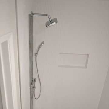
This full bathroom renovation in San Francisco brings together organic materials and contemporary design for a result that feels fresh, calm, and thoroughly considered. Though distinct from a typical tile-heavy remodel, this project stands out through its thoughtful layering of texture, tone, and carefully selected fixtures.
The walk-in shower makes a quiet but confident statement. The walls are clad in large-format white tiles with a subtle vertical ribbed texture, giving the space a soft, dimensional quality without competing with the other design elements. A full-height vertical accent column of mixed glass and stone mosaic — featuring elongated pieces in slate, taupe, gray, and warm brown — frames the shower entry and serves as the room's focal point. A generously sized recessed niche is built seamlessly into the back wall for clutter-free storage.
The shower floor is finished in a natural pebble mosaic tile in a warm mix of cream, blush, taupe, and gray — a grounding, spa-like touch that contrasts beautifully with the crisp white walls. A linear drain runs along one edge, keeping the floor visually clean and modern. The chrome shower system includes both a rain showerhead and a handheld unit on a slide bar for flexible use.
In the vanity area, a floating wood-grain cabinet with a white integrated countertop sink brings warmth and lightness to the room. A single-hole chrome faucet with a squared modern profile adds a refined detail. Above, a wide frameless mirror and a sleek multi-bulb vanity bar ensure the space is bright and functional. The floor throughout features large-format warm-toned tiles that unify the entire room. A streamlined one-piece toilet rounds out the clean, contemporary look.
KEY FEATURES:
Ribbed vertical-texture white large-format shower wall tile
Full-height glass & stone mosaic accent column
Natural pebble mosaic shower floor
Linear drain
Rain showerhead + handheld slide bar combo
Large recessed shower niche
Floating wood-grain vanity with integrated sink
Frameless mirror with multi-bulb vanity light
One-piece contemporary toilet
Warm large-format floor tile throughout

 Heritage Construction Companies, LLC.
Example of a huge trendy metal floating open staircase design in Minneapolis
 Nar Design Group
Once a sunken living room closed off from the kitchen, we aimed to change the awkward accessibility of the space into an open and easily functional space that is cohesive. To open up the space even further, we designed a blackened steel structure with mirrorpane glass to reflect light and enlarge the room. Within the structure lives a previously existing lava rock wall. We painted this wall in glitter gold and enhanced the gold luster with built-in backlit LEDs.
Centered within the steel framing is a TV, which has the ability to be hidden when the mirrorpane doors are closed. The adjacent staircase wall is cladded with a large format white casework grid and seamlessly houses the wine refrigerator. The clean lines create a simplistic ornate design as a fresh backdrop for the repurposed crystal chandelier.
Nothing short of bold sophistication, this kitchen overflows with playful elegance — from the gold accents to the glistening crystal chandelier above the island. We took advantage of the large window above the 7’ galley workstation to bring in a great deal of natural light and a beautiful view of the backyard.
In a kitchen full of light and symmetrical elements, on the end of the island we incorporated an asymmetrical focal point finished in a dark slate. This four drawer piece is wrapped in safari brasilica wood that purposefully carries the warmth of the floor up and around the end piece to ground the space further. The wow factor of this kitchen is the geometric glossy gold tiles of the hood creating a glamourous accent against a marble backsplash above the cooktop.
This kitchen is not only classically striking but also highly functional. The versatile wall, opposite of the galley sink, includes an integrated refrigerator, freezer, steam oven, convection oven, two appliance garages, and tall cabinetry for pantry items. The kitchen’s layout of appliances creates a fluid circular flow in the kitchen. Across from the kitchen stands a slate gray wine hutch incorporated into the wall. The doors and drawers have a gilded diamond mesh in the center panels. This mesh ties in the golden accents around the kitchens décor and allows you to have a peek inside the hutch when the interior lights are on for a soft glow creating a beautiful transition into the living room. Between the warm tones of light flooring and the light whites and blues of the cabinetry, the kitchen is well-balanced with a bright and airy atmosphere.
The powder room for this home is gilded with glamor. The rich tones of the walnut wood vanity come forth midst the cool hues of the marble countertops and backdrops. Keeping the walls light, the ornate framed mirror pops within the space. We brought this mirror into the place from another room within the home to balance the window alongside it. The star of this powder room is the repurposed golden swan faucet extending from the marble countertop. We places a facet patterned glass vessel to create a transparent complement adjacent to the gold swan faucet. In front of the window hangs an asymmetrical pendant light with a sculptural glass form that does not compete with the mirror.
 Nar Design Group
Once a sunken living room closed off from the kitchen, we aimed to change the awkward accessibility of the space into an open and easily functional space that is cohesive. To open up the space even further, we designed a blackened steel structure with mirrorpane glass to reflect light and enlarge the room. Within the structure lives a previously existing lava rock wall. We painted this wall in glitter gold and enhanced the gold luster with built-in backlit LEDs.
Centered within the steel framing is a TV, which has the ability to be hidden when the mirrorpane doors are closed. The adjacent staircase wall is cladded with a large format white casework grid and seamlessly houses the wine refrigerator. The clean lines create a simplistic ornate design as a fresh backdrop for the repurposed crystal chandelier.
Nothing short of bold sophistication, this kitchen overflows with playful elegance — from the gold accents to the glistening crystal chandelier above the island. We took advantage of the large window above the 7’ galley workstation to bring in a great deal of natural light and a beautiful view of the backyard.
In a kitchen full of light and symmetrical elements, on the end of the island we incorporated an asymmetrical focal point finished in a dark slate. This four drawer piece is wrapped in safari brasilica wood that purposefully carries the warmth of the floor up and around the end piece to ground the space further. The wow factor of this kitchen is the geometric glossy gold tiles of the hood creating a glamourous accent against a marble backsplash above the cooktop.
This kitchen is not only classically striking but also highly functional. The versatile wall, opposite of the galley sink, includes an integrated refrigerator, freezer, steam oven, convection oven, two appliance garages, and tall cabinetry for pantry items. The kitchen’s layout of appliances creates a fluid circular flow in the kitchen. Across from the kitchen stands a slate gray wine hutch incorporated into the wall. The doors and drawers have a gilded diamond mesh in the center panels. This mesh ties in the golden accents around the kitchens décor and allows you to have a peek inside the hutch when the interior lights are on for a soft glow creating a beautiful transition into the living room. Between the warm tones of light flooring and the light whites and blues of the cabinetry, the kitchen is well-balanced with a bright and airy atmosphere.
The powder room for this home is gilded with glamor. The rich tones of the walnut wood vanity come forth midst the cool hues of the marble countertops and backdrops. Keeping the walls light, the ornate framed mirror pops within the space. We brought this mirror into the place from another room within the home to balance the window alongside it. The star of this powder room is the repurposed golden swan faucet extending from the marble countertop. We places a facet patterned glass vessel to create a transparent complement adjacent to the gold swan faucet. In front of the window hangs an asymmetrical pendant light with a sculptural glass form that does not compete with the mirror.
Sponsored
Plain City, OH

The Creative Kitchen Company
Columbus Area Kitchen Remodeling and Refacing Professional
 Nar Design Group
Once a sunken living room closed off from the kitchen, we aimed to change the awkward accessibility of the space into an open and easily functional space that is cohesive. To open up the space even further, we designed a blackened steel structure with mirrorpane glass to reflect light and enlarge the room. Within the structure lives a previously existing lava rock wall. We painted this wall in glitter gold and enhanced the gold luster with built-in backlit LEDs.
Centered within the steel framing is a TV, which has the ability to be hidden when the mirrorpane doors are closed. The adjacent staircase wall is cladded with a large format white casework grid and seamlessly houses the wine refrigerator. The clean lines create a simplistic ornate design as a fresh backdrop for the repurposed crystal chandelier.
Nothing short of bold sophistication, this kitchen overflows with playful elegance — from the gold accents to the glistening crystal chandelier above the island. We took advantage of the large window above the 7’ galley workstation to bring in a great deal of natural light and a beautiful view of the backyard.
In a kitchen full of light and symmetrical elements, on the end of the island we incorporated an asymmetrical focal point finished in a dark slate. This four drawer piece is wrapped in safari brasilica wood that purposefully carries the warmth of the floor up and around the end piece to ground the space further. The wow factor of this kitchen is the geometric glossy gold tiles of the hood creating a glamourous accent against a marble backsplash above the cooktop.
This kitchen is not only classically striking but also highly functional. The versatile wall, opposite of the galley sink, includes an integrated refrigerator, freezer, steam oven, convection oven, two appliance garages, and tall cabinetry for pantry items. The kitchen’s layout of appliances creates a fluid circular flow in the kitchen. Across from the kitchen stands a slate gray wine hutch incorporated into the wall. The doors and drawers have a gilded diamond mesh in the center panels. This mesh ties in the golden accents around the kitchens décor and allows you to have a peek inside the hutch when the interior lights are on for a soft glow creating a beautiful transition into the living room. Between the warm tones of light flooring and the light whites and blues of the cabinetry, the kitchen is well-balanced with a bright and airy atmosphere.
The powder room for this home is gilded with glamor. The rich tones of the walnut wood vanity come forth midst the cool hues of the marble countertops and backdrops. Keeping the walls light, the ornate framed mirror pops within the space. We brought this mirror into the place from another room within the home to balance the window alongside it. The star of this powder room is the repurposed golden swan faucet extending from the marble countertop. We places a facet patterned glass vessel to create a transparent complement adjacent to the gold swan faucet. In front of the window hangs an asymmetrical pendant light with a sculptural glass form that does not compete with the mirror.
 Nar Design Group
Once a sunken living room closed off from the kitchen, we aimed to change the awkward accessibility of the space into an open and easily functional space that is cohesive. To open up the space even further, we designed a blackened steel structure with mirrorpane glass to reflect light and enlarge the room. Within the structure lives a previously existing lava rock wall. We painted this wall in glitter gold and enhanced the gold luster with built-in backlit LEDs.
Centered within the steel framing is a TV, which has the ability to be hidden when the mirrorpane doors are closed. The adjacent staircase wall is cladded with a large format white casework grid and seamlessly houses the wine refrigerator. The clean lines create a simplistic ornate design as a fresh backdrop for the repurposed crystal chandelier.
Nothing short of bold sophistication, this kitchen overflows with playful elegance — from the gold accents to the glistening crystal chandelier above the island. We took advantage of the large window above the 7’ galley workstation to bring in a great deal of natural light and a beautiful view of the backyard.
In a kitchen full of light and symmetrical elements, on the end of the island we incorporated an asymmetrical focal point finished in a dark slate. This four drawer piece is wrapped in safari brasilica wood that purposefully carries the warmth of the floor up and around the end piece to ground the space further. The wow factor of this kitchen is the geometric glossy gold tiles of the hood creating a glamourous accent against a marble backsplash above the cooktop.
This kitchen is not only classically striking but also highly functional. The versatile wall, opposite of the galley sink, includes an integrated refrigerator, freezer, steam oven, convection oven, two appliance garages, and tall cabinetry for pantry items. The kitchen’s layout of appliances creates a fluid circular flow in the kitchen. Across from the kitchen stands a slate gray wine hutch incorporated into the wall. The doors and drawers have a gilded diamond mesh in the center panels. This mesh ties in the golden accents around the kitchens décor and allows you to have a peek inside the hutch when the interior lights are on for a soft glow creating a beautiful transition into the living room. Between the warm tones of light flooring and the light whites and blues of the cabinetry, the kitchen is well-balanced with a bright and airy atmosphere.
The powder room for this home is gilded with glamor. The rich tones of the walnut wood vanity come forth midst the cool hues of the marble countertops and backdrops. Keeping the walls light, the ornate framed mirror pops within the space. We brought this mirror into the place from another room within the home to balance the window alongside it. The star of this powder room is the repurposed golden swan faucet extending from the marble countertop. We places a facet patterned glass vessel to create a transparent complement adjacent to the gold swan faucet. In front of the window hangs an asymmetrical pendant light with a sculptural glass form that does not compete with the mirror.

 Hueber Industries
This railing was the first planned update of the Fort Collins, CO couples home renovation. The wavy lines give the room a natural feel. Design and fabrication by Hueber Industries LLC. Photo: Rory Schaar.
25