
Search results for "Connecting individuals" in Home Design Ideas
 Studio Dhi
Kanso home
A Balanced Retreat for the Quietly Powerful
In the heart of bustling Wadala, amidst the towering silhouettes of Mumbai’s skyline, lies a home that whispers rather than shouts—one that celebrates calm over clutter and intention overindulgence. Designed under the concept “Stillness in Structure,” this residence for the wonderful couple and their beautiful daughter, at Dosti Eastern Bay stands as a meditative retreat—an ode to
balance, warmth, and quiet sophistication.
The central design narrative revolves around creating a sanctuary that embodies restraint and timeless grace. Every surface, curve, and finish has been curated to exude composure. The palette—woven from taupes, soft greys, dusty beiges, and stone whites—becomes the visual language of serenity.
Lighting plays a quiet yet profound role—concealed within coves or diffused through sheer drapes—casting a soft glow that mirrors the homeowners’ gentle temperament. The overall effect is of a space that breathes, inviting introspection and ease.
The Living Core: Connection and Continuity
The living and dining areas are designed as fluid extensions of one another, encouraging conversation and connection. With earthy finishes, clean silhouettes, and subtle textural layering, the rooms flow seamlessly into a balcony that becomes a serene escape. Soft furnishings transform the space into an urban oasis—a moment of stillness above the city’s rhythm.
The dining corner, defined by warm tones and minimalist lighting, balances functionality with grace. Custom cabinetry with clean lines anchors the space, offering both utility and sculptural beauty.
The Private Realms
The master bedroom continues the home’s philosophy of quiet luxury. With muted undertones, warm timber, and linen textures, it exudes a sense of grounded comfort. A tailored study nook and soft lighting create an atmosphere conducive to focus and rest in equal measure.
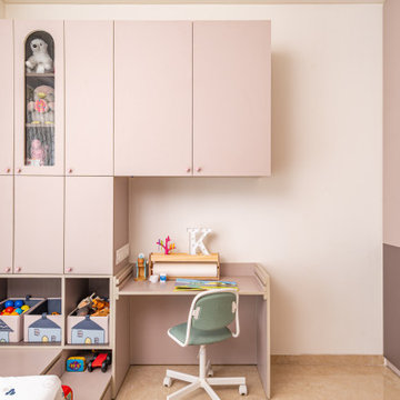
The daughter’s room, in contrast, introduces a tender narrative—pastel hues of blush, sage, and mauve meet whimsical elements. It balances playfulness and calm, ensuring the design grows gracefully with its young occupant.
Meanwhile, the guest bedroom embodies understated hospitality—tones of beige and olive layered with soft fabrics and tactile finishes. It maintains harmony with the home’s larger aesthetic, while introducing subtle individuality through its bespoke furniture details.
Crafted Details and Quiet Precision
Every element—from custom joinery and door designs to the utility layout and curtain treatments—reflects an unwavering attention to proportion and texture. Rounded corners, soft lighting coves, and flush detailing enhance spatial fluidity. Even the kitchen area is designed with the same philosophy—functional minimalism executed with warmth and precision
An Ode to Intentional Living
“Stillness in Structure” transcends mere visual beauty—it’s a state of being. The home tells the story of two individuals who find strength in subtlety and meaning in moderation. It’s a space that nurtures the rhythm of everyday life while offering a meditative counterpoint to the world outside.
 Walczak Design And Build
What once felt dark, segmented, and inefficient is now a bright, connected, and highly functional first floor designed for real family living.
Our clients, Terry and Lou, came to us with a home that simply wasn’t keeping up with their growing family. The kitchen was cramped, with tight working lanes and limited light. The laundry room doubled as a powder room—yet functioned poorly as both. Sightlines between spaces were cut off, making it difficult to stay connected to their young children throughout the day. Across the board, the home felt dated and disconnected.
Through thoughtful planning and strategic structural changes, we reimagined the entire first floor to better support how this family truly lives.
We began by redefining the entry experience—creating a true foyer complete with a dedicated drop zone and custom cubby storage. This space now acts as a natural landing point, bringing order and intention to everyday comings and goings.
Adjacent to the new entry, we relocated and redesigned the laundry room. Now positioned exactly where it needs to be, it functions as a hardworking utility space with countertops for folding, a utility sink for immediate stain treatment, and the ability to be closed off—keeping daily life contained when needed.
Separating the previous shared function allowed us to carve out a distinct, personality-filled powder room. Wrapped in a bold wave-patterned wallpaper and grounded by a custom reeded oak vanity with warm brass accents, this space delivers a moment of delight and individuality within the home.
The kitchen transformation is where the impact is felt most deeply.
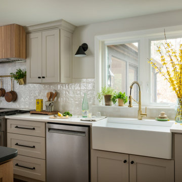
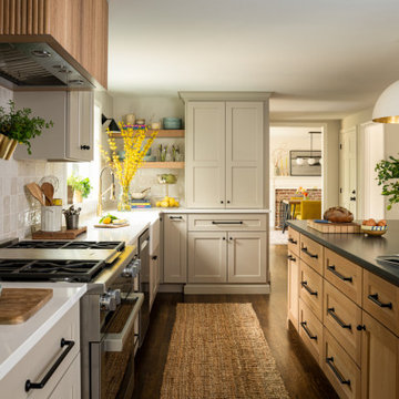
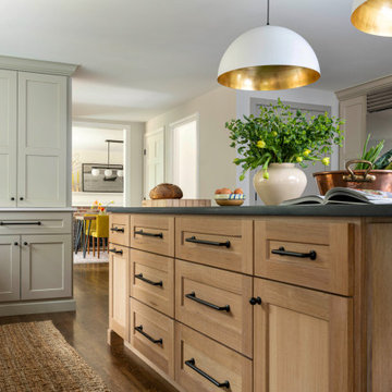
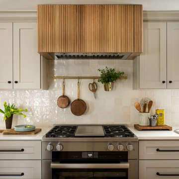
What was once a dark, restrictive layout has been opened into a spacious, highly efficient U-shaped kitchen with generous clearances and an oversized island for gathering. A thoughtful mix of painted cabinetry and rift white oak introduces warmth and balance, while the custom reeded hood becomes a sculptural focal point. Open shelving, integrated pantry storage, and layered lighting ensure the space is as functional as it is beautiful.
Beyond aesthetics, the redesign prioritizes flow—both in movement and in connection. Sightlines between the kitchen, dining, and living areas were intentionally opened, allowing for ease of interaction and visibility throughout the main living spaces.
To unify the home, existing hardwood floors were refinished and extended, creating continuity and a seamless visual experience from one space to the next.
The result is a home that feels lighter, more open, and deeply aligned with how this family lives day to day—designed not just to look beautiful, but to support everything from busy mornings to slow, shared evenings.
 Walczak Design And Build
What once felt dark, segmented, and inefficient is now a bright, connected, and highly functional first floor designed for real family living.
Our clients, Terry and Lou, came to us with a home that simply wasn’t keeping up with their growing family. The kitchen was cramped, with tight working lanes and limited light. The laundry room doubled as a powder room—yet functioned poorly as both. Sightlines between spaces were cut off, making it difficult to stay connected to their young children throughout the day. Across the board, the home felt dated and disconnected.
Through thoughtful planning and strategic structural changes, we reimagined the entire first floor to better support how this family truly lives.
We began by redefining the entry experience—creating a true foyer complete with a dedicated drop zone and custom cubby storage. This space now acts as a natural landing point, bringing order and intention to everyday comings and goings.
Adjacent to the new entry, we relocated and redesigned the laundry room. Now positioned exactly where it needs to be, it functions as a hardworking utility space with countertops for folding, a utility sink for immediate stain treatment, and the ability to be closed off—keeping daily life contained when needed.
Separating the previous shared function allowed us to carve out a distinct, personality-filled powder room. Wrapped in a bold wave-patterned wallpaper and grounded by a custom reeded oak vanity with warm brass accents, this space delivers a moment of delight and individuality within the home.
The kitchen transformation is where the impact is felt most deeply.
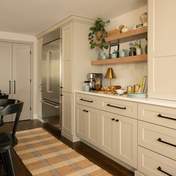
What was once a dark, restrictive layout has been opened into a spacious, highly efficient U-shaped kitchen with generous clearances and an oversized island for gathering. A thoughtful mix of painted cabinetry and rift white oak introduces warmth and balance, while the custom reeded hood becomes a sculptural focal point. Open shelving, integrated pantry storage, and layered lighting ensure the space is as functional as it is beautiful.
Beyond aesthetics, the redesign prioritizes flow—both in movement and in connection. Sightlines between the kitchen, dining, and living areas were intentionally opened, allowing for ease of interaction and visibility throughout the main living spaces.
To unify the home, existing hardwood floors were refinished and extended, creating continuity and a seamless visual experience from one space to the next.
The result is a home that feels lighter, more open, and deeply aligned with how this family lives day to day—designed not just to look beautiful, but to support everything from busy mornings to slow, shared evenings.
Find the right local pro for your project
 Walczak Design And Build
What once felt dark, segmented, and inefficient is now a bright, connected, and highly functional first floor designed for real family living.
Our clients, Terry and Lou, came to us with a home that simply wasn’t keeping up with their growing family. The kitchen was cramped, with tight working lanes and limited light. The laundry room doubled as a powder room—yet functioned poorly as both. Sightlines between spaces were cut off, making it difficult to stay connected to their young children throughout the day. Across the board, the home felt dated and disconnected.
Through thoughtful planning and strategic structural changes, we reimagined the entire first floor to better support how this family truly lives.
We began by redefining the entry experience—creating a true foyer complete with a dedicated drop zone and custom cubby storage. This space now acts as a natural landing point, bringing order and intention to everyday comings and goings.
Adjacent to the new entry, we relocated and redesigned the laundry room. Now positioned exactly where it needs to be, it functions as a hardworking utility space with countertops for folding, a utility sink for immediate stain treatment, and the ability to be closed off—keeping daily life contained when needed.
Separating the previous shared function allowed us to carve out a distinct, personality-filled powder room. Wrapped in a bold wave-patterned wallpaper and grounded by a custom reeded oak vanity with warm brass accents, this space delivers a moment of delight and individuality within the home.
The kitchen transformation is where the impact is felt most deeply.
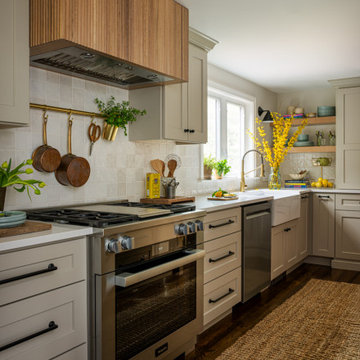
What was once a dark, restrictive layout has been opened into a spacious, highly efficient U-shaped kitchen with generous clearances and an oversized island for gathering. A thoughtful mix of painted cabinetry and rift white oak introduces warmth and balance, while the custom reeded hood becomes a sculptural focal point. Open shelving, integrated pantry storage, and layered lighting ensure the space is as functional as it is beautiful.
Beyond aesthetics, the redesign prioritizes flow—both in movement and in connection. Sightlines between the kitchen, dining, and living areas were intentionally opened, allowing for ease of interaction and visibility throughout the main living spaces.
To unify the home, existing hardwood floors were refinished and extended, creating continuity and a seamless visual experience from one space to the next.
The result is a home that feels lighter, more open, and deeply aligned with how this family lives day to day—designed not just to look beautiful, but to support everything from busy mornings to slow, shared evenings.
 Walczak Design And Build
What once felt dark, segmented, and inefficient is now a bright, connected, and highly functional first floor designed for real family living.
Our clients, Terry and Lou, came to us with a home that simply wasn’t keeping up with their growing family. The kitchen was cramped, with tight working lanes and limited light. The laundry room doubled as a powder room—yet functioned poorly as both. Sightlines between spaces were cut off, making it difficult to stay connected to their young children throughout the day. Across the board, the home felt dated and disconnected.
Through thoughtful planning and strategic structural changes, we reimagined the entire first floor to better support how this family truly lives.
We began by redefining the entry experience—creating a true foyer complete with a dedicated drop zone and custom cubby storage. This space now acts as a natural landing point, bringing order and intention to everyday comings and goings.
Adjacent to the new entry, we relocated and redesigned the laundry room. Now positioned exactly where it needs to be, it functions as a hardworking utility space with countertops for folding, a utility sink for immediate stain treatment, and the ability to be closed off—keeping daily life contained when needed.
Separating the previous shared function allowed us to carve out a distinct, personality-filled powder room. Wrapped in a bold wave-patterned wallpaper and grounded by a custom reeded oak vanity with warm brass accents, this space delivers a moment of delight and individuality within the home.
The kitchen transformation is where the impact is felt most deeply.
What was once a dark, restrictive layout has been opened into a spacious, highly efficient U-shaped kitchen with generous clearances and an oversized island for gathering. A thoughtful mix of painted cabinetry and rift white oak introduces warmth and balance, while the custom reeded hood becomes a sculptural focal point. Open shelving, integrated pantry storage, and layered lighting ensure the space is as functional as it is beautiful.
Beyond aesthetics, the redesign prioritizes flow—both in movement and in connection. Sightlines between the kitchen, dining, and living areas were intentionally opened, allowing for ease of interaction and visibility throughout the main living spaces.
To unify the home, existing hardwood floors were refinished and extended, creating continuity and a seamless visual experience from one space to the next.
The result is a home that feels lighter, more open, and deeply aligned with how this family lives day to day—designed not just to look beautiful, but to support everything from busy mornings to slow, shared evenings.
 Walczak Design And Build
What once felt dark, segmented, and inefficient is now a bright, connected, and highly functional first floor designed for real family living.
Our clients, Terry and Lou, came to us with a home that simply wasn’t keeping up with their growing family. The kitchen was cramped, with tight working lanes and limited light. The laundry room doubled as a powder room—yet functioned poorly as both. Sightlines between spaces were cut off, making it difficult to stay connected to their young children throughout the day. Across the board, the home felt dated and disconnected.
Through thoughtful planning and strategic structural changes, we reimagined the entire first floor to better support how this family truly lives.
We began by redefining the entry experience—creating a true foyer complete with a dedicated drop zone and custom cubby storage. This space now acts as a natural landing point, bringing order and intention to everyday comings and goings.
Adjacent to the new entry, we relocated and redesigned the laundry room. Now positioned exactly where it needs to be, it functions as a hardworking utility space with countertops for folding, a utility sink for immediate stain treatment, and the ability to be closed off—keeping daily life contained when needed.
Separating the previous shared function allowed us to carve out a distinct, personality-filled powder room. Wrapped in a bold wave-patterned wallpaper and grounded by a custom reeded oak vanity with warm brass accents, this space delivers a moment of delight and individuality within the home.
The kitchen transformation is where the impact is felt most deeply.
What was once a dark, restrictive layout has been opened into a spacious, highly efficient U-shaped kitchen with generous clearances and an oversized island for gathering. A thoughtful mix of painted cabinetry and rift white oak introduces warmth and balance, while the custom reeded hood becomes a sculptural focal point. Open shelving, integrated pantry storage, and layered lighting ensure the space is as functional as it is beautiful.
Beyond aesthetics, the redesign prioritizes flow—both in movement and in connection. Sightlines between the kitchen, dining, and living areas were intentionally opened, allowing for ease of interaction and visibility throughout the main living spaces.
To unify the home, existing hardwood floors were refinished and extended, creating continuity and a seamless visual experience from one space to the next.
The result is a home that feels lighter, more open, and deeply aligned with how this family lives day to day—designed not just to look beautiful, but to support everything from busy mornings to slow, shared evenings.
 Walczak Design And Build
What once felt dark, segmented, and inefficient is now a bright, connected, and highly functional first floor designed for real family living.
Our clients, Terry and Lou, came to us with a home that simply wasn’t keeping up with their growing family. The kitchen was cramped, with tight working lanes and limited light. The laundry room doubled as a powder room—yet functioned poorly as both. Sightlines between spaces were cut off, making it difficult to stay connected to their young children throughout the day. Across the board, the home felt dated and disconnected.
Through thoughtful planning and strategic structural changes, we reimagined the entire first floor to better support how this family truly lives.
We began by redefining the entry experience—creating a true foyer complete with a dedicated drop zone and custom cubby storage. This space now acts as a natural landing point, bringing order and intention to everyday comings and goings.
Adjacent to the new entry, we relocated and redesigned the laundry room. Now positioned exactly where it needs to be, it functions as a hardworking utility space with countertops for folding, a utility sink for immediate stain treatment, and the ability to be closed off—keeping daily life contained when needed.
Separating the previous shared function allowed us to carve out a distinct, personality-filled powder room. Wrapped in a bold wave-patterned wallpaper and grounded by a custom reeded oak vanity with warm brass accents, this space delivers a moment of delight and individuality within the home.
The kitchen transformation is where the impact is felt most deeply.
What was once a dark, restrictive layout has been opened into a spacious, highly efficient U-shaped kitchen with generous clearances and an oversized island for gathering. A thoughtful mix of painted cabinetry and rift white oak introduces warmth and balance, while the custom reeded hood becomes a sculptural focal point. Open shelving, integrated pantry storage, and layered lighting ensure the space is as functional as it is beautiful.
Beyond aesthetics, the redesign prioritizes flow—both in movement and in connection. Sightlines between the kitchen, dining, and living areas were intentionally opened, allowing for ease of interaction and visibility throughout the main living spaces.
To unify the home, existing hardwood floors were refinished and extended, creating continuity and a seamless visual experience from one space to the next.
The result is a home that feels lighter, more open, and deeply aligned with how this family lives day to day—designed not just to look beautiful, but to support everything from busy mornings to slow, shared evenings.
Sponsored
Columbus, OH

Wannemacher Interiors
Customized Award-Winning Interior Design Solutions in Franklin Cnty OH
 Walczak Design And Build
What once felt dark, segmented, and inefficient is now a bright, connected, and highly functional first floor designed for real family living.
Our clients, Terry and Lou, came to us with a home that simply wasn’t keeping up with their growing family. The kitchen was cramped, with tight working lanes and limited light. The laundry room doubled as a powder room—yet functioned poorly as both. Sightlines between spaces were cut off, making it difficult to stay connected to their young children throughout the day. Across the board, the home felt dated and disconnected.
Through thoughtful planning and strategic structural changes, we reimagined the entire first floor to better support how this family truly lives.
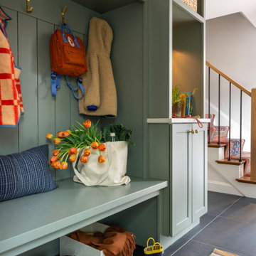
We began by redefining the entry experience—creating a true foyer complete with a dedicated drop zone and custom cubby storage. This space now acts as a natural landing point, bringing order and intention to everyday comings and goings.
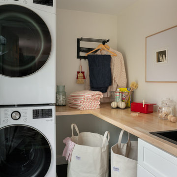
Adjacent to the new entry, we relocated and redesigned the laundry room. Now positioned exactly where it needs to be, it functions as a hardworking utility space with countertops for folding, a utility sink for immediate stain treatment, and the ability to be closed off—keeping daily life contained when needed.
Separating the previous shared function allowed us to carve out a distinct, personality-filled powder room. Wrapped in a bold wave-patterned wallpaper and grounded by a custom reeded oak vanity with warm brass accents, this space delivers a moment of delight and individuality within the home.
The kitchen transformation is where the impact is felt most deeply.
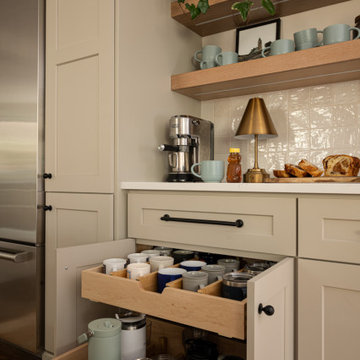
What was once a dark, restrictive layout has been opened into a spacious, highly efficient U-shaped kitchen with generous clearances and an oversized island for gathering. A thoughtful mix of painted cabinetry and rift white oak introduces warmth and balance, while the custom reeded hood becomes a sculptural focal point. Open shelving, integrated pantry storage, and layered lighting ensure the space is as functional as it is beautiful.
Beyond aesthetics, the redesign prioritizes flow—both in movement and in connection. Sightlines between the kitchen, dining, and living areas were intentionally opened, allowing for ease of interaction and visibility throughout the main living spaces.
To unify the home, existing hardwood floors were refinished and extended, creating continuity and a seamless visual experience from one space to the next.
The result is a home that feels lighter, more open, and deeply aligned with how this family lives day to day—designed not just to look beautiful, but to support everything from busy mornings to slow, shared evenings.
 Walczak Design And Build
What once felt dark, segmented, and inefficient is now a bright, connected, and highly functional first floor designed for real family living.
Our clients, Terry and Lou, came to us with a home that simply wasn’t keeping up with their growing family. The kitchen was cramped, with tight working lanes and limited light. The laundry room doubled as a powder room—yet functioned poorly as both. Sightlines between spaces were cut off, making it difficult to stay connected to their young children throughout the day. Across the board, the home felt dated and disconnected.
Through thoughtful planning and strategic structural changes, we reimagined the entire first floor to better support how this family truly lives.
We began by redefining the entry experience—creating a true foyer complete with a dedicated drop zone and custom cubby storage. This space now acts as a natural landing point, bringing order and intention to everyday comings and goings.
Adjacent to the new entry, we relocated and redesigned the laundry room. Now positioned exactly where it needs to be, it functions as a hardworking utility space with countertops for folding, a utility sink for immediate stain treatment, and the ability to be closed off—keeping daily life contained when needed.
Separating the previous shared function allowed us to carve out a distinct, personality-filled powder room. Wrapped in a bold wave-patterned wallpaper and grounded by a custom reeded oak vanity with warm brass accents, this space delivers a moment of delight and individuality within the home.
The kitchen transformation is where the impact is felt most deeply.
What was once a dark, restrictive layout has been opened into a spacious, highly efficient U-shaped kitchen with generous clearances and an oversized island for gathering. A thoughtful mix of painted cabinetry and rift white oak introduces warmth and balance, while the custom reeded hood becomes a sculptural focal point. Open shelving, integrated pantry storage, and layered lighting ensure the space is as functional as it is beautiful.
Beyond aesthetics, the redesign prioritizes flow—both in movement and in connection. Sightlines between the kitchen, dining, and living areas were intentionally opened, allowing for ease of interaction and visibility throughout the main living spaces.
To unify the home, existing hardwood floors were refinished and extended, creating continuity and a seamless visual experience from one space to the next.
The result is a home that feels lighter, more open, and deeply aligned with how this family lives day to day—designed not just to look beautiful, but to support everything from busy mornings to slow, shared evenings.
 Walczak Design And Build
What once felt dark, segmented, and inefficient is now a bright, connected, and highly functional first floor designed for real family living.
Our clients, Terry and Lou, came to us with a home that simply wasn’t keeping up with their growing family. The kitchen was cramped, with tight working lanes and limited light. The laundry room doubled as a powder room—yet functioned poorly as both. Sightlines between spaces were cut off, making it difficult to stay connected to their young children throughout the day. Across the board, the home felt dated and disconnected.
Through thoughtful planning and strategic structural changes, we reimagined the entire first floor to better support how this family truly lives.
We began by redefining the entry experience—creating a true foyer complete with a dedicated drop zone and custom cubby storage. This space now acts as a natural landing point, bringing order and intention to everyday comings and goings.
Adjacent to the new entry, we relocated and redesigned the laundry room. Now positioned exactly where it needs to be, it functions as a hardworking utility space with countertops for folding, a utility sink for immediate stain treatment, and the ability to be closed off—keeping daily life contained when needed.
Separating the previous shared function allowed us to carve out a distinct, personality-filled powder room. Wrapped in a bold wave-patterned wallpaper and grounded by a custom reeded oak vanity with warm brass accents, this space delivers a moment of delight and individuality within the home.
The kitchen transformation is where the impact is felt most deeply.
What was once a dark, restrictive layout has been opened into a spacious, highly efficient U-shaped kitchen with generous clearances and an oversized island for gathering. A thoughtful mix of painted cabinetry and rift white oak introduces warmth and balance, while the custom reeded hood becomes a sculptural focal point. Open shelving, integrated pantry storage, and layered lighting ensure the space is as functional as it is beautiful.
Beyond aesthetics, the redesign prioritizes flow—both in movement and in connection. Sightlines between the kitchen, dining, and living areas were intentionally opened, allowing for ease of interaction and visibility throughout the main living spaces.
To unify the home, existing hardwood floors were refinished and extended, creating continuity and a seamless visual experience from one space to the next.
The result is a home that feels lighter, more open, and deeply aligned with how this family lives day to day—designed not just to look beautiful, but to support everything from busy mornings to slow, shared evenings.
 Dexign Matter Studio
We are Dexign Matter, an award-winning studio sought after for crafting multi-layered interiors that we expertly curated to fulfill individual design needs.
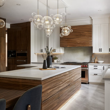
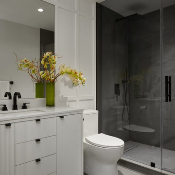
Design Director Zoe Lee’s passion for customization is evident in this city residence where she melds the elevated experience of luxury hotels with a soft and inviting atmosphere that feels welcoming. Lee’s panache for artful contrasts pairs the richness of strong materials, such as oak and porcelain, with the sophistication of contemporary silhouettes. “The goal was to create a sense of indulgence and comfort, making every moment spent in the homea truly memorable one,” says Lee.
By enlivening a once-predominantly white colour scheme with muted hues and tactile textures, Lee was able to impart a characterful countenance that still feels comfortable. She relied on subtle details to ensure this is a residence infused with softness. “The carefully placed and concealed LED light strips throughout create a gentle and ambient illumination,” says Lee.
“They conjure a warm ambiance, while adding a touch of modernity.” Further finishes include a Shaker feature wall in the living room. It extends seamlessly to the room’s double-height ceiling, adding an element of continuity and establishing a connection with the primary ensuite’s wood panelling. “This integration of design elements creates a cohesive and visually appealing atmosphere,” Lee says.
The ensuite’s dramatically veined marble-look is carried from the walls to the countertop and even the cabinet doors. “This consistent finish serves as another unifying element, transforming the individual components into a
captivating feature wall. It adds an elegant touch to the overall aesthetic of the space.”
Pops of black hardware throughout channel that elegance and feel welcoming. Lee says, “The furnishings’ unique characteristics and visual appeal contribute to a sense of continuous luxury – it is now a home that is both bespoke and wonderfully beckoning.”
 STUDIO KONDE | Konrad Idaszewski Architect
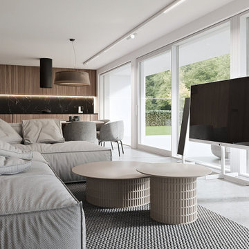
Techplan house interior designed by STUDIO KONDE Konrad Idaszewski Architekt, combining contemporary architecture with a warm, carefully balanced interior. Project details: https://conde.pl/portfolio/gotowy-projekt-wnetrz-domu-techplan/ . The Techplan concept belongs to the Modelowedomy collection of three individually configurable houses and is defined by a modern flat roof and an open living space connecting the lounge, dining area and kitchen. For clients looking for an interior architect in Poznań, the project demonstrates how a generous open-plan layout can remain comfortable and clearly organized.
Warm oak cabinetry, soft grey upholstery, dark accents and extensive glazing create a calm and sophisticated living environment. The restrained palette gives the interior a timeless quality. Carefully placed furniture and lighting define the individual functions without closing the space into separate rooms.
A large sectional sofa in light grey-beige fabric occupies the foreground. Deep seats, broad cushions and generous proportions create a relaxed lounge arrangement. Several loosely positioned cushions add texture and a casual residential feel. In front of the sofa, two round coffee tables introduce a sculptural accent. Both have smooth light-coloured tops and cylindrical bases formed from a fine vertical lattice. Their different sizes create a layered composition over the dark textured rug.
Facing the seating area, a large flat-screen television stands freely in front of the glazed façade. Two tall, narrow speakers flank the screen on minimalist white bases. This freestanding arrangement keeps the media zone visually light. It also leaves the garden visible through the windows behind it.
Further inside, the kitchen is integrated into a wall of warm oak-toned cabinetry. Full-height timber fronts create a strong architectural backdrop. A dark stone backsplash with expressive light veining introduces a contrasting horizontal band. Concealed LED lighting runs along its upper edge and softly illuminates the work surface. Black pendant lighting adds another dark accent above the kitchen and dining zones.
The dining area sits naturally between the kitchen and living room. A rounded table and softly upholstered chairs continue the neutral palette. Their curved silhouettes contrast with the linear cabinetry. Warm timber surfaces provide visual continuity between the two functional zones.
Large glazed openings extend across the side of the living area. Mature trees, lawn and a white vertical fence are visible outside. Natural daylight emphasizes the grain of the oak cabinetry and the textures of the upholstery, rug and coffee-table bases. The resulting Techplan interior combines open-plan functionality with a refined material palette and a strong connection to the garden, reflecting the residential interior design work of STUDIO KONDE in Poznań.
 Dexign Matter Studio
We are Dexign Matter, an award-winning studio sought after for crafting multi-layered interiors that we expertly curated to fulfill individual design needs.
Design Director Zoe Lee’s passion for customization is evident in this city residence where she melds the elevated experience of luxury hotels with a soft and inviting atmosphere that feels welcoming. Lee’s panache for artful contrasts pairs the richness of strong materials, such as oak and porcelain, with the sophistication of contemporary silhouettes. “The goal was to create a sense of indulgence and comfort, making every moment spent in the homea truly memorable one,” says Lee.
By enlivening a once-predominantly white colour scheme with muted hues and tactile textures, Lee was able to impart a characterful countenance that still feels comfortable. She relied on subtle details to ensure this is a residence infused with softness. “The carefully placed and concealed LED light strips throughout create a gentle and ambient illumination,” says Lee.
“They conjure a warm ambiance, while adding a touch of modernity.” Further finishes include a Shaker feature wall in the living room. It extends seamlessly to the room’s double-height ceiling, adding an element of continuity and establishing a connection with the primary ensuite’s wood panelling. “This integration of design elements creates a cohesive and visually appealing atmosphere,” Lee says.
The ensuite’s dramatically veined marble-look is carried from the walls to the countertop and even the cabinet doors. “This consistent finish serves as another unifying element, transforming the individual components into a
captivating feature wall. It adds an elegant touch to the overall aesthetic of the space.”
Pops of black hardware throughout channel that elegance and feel welcoming. Lee says, “The furnishings’ unique characteristics and visual appeal contribute to a sense of continuous luxury – it is now a home that is both bespoke and wonderfully beckoning.”
Sponsored
Columbus, OH
Wannemacher Interiors
Customized Award-Winning Interior Design Solutions in Franklin Cnty OH
 Dexign Matter Studio
We are Dexign Matter, an award-winning studio sought after for crafting multi-layered interiors that we expertly curated to fulfill individual design needs.
Design Director Zoe Lee’s passion for customization is evident in this city residence where she melds the elevated experience of luxury hotels with a soft and inviting atmosphere that feels welcoming. Lee’s panache for artful contrasts pairs the richness of strong materials, such as oak and porcelain, with the sophistication of contemporary silhouettes. “The goal was to create a sense of indulgence and comfort, making every moment spent in the homea truly memorable one,” says Lee.
By enlivening a once-predominantly white colour scheme with muted hues and tactile textures, Lee was able to impart a characterful countenance that still feels comfortable. She relied on subtle details to ensure this is a residence infused with softness. “The carefully placed and concealed LED light strips throughout create a gentle and ambient illumination,” says Lee.
“They conjure a warm ambiance, while adding a touch of modernity.” Further finishes include a Shaker feature wall in the living room. It extends seamlessly to the room’s double-height ceiling, adding an element of continuity and establishing a connection with the primary ensuite’s wood panelling. “This integration of design elements creates a cohesive and visually appealing atmosphere,” Lee says.
The ensuite’s dramatically veined marble-look is carried from the walls to the countertop and even the cabinet doors. “This consistent finish serves as another unifying element, transforming the individual components into a
captivating feature wall. It adds an elegant touch to the overall aesthetic of the space.”
Pops of black hardware throughout channel that elegance and feel welcoming. Lee says, “The furnishings’ unique characteristics and visual appeal contribute to a sense of continuous luxury – it is now a home that is both bespoke and wonderfully beckoning.”
 Dexign Matter Studio
We are Dexign Matter, an award-winning studio sought after for crafting multi-layered interiors that we expertly curated to fulfill individual design needs.
Design Director Zoe Lee’s passion for customization is evident in this city residence where she melds the elevated experience of luxury hotels with a soft and inviting atmosphere that feels welcoming. Lee’s panache for artful contrasts pairs the richness of strong materials, such as oak and porcelain, with the sophistication of contemporary silhouettes. “The goal was to create a sense of indulgence and comfort, making every moment spent in the homea truly memorable one,” says Lee.
By enlivening a once-predominantly white colour scheme with muted hues and tactile textures, Lee was able to impart a characterful countenance that still feels comfortable. She relied on subtle details to ensure this is a residence infused with softness. “The carefully placed and concealed LED light strips throughout create a gentle and ambient illumination,” says Lee.
“They conjure a warm ambiance, while adding a touch of modernity.” Further finishes include a Shaker feature wall in the living room. It extends seamlessly to the room’s double-height ceiling, adding an element of continuity and establishing a connection with the primary ensuite’s wood panelling. “This integration of design elements creates a cohesive and visually appealing atmosphere,” Lee says.
The ensuite’s dramatically veined marble-look is carried from the walls to the countertop and even the cabinet doors. “This consistent finish serves as another unifying element, transforming the individual components into a
captivating feature wall. It adds an elegant touch to the overall aesthetic of the space.”
Pops of black hardware throughout channel that elegance and feel welcoming. Lee says, “The furnishings’ unique characteristics and visual appeal contribute to a sense of continuous luxury – it is now a home that is both bespoke and wonderfully beckoning.”
 Dexign Matter Studio
We are Dexign Matter, an award-winning studio sought after for crafting multi-layered interiors that we expertly curated to fulfill individual design needs.
Design Director Zoe Lee’s passion for customization is evident in this city residence where she melds the elevated experience of luxury hotels with a soft and inviting atmosphere that feels welcoming. Lee’s panache for artful contrasts pairs the richness of strong materials, such as oak and porcelain, with the sophistication of contemporary silhouettes. “The goal was to create a sense of indulgence and comfort, making every moment spent in the homea truly memorable one,” says Lee.
By enlivening a once-predominantly white colour scheme with muted hues and tactile textures, Lee was able to impart a characterful countenance that still feels comfortable. She relied on subtle details to ensure this is a residence infused with softness. “The carefully placed and concealed LED light strips throughout create a gentle and ambient illumination,” says Lee.
“They conjure a warm ambiance, while adding a touch of modernity.” Further finishes include a Shaker feature wall in the living room. It extends seamlessly to the room’s double-height ceiling, adding an element of continuity and establishing a connection with the primary ensuite’s wood panelling. “This integration of design elements creates a cohesive and visually appealing atmosphere,” Lee says.
The ensuite’s dramatically veined marble-look is carried from the walls to the countertop and even the cabinet doors. “This consistent finish serves as another unifying element, transforming the individual components into a
captivating feature wall. It adds an elegant touch to the overall aesthetic of the space.”
Pops of black hardware throughout channel that elegance and feel welcoming. Lee says, “The furnishings’ unique characteristics and visual appeal contribute to a sense of continuous luxury – it is now a home that is both bespoke and wonderfully beckoning.”

 Design Connection, Inc.
This temperature-controlled wine cellar can house over 1000 bottles. The custom cabinetry went through about 3 different versions between using a premanufactured cabinet vs designing and having a local cabinet company make it. Using the different styles of racks, X cabinets and grid styles of wine storage added to the beauty of this space. The custom table in the middle is for tastings and the back wall cabinet was designed to house all the tools needed for opening up a bottle and the shelves are used to display wine glasses and pictures of their travels. The natural look was used to help showcase the wine bottles as the labels added color.
Design Connection, Inc. Kansas City interior designer provided space planning, architectural drawings, barstools, tile, plumbing fixtures, countertops, cabinets and hardware, lighting, paint colors, coordination with the builder and project management to ensure that the high standards of Design Connection, Inc. were maintained.
Sponsored
Columbus, OH
Wannemacher Interiors
Customized Award-Winning Interior Design Solutions in Franklin Cnty OH
 Spaces By Juliana Linssen, Inc.
Mark Pinkerton VI 360
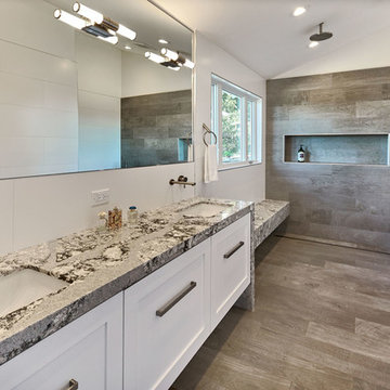
Inspiration for a contemporary bathroom remodel in San Francisco
Inspiration for a contemporary bathroom remodel in San Francisco

 Amazing Spaces
The new flow around the kitchen works for this busy family of five, and mom and dad always have a clear view of the family room. Natural elements are incorporated in a fresh transitional style in details such as quarter sawn white oak cabinetry with mitered cabinet doors. In lieu of a traditional set of table and chairs, the dining table is connected to the end of the large island, which also places it in a nice sunny spot in close proximity to the doors leading to the deck. Additional counter seating is included with complimentary furniture. The island is highlighted with a fantastic slab of natural stone, adding contrast and a little drama while perfectly complimenting the other materials in the space.
The great room has an intimate feeling by defining its individual functions. In this case, the kitchen vs. the family room, we dropped the ceiling just enough to create two recessed areas that are thoughtfully punctuated with decorative lighting. This adds personality while offsetting the recessed fixtures needed in the space.
Photo: Peter Krupenye

 sonnemanlighting
Suspenders™ LED system is a delicately scaled, modular system of interconnected elements and suspended LED components. It can be configured as individual lighting sculptures or as a tiered web of infinite scope and variety. Using today’s leadingedge technology, Robert Sonneman has reimagined and greatly expanded his original Suspenders concept from the late 1980s with a lighter scale, increased capability, and wider range of precisely scaled luminaires.
Because of the extensive range of possibilities offered by Suspenders, we have preconfigured a collection of arrangements that you can select as shown. You can also modify these arrangements using our configuration tables, or use them as inspiration to create your own completely custom configurations.
We will continue to build upon and expand Suspenders as an openframed illumination system of innovative possibilities as we move forward.
A single Luminaire hangs on a 12” Luminaire Hanger from a wall-mounted Mini-Box Power Feed. Includes Mini-Box recessed transformer enclosure with knockout for conduit connection.
44