
Search results for "Considerate approach" in Home Design Ideas
 Simply Home Decorating
There are not many things better than a room full of your favourite people. As you gather you smell dinner cooking in the kitchen and music playing in the background, as joyful conversation and laughter fill the room. I feel so grateful that we are inching our way back to these days. How about you?
The project I’m sharing with you today has beautiful moments like these at its heart. Spaces that invite people in, foster connection, and make everyday living so simple that it’s impossible not to enjoy...
Meet our Delightful Clients:
The family behind this 1950s North Vancouver home transformation enjoy entertaining friends just as much as cosying up to watch a movie together. A professional couple (I'll call them Jon and Anna) with two elementary school-aged sons, Anna and Jon approached us with the task of furnishing the main floor living spaces and the basement of their family home.
Anna is a busy lawyer who is now working almost full time from home, and Jon works in the film industry. With full careers, two active boys, and a love of gathering, they craved a home that could support their everyday lifestyle.
Design and Lifestyle Goals:
Our central goal for this project was simple: to uncover the hidden potential in their home and create a family-friendly space that functioned well and flowed seamlessly.
On the main floor, our clients tasked us with creating an area for the family to relax and entertain, along with crafting a work and play space for the boys. They also dreamed of a more functional and bright basement, which they envisioned as a dual purpose family room and home office for Anna.
Reveal: Comfortable and Welcoming Entryway & Living Room:
Imagine you are coming home, and you walk through a bright, sunny front door like this one. You are met by this entryway of calming earth and sea tones, paired with warm, natural wood flooring. You feel instantly welcomed and eager to venture further inside... The same is now true for our clients!
The simple details in their entryway are thoughtfully arranged with clean lines and colourful art as the focal point, achieving a timeless and friendly aesthetic. Dried wheat brings movement into the space and plays up the beauty of nature, while the vibrant yet warm colours and textures evoke feelings of comfort and homecoming.
The entry flows seamlessly into this connected living area, which is adorned with ample seating strategically arranged to host and accommodate joyful conversations. With the fireplace and wood mantel as the focal point, these natural elements and hues warm up the room to make it feel beautifully lived-in (not like an untouchable museum).
Another colourful work of art graces the space above Jon’s and Anna’s sofa, and we used decorative pillows and a throw blanket to tempt those colours into the rest of the room. A simply styled coffee table keeps the space feeling open and engaged. Reading material, anyone?
Just beyond this living area, you get a glimpse of the second space our clients requested on their main floor...
A Collected Space for Children to Work + Play:
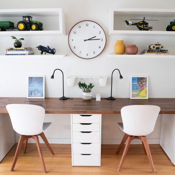
When Jon and Anna realised that their formal dining area wasn’t being used to its full potential, they imagined creating a work and play space for their boys instead. We came up with a plan to create a shared desk area with plentiful storage.
This timeless natural wood desk was the perfect way to maximise surface area and give the boys plenty of space to do homework during the school year, or spend time crafting or building LEGOs during the summers. The drawers provide storage for all the wonderful items that fuel their productivity or creativity. Or both.
I also love how the white floating shelves display a collection of nostalgic toys, providing just the right amount of childhood endearment to this sophisticated and functional space. This workspace now has endless possibilities for the boys, and it helps Jon and Anna keep their minds and spaces clear, too. Which brings us to...
Basement Family Room & Home Office:
In general, we knew we had to maximise surface area in this ‘50s home, and this was especially true for our clients’ basement. I’m happy to say that we designed an effortlessly comfortable space that focuses on family and makes it simple to settle in and work… or leave the workday behind.
Welcome to this dual-function office and family room. Toward the back of the room, we strategically positioned Anna’s wraparound desk facing out into the room and gave her a wallpaper-and-art backdrop for stunning Zoom calls (she has already received glowing compliments). There is plenty of storage for easy organization including a space to store the family’s shared printer near the door… so they don’t have to interrupt “Mom” to get to it.
Anna also wanted the freedom to be able to relax in this space with her family and turn her back on the work day — quite literally! The sofa is perfectly positioned backing onto the desk allowing her to do just that.
We relocated an existing mustard yellow chair and used pops of the same colour to integrate it into the overall scheme. The wood armrests on this modular sectional provide surfaces for snacks and drinks where there was no room for an end table. The walnut finish carries the theme of natural comfort from the upstairs spaces down into the family room.
The view from the sectional is less business and more pleasure, featuring cosy seating and throw pillows in cheerful colours and patterns.
The highlight of this space? A wallpapered accent wall where we were able to achieve the high-end feel of custom built-in shelving with a simple IKEA hack. The shelves and cabinetry around the television offer plenty of much needed storage space to house family games and movies at a budget price point.
This fun room is the perfect balance of work and play, accommodating and supporting our clients’ daily family adventures.
What Our Clients Had to Say...
Our clients could not be happier with their warm yet functional new rooms. With thoughtful consideration and a plan of action, we were able to transform two areas of their home into spaces that function well and feel good. In fact, they had this to say:
“Lori and her team were everything we were looking for: great listeners, wonderfully creative and highly professional. We couldn't be happier with our interior makeover.” — Clients
That is why we do what we do. If you're ready to start your redesign project, we would love to help. Reach out to us here, and let's get to know more about each other.
 Klopf Architecture
From Mid-Century Classic to the Present
An iconic design updated with comfort, function, and flow for today.
A Remodel That Balances Past and Present
What started as a desire to update a classic Eichler soon became an exploration of how Mid-Century Modern design can successfully evolve for today. The client, a tech professional with a passion for scuba diving and underwater photography, wanted a home that would both honor its original character and feel tailored to his daily life. A lifelong technology enthusiast, he still owns the very first Mac desktop he saved up for as a teenager working at Radio Shack, a detail that underscores his appreciation for design that melds function and form.
Honoring Separation While Expanding Possibility
Unlike many contemporary remodels where walls are opened up to create expansive living spaces, this project took a more restrained approach. The client valued the defined rooms of the original plan and wanted to preserve as much wall space as possible for displaying his large-format underwater photography. The emphasis was not on dramatic spatial reinvention, but on thoughtful refinements. Klopf Architecture shaped a gallery-like backdrop while also expanding the primary suite, modernizing materials and fixtures throughout the home, and improving the functionality and layout of the kitchen. The finished home feels at once timeless and renewed, an Eichler that continues to inspire while fully supporting the lifestyle of its present-day owner.
A major turning point came mid-design. The original project brief had not included an addition, but as the reconfiguration of the primary bedroom and bath unfolded, it became clear that an expansion was the best approach to achieve the client’s vision of a more spacious suite. Fortunately, the adjustment came at a stage when revisions were still manageable and was integrated seamlessly, showing how thoughtful course corrections can strengthen a project rather than hinder it.
Navigating Challenges With Precision
The design development included multiple conceptual rounds, balancing preservation with subtle expansion. During construction, an existing post previously thought to be load-bearing turned out not to be. The structural engineer was able to pivot quickly, and both the post and the cross beam that had been intended to replace it could be omitted, allowing the original rhythm of the Eichler beam bays to be preserved.
Sustainability was not just a checklist item, but a way to align the home with the client’s values of simplicity, efficiency, and long-term functionality. R-38 roof insulation reduced energy usage, solar panels with battery storage provided independence and resilience, and passive comfort strategies eliminated the need forenergy-intensive air conditioning. An electric vehicle charger and an on-demand hot water recirculation system (with call buttons as opposed to having constant circulation) add to the home’s long-term efficiency factors. Together, these moves created a home that is quieter, more comfortable, and better equipped for the future, qualities that supported the client’s pragmatic approach to design and living lightly.
Details That Respect the Eichler DNA
The remodel carries forward the Eichler’s original spirit while introducing new layers of modern livability. Originally, the house was approached along a deep, narrow walk, with the garage on one side and the house on the other, leaving the front door tucked far back within this chasm-like space. By pulling the entry forward, the design reshaped the arrival experience, creating a clearer threshold and a natural drop-off zone for bags, shoes, and keys. This shift also made room for a custom bench at the entry that extends seamlessly through the glass sidelight. The bench and drop-off zone now work together as a single, integrated sequence that supports everyday living while offering a tactile reminder of Eichler’s philosophy of connectedness.
At the client’s request, Klopf reintroduced a classic Eichler gesture by extending the exterior siding into the entry and living room. The detail reinforces a sense of indoor/outdoor continuity while providing a subtle architectural surface that allows the client’s photography to take visual precedence.
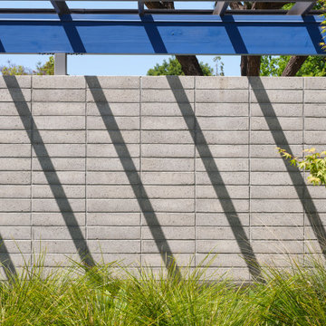
The signature concrete masonry wall at the front was reconstructed using blocks sourced to match the originals, now strengthened with rebar for seismic resilience while maintaining a private outdoor courtyard, visually extending the kitchen outward. A decorative trellis element, a detail borrowed from a neighboring Eichler, restores a familiar mid-century modern architectural motif. At the courtyard entry door, a custom etched glass sidelight with an ocean-themed design featuring kelp and jellyfish serves as a subtle homage to the client’s passion for deep-sea diving.
Landscaping became an integral part of the overall transformation. The homeowner engaged landscape architect Randi Johnsen of Third Nature Studio to shape a series of calm, inviting outdoor rooms that read as a natural extension of the interiors. While technically outside of the core construction scope, the landscape design proved central to achieving a sense of completeness and connectedness across the property. Such whole-property considerations often emerge as design ideas take shape, underscoring the importance of flexibility in planning and budgeting, as well as close collaboration among the design team starting early in the process.
The Value of Evolving Scope
As with many custom residential projects, the scope evolved during the design process. What began as a targeted remodel grew to include a new/expanded primary suite, a rebuilt CMU patio wall for strength and longevity, and a solar panel array and battery storage for energy resilience and carbon-reduction. Each thoughtful decision represented a conscious investment in the home’s performance and character, rather than a cost overrun.
The result was a project delivered on schedule, tailored precisely to the client’s lifestyle, and positioned to add long-term value both functionally and aesthetically. By embracing scope evolution as an opportunity rather than a challenge, and relying on good design paired with transparent communication, this remodel demonstrates how Eichler homes can be adapted for contemporary living without erasing their DNA.
Klopf Architecture project team: John Klopf, AIA, and Klara Kevane, Elise Webb and Nicholas LaNasa.
Contractor: Golden Cove Construction
Landscape Design: Third Nature Studio
Structural Engineer: Daniel Bastiao Design
Photography: ©2025 Mariko Reed
Year Completed: 2024
Location: Sunnyvale, CA
 TVL Creative Ltd.
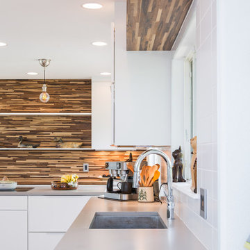
This project is an exhilarating exploration into function, simplicity, and the beauty of a white palette. Our wonderful client and friend was seeking a massive upgrade to a newly purchased home and had hopes of integrating her European inspired aesthetic throughout. At the forefront of consideration was clean-lined simplicity, and this concept is evident in every space in the home. The highlight of the project is the heart of the home: the kitchen. We integrated smooth, sleek, white slab cabinetry to create a functional kitchen with minimal door details and upgraded modernity. The cabinets are topped with concrete-look quartz from Caesarstone; a welcome soft contrast that further emphasizes the contemporary approach we took. The backsplash is a simple and elongated white subway paired against white grout for a modernist grid that virtually melts into the background. Taking the kitchen far outside of its intended footprint, we created a floating island with a waterfall countertop that can house critical cooking fixtures on one side and adequate seating on the other. The island is backed by a dramatic exotic wood countertop that extends into a full wall splash reaching the ceiling. Pops of black and high-gloss finishes in appliances add a touch of drama in an otherwise white field. The entire main level has new hickory floors in a natural finish, allowing the gorgeous variation of the wood to shine. Also included on the main level is a re-face to the living room fireplace, powder room, and upgrades to all walls and lighting. Upstairs, we created two critical retreats: a warm Mediterranean inspired bathroom for the client's mother, and the master bathroom. In the mother's bathroom, we covered the floors and a large accent wall with dramatic travertine tile in a bold Versailles pattern. We paired this highly traditional tile with sleek contemporary floating vanities and dark fixtures for contrast. The shower features a slab quartz base and thin profile glass door. In the master bath, we welcomed drama and explored space planning and material use adventurously. Keeping with the quiet monochromatic palette, we integrated all black and white into our bathroom concept. The floors are covered with large format graphic tiles in a deco pattern that reach through every part of the space. At the vanity area, high gloss white floating vanities offer separate space for his/her use. Tall linear LED fixtures provide ample lighting and illuminate another grid pattern backsplash that runs floor to ceiling. The show-stopping bathtub is a square steel soaker tub that nestles quietly between windows in the bathroom's far corner. We paired this tub with an unapologetic tub filler that is bold and large in scale. Next to the tub, an open shower is adorned with a full expanse of white grid subway tile, a slab quartz shower base, and sleek steel fixtures. This project was exciting and inspiring in its ability to push the boundaries of simplicity and quietude in color. We love the result and are so thrilled that our wonderful clients can enjoy this home for years to come!
Find the right local pro for your project
 TVL Creative Ltd.
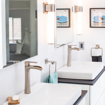
This project is an exhilarating exploration into function, simplicity, and the beauty of a white palette. Our wonderful client and friend was seeking a massive upgrade to a newly purchased home and had hopes of integrating her European inspired aesthetic throughout. At the forefront of consideration was clean-lined simplicity, and this concept is evident in every space in the home. The highlight of the project is the heart of the home: the kitchen. We integrated smooth, sleek, white slab cabinetry to create a functional kitchen with minimal door details and upgraded modernity. The cabinets are topped with concrete-look quartz from Caesarstone; a welcome soft contrast that further emphasizes the contemporary approach we took. The backsplash is a simple and elongated white subway paired against white grout for a modernist grid that virtually melts into the background. Taking the kitchen far outside of its intended footprint, we created a floating island with a waterfall countertop that can house critical cooking fixtures on one side and adequate seating on the other. The island is backed by a dramatic exotic wood countertop that extends into a full wall splash reaching the ceiling. Pops of black and high-gloss finishes in appliances add a touch of drama in an otherwise white field. The entire main level has new hickory floors in a natural finish, allowing the gorgeous variation of the wood to shine. Also included on the main level is a re-face to the living room fireplace, powder room, and upgrades to all walls and lighting. Upstairs, we created two critical retreats: a warm Mediterranean inspired bathroom for the client's mother, and the master bathroom. In the mother's bathroom, we covered the floors and a large accent wall with dramatic travertine tile in a bold Versailles pattern. We paired this highly traditional tile with sleek contemporary floating vanities and dark fixtures for contrast. The shower features a slab quartz base and thin profile glass door. In the master bath, we welcomed drama and explored space planning and material use adventurously. Keeping with the quiet monochromatic palette, we integrated all black and white into our bathroom concept. The floors are covered with large format graphic tiles in a deco pattern that reach through every part of the space. At the vanity area, high gloss white floating vanities offer separate space for his/her use. Tall linear LED fixtures provide ample lighting and illuminate another grid pattern backsplash that runs floor to ceiling. The show-stopping bathtub is a square steel soaker tub that nestles quietly between windows in the bathroom's far corner. We paired this tub with an unapologetic tub filler that is bold and large in scale. Next to the tub, an open shower is adorned with a full expanse of white grid subway tile, a slab quartz shower base, and sleek steel fixtures. This project was exciting and inspiring in its ability to push the boundaries of simplicity and quietude in color. We love the result and are so thrilled that our wonderful clients can enjoy this home for years to come!
 Drury Design
The Setup
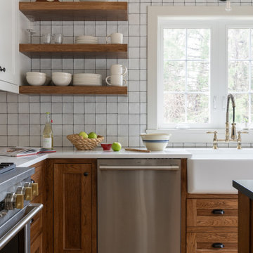
The homeowners of this Barrington Hills residence approached Drury Design with a clear vision: transform their existing kitchen into a space that would better serve their active family of four. With two young children who are homeschooled and love to bake with their mom, plus two dogs, this kitchen needed to function as the true heart of the home.
The existing kitchen was functional but didn’t maximize the potential of the beautiful natural light and scenic views available through the floor-to-ceiling windows. The space was locked between the dining room and family room, which limited structural modifications, but the homeowners wanted to create a more family-friendly environment that would complement the warm walnut built-ins and furnishings in the adjacent dining room while staying true to the home’s overall aesthetic.
Design Objectives:
Create a highly functional workspace that accommodates multiple family members cooking and gathering simultaneously
Maximize the connection to the beautiful outdoor scenery and natural light through thoughtful design choices
Establish a cohesive color palette that complements the existing walnut elements in the adjacent dining room without becoming too tone-on-tone (aka “matchy matchy”)
Improve the seating arrangement to take advantage of the stunning views (rather than facing away from the windows)
Work within the existing architectural constraints, including a curved soffit that could not be removed
Increase storage capacity while maintaining clean, uncluttered sightlines throughout the space
Design Challenges:
The curved soffit presented a design dilemma of whether to echo the curve throughout the kitchen or work with it in a more subtle way
The relatively low ceiling height required careful consideration to avoid making the space feel cramped or cave-like
The existing hardwood floor could not be refinished, which meant the new kitchen footprint had to match or exceed the original layout exactly
Finding the right balance of warm and neutral tones to complement both the existing walnut elements nearby and the natural outdoor views proved challenging
The refrigerator placement was constrained by door swing requirements, which affected the entire layout and prevented centering the sink on the back wall
Rethinking the original seating, which faced inward toward the kitchen (turning backs to the beautiful windows and outdoor views)
Pendant lighting from the previous kitchen obstructed views to the outdoors despite the abundant natural light available
The Renewed Space
Design Solutions:
The curved soffit was embraced subtly through the full slab backsplash, which echoes the curve without requiring curved cabinetry or architectural elements that might feel forced
Low ceiling challenges were addressed by using lighter painted cabinets for some tall elements, including the double oven, pantries, and refrigerator area, creating an airy feel while reserving the darker stained walnut for the center section and island
The floor constraint was managed by designing the new layout to cover all previously unfinished areas while maintaining the exact footprint, with only minor touch-ups needed in a few areas
The color palette balances warm walnut stain (harmonizing with the dining room built-ins) with soft, neutral painted cabinets – avoiding stark white that wouldn’t complement the home’s warm aesthetic
Refrigerator placement was optimized with a slim pullout pantry to the left, allowing proper door clearance while maintaining the desired layout flow and enabling the main pantry to be positioned adjacently
The seating was completely reimagined with a built-in banquette facing the windows, allowing diners to enjoy the outdoor views while providing flexible seating for two to four people
Decorative pendant lighting was eliminated in favor of recessed can lights, preserving the unobstructed views to the beautiful outdoor scenery
This kitchen transformation demonstrates how thoughtful design can dramatically improve functionality for a busy family while honoring existing architectural elements. The children immediately began cooking and baking with their mother in the new space, and the window-facing banquette has become a favorite gathering spot where the family can enjoy both meals and the beautiful outdoor views.
 Walczak Design And Build
After years of dedication and anticipation, our clients embarked on their dream renovation project as they approached retirement. Their vision? A cozy yet elegant space nestled in the picturesque coastal town of Ipswich, MA. With the help of Betsy at Hutton Home Design, our skilled team, and many trade partners, our client’s vision became a reality.
We built them a custom, one-bedroom accessory dwelling unit (ADU) over the garage of their daughter and son-in-law's home. The heating and cooling system consisted of mini split units. We cantilevered the second floor to add space to the kitchen, making the room seem larger. We created a functional and beautiful space within the zoning constraints of 900 square feet. All the while, careful consideration was given to scale and ensuring the addition looked like an extension of the existing home.
The completed renovation exceeded all expectations, providing the couple with a perfect haven when they embark on their retirement journey.
The newly renovated space boasts:
Shared foyer with white oak stairs and floors throughout
Custom kitchen with hickory island, vaulted ceilings with white oak beam and access to their shared deck
Living room with gas fireplace
Convenient laundry space
Spacious bathroom with curbless shower and custom vanity
Bright bedroom with his and her closets
Plenty of storage via a pantry, laundry closet, coat closet and cleaning supply closet
 MAKHNO studio
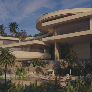
The hotel's architectural design blends sculptural forms with fluid lines, creating a harmonious balance between modern aesthetics and the natural landscape. Each structure features rounded contours that echo the organic shapes found in nature, while expansive glass facades invite the outside in, offering panoramic views of the lush surroundings. The integration of natural materials, such as stone and wood, with contemporary concrete forms, emphasizes a luxurious yet environmentally considerate approach to resort design.
 Klopf Architecture
From Mid-Century Classic to the Present
An iconic design updated with comfort, function, and flow for today.
A Remodel That Balances Past and Present
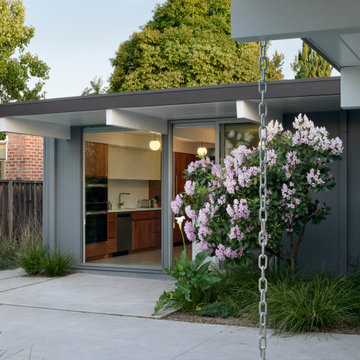
What started as a desire to update a classic Eichler soon became an exploration of how Mid-Century Modern design can successfully evolve for today. The client, a tech professional with a passion for scuba diving and underwater photography, wanted a home that would both honor its original character and feel tailored to his daily life. A lifelong technology enthusiast, he still owns the very first Mac desktop he saved up for as a teenager working at Radio Shack, a detail that underscores his appreciation for design that melds function and form.
Honoring Separation While Expanding Possibility
Unlike many contemporary remodels where walls are opened up to create expansive living spaces, this project took a more restrained approach. The client valued the defined rooms of the original plan and wanted to preserve as much wall space as possible for displaying his large-format underwater photography. The emphasis was not on dramatic spatial reinvention, but on thoughtful refinements. Klopf Architecture shaped a gallery-like backdrop while also expanding the primary suite, modernizing materials and fixtures throughout the home, and improving the functionality and layout of the kitchen. The finished home feels at once timeless and renewed, an Eichler that continues to inspire while fully supporting the lifestyle of its present-day owner.
A major turning point came mid-design. The original project brief had not included an addition, but as the reconfiguration of the primary bedroom and bath unfolded, it became clear that an expansion was the best approach to achieve the client’s vision of a more spacious suite. Fortunately, the adjustment came at a stage when revisions were still manageable and was integrated seamlessly, showing how thoughtful course corrections can strengthen a project rather than hinder it.
Navigating Challenges With Precision
The design development included multiple conceptual rounds, balancing preservation with subtle expansion. During construction, an existing post previously thought to be load-bearing turned out not to be. The structural engineer was able to pivot quickly, and both the post and the cross beam that had been intended to replace it could be omitted, allowing the original rhythm of the Eichler beam bays to be preserved.
Sustainability was not just a checklist item, but a way to align the home with the client’s values of simplicity, efficiency, and long-term functionality. R-38 roof insulation reduced energy usage, solar panels with battery storage provided independence and resilience, and passive comfort strategies eliminated the need forenergy-intensive air conditioning. An electric vehicle charger and an on-demand hot water recirculation system (with call buttons as opposed to having constant circulation) add to the home’s long-term efficiency factors. Together, these moves created a home that is quieter, more comfortable, and better equipped for the future, qualities that supported the client’s pragmatic approach to design and living lightly.
Details That Respect the Eichler DNA
The remodel carries forward the Eichler’s original spirit while introducing new layers of modern livability. Originally, the house was approached along a deep, narrow walk, with the garage on one side and the house on the other, leaving the front door tucked far back within this chasm-like space. By pulling the entry forward, the design reshaped the arrival experience, creating a clearer threshold and a natural drop-off zone for bags, shoes, and keys. This shift also made room for a custom bench at the entry that extends seamlessly through the glass sidelight. The bench and drop-off zone now work together as a single, integrated sequence that supports everyday living while offering a tactile reminder of Eichler’s philosophy of connectedness.
At the client’s request, Klopf reintroduced a classic Eichler gesture by extending the exterior siding into the entry and living room. The detail reinforces a sense of indoor/outdoor continuity while providing a subtle architectural surface that allows the client’s photography to take visual precedence.
The signature concrete masonry wall at the front was reconstructed using blocks sourced to match the originals, now strengthened with rebar for seismic resilience while maintaining a private outdoor courtyard, visually extending the kitchen outward. A decorative trellis element, a detail borrowed from a neighboring Eichler, restores a familiar mid-century modern architectural motif. At the courtyard entry door, a custom etched glass sidelight with an ocean-themed design featuring kelp and jellyfish serves as a subtle homage to the client’s passion for deep-sea diving.
Landscaping became an integral part of the overall transformation. The homeowner engaged landscape architect Randi Johnsen of Third Nature Studio to shape a series of calm, inviting outdoor rooms that read as a natural extension of the interiors. While technically outside of the core construction scope, the landscape design proved central to achieving a sense of completeness and connectedness across the property. Such whole-property considerations often emerge as design ideas take shape, underscoring the importance of flexibility in planning and budgeting, as well as close collaboration among the design team starting early in the process.
The Value of Evolving Scope
As with many custom residential projects, the scope evolved during the design process. What began as a targeted remodel grew to include a new/expanded primary suite, a rebuilt CMU patio wall for strength and longevity, and a solar panel array and battery storage for energy resilience and carbon-reduction. Each thoughtful decision represented a conscious investment in the home’s performance and character, rather than a cost overrun.
The result was a project delivered on schedule, tailored precisely to the client’s lifestyle, and positioned to add long-term value both functionally and aesthetically. By embracing scope evolution as an opportunity rather than a challenge, and relying on good design paired with transparent communication, this remodel demonstrates how Eichler homes can be adapted for contemporary living without erasing their DNA.
Klopf Architecture project team: John Klopf, AIA, and Klara Kevane, Elise Webb and Nicholas LaNasa.
Contractor: Golden Cove Construction
Landscape Design: Third Nature Studio
Structural Engineer: Daniel Bastiao Design
Photography: ©2025 Mariko Reed
Year Completed: 2024
Location: Sunnyvale, CA
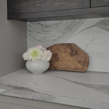 Drury Design
The Setup
The homeowners of this Barrington Hills residence approached Drury Design with a clear vision: transform their existing kitchen into a space that would better serve their active family of four. With two young children who are homeschooled and love to bake with their mom, plus two dogs, this kitchen needed to function as the true heart of the home.
The existing kitchen was functional but didn’t maximize the potential of the beautiful natural light and scenic views available through the floor-to-ceiling windows. The space was locked between the dining room and family room, which limited structural modifications, but the homeowners wanted to create a more family-friendly environment that would complement the warm walnut built-ins and furnishings in the adjacent dining room while staying true to the home’s overall aesthetic.
Design Objectives:
Create a highly functional workspace that accommodates multiple family members cooking and gathering simultaneously
Maximize the connection to the beautiful outdoor scenery and natural light through thoughtful design choices
Establish a cohesive color palette that complements the existing walnut elements in the adjacent dining room without becoming too tone-on-tone (aka “matchy matchy”)
Improve the seating arrangement to take advantage of the stunning views (rather than facing away from the windows)
Work within the existing architectural constraints, including a curved soffit that could not be removed
Increase storage capacity while maintaining clean, uncluttered sightlines throughout the space
Design Challenges:
The curved soffit presented a design dilemma of whether to echo the curve throughout the kitchen or work with it in a more subtle way
The relatively low ceiling height required careful consideration to avoid making the space feel cramped or cave-like
The existing hardwood floor could not be refinished, which meant the new kitchen footprint had to match or exceed the original layout exactly
Finding the right balance of warm and neutral tones to complement both the existing walnut elements nearby and the natural outdoor views proved challenging
The refrigerator placement was constrained by door swing requirements, which affected the entire layout and prevented centering the sink on the back wall
Rethinking the original seating, which faced inward toward the kitchen (turning backs to the beautiful windows and outdoor views)
Pendant lighting from the previous kitchen obstructed views to the outdoors despite the abundant natural light available
The Renewed Space
Design Solutions:
The curved soffit was embraced subtly through the full slab backsplash, which echoes the curve without requiring curved cabinetry or architectural elements that might feel forced
Low ceiling challenges were addressed by using lighter painted cabinets for some tall elements, including the double oven, pantries, and refrigerator area, creating an airy feel while reserving the darker stained walnut for the center section and island
The floor constraint was managed by designing the new layout to cover all previously unfinished areas while maintaining the exact footprint, with only minor touch-ups needed in a few areas
The color palette balances warm walnut stain (harmonizing with the dining room built-ins) with soft, neutral painted cabinets – avoiding stark white that wouldn’t complement the home’s warm aesthetic
Refrigerator placement was optimized with a slim pullout pantry to the left, allowing proper door clearance while maintaining the desired layout flow and enabling the main pantry to be positioned adjacently
The seating was completely reimagined with a built-in banquette facing the windows, allowing diners to enjoy the outdoor views while providing flexible seating for two to four people
Decorative pendant lighting was eliminated in favor of recessed can lights, preserving the unobstructed views to the beautiful outdoor scenery
This kitchen transformation demonstrates how thoughtful design can dramatically improve functionality for a busy family while honoring existing architectural elements. The children immediately began cooking and baking with their mother in the new space, and the window-facing banquette has become a favorite gathering spot where the family can enjoy both meals and the beautiful outdoor views.
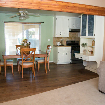
 Staging Beautifully
Kim Roberts, owner of Staging Beautifully, has a passion for creating beautiful spaces. From home staging to redecorating, Kim’s relaxed and friendly approach make even the most challenging project fun and enjoyable.
For those interested in refreshing their space, Staging Beautifully can assist a homeowner in decorating their home with the items they already own and love. Like staging, redesign may include color selection, rearranging furniture, hanging art and placing accessories. It is a cost effective design alternative which will give your home a facelift without the cost of an Interior Designer. Utilizing your furnishings and treasures, we will shop your home to find new and creative ways to display your family’s possessions. This will result in a complete interior transformation which will reflect your personality, style, comfort and functionality to your living space without having to buy anything.
Looking to sell your home, consider home staging to target a higher selling price. Home Staging aims to de-personalize your home and make it appealing to virtually all prospective buyers. The way you live in your home and the way you market your home are two very different things. Your home is competing with every other home on the market. A home that looks like it needs work or isn't move-in ready prompts buyers to low-ball their offers, or eliminate your home from consideration all together. Those homes that are staged to reflect current trends attract and appeal to more buyers, resulting in more offers, faster sales, and higher sale prices. Sometimes, an agent may even recommend your price be increased once your home is staged! A well-staged home can even start a bidding war with multiple offers!
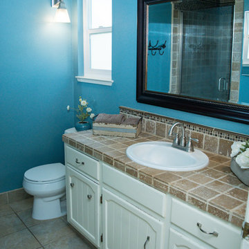 Staging Beautifully
Kim Roberts, owner of Staging Beautifully, has a passion for creating beautiful spaces. From home staging to redecorating, Kim’s relaxed and friendly approach make even the most challenging project fun and enjoyable.
For those interested in refreshing their space, Staging Beautifully can assist a homeowner in decorating their home with the items they already own and love. Like staging, redesign may include color selection, rearranging furniture, hanging art and placing accessories. It is a cost effective design alternative which will give your home a facelift without the cost of an Interior Designer. Utilizing your furnishings and treasures, we will shop your home to find new and creative ways to display your family’s possessions. This will result in a complete interior transformation which will reflect your personality, style, comfort and functionality to your living space without having to buy anything.
Looking to sell your home, consider home staging to target a higher selling price. Home Staging aims to de-personalize your home and make it appealing to virtually all prospective buyers. The way you live in your home and the way you market your home are two very different things. Your home is competing with every other home on the market. A home that looks like it needs work or isn't move-in ready prompts buyers to low-ball their offers, or eliminate your home from consideration all together. Those homes that are staged to reflect current trends attract and appeal to more buyers, resulting in more offers, faster sales, and higher sale prices. Sometimes, an agent may even recommend your price be increased once your home is staged! A well-staged home can even start a bidding war with multiple offers!
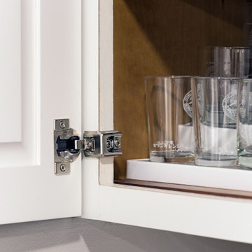
 The Creative Kitchen Company
We love being able to turn a drab, not-so-functional kitchen into something fresh, functional and beautiful and that's just what we did here – all within a limited budget (but unlimited imagination). With the word "creative" at the cornerstone of our name, this is how we approach every project, including this one. Hearing this clients storage needs and space concerns we were able to open everything up considerably and add some great new features to make this overall a brighter more thoughtful space.
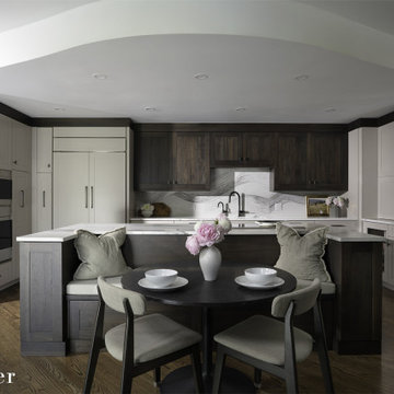 Drury Design
The Setup
The homeowners of this Barrington Hills residence approached Drury Design with a clear vision: transform their existing kitchen into a space that would better serve their active family of four. With two young children who are homeschooled and love to bake with their mom, plus two dogs, this kitchen needed to function as the true heart of the home.
The existing kitchen was functional but didn’t maximize the potential of the beautiful natural light and scenic views available through the floor-to-ceiling windows. The space was locked between the dining room and family room, which limited structural modifications, but the homeowners wanted to create a more family-friendly environment that would complement the warm walnut built-ins and furnishings in the adjacent dining room while staying true to the home’s overall aesthetic.
Design Objectives:
Create a highly functional workspace that accommodates multiple family members cooking and gathering simultaneously
Maximize the connection to the beautiful outdoor scenery and natural light through thoughtful design choices
Establish a cohesive color palette that complements the existing walnut elements in the adjacent dining room without becoming too tone-on-tone (aka “matchy matchy”)
Improve the seating arrangement to take advantage of the stunning views (rather than facing away from the windows)
Work within the existing architectural constraints, including a curved soffit that could not be removed
Increase storage capacity while maintaining clean, uncluttered sightlines throughout the space
Design Challenges:
The curved soffit presented a design dilemma of whether to echo the curve throughout the kitchen or work with it in a more subtle way
The relatively low ceiling height required careful consideration to avoid making the space feel cramped or cave-like
The existing hardwood floor could not be refinished, which meant the new kitchen footprint had to match or exceed the original layout exactly
Finding the right balance of warm and neutral tones to complement both the existing walnut elements nearby and the natural outdoor views proved challenging
The refrigerator placement was constrained by door swing requirements, which affected the entire layout and prevented centering the sink on the back wall
Rethinking the original seating, which faced inward toward the kitchen (turning backs to the beautiful windows and outdoor views)
Pendant lighting from the previous kitchen obstructed views to the outdoors despite the abundant natural light available
The Renewed Space
Design Solutions:
The curved soffit was embraced subtly through the full slab backsplash, which echoes the curve without requiring curved cabinetry or architectural elements that might feel forced
Low ceiling challenges were addressed by using lighter painted cabinets for some tall elements, including the double oven, pantries, and refrigerator area, creating an airy feel while reserving the darker stained walnut for the center section and island
The floor constraint was managed by designing the new layout to cover all previously unfinished areas while maintaining the exact footprint, with only minor touch-ups needed in a few areas
The color palette balances warm walnut stain (harmonizing with the dining room built-ins) with soft, neutral painted cabinets – avoiding stark white that wouldn’t complement the home’s warm aesthetic
Refrigerator placement was optimized with a slim pullout pantry to the left, allowing proper door clearance while maintaining the desired layout flow and enabling the main pantry to be positioned adjacently
The seating was completely reimagined with a built-in banquette facing the windows, allowing diners to enjoy the outdoor views while providing flexible seating for two to four people
Decorative pendant lighting was eliminated in favor of recessed can lights, preserving the unobstructed views to the beautiful outdoor scenery
This kitchen transformation demonstrates how thoughtful design can dramatically improve functionality for a busy family while honoring existing architectural elements. The children immediately began cooking and baking with their mother in the new space, and the window-facing banquette has become a favorite gathering spot where the family can enjoy both meals and the beautiful outdoor views.
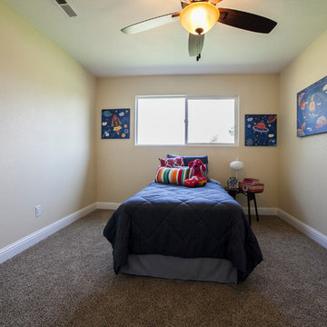 Staging Beautifully
Kim Roberts, owner of Staging Beautifully, has a passion for creating beautiful spaces. From home staging to redecorating, Kim’s relaxed and friendly approach make even the most challenging project fun and enjoyable.
For those interested in refreshing their space, Staging Beautifully can assist a homeowner in decorating their home with the items they already own and love. Like staging, redesign may include color selection, rearranging furniture, hanging art and placing accessories. It is a cost effective design alternative which will give your home a facelift without the cost of an Interior Designer. Utilizing your furnishings and treasures, we will shop your home to find new and creative ways to display your family’s possessions. This will result in a complete interior transformation which will reflect your personality, style, comfort and functionality to your living space without having to buy anything.
Looking to sell your home, consider home staging to target a higher selling price. Home Staging aims to de-personalize your home and make it appealing to virtually all prospective buyers. The way you live in your home and the way you market your home are two very different things. Your home is competing with every other home on the market. A home that looks like it needs work or isn't move-in ready prompts buyers to low-ball their offers, or eliminate your home from consideration all together. Those homes that are staged to reflect current trends attract and appeal to more buyers, resulting in more offers, faster sales, and higher sale prices. Sometimes, an agent may even recommend your price be increased once your home is staged! A well-staged home can even start a bidding war with multiple offers!
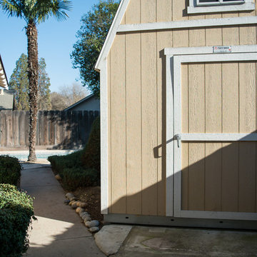 Staging Beautifully
Kim Roberts, owner of Staging Beautifully, has a passion for creating beautiful spaces. From home staging to redecorating, Kim’s relaxed and friendly approach make even the most challenging project fun and enjoyable.
For those interested in refreshing their space, Staging Beautifully can assist a homeowner in decorating their home with the items they already own and love. Like staging, redesign may include color selection, rearranging furniture, hanging art and placing accessories. It is a cost effective design alternative which will give your home a facelift without the cost of an Interior Designer. Utilizing your furnishings and treasures, we will shop your home to find new and creative ways to display your family’s possessions. This will result in a complete interior transformation which will reflect your personality, style, comfort and functionality to your living space without having to buy anything.
Looking to sell your home, consider home staging to target a higher selling price. Home Staging aims to de-personalize your home and make it appealing to virtually all prospective buyers. The way you live in your home and the way you market your home are two very different things. Your home is competing with every other home on the market. A home that looks like it needs work or isn't move-in ready prompts buyers to low-ball their offers, or eliminate your home from consideration all together. Those homes that are staged to reflect current trends attract and appeal to more buyers, resulting in more offers, faster sales, and higher sale prices. Sometimes, an agent may even recommend your price be increased once your home is staged! A well-staged home can even start a bidding war with multiple offers!
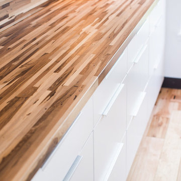 TVL Creative Ltd.
This project is an exhilarating exploration into function, simplicity, and the beauty of a white palette. Our wonderful client and friend was seeking a massive upgrade to a newly purchased home and had hopes of integrating her European inspired aesthetic throughout. At the forefront of consideration was clean-lined simplicity, and this concept is evident in every space in the home. The highlight of the project is the heart of the home: the kitchen. We integrated smooth, sleek, white slab cabinetry to create a functional kitchen with minimal door details and upgraded modernity. The cabinets are topped with concrete-look quartz from Caesarstone; a welcome soft contrast that further emphasizes the contemporary approach we took. The backsplash is a simple and elongated white subway paired against white grout for a modernist grid that virtually melts into the background. Taking the kitchen far outside of its intended footprint, we created a floating island with a waterfall countertop that can house critical cooking fixtures on one side and adequate seating on the other. The island is backed by a dramatic exotic wood countertop that extends into a full wall splash reaching the ceiling. Pops of black and high-gloss finishes in appliances add a touch of drama in an otherwise white field. The entire main level has new hickory floors in a natural finish, allowing the gorgeous variation of the wood to shine. Also included on the main level is a re-face to the living room fireplace, powder room, and upgrades to all walls and lighting. Upstairs, we created two critical retreats: a warm Mediterranean inspired bathroom for the client's mother, and the master bathroom. In the mother's bathroom, we covered the floors and a large accent wall with dramatic travertine tile in a bold Versailles pattern. We paired this highly traditional tile with sleek contemporary floating vanities and dark fixtures for contrast. The shower features a slab quartz base and thin profile glass door. In the master bath, we welcomed drama and explored space planning and material use adventurously. Keeping with the quiet monochromatic palette, we integrated all black and white into our bathroom concept. The floors are covered with large format graphic tiles in a deco pattern that reach through every part of the space. At the vanity area, high gloss white floating vanities offer separate space for his/her use. Tall linear LED fixtures provide ample lighting and illuminate another grid pattern backsplash that runs floor to ceiling. The show-stopping bathtub is a square steel soaker tub that nestles quietly between windows in the bathroom's far corner. We paired this tub with an unapologetic tub filler that is bold and large in scale. Next to the tub, an open shower is adorned with a full expanse of white grid subway tile, a slab quartz shower base, and sleek steel fixtures. This project was exciting and inspiring in its ability to push the boundaries of simplicity and quietude in color. We love the result and are so thrilled that our wonderful clients can enjoy this home for years to come!
 Modern Staging | Spaces
Listing Realtor: Geoffrey Grace
Photographer: Rob Howloka at Birdhouse Media
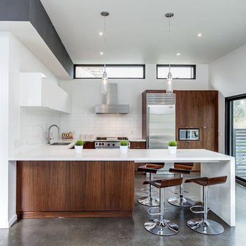
Kitchen - mid-sized contemporary u-shaped concrete floor and gray floor kitchen idea in Toronto with an undermount sink, flat-panel cabinets, dark wood cabinets, white backsplash, stainless steel appliances, a peninsula, solid surface countertops, ceramic backsplash and white countertops
Kitchen - mid-sized contemporary u-shaped concrete floor and gray floor kitchen idea in Toronto with an undermount sink, flat-panel cabinets, dark wood cabinets, white backsplash, stainless steel appliances, a peninsula, solid surface countertops, ceramic backsplash and white countertops
 MAKHNO studio
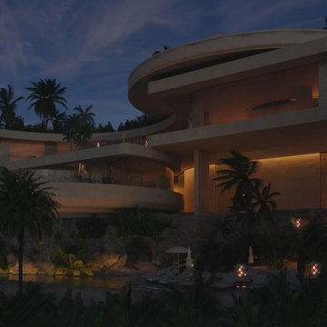
The hotel's architectural design blends sculptural forms with fluid lines, creating a harmonious balance between modern aesthetics and the natural landscape. Each structure features rounded contours that echo the organic shapes found in nature, while expansive glass facades invite the outside in, offering panoramic views of the lush surroundings. The integration of natural materials, such as stone and wood, with contemporary concrete forms, emphasizes a luxurious yet environmentally considerate approach to resort design.
 Echohousepainting
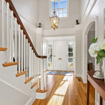
How does EchoHousePainting approach interior painting projects? The answer is short: seriously
We approach it seriously. Even though the interior of your home is not affected by weather conditions that much, we do a thorough assessment before we start working on your project.
We set up a meeting with you and talk about a few things before we proceed to work:
Your color and design preferences;
The color and style of your furniture;
The zoning and function of the room.
Most ultramodern houses we work within the Boston area need an individual approach in their maintaining and fixing. We treat every residential painting project differently and take into consideration the specific details of your property. Moreover, the preparation of any surface where we apply paint on is a priority to us. We want our work to last for a long time. We want to know that we did an impeccable job at your home. It makes us proud and satisfied to know we can guarantee quality. We feel humble and rewarded when our project becomes a visit card, recommending us to other potential customers.
 Staging Beautifully
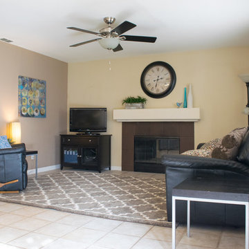
Kim Roberts, owner of Staging Beautifully, has a passion for creating beautiful spaces. From home staging to redecorating, Kim’s relaxed and friendly approach make even the most challenging project fun and enjoyable.
For those interested in refreshing their space, Staging Beautifully can assist a homeowner in decorating their home with the items they already own and love. Like staging, redesign may include color selection, rearranging furniture, hanging art and placing accessories. It is a cost effective design alternative which will give your home a facelift without the cost of an Interior Designer. Utilizing your furnishings and treasures, we will shop your home to find new and creative ways to display your family’s possessions. This will result in a complete interior transformation which will reflect your personality, style, comfort and functionality to your living space without having to buy anything.
Looking to sell your home, consider home staging to target a higher selling price. Home Staging aims to de-personalize your home and make it appealing to virtually all prospective buyers. The way you live in your home and the way you market your home are two very different things. Your home is competing with every other home on the market. A home that looks like it needs work or isn't move-in ready prompts buyers to low-ball their offers, or eliminate your home from consideration all together. Those homes that are staged to reflect current trends attract and appeal to more buyers, resulting in more offers, faster sales, and higher sale prices. Sometimes, an agent may even recommend your price be increased once your home is staged! A well-staged home can even start a bidding war with multiple offers!
9