
Search results for "Consolidate" in Home Design Ideas
 French Creek Designs Kitchen & Bath Design Center
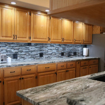
DIY Kitchen Splash project is fun and interesting. Client wanted to update their galley-style kitchen and chose to update with new countertops and backsplash. Furthermore, the choice of new granite with greys, blacks, and hints of green tones exquisitely marbled throughout the countertop is stunning. In addition, the client needed backsplash to enhance the colors in their granite. Working with a French Creek Kitchen Designer they found the right sample. Similarly, this glass and stone mix pulled together the tones from the granite and beautifully enhances their oak cabinets. Clients to do it yourself install their kitchen backsplash and successfully they did. Wow!
Kitchen Backsplash and countertops complete in Client Project Kitchen Update ~ Thank you for sharing!
Looking to do a DIY Kitchen Splash project shop our extensive affordable selection of mosaics and tile kitchen backsplashes. In effect choose from various glass, stone, encaustic, marble and other natural stone mosaics and tiles. No matter your style or color we have you covered.
When planning a kitchen renovation, start with a kitchen designer to assist in organizing, planning, and choosing the right cabinets, countertops, kitchen backsplash, tile, flooring and so much more. We have streamlined kitchen planning and design by consolidating the design process with material selection all in one place. Our designer will work with you to develop a kitchen design.
 French Creek Designs Kitchen & Bath Design Center
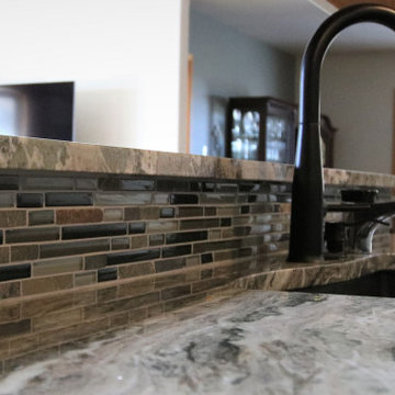
DIY Kitchen Splash project is fun and interesting. Client wanted to update their galley-style kitchen and chose to update with new countertops and backsplash. Furthermore, the choice of new granite with greys, blacks, and hints of green tones exquisitely marbled throughout the countertop is stunning. In addition, the client needed backsplash to enhance the colors in their granite. Working with a French Creek Kitchen Designer they found the right sample. Similarly, this glass and stone mix pulled together the tones from the granite and beautifully enhances their oak cabinets. Clients to do it yourself install their kitchen backsplash and successfully they did. Wow!
Kitchen Backsplash and countertops complete in Client Project Kitchen Update ~ Thank you for sharing!
Looking to do a DIY Kitchen Splash project shop our extensive affordable selection of mosaics and tile kitchen backsplashes. In effect choose from various glass, stone, encaustic, marble and other natural stone mosaics and tiles. No matter your style or color we have you covered.
When planning a kitchen renovation, start with a kitchen designer to assist in organizing, planning, and choosing the right cabinets, countertops, kitchen backsplash, tile, flooring and so much more. We have streamlined kitchen planning and design by consolidating the design process with material selection all in one place. Our designer will work with you to develop a kitchen design.

 Matt Fajkus Architecture
The Main Stay House exists as a straightforward proposal on an urban infill lot, paring down the components of a house to a minimal amount of planes and openings. The scheme is anchored by a modern entry sequence and a staircase volume, both clad in iron spot masonry externally and internally, creating thresholds between the respective realms of public, common and private, by minimal means. The masonry contrasts with an otherwise muted interior atmosphere of smooth, desaturated surfaces.
The entry sequence is a twist upon the conventional domestic front door, front facade, and fence. The front masonry wall replaces the typical residential fence and frames an indirect access to the front door, functioning as a privacy barrier while revealing slices of the interior to the public street.
The staircase bifurcates the layout to provide a clear division between the common and private zones of the house, while clearly reading as a mass from all outside view. Brick and glass become portals between common and private zones.
The design consolidates the service core along the west façade, allowing the structure to fully open the living zone to the pool court and existing trees. This directly connects interior and exterior, as well as human and nature. Freedom to vary the program or functional use of the area is enabled and strongly encouraged.
Photography: Twist Tours
Find the right local pro for your project
 Matt Fajkus Architecture
The Main Stay House exists as a straightforward proposal on an urban infill lot, paring down the components of a house to a minimal amount of planes and openings. The scheme is anchored by a modern entry sequence and a staircase volume, both clad in iron spot masonry externally and internally, creating thresholds between the respective realms of public, common and private, by minimal means. The masonry contrasts with an otherwise muted interior atmosphere of smooth, desaturated surfaces.
The entry sequence is a twist upon the conventional domestic front door, front facade, and fence. The front masonry wall replaces the typical residential fence and frames an indirect access to the front door, functioning as a privacy barrier while revealing slices of the interior to the public street.
The staircase bifurcates the layout to provide a clear division between the common and private zones of the house, while clearly reading as a mass from all outside view. Brick and glass become portals between common and private zones.
The design consolidates the service core along the west façade, allowing the structure to fully open the living zone to the pool court and existing trees. This directly connects interior and exterior, as well as human and nature. Freedom to vary the program or functional use of the area is enabled and strongly encouraged.
Photography: Charles Davis Smith

 Marlene Zeiger Design
A BIG Transformation ON A modest BUDGET:
This is the first phase of our work, which involves real deal transformation. Yes, the entry was in need of some love, along with some consolidating and simplifying. The client wanted to express her East Coast beach-y roots, and we wanted to do this without getting super theme-y.
We utilized sunny yellow and yellow-greens, along with colors of the sea. We created a cozy, warm and uber-inviting sitting area. The drapes were sewn through Warehouse Fabrics, Inc., doing a fabulous job creating custom treatments (a teal linen weave with yellow brush trim), within a very tight budget.
The seating was custom (Castellano Furniture of Portland); lime green chairs and a curvy sofa in yellow with that lime green welting & pillows. Also some playful Blue and yellow pillow fabric (Kravet) was the genuine inspiration for character and color scheme.
The rug, by FLOR of Portland (thanks Shaina) is meant to evoke a beach blanket. Oh, and the glass jar filled with sand and sand dollars. . . well, ok, we are giving a nod to the sea.
 Marlene Zeiger Design
A BIG Transformation ON A modest BUDGET:
This is the first phase of our work, which involves real deal transformation. Yes, the entry was in need of some love, along with some consolidating and simplifying. The client wanted to express her East Coast beach-y roots, and we wanted to do this without getting super theme-y.
We utilized sunny yellow and yellow-greens, along with colors of the sea. We created a cozy, warm and uber-inviting sitting area. The drapes were sewn through Warehouse Fabrics, Inc., doing a fabulous job creating custom treatments (a teal linen weave with yellow brush trim), within a very tight budget.
The seating was custom (Castellano Furniture of Portland); lime green chairs and a curvy sofa in yellow with that lime green welting & pillows. Also some playful Blue and yellow pillow fabric (Kravet) was the genuine inspiration for character and color scheme.
The rug, by FLOR of Portland (thanks Shaina) is meant to evoke a beach blanket. Oh, and the glass jar filled with sand and sand dollars. . . well, ok, we are giving a nod to the sea.
 Marlene Zeiger Design
A BIG Transformation ON A modest BUDGET:
This is the first phase of our work, which involves real deal transformation. Yes, the entry was in need of some love, along with some consolidating and simplifying. The client wanted to express her East Coast beach-y roots, and we wanted to do this without getting super theme-y.
We utilized sunny yellow and yellow-greens, along with colors of the sea. We created a cozy, warm and uber-inviting sitting area. The drapes were sewn through Warehouse Fabrics, Inc., doing a fabulous job creating custom treatments (a teal linen weave with yellow brush trim), within a very tight budget.
The seating was custom (Castellano Furniture of Portland); lime green chairs and a curvy sofa in yellow with that lime green welting & pillows. Also some playful Blue and yellow pillow fabric (Kravet) was the genuine inspiration for character and color scheme.
The rug, by FLOR of Portland (thanks Shaina) is meant to evoke a beach blanket. Oh, and the glass jar filled with sand and sand dollars. . . well, ok, we are giving a nod to the sea.

 Friel Lumber Company
The homeowners chose to install perimeter cabinets using Dynasty by Omega. They chose the Madrid door style, Cherry wood, and a truffle stain. As for the island cabinets, they wanted the Madrid door style and Maple wood and then opted for the Pearl paint. The countertops are quartz and the island is granite.
Before the renovation started, the homeowners selected Jenn-Air appliances, including an induction cooktop and built-in microwave oven with speed cook. Once the construction was underway, we removed the bulkheads to allow new cabinets that extended to the ceiling with two PC crown molding. This provided a cleaner, more modern look along with added storage for items that are occasionally used.
We also swapped the pantry and refrigerator location to open up space as you enter the kitchen from the garage. The redesign also gave the refrigerator a built-in look. Then, we moved the cooktop to the corner and installed stainless steel Zephyr range hood and beveled subway tile in a herringbone pattern. The backsplash and new cooktop turned the most used area of the kitchen into a design feature.
The addition of an enlarged island allows extra seating for up to four people. Moreover, island cabinets include two full-sized waste baskets for recycling and standard waste. The new farmhouse sink from Kohler not only looks and functions well but the drain is positioned at the rear corner. The plumbing in the cabinet below is consolidated to the back corner providing much more storage. Last, the built-in TV not only looks great but also reduces counter clutter. Plus, the drawer below the TV contains USB outlet for small personal device charging.
 Marlene Zeiger Design
A BIG Transformation ON A modest BUDGET:
This is the first phase of our work, which involves real deal transformation. Yes, the entry was in need of some love, along with some consolidating and simplifying. The client wanted to express her East Coast beach-y roots, and we wanted to do this without getting super theme-y.
We utilized sunny yellow and yellow-greens, along with colors of the sea. We created a cozy, warm and uber-inviting sitting area. The drapes were sewn through Warehouse Fabrics, Inc., doing a fabulous job creating custom treatments (a teal linen weave with yellow brush trim), within a very tight budget.
The seating was custom (Castellano Furniture of Portland); lime green chairs and a curvy sofa in yellow with that lime green welting & pillows. Also some playful Blue and yellow pillow fabric (Kravet) was the genuine inspiration for character and color scheme.
The rug, by FLOR of Portland (thanks Shaina) is meant to evoke a beach blanket. Oh, and the glass jar filled with sand and sand dollars. . . well, ok, we are giving a nod to the sea.

 Ehrlich Yanai Rhee Chaney Architects
The ground floor volumes wrapped in an elongated hand-fired brick, emphasizing the horizontality of the architecture that lays solidly on the land.
(Photography by: Matthew Millman)
 Matt Fajkus Architecture
The Main Stay House exists as a straightforward proposal on an urban infill lot, paring down the components of a house to a minimal amount of planes and openings. The scheme is anchored by a modern entry sequence and a staircase volume, both clad in iron spot masonry externally and internally, creating thresholds between the respective realms of public, common and private, by minimal means. The masonry contrasts with an otherwise muted interior atmosphere of smooth, desaturated surfaces.
The entry sequence is a twist upon the conventional domestic front door, front facade, and fence. The front masonry wall replaces the typical residential fence and frames an indirect access to the front door, functioning as a privacy barrier while revealing slices of the interior to the public street.
The staircase bifurcates the layout to provide a clear division between the common and private zones of the house, while clearly reading as a mass from all outside view. Brick and glass become portals between common and private zones.
The design consolidates the service core along the west façade, allowing the structure to fully open the living zone to the pool court and existing trees. This directly connects interior and exterior, as well as human and nature. Freedom to vary the program or functional use of the area is enabled and strongly encouraged.
Photography: Charles Davis Smith
 Marlene Zeiger Design
A BIG Transformation ON A modest BUDGET:
This is the first phase of our work, which involves real deal transformation. Yes, the entry was in need of some love, along with some consolidating and simplifying. The client wanted to express her East Coast beach-y roots, and we wanted to do this without getting super theme-y.
We utilized sunny yellow and yellow-greens, along with colors of the sea. We created a cozy, warm and uber-inviting sitting area. The drapes were sewn through Warehouse Fabrics, Inc., doing a fabulous job creating custom treatments (a teal linen weave with yellow brush trim), within a very tight budget.
The seating was custom (Castellano Furniture of Portland); lime green chairs and a curvy sofa in yellow with that lime green welting & pillows. Also some playful Blue and yellow pillow fabric (Kravet) was the genuine inspiration for character and color scheme.
The rug, by FLOR of Portland (thanks Shaina) is meant to evoke a beach blanket. Oh, and the glass jar filled with sand and sand dollars. . . well, ok, we are giving a nod to the sea.
 French Creek Designs Kitchen & Bath Design Center
Stunning Showcase Kitchen Remodel
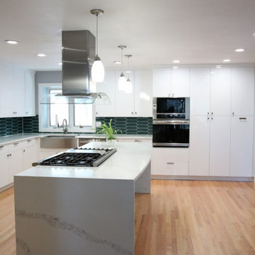
Acrylic Cabinetry is the stunning choice in this complete kitchen remodel. A high gloss finish that is smooth and highly reflective on these white acrylic cabinets is perfect. In addition, satin finishes for cabinet hardware including a satin stainless steel apron sink is breathtaking. In addition, to the stainless-steel appliances. The client wanted to use contrasting grey cabinetry for the island. Moreover, the island top and countertops is finished with a quartz marble-look. The island quartz countertops extend into a waterfall on both sides of the island. In essence, a dark teal picket mosaic was used for the kitchen backsplash running horizontally through the cabinets and picked up in the island. Finally, this kitchen has an abundant amount of storage with floor to ceiling cabinets. This kitchen is a remarkable showcase.
Client testimony is especially appreciated “We had a great experience. FCD redid our kitchen – taking it from the 1980s to the 2020s! They were professional and responsive throughout the process. The contractor did an amazing job. Quick and painless. Beautiful work!“
Kitchen cabinetry, cabinet hardware, countertops, sink, and backsplash complete in Client Project Kitchen Update ~ Thank you for sharing!
Kitchen Planning & Renovations
When planning a kitchen renovation, start with a kitchen designer to assist in organizing, planning. Designers assist in choosing the right cabinets, countertops, kitchen backsplash, tile, and flooring. In addition, remember to purchase your kitchen cabinet hardware for those finishing touches. Moreover, we have streamlined kitchen planning and design by consolidating the design process with material selection all in one place. Our designer will work with you to develop a kitchen design.

 Anchor Builders
Builder: Anchor Builders / Building design by Fluidesign Studio and Anchor Builders. Interior finishes by Fluidesign Studio. Plans drafted by Fluidesign Studio and Orfield Drafting / Photos: Seth Benn Photography
 Friel Lumber Company
The homeowners chose to install perimeter cabinets using Dynasty by Omega. They chose the Madrid door style, Cherry wood, and a truffle stain. As for the island cabinets, they wanted the Madrid door style and Maple wood and then opted for the Pearl paint. The countertops are quartz and the island is granite.
Before the renovation started, the homeowners selected Jenn-Air appliances, including an induction cooktop and built-in microwave oven with speed cook. Once the construction was underway, we removed the bulkheads to allow new cabinets that extended to the ceiling with two PC crown molding. This provided a cleaner, more modern look along with added storage for items that are occasionally used.
We also swapped the pantry and refrigerator location to open up space as you enter the kitchen from the garage. The redesign also gave the refrigerator a built-in look. Then, we moved the cooktop to the corner and installed stainless steel Zephyr range hood and beveled subway tile in a herringbone pattern. The backsplash and new cooktop turned the most used area of the kitchen into a design feature.
The addition of an enlarged island allows extra seating for up to four people. Moreover, island cabinets include two full-sized waste baskets for recycling and standard waste. The new farmhouse sink from Kohler not only looks and functions well but the drain is positioned at the rear corner. The plumbing in the cabinet below is consolidated to the back corner providing much more storage. Last, the built-in TV not only looks great but also reduces counter clutter. Plus, the drawer below the TV contains USB outlet for small personal device charging.
 Friel Lumber Company
The homeowners chose to install perimeter cabinets using Dynasty by Omega. They chose the Madrid door style, Cherry wood, and a truffle stain. As for the island cabinets, they wanted the Madrid door style and Maple wood and then opted for the Pearl paint. The countertops are quartz and the island is granite.
Before the renovation started, the homeowners selected Jenn-Air appliances, including an induction cooktop and built-in microwave oven with speed cook. Once the construction was underway, we removed the bulkheads to allow new cabinets that extended to the ceiling with two PC crown molding. This provided a cleaner, more modern look along with added storage for items that are occasionally used.
We also swapped the pantry and refrigerator location to open up space as you enter the kitchen from the garage. The redesign also gave the refrigerator a built-in look. Then, we moved the cooktop to the corner and installed stainless steel Zephyr range hood and beveled subway tile in a herringbone pattern. The backsplash and new cooktop turned the most used area of the kitchen into a design feature.
The addition of an enlarged island allows extra seating for up to four people. Moreover, island cabinets include two full-sized waste baskets for recycling and standard waste. The new farmhouse sink from Kohler not only looks and functions well but the drain is positioned at the rear corner. The plumbing in the cabinet below is consolidated to the back corner providing much more storage. Last, the built-in TV not only looks great but also reduces counter clutter. Plus, the drawer below the TV contains USB outlet for small personal device charging.
 Hillcrest Construction
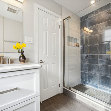
 designed and executed a complete facelift for these West Chester clients’ master bathroom. The sink/toilet/shower layout stayed relatively unchanged due to the limitations of the small space, but major changes were slated for the overall functionality and aesthetic appeal.
The bathroom was gutted completely, the wiring was updated, and minor plumbing alterations were completed for code compliance.
Bathroom waterproofing was installed utilizing the state-of-the-industry Schluter substrate products, and the feature wall of the shower is tiled with a striking blue 12x12 tile set in a stacked pattern, which is a departure of color and layout from the staggered gray-tome wall tile and floor tile.
The original bathroom lacked storage, and what little storage it had lacked practicality.
The original 1’ wide by 4’ deep “reach-in closet” was abandoned and replaced with a custom cabinetry unit that featured six 30” drawers to hold a world of personal bathroom items which could pulled out for easy access. The upper cubbie was shallower at 13” and was sized right to hold a few spare towels without the towels being lost to an unreachable area. The custom furniture-style vanity, also built and finished at the Hillcrest custom shop facilitated a clutter-free countertop with its two deep drawers, one with a u-shaped cut out for the sink plumbing. Considering the relatively small size of the bathroom, and the vanity’s proximity to the toilet, the drawer design allows for greater access to the storage area as compared to a vanity door design that would only be accessed from the front. The custom niche in the shower serves and a consolidated home for soap, shampoo bottles, and all other shower accessories.
Moen fixtures at the sink and in the shower and a Toto toilet complete the contemporary feel. The controls at the shower allow the user to easily switch between the fixed rain head, the hand shower, or both. And for a finishing touch, the client chose between a number for shower grate color and design options to complete their tailor-made sanctuary.
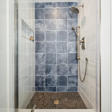 Hillcrest Construction
 designed and executed a complete facelift for these West Chester clients’ master bathroom. The sink/toilet/shower layout stayed relatively unchanged due to the limitations of the small space, but major changes were slated for the overall functionality and aesthetic appeal.
The bathroom was gutted completely, the wiring was updated, and minor plumbing alterations were completed for code compliance.
Bathroom waterproofing was installed utilizing the state-of-the-industry Schluter substrate products, and the feature wall of the shower is tiled with a striking blue 12x12 tile set in a stacked pattern, which is a departure of color and layout from the staggered gray-tome wall tile and floor tile.
The original bathroom lacked storage, and what little storage it had lacked practicality.
The original 1’ wide by 4’ deep “reach-in closet” was abandoned and replaced with a custom cabinetry unit that featured six 30” drawers to hold a world of personal bathroom items which could pulled out for easy access. The upper cubbie was shallower at 13” and was sized right to hold a few spare towels without the towels being lost to an unreachable area. The custom furniture-style vanity, also built and finished at the Hillcrest custom shop facilitated a clutter-free countertop with its two deep drawers, one with a u-shaped cut out for the sink plumbing. Considering the relatively small size of the bathroom, and the vanity’s proximity to the toilet, the drawer design allows for greater access to the storage area as compared to a vanity door design that would only be accessed from the front. The custom niche in the shower serves and a consolidated home for soap, shampoo bottles, and all other shower accessories.
Moen fixtures at the sink and in the shower and a Toto toilet complete the contemporary feel. The controls at the shower allow the user to easily switch between the fixed rain head, the hand shower, or both. And for a finishing touch, the client chose between a number for shower grate color and design options to complete their tailor-made sanctuary.


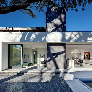 Matt Fajkus Architecture
The Main Stay House exists as a straightforward proposal on an urban infill lot, paring down the components of a house to a minimal amount of planes and openings. The scheme is anchored by a modern entry sequence and a staircase volume, both clad in iron spot masonry externally and internally, creating thresholds between the respective realms of public, common and private, by minimal means. The masonry contrasts with an otherwise muted interior atmosphere of smooth, desaturated surfaces.
The entry sequence is a twist upon the conventional domestic front door, front facade, and fence. The front masonry wall replaces the typical residential fence and frames an indirect access to the front door, functioning as a privacy barrier while revealing slices of the interior to the public street.
The staircase bifurcates the layout to provide a clear division between the common and private zones of the house, while clearly reading as a mass from all outside view. Brick and glass become portals between common and private zones.
The design consolidates the service core along the west façade, allowing the structure to fully open the living zone to the pool court and existing trees. This directly connects interior and exterior, as well as human and nature. Freedom to vary the program or functional use of the area is enabled and strongly encouraged.
Photography: Charles Davis Smith
31