
Search results for "Cracked window" in Home Design Ideas
 SurroundYou Design
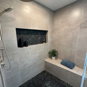
This primary bathroom remodel is a masterclass in balancing warmth and drama. A long, floating white oak vanity anchors the space, its clean flat-front drawer faces and natural wood grain bringing organic texture against the cool large-format gray tile flooring. The integrated white double sink countertop keeps the surface seamless and sleek.
The showstopper is the bold black pebble or cracked-pattern mosaic tile backsplash that runs the full length of the vanity - a striking contrast to the light wood tones and crisp white surfaces. Wall-mounted brushed nickel faucets keep the counter uncluttered while adding a refined, architectural touch.
A full-width frameless beveled mirror reflects natural light from two windows, making the space feel open and expansive. Floating wood shelves above the toilet echo the vanity's warm oak finish and provide styled open storage, keeping the aesthetic cohesive throughout.
Exposed painted beams on the shiplap ceiling connect this bathroom to the home's mid-century bones, while every finish and fixture feels thoroughly contemporary. The result is a spa-like primary bath that is both highly functional and visually stunning.
 In Detail Interiors
A master bedroom with rich color, texture and personality!
With a colorful master bathroom that blends the perfect matte finish, semi-primitive blast of pattern with rich, saturated jewel tones and a little calacatta gold tile – determining the best fabrics and finishes for the master bedroom felt like a HUGE challenge. How do you stand up to something so fabulously unique and still create a soft respite for someone to slumber?!
This bedroom was a small space with existing Vetrazzo floors and an entire wall dedicated to floor-to-ceiling fixed glass pane windows. Between the cracks in the plaster ceiling and the lacquered pink dresser we knew we had our work cut out.
Saturated colors create a fairy tale bedroom
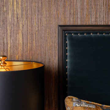
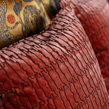
Fast forward to finding the perfect, sumptuously soft evergreen mohair for the headboard and furry tuffets for the foot of the bed. Texture became the name of the game and a certain level of color variation had to tie through from selection to selection. Cladding the walls with a gilt woven cloth wall covering that also pulled a sort of skin-tone clay from detail found in the Vetrazzo flooring (OMG! so pretty!) and grounding everything with a sort of deco-inspired one-of-a-kind wool rug. The layers of unexpected style helped develop a more collected – less stylized – feeling overall.
Then it was bye-bye to the pink lacquer! A local artisan worked on a faux finish for the custom dresser that the client had already invested in and we just gave it a refresh with a deep bronze finish. Balancing this piece with the playful silk tassel pendant lights that frame a beautiful original painting of red headed queens by artist Nancy Rhodes Harper.
Exquisite lighting for a sexy master bedroom
Additionally, the swirl and swoop of the forged metal light fixture overhead play off the more structured spinal-column type pattern of the black out window treatments that truly act as their own piece of art. Each element has its place and plays with the visual and textural aesthetics that make our client (and our team) swoon.
Want more colorful and moody interior spaces? Check out another one of our recent projects here! Then call us for more information on how we can help you! Read more about our full-service interior design here!
 SurroundYou Design
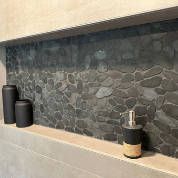
This primary bathroom remodel is a masterclass in balancing warmth and drama. A long, floating white oak vanity anchors the space, its clean flat-front drawer faces and natural wood grain bringing organic texture against the cool large-format gray tile flooring. The integrated white double sink countertop keeps the surface seamless and sleek.
The showstopper is the bold black pebble or cracked-pattern mosaic tile backsplash that runs the full length of the vanity - a striking contrast to the light wood tones and crisp white surfaces. Wall-mounted brushed nickel faucets keep the counter uncluttered while adding a refined, architectural touch.
A full-width frameless beveled mirror reflects natural light from two windows, making the space feel open and expansive. Floating wood shelves above the toilet echo the vanity's warm oak finish and provide styled open storage, keeping the aesthetic cohesive throughout.
Exposed painted beams on the shiplap ceiling connect this bathroom to the home's mid-century bones, while every finish and fixture feels thoroughly contemporary. The result is a spa-like primary bath that is both highly functional and visually stunning.
Find the right local pro for your project
 In Detail Interiors
A master bedroom with rich color, texture and personality!
With a colorful master bathroom that blends the perfect matte finish, semi-primitive blast of pattern with rich, saturated jewel tones and a little calacatta gold tile – determining the best fabrics and finishes for the master bedroom felt like a HUGE challenge. How do you stand up to something so fabulously unique and still create a soft respite for someone to slumber?!
This bedroom was a small space with existing Vetrazzo floors and an entire wall dedicated to floor-to-ceiling fixed glass pane windows. Between the cracks in the plaster ceiling and the lacquered pink dresser we knew we had our work cut out.
Saturated colors create a fairy tale bedroom
Fast forward to finding the perfect, sumptuously soft evergreen mohair for the headboard and furry tuffets for the foot of the bed. Texture became the name of the game and a certain level of color variation had to tie through from selection to selection. Cladding the walls with a gilt woven cloth wall covering that also pulled a sort of skin-tone clay from detail found in the Vetrazzo flooring (OMG! so pretty!) and grounding everything with a sort of deco-inspired one-of-a-kind wool rug. The layers of unexpected style helped develop a more collected – less stylized – feeling overall.
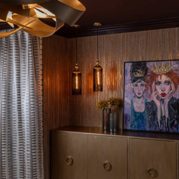
Then it was bye-bye to the pink lacquer! A local artisan worked on a faux finish for the custom dresser that the client had already invested in and we just gave it a refresh with a deep bronze finish. Balancing this piece with the playful silk tassel pendant lights that frame a beautiful original painting of red headed queens by artist Nancy Rhodes Harper.
Exquisite lighting for a sexy master bedroom
Additionally, the swirl and swoop of the forged metal light fixture overhead play off the more structured spinal-column type pattern of the black out window treatments that truly act as their own piece of art. Each element has its place and plays with the visual and textural aesthetics that make our client (and our team) swoon.
Want more colorful and moody interior spaces? Check out another one of our recent projects here! Then call us for more information on how we can help you! Read more about our full-service interior design here!
 Story Homes
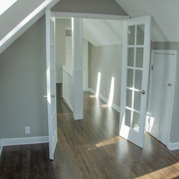
We Minnesotans understand that winters can be long, cold, and dark. Sunshine is a precious commodity in the middle of February. We designed the second-floor addition to let the sunshine in and make this the brightest room in the home.
Two skylights were added to the stair well, with three more in the new addition.
The second-floor landing was extended into the new space. Following the home’s existing architecture, this new 300 sq. ft. room features dormers with high-efficiency windows. Additional storage was created with several built-in closets in both the hallway and the addition.
These photos were taken in March. With all the skylights facing the South, you can imagine how bright this room will be year-round.
The remodeled staircase leads to the second floor and the new addition. The stair's risers, handrail, and banister are white, a master design detail that flows from the first floor to the second.
The stair treads and new room flooring are constructed with 1 ½ inch solid Red Oak, an excellent choice that soaks up sunshine and offers a complement to the light gray walls and white trim and accents.
I hate dusting. Doesn't everyone? The arrow above points to a place where dust can collect on mission-style railings, right at the crevice of the bottom of the stair railing. That severe crack makes it difficult to clean. On my projects (like the one above), the bottom rail straightens out and then connects to the banister at a right angle, eliminating the dust trap which is always hard to reach!
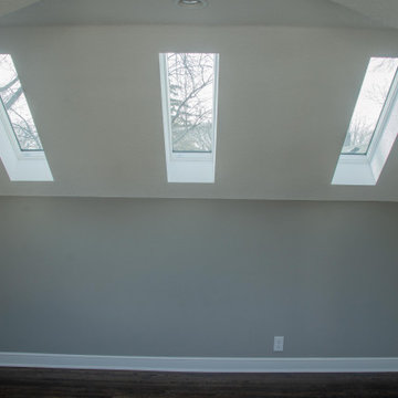 Story Homes
We Minnesotans understand that winters can be long, cold, and dark. Sunshine is a precious commodity in the middle of February. We designed the second-floor addition to let the sunshine in and make this the brightest room in the home.
Two skylights were added to the stair well, with three more in the new addition.
The second-floor landing was extended into the new space. Following the home’s existing architecture, this new 300 sq. ft. room features dormers with high-efficiency windows. Additional storage was created with several built-in closets in both the hallway and the addition.
These photos were taken in March. With all the skylights facing the South, you can imagine how bright this room will be year-round.
The remodeled staircase leads to the second floor and the new addition. The stair's risers, handrail, and banister are white, a master design detail that flows from the first floor to the second.
The stair treads and new room flooring are constructed with 1 ½ inch solid Red Oak, an excellent choice that soaks up sunshine and offers a complement to the light gray walls and white trim and accents.
I hate dusting. Doesn't everyone? The arrow above points to a place where dust can collect on mission-style railings, right at the crevice of the bottom of the stair railing. That severe crack makes it difficult to clean. On my projects (like the one above), the bottom rail straightens out and then connects to the banister at a right angle, eliminating the dust trap which is always hard to reach!
 SurroundYou Design
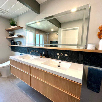
This primary bathroom remodel is a masterclass in balancing warmth and drama. A long, floating white oak vanity anchors the space, its clean flat-front drawer faces and natural wood grain bringing organic texture against the cool large-format gray tile flooring. The integrated white double sink countertop keeps the surface seamless and sleek.
The showstopper is the bold black pebble or cracked-pattern mosaic tile backsplash that runs the full length of the vanity - a striking contrast to the light wood tones and crisp white surfaces. Wall-mounted brushed nickel faucets keep the counter uncluttered while adding a refined, architectural touch.
A full-width frameless beveled mirror reflects natural light from two windows, making the space feel open and expansive. Floating wood shelves above the toilet echo the vanity's warm oak finish and provide styled open storage, keeping the aesthetic cohesive throughout.
Exposed painted beams on the shiplap ceiling connect this bathroom to the home's mid-century bones, while every finish and fixture feels thoroughly contemporary. The result is a spa-like primary bath that is both highly functional and visually stunning.

 Story Homes
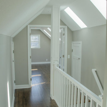
We Minnesotans understand that winters can be long, cold, and dark. Sunshine is a precious commodity in the middle of February. We designed the second-floor addition to let the sunshine in and make this the brightest room in the home.
Two skylights were added to the stair well, with three more in the new addition.
The second-floor landing was extended into the new space. Following the home’s existing architecture, this new 300 sq. ft. room features dormers with high-efficiency windows. Additional storage was created with several built-in closets in both the hallway and the addition.
These photos were taken in March. With all the skylights facing the South, you can imagine how bright this room will be year-round.
The remodeled staircase leads to the second floor and the new addition. The stair's risers, handrail, and banister are white, a master design detail that flows from the first floor to the second.
The stair treads and new room flooring are constructed with 1 ½ inch solid Red Oak, an excellent choice that soaks up sunshine and offers a complement to the light gray walls and white trim and accents.
I hate dusting. Doesn't everyone? The arrow above points to a place where dust can collect on mission-style railings, right at the crevice of the bottom of the stair railing. That severe crack makes it difficult to clean. On my projects (like the one above), the bottom rail straightens out and then connects to the banister at a right angle, eliminating the dust trap which is always hard to reach!
 SurroundYou Design
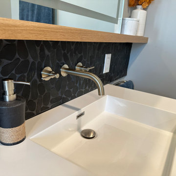
This primary bathroom remodel is a masterclass in balancing warmth and drama. A long, floating white oak vanity anchors the space, its clean flat-front drawer faces and natural wood grain bringing organic texture against the cool large-format gray tile flooring. The integrated white double sink countertop keeps the surface seamless and sleek.
The showstopper is the bold black pebble or cracked-pattern mosaic tile backsplash that runs the full length of the vanity - a striking contrast to the light wood tones and crisp white surfaces. Wall-mounted brushed nickel faucets keep the counter uncluttered while adding a refined, architectural touch.
A full-width frameless beveled mirror reflects natural light from two windows, making the space feel open and expansive. Floating wood shelves above the toilet echo the vanity's warm oak finish and provide styled open storage, keeping the aesthetic cohesive throughout.
Exposed painted beams on the shiplap ceiling connect this bathroom to the home's mid-century bones, while every finish and fixture feels thoroughly contemporary. The result is a spa-like primary bath that is both highly functional and visually stunning.

 We Make It Our Home
The living room was long and narrow but with an amazing bay window. Instead of a galley style living room used by the previous owner, we decided to change the furniture arrangement by putting one big comfy L-shaped sectional all the way to one side to create a pass-through area enabling a better foot traffic. We then added two side chairs for extra seats. We also mounted our TV on top of the fireplace to gain more space. Although it's not my favorite design choice to have TV on top of the fireplace because I think it takes away from the fireplace but we had to work within the limitation of the space.
For the fireplace, we bought wood stove insert and inserted it into the existing masonry fireplace. The look was updated by granite tiles around the insert and custom built wood mantel.
Buying wood fireplace insert was the best decision we made. First of all, it created a memorable space in our home. I LOVE the sound of wood cracking and the smell of wood burning. In winter nights we would sit around the fireplace and make s'mores like it's a campfire. Second, it's a clean burning and efficient heater. You don't lose the majority the fire’s heat up the chimney thereby saving money on your heating bill.
The coffee table is purchased from Wicker Emporium and it's made from reclaimed pine timbers giving the house a rustic feel.
The side chair by the fireplace is the perfect spot for me to relax, put my feet up on the large ball shaped knitted foot rest and enjoy a cup of cappuccino or cozy up with a good book.


 Drawing Dept
RVP Photography
Example of a trendy open concept concrete floor family room design in Cincinnati with white walls and no fireplace
Example of a trendy open concept concrete floor family room design in Cincinnati with white walls and no fireplace
 In Detail Interiors
A master bedroom with rich color, texture and personality!
With a colorful master bathroom that blends the perfect matte finish, semi-primitive blast of pattern with rich, saturated jewel tones and a little calacatta gold tile – determining the best fabrics and finishes for the master bedroom felt like a HUGE challenge. How do you stand up to something so fabulously unique and still create a soft respite for someone to slumber?!
This bedroom was a small space with existing Vetrazzo floors and an entire wall dedicated to floor-to-ceiling fixed glass pane windows. Between the cracks in the plaster ceiling and the lacquered pink dresser we knew we had our work cut out.
Saturated colors create a fairy tale bedroom
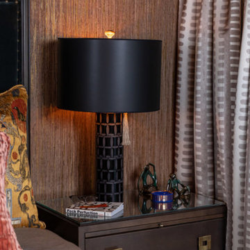
Fast forward to finding the perfect, sumptuously soft evergreen mohair for the headboard and furry tuffets for the foot of the bed. Texture became the name of the game and a certain level of color variation had to tie through from selection to selection. Cladding the walls with a gilt woven cloth wall covering that also pulled a sort of skin-tone clay from detail found in the Vetrazzo flooring (OMG! so pretty!) and grounding everything with a sort of deco-inspired one-of-a-kind wool rug. The layers of unexpected style helped develop a more collected – less stylized – feeling overall.
Then it was bye-bye to the pink lacquer! A local artisan worked on a faux finish for the custom dresser that the client had already invested in and we just gave it a refresh with a deep bronze finish. Balancing this piece with the playful silk tassel pendant lights that frame a beautiful original painting of red headed queens by artist Nancy Rhodes Harper.
Exquisite lighting for a sexy master bedroom
Additionally, the swirl and swoop of the forged metal light fixture overhead play off the more structured spinal-column type pattern of the black out window treatments that truly act as their own piece of art. Each element has its place and plays with the visual and textural aesthetics that make our client (and our team) swoon.
Want more colorful and moody interior spaces? Check out another one of our recent projects here! Then call us for more information on how we can help you! Read more about our full-service interior design here!
Sponsored
Galena, OH

Buckeye Restoration & Remodeling Inc.
Central Ohio's Premier Home Remodelers Since 1996
 In Detail Interiors
A master bedroom with rich color, texture and personality!
With a colorful master bathroom that blends the perfect matte finish, semi-primitive blast of pattern with rich, saturated jewel tones and a little calacatta gold tile – determining the best fabrics and finishes for the master bedroom felt like a HUGE challenge. How do you stand up to something so fabulously unique and still create a soft respite for someone to slumber?!
This bedroom was a small space with existing Vetrazzo floors and an entire wall dedicated to floor-to-ceiling fixed glass pane windows. Between the cracks in the plaster ceiling and the lacquered pink dresser we knew we had our work cut out.
Saturated colors create a fairy tale bedroom
Fast forward to finding the perfect, sumptuously soft evergreen mohair for the headboard and furry tuffets for the foot of the bed. Texture became the name of the game and a certain level of color variation had to tie through from selection to selection. Cladding the walls with a gilt woven cloth wall covering that also pulled a sort of skin-tone clay from detail found in the Vetrazzo flooring (OMG! so pretty!) and grounding everything with a sort of deco-inspired one-of-a-kind wool rug. The layers of unexpected style helped develop a more collected – less stylized – feeling overall.
Then it was bye-bye to the pink lacquer! A local artisan worked on a faux finish for the custom dresser that the client had already invested in and we just gave it a refresh with a deep bronze finish. Balancing this piece with the playful silk tassel pendant lights that frame a beautiful original painting of red headed queens by artist Nancy Rhodes Harper.
Exquisite lighting for a sexy master bedroom
Additionally, the swirl and swoop of the forged metal light fixture overhead play off the more structured spinal-column type pattern of the black out window treatments that truly act as their own piece of art. Each element has its place and plays with the visual and textural aesthetics that make our client (and our team) swoon.
Want more colorful and moody interior spaces? Check out another one of our recent projects here! Then call us for more information on how we can help you! Read more about our full-service interior design here!

 Sound Concrete Countertops
Colorful Kitchen Remodel in Tacoma WA. Custom made concrete countertops with an integral concrete kitchen sink
Example of an eclectic l-shaped eat-in kitchen design in Seattle with an integrated sink, flat-panel cabinets, white cabinets, concrete countertops, cement tile backsplash and stainless steel appliances
Example of an eclectic l-shaped eat-in kitchen design in Seattle with an integrated sink, flat-panel cabinets, white cabinets, concrete countertops, cement tile backsplash and stainless steel appliances


 Anita Buchheim Interiors
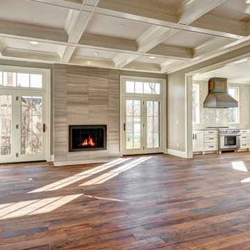
When old floor tile started to crack and the cramped tub was uncomfortable due to keeping your knees bent to fit, the clients knew they wanted an update. They are skiers and wanted the luxury of a jetted tub and steam shower to relax & pamper sore muscles. It was important to them to incorporate blue, their favorite color and sleek contemporary fixtures and interesting, one of kind finishes. Featuring chromotherapy, and surrounded by a deck of stunning Italian glass & mirrored floral mosaic tile, the jetted tub grabs your attention. A beautiful oversized contemporary pendant light fixture, featuring 60 hanging swirl crystal pieces and balls from a mirrored canopy, emerges from the ceiling highlighting the Palladian window and tub. The steam shower is surrounded by in relief circular contemporary wall tile. Large cream colored marble floor tile, mosaic floor for the shower and granite bench and counter tops complete the finishes. “His and Hers” Indigo Blue vanities anchor the door. Custom cut mirrors over the door and each vanity are surrounded by millwork that highlights the vanities. Crystal beaded sconces that appear to float on the mirrors complete the design.
Sponsored
Columbus, OH

Hope Restoration & General Contracting
Columbus Design-Build, Kitchen & Bath Remodeling, Historic Renovations
 Klopf Architecture
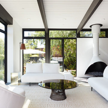
The Roger Lee designed house from 1962 was purchased by the current homeowners in almost original condition, as the previous owners elected to defer most maintenance projects over the years. The clients were able to see beyond the dated materials and finishes, single-paned glass and uninsulated walls and they approached Klopf Architecture to help them expand and update the entire home, one the family could settle into and enjoy for years to come. It was important that the new designs were aligned with Lee's original intent not only because of the client's appreciation for mid-century modern architecture, but also because the house was deemed historical. The Stanford Real Estate Office requires a stringent design review which safeguards the integrity of the community, which Klopf Architecture was happy to oblige going into their updated designs.
As with many original mid-century modern homes, the house was scaled to the 1960s lifestyle where rooms were smaller and openings to views were limited and tightly framed. The original conditions defined the direction the family of four would take in updating the house and making it comfortable for their modern lifestyle. Klopf designed a full gut remodel and major addition to bring the house into the 21st century and provide the living area needed for the client's family. The newly expanded house added just about 1,100 sf to create an airy, comfortable and family friendly house, taking full advantage of the beautiful southwestern views that extend out to the hills beyond. The enclosed garage created an additional 240 sf of covered space for long-term storage.
A cracked swimming pool created an eyesore taking up a majority of the backyard landscape, so it was one of the first elements to go during the transformation. Working with Outer Space Landscape Architects, the family asked for a mix of relaxing outdoor patio spaces that eventually blend into the native landscaping, extending their views outward toward the natural greenery of the trees beyond their property. Filling in the old pool was a smart way to expand the living spaces outward. The orientation of the house was designed to enjoy the views, but the original architecture provided the first homeowners with mere glimpses of the landscape outside.
Klopf was able to broaden those views, continuing and extending on the original architecture to take full advantage of the unobstructed natural views across the rear facade of the house. Small horizontal openings in the primary bedroom and office were replaced with much taller windows that now follow the angled roof line upward, extending across almost all of the facade. We worked with Western Windows, whose designs included an oblique-shaped, operable casement that allowed our design to rise with the slope. A new corner office added to the primary suite, offers a bright and functional work-from-home solution that looks out at the distant views and added natural light from the expanded window configuration that now wraps around the corner.
The existing lower level was designed by Lee as a utilitarian space, serving as a wet pool room with a drain in the center of the floor, bathroom, laundry and storage areas. Without the need for a pool room, Klopf was able to convert the area into a much more comfortable and functional living space with a new family room and guest suite. The new spaces enjoy easy access to a new outdoor patio through floor to ceiling, full-width glass sliders.
Continuing along the rear facade, a previously exposed deck extending from the living room and hallway provided access to the backyard through a single set of stairs leading toward the side of the house which made sense when the pool was in place. The new deck was re-envisioned as an extension of the main living room and now serves as a second outdoor living room. A new slatted pergola above provides the homeowners welcome relief from the hot afternoon sun. A second set of stairs now creates a better connection to the redesigned lower level. Klopf was able to reconfigure the spaces, extending the living room outward toward the views, where the family now claims it as the heart of the home, spending a large majority of their time outdoors.
Back inside, the original wood-burning Malm fireplace was beautifully restored and a gas burner installed to comply with California's strict air standards. It now rests in front of a wall of Heath accent tiles where a dated red brick wall used to stand. A new taller window brings more light and views into the refreshed interior living room. The original glass doors opposite the fireplace were replaced by larger sliders that when fully opened, create a seamless transition to the new outdoor living area so the two spaces feel like one connected space. The original utilitarian kitchen was needlessly tucked into the far back corner and closed-off, out of sight from the living room, so the clients asked Klopf to open it up and expand the kitchen forward so it felt more connected. Today the much larger kitchen is connected to the living area where a short wall with a cutout offers a visual glimpse into the kitchen and a handy pass-through counter for serving guests. A new breakfast nook was also added to create another spot where the family can gather for casual meals. Just outside, a new built-in outdoor grill and prep area extends the kitchen outside and connects to a new outdoor dining spot nestled amongst the trees, taking advantage of the views out back.
Klopf was able to expand the other two bedrooms, add a new laundry room and half-bath and convert the carport to an enclosed garage to add more storage areas which was lost when the pool house was converted to the family and guest room.
To maintain a historical connection to the original designs, the exterior siding was repeated on all exterior walls, a full-height stained glass window at the front entryway restored, and an interior slatted screen element repeated outside at the exterior entry courtyard and over the new outdoor living room to create a shade trellis. The new house stands proudly and shines against it's new landscaping features, while respecting and expanding on the original intent of Roger Lee's designs epitomizing the comforts of indoor-outdoor living in Northern California.
Completion year: 2020
Klopf Architecture project team: John Klopf, Klara Kevane, Noel Andrade
Contractor: ORB Construction, Brendan O'Reilly
Structural engineer: Sezen and Moon
Landscape architect: Outer space
Furnishings and decoration: Urbanism Designs
Photographer: Mariko Reed
 We Make It Our Home
The living room was long and narrow but with an amazing bay window. Instead of a galley style living room used by the previous owner, we decided to change the furniture arrangement by putting one big comfy L-shaped sectional all the way to one side to create a pass-through area enabling a better foot traffic. We then added two side chairs for extra seats. We also mounted our TV on top of the fireplace to gain more space. Although it's not my favorite design choice to have TV on top of the fireplace because I think it takes away from the fireplace but we had to work within the limitation of the space.
For the fireplace, we bought wood stove insert and inserted it into the existing masonry fireplace. The look was updated by granite tiles around the insert and custom built wood mantel.
Buying wood fireplace insert was the best decision we made. First of all, it created a memorable space in our home. I LOVE the sound of wood cracking and the smell of wood burning. In winter nights we would sit around the fireplace and make s'mores like it's a campfire. Second, it's a clean burning and efficient heater. You don't lose the majority the fire’s heat up the chimney thereby saving money on your heating bill.
The coffee table is purchased from Wicker Emporium and it's made from reclaimed pine timbers giving the house a rustic feel.
The side chair by the fireplace is the perfect spot for me to relax, put my feet up on the large ball shaped knitted foot rest and enjoy a cup of cappuccino or cozy up with a good book.


51