
Search results for "Creating interactive" in Home Design Ideas
 NanaWall
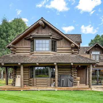
Originally built in 1892, this quaint log cabin has undergone a transformative renovation while preserving its charming character. Located near the Little Deschutes River in Central Oregon, within the historic Vandert Homestead, the home now boasts bright, open spaces for everyday living, complete with flexible aluminum clad folding doors.
Working alongside contractor Bales Inc., architect Jeff Klein from Klein Architecture led the renovation with the goal of opening the once dark interior to natural light and the surrounding landscape. Central to the design was transforming a deteriorating garage into a new functional sunroom, creating a light-filled space that reorients the cabin design toward the patio and natural environment.
Restoring a Historic Cabin with Aluminum Clad Folding Doors
outdoor living with aluminum clad folding door
A Revamped Cabin Design for Indoor-Outdoor Living
The former garage is now a transitional space between the cabin and a natural stone patio. Positioned along the south elevation, the sunroom captures daylight throughout the day while acting as a buffer between the interior and exterior environments. A revised roof assembly was developed to resolve previous drainage failures. Working with framers, the design team incorporated a sloping roof system with a waterproof membrane to direct water away from the structure.
This approach not only protected the log walls but also created access to a rooftop deck from the upper level, adding functional outdoor space without expanding the building footprint.
“It was also critical to transform the existing dark, segmented interior spaces by physically opening them up to the new sunroom,” says Klein. “NanaWall systems offered the ideal solution for what we were after.”
historical homestead interior
Improving Spatial Flow, From the Kitchen to the Sunroom
The kitchen remained largely intact during the renovation, retaining many of the elements that had defined the cabin’s character for decades. Features such as the farmhouse sink, concrete countertops, butcher-block island, and built-in seating were retained, creating a perfect blend of old and new.
What changed was how the kitchen connects to the surrounding rooms. The layout now flows naturally into an adjacent dining area before extending into the newly added sunroom, delivering a seamless transition from the interiors to the outdoors through aluminum clad folding doors.
Historic log cabin with clad folding doors and windows
A Light-Filled Sunroom Designed for Gatherings with Aluminum Clad Windows and Doors
The newly added sunroom became the centerpiece of the cabin design. Designed as a bright, welcoming space, it connects the historic cabin to the natural stone patio beyond. Interior designer Sue Olson helped create the room's atmosphere by choosing finishes and furnishings that complement the cabin's rustic materials while keeping the space open and inviting.
The sunroom captures sunlight throughout the day and serves as a flexible space for dining, relaxing, and entertaining. The addition was designed to sit comfortably alongside the existing log structure while introducing expansive glazing and aluminum clad folding doors that draw daylight deep into the home.
NanaWall aluminum clad folding doors and windows
Aluminum Clad Folding Doors Open the Sunroom to the Patio
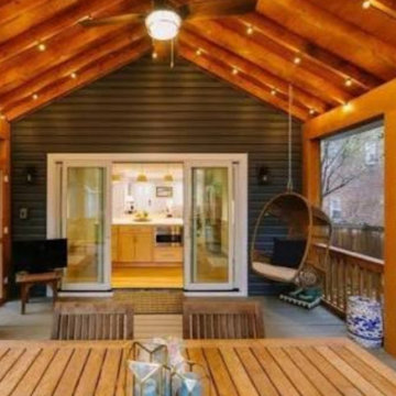
A NanaWall aluminum clad folding glass door opens the south wall of the sunroom, creating a direct connection to the natural stone patio. Spanning more than thirteen feet wide and nearly eight feet tall, the system allows the entire façade to open when the panels are folded back. Specified with pine wood frames and simulated divided lites, the door complements the cabin’s traditional materials while introducing the flexibility of modern indoor-outdoor living.
When closed, the door frames the view while bringing daylight into the sunroom. When open, the space seamlessly flows into the patio. Plus, customized with double glazed panels, these aluminum clad systems offer an insulated barrier that keeps cold weather out and keeps comfortable interiors year-round.
“The NanaWall system was the ideal solution for the proposed design,” says Klein. “The result is a seamless connection between the sheltered interior area and the openness of the outdoor environment.”
aluminum clad folding windows
A Folding Window Creates an Indoor-Outdoor Bar
Complementing the folding door and indoor-outdoor cabin design, a NanaWall aluminum clad folding window was installed at bar height along the sunroom wall facing the patio. Stretching more than thirteen feet across and just over four feet in height, the opening transforms the wall into a casual indoor-outdoor serving counter.
Specified with matching pine wood frames and simulated divided lites, the system folds away easily, creating an indoor-outdoor bar that encourages interaction between the sunroom and patio. When open, the counter becomes a flexible gathering point for meals, drinks, and conversation, allowing those inside and outside to share the space comfortably.
“The NanaWall door and window systems played a pivotal role in achieving our design objectives,” says Klein. “The connection between the indoor and outdoor environment has become seamless.”
inoor-outdoor living with clad folding windows and doors
The Flexible Design Solution for Every Home Style
Beyond creating large openings, the NanaWall aluminum clad folding doors were chosen for how well they integrate with the cabin’s traditional architecture while delivering modern functionality. The wood clad panels, specified with simulated divided lites, reflect the style and charm of classic window detailing, while panels that fold outward maximize usable space inside the cabin.
Minimal frames maximize glass area, drawing natural light deeper into the sunroom and adjacent spaces. Paired with higher weather performance sills, the systems are built to withstand the region’s climate while allowing the sunroom to shift easily between a sheltered interior space and an open-air extension of the patio.
Additionally, NanaWall aluminum clad systems feature clip-on cladding technology that allows the wood to breathe in environments where temperatures are extremely hot, humid, or cold. This, in turn, aligns with the renovation’s goal of resolving prior drainage and moisture issues.
outdoor living with NanaWall aluminum clad systems
Final Thoughts: Historic Cabin Design Reimagined for Modern Living
Today, the Vandevert Homestead perfectly blends old-time charm with modern living. The renovation maintains the historic character of the original log structure while introducing brighter, more connected spaces that better engage with the surrounding landscape.
With the transformation of the garage into a light-filled sunroom and flexible NanaWall aluminum clad folding doors, everyday living now flows naturally between the kitchen, dining area, sunroom, and patio. The result is a cabin that feels both timeless and renewed, where historic craftsmanship remains intact while the home experience is lighter, more open, and closely tied to the natural beauty of Central Oregon.
 NanaWall
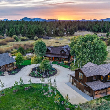
Originally built in 1892, this quaint log cabin has undergone a transformative renovation while preserving its charming character. Located near the Little Deschutes River in Central Oregon, within the historic Vandert Homestead, the home now boasts bright, open spaces for everyday living, complete with flexible aluminum clad folding doors.
Working alongside contractor Bales Inc., architect Jeff Klein from Klein Architecture led the renovation with the goal of opening the once dark interior to natural light and the surrounding landscape. Central to the design was transforming a deteriorating garage into a new functional sunroom, creating a light-filled space that reorients the cabin design toward the patio and natural environment.
Restoring a Historic Cabin with Aluminum Clad Folding Doors
outdoor living with aluminum clad folding door
A Revamped Cabin Design for Indoor-Outdoor Living
The former garage is now a transitional space between the cabin and a natural stone patio. Positioned along the south elevation, the sunroom captures daylight throughout the day while acting as a buffer between the interior and exterior environments. A revised roof assembly was developed to resolve previous drainage failures. Working with framers, the design team incorporated a sloping roof system with a waterproof membrane to direct water away from the structure.
This approach not only protected the log walls but also created access to a rooftop deck from the upper level, adding functional outdoor space without expanding the building footprint.
“It was also critical to transform the existing dark, segmented interior spaces by physically opening them up to the new sunroom,” says Klein. “NanaWall systems offered the ideal solution for what we were after.”
historical homestead interior
Improving Spatial Flow, From the Kitchen to the Sunroom
The kitchen remained largely intact during the renovation, retaining many of the elements that had defined the cabin’s character for decades. Features such as the farmhouse sink, concrete countertops, butcher-block island, and built-in seating were retained, creating a perfect blend of old and new.
What changed was how the kitchen connects to the surrounding rooms. The layout now flows naturally into an adjacent dining area before extending into the newly added sunroom, delivering a seamless transition from the interiors to the outdoors through aluminum clad folding doors.
Historic log cabin with clad folding doors and windows
A Light-Filled Sunroom Designed for Gatherings with Aluminum Clad Windows and Doors
The newly added sunroom became the centerpiece of the cabin design. Designed as a bright, welcoming space, it connects the historic cabin to the natural stone patio beyond. Interior designer Sue Olson helped create the room's atmosphere by choosing finishes and furnishings that complement the cabin's rustic materials while keeping the space open and inviting.
The sunroom captures sunlight throughout the day and serves as a flexible space for dining, relaxing, and entertaining. The addition was designed to sit comfortably alongside the existing log structure while introducing expansive glazing and aluminum clad folding doors that draw daylight deep into the home.
NanaWall aluminum clad folding doors and windows
Aluminum Clad Folding Doors Open the Sunroom to the Patio
A NanaWall aluminum clad folding glass door opens the south wall of the sunroom, creating a direct connection to the natural stone patio. Spanning more than thirteen feet wide and nearly eight feet tall, the system allows the entire façade to open when the panels are folded back. Specified with pine wood frames and simulated divided lites, the door complements the cabin’s traditional materials while introducing the flexibility of modern indoor-outdoor living.
When closed, the door frames the view while bringing daylight into the sunroom. When open, the space seamlessly flows into the patio. Plus, customized with double glazed panels, these aluminum clad systems offer an insulated barrier that keeps cold weather out and keeps comfortable interiors year-round.
“The NanaWall system was the ideal solution for the proposed design,” says Klein. “The result is a seamless connection between the sheltered interior area and the openness of the outdoor environment.”
aluminum clad folding windows
A Folding Window Creates an Indoor-Outdoor Bar
Complementing the folding door and indoor-outdoor cabin design, a NanaWall aluminum clad folding window was installed at bar height along the sunroom wall facing the patio. Stretching more than thirteen feet across and just over four feet in height, the opening transforms the wall into a casual indoor-outdoor serving counter.
Specified with matching pine wood frames and simulated divided lites, the system folds away easily, creating an indoor-outdoor bar that encourages interaction between the sunroom and patio. When open, the counter becomes a flexible gathering point for meals, drinks, and conversation, allowing those inside and outside to share the space comfortably.
“The NanaWall door and window systems played a pivotal role in achieving our design objectives,” says Klein. “The connection between the indoor and outdoor environment has become seamless.”
inoor-outdoor living with clad folding windows and doors
The Flexible Design Solution for Every Home Style
Beyond creating large openings, the NanaWall aluminum clad folding doors were chosen for how well they integrate with the cabin’s traditional architecture while delivering modern functionality. The wood clad panels, specified with simulated divided lites, reflect the style and charm of classic window detailing, while panels that fold outward maximize usable space inside the cabin.
Minimal frames maximize glass area, drawing natural light deeper into the sunroom and adjacent spaces. Paired with higher weather performance sills, the systems are built to withstand the region’s climate while allowing the sunroom to shift easily between a sheltered interior space and an open-air extension of the patio.
Additionally, NanaWall aluminum clad systems feature clip-on cladding technology that allows the wood to breathe in environments where temperatures are extremely hot, humid, or cold. This, in turn, aligns with the renovation’s goal of resolving prior drainage and moisture issues.
outdoor living with NanaWall aluminum clad systems
Final Thoughts: Historic Cabin Design Reimagined for Modern Living
Today, the Vandevert Homestead perfectly blends old-time charm with modern living. The renovation maintains the historic character of the original log structure while introducing brighter, more connected spaces that better engage with the surrounding landscape.
With the transformation of the garage into a light-filled sunroom and flexible NanaWall aluminum clad folding doors, everyday living now flows naturally between the kitchen, dining area, sunroom, and patio. The result is a cabin that feels both timeless and renewed, where historic craftsmanship remains intact while the home experience is lighter, more open, and closely tied to the natural beauty of Central Oregon.

Find the right local pro for your project
 Boyenga Team / Compass
Eichler X-100 Kitchen: A Futuristic Vision of Function and Design
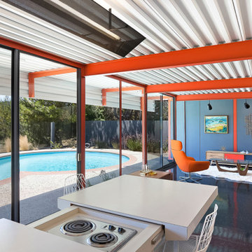
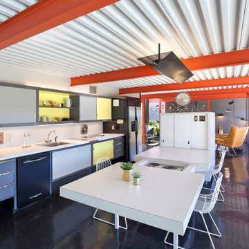
The kitchen of the Eichler X-100 is not just a place to cook—it is a designed system, a forward-thinking experiment in how everyday living could be streamlined, modernized, and elevated through architecture. Envisioned by A. Quincy Jones and Frederick Emmons for Joseph Eichler, the space reflects a bold reimagining of the American kitchen in the mid-20th century.
A Central Hub of the Home
Positioned within the home’s central utility core, the kitchen is strategically located to connect all major living zones. Rather than being tucked away, it becomes a functional anchor, allowing for seamless interaction between cooking, dining, and gathering spaces.
This layout reinforces Eichler’s philosophy:
the kitchen is not separate—it’s part of everyday life.
Innovation Built In
What sets the X-100 kitchen apart is its integration of experimental, built-in features that were far ahead of their time.
Highlights include:
A sliding dining table with integrated electric burners, blending cooking and dining into one continuous experience
Built-in appliances and systems, designed to reduce clutter and maximize efficiency
Thoughtful ergonomic planning that simplifies daily routines
These elements reflect a larger idea:
that the home should work for you—not the other way around.
Material as Modern Expression
The kitchen showcases extensive use of laminate surfaces (Formica)—a material that, in the 1950s, symbolized innovation, durability, and modern living. Clean, smooth, and easy to maintain, these surfaces reinforce the home’s futuristic identity.
Paired with steel structure and clean lines, the material palette creates a space that feels both industrial and approachable.
Open, Light-Filled Design
True to the X-100’s overall concept, the kitchen is fully integrated into the open-plan layout. Sightlines extend outward to living areas, glass walls, and even interior gardens, ensuring the space never feels enclosed.
Natural light filters in from multiple directions, enhanced by skylights and reflective surfaces, giving the kitchen a bright, uplifting atmosphere throughout the day.
A Prototype for Modern Living
In many ways, the X-100 kitchen anticipated how we live today:
Open-concept layouts
Multi-functional islands and dining spaces
Integrated appliances
Clean, minimal design
What feels standard now was radical in 1956.
Where Design Meets Daily Life
The kitchen of the Eichler X-100 is a perfect example of how architecture can elevate the everyday. It transforms routine into experience—where cooking, gathering, and living all happen within a single, beautifully orchestrated space.
It’s not just a kitchen.
It’s a glimpse into the future—designed decades ahead of its time.

 Casa Outdoor Design
Other people call this style Zen gardens because they are meant for contemplation. This garden style originated in Japan at the same time Zen Buddhism started to become more popular around 1300 AC.
Japanese gardens tend to be minimalist, monochromatic and well-trimmed. Not straight lines like in Formal gardens, but rather round or smoothly in and out shapes. Since the purpose of creating this garden style is for contemplation, relaxation and meditation, every element brought into the design has to be in alignment with this philosophy. These gardens are meant to connect visually but not physically. Japanese gardens calm your senses.
Like English gardens, they are meant to be around your home. This garden style wants to replicate the mountains and rivers seeing in the beautiful natural landscapes in Asia but at a small, intimate scale. Every element brought to Japanese gardens has a meaning. These elements have to be well curated and carefully placed. Boulders represent mountains, raked white sands represent rivers and waves from the ocean, bridges mean connection between the earthly world and the spiritual earth, islands symbolize of longevity and health, water basins are used for ritual cleansing and the round trimmed bushes provide smoothness and calm to your senses. Sound is
something not to forget when planning these gardens. You can achieve this by incorporating soft running water or planting bamboo (its leaves produce a soft, crackling sound when wind passes by). Water also represents life-giving force.
Other garden elements to consider are stone lanterns, color red (denotes strength, strong emotions, vitality, power). Plants mostly used in Japanese gardens are cherry trees, Japanese maples, pines, Yaupon hollies, bamboo, azaleas, camelias, hydrangeas, water lilies, mosses among others.
 Drury Design
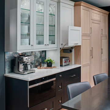
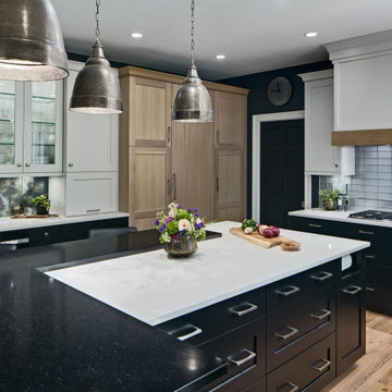
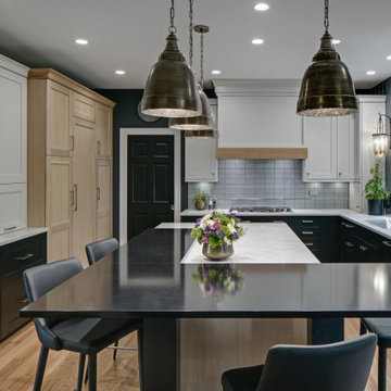
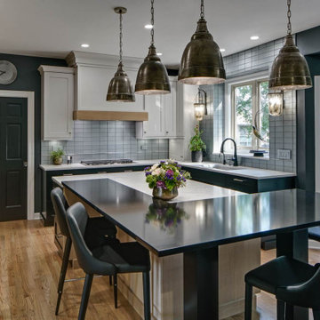
The original intent of this project was to replace the island, hood, countertops, and a few appliances. A primary bath remodel was the main priority. But once the couple realized certain features would enhance the functionality of the kitchen – not to mention completely change the aesthetic – they put the master bath on hold and decided to remodel the entire kitchen first.
Design objectives:
-Omit separate table, plan for a larger island that would seat 7 people
-Simple, clean lines – no rounded corners or weird angles
-Nothing trendy – use modern classic details
-Uncluttered countertops
-Better pantry storage for food & small appliances
-Integrated major appliances
-Coffee bar
-Avoid “1 color on perimeter with second color on island”
-Integrate a harmonious variety of finishes
-Integrate black & handmade metals
Design challenges:
-Island shape to fit within confines of existing half wall between kitchen & family room & bay window/door to backyard
-Narrow kitchen with major walkway
-Planning for 7 seats at the island
-Keep guest social area away from the cook’s zone
-Place appliances according to use
-Point-of-use storage for an avid cook within a relatively small space
-Integrate colors without looking too busy
THE NEW KITCHEN
-While the island is mostly rectangular, the seating area utilizes the bay extension without interfering with the exterior door
-All seating is placed on the outside perimeter of the island, giving the cook dedicated prep space
-The L-shaped seating area & adjacent coffee bar encourage guests to gather on the outside edge of the kitchen where they can still interact with the cook
-Island prep space includes 5 feet of versatile drawer storage, double waste basket and an open paper towel dispenser
-One pantry designated for food; the other for small appliances & bulk storage; creates visual armoire look
-Microwave drawer in island faces refrigerator for easy access & less interference with cook’s zone
-Appliance garages avoid clutter on the countertops
-Off-white upper cabinets make the kitchen look larger while the black bases offer contrast without closing in the space
Once the client committed to remodeling her entire kitchen, she had a good idea of the direction she wanted the space to take. Even so, there were many details that remained open to explore & contemplate. The end result is modern, clean and ultimately transitional – a creative vision anchored in functionality and artistry!
A powder room remodel was added to the project that beautifully compliments the kitchen aesthetic. The entire staircase, all trim & doors were painted in the same tones as the kitchen, transforming the entire first floor into a cohesive & welcoming space. It was a great collaborative partnership!
 Boyenga Team / Compass
Eichler X-100 Kitchen: A Futuristic Vision of Function and Design
The kitchen of the Eichler X-100 is not just a place to cook—it is a designed system, a forward-thinking experiment in how everyday living could be streamlined, modernized, and elevated through architecture. Envisioned by A. Quincy Jones and Frederick Emmons for Joseph Eichler, the space reflects a bold reimagining of the American kitchen in the mid-20th century.
A Central Hub of the Home
Positioned within the home’s central utility core, the kitchen is strategically located to connect all major living zones. Rather than being tucked away, it becomes a functional anchor, allowing for seamless interaction between cooking, dining, and gathering spaces.
This layout reinforces Eichler’s philosophy:
the kitchen is not separate—it’s part of everyday life.
Innovation Built In
What sets the X-100 kitchen apart is its integration of experimental, built-in features that were far ahead of their time.
Highlights include:
A sliding dining table with integrated electric burners, blending cooking and dining into one continuous experience
Built-in appliances and systems, designed to reduce clutter and maximize efficiency
Thoughtful ergonomic planning that simplifies daily routines
These elements reflect a larger idea:
that the home should work for you—not the other way around.
Material as Modern Expression
The kitchen showcases extensive use of laminate surfaces (Formica)—a material that, in the 1950s, symbolized innovation, durability, and modern living. Clean, smooth, and easy to maintain, these surfaces reinforce the home’s futuristic identity.
Paired with steel structure and clean lines, the material palette creates a space that feels both industrial and approachable.
Open, Light-Filled Design
True to the X-100’s overall concept, the kitchen is fully integrated into the open-plan layout. Sightlines extend outward to living areas, glass walls, and even interior gardens, ensuring the space never feels enclosed.
Natural light filters in from multiple directions, enhanced by skylights and reflective surfaces, giving the kitchen a bright, uplifting atmosphere throughout the day.
A Prototype for Modern Living
In many ways, the X-100 kitchen anticipated how we live today:
Open-concept layouts
Multi-functional islands and dining spaces
Integrated appliances
Clean, minimal design
What feels standard now was radical in 1956.
Where Design Meets Daily Life
The kitchen of the Eichler X-100 is a perfect example of how architecture can elevate the everyday. It transforms routine into experience—where cooking, gathering, and living all happen within a single, beautifully orchestrated space.
It’s not just a kitchen.
It’s a glimpse into the future—designed decades ahead of its time.
Sponsored
Delaware, OH

Buckeye Basements, Inc.
Central Ohio's Basement Finishing ExpertsBest Of Houzz '13-'21
 San Luis Kitchen Co.
The owners of a charming home in the hills west of Paso Robles recently decided to remodel their not-so-charming kitchen. Referred to San Luis Kitchen by several of their friends, the homeowners visited our showroom and soon decided we were the best people to design a kitchen fitting the style of their home. We were delighted to get to work on the project right away.
When we arrived at the house, we found a small, cramped and out-dated kitchen. The ceiling was low, the cabinets old fashioned and painted a stark dead white, and the best view in the house was neglected in a seldom-used breakfast nook (sequestered behind the kitchen peninsula). This kitchen was also handicapped by white tile counters with dark grout, odd-sized and cluttered cabinets, and small ‘desk’ tacked on to the side of the oven cabinet. Due to a marked lack of counter space & inadequate storage the homeowner had resorted to keeping her small appliances on a little cart parked in the corner and the garbage was just sitting by the wall in full view of everything! On the plus side, the kitchen opened into a nice dining room and had beautiful saltillo tile floors.
Mrs. Homeowner loves to entertain and often hosts dinner parties for her friends. She enjoys visiting with her guests in the kitchen while putting the finishing touches on the evening’s meal. Sadly, her small kitchen really limited her interactions with her guests – she often felt left out of the mix at her own parties! This savvy homeowner dreamed big – a new kitchen that would accommodate multiple workstations, have space for guests to gather but not be in the way, and maybe a prettier transition from the kitchen to the dining (wine service area or hutch?) – while managing the remodel budget by reusing some of her major appliances and keeping (patching as needed) her existing floors.
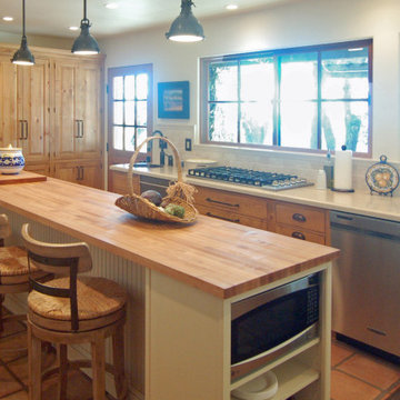
Responding to the homeowner’s stated wish list and the opportunities presented by the home's setting and existing architecture, the designers at San Luis Kitchen decided to expand the kitchen into the breakfast nook using Wood-Mode cabinetry. This change allowed the work area to be reoriented to take advantage of the great view – we replaced the existing window and added another while moving the door to gain space. A second sink and set of refrigerator drawers (housing fresh fruits & veggies) were included for the convenience of this mainly vegetarian cook – her prep station. The clean-up area now boasts a farmhouse style single bowl sink – adding to the ‘cottage’ charm. We located a new gas cook-top between the two workstations for easy access from each. Also tucked in here is a pullout trash/recycle cabinet for convenience and additional drawers for storage.
Running parallel to the work counter we added a long butcher-block island with easy-to-access open shelves for the avid cook and seating for friendly guests placed just right to take in the view. A counter-top garage is used to hide excess small appliances. Glass door cabinets and open shelves are now available to display the owners beautiful dishware. The microwave was placed inconspicuously on the end of the island facing the refrigerator – easy access for guests (and extraneous family members) to help themselves to drinks and snacks while staying out of the cook’s way.
We also moved the pantry storage away from the dining room (putting it on the far wall and closer to the work triangle) and added a furniture-like hutch in its place allowing the more formal dining area to flow seamlessly into the up-beat work area of the kitchen. This space is now also home (opposite wall) to an under counter wine refrigerator, a liquor cabinet and pretty glass door wall cabinet for stemware storage – meeting Mr. Homeowner’s desire for a bar service area.
And then the aesthetic: an old-world style country cottage theme. The homeowners wanted the kitchen to have a warm feel while still loving the look of white cabinetry. San Luis Kitchen melded country-casual knotty pine base cabinets with vintage hand-brushed creamy white wall cabinets to create the desired cottage look. We also added bead board and mullioned glass doors for charm, used an inset doorstyle on the cabinets for authenticity, and mixed stone and wood counters to create an eclectic nuance in the space. All in all, the happy homeowners now boast a charming county cottage kitchen with plenty of space for entertaining their guests while creating gourmet meals to feed them.

 Zelaya Properties LLC
We used: Custom cherry cabinetry in Arts & Crafts Shaker style by Kabinart in Boulder and Espresso stains. Liberty Hardware Venetian bronze 1-1/2" cabinet knobs. KitchenAid Architect II Series 22 CF counter-depth French door refrigerator. KitchenAid Architect Series II 27" convection single wall oven. KitchenAid 36" 6-burner dual fuel freestanding commercial-style range. KitchenAid Architect II Series 24" dishwasher. Sharp Insight Pro Series 24" built-in microwave drawer (Model #KB6524PS). Crystorama Solaris 12" wide pendant lights in English bronze. Granite countertops in Brown Fantasy. 3"x6" polished marble backsplash.
Paint colors:
Walls: Glidden Silver Cloud 30YY 63/024
Ceilings/Trims/Doors: Glidden Swan White GLC23
Robert B. Narod Photography
 San Luis Kitchen Co.
The owners of a charming home in the hills west of Paso Robles recently decided to remodel their not-so-charming kitchen. Referred to San Luis Kitchen by several of their friends, the homeowners visited our showroom and soon decided we were the best people to design a kitchen fitting the style of their home. We were delighted to get to work on the project right away.
When we arrived at the house, we found a small, cramped and out-dated kitchen. The ceiling was low, the cabinets old fashioned and painted a stark dead white, and the best view in the house was neglected in a seldom-used breakfast nook (sequestered behind the kitchen peninsula). This kitchen was also handicapped by white tile counters with dark grout, odd-sized and cluttered cabinets, and small ‘desk’ tacked on to the side of the oven cabinet. Due to a marked lack of counter space & inadequate storage the homeowner had resorted to keeping her small appliances on a little cart parked in the corner and the garbage was just sitting by the wall in full view of everything! On the plus side, the kitchen opened into a nice dining room and had beautiful saltillo tile floors.
Mrs. Homeowner loves to entertain and often hosts dinner parties for her friends. She enjoys visiting with her guests in the kitchen while putting the finishing touches on the evening’s meal. Sadly, her small kitchen really limited her interactions with her guests – she often felt left out of the mix at her own parties! This savvy homeowner dreamed big – a new kitchen that would accommodate multiple workstations, have space for guests to gather but not be in the way, and maybe a prettier transition from the kitchen to the dining (wine service area or hutch?) – while managing the remodel budget by reusing some of her major appliances and keeping (patching as needed) her existing floors.
Responding to the homeowner’s stated wish list and the opportunities presented by the home's setting and existing architecture, the designers at San Luis Kitchen decided to expand the kitchen into the breakfast nook using Wood-Mode cabinetry. This change allowed the work area to be reoriented to take advantage of the great view – we replaced the existing window and added another while moving the door to gain space. A second sink and set of refrigerator drawers (housing fresh fruits & veggies) were included for the convenience of this mainly vegetarian cook – her prep station. The clean-up area now boasts a farmhouse style single bowl sink – adding to the ‘cottage’ charm. We located a new gas cook-top between the two workstations for easy access from each. Also tucked in here is a pullout trash/recycle cabinet for convenience and additional drawers for storage.
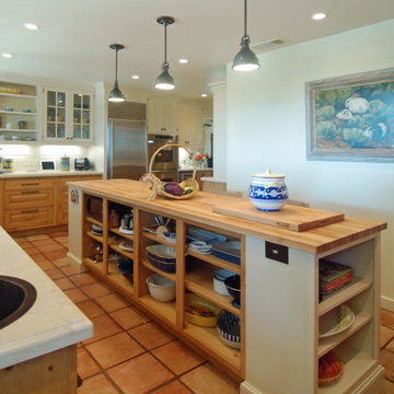
Running parallel to the work counter we added a long butcher-block island with easy-to-access open shelves for the avid cook and seating for friendly guests placed just right to take in the view. A counter-top garage is used to hide excess small appliances. Glass door cabinets and open shelves are now available to display the owners beautiful dishware. The microwave was placed inconspicuously on the end of the island facing the refrigerator – easy access for guests (and extraneous family members) to help themselves to drinks and snacks while staying out of the cook’s way.
We also moved the pantry storage away from the dining room (putting it on the far wall and closer to the work triangle) and added a furniture-like hutch in its place allowing the more formal dining area to flow seamlessly into the up-beat work area of the kitchen. This space is now also home (opposite wall) to an under counter wine refrigerator, a liquor cabinet and pretty glass door wall cabinet for stemware storage – meeting Mr. Homeowner’s desire for a bar service area.
And then the aesthetic: an old-world style country cottage theme. The homeowners wanted the kitchen to have a warm feel while still loving the look of white cabinetry. San Luis Kitchen melded country-casual knotty pine base cabinets with vintage hand-brushed creamy white wall cabinets to create the desired cottage look. We also added bead board and mullioned glass doors for charm, used an inset doorstyle on the cabinets for authenticity, and mixed stone and wood counters to create an eclectic nuance in the space. All in all, the happy homeowners now boast a charming county cottage kitchen with plenty of space for entertaining their guests while creating gourmet meals to feed them.
 San Luis Kitchen Co.
The owners of a charming home in the hills west of Paso Robles recently decided to remodel their not-so-charming kitchen. Referred to San Luis Kitchen by several of their friends, the homeowners visited our showroom and soon decided we were the best people to design a kitchen fitting the style of their home. We were delighted to get to work on the project right away.
When we arrived at the house, we found a small, cramped and out-dated kitchen. The ceiling was low, the cabinets old fashioned and painted a stark dead white, and the best view in the house was neglected in a seldom-used breakfast nook (sequestered behind the kitchen peninsula). This kitchen was also handicapped by white tile counters with dark grout, odd-sized and cluttered cabinets, and small ‘desk’ tacked on to the side of the oven cabinet. Due to a marked lack of counter space & inadequate storage the homeowner had resorted to keeping her small appliances on a little cart parked in the corner and the garbage was just sitting by the wall in full view of everything! On the plus side, the kitchen opened into a nice dining room and had beautiful saltillo tile floors.
Mrs. Homeowner loves to entertain and often hosts dinner parties for her friends. She enjoys visiting with her guests in the kitchen while putting the finishing touches on the evening’s meal. Sadly, her small kitchen really limited her interactions with her guests – she often felt left out of the mix at her own parties! This savvy homeowner dreamed big – a new kitchen that would accommodate multiple workstations, have space for guests to gather but not be in the way, and maybe a prettier transition from the kitchen to the dining (wine service area or hutch?) – while managing the remodel budget by reusing some of her major appliances and keeping (patching as needed) her existing floors.
Responding to the homeowner’s stated wish list and the opportunities presented by the home's setting and existing architecture, the designers at San Luis Kitchen decided to expand the kitchen into the breakfast nook using Wood-Mode cabinetry. This change allowed the work area to be reoriented to take advantage of the great view – we replaced the existing window and added another while moving the door to gain space. A second sink and set of refrigerator drawers (housing fresh fruits & veggies) were included for the convenience of this mainly vegetarian cook – her prep station. The clean-up area now boasts a farmhouse style single bowl sink – adding to the ‘cottage’ charm. We located a new gas cook-top between the two workstations for easy access from each. Also tucked in here is a pullout trash/recycle cabinet for convenience and additional drawers for storage.
Running parallel to the work counter we added a long butcher-block island with easy-to-access open shelves for the avid cook and seating for friendly guests placed just right to take in the view. A counter-top garage is used to hide excess small appliances. Glass door cabinets and open shelves are now available to display the owners beautiful dishware. The microwave was placed inconspicuously on the end of the island facing the refrigerator – easy access for guests (and extraneous family members) to help themselves to drinks and snacks while staying out of the cook’s way.
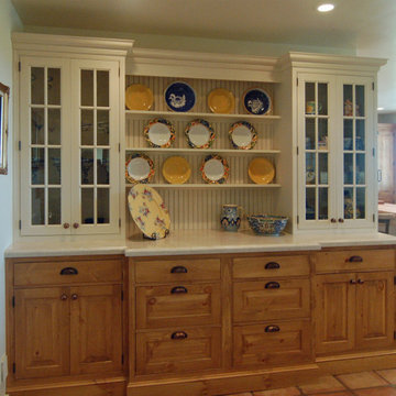
We also moved the pantry storage away from the dining room (putting it on the far wall and closer to the work triangle) and added a furniture-like hutch in its place allowing the more formal dining area to flow seamlessly into the up-beat work area of the kitchen. This space is now also home (opposite wall) to an under counter wine refrigerator, a liquor cabinet and pretty glass door wall cabinet for stemware storage – meeting Mr. Homeowner’s desire for a bar service area.
And then the aesthetic: an old-world style country cottage theme. The homeowners wanted the kitchen to have a warm feel while still loving the look of white cabinetry. San Luis Kitchen melded country-casual knotty pine base cabinets with vintage hand-brushed creamy white wall cabinets to create the desired cottage look. We also added bead board and mullioned glass doors for charm, used an inset doorstyle on the cabinets for authenticity, and mixed stone and wood counters to create an eclectic nuance in the space. All in all, the happy homeowners now boast a charming county cottage kitchen with plenty of space for entertaining their guests while creating gourmet meals to feed them.
 Drury Design
The original intent of this project was to replace the island, hood, countertops, and a few appliances. A primary bath remodel was the main priority. But once the couple realized certain features would enhance the functionality of the kitchen – not to mention completely change the aesthetic – they put the master bath on hold and decided to remodel the entire kitchen first.
Design objectives:
-Omit separate table, plan for a larger island that would seat 7 people
-Simple, clean lines – no rounded corners or weird angles
-Nothing trendy – use modern classic details
-Uncluttered countertops
-Better pantry storage for food & small appliances
-Integrated major appliances
-Coffee bar
-Avoid “1 color on perimeter with second color on island”
-Integrate a harmonious variety of finishes
-Integrate black & handmade metals
Design challenges:
-Island shape to fit within confines of existing half wall between kitchen & family room & bay window/door to backyard
-Narrow kitchen with major walkway
-Planning for 7 seats at the island
-Keep guest social area away from the cook’s zone
-Place appliances according to use
-Point-of-use storage for an avid cook within a relatively small space
-Integrate colors without looking too busy
THE NEW KITCHEN
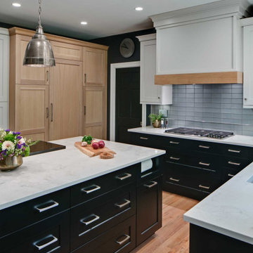
-While the island is mostly rectangular, the seating area utilizes the bay extension without interfering with the exterior door
-All seating is placed on the outside perimeter of the island, giving the cook dedicated prep space
-The L-shaped seating area & adjacent coffee bar encourage guests to gather on the outside edge of the kitchen where they can still interact with the cook
-Island prep space includes 5 feet of versatile drawer storage, double waste basket and an open paper towel dispenser
-One pantry designated for food; the other for small appliances & bulk storage; creates visual armoire look
-Microwave drawer in island faces refrigerator for easy access & less interference with cook’s zone
-Appliance garages avoid clutter on the countertops
-Off-white upper cabinets make the kitchen look larger while the black bases offer contrast without closing in the space
Once the client committed to remodeling her entire kitchen, she had a good idea of the direction she wanted the space to take. Even so, there were many details that remained open to explore & contemplate. The end result is modern, clean and ultimately transitional – a creative vision anchored in functionality and artistry!
A powder room remodel was added to the project that beautifully compliments the kitchen aesthetic. The entire staircase, all trim & doors were painted in the same tones as the kitchen, transforming the entire first floor into a cohesive & welcoming space. It was a great collaborative partnership!
Sponsored
Delaware, OH
Buckeye Basements, Inc.
Central Ohio's Basement Finishing ExpertsBest Of Houzz '13-'21
 Drury Design
The original intent of this project was to replace the island, hood, countertops, and a few appliances. A primary bath remodel was the main priority. But once the couple realized certain features would enhance the functionality of the kitchen – not to mention completely change the aesthetic – they put the master bath on hold and decided to remodel the entire kitchen first.
Design objectives:
-Omit separate table, plan for a larger island that would seat 7 people
-Simple, clean lines – no rounded corners or weird angles
-Nothing trendy – use modern classic details
-Uncluttered countertops
-Better pantry storage for food & small appliances
-Integrated major appliances
-Coffee bar
-Avoid “1 color on perimeter with second color on island”
-Integrate a harmonious variety of finishes
-Integrate black & handmade metals
Design challenges:
-Island shape to fit within confines of existing half wall between kitchen & family room & bay window/door to backyard
-Narrow kitchen with major walkway
-Planning for 7 seats at the island
-Keep guest social area away from the cook’s zone
-Place appliances according to use
-Point-of-use storage for an avid cook within a relatively small space
-Integrate colors without looking too busy
THE NEW KITCHEN
-While the island is mostly rectangular, the seating area utilizes the bay extension without interfering with the exterior door
-All seating is placed on the outside perimeter of the island, giving the cook dedicated prep space
-The L-shaped seating area & adjacent coffee bar encourage guests to gather on the outside edge of the kitchen where they can still interact with the cook
-Island prep space includes 5 feet of versatile drawer storage, double waste basket and an open paper towel dispenser
-One pantry designated for food; the other for small appliances & bulk storage; creates visual armoire look
-Microwave drawer in island faces refrigerator for easy access & less interference with cook’s zone
-Appliance garages avoid clutter on the countertops
-Off-white upper cabinets make the kitchen look larger while the black bases offer contrast without closing in the space
Once the client committed to remodeling her entire kitchen, she had a good idea of the direction she wanted the space to take. Even so, there were many details that remained open to explore & contemplate. The end result is modern, clean and ultimately transitional – a creative vision anchored in functionality and artistry!
A powder room remodel was added to the project that beautifully compliments the kitchen aesthetic. The entire staircase, all trim & doors were painted in the same tones as the kitchen, transforming the entire first floor into a cohesive & welcoming space. It was a great collaborative partnership!
 Drury Design
The original intent of this project was to replace the island, hood, countertops, and a few appliances. A primary bath remodel was the main priority. But once the couple realized certain features would enhance the functionality of the kitchen – not to mention completely change the aesthetic – they put the master bath on hold and decided to remodel the entire kitchen first.
Design objectives:
-Omit separate table, plan for a larger island that would seat 7 people
-Simple, clean lines – no rounded corners or weird angles
-Nothing trendy – use modern classic details
-Uncluttered countertops
-Better pantry storage for food & small appliances
-Integrated major appliances
-Coffee bar
-Avoid “1 color on perimeter with second color on island”
-Integrate a harmonious variety of finishes
-Integrate black & handmade metals
Design challenges:
-Island shape to fit within confines of existing half wall between kitchen & family room & bay window/door to backyard
-Narrow kitchen with major walkway
-Planning for 7 seats at the island
-Keep guest social area away from the cook’s zone
-Place appliances according to use
-Point-of-use storage for an avid cook within a relatively small space
-Integrate colors without looking too busy
THE NEW KITCHEN
-While the island is mostly rectangular, the seating area utilizes the bay extension without interfering with the exterior door
-All seating is placed on the outside perimeter of the island, giving the cook dedicated prep space
-The L-shaped seating area & adjacent coffee bar encourage guests to gather on the outside edge of the kitchen where they can still interact with the cook
-Island prep space includes 5 feet of versatile drawer storage, double waste basket and an open paper towel dispenser
-One pantry designated for food; the other for small appliances & bulk storage; creates visual armoire look
-Microwave drawer in island faces refrigerator for easy access & less interference with cook’s zone
-Appliance garages avoid clutter on the countertops
-Off-white upper cabinets make the kitchen look larger while the black bases offer contrast without closing in the space
Once the client committed to remodeling her entire kitchen, she had a good idea of the direction she wanted the space to take. Even so, there were many details that remained open to explore & contemplate. The end result is modern, clean and ultimately transitional – a creative vision anchored in functionality and artistry!
A powder room remodel was added to the project that beautifully compliments the kitchen aesthetic. The entire staircase, all trim & doors were painted in the same tones as the kitchen, transforming the entire first floor into a cohesive & welcoming space. It was a great collaborative partnership!
 Drury Design
The original intent of this project was to replace the island, hood, countertops, and a few appliances. A primary bath remodel was the main priority. But once the couple realized certain features would enhance the functionality of the kitchen – not to mention completely change the aesthetic – they put the master bath on hold and decided to remodel the entire kitchen first.
Design objectives:
-Omit separate table, plan for a larger island that would seat 7 people
-Simple, clean lines – no rounded corners or weird angles
-Nothing trendy – use modern classic details
-Uncluttered countertops
-Better pantry storage for food & small appliances
-Integrated major appliances
-Coffee bar
-Avoid “1 color on perimeter with second color on island”
-Integrate a harmonious variety of finishes
-Integrate black & handmade metals
Design challenges:
-Island shape to fit within confines of existing half wall between kitchen & family room & bay window/door to backyard
-Narrow kitchen with major walkway
-Planning for 7 seats at the island
-Keep guest social area away from the cook’s zone
-Place appliances according to use
-Point-of-use storage for an avid cook within a relatively small space
-Integrate colors without looking too busy
THE NEW KITCHEN
-While the island is mostly rectangular, the seating area utilizes the bay extension without interfering with the exterior door
-All seating is placed on the outside perimeter of the island, giving the cook dedicated prep space
-The L-shaped seating area & adjacent coffee bar encourage guests to gather on the outside edge of the kitchen where they can still interact with the cook
-Island prep space includes 5 feet of versatile drawer storage, double waste basket and an open paper towel dispenser
-One pantry designated for food; the other for small appliances & bulk storage; creates visual armoire look
-Microwave drawer in island faces refrigerator for easy access & less interference with cook’s zone
-Appliance garages avoid clutter on the countertops
-Off-white upper cabinets make the kitchen look larger while the black bases offer contrast without closing in the space
Once the client committed to remodeling her entire kitchen, she had a good idea of the direction she wanted the space to take. Even so, there were many details that remained open to explore & contemplate. The end result is modern, clean and ultimately transitional – a creative vision anchored in functionality and artistry!
A powder room remodel was added to the project that beautifully compliments the kitchen aesthetic. The entire staircase, all trim & doors were painted in the same tones as the kitchen, transforming the entire first floor into a cohesive & welcoming space. It was a great collaborative partnership!
 San Luis Kitchen Co.
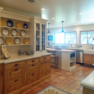
The owners of a charming home in the hills west of Paso Robles recently decided to remodel their not-so-charming kitchen. Referred to San Luis Kitchen by several of their friends, the homeowners visited our showroom and soon decided we were the best people to design a kitchen fitting the style of their home. We were delighted to get to work on the project right away.
When we arrived at the house, we found a small, cramped and out-dated kitchen. The ceiling was low, the cabinets old fashioned and painted a stark dead white, and the best view in the house was neglected in a seldom-used breakfast nook (sequestered behind the kitchen peninsula). This kitchen was also handicapped by white tile counters with dark grout, odd-sized and cluttered cabinets, and small ‘desk’ tacked on to the side of the oven cabinet. Due to a marked lack of counter space & inadequate storage the homeowner had resorted to keeping her small appliances on a little cart parked in the corner and the garbage was just sitting by the wall in full view of everything! On the plus side, the kitchen opened into a nice dining room and had beautiful saltillo tile floors.
Mrs. Homeowner loves to entertain and often hosts dinner parties for her friends. She enjoys visiting with her guests in the kitchen while putting the finishing touches on the evening’s meal. Sadly, her small kitchen really limited her interactions with her guests – she often felt left out of the mix at her own parties! This savvy homeowner dreamed big – a new kitchen that would accommodate multiple workstations, have space for guests to gather but not be in the way, and maybe a prettier transition from the kitchen to the dining (wine service area or hutch?) – while managing the remodel budget by reusing some of her major appliances and keeping (patching as needed) her existing floors.
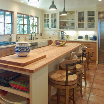
Responding to the homeowner’s stated wish list and the opportunities presented by the home's setting and existing architecture, the designers at San Luis Kitchen decided to expand the kitchen into the breakfast nook using Wood-Mode cabinetry. This change allowed the work area to be reoriented to take advantage of the great view – we replaced the existing window and added another while moving the door to gain space. A second sink and set of refrigerator drawers (housing fresh fruits & veggies) were included for the convenience of this mainly vegetarian cook – her prep station. The clean-up area now boasts a farmhouse style single bowl sink – adding to the ‘cottage’ charm. We located a new gas cook-top between the two workstations for easy access from each. Also tucked in here is a pullout trash/recycle cabinet for convenience and additional drawers for storage.
Running parallel to the work counter we added a long butcher-block island with easy-to-access open shelves for the avid cook and seating for friendly guests placed just right to take in the view. A counter-top garage is used to hide excess small appliances. Glass door cabinets and open shelves are now available to display the owners beautiful dishware. The microwave was placed inconspicuously on the end of the island facing the refrigerator – easy access for guests (and extraneous family members) to help themselves to drinks and snacks while staying out of the cook’s way.
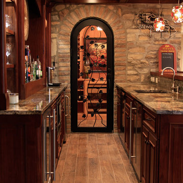
We also moved the pantry storage away from the dining room (putting it on the far wall and closer to the work triangle) and added a furniture-like hutch in its place allowing the more formal dining area to flow seamlessly into the up-beat work area of the kitchen. This space is now also home (opposite wall) to an under counter wine refrigerator, a liquor cabinet and pretty glass door wall cabinet for stemware storage – meeting Mr. Homeowner’s desire for a bar service area.
And then the aesthetic: an old-world style country cottage theme. The homeowners wanted the kitchen to have a warm feel while still loving the look of white cabinetry. San Luis Kitchen melded country-casual knotty pine base cabinets with vintage hand-brushed creamy white wall cabinets to create the desired cottage look. We also added bead board and mullioned glass doors for charm, used an inset doorstyle on the cabinets for authenticity, and mixed stone and wood counters to create an eclectic nuance in the space. All in all, the happy homeowners now boast a charming county cottage kitchen with plenty of space for entertaining their guests while creating gourmet meals to feed them.
Sponsored
Delaware, OH
Buckeye Basements, Inc.
Central Ohio's Basement Finishing ExpertsBest Of Houzz '13-'21
 San Luis Kitchen Co.
The owners of a charming home in the hills west of Paso Robles recently decided to remodel their not-so-charming kitchen. Referred to San Luis Kitchen by several of their friends, the homeowners visited our showroom and soon decided we were the best people to design a kitchen fitting the style of their home. We were delighted to get to work on the project right away.
When we arrived at the house, we found a small, cramped and out-dated kitchen. The ceiling was low, the cabinets old fashioned and painted a stark dead white, and the best view in the house was neglected in a seldom-used breakfast nook (sequestered behind the kitchen peninsula). This kitchen was also handicapped by white tile counters with dark grout, odd-sized and cluttered cabinets, and small ‘desk’ tacked on to the side of the oven cabinet. Due to a marked lack of counter space & inadequate storage the homeowner had resorted to keeping her small appliances on a little cart parked in the corner and the garbage was just sitting by the wall in full view of everything! On the plus side, the kitchen opened into a nice dining room and had beautiful saltillo tile floors.
Mrs. Homeowner loves to entertain and often hosts dinner parties for her friends. She enjoys visiting with her guests in the kitchen while putting the finishing touches on the evening’s meal. Sadly, her small kitchen really limited her interactions with her guests – she often felt left out of the mix at her own parties! This savvy homeowner dreamed big – a new kitchen that would accommodate multiple workstations, have space for guests to gather but not be in the way, and maybe a prettier transition from the kitchen to the dining (wine service area or hutch?) – while managing the remodel budget by reusing some of her major appliances and keeping (patching as needed) her existing floors.
Responding to the homeowner’s stated wish list and the opportunities presented by the home's setting and existing architecture, the designers at San Luis Kitchen decided to expand the kitchen into the breakfast nook using Wood-Mode cabinetry. This change allowed the work area to be reoriented to take advantage of the great view – we replaced the existing window and added another while moving the door to gain space. A second sink and set of refrigerator drawers (housing fresh fruits & veggies) were included for the convenience of this mainly vegetarian cook – her prep station. The clean-up area now boasts a farmhouse style single bowl sink – adding to the ‘cottage’ charm. We located a new gas cook-top between the two workstations for easy access from each. Also tucked in here is a pullout trash/recycle cabinet for convenience and additional drawers for storage.
Running parallel to the work counter we added a long butcher-block island with easy-to-access open shelves for the avid cook and seating for friendly guests placed just right to take in the view. A counter-top garage is used to hide excess small appliances. Glass door cabinets and open shelves are now available to display the owners beautiful dishware. The microwave was placed inconspicuously on the end of the island facing the refrigerator – easy access for guests (and extraneous family members) to help themselves to drinks and snacks while staying out of the cook’s way.
We also moved the pantry storage away from the dining room (putting it on the far wall and closer to the work triangle) and added a furniture-like hutch in its place allowing the more formal dining area to flow seamlessly into the up-beat work area of the kitchen. This space is now also home (opposite wall) to an under counter wine refrigerator, a liquor cabinet and pretty glass door wall cabinet for stemware storage – meeting Mr. Homeowner’s desire for a bar service area.
And then the aesthetic: an old-world style country cottage theme. The homeowners wanted the kitchen to have a warm feel while still loving the look of white cabinetry. San Luis Kitchen melded country-casual knotty pine base cabinets with vintage hand-brushed creamy white wall cabinets to create the desired cottage look. We also added bead board and mullioned glass doors for charm, used an inset doorstyle on the cabinets for authenticity, and mixed stone and wood counters to create an eclectic nuance in the space. All in all, the happy homeowners now boast a charming county cottage kitchen with plenty of space for entertaining their guests while creating gourmet meals to feed them.
 Drury Design
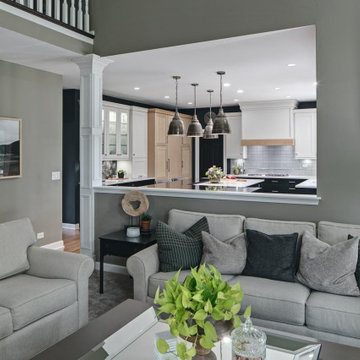
The original intent of this project was to replace the island, hood, countertops, and a few appliances. A primary bath remodel was the main priority. But once the couple realized certain features would enhance the functionality of the kitchen – not to mention completely change the aesthetic – they put the master bath on hold and decided to remodel the entire kitchen first.
Design objectives:
-Omit separate table, plan for a larger island that would seat 7 people
-Simple, clean lines – no rounded corners or weird angles
-Nothing trendy – use modern classic details
-Uncluttered countertops
-Better pantry storage for food & small appliances
-Integrated major appliances
-Coffee bar
-Avoid “1 color on perimeter with second color on island”
-Integrate a harmonious variety of finishes
-Integrate black & handmade metals
Design challenges:
-Island shape to fit within confines of existing half wall between kitchen & family room & bay window/door to backyard
-Narrow kitchen with major walkway
-Planning for 7 seats at the island
-Keep guest social area away from the cook’s zone
-Place appliances according to use
-Point-of-use storage for an avid cook within a relatively small space
-Integrate colors without looking too busy
THE NEW KITCHEN
-While the island is mostly rectangular, the seating area utilizes the bay extension without interfering with the exterior door
-All seating is placed on the outside perimeter of the island, giving the cook dedicated prep space
-The L-shaped seating area & adjacent coffee bar encourage guests to gather on the outside edge of the kitchen where they can still interact with the cook
-Island prep space includes 5 feet of versatile drawer storage, double waste basket and an open paper towel dispenser
-One pantry designated for food; the other for small appliances & bulk storage; creates visual armoire look
-Microwave drawer in island faces refrigerator for easy access & less interference with cook’s zone
-Appliance garages avoid clutter on the countertops
-Off-white upper cabinets make the kitchen look larger while the black bases offer contrast without closing in the space
Once the client committed to remodeling her entire kitchen, she had a good idea of the direction she wanted the space to take. Even so, there were many details that remained open to explore & contemplate. The end result is modern, clean and ultimately transitional – a creative vision anchored in functionality and artistry!
A powder room remodel was added to the project that beautifully compliments the kitchen aesthetic. The entire staircase, all trim & doors were painted in the same tones as the kitchen, transforming the entire first floor into a cohesive & welcoming space. It was a great collaborative partnership!
 highland
Creating the perfect fall home design, Pedrovazpaulo Real Estate and floorplan is one of the best ways to make your living space warm, functional, and visually attractive during the cozy autumn season. Fall is the time when families spend more time indoors, enjoy warm colors, and focus on comfort. A well-planned home layout not only improves beauty but also increases convenience for everyday living. A smart fall home design and floorplan should include open spaces, natural lighting, warm textures, and practical room arrangements. Whether you are building a new home or renovating your current one, choosing the right layout is essential. Modern homeowners also look for stylish house design plan options that combine beauty with efficiency. In this article, we will explore how to create the perfect fall home design and floorplan, discuss modern layout trends, and explain how house plan design, home architecture design, home design plans, and home plan design work together to build a dream home.
Why Fall Home Design Matters
A good fall home design and floorplan helps your house feel welcoming and peaceful. During autumn, people prefer warm interiors, comfortable seating areas, and rooms that allow better natural light. A thoughtful layout supports these needs while improving the overall value of the property. Fall-inspired homes often include earthy tones like brown, beige, orange, and cream. Large windows are also common because they allow sunlight to brighten indoor spaces. Open kitchens connected to dining and living rooms are another popular feature in modern house design plan ideas. When your fall home design and floorplan is properly planned, every room serves a purpose while maintaining visual harmony.
Key Features of a Perfect Floorplan
1. Open Living Spaces
One major part of a strong fall home design and floorplan is an open-concept living area. Combining the kitchen, dining room, and living room creates a spacious feeling and improves family interaction. Modern house plan design focuses on flexibility. Open spaces make entertaining guests easier and allow better furniture arrangement for seasonal decorations.
2. Functional Entryway
Your entrance should feel warm and organized. A good mudroom or foyer is essential in any fall home design and floorplan because it helps manage shoes, coats, and seasonal accessories. This practical idea is often included in professional home design plans for families who want both beauty and convenience.
3. Cozy Bedrooms
Bedrooms should provide comfort and privacy. Soft lighting, warm colors, and smart furniture placement improve relaxation. A strong home plan design ensures bedrooms are away from noisy areas for better peace.
4. Outdoor Connection
Fall is perfect for enjoying patios, balconies, and garden views. Many experts in home architecture design recommend adding sliding glass doors or covered patios to connect indoor and outdoor spaces. This improves both beauty and property value.
Importance of House Design Planning
A successful fall home design and floorplan starts with a detailed house design plan. Without proper planning, homes may look attractive but fail in functionality. A professional house design plan includes room sizes, traffic flow, ventilation, and furniture placement. It also ensures your budget is used wisely. Many homeowners regret skipping this step because poor layouts create long-term inconvenience. Good planning also supports future needs such as children, guests, or work-from-home spaces.
Role of Home Architecture Design
Strong home architecture design gives personality to your house. It combines exterior beauty with interior efficiency. The roof style, wall structure, windows, and natural light all affect the success of your fall home design and floorplan. For example, homes with high ceilings and large windows feel brighter and more open during fall. Natural materials like wood and stone also add warmth and seasonal charm. Professional home architecture design creates a balance between modern trends and personal lifestyle needs.
Choosing the Right Home Design Plans
Selecting the right home design plans helps avoid expensive mistakes. Your plan should match your land size, family size, and future goals. Single-story homes are ideal for small families and elderly residents, while double-story layouts work better for growing families. Your fall home design and floorplan should also include storage spaces, laundry areas, and practical bathroom locations. Customized home design plans are often better than copied layouts because they reflect your exact needs.
Modern Trends in Home Plan Design
Today’s home plan design focuses on simplicity, energy efficiency, and natural comfort. Some popular trends include:
- Minimalist kitchens with hidden storage
- Multi-purpose rooms for office and guest use
- Energy-saving windows and insulation
- Smart lighting systems
- Indoor plants and natural decoration
Conclusion
A well-planned fall home design and floorplan creates a home that feels warm, beautiful, and highly functional. From open living spaces to cozy bedrooms and outdoor connections, every detail matters when designing a seasonal home. Using a smart house design plan, strong house plan design, creative home architecture design, detailed home design plans, and practical home plan design helps you achieve the perfect balance of style and comfort. Whether you are building from scratch or improving your current house, investing in the right fall home design and floorplan will bring long-term satisfaction and better living quality. A thoughtful home is not just a place to live—it becomes a place to truly enjoy every season. Also you can read in homemaxe website for Pedrovazpaulo Real Estate
FAQs
1. What is a fall home design and floorplan?
A fall home design and floorplan is a home layout designed to create warmth, comfort, and functionality during the autumn season using cozy interiors and smart room arrangements.
2. Why is a house design plan important?
A house design plan helps organize room sizes, movement flow, lighting, and budget management before construction begins.
3. How does home architecture design improve a house?
Home architecture design improves both exterior appearance and interior comfort by balancing beauty, structure, and natural lighting.
4. What should be included in home design plans?
Good home design plans should include bedrooms, bathrooms, kitchen layout, storage spaces, outdoor areas, and future family needs.
5. What makes a modern home plan design successful?
A successful home plan design focuses on comfort, energy efficiency
93