
Search results for "Credits required" in Home Design Ideas
 UltraMedia, Inc.
UltraMedia featured in Electronic House magazine:
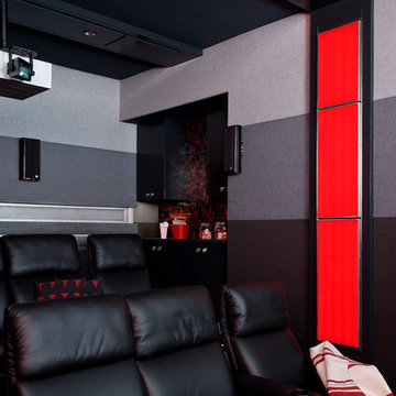
"Reaching this point of acoustical nirvana required plenty of calculations, CAD drawings and calibration, says Mike Brock of custom electronics design and installation firm UltraMedia, Richardson, Texas. His company worked directly with the manufacturer—Auralex—to make sure every inch of wall surface, both inside and out, was covered with the perfect type and amount of acoustical material. “We sent the room dimensions and the planned locations of the video projector, speakers and other equipment to the engineers at Auralex,” Brock explains. Using this information, the company was able to specify products and determine their proper placement. “This was the first time where I actually had the manufacturer come down and take an active role in the project and it really worked to everyone’s advantage,” Brock continues.
Home-Theater-Wolf-Projector.jpg
Auralex’s help with the design of the acoustical treatments afforded Brock the time to implement other sound-enhancing solutions. For example, he filled the hollow metal legs of the bar with sand to prevent them from resonating during loud passages in movie soundtracks. A thick, heavily padded carpet was added, and the general contractor constructed the shell of the room with sound-reducing drywall and installed a solid core door to prevent audio from seeping out into other areas of the house.
Lastly, the sound system was calibrated. Unlike many acoustically treated theaters, where the speakers are installed within the walls and covered with special fabric, in this room UltraMedia kept the nine Vienna Acoustic speakers completely exposed. The front three Vienna Acoustics Klimt Music speakers (as well as two REL sub bass units) were positioned on the floor, and the back six speakers were mounted to the surface of the walls. “The cherry in this theater are the Klimts,” says Brock. “We really dialed them in for the best possible sound.” By “dialing in,” Brock means using his and his team’s critical listening skills to position the speakers properly, then using the Integra receiver’s built-in Audyssey technology (a combination of sophisticated software and microphones) to calibrate the speakers to compensate for any acoustical anomalies. The end result: audio perfection."
Photo credit: UltraMedia, Inc.
 Nar Design Group
This client grew up in this 1950’s family home and has now become owner in his adult life. Designing and remodeling this childhood home that the client was very bonded and familiar with was a tall order. This modern twist of original mid-century style combined with an eclectic fusion of modern day materials and concepts fills the room with a powerful presence while maintaining its clean lined austerity and elegance. The kitchen was part of a grander complete home re-design and remodel.
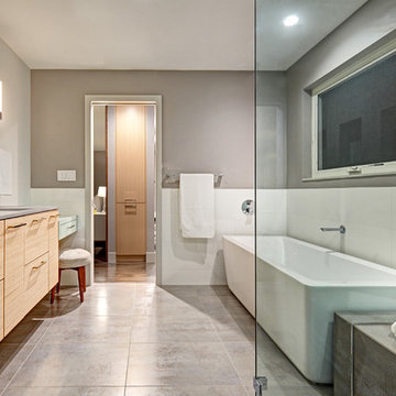
A modern version of a mid-century His and Hers grand master bathroom was created to include all the amenities and nothing left behind! This bathroom has so much noticeable and hidden “POW” that commands its peaceful spa feeling with a lot of attitude. Maintaining ultra-clean lines yet delivering ample design interest at every detail, This bathroom is eclectically a one of a kind luxury statement.
The concept in the laundry room was to create a simple, easy to use and clean space with ample storage and a place removed from the central part of the home to house the necessity of the cats and their litter box needs. There was no need for glamour in the laundry room yet we were able to create a simple highly utilitarian space.
If there is one room in the home that requires frequent visitors to thoroughly enjoy with a huge element of surprise, it’s the powder room! This is a room where you know that eventually, every guest will visit. Knowing this, we created a bold statement with layers of intrigue that would leave ample room for fun conversation with your guests upon their prolonged exit. We kept the lights dim here for that intriguing experience of crafted elegance and created ambiance. The walls of peeling metallic rust are the welcoming gesture to a powder room experience of defiance and elegant mystical complexity.
It's a lucky house guest indeed who gets to stay in this newly remodeled home. This on-suite bathroom allows them their own space and privacy. Both Bedroom and Bathroom offer plenty of storage for an extended stay. Rift White Oak cabinets and sleek Silestone counters make a lovely combination in the bathroom while the bedroom showcases textured white cabinets with a dark walnut wrap.
Photo credit: Fred Donham of PhotographerLink
 Wood Anchor
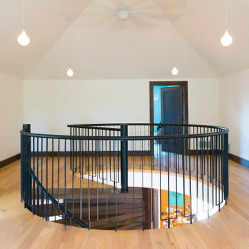
This almighty Oak staircase was one of our more challenging ones to build and install but we pulled it off!
The first hurdle was installing the treads (from the top) onto the central post which was difficult with the extremely heavy 4″ thick solid Oak treads.
The staircase was finished off with our custom designed steel hand railing which required a large amount of onsite welding. The result is a staircase that has to be seen in situ to get a sense of its impressive stature!
Photo credits: 2020 © Ray Chan Photo, All Rights Reserved
Find the right local pro for your project
 User
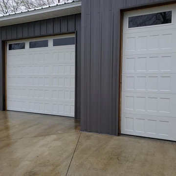
UserWith recessed short panels and long windows, these new garage doors are stylish AND practical. The building is used as a garage and workshop; therefore, different sized doors are needed to accommodate extra height requirements. But as this garage door installation illustrates, there's no need to sacrifice great design even in a work settings. | Project and Photo Credits: ProLift Garage Doors of Chattanooga
 Chelsea Building Group
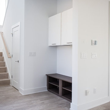
The tucked away mudroom is just off of the garage, the door to the backyard and the kitchen, which means your shoes are always in one spot. The nook has room for shoes, backpacks and coats without requiring a separate room.
The ReAlign plan boasts a private master suite at the back of the house, a flex space perfect for a home office or playroom, a jack-and-jill bath and more windows than we can count.
What the homeowners love:
Huge energy savings from the solar & energy saving build process
Super quiet interior rooms (from the insulated interior walls)
Large windows placed for optimal sunlight and privacy from the neighbors
Smart home system that's part of the house
Refresh is a 3 bed, 2.5 bath home and is 2,333 square feet.
Credit: Brendan Kahm
 Houseplay Renovations LLC
This Jersey City, NJ space was the first permanent ‘home’ for the yoga studio, so it was essential for us to listen well and design a space to serve their needs for years to come. Through our design process, we helped to guide the owners through the fit-out of their new studio location that required minimal demolition and disruption to the existing space.
Together, we converted a space originally used as a preschool into a welcoming, spacious yoga studio for local yogis. We created one main yoga studio by combining four small classrooms into a single larger space with new walls, while all the other program spaces (including designated areas for holistic treatments, massage, and bodywork) were accommodated into pre-existing rooms.
Our team completed all demo, sheetrock, electrical, and painting aspects of the project. (The studio owners did some of the work themselves, and a different company installed the flooring and carpets.) The results speak for themselves: a peaceful, restorative space to facilitate health and healing for the studio’s community.
Looking to renovate your place of business? Contact the Houseplay team; we’ll help make it happen!
Photo Credit: Anne Ruthmann Photography
 Wood Anchor
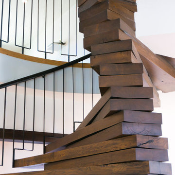
This almighty Oak staircase was one of our more challenging ones to build and install but we pulled it off!
The first hurdle was installing the treads (from the top) onto the central post which was difficult with the extremely heavy 4″ thick solid Oak treads.
The staircase was finished off with our custom designed steel hand railing which required a large amount of onsite welding. The result is a staircase that has to be seen in situ to get a sense of its impressive stature!
Photo credits: 2020 © Ray Chan Photo, All Rights Reserved
Sponsored
Columbus, OH

Hope Restoration & General Contracting
Columbus Design-Build, Kitchen & Bath Remodeling, Historic Renovations

 OLSON LEWIS + Architects
Published in the NORTHSHORE HOME MAGAZINE Fall 2015 issue, this home was dubbed 'Manchester Marvel'.
Before its renovation, the home consisted of a street front cottage built in the 1820’s, with a wing added onto the back at a later point. The home owners required a family friendly space to accommodate a large extended family, but they also wished to retain the original character of the home.
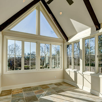
The design solution was to turn the rectangular footprint into an L shape. The kitchen and the formal entertaining rooms run along the vertical wing of the home. Within the central hub of the home is a large family room that opens to the kitchen and the back of the patio. Located in the horizontal plane are the solarium, mudroom and garage.
Client Quote
"He (John Olson of OLSON LEWIS + Architects) did an amazing job. He asked us about our goals and actually walked through our former house with us to see what we did and did not like about it. He also worked really hard to give us the same level of detail we had in our last home."
“Manchester Marvel” clients.
Photo Credits:
Eric Roth
 Duradek
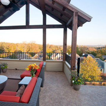
A combination of Durarail railing options was used for the guardrails. Standard black picket railing on the pony walls on the covered portion of the deck allowed them to meet the guardrail height requirement where they desired more privacy. Topless Glass Railing around the open portion of the deck with the PUP post system was added to complete deck and complement the gorgeous view that inspired it. The home owners chose Durarail’s powder coated railings for its durable low maintenance advantages (will not chip or rust), and for the unobstructed views of the Atlanta skyline.
Photo Credit: Duradek of Georgia
 BGD&C Custom Homes
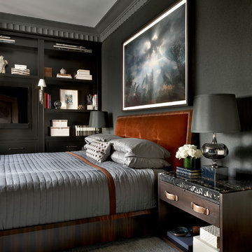
This new penthouse apartment built by BGD&C and designed by Darcy Bonner & Associates was the perfect location for the owner who did not care for the standard level of finishes offered by the developer. Working all together, every inch of the space was designed and engineered with the highest of finishes in mind; rare woods were selected, fully-filled and highly polished; in the full-service Butler’s Pantry, a beautifully cerused oak was used. The real challenge? Working in hi-rises has its quirks, getting the custom 12’ range hood up into the space - the last bit required it to be walked up a fire escape.
Photo Credit - Tony Soluri
 RAJ Kitchen and Bath, LLC
**Check out the video of this transformation on our website**
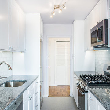
This small kitchen was way too small for this 2 bedrooms, 2 bathrooms apartment. Not only was it a very small kitchen, but the physical location of it made it very difficult to make it any bigger. There wasn't much that could have been done without incurring astronomical cost, which would get little or no return on the investment. The client wanted a kitchen that can be optimized in its current location to add a ton of value for resale.
This was difficult to do, because there was no moving of any mechanical around in the kitchen and even if we wanted to, the management of the building would not allow. For those of you who live in condos, co-ops or apartment building, you know how difficult it is to rework these foot prints. When we showed up, we saw the problems, but we also saw a huge opportunity where we can achieve those goals in the small space. This was accomplished by making some key changes and to incorporate some new things that was not possible when this kitchen was built years ago.
The crucial part of the design that would drive the entire new layout, was selecting the only appliance; that was the Refrigerator. Once we nailed down that refrigerator, we then proceeded to design the kitchen around it. We moved it to the other side of the wall where the sink was so that we can tap into the water line from the sink plumbing. It was crucial that it stays exactly 24" deep, not an inch more because we had to keep the entry as open as possible. Also, it was going to be directly in front of another big storage unit - The pantry. It is not ideal in most cases, but we needed the rest of the space to ramp up the design and open feel towards the side where all of the activities would take place, which happend to be the dining room and the view.
Once all that was figured out, we re-positioned the sink, dishwasher and the range and proceeded to wrap the cabinets around the columns to integrate them into the space. Thirty- six inches cabinets height was used so that they can be installed higher towards the ceiling height to give more room rather than the standard 18" required height between the counter tops. This was done to make the room feel a lot bigger than it really was. Not to mention, we also didn't want the faucet to be buried under the cabinets so that was also a necessary design detail for the space.
We then lowered both knee walls so that the counter top can sit on top of them, by removing that stop point that would have otherwise defined the kitchen area. This allowed us to pick up that extra footprint into the room for added prep space and enabled us to create the illusion of a kitchen that is looking longer than it really is. Every inch mattered when designing this kitchen and we made a conscious decision to use every one of that inch.
White cabinets were selected to do just what white cabinets are design to do; make a small or dark room appear bigger, brighter and more open. In this kitchen, this was amplified the more because of the kitchen location. It was perfect! We knew we did justice to the space because while we were there taking some photos, a few potential buyers walked in and went straight for the kitchen! They said its design just to fit the apartment.
Pantry roll out shelving, Double recycle bin, fancy handles, LED lighting, Quartz counter top, beautiful backslash tiles and grey linen floors finished off the kitchen which looked over a beautiful view of the George Washington Bridge from the top of this lovely 4th floor apartment.
Credit to Masterpiece Tile and Marble (Annmarie on the selection of Tiles and countertop and Val on the Construction to complete this project).
Davor Kokic Photography
 Wood Anchor
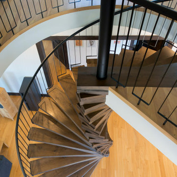
This almighty Oak staircase was one of our more challenging ones to build and install but we pulled it off!
The first hurdle was installing the treads (from the top) onto the central post which was difficult with the extremely heavy 4″ thick solid Oak treads.
The staircase was finished off with our custom designed steel hand railing which required a large amount of onsite welding. The result is a staircase that has to be seen in situ to get a sense of its impressive stature!
Photo credits: 2020 © Ray Chan Photo, All Rights Reserved
 Amanda Martocchio Architecture
Photo credit Jane Beiles
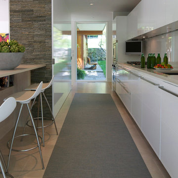
Located on a beautiful property with a legacy of architectural and landscape innovation, this guest house was originally designed by the offices of Eliot Noyes and Alan Goldberg. Due to its age and expanded use as an in-law dwelling for extended stays, the 1200 sf structure required a renovation and small addition. While one objective was to make the structure function independently of the main house with its own access road, garage, and entrance, another objective was to knit the guest house into the architectural fabric of the property. New window openings deliberately frame landscape and architectural elements on the site, while exterior finishes borrow from that of the main house (cedar, zinc, field stone) bringing unity to the family compound. Inside, the use of lighter materials gives the simple, efficient spaces airiness.
A challenge was to find an interior design vocabulary which is both simple and clean, but not cold or uninteresting. A combination of rough slate, white washed oak, and high gloss lacquer cabinets provide interest and texture, but with their minimal detailing create a sense of calm.
Sponsored
Columbus, OH
Hope Restoration & General Contracting
Columbus Design-Build, Kitchen & Bath Remodeling, Historic Renovations
 RAJ Kitchen and Bath, LLC
**Check out the video of this transformation on our website**
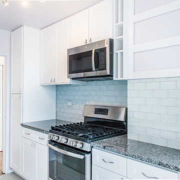
This small kitchen was way too small for this 2 bedrooms, 2 bathrooms apartment. Not only was it a very small kitchen, but the physical location of it made it very difficult to make it any bigger. There wasn't much that could have been done without incurring astronomical cost, which would get little or no return on the investment. The client wanted a kitchen that can be optimized in its current location to add a ton of value for resale.
This was difficult to do, because there was no moving of any mechanical around in the kitchen and even if we wanted to, the management of the building would not allow. For those of you who live in condos, co-ops or apartment building, you know how difficult it is to rework these foot prints. When we showed up, we saw the problems, but we also saw a huge opportunity where we can achieve those goals in the small space. This was accomplished by making some key changes and to incorporate some new things that was not possible when this kitchen was built years ago.
The crucial part of the design that would drive the entire new layout, was selecting the only appliance; that was the Refrigerator. Once we nailed down that refrigerator, we then proceeded to design the kitchen around it. We moved it to the other side of the wall where the sink was so that we can tap into the water line from the sink plumbing. It was crucial that it stays exactly 24" deep, not an inch more because we had to keep the entry as open as possible. Also, it was going to be directly in front of another big storage unit - The pantry. It is not ideal in most cases, but we needed the rest of the space to ramp up the design and open feel towards the side where all of the activities would take place, which happend to be the dining room and the view.
Once all that was figured out, we re-positioned the sink, dishwasher and the range and proceeded to wrap the cabinets around the columns to integrate them into the space. Thirty- six inches cabinets height was used so that they can be installed higher towards the ceiling height to give more room rather than the standard 18" required height between the counter tops. This was done to make the room feel a lot bigger than it really was. Not to mention, we also didn't want the faucet to be buried under the cabinets so that was also a necessary design detail for the space.
We then lowered both knee walls so that the counter top can sit on top of them, by removing that stop point that would have otherwise defined the kitchen area. This allowed us to pick up that extra footprint into the room for added prep space and enabled us to create the illusion of a kitchen that is looking longer than it really is. Every inch mattered when designing this kitchen and we made a conscious decision to use every one of that inch.
White cabinets were selected to do just what white cabinets are design to do; make a small or dark room appear bigger, brighter and more open. In this kitchen, this was amplified the more because of the kitchen location. It was perfect! We knew we did justice to the space because while we were there taking some photos, a few potential buyers walked in and went straight for the kitchen! They said its design just to fit the apartment.
Pantry roll out shelving, Double recycle bin, fancy handles, LED lighting, Quartz counter top, beautiful backslash tiles and grey linen floors finished off the kitchen which looked over a beautiful view of the George Washington Bridge from the top of this lovely 4th floor apartment.
Credit to Masterpiece Tile and Marble (Annmarie on the selection of Tiles and countertop and Val on the Construction to complete this project).
Davor Kokic Photography
 Houseplay Renovations LLC
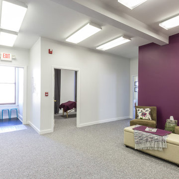
This Jersey City, NJ space was the first permanent ‘home’ for the yoga studio, so it was essential for us to listen well and design a space to serve their needs for years to come. Through our design process, we helped to guide the owners through the fit-out of their new studio location that required minimal demolition and disruption to the existing space.
Together, we converted a space originally used as a preschool into a welcoming, spacious yoga studio for local yogis. We created one main yoga studio by combining four small classrooms into a single larger space with new walls, while all the other program spaces (including designated areas for holistic treatments, massage, and bodywork) were accommodated into pre-existing rooms.
Our team completed all demo, sheetrock, electrical, and painting aspects of the project. (The studio owners did some of the work themselves, and a different company installed the flooring and carpets.) The results speak for themselves: a peaceful, restorative space to facilitate health and healing for the studio’s community.
Looking to renovate your place of business? Contact the Houseplay team; we’ll help make it happen!
Photo Credit: Anne Ruthmann Photography
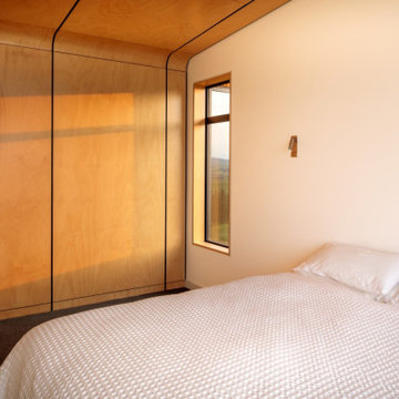
 Totem Studio Architects
Carefully orientated and sited on the edge of small plateau this house looks out across the rolling countryside of North Canterbury. The 3-bedroom rural family home is an exemplar of simplicity done with care and precision.
Tucked in alongside a private limestone quarry with cows grazing in the distance the choice of materials are intuitively natural and implemented with bare authenticity.
Oiled random width cedar weatherboards are contemporary and rustic, the polished concrete floors with exposed aggregate tie in wonderfully to the adjacent limestone cliffs, and the clean folded wall to roof, envelopes the building from the sheltered south to the amazing views to the north. Designed to portray purity of form the outer metal surface provides enclosure and shelter from the elements, while its inner face is a continuous skin of hoop pine timber from inside to out.
The hoop pine linings bend up the inner walls to form the ceiling and then soar continuous outward past the full height glazing to become the outside soffit. The bold vertical lines of the panel joins are strongly expressed aligning with windows and jambs, they guild the eye up and out so as you step in through the sheltered Southern entrances the landscape flows out in front of you.
Every detail required careful thought in design and craft in construction. As two simple boxes joined by a glass link, a house that sits so beautifully in the landscape was deceptively challenging, and stands as a credit to our client passion for their new home & the builders craftsmanship to see it though, it is a end result we are all very proud to have been a part of.
 Wood Anchor
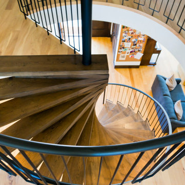
This almighty Oak staircase was one of our more challenging ones to build and install but we pulled it off!
The first hurdle was installing the treads (from the top) onto the central post which was difficult with the extremely heavy 4″ thick solid Oak treads.
The staircase was finished off with our custom designed steel hand railing which required a large amount of onsite welding. The result is a staircase that has to be seen in situ to get a sense of its impressive stature!
Photo credits: 2020 © Ray Chan Photo, All Rights Reserved
Sponsored
Columbus, OH
Hope Restoration & General Contracting
Columbus Design-Build, Kitchen & Bath Remodeling, Historic Renovations
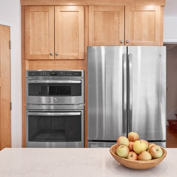
 J.T. McDermott Remodeling
The tight space of this kitchen and the desire to keep the island made for a tricky layout, requiring a cabinet depth refrigerator and no overhang on the small island. Photo Credit: Chris Malacarne Photography
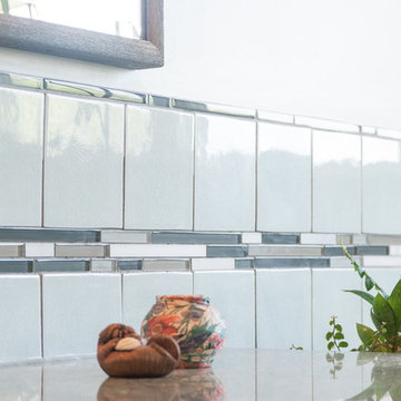 Houseplay Renovations LLC
What if your bathroom could be not just lackluster, but a place of real luxury … spacious, fresh, and beautiful? In this project, we gave new life to a bathroom that wasn’t meeting its full potential.
This spacious, sunny bathroom’s layout and design were pre-existing, so the space simply needed freshening up. Our team did just that, through the use of careful planning, new materials, and skilled labor.
With serenity in mind, we created an oasis, painting and tiling to bring the homeowner’s vision to life. While installing new tile required the removal and re-installation of all plumbing fixtures, the transformation was well worth it.
This project is a great example of how choosing materials gives life to a space. Here, the wood-look floor tile, ceramic crackle wall tile, and glass mosaic detail strips join together to create the lush, luxurious look.
Once we’d established a new look for the space, we turned our attention to the finishing touches, such as the deep soaker tub, square drain in the standing shower, and stone tops on the vanity and half-walls. These details complete the room, facilitating a sense of ease and tranquility.
Sometimes, all it takes is a few changes to yield a fantastic result … in this case, a place of peace in the midst of a wild world.
Want to brighten up your home? Contact us; we’re here to help.
Photo Credit: Tamara Templeman
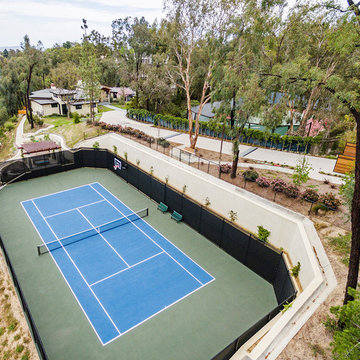
 GDC Construction
The tennis court required new permitting and extensive excavation.
Photo Credit: JoJo Feliciano
Photo of a contemporary landscaping in San Diego.
Photo of a contemporary landscaping in San Diego.
17