
Search results for "Crucial" in Home Design Ideas
 Glenview Haus – Custom Doors & Wine Cellars
Combining Form and Function of Wine Cellar
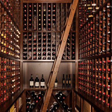
In collaboration with Chicago based interior designers, Stones Throw Interiors, we were able to provide a speak-easy style wine cellar in a beautiful Chicago high-rise. We combined our expertise and design skills with lead designer, Lonnie Unger, to create this one-of-a-kind experience for our customer. From the wine cellar door and custom wine racks, to the cooling system, we were able to utilize all of our products to their highest potential. Our expertise relies heavily on custom design, so we were delighted to be brought on to this project to showcase our abilities. We are able to build our products to fit any space limitation. Luckily for us, our client had a space with 14′ high ceilings and wanted to utilize as much of the space as possible.
Custom Wine Racking Designs
We used a classic crossed shelving design that is consistent with the ‘old-world’ speakeasy era. The use of dark Mahogany wood was ideal for this moody and dramatic wine cellar. Keeping with traditional styles, we stuck to our classic X racking technique from top to bottom. This style of racking is consistent with the era that the rest of the project was emulating.
Custom Wine Cellar Cooling System
One detail that is crucial to the project, is the temperature controlled cooling system. Wine is strongly encouraged to be kept at a strict 55 degrees in order to stay preserved. For collectors, this feature is crucial to maintaining and prolonging the life of each bottle. With such an extensive wine collection, preservation was a top priority while working on this project. Our goal was to ensure that this collection would withstand the test of time. Function and form are fused together with this classic speak-easy style wine cellar. We love working with designers and our clients to create timeless products that are reputable in their appearance and purpose.
 RAJ Kitchen and Bath, LLC
**Check out the video of this transformation on our website**
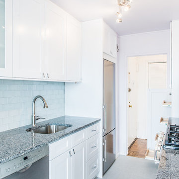
This small kitchen was way too small for this 2 bedrooms, 2 bathrooms apartment. Not only was it a very small kitchen, but the physical location of it made it very difficult to make it any bigger. There wasn't much that could have been done without incurring astronomical cost, which would get little or no return on the investment. The client wanted a kitchen that can be optimized in its current location to add a ton of value for resale.
This was difficult to do, because there was no moving of any mechanical around in the kitchen and even if we wanted to, the management of the building would not allow. For those of you who live in condos, co-ops or apartment building, you know how difficult it is to rework these foot prints. When we showed up, we saw the problems, but we also saw a huge opportunity where we can achieve those goals in the small space. This was accomplished by making some key changes and to incorporate some new things that was not possible when this kitchen was built years ago.
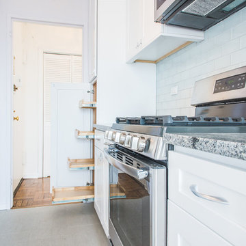
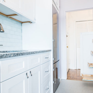
The crucial part of the design that would drive the entire new layout, was selecting the only appliance; that was the Refrigerator. Once we nailed down that refrigerator, we then proceeded to design the kitchen around it. We moved it to the other side of the wall where the sink was so that we can tap into the water line from the sink plumbing. It was crucial that it stays exactly 24" deep, not an inch more because we had to keep the entry as open as possible. Also, it was going to be directly in front of another big storage unit - The pantry. It is not ideal in most cases, but we needed the rest of the space to ramp up the design and open feel towards the side where all of the activities would take place, which happend to be the dining room and the view.
Once all that was figured out, we re-positioned the sink, dishwasher and the range and proceeded to wrap the cabinets around the columns to integrate them into the space. Thirty- six inches cabinets height was used so that they can be installed higher towards the ceiling height to give more room rather than the standard 18" required height between the counter tops. This was done to make the room feel a lot bigger than it really was. Not to mention, we also didn't want the faucet to be buried under the cabinets so that was also a necessary design detail for the space.
We then lowered both knee walls so that the counter top can sit on top of them, by removing that stop point that would have otherwise defined the kitchen area. This allowed us to pick up that extra footprint into the room for added prep space and enabled us to create the illusion of a kitchen that is looking longer than it really is. Every inch mattered when designing this kitchen and we made a conscious decision to use every one of that inch.
White cabinets were selected to do just what white cabinets are design to do; make a small or dark room appear bigger, brighter and more open. In this kitchen, this was amplified the more because of the kitchen location. It was perfect! We knew we did justice to the space because while we were there taking some photos, a few potential buyers walked in and went straight for the kitchen! They said its design just to fit the apartment.
Pantry roll out shelving, Double recycle bin, fancy handles, LED lighting, Quartz counter top, beautiful backslash tiles and grey linen floors finished off the kitchen which looked over a beautiful view of the George Washington Bridge from the top of this lovely 4th floor apartment.
Credit to Masterpiece Tile and Marble (Annmarie on the selection of Tiles and countertop and Val on the Construction to complete this project).
Davor Kokic Photography
 Reynard Architectural Designs
A family of three designed the ideal home to age in place and care for their adult son.
Designing a Unique Space
For years, the Bronks had a clear idea of what their master suite should look like. Their unique design even began appearing on HGTV shows, much to their amusement. The layout was essential to accommodating their schedules without disturbing each other's sleep.
The house is ingeniously split into two units. The main living area features three bedrooms—one serves as Dale's home office, another as his wife's art studio, and the third is their master suite. Connected by a wall, there's a separate 700-square-foot, one-bedroom apartment with its own laundry, kitchen, and living room.
This separate apartment is home to their unique needs adult son. "Having a place where he's connected to the family but has his own autonomous space was crucial," Dale explained. The design includes a discreet connecting door for emergencies, promoting his independence while ensuring safety.
"Having a place where he's connected to the family but has his own autonomous space was crucial," Dale explained. The design includes a discreet connecting door for emergencies, promoting his independence while ensuring safety.
Interior view of kitchen and dining room of a custom home designed by Reynard Custom Homes architecture, interior design, Cumming, GA
Collaboration with Reynard Custom Homes
With their master suite and apartment designs in place, the Bronks faced challenges with the rest of the layout. That's when Dale turned to Reynard Custom Homes. "I found Reynard through LinkedIn. We'd been in touch from a previous project, so I reached out. They were instrumental in bridging the gap between our ideas," Dale shared.
James from Reynard Custom Homes worked closely with the Bronks to refine their plans. "We had the apartment on one side and the master suite on the other. James helped us create a cohesive design that brought everything together beautifully."
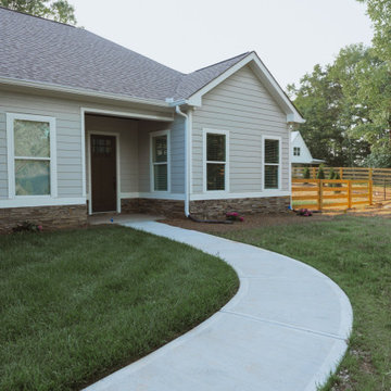
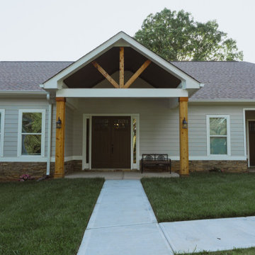
Exterior view of custom home in Cumming, GA designed by Reynard Custom Homes and built in 2024 for a family of three
A Dream Realized
After two years of meticulous planning and construction, the Bronk family's dream home was finally completed in 2024. Dale expressed his gratitude, saying, "Working with Reynard Custom Homes was a fantastic experience. They helped turn our vision into reality."
As Dale and his family settled into their new home, they looked forward to many happy years ahead, enjoying the thoughtful design and personalized touches that made their house truly theirs.
The Bronk family's journey with Reynard Custom Homes is a testament to the power of collaboration, vision, and meticulous planning. Their new home in Cumming, GA, stands as a perfect example of how dreams can indeed become reality with the right team and a clear vision.
Find the right local pro for your project
 RAJ Kitchen and Bath, LLC
**Check out the video of this transformation on our website**
This small kitchen was way too small for this 2 bedrooms, 2 bathrooms apartment. Not only was it a very small kitchen, but the physical location of it made it very difficult to make it any bigger. There wasn't much that could have been done without incurring astronomical cost, which would get little or no return on the investment. The client wanted a kitchen that can be optimized in its current location to add a ton of value for resale.
This was difficult to do, because there was no moving of any mechanical around in the kitchen and even if we wanted to, the management of the building would not allow. For those of you who live in condos, co-ops or apartment building, you know how difficult it is to rework these foot prints. When we showed up, we saw the problems, but we also saw a huge opportunity where we can achieve those goals in the small space. This was accomplished by making some key changes and to incorporate some new things that was not possible when this kitchen was built years ago.
The crucial part of the design that would drive the entire new layout, was selecting the only appliance; that was the Refrigerator. Once we nailed down that refrigerator, we then proceeded to design the kitchen around it. We moved it to the other side of the wall where the sink was so that we can tap into the water line from the sink plumbing. It was crucial that it stays exactly 24" deep, not an inch more because we had to keep the entry as open as possible. Also, it was going to be directly in front of another big storage unit - The pantry. It is not ideal in most cases, but we needed the rest of the space to ramp up the design and open feel towards the side where all of the activities would take place, which happend to be the dining room and the view.
Once all that was figured out, we re-positioned the sink, dishwasher and the range and proceeded to wrap the cabinets around the columns to integrate them into the space. Thirty- six inches cabinets height was used so that they can be installed higher towards the ceiling height to give more room rather than the standard 18" required height between the counter tops. This was done to make the room feel a lot bigger than it really was. Not to mention, we also didn't want the faucet to be buried under the cabinets so that was also a necessary design detail for the space.
We then lowered both knee walls so that the counter top can sit on top of them, by removing that stop point that would have otherwise defined the kitchen area. This allowed us to pick up that extra footprint into the room for added prep space and enabled us to create the illusion of a kitchen that is looking longer than it really is. Every inch mattered when designing this kitchen and we made a conscious decision to use every one of that inch.
White cabinets were selected to do just what white cabinets are design to do; make a small or dark room appear bigger, brighter and more open. In this kitchen, this was amplified the more because of the kitchen location. It was perfect! We knew we did justice to the space because while we were there taking some photos, a few potential buyers walked in and went straight for the kitchen! They said its design just to fit the apartment.
Pantry roll out shelving, Double recycle bin, fancy handles, LED lighting, Quartz counter top, beautiful backslash tiles and grey linen floors finished off the kitchen which looked over a beautiful view of the George Washington Bridge from the top of this lovely 4th floor apartment.
Credit to Masterpiece Tile and Marble (Annmarie on the selection of Tiles and countertop and Val on the Construction to complete this project).
Davor Kokic Photography
 RAJ Kitchen and Bath, LLC
**Check out the video of this transformation on our website**
This small kitchen was way too small for this 2 bedrooms, 2 bathrooms apartment. Not only was it a very small kitchen, but the physical location of it made it very difficult to make it any bigger. There wasn't much that could have been done without incurring astronomical cost, which would get little or no return on the investment. The client wanted a kitchen that can be optimized in its current location to add a ton of value for resale.
This was difficult to do, because there was no moving of any mechanical around in the kitchen and even if we wanted to, the management of the building would not allow. For those of you who live in condos, co-ops or apartment building, you know how difficult it is to rework these foot prints. When we showed up, we saw the problems, but we also saw a huge opportunity where we can achieve those goals in the small space. This was accomplished by making some key changes and to incorporate some new things that was not possible when this kitchen was built years ago.
The crucial part of the design that would drive the entire new layout, was selecting the only appliance; that was the Refrigerator. Once we nailed down that refrigerator, we then proceeded to design the kitchen around it. We moved it to the other side of the wall where the sink was so that we can tap into the water line from the sink plumbing. It was crucial that it stays exactly 24" deep, not an inch more because we had to keep the entry as open as possible. Also, it was going to be directly in front of another big storage unit - The pantry. It is not ideal in most cases, but we needed the rest of the space to ramp up the design and open feel towards the side where all of the activities would take place, which happend to be the dining room and the view.
Once all that was figured out, we re-positioned the sink, dishwasher and the range and proceeded to wrap the cabinets around the columns to integrate them into the space. Thirty- six inches cabinets height was used so that they can be installed higher towards the ceiling height to give more room rather than the standard 18" required height between the counter tops. This was done to make the room feel a lot bigger than it really was. Not to mention, we also didn't want the faucet to be buried under the cabinets so that was also a necessary design detail for the space.
We then lowered both knee walls so that the counter top can sit on top of them, by removing that stop point that would have otherwise defined the kitchen area. This allowed us to pick up that extra footprint into the room for added prep space and enabled us to create the illusion of a kitchen that is looking longer than it really is. Every inch mattered when designing this kitchen and we made a conscious decision to use every one of that inch.
White cabinets were selected to do just what white cabinets are design to do; make a small or dark room appear bigger, brighter and more open. In this kitchen, this was amplified the more because of the kitchen location. It was perfect! We knew we did justice to the space because while we were there taking some photos, a few potential buyers walked in and went straight for the kitchen! They said its design just to fit the apartment.
Pantry roll out shelving, Double recycle bin, fancy handles, LED lighting, Quartz counter top, beautiful backslash tiles and grey linen floors finished off the kitchen which looked over a beautiful view of the George Washington Bridge from the top of this lovely 4th floor apartment.
Credit to Masterpiece Tile and Marble (Annmarie on the selection of Tiles and countertop and Val on the Construction to complete this project).
Davor Kokic Photography
 RAJ Kitchen and Bath, LLC
This family throws some mean parties where large crowds usually sit at the poolside. There’s an entire section of this walk out second level that is dedicated to entertaining which also gives access to the pool in the backyard. This place comes alive at night with built in surround sounds and LED lights. There was just one issue. The kitchen.
The kitchen did not fit in. It was old, outdated, out-styled and nonfunctional. They knew the kitchen had to be address eventually but they just didn’t want to redo the kitchen. They wanted to revamp the kitchen, so they asked us to come in and look at the space to see how we can design this second floor kitchen in their New Rochelle home.
It was a small kitchen, strategically located where it could be the hub that the family wanted it to be. It held its own amongst everything that was in the open space like the big screen TV, fireplace and pool table. That is exactly what we did in the design and here is how we did it.
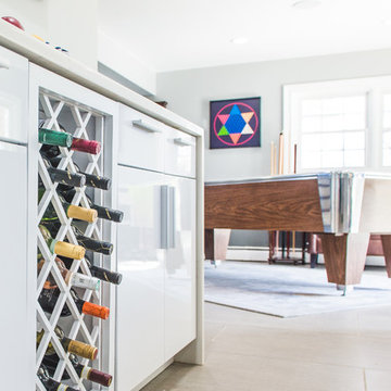
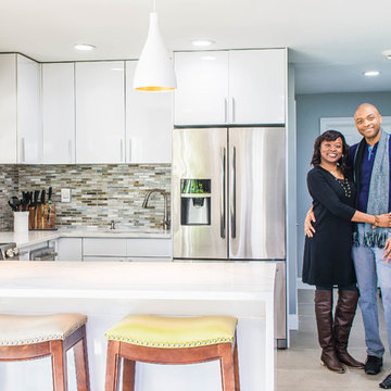
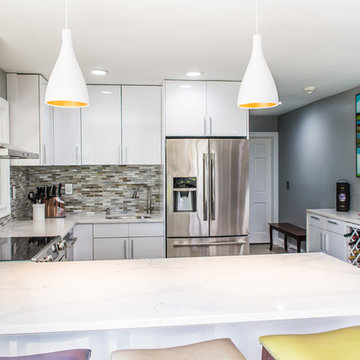
First, we got rid of the kitchen table and by doing so we created a peninsular. This eventually sets up the space for a couple of really cool pendant lights, some unique counter chairs and a wine cooler that was purchased before but never really had a home. We then turned our attention to the range and hood. This was not the main kitchen, so wall storage wasn’t the main goal here. We wanted to create a more open feel interaction while in the kitchen, hence we designed the free standing chimney hood alone to the left of the window.
We then looked at how we can make it more entertaining. We did that by adding a Wine rack on a buffet style type area. This wall was free and would have remained empty had we not find a way to add some more glitz.
Finally came the counter-top. Every detail was crucial because the view of the kitchen can be seen from when you enter the front door even if it was on the second floor walk out. The use of the space called for a waterfall edge counter-top and more importantly, the stone selection to further accentuate the effect. It was crucial that there was movement in the stone which connects to the 45 degree waterfall edge so it would be very dramatic.
Nothing was overlooked in this space. It had to be done this way if it was going to have a fighting chance to take command of its territory.
Have a look at some before and after photos on the left and see a brief video transformation of this lovely small kitchen.
See more photos and vidoe of this transformation on our website @ http://www.rajkitchenandbath.com/portfolio-items/kitchen-remodel-new-rochelle-ny-10801/
 RAJ Kitchen and Bath, LLC
This family throws some mean parties where large crowds usually sit at the poolside. There’s an entire section of this walk out second level that is dedicated to entertaining which also gives access to the pool in the backyard. This place comes alive at night with built in surround sounds and LED lights. There was just one issue. The kitchen.
The kitchen did not fit in. It was old, outdated, out-styled and nonfunctional. They knew the kitchen had to be address eventually but they just didn’t want to redo the kitchen. They wanted to revamp the kitchen, so they asked us to come in and look at the space to see how we can design this second floor kitchen in their New Rochelle home.
It was a small kitchen, strategically located where it could be the hub that the family wanted it to be. It held its own amongst everything that was in the open space like the big screen TV, fireplace and pool table. That is exactly what we did in the design and here is how we did it.
First, we got rid of the kitchen table and by doing so we created a peninsular. This eventually sets up the space for a couple of really cool pendant lights, some unique counter chairs and a wine cooler that was purchased before but never really had a home. We then turned our attention to the range and hood. This was not the main kitchen, so wall storage wasn’t the main goal here. We wanted to create a more open feel interaction while in the kitchen, hence we designed the free standing chimney hood alone to the left of the window.
We then looked at how we can make it more entertaining. We did that by adding a Wine rack on a buffet style type area. This wall was free and would have remained empty had we not find a way to add some more glitz.
Finally came the counter-top. Every detail was crucial because the view of the kitchen can be seen from when you enter the front door even if it was on the second floor walk out. The use of the space called for a waterfall edge counter-top and more importantly, the stone selection to further accentuate the effect. It was crucial that there was movement in the stone which connects to the 45 degree waterfall edge so it would be very dramatic.
Nothing was overlooked in this space. It had to be done this way if it was going to have a fighting chance to take command of its territory.
Have a look at some before and after photos on the left and see a brief video transformation of this lovely small kitchen.
See more photos and vidoe of this transformation on our website @ http://www.rajkitchenandbath.com/portfolio-items/kitchen-remodel-new-rochelle-ny-10801/
 RAJ Kitchen and Bath, LLC
This family throws some mean parties where large crowds usually sit at the poolside. There’s an entire section of this walk out second level that is dedicated to entertaining which also gives access to the pool in the backyard. This place comes alive at night with built in surround sounds and LED lights. There was just one issue. The kitchen.
The kitchen did not fit in. It was old, outdated, out-styled and nonfunctional. They knew the kitchen had to be address eventually but they just didn’t want to redo the kitchen. They wanted to revamp the kitchen, so they asked us to come in and look at the space to see how we can design this second floor kitchen in their New Rochelle home.
It was a small kitchen, strategically located where it could be the hub that the family wanted it to be. It held its own amongst everything that was in the open space like the big screen TV, fireplace and pool table. That is exactly what we did in the design and here is how we did it.
First, we got rid of the kitchen table and by doing so we created a peninsular. This eventually sets up the space for a couple of really cool pendant lights, some unique counter chairs and a wine cooler that was purchased before but never really had a home. We then turned our attention to the range and hood. This was not the main kitchen, so wall storage wasn’t the main goal here. We wanted to create a more open feel interaction while in the kitchen, hence we designed the free standing chimney hood alone to the left of the window.
We then looked at how we can make it more entertaining. We did that by adding a Wine rack on a buffet style type area. This wall was free and would have remained empty had we not find a way to add some more glitz.
Finally came the counter-top. Every detail was crucial because the view of the kitchen can be seen from when you enter the front door even if it was on the second floor walk out. The use of the space called for a waterfall edge counter-top and more importantly, the stone selection to further accentuate the effect. It was crucial that there was movement in the stone which connects to the 45 degree waterfall edge so it would be very dramatic.
Nothing was overlooked in this space. It had to be done this way if it was going to have a fighting chance to take command of its territory.
Have a look at some before and after photos on the left and see a brief video transformation of this lovely small kitchen.
See more photos and vidoe of this transformation on our website @ http://www.rajkitchenandbath.com/portfolio-items/kitchen-remodel-new-rochelle-ny-10801/
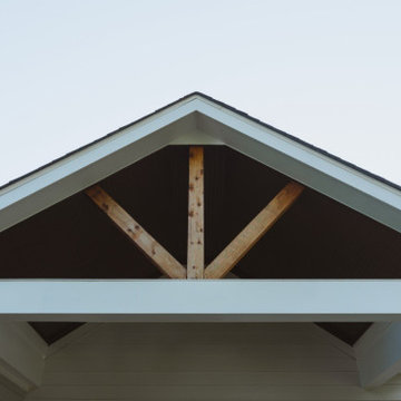 Reynard Architectural Designs
A family of three designed the ideal home to age in place and care for their adult son.
Designing a Unique Space
For years, the Bronks had a clear idea of what their master suite should look like. Their unique design even began appearing on HGTV shows, much to their amusement. The layout was essential to accommodating their schedules without disturbing each other's sleep.
The house is ingeniously split into two units. The main living area features three bedrooms—one serves as Dale's home office, another as his wife's art studio, and the third is their master suite. Connected by a wall, there's a separate 700-square-foot, one-bedroom apartment with its own laundry, kitchen, and living room.
This separate apartment is home to their unique needs adult son. "Having a place where he's connected to the family but has his own autonomous space was crucial," Dale explained. The design includes a discreet connecting door for emergencies, promoting his independence while ensuring safety.
"Having a place where he's connected to the family but has his own autonomous space was crucial," Dale explained. The design includes a discreet connecting door for emergencies, promoting his independence while ensuring safety.
Interior view of kitchen and dining room of a custom home designed by Reynard Custom Homes architecture, interior design, Cumming, GA
Collaboration with Reynard Custom Homes
With their master suite and apartment designs in place, the Bronks faced challenges with the rest of the layout. That's when Dale turned to Reynard Custom Homes. "I found Reynard through LinkedIn. We'd been in touch from a previous project, so I reached out. They were instrumental in bridging the gap between our ideas," Dale shared.
James from Reynard Custom Homes worked closely with the Bronks to refine their plans. "We had the apartment on one side and the master suite on the other. James helped us create a cohesive design that brought everything together beautifully."
Exterior view of custom home in Cumming, GA designed by Reynard Custom Homes and built in 2024 for a family of three
A Dream Realized
After two years of meticulous planning and construction, the Bronk family's dream home was finally completed in 2024. Dale expressed his gratitude, saying, "Working with Reynard Custom Homes was a fantastic experience. They helped turn our vision into reality."
As Dale and his family settled into their new home, they looked forward to many happy years ahead, enjoying the thoughtful design and personalized touches that made their house truly theirs.
The Bronk family's journey with Reynard Custom Homes is a testament to the power of collaboration, vision, and meticulous planning. Their new home in Cumming, GA, stands as a perfect example of how dreams can indeed become reality with the right team and a clear vision.
 RAJ Kitchen and Bath, LLC
This family throws some mean parties where large crowds usually sit at the poolside. There’s an entire section of this walk out second level that is dedicated to entertaining which also gives access to the pool in the backyard. This place comes alive at night with built in surround sounds and LED lights. There was just one issue. The kitchen.
The kitchen did not fit in. It was old, outdated, out-styled and nonfunctional. They knew the kitchen had to be address eventually but they just didn’t want to redo the kitchen. They wanted to revamp the kitchen, so they asked us to come in and look at the space to see how we can design this second floor kitchen in their New Rochelle home.
It was a small kitchen, strategically located where it could be the hub that the family wanted it to be. It held its own amongst everything that was in the open space like the big screen TV, fireplace and pool table. That is exactly what we did in the design and here is how we did it.
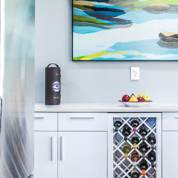
First, we got rid of the kitchen table and by doing so we created a peninsular. This eventually sets up the space for a couple of really cool pendant lights, some unique counter chairs and a wine cooler that was purchased before but never really had a home. We then turned our attention to the range and hood. This was not the main kitchen, so wall storage wasn’t the main goal here. We wanted to create a more open feel interaction while in the kitchen, hence we designed the free standing chimney hood alone to the left of the window.
We then looked at how we can make it more entertaining. We did that by adding a Wine rack on a buffet style type area. This wall was free and would have remained empty had we not find a way to add some more glitz.
Finally came the counter-top. Every detail was crucial because the view of the kitchen can be seen from when you enter the front door even if it was on the second floor walk out. The use of the space called for a waterfall edge counter-top and more importantly, the stone selection to further accentuate the effect. It was crucial that there was movement in the stone which connects to the 45 degree waterfall edge so it would be very dramatic.
Nothing was overlooked in this space. It had to be done this way if it was going to have a fighting chance to take command of its territory.
Have a look at some before and after photos on the left and see a brief video transformation of this lovely small kitchen.
See more photos and vidoe of this transformation on our website @ http://www.rajkitchenandbath.com/portfolio-items/kitchen-remodel-new-rochelle-ny-10801/
 RAJ Kitchen and Bath, LLC
**Check out the video of this transformation on our website**
This small kitchen was way too small for this 2 bedrooms, 2 bathrooms apartment. Not only was it a very small kitchen, but the physical location of it made it very difficult to make it any bigger. There wasn't much that could have been done without incurring astronomical cost, which would get little or no return on the investment. The client wanted a kitchen that can be optimized in its current location to add a ton of value for resale.
This was difficult to do, because there was no moving of any mechanical around in the kitchen and even if we wanted to, the management of the building would not allow. For those of you who live in condos, co-ops or apartment building, you know how difficult it is to rework these foot prints. When we showed up, we saw the problems, but we also saw a huge opportunity where we can achieve those goals in the small space. This was accomplished by making some key changes and to incorporate some new things that was not possible when this kitchen was built years ago.
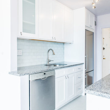
The crucial part of the design that would drive the entire new layout, was selecting the only appliance; that was the Refrigerator. Once we nailed down that refrigerator, we then proceeded to design the kitchen around it. We moved it to the other side of the wall where the sink was so that we can tap into the water line from the sink plumbing. It was crucial that it stays exactly 24" deep, not an inch more because we had to keep the entry as open as possible. Also, it was going to be directly in front of another big storage unit - The pantry. It is not ideal in most cases, but we needed the rest of the space to ramp up the design and open feel towards the side where all of the activities would take place, which happend to be the dining room and the view.
Once all that was figured out, we re-positioned the sink, dishwasher and the range and proceeded to wrap the cabinets around the columns to integrate them into the space. Thirty- six inches cabinets height was used so that they can be installed higher towards the ceiling height to give more room rather than the standard 18" required height between the counter tops. This was done to make the room feel a lot bigger than it really was. Not to mention, we also didn't want the faucet to be buried under the cabinets so that was also a necessary design detail for the space.
We then lowered both knee walls so that the counter top can sit on top of them, by removing that stop point that would have otherwise defined the kitchen area. This allowed us to pick up that extra footprint into the room for added prep space and enabled us to create the illusion of a kitchen that is looking longer than it really is. Every inch mattered when designing this kitchen and we made a conscious decision to use every one of that inch.
White cabinets were selected to do just what white cabinets are design to do; make a small or dark room appear bigger, brighter and more open. In this kitchen, this was amplified the more because of the kitchen location. It was perfect! We knew we did justice to the space because while we were there taking some photos, a few potential buyers walked in and went straight for the kitchen! They said its design just to fit the apartment.
Pantry roll out shelving, Double recycle bin, fancy handles, LED lighting, Quartz counter top, beautiful backslash tiles and grey linen floors finished off the kitchen which looked over a beautiful view of the George Washington Bridge from the top of this lovely 4th floor apartment.
Credit to Masterpiece Tile and Marble (Annmarie on the selection of Tiles and countertop and Val on the Construction to complete this project).
Davor Kokic Photography
 Glenview Haus – Custom Doors & Wine Cellars
Combining Form and Function of Wine Cellar
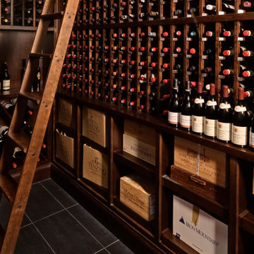
In collaboration with Chicago based interior designers, Stones Throw Interiors, we were able to provide a speak-easy style wine cellar in a beautiful Chicago high-rise. We combined our expertise and design skills with lead designer, Lonnie Unger, to create this one-of-a-kind experience for our customer. From the wine cellar door and custom wine racks, to the cooling system, we were able to utilize all of our products to their highest potential. Our expertise relies heavily on custom design, so we were delighted to be brought on to this project to showcase our abilities. We are able to build our products to fit any space limitation. Luckily for us, our client had a space with 14′ high ceilings and wanted to utilize as much of the space as possible.
Custom Wine Racking Designs
We used a classic crossed shelving design that is consistent with the ‘old-world’ speakeasy era. The use of dark Mahogany wood was ideal for this moody and dramatic wine cellar. Keeping with traditional styles, we stuck to our classic X racking technique from top to bottom. This style of racking is consistent with the era that the rest of the project was emulating.
Custom Wine Cellar Cooling System
One detail that is crucial to the project, is the temperature controlled cooling system. Wine is strongly encouraged to be kept at a strict 55 degrees in order to stay preserved. For collectors, this feature is crucial to maintaining and prolonging the life of each bottle. With such an extensive wine collection, preservation was a top priority while working on this project. Our goal was to ensure that this collection would withstand the test of time. Function and form are fused together with this classic speak-easy style wine cellar. We love working with designers and our clients to create timeless products that are reputable in their appearance and purpose.
 katherine
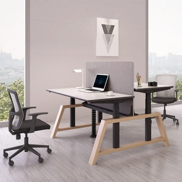
Office Workstations and Cubicles: The Unsung Heroes of Efficient Team Environments
In today's fast-paced business world, the hum of productivity is the sweetest sound an office can produce. But what fuels this symphony of efficiency?
While leadership and strategy are crucial, the physical environment in which a team operates plays a role that is just as vital. The debate between open-plan offices and traditional cubicles has raged for years, yet the truth is that a well-designed space incorporating both office workstations cubicles can be the key to unlocking a team's full potential. This isn't just about furniture; it's about creating a habitat for success.
The Evolution of the Workspace: Beyond the Beige Box
Gone are the days of monotonous rows of identical, soul-crushing cubicles. Modern office design has embraced a more nuanced understanding of worker needs. The contemporary workstation is a far cry from its predecessors, offering flexibility, ergonomic support, and a nod to aesthetic appeal. This evolution recognizes that a one-size-fits-all approach stifles creativity and productivity.
Fostering Focus in a Sea of Collaboration
While collaboration is a cornerstone of modern business, the need for individual, focused work remains paramount. This is where the modern cubicle shines. It provides a sanctuary from the constant distractions of a completely open office, allowing employees to delve deep into tasks that require concentration. This dedicated space minimizes interruptions, leading to higher quality work and reduced stress levels.
The Power of Personalization and Ownership
Giving employees a degree of control over their immediate environment can have a profound impact on morale and engagement. Modern workstations and cubicles that allow for personalization be it through adjustable shelving, pinboards for personal items, or even the choice of chair foster a sense of ownership. This small act of empowerment can translate into a greater sense of belonging and commitment to the organization.
Ergonomics: The Foundation of Employee Well-being and Productivity
A comfortable employee is a productive employee. Ergonomics is not a luxury; it's a fundamental necessity in any office environment. Poorly designed workstations can lead to a host of musculoskeletal issues, from back pain to carpal tunnel syndrome, resulting in increased absenteeism and decreased efficiency. Investing in ergonomic chairs, adjustable-height desks, and properly positioned monitors is an investment in the long-term health and performance of your team.
Designing for Synergy: The Strategic office layout design
The arrangement of workstations and cubicles is as important as the furniture itself. A strategic office layout design can facilitate seamless communication and collaboration while still providing pockets of privacy for focused work. This involves creating "neighborhoods" for different teams, placing collaborative zones in central, easily accessible areas, and ensuring that high-traffic pathways don't cut through quiet work zones.
Breaking Down Barriers with Hybrid Designs
The most effective office environments often feature a hybrid approach. This might involve clusters of cubicles for focused work, interspersed with open, collaborative "huddle spaces" equipped with whiteboards and comfortable seating. This variety allows employees to choose the environment that best suits the task at hand, offering the best of both worlds.
The Role of Acoustics in a Thriving Workplace
Noise is one of the biggest complaints in open-plan offices. Well-designed cubicles with sound-dampening panels can significantly mitigate this issue. Furthermore, incorporating acoustic solutions throughout the office, such as sound-absorbing materials on walls and ceilings, can create a more pleasant and productive auditory environment for everyone.
Integrating Technology for a Seamless Workflow
In the digital age, technology is the lifeblood of any business. Modern office workstations are designed with this in mind, featuring integrated power and data ports, cable management systems, and ample space for multiple monitors. This seamless integration of technology ensures that employees have the tools they need to work efficiently and without frustration.
Choosing the Right Partner for Your Office Environment
The task of outfitting an office can be daunting. Partnering with a knowledgeable and reputable Meet&Co commercial furniture supplier is crucial to creating an environment that is both functional and inspiring. A good supplier will not only offer a wide range of high-quality products but will also provide expert advice on space planning and ergonomic best practices, ensuring that your investment yields the best possible return.
The Future of the Office: Flexibility and Adaptability
The world of work is constantly evolving, and office design must evolve with it. The future lies in creating flexible and adaptable spaces that can be easily reconfigured to meet the changing needs of a business. Modular furniture and movable partitions are key components of this future-proof approach, allowing organizations to scale and adapt without the need for costly and disruptive renovations.
Conclusion: A Strategic Investment in Your Greatest Asset
Ultimately, the design of your office is a direct reflection of your company's culture and values. By investing in high-quality, ergonomic, and well-designed office workstations and cubicles, you are sending a clear message to your employees: their well-being and productivity matter. This strategic investment in your physical workspace is, in fact, an investment in your most valuable asset your people. The result is a more engaged, efficient, and innovative team, ready to tackle the challenges of tomorrow.
 RAJ Kitchen and Bath, LLC
This family throws some mean parties where large crowds usually sit at the poolside. There’s an entire section of this walk out second level that is dedicated to entertaining which also gives access to the pool in the backyard. This place comes alive at night with built in surround sounds and LED lights. There was just one issue. The kitchen.
The kitchen did not fit in. It was old, outdated, out-styled and nonfunctional. They knew the kitchen had to be address eventually but they just didn’t want to redo the kitchen. They wanted to revamp the kitchen, so they asked us to come in and look at the space to see how we can design this second floor kitchen in their New Rochelle home.
It was a small kitchen, strategically located where it could be the hub that the family wanted it to be. It held its own amongst everything that was in the open space like the big screen TV, fireplace and pool table. That is exactly what we did in the design and here is how we did it.
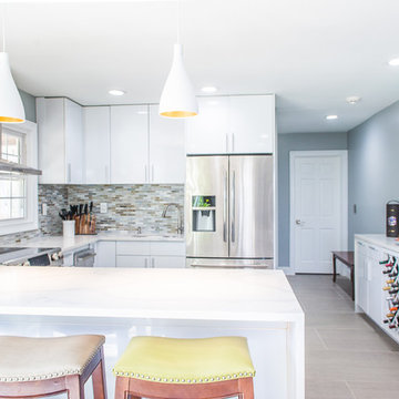
First, we got rid of the kitchen table and by doing so we created a peninsular. This eventually sets up the space for a couple of really cool pendant lights, some unique counter chairs and a wine cooler that was purchased before but never really had a home. We then turned our attention to the range and hood. This was not the main kitchen, so wall storage wasn’t the main goal here. We wanted to create a more open feel interaction while in the kitchen, hence we designed the free standing chimney hood alone to the left of the window.
We then looked at how we can make it more entertaining. We did that by adding a Wine rack on a buffet style type area. This wall was free and would have remained empty had we not find a way to add some more glitz.
Finally came the counter-top. Every detail was crucial because the view of the kitchen can be seen from when you enter the front door even if it was on the second floor walk out. The use of the space called for a waterfall edge counter-top and more importantly, the stone selection to further accentuate the effect. It was crucial that there was movement in the stone which connects to the 45 degree waterfall edge so it would be very dramatic.
Nothing was overlooked in this space. It had to be done this way if it was going to have a fighting chance to take command of its territory.
Have a look at some before and after photos on the left and see a brief video transformation of this lovely small kitchen.
See more photos and vidoe of this transformation on our website @ http://www.rajkitchenandbath.com/portfolio-items/kitchen-remodel-new-rochelle-ny-10801/
 RAJ Kitchen and Bath, LLC
This family throws some mean parties where large crowds usually sit at the poolside. There’s an entire section of this walk out second level that is dedicated to entertaining which also gives access to the pool in the backyard. This place comes alive at night with built in surround sounds and LED lights. There was just one issue. The kitchen.
The kitchen did not fit in. It was old, outdated, out-styled and nonfunctional. They knew the kitchen had to be address eventually but they just didn’t want to redo the kitchen. They wanted to revamp the kitchen, so they asked us to come in and look at the space to see how we can design this second floor kitchen in their New Rochelle home.
It was a small kitchen, strategically located where it could be the hub that the family wanted it to be. It held its own amongst everything that was in the open space like the big screen TV, fireplace and pool table. That is exactly what we did in the design and here is how we did it.
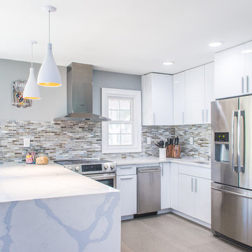
First, we got rid of the kitchen table and by doing so we created a peninsular. This eventually sets up the space for a couple of really cool pendant lights, some unique counter chairs and a wine cooler that was purchased before but never really had a home. We then turned our attention to the range and hood. This was not the main kitchen, so wall storage wasn’t the main goal here. We wanted to create a more open feel interaction while in the kitchen, hence we designed the free standing chimney hood alone to the left of the window.
We then looked at how we can make it more entertaining. We did that by adding a Wine rack on a buffet style type area. This wall was free and would have remained empty had we not find a way to add some more glitz.
Finally came the counter-top. Every detail was crucial because the view of the kitchen can be seen from when you enter the front door even if it was on the second floor walk out. The use of the space called for a waterfall edge counter-top and more importantly, the stone selection to further accentuate the effect. It was crucial that there was movement in the stone which connects to the 45 degree waterfall edge so it would be very dramatic.
Nothing was overlooked in this space. It had to be done this way if it was going to have a fighting chance to take command of its territory.
Have a look at some before and after photos on the left and see a brief video transformation of this lovely small kitchen.
See more photos and vidoe of this transformation on our website @ http://www.rajkitchenandbath.com/portfolio-items/kitchen-remodel-new-rochelle-ny-10801/
 A&E Construction and Design Center
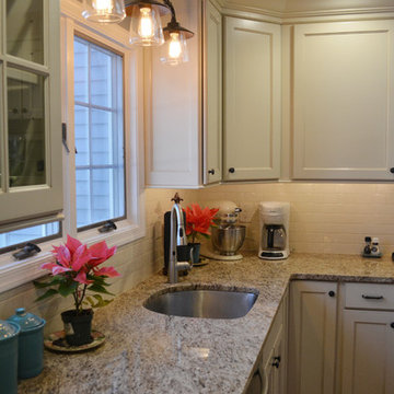
A&E Construction. Our Pennington NJ client had recently moved into this home and was dissatisfied with the way the kitchen functioned. As it was before, the kitchen was closed off from the rest of the home with the single entrance being on the far end of the main first-floor hallway, next to the door to the garage. A&E Construction developed a design for her kitchen remodel that both creates a better flow between the kitchen and the rest of the house, and also offers a better option for eating/work space.
 Reynard Architectural Designs
A family of three designed the ideal home to age in place and care for their adult son.
Designing a Unique Space
For years, the Bronks had a clear idea of what their master suite should look like. Their unique design even began appearing on HGTV shows, much to their amusement. The layout was essential to accommodating their schedules without disturbing each other's sleep.
The house is ingeniously split into two units. The main living area features three bedrooms—one serves as Dale's home office, another as his wife's art studio, and the third is their master suite. Connected by a wall, there's a separate 700-square-foot, one-bedroom apartment with its own laundry, kitchen, and living room.
This separate apartment is home to their unique needs adult son. "Having a place where he's connected to the family but has his own autonomous space was crucial," Dale explained. The design includes a discreet connecting door for emergencies, promoting his independence while ensuring safety.
"Having a place where he's connected to the family but has his own autonomous space was crucial," Dale explained. The design includes a discreet connecting door for emergencies, promoting his independence while ensuring safety.
Interior view of kitchen and dining room of a custom home designed by Reynard Custom Homes architecture, interior design, Cumming, GA
Collaboration with Reynard Custom Homes
With their master suite and apartment designs in place, the Bronks faced challenges with the rest of the layout. That's when Dale turned to Reynard Custom Homes. "I found Reynard through LinkedIn. We'd been in touch from a previous project, so I reached out. They were instrumental in bridging the gap between our ideas," Dale shared.
James from Reynard Custom Homes worked closely with the Bronks to refine their plans. "We had the apartment on one side and the master suite on the other. James helped us create a cohesive design that brought everything together beautifully."
Exterior view of custom home in Cumming, GA designed by Reynard Custom Homes and built in 2024 for a family of three
A Dream Realized
After two years of meticulous planning and construction, the Bronk family's dream home was finally completed in 2024. Dale expressed his gratitude, saying, "Working with Reynard Custom Homes was a fantastic experience. They helped turn our vision into reality."
As Dale and his family settled into their new home, they looked forward to many happy years ahead, enjoying the thoughtful design and personalized touches that made their house truly theirs.
The Bronk family's journey with Reynard Custom Homes is a testament to the power of collaboration, vision, and meticulous planning. Their new home in Cumming, GA, stands as a perfect example of how dreams can indeed become reality with the right team and a clear vision.
 Home Improvements
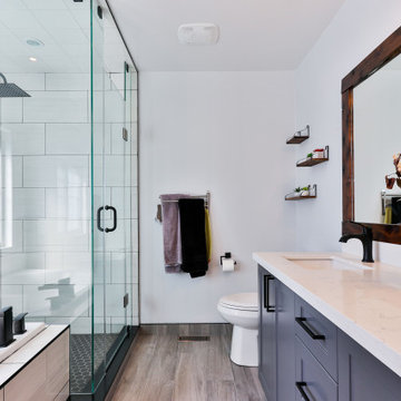
Embarking on a bathroom remodeling project is an exciting endeavor that can greatly enhance the functionality, aesthetics, and value of your home. However, finding a reliable and skilled contractor in a bustling city like Los Angeles can be a daunting task. To simplify the process and ensure a successful bathroom renovation, we have compiled a comprehensive guide on how to find a reputable bathroom remodeling contractor in Los Angeles, California.
Start with Online Research:
The first step in your quest for a reliable contractor is to conduct thorough online research. Utilize search engines like Google to find bathroom remodeling contractors in Los Angeles. Be sure to include specific keywords such as "bathroom remodeling," "contractor," and "Los Angeles" to refine your search results.
Check Online Directories and Review Platforms:
Explore online directories and review platforms like Yelp, Angie's List, and Houzz to find a curated list of bathroom remodeling contractors in Los Angeles. These platforms often provide detailed information about contractors, including customer reviews, ratings, project photos, and contact details. Assess the overall rating and read through multiple reviews to gauge the contractor's reputation and reliability.
Seek Recommendations:
Ask friends, family, neighbors, and colleagues who have recently undergone a bathroom remodeling project in Los Angeles for recommendations. Personal referrals can provide valuable insights and firsthand experiences that online research may not uncover. Inquire about the contractor's professionalism, craftsmanship, adherence to timelines, and overall satisfaction with the project.
Verify Credentials and Licensing:
Once you have shortlisted potential contractors, it is crucial to verify their credentials and licensing. Check if they are licensed by the Contractors State License Board (CSLB) in California. A valid license ensures that the contractor meets the state's requirements and regulations. Additionally, inquire about their insurance coverage to protect against any potential liabilities during the remodeling process.
Evaluate Experience and Expertise:
Assess the experience and expertise of the contractors on your list. Look for contractors who specialize in bathroom remodeling and have a proven track record of successful projects. Review their portfolios or ask for references to see examples of their previous work. A skilled contractor should be able to handle a variety of bathroom designs and styles, and provide creative solutions to meet your specific needs.
Schedule In-Person Consultations:
Arrange in-person consultations with the shortlisted contractors. Use this opportunity to discuss your remodeling goals, budget, timeline, and any specific requirements you may have. A reputable contractor will listen attentively, provide insights, and offer suggestions based on their expertise. Pay attention to their communication style, professionalism, and responsiveness, as these qualities are crucial for a smooth working relationship.
Request Detailed Quotes and Contracts:
Ask the contractors for detailed written quotes that outline the project's scope, materials, labor costs, and any additional expenses. A comprehensive quote will help you compare the estimates provided by different contractors effectively. Once you have selected a contractor, ensure that you have a detailed contract in place that covers all aspects of the project, including timelines, payment schedules, warranties, and dispute resolution processes.
Seek Permits and Building Code Compliance:
Bathroom remodeling projects often require permits and adherence to building codes. A reputable contractor will be familiar with the local building regulations in Los Angeles and should handle the permit application process on your behalf. Verify that the contractor will obtain the necessary permits and ensure that all work is compliant with local codes and regulations.
Conclusion:
Finding a bathroom remodeling contractor in Los Angeles, California, may seem overwhelming, but by following these guidelines, you can streamline the process and select a contractor who meets your expectations. Conduct thorough online research, seek recommendations, verify credentials, evaluate experience, and schedule in-person consultations to make an informed decision.
 Muhammad zaid
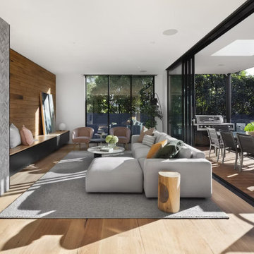
Building a new home is a momentous occasion. For many, this is a once-in-a-lifetime opportunity to create the home of their dreams. However, selecting the perfect home design and floor plan can feel like a daunting task. After all, you want to ensure that your new home will meet your family's needs and desires for years. That's where trusted services come in. With the latest technology, you can design your entire home and even tour it in 3D. From building your 2D floor plan to furnishing it, you can watch as your dream home is brought to life. In this article, we will explore how you can beautifully decorate your home online.
Select the Main Theme
Embarking on a new home design project can be an exciting yet difficult task. One crucial step is to determine your style preference, as it will guide your decor choices throughout your home. Researching through various platforms and furniture websites can provide inspiration and help gauge pricing for your favorite pieces. One helpful strategy is to create a mood board where you gather your favorite interior design looks and examine any patterns that emerge.
By taking the time to establish your preferred style, you can create a cohesive and inviting atmosphere in your home that reflects your personal taste and style. If you want to create a design while traveling, you may need to use a USA VPN to access some online services with advanced home design tools. It will allow you to bypass geo-blocks.
Create a Layout
The global home design market reached $115 billion in 2022. When designing living spaces, several factors must be considered, including the arrangement of social and private areas and accommodating the changing needs of families over time. Parents with young children usually prefer bedrooms and bathrooms to be clustered together while families with teenagers often request more segregated spaces in two-story home designs.
Home design is an intricate art form that involves creating an interior space that is both visually appealing and functional. Whether you are starting afresh with a new home or looking to revamp an existing one, home design offers ample opportunities to unleash your creativity. It does not matter if you lack professional architecture expertise, as anyone can undertake the planning and execution of a home design project.
The initial steps involve analyzing your existing home layout and then conceptualizing your desired vision for the remodel. This is the cornerstone on which your entire project will be built, and it sets the tone for the aesthetic of your home's interior.
Utilize online home design software to generate realistic images of your new home and easily gather feedback from others. This allows you to make necessary adjustments to perfect your design. With the help of professional software, realizing your ideal home design is now made easy and achievable without requiring any specialized training or knowledge. You can access online tools using VeePN for a secure connection. Start by creating a blueprint of your floor plan.
Furnish Your Space
If you need to decorate house, selecting the right flooring and paint or wallpaper for the walls is key. Using online services, you can speed up this process. With intuitive tools such as dragging and dropping items, you can create a truly unique and personalized home design that is sure to impress.
When selecting a color scheme for your design, it is crucial to consider the benefits and drawbacks of using neutral tones versus incorporating a pop of color. While a neutral palette can simplify the design process and provide a timeless look, it may lack individuality or a focal point. Whereas, a splash of color can introduce a dynamic quality, offer intrigue, and contribute to an energetic ambiance. Additionally, combining a range of price points and textures can add dimension to your design. Consider juxtaposing high-end decor with refurbished furniture and incorporating cozy textures like plush rugs and fluffy cushions, to achieve both sophistication and comfort in your space.
Create a 3D Tour
Home design is a craft that involves creating an attractive home interior, irrespective of whether you're starting from scratch or remodeling an existing home. While anyone can undertake a home design project, you don't necessarily need to be a professional architect. The first step to kick-starting your project entails creating an outline of your abode's current status, and then proceeding to blueprint your preferred design. As you piece everything together, you'll be able to turn your creative vision into a tangible reality. The satisfaction derived from transforming your space into the home of your dreams is truly priceless.
As the market size of the interior design industry is projected to grow by over 4% in the next five years, it is clear that such services are in high demand. Home design involves creating an interior space that is both pleasing and functional. With the help of online tools, you can easily create realistic images of your dream home while gathering feedback from others to perfect your vision. As you piece everything together, be sure to consider neutral color palettes, mix price points, and textures, and add accent colors for depth and vibrancy. With a bit of planning and creativity, you can achieve your ideal design in no time!
 RAJ Kitchen and Bath, LLC
**Check out the video of this transformation on our website**
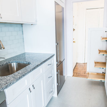
This small kitchen was way too small for this 2 bedrooms, 2 bathrooms apartment. Not only was it a very small kitchen, but the physical location of it made it very difficult to make it any bigger. There wasn't much that could have been done without incurring astronomical cost, which would get little or no return on the investment. The client wanted a kitchen that can be optimized in its current location to add a ton of value for resale.
This was difficult to do, because there was no moving of any mechanical around in the kitchen and even if we wanted to, the management of the building would not allow. For those of you who live in condos, co-ops or apartment building, you know how difficult it is to rework these foot prints. When we showed up, we saw the problems, but we also saw a huge opportunity where we can achieve those goals in the small space. This was accomplished by making some key changes and to incorporate some new things that was not possible when this kitchen was built years ago.
The crucial part of the design that would drive the entire new layout, was selecting the only appliance; that was the Refrigerator. Once we nailed down that refrigerator, we then proceeded to design the kitchen around it. We moved it to the other side of the wall where the sink was so that we can tap into the water line from the sink plumbing. It was crucial that it stays exactly 24" deep, not an inch more because we had to keep the entry as open as possible. Also, it was going to be directly in front of another big storage unit - The pantry. It is not ideal in most cases, but we needed the rest of the space to ramp up the design and open feel towards the side where all of the activities would take place, which happend to be the dining room and the view.
Once all that was figured out, we re-positioned the sink, dishwasher and the range and proceeded to wrap the cabinets around the columns to integrate them into the space. Thirty- six inches cabinets height was used so that they can be installed higher towards the ceiling height to give more room rather than the standard 18" required height between the counter tops. This was done to make the room feel a lot bigger than it really was. Not to mention, we also didn't want the faucet to be buried under the cabinets so that was also a necessary design detail for the space.
We then lowered both knee walls so that the counter top can sit on top of them, by removing that stop point that would have otherwise defined the kitchen area. This allowed us to pick up that extra footprint into the room for added prep space and enabled us to create the illusion of a kitchen that is looking longer than it really is. Every inch mattered when designing this kitchen and we made a conscious decision to use every one of that inch.
White cabinets were selected to do just what white cabinets are design to do; make a small or dark room appear bigger, brighter and more open. In this kitchen, this was amplified the more because of the kitchen location. It was perfect! We knew we did justice to the space because while we were there taking some photos, a few potential buyers walked in and went straight for the kitchen! They said its design just to fit the apartment.
Pantry roll out shelving, Double recycle bin, fancy handles, LED lighting, Quartz counter top, beautiful backslash tiles and grey linen floors finished off the kitchen which looked over a beautiful view of the George Washington Bridge from the top of this lovely 4th floor apartment.
Credit to Masterpiece Tile and Marble (Annmarie on the selection of Tiles and countertop and Val on the Construction to complete this project).
Davor Kokic Photography
12