
Search results for "Data efficiently" in Home Design Ideas



Find the right local pro for your project



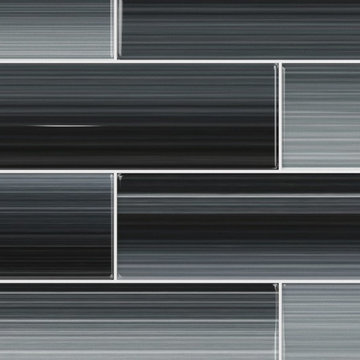
 Bodesi Glass Tile and Mosaic
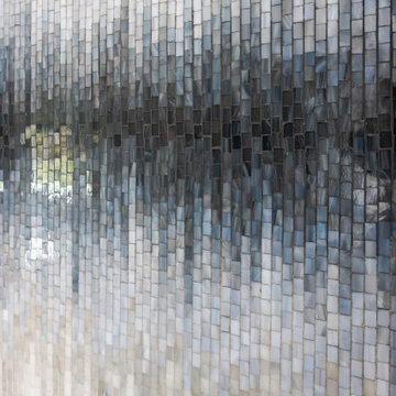
Not entirely black, this hand painted glass subway tile is much more than plain black. Touches of gray work with a cool palette for a black tile that is simply beautiful to admire. Ultra dark hues play as blacks in this intriguing mix of black and gray de-saturated wonderfulness.The size is a contemporary shape that allows it to be used in smaller areas such as a trim around bathroom, or in larger areas such as the entire tubs surround or bathroom backsplash. The tiles come individually packaged so that you can choose to play with the pattern. Either way you go, this tile will be the fantastic feature to your next bathroom remodel.



 User
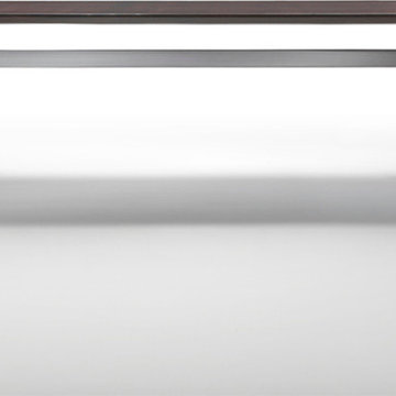
UserLight in its image, solid and architectural in its form, the dining table has a metal base with two legs to support the top. The collection of tables features the same single leg that splits into three feet at the base. The rectangular tables can have a base placed off center with respect to the top.



 Montenegro Homes & Development LLC
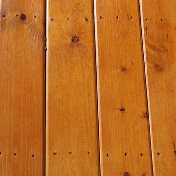
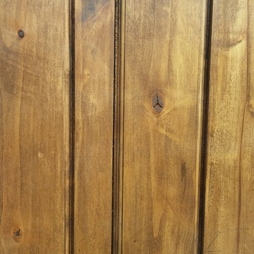
Detail of handmade Knotty alder door
for laundry room- in progress
Example of a tuscan laundry room design in Phoenix
Example of a tuscan laundry room design in Phoenix

 Bennett Contracting, Inc.
This Loudonville couple started by getting a quote to finish their attic space, but then changed gears and decided the kitchen was more important at this time. Estimator Anthony and designer Justina from Bennett Contracting went to work on a new design. The home is an older colonial with classic features, and the existing kitchen was a poorly laid out 90’s nightmare. With children in the home the island cooktop alone was a constant danger. By adding a window and removing the wall from the dining room, the new kitchen is much brighter and connected to the rest of the home. Bennett removed the old vinyl tile and continued the wood flooring into the new kitchen space. Justina admits it was so much fun working on this project because the owners were open to all sorts of design features. Roll-outs in most cabinets, hidden bread boards, hutch coffee bar, brass chicken wire, and the very cool antique foot rail. Then there are the custom cabinet colors. RD Henry Cabinets matched Glidden paint colors to get the exact color the client desired. They even sent three cabinet samples to get it right. These classic features combined with the modern design brings new life to the space.



 KSI Kitchen & Bath
Eat-in kitchen - large transitional eat-in kitchen idea in Detroit with white cabinets, quartz countertops, white backsplash and stone tile backsplash
 KURV Architecture DPC (Alex Hughes Architects)
Located in the heart of Manhattan’s Lower East Side, the building was erected on a shallow commercial lot between two 120 year old masonry buildings and a new residential rental building. 330 Grand Street is a mix of 725 SF 1BRs and 1050 SF 2BR apartments. It also contains a 1100 SF two story duplex as well as private and public rooftop space, large private balconies for most units and two large private terraces for the ground floor units.
330 Grand Street was originally designed and approved at the NYC DOB as a prefabricated modular building. During the pandemic, as shipping costs skyrocketed putting the project at risk, we suggested redesigning the building as a reinforced cast-in-place concrete structure. Concrete was readily available and prices had not been affected by the demand increase that many other materials suffered in the pandemic. We took this opportunity to raise floor to ceiling heights, enlarge high performance windows and redistribute the buildings MEPFS and Structural Systems to create very open floor plans.
The challenge was to create a luxurious sensorial living experience with very limited means. In a city with very high construction costs, low cost residential buildings in the area are usually devoid of good quality, design and character. Our approach was to aim high for the end user, prioritizing natural light, open space with long visual perspectives, high ceilings and as always, rejecting the use of predefined building templates.
Our biggest challenge was to ensure that the small spaces feel as clean cut, large and bright as possible. Several unique design decisions were made to ensure low cost and high quality;
Floor plans were laid out so that spaces were wide open and free of clutter from mechanical or structural interruptions. Therefore all infrastructure was placed in lateral demising walls, which in turn act as the unit’s storage and kitchen. The apartments feel wide open, are super quiet and have more storage space than any other comparable apartment in the city.
To solve the problem of the site’s shallow commercial lot which is typically prone to dark interior spaces we focused our attention on the building’s envelope. Instead of the usual small punched window openings, oversized high performance windows were designed to ensure that light penetrated as far as possible into the units. In the smaller 1BR units, the full 50’ depth of the lot is perceived by partitioning spaces with sliding pocket doors that can be retracted to allow deep visual perspectives, making the sight lines in the space feel longer, larger, more ample than normal. In addition to the full height glazing, each unit above the 2nd floor receives a 7 foot covered balcony, adding 120 to 240 sf to each apartment, something unusual in New York City buildings. The space is large enough for a full size dining table, when the weather permits being outside.
We also worked hard to ensure modularity. For example, all kitchen units are all identical throughout the building. The idea of modularity and the economy of the repetitive unit is exercised to the maximum through the building.
Hardware, appliances, flooring, wall coverings and material finishes are all carefully selected to feel bespoke, high quality and unique.
It was important to KURV that the result of this work manifest into something that would deeply connect with the end user and sustain relationships with the consumers of this space.
All images by KURV Architecture ©
33