
Search results for "Decided" in Home Design Ideas
 Haven Design and Construction
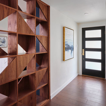
The original foyer of this 1959 home was dark and cave like. The ceiling could not be raised because of AC equipment above, so the designer decided to "visually open" the space by removing a portion of the wall between the kitchen and the foyer. The team designed and installed a "see through" walnut dividing wall to allow light to spill into the space. A peek into the kitchen through the geometric triangles on the walnut wall provides a "wow" factor for the foyer.
 Busby Cabinets
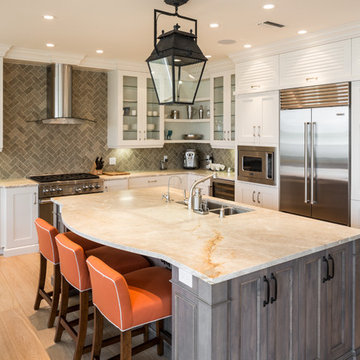
Transitional l-shaped light wood floor kitchen photo in Miami with a double-bowl sink, shaker cabinets, white cabinets, gray backsplash, stainless steel appliances and an island
 Valerie Grant Interiors
Peter Rymwid
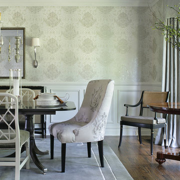
Enclosed dining room - large traditional dark wood floor enclosed dining room idea in New York with no fireplace and beige walls
Enclosed dining room - large traditional dark wood floor enclosed dining room idea in New York with no fireplace and beige walls
Find the right local pro for your project
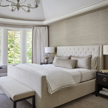
Large transitional master beige floor and carpeted bedroom photo in Chicago with beige walls and no fireplace
 Masonry Design Solutions Ltd
Intense Photography
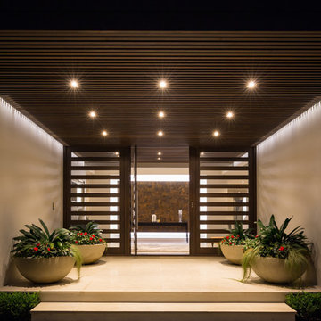
Inspiration for a large contemporary beige floor single front door remodel in Auckland with beige walls and a dark wood front door
Inspiration for a large contemporary beige floor single front door remodel in Auckland with beige walls and a dark wood front door

 JAUREGUI Architecture Interiors Construction
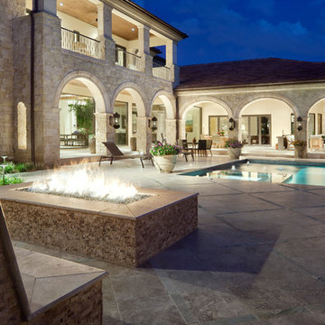
Tuscan patio photo in Austin with a fire pit and no cover
Sponsored
Columbus, OH

Hope Restoration & General Contracting
Columbus Design-Build, Kitchen & Bath Remodeling, Historic Renovations
 User
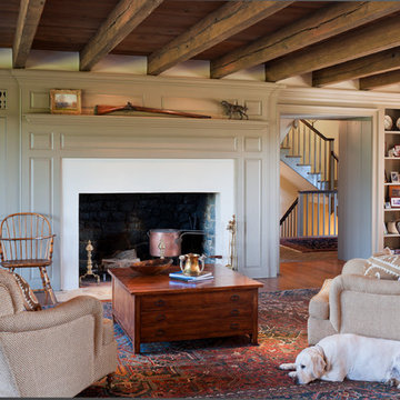
UserLiving room - cottage dark wood floor living room idea in Philadelphia with a standard fireplace, no tv and gray walls
 Archambault Construction
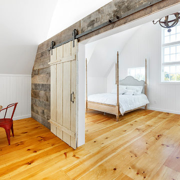
Example of a large country master light wood floor and brown floor bedroom design in Boston with white walls and no fireplace
 Leclair Decor
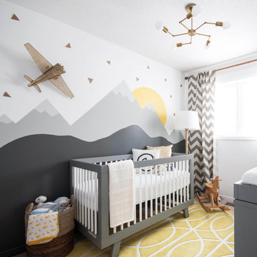
When we found out we were expecting in June, we had already put a plan in motion to merge our home offices to eventually make way for a nursery. After the excitement of the big news we kicked it into high gear!
First off we painted the room a crisp white to contrast from the past 2 tone dark office colours. Our amazing painter Carolyn from Roll Her Sleeves then traced out and painted our vision for the mural. At first we wanted to go very minimal but after looking at it for a few weeks, we asked her to come back and add a forefront layer of grey mountains, details in the peaks and the yellow sun.
During that time the search for the perfect modern crib was on. We found the Hudson model from Babyletto which we loved from one of our suppliers in the states but after duties and shipping it ended up being more practical to buy it here in town.
At the Artemano opening we hosted in November, we connected with Jonathan from Obasan mattresses. He graciously offered to supply us with one of their locally made high quality mattresses. We can’t wait for our baby boy to sleep on it!
Our rocking chair has quite the story behind it. We originally found it for $8 ( yes eight ) dollars last spring. We weren’t sure at the time where and how we were going to use it so we had stored it in one of the garages where we were keeping furniture for an ongoing model home project. One morning we arrived and noticed the chair was missing. We made a call to our construction contact and he relayed the message. Next thing we know a worker was jumping in the garbage bins across the street. They had believed the chair was to be thrown away. Although a bit dusty it was recovered in decent shape. A few months passed and we started entertaining the idea of using it as our rocker. We asked Melissa’s dad if he would be interested in converting it to a rocker for us, and always up for a challenge he accepted and came through big time! At least was the task of reupholstering. We kind of liked the fun bright orange it was but decided to keep it safe with a nice grey material.
After trying numerous curtains ( we lost count ) we finally settled on a old fav, the west elm chevrons. As well, 3 or 4 rugs were attempted until we tried the yellow rug from Urban Barn and instantly knew that was the one.
We slid a couple small Ikea hacks in there. We wrapped an inexpensive floor lamp with rope to give it a different look ( and hide the silver since everything is brass ) and spray painted the shelf hinges to match the rest of the finishes.
Photo: Sacha Leclair
 Tiffany Brooks, HGTV Host & Interior Designer
Inquire About Our Design Services
When we first started talking in the spring of 2015, I was impressed. She was witty, realistic, and understood that as much as she loves my shows on HGTV, design does not does not happen in 43 minutes! She told me about her space, and how she felt that her bedroom seemed “blah” to her. She had no retreat. Molly desperately longed for a place that she could spend time in, read in, play in and above all, relax in.
What we did:
Many people are terrified of hiring a designer. Rightfully so, they are investing a pretty penny in their homes. They want to make sure that everything, down to the last floral arrangement, is to their liking, because they will have to live it (and pay for it). Unfortunately, a client can unintentionally stifle a designer’s creativity through micro-management. This can produce lackluster results and ultimately cause more time (and money) to be spent on a project than is really necessary.
With Molly, that was never an issue. Before she even showed me the room in question, she said that I could have full creative license to do what I needed to do to her bedroom. SAY WHAAH!?
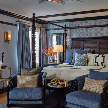
With Molly giving me complete creative freedom, I planned everything out and got down to business. The result: Bite-your-bottom-lip sexy. I don’t get jealous of too many of my clients’ spaces, but this one still takes my breath away every time I look at the pics!
The craziest part was that by adding more furniture, it actually made the space feel larger.
Molly and her husband Patrick loved the finished space, and promised me I will be back to finish the rest of the house!
Here’s the highlights of the rest of the project:
I came up with a space plan with three options.
Next, we reviewed mood boards and fabric schemes that would work for both Molly and her hubby Patrick.
We started with the bed. My goal was to add edge to its otherwise traditional style.
We decided to spice things up by painting the trim work in the room black.
We built in layers of lighting with dimmers. In a bedroom everything should be on dimmers, right? Right.
We designed and customized bedding, chairs and window treatments.
Together with Molly, we selected the most perfect wallpaper. This geometric “grasscloth” adds so much depth and dimension that was just missing before.
What I love:
That light fixture. I mean it is really, really amazing in person.
The porcupine mirror. This thing came packaged like it was the hope diamond, and everyone was terrified to handle it. But it really became a highlight of the room.
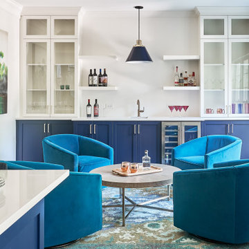
 DiFabion Remodeling, Inc.
Example of a large transitional l-shaped medium tone wood floor and brown floor home bar design in Charlotte with an undermount sink, recessed-panel cabinets, quartz countertops, stainless steel appliances, an island and yellow countertops
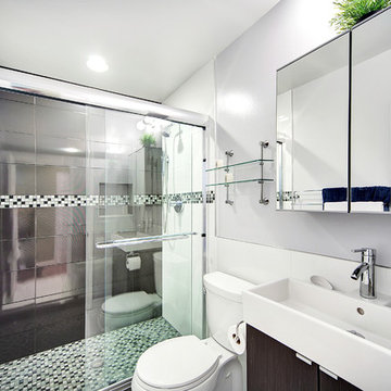
 Brook Custom Remodeling
Trish Hamilton
Inspiration for a contemporary gray tile and porcelain tile alcove shower remodel in DC Metro with a two-piece toilet, an integrated sink, flat-panel cabinets and dark wood cabinets
Inspiration for a contemporary gray tile and porcelain tile alcove shower remodel in DC Metro with a two-piece toilet, an integrated sink, flat-panel cabinets and dark wood cabinets
Sponsored
Columbus, OH
Hope Restoration & General Contracting
Columbus Design-Build, Kitchen & Bath Remodeling, Historic Renovations
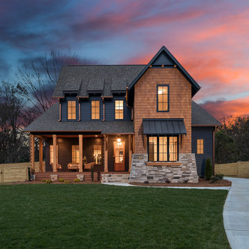
 Pike Properties
Large cottage black two-story mixed siding gable roof idea in Charlotte with a shingle roof
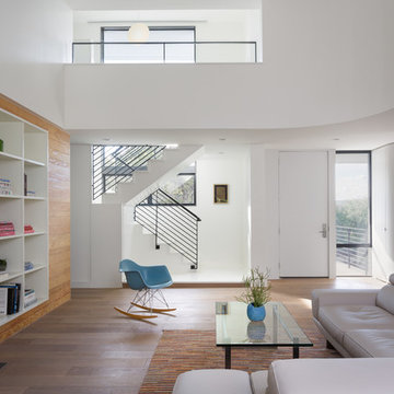
 Milgard Windows & Doors
The Kiguchi family moved into their Austin, Texas home in 1994. Built in the 1980’s as part of a neighborhood development, they happily raised their family here but longed for something more contemporary. Once they became empty nesters, they decided it was time for a major remodel. After spending many years visiting Austin AIA Home Tours that highlight contemporary residential architecture, they had a lot of ideas and in 2013 were ready to interview architects and get their renovation underway.
The project turned into a major remodel due to an unstable foundation. Architects Ben Arbib and Ed Hughey, of Arbib Hughey Design were hired to solve the structural issue and look for inspiration in the bones of the house, which sat on top of a hillside and was surrounded by great views.
Unfortunately, with the old floor plan, the beautiful views were hidden by small windows that were poorly placed. In order to bring more natural light into the house the window sizes and configurations had to be addressed, all while keeping in mind the homeowners desire for a modern look and feel.
To achieve a more contemporary and sophisticated front of house, a new entry was designed that included removing a two-story bay window and porch. The entrance of the home also became more integrated with the landscape creating a template for new foliage to be planted. Older exterior materials were updated to incorporate a more muted palette of colors with a metal roof, dark grey siding in the back and white stucco in the front. Deep eaves were added over many of the new large windows for clean lines and sun protection.
“Inside it was about opening up the floor plan, expanding the views throughout the house, and updating the material palette to get a modern look that was also warm and inviting,” said Ben from Arbib Hughey Design. “Prior to the remodel, the house had the typical separation of rooms. We removed the walls between them and changed all of the windows to Milgard Thermally Improved Aluminum to connect the inside with the outside. No matter where you are you get nice views and natural light.”
The architects wanted to create some drama, which they accomplished with the window placement and opening up the interior floor plan to an open concept approach. Cabinetry was used to help delineate intimate spaces. To add warmth to an all-white living room, white-washed oak wood floors were installed and pine planks were used around the fireplace. The large windows served as artwork bringing the color of nature into the space.
An octagon shaped, elevated dining room, (named “the turret”), had a big impact on the design of the house. They architects rounded the corners and added larger window openings overlooking a new sunken garden. The great room was also softened by rounding out the corners and that circular theme continued throughout the house, being picked up in skylight wells and kitchen cabinetry. A staircase leading to a catwalk was added and the result was a two-story window wall that flooded the home with natural light.
When asked why Milgard® Thermally Improved Aluminum windows were selected, the architectural team listed many reasons:
1) Aesthetics: “We liked the slim profiles and narrow sightlines. The window frames never get in the way of the view and that was important to us. They also have a very contemporary look that went well with our design.”
2) Options: “We liked that we could get large sliding doors that matched the windows, giving us a very cohesive look and feel throughout the project.”
3) Cost Effective: “Milgard windows are affordable. You get a good product at a good price.”
4) Custom Sizes: “Milgard windows are customizable, which allowed us to get the right window for each location.”
Ready to take on your own traditional to modern home remodeling project? Arbib Hughey Design advises, “Work with a good architect. That means picking a team that is creative, communicative, listens well and is responsive. We think it’s important for an architect to listen to their clients and give them something they want, not something the architect thinks they should have. At the same time you want an architect who is willing and able to think outside the box and offer up design options that you may not have considered. Design is about a lot of back and forth, trying out ideas, getting feedback and trying again.”
The home was completely transformed into a unique, contemporary house perfectly integrated with its site. Internally the home has a natural flow for the occupants and externally it is integrated with the surroundings taking advantage of great natural light. As a side note, it was highly praised as part of the Austin AIA homes tour.
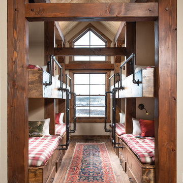
 M.T.N Design
The kids' loft provides plenty of play room thanks to its space-saving bunks. Burnished timbers are a lovely compliment to the hardwood floor, wood-framed windows, and angled, wood ceiling.
Produced By: PrecisionCraft Log & Timber Homes
Photos By: Longviews Studios, Inc.
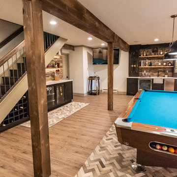
 Gardner/Fox Associates, Inc
This rustic-inspired basement includes an entertainment area, two bars, and a gaming area. The renovation created a bathroom and guest room from the original office and exercise room. To create the rustic design the renovation used different naturally textured finishes, such as Coretec hard pine flooring, wood-look porcelain tile, wrapped support beams, walnut cabinetry, natural stone backsplashes, and fireplace surround,
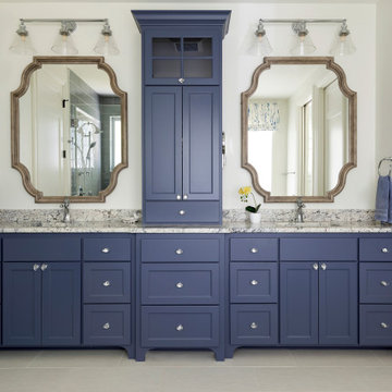
 Lenox House Design
A Custom double vanity fits perfectly in this spacious Master Bath. The vanity color is Benjamin Moore Andes Summit. The countertop material is White River Granite. The mirrors were purchased by the client. All of the hardware is Crystal knobs from Emtek.

48