
Search results for "Digital identities" in Home Design Ideas
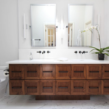
 Change Your Bathroom©
The detailed plans for this bathroom can be purchased here: https://www.changeyourbathroom.com/shop/warm-walnut-bathroom-plans/
Warm walnut vanity with white quartz counter top, sinks and matte black fixtures, stacked stone accent wall with mirrored back recessed shelf, digital shower controls, porcelain floor and wall tiles and marble shower floor.
 OLSON LEWIS + Architects
Contractor: Anderson Contracting Services
Photographer: Eric Roth
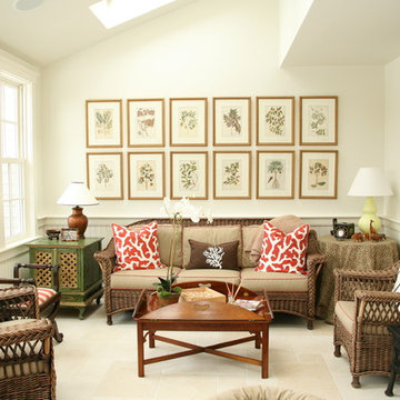
Inspiration for a mid-sized victorian open concept carpeted family room remodel in Boston with white walls and no tv
Inspiration for a mid-sized victorian open concept carpeted family room remodel in Boston with white walls and no tv
Find the right local pro for your project
 Byler Perry Builders
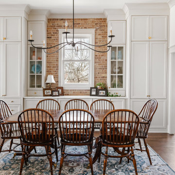
Dining room - traditional dark wood floor and brown floor dining room idea in Dallas with white walls
 Ivy Lane Living
Angie Seckinger
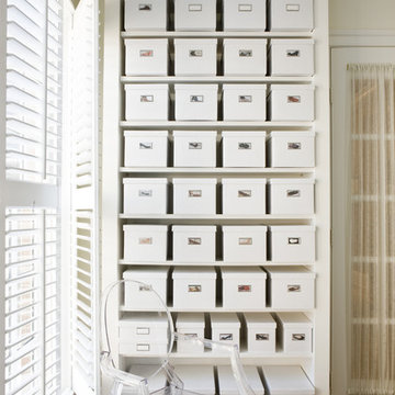
Inspiration for a transitional medium tone wood floor closet remodel in DC Metro with open cabinets and white cabinets
Inspiration for a transitional medium tone wood floor closet remodel in DC Metro with open cabinets and white cabinets
 Studio41 Home Design Showroom
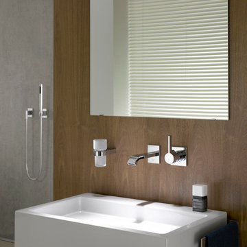
WELCOME TO YOUR BATHROOM | IMO is the fitting for all those who would like to design their own bathroom. The series has a modern, hybrid form that fits into virtually any living environment. IMO makes good design your everyday companion. In digital communication, IMO is the common abbreviation for "In My Opinion". The name IMO invokes this phrase and puts the focus not on the fitting, but on the user's individual view of life. Their opinion, their taste and their individual style of furnishing shape the identity of the IMO series. The IMO series is uniquely versatile. This is also because the design unites two prevalent uses of form, combining a round body with a right-angled lever and spout. | Available at www.shopstudio41.com
 Studio41 Home Design Showroom
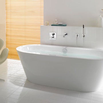
WELCOME TO YOUR BATHROOM | IMO is the fitting for all those who would like to design their own bathroom. The series has a modern, hybrid form that fits into virtually any living environment. IMO makes good design your everyday companion. In digital communication, IMO is the common abbreviation for "In My Opinion". The name IMO invokes this phrase and puts the focus not on the fitting, but on the user's individual view of life. Their opinion, their taste and their individual style of furnishing shape the identity of the IMO series. The IMO series is uniquely versatile. This is also because the design unites two prevalent uses of form, combining a round body with a right-angled lever and spout. | Available at www.shopstudio41.com
 QDIsurfaces
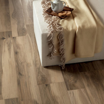
Italian design and technology, manufactured in Italy. Digital technology reproduces graphic patterns of natural wood on this material, and gives the surface its realistic and intricate identity. This material allows you the beauty of wood flooring with the versatility, reliability, and easy maintenance of a porcelain tile. The wood grain look with the durability of porcelain.
 Studio41 Home Design Showroom
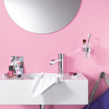
WELCOME TO YOUR BATHROOM | IMO is the fitting for all those who would like to design their own bathroom. The series has a modern, hybrid form that fits into virtually any living environment. IMO makes good design your everyday companion. In digital communication, IMO is the common abbreviation for "In My Opinion". The name IMO invokes this phrase and puts the focus not on the fitting, but on the user's individual view of life. Their opinion, their taste and their individual style of furnishing shape the identity of the IMO series. The IMO series is uniquely versatile. This is also because the design unites two prevalent uses of form, combining a round body with a right-angled lever and spout. | Available at www.shopstudio41.com
 TOC design & construction inc.
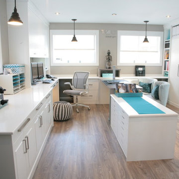
The importance of a properly designed home office ( especially when the space is also used as a meeting-place/showroom ) entails the comfort & positive experience of your customer in the following manner:
1. Exclusive office space with its own entrance separate from rest of home.
2. Ergonomic customer seating and ample presentation surfaces.
3. Dedicated customer computer screen(s) detailing CAD drawings & presentation in a show and tell manner.
4. Proper lighting ( LED lighting has come a long way )
5. Practical design touches ( hooks for purses, coats, umbrella stand, refreshments area, guest WIFI, etc...)
One of the greatest benefits of a home office is the freedom to design it with a distinct identity. In other words, we shouldn’t blend the workplace with the rest of our personal space, aka home.
 katherine
Office Workstations and Cubicles: The Unsung Heroes of Efficient Team Environments
In today's fast-paced business world, the hum of productivity is the sweetest sound an office can produce. But what fuels this symphony of efficiency?
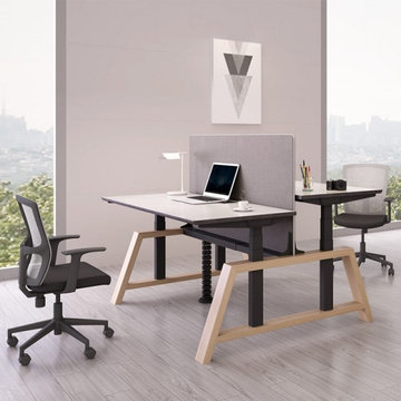
While leadership and strategy are crucial, the physical environment in which a team operates plays a role that is just as vital. The debate between open-plan offices and traditional cubicles has raged for years, yet the truth is that a well-designed space incorporating both office workstations cubicles can be the key to unlocking a team's full potential. This isn't just about furniture; it's about creating a habitat for success.
The Evolution of the Workspace: Beyond the Beige Box
Gone are the days of monotonous rows of identical, soul-crushing cubicles. Modern office design has embraced a more nuanced understanding of worker needs. The contemporary workstation is a far cry from its predecessors, offering flexibility, ergonomic support, and a nod to aesthetic appeal. This evolution recognizes that a one-size-fits-all approach stifles creativity and productivity.
Fostering Focus in a Sea of Collaboration
While collaboration is a cornerstone of modern business, the need for individual, focused work remains paramount. This is where the modern cubicle shines. It provides a sanctuary from the constant distractions of a completely open office, allowing employees to delve deep into tasks that require concentration. This dedicated space minimizes interruptions, leading to higher quality work and reduced stress levels.
The Power of Personalization and Ownership
Giving employees a degree of control over their immediate environment can have a profound impact on morale and engagement. Modern workstations and cubicles that allow for personalization be it through adjustable shelving, pinboards for personal items, or even the choice of chair foster a sense of ownership. This small act of empowerment can translate into a greater sense of belonging and commitment to the organization.
Ergonomics: The Foundation of Employee Well-being and Productivity
A comfortable employee is a productive employee. Ergonomics is not a luxury; it's a fundamental necessity in any office environment. Poorly designed workstations can lead to a host of musculoskeletal issues, from back pain to carpal tunnel syndrome, resulting in increased absenteeism and decreased efficiency. Investing in ergonomic chairs, adjustable-height desks, and properly positioned monitors is an investment in the long-term health and performance of your team.
Designing for Synergy: The Strategic office layout design
The arrangement of workstations and cubicles is as important as the furniture itself. A strategic office layout design can facilitate seamless communication and collaboration while still providing pockets of privacy for focused work. This involves creating "neighborhoods" for different teams, placing collaborative zones in central, easily accessible areas, and ensuring that high-traffic pathways don't cut through quiet work zones.
Breaking Down Barriers with Hybrid Designs
The most effective office environments often feature a hybrid approach. This might involve clusters of cubicles for focused work, interspersed with open, collaborative "huddle spaces" equipped with whiteboards and comfortable seating. This variety allows employees to choose the environment that best suits the task at hand, offering the best of both worlds.
The Role of Acoustics in a Thriving Workplace
Noise is one of the biggest complaints in open-plan offices. Well-designed cubicles with sound-dampening panels can significantly mitigate this issue. Furthermore, incorporating acoustic solutions throughout the office, such as sound-absorbing materials on walls and ceilings, can create a more pleasant and productive auditory environment for everyone.
Integrating Technology for a Seamless Workflow
In the digital age, technology is the lifeblood of any business. Modern office workstations are designed with this in mind, featuring integrated power and data ports, cable management systems, and ample space for multiple monitors. This seamless integration of technology ensures that employees have the tools they need to work efficiently and without frustration.
Choosing the Right Partner for Your Office Environment
The task of outfitting an office can be daunting. Partnering with a knowledgeable and reputable Meet&Co commercial furniture supplier is crucial to creating an environment that is both functional and inspiring. A good supplier will not only offer a wide range of high-quality products but will also provide expert advice on space planning and ergonomic best practices, ensuring that your investment yields the best possible return.
The Future of the Office: Flexibility and Adaptability
The world of work is constantly evolving, and office design must evolve with it. The future lies in creating flexible and adaptable spaces that can be easily reconfigured to meet the changing needs of a business. Modular furniture and movable partitions are key components of this future-proof approach, allowing organizations to scale and adapt without the need for costly and disruptive renovations.
Conclusion: A Strategic Investment in Your Greatest Asset
Ultimately, the design of your office is a direct reflection of your company's culture and values. By investing in high-quality, ergonomic, and well-designed office workstations and cubicles, you are sending a clear message to your employees: their well-being and productivity matter. This strategic investment in your physical workspace is, in fact, an investment in your most valuable asset your people. The result is a more engaged, efficient, and innovative team, ready to tackle the challenges of tomorrow.

 safe ZOnea
Ask a kitchen designer in Chicago which countertop question comes up most and you will hear the same answer: white or off-white quartz, and which shade. Homeowners walk into showrooms with a photo saved on their phone, usually a bright, veined slab from a magazine spread, and leave an hour later realizing there are a dozen versions of that same look. The confusion is not about taste. It is about the fact that "white quartz" covers a huge range of patterns, undertones, and price points, and nobody explains the differences before the sale.
Older bungalows and newer builds alike are getting stripped of their dated laminate and butcher block in favor of quartz, and the reasons are practical rather than trendy. Quartz does not need sealing, resists the kind of staining that granite can suffer over decades, and holds up to the freeze-thaw humidity swings that Chicago basements and kitchens go through every year. Once a homeowner commits to quartz, though, the real decision starts: which white, and does the pattern justify the difference in cost.
This piece walks through three specific slabs that keep showing up in Chicago renovation projects, why designers reach for them in different rooms, and what actually separates a flat white surface from one with real depth. None of this requires a design background to follow. It is mostly about paying attention to how a slab behaves under kitchen lighting, how busy the vending gets, and how it photographs versus how it looks in person.
Why White Quartz Took Over Chicago Kitchens
Ten years ago, granite dominated Chicago kitchen remodels almost by default. It was durable, it looked expensive, and every fabricator in the metro area carried a wide range of colors. Quartz has since taken over that position, and the shift happened faster than most contractors expected. Engineered stone gave homeowners a more predictable surface, since natural granite varies slab to slab while quartz is manufactured to a consistent pattern batch after batch.
The other driver is light. Chicago winters are long and gray, and a lot of kitchens, especially in older two-flats and courtyard buildings, do not get much direct sun. A dark granite countertop in a dim kitchen can make the whole room feel smaller. White and light-toned quartz reflects what little natural light comes through the windows, and it makes a galley kitchen or a north-facing space feel noticeably brighter without touching the cabinetry or the layout.
There is also a resale argument that local real estate agents bring up constantly. White quartz photographs well for listings, reads as updated and low-maintenance to buyers touring in person, and does not compete visually with whatever cabinet color the next owner might prefer. It is a safer bet than a bold veined marble look or a colored quartz that might feel dated in five years.
Arctic White and the Cost Question
Among the flatter, more uniform whites, arctic white quartz price comes up constantly in budget conversations because the slab sits at a more approachable point than the heavily veined Italian-marble-inspired patterns. It reads as clean and bright without the busy movement that some homeowners find overwhelming in a small kitchen. Fabricators in the Chicago area tend to keep it in stock precisely because demand stays steady across both new construction and remodel projects.
Part of what keeps this slab affordable relative to its heavily patterned cousins comes down to manufacturing complexity. A quartz surface with minimal veining and a consistent white base is simpler to produce at scale than one that mimics the irregular, high-contrast movement of natural Calacatta marble. That production difference shows up directly in what a homeowner pays per square foot, and it is worth asking a fabricator to walk through that pricing before assuming every white quartz costs the same.
Homeowners planning a full kitchen, including an island, backsplash, and perimeter counters, often use a flatter white like this specifically because it lets other elements carry the visual interest. A patterned tile backsplash or a bold cabinet color reads more clearly against a calm countertop than against one already fighting for attention with heavy veining. Designers frequently pair simpler whites with statement lighting fixtures for exactly this reason.
What Makes Calacatta Patterns Different
Calacatta refers to a family of marble originally quarried in Italy, known for a bright white background broken up by bold, often gold-toned veining that moves in thick, dramatic streaks rather than thin gray lines. Natural Calacatta marble is soft, porous, and expensive to maintain, which is exactly why quartz manufacturers spent years developing engineered versions that replicate the look without the upkeep headaches.
The challenge with any Calacatta-style quartz is getting the veining to look organic instead of printed. Early generations of engineered stone struggled with repetitive patterns that gave away the fact the slab was manufactured rather than cut from actual marble. Modern digital printing and layering techniques have closed that gap considerably, and the better Calacatta-inspired quartz lines now vary the veining across each slab batch so two counters in the same kitchen do not look identical.
Chicago designers gravitate toward Calacatta patterns for kitchens that function as the visual centerpiece of an open floor plan, which describes a large share of the gut renovations happening in neighborhoods like Lincoln Park, Roscoe Village, and the North Shore suburbs. When the kitchen island is visible from the living room and dining area, a dramatic veined surface becomes part of the home's overall design language rather than a purely functional work surface.
Calacatta Arno Under Kitchen Lighting
One of the more popular options in this category, calacatta arno quartz, balances a warm white base with soft gray and gold veining that avoids looking too stark under the cooler LED lighting common in newer Chicago builds. Homeowners touring showrooms sometimes make the mistake of judging a slab entirely under warm incandescent lighting, then get surprised when the same surface looks slightly different once installed under their kitchen's actual fixtures.
What separates this particular pattern from flatter competitors is how the veining clusters rather than spreading evenly across the slab. That clustering mimics the way real quarried marble forms, with denser mineral deposits in some sections and cleaner stretches in others. Fabricators cutting a large island slab from a single piece will often orient the pattern intentionally so the busiest veining lands somewhere visually interesting rather than getting cut off at an edge.
Because the background reads warmer than a stark white, this pattern tends to pair well with brass or matte gold hardware, a combination that has been showing up repeatedly in Chicago kitchen remodels over the past few renovation seasons. Cabinet painters report a similar trend, with more clients requesting warm white or greige cabinet colors specifically because they complement this kind of veined quartz better than a cooler, blue-toned white would.
Silestone's Version of the Calacatta Look
Manufacturers compete directly in this Calacatta-inspired category, and silestone eternal calacatta gold represents one brand's specific take on the pattern, distinguished by richer gold veining set against a brighter white base than some competing slabs in the same family. Silestone has built a reputation around anti-bacterial surface treatments in addition to the standard quartz durability, a detail some homeowners specifically ask about for kitchens used heavily by families with young children.
The veining in this particular slab tends to run in longer, more continuous lines compared to the clustered pattern found in some other Calacatta-style options, which gives large island surfaces a sense of visual flow from one end to the other. Fabricators working with bigger islands, the kind increasingly common in open-concept Chicago remodels, often favor patterns like this because there is less need to worry about seams interrupting a busy, disconnected pattern.
Price positioning for this slab tends to sit toward the upper end of the engineered quartz category, reflecting both the brand's manufacturing process and the complexity of replicating that continuous gold veining consistently across production batches. Homeowners weighing this option against other Calacatta-style quartz should ask their fabricator directly about batch availability, since premium patterns sometimes have longer lead times than standard stock colors.
Living With Quartz Day to Day
Beyond how a slab looks in a showroom or a listing photo, the daily experience of owning quartz countertops matters more once the renovation dust settles. Quartz resists scratching far better than laminate and holds up to the acidic spills, hot pans, and general abuse of an active kitchen without the sealing maintenance that natural stone requires every year or two. That low-maintenance reputation is a large part of why quartz overtook granite in the first place.
Heat resistance is a detail that gets less attention than it should. While quartz handles moderate heat well, manufacturers generally recommend using a trivet or pad for very hot pots straight off the stove, since sudden temperature shock can occasionally cause stress marks in the resin binder that holds the engineered stone together. This is a minor precaution rather than a major limitation, but it is worth mentioning to anyone assuming quartz is entirely indestructible.
Cleaning routines stay simple across almost every pattern in this category. A damp cloth and mild soap handle daily messes, and the nonporous surface means wine, coffee, and tomato-based sauces do not soak in the way they can with unsealed granite or marble. Homeowners moving from an older stone counter often mention how much less they worry about everyday spills once quartz is installed, which is a quality-of-life change that rarely makes it into the initial design conversation.
Choosing Between the Three
There is no single correct answer among these three slabs, and that is exactly why they keep coming up together in the same design conversations across Chicago renovation projects. A flatter white with minimal veining suits kitchens where other elements need to carry the visual interest, while a bolder Calacatta-inspired pattern makes sense when the countertop itself is meant to be the centerpiece of an open floor plan.
Budget matters too, and it is worth having a direct conversation with a fabricator about where each option lands before falling in love with a specific slab in a showroom. Lighting, cabinet color, and how the kitchen connects to the rest of the home all play into which pattern will actually look right once installation is finished rather than just in a photo.
Whatever direction a homeowner leans, seeing a full slab in person under actual kitchen lighting remains the single most useful step before signing off. Photos only go so far once the countertop is sitting in the room it will live in for years.
 QDIsurfaces
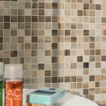
Italian design and technology, manufactured in Italy. Digital technology reproduces graphic patterns of natural wood on this material, and gives the surface its realistic and intricate identity. This material allows you the beauty of wood flooring with the versatility, reliability, and easy maintenance of a porcelain tile. The wood grain look with the durability of porcelain.
 Elite Empire Construction Inc.
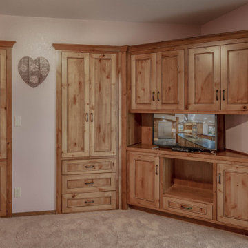
Custom Knotty Alder Daughter's Suite: Integrated Storage & Home Tech
We designed this daughter's bedroom as a fully unified sanctuary, leveraging intricate, hand-finished millwork to create a seamless living and media hub. By strictly utilizing the same custom Knotty Alder found throughout the entire Hayden estate, we ensured the secondary rooms deliver the identical "no-expense-spared" standard as the primary master suite.
Artisan Features & Construction Excellence:
Complete Knotty Alder Media Wall: The centerpiece of the room is a comprehensive Knotty Alder built-in system. This isn't just cabinetry; it's a structural element designed to define the room’s function, showcasing the natural, rustic texture that balances the home’s modern technology.
Integrated Media Console: The lower cabinetry features a dedicated media console with open component shelving and concealable storage drawers. We engineered the console to support a integrated smart TV (note the kitchen construction detail on the screen!), seamlessly hiding all wiring behind the precision panel work.
High-Capacity Floor-to-Ceiling Storage: Flanking the media zone are massive linen towers and wardrobes, providing sophisticated, long-term organization. Every door and drawer utilizes furniture-grade joinery and substantial, traditional hardware to match the luxury aesthetic of the home's plumbing.
Unified Architectural Details: We extended the Knotty Alder into substantial architectural casings, framing the expansive window/slider and tying the room into the surrounding Idaho landscape. This continuity of material creates a sophisticated, "Mountain Modern" environment throughout the entire residence.
Technical Flow: Note the complex integration of the built-ins into the room’s geometry, including the perfectly fit baseboard trim. This level of finish work demonstrates our capability to manage complex millwork installations as effectively as our advanced Kohler hydrotherapy systems.
1