
Search results for "Dining establishments" in Home Design Ideas
 Simply Home Decorating
This penthouse condo in Raven Woods is home to an adventurous, nature-loving couple. With their children grown and starting families of their own, Jeremy and Cynthia (names changed) chose to downsize their livable space and “upsize” in quality and luxury.
The couple hired us to help them achieve several well-defined goals: feeling immersed and connected to nature, having warm and welcoming spaces to host their family and friends, and selecting pieces that would support local makers and artisans. (If you know me, you know that nature, connection, and community are some of my most important values, personally and professionally — the perfect fit!)
Using our comprehensive design process, we spent months designing, procuring, and installing their new, long-time home. The resulting spaces are breathtaking, creating a daily living experience that is full of serenity and bliss.
Welcoming & Bright Home with Forest Views:
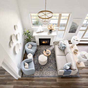
Ahhh… can you imagine coming home to a space as bright and soothing as this one? To find inspiration for this home’s interiors, we needed to look no further than out the windows, where mountain views greet us to the north and the ocean beckons from the south.
Paying homage to their locale, we curated a colour palette of subtle blues and grays, warm-toned woods, and natural materials, all set against a crisp, white backdrop. These help us create a seamless visual transition between the interior and exterior. Let’s start our tour in the living area…
A Cozy Living Area with Warmth & Dimension:
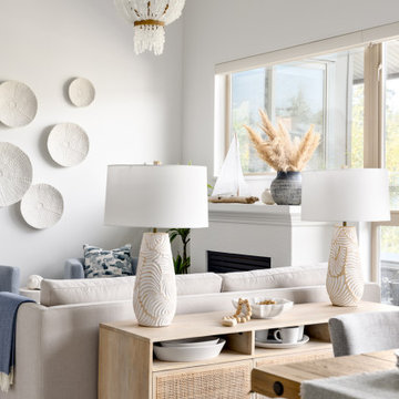
In the living area, the fireplace was the starting point for the design, as it determined the size of the space and the scale of our furnishings. To keep this area feeling cozy but not crowded, we selected this soft ottoman to serve as a table surface with a tray or as additional seating when Jeremy and Cynthia host guests. (Multi-purpose items are one of the 5 elements of The Simple Home.)
Additional textures — the sofa, upholstered swivel chairs, pillows, and ceramic wall art reminiscent of sand dollars — offer further depth and dimension in this simple yet layered space. The result is a cozy living room area perfect for a relaxing read on an overcast day or a social evening by the fire.
While daunting at first, this home’s small and open footprint offered a special opportunity for us to design thoughtful “zones”. To create a defined living space, we used an area rug to establish a border and situated the larger seating (the sofa) on the right. Its visual weight serves as a grounding barrier that naturally separates the living and dining areas.
Overhead, the centrally located brass and glass chandelier serves as another focal point, making the entire living area feel like one unit. Last but not least…
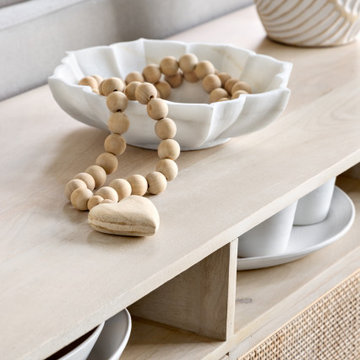
Styled with tall decorative lamps, this light oak and rattan console sits just behind the sofa, creating an additional visual barrier between the living and dining areas. We styled it with accessories that complement the overall palette, and it has the added benefit of providing storage right where Jeremy and Cynthia need it, the dining area.
An Art-Infused Dining Area:
The dining area is warm, woodsy, and filled with locally sourced art that Jeremy and Cynthia love. Next to the console is a custom textile piece from Vancouver artist, With Strings Attached, that mimics the scenic, mountain backdrop. The blue hues of the piece work in harmony with the warm wood dining table, cool gray upholstered chairs, and neutral stools at the kitchen bar.
On the other side of the space, is Jeremy’s and Cynthia’s favourite piece, a commissioned work of art by local maker, Katie Napier. Carefully positioned in a central location and framed by two modern sconces, this piece captures the feel of gentle waters on a misty day and evokes calm.
Other curated pieces include this rectangular vessel centrepiece by sculptural artist, Martha Sturdy, bearing a stunning moss arrangement by Soul Roots Moss Art. As this couple can attest, a treasured memento or piece of art can transform your space and your mood, transporting you to a relaxed and peaceful state.
A Bedroom Full of Light & Texture:
This beautiful bedroom is another manifestation of Jeremy and Cynthia’s favourite experiences: hiking the rainforest trails and enjoying the spray of the sea. The blue-and-green branching pattern found in the window treatments and pillows ground the space, while bright turquoise lamps — akin to sea glass — infuse the room with a touch of coastal vibrance.
Similar to the living area, we added comfort through texture and warm tones, incorporating oak end tables, natural woven wall decor above the headboard, knitted ottomans at the foot of the bed, a textured duvet, and an extra plush area rug.
A Loft Inspired by Flora & Fauna:
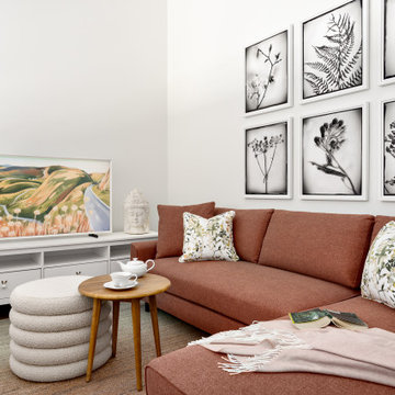
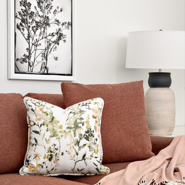
For the loft space, we moved away from coastal elements and decided to ground the space in the more earthy elements of nature: flora and fauna. We selected an umber-hued sofa complemented by floral decorative pillows and walls adorned with botanical prints by Heather Johnston.
This multi-purpose space serves as a reprieve for our clients to read, practice yoga, and relax. Alternatively, a Frame TV intentionally meant to blend as art allows the space to function as a secondary entertainment space or a place for their granddaughter to play and sleep over.
Praise from Our Clients:
This home’s small footprint pushed us to be more resourceful in our furniture sourcing and more creative in our space planning. The result is a home as livable, beautiful, and intentional as any larger home would be. Most importantly, Jeremy and Cynthia love it!
“Lori listened to our love of nature and designed our condo reflecting that love. It is beautiful, serene, and welcoming. We couldn't be happier.”
If you’re ready to uncover the hidden potential in your home, that is what we do best. Contact us here or download our complimentary guide below to discover more.
 Skill Construction & Design, LLC
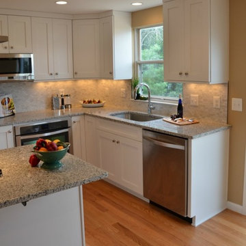
There are so many design elements to this kitchen, I almost don’t know where to start. Bright and airy with crisp clean white cabinets, the kitchen is open and welcoming. Still crisp but gently contrasting, the stainless steel appliance add depth amid the white. To keep this kitchen warm, natural oak covers the floors and a toasted wheat color washes the walls. And then there is the architectural elements. You know. That post and beam in the middle of the room. It’s the center of attention.
When you walk into a room your eyes roam around, establishing the size and shape of the room as your feet take you forward. From the front door of this home straight ahead you encountered this wall. The dining area to the right gives you a glimpse of things to come. Where there is a dining room you will usually find a kitchen.
The architecture of years gone by consistently hides the kitchen, the heart of the home, behind walls. I sympathize with my Mom, and all the other Moms, who have had to spend so much time tucked into a tight kitchen, away from the family. This wall had to go, but it was structural. We needed its support but not its bulk.
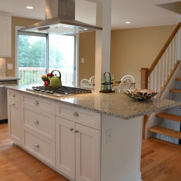
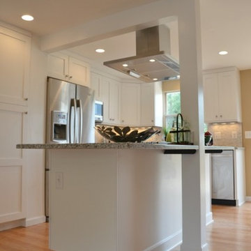
So we got rid of the bulk and only the bulk. Instead of a wall we have a post and beam, offering all of the structure we need. We could have installed a huge steel beam and reconfigure the joists to upset the beam, but why? The small beam and post add an incredible architectural element. It’s turning lemons into lemon, we simply made the most of what we had. It may be functional but it’s so fantastic. It looks like we created the effect just for the drama.
The original kitchen may have had a working triangle and some counter space, but it was fairly small, with each area only a step or two away. The dark cabinets made the space feel even smaller and the butcher block patterned laminate counter tops were very dated. The appliances were feeling their age as well, from a coil burner electric stove to a top freezer refrigerator. To keep this kitchen within its space, a half wall separated it from the dining area.
With the wall gone we borrowed some space from the living room and extended what was a U shaped kitchen into an L. At the living room window we start our new kitchen. We kept a small part of the wall to support the other end of our decorative beam. Sandwiched between a large pantry and our new French door refrigerator, the wall disappears. With our new open floor plan a sizable island was in order.
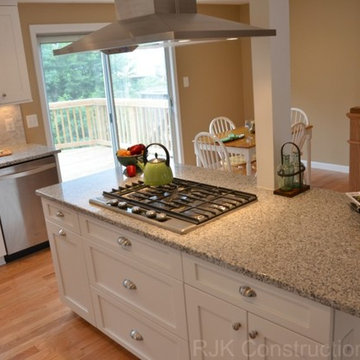
We split our cooking areas and installed a continuous grill gas cooktop into the island. A sleek island hood takes care of exhaust and adds an extra element to our architectural feature. Under the cooktop we added over-sized drawers for pots and pan storage. The frameless cabinets from New River Cabinetry are maple, painted white, with the Herndon door style. With the cooktop safely nestled into our island, we still had to add an oven.
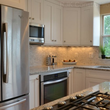
We used the space where the old range sat for a large single oven of stainless steel and glass. If it worked for one, why not two? We created a home for a microwave in the wall cabinets. It’s perfect for heating leftovers so close to the refrigerator.
An important consideration for hot spots in your kitchen is landing zones. Each of our cooking areas have generous landing zones, one on each side of the cooktop and an entire counter area above or below the ovens, depending on which one you’re using.
We wanted to give the sink area more room so the half wall had to come out. We moved the trash and recycle cans into a cabinet, removed the heavy soffits and kept the sink under the window.
With that little bit of extra space we were able to add a larger cabinet above the dishwasher and slide it all down. This used to be where the carpeting met the vinyl floor, but all of it is gone. Long oak planks eliminate that final divide between the kitchen and the dining area, while adding visual length to the area. White wall cabinets on each side of the window reflect the sunlight for a brighter view.
With all of the darker cabinetry the backsplash walls had been painted white. Even still, there was a darkness in the corners and it wasn’t very exciting. We wanted to add visual interest and reflect the new under-cabinet lighting, eliminating the shadows in this corner.
With 1″x 2″ Arabescato Honed marble mosaics and those under-cabinet lights, we achieved the perfect balance. The marble has subtle swirls in gray and beige on a clean white background, but with the honed finish the light is softly reflected instead of glaring. For granite, we chose the soft gray tones of Luna Pearl. The speckles of gray and beige are a gentle contrast to the white cabinets and emulate the color of the stainless steel.
Between the carpet, red half wall, dark railing and dated light fixture, the dining area felt tired. Since the kitchen lacked sufficient storage, a large utility cabinet crowded the table space without adding any decorate elements.
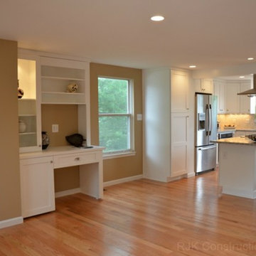
Although it didn’t get any bigger, our dining area feels fresher and more open too. With the oak flooring joining the area to the rest of our space and the toasted wheat on the walls, the white table and chairs compliment the cabinetry while contrasting the warmer colors. We replaced the chandelier with recessed lighting and changed that railing too.
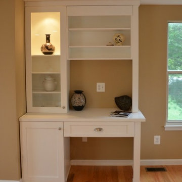
With our new open floor plan, we ended up with a fairly open area in between our foyer closet and the living room window. Not one to miss an opportunity, we filled the space with a multi-functional work space.
With the sunlight streaming in this bright corner works for anything this family needs.
There’s plenty of space for a chair under this large desk drawer. A closed cabinet below, glass doors above and lots of open shelving let you store and or showcase your belongings. We added a lite area at the top to keep away the darker corners.
The transformation is complete. This kitchen and all of its features are truly the center of attention in this home.
http://www.designsbyskill.com/
http://www.rjkconstructioninc.com/
 Skill Construction & Design, LLC
There are so many design elements to this kitchen, I almost don’t know where to start. Bright and airy with crisp clean white cabinets, the kitchen is open and welcoming. Still crisp but gently contrasting, the stainless steel appliance add depth amid the white. To keep this kitchen warm, natural oak covers the floors and a toasted wheat color washes the walls. And then there is the architectural elements. You know. That post and beam in the middle of the room. It’s the center of attention.
When you walk into a room your eyes roam around, establishing the size and shape of the room as your feet take you forward. From the front door of this home straight ahead you encountered this wall. The dining area to the right gives you a glimpse of things to come. Where there is a dining room you will usually find a kitchen.
The architecture of years gone by consistently hides the kitchen, the heart of the home, behind walls. I sympathize with my Mom, and all the other Moms, who have had to spend so much time tucked into a tight kitchen, away from the family. This wall had to go, but it was structural. We needed its support but not its bulk.
So we got rid of the bulk and only the bulk. Instead of a wall we have a post and beam, offering all of the structure we need. We could have installed a huge steel beam and reconfigure the joists to upset the beam, but why? The small beam and post add an incredible architectural element. It’s turning lemons into lemon, we simply made the most of what we had. It may be functional but it’s so fantastic. It looks like we created the effect just for the drama.
The original kitchen may have had a working triangle and some counter space, but it was fairly small, with each area only a step or two away. The dark cabinets made the space feel even smaller and the butcher block patterned laminate counter tops were very dated. The appliances were feeling their age as well, from a coil burner electric stove to a top freezer refrigerator. To keep this kitchen within its space, a half wall separated it from the dining area.
With the wall gone we borrowed some space from the living room and extended what was a U shaped kitchen into an L. At the living room window we start our new kitchen. We kept a small part of the wall to support the other end of our decorative beam. Sandwiched between a large pantry and our new French door refrigerator, the wall disappears. With our new open floor plan a sizable island was in order.
We split our cooking areas and installed a continuous grill gas cooktop into the island. A sleek island hood takes care of exhaust and adds an extra element to our architectural feature. Under the cooktop we added over-sized drawers for pots and pan storage. The frameless cabinets from New River Cabinetry are maple, painted white, with the Herndon door style. With the cooktop safely nestled into our island, we still had to add an oven.
We used the space where the old range sat for a large single oven of stainless steel and glass. If it worked for one, why not two? We created a home for a microwave in the wall cabinets. It’s perfect for heating leftovers so close to the refrigerator.
An important consideration for hot spots in your kitchen is landing zones. Each of our cooking areas have generous landing zones, one on each side of the cooktop and an entire counter area above or below the ovens, depending on which one you’re using.
We wanted to give the sink area more room so the half wall had to come out. We moved the trash and recycle cans into a cabinet, removed the heavy soffits and kept the sink under the window.
With that little bit of extra space we were able to add a larger cabinet above the dishwasher and slide it all down. This used to be where the carpeting met the vinyl floor, but all of it is gone. Long oak planks eliminate that final divide between the kitchen and the dining area, while adding visual length to the area. White wall cabinets on each side of the window reflect the sunlight for a brighter view.
With all of the darker cabinetry the backsplash walls had been painted white. Even still, there was a darkness in the corners and it wasn’t very exciting. We wanted to add visual interest and reflect the new under-cabinet lighting, eliminating the shadows in this corner.
With 1″x 2″ Arabescato Honed marble mosaics and those under-cabinet lights, we achieved the perfect balance. The marble has subtle swirls in gray and beige on a clean white background, but with the honed finish the light is softly reflected instead of glaring. For granite, we chose the soft gray tones of Luna Pearl. The speckles of gray and beige are a gentle contrast to the white cabinets and emulate the color of the stainless steel.
Between the carpet, red half wall, dark railing and dated light fixture, the dining area felt tired. Since the kitchen lacked sufficient storage, a large utility cabinet crowded the table space without adding any decorate elements.
Although it didn’t get any bigger, our dining area feels fresher and more open too. With the oak flooring joining the area to the rest of our space and the toasted wheat on the walls, the white table and chairs compliment the cabinetry while contrasting the warmer colors. We replaced the chandelier with recessed lighting and changed that railing too.
With our new open floor plan, we ended up with a fairly open area in between our foyer closet and the living room window. Not one to miss an opportunity, we filled the space with a multi-functional work space.
With the sunlight streaming in this bright corner works for anything this family needs.
There’s plenty of space for a chair under this large desk drawer. A closed cabinet below, glass doors above and lots of open shelving let you store and or showcase your belongings. We added a lite area at the top to keep away the darker corners.
The transformation is complete. This kitchen and all of its features are truly the center of attention in this home.
http://www.designsbyskill.com/
http://www.rjkconstructioninc.com/
Find the right local pro for your project
 Skill Construction & Design, LLC
There are so many design elements to this kitchen, I almost don’t know where to start. Bright and airy with crisp clean white cabinets, the kitchen is open and welcoming. Still crisp but gently contrasting, the stainless steel appliance add depth amid the white. To keep this kitchen warm, natural oak covers the floors and a toasted wheat color washes the walls. And then there is the architectural elements. You know. That post and beam in the middle of the room. It’s the center of attention.
When you walk into a room your eyes roam around, establishing the size and shape of the room as your feet take you forward. From the front door of this home straight ahead you encountered this wall. The dining area to the right gives you a glimpse of things to come. Where there is a dining room you will usually find a kitchen.
The architecture of years gone by consistently hides the kitchen, the heart of the home, behind walls. I sympathize with my Mom, and all the other Moms, who have had to spend so much time tucked into a tight kitchen, away from the family. This wall had to go, but it was structural. We needed its support but not its bulk.
So we got rid of the bulk and only the bulk. Instead of a wall we have a post and beam, offering all of the structure we need. We could have installed a huge steel beam and reconfigure the joists to upset the beam, but why? The small beam and post add an incredible architectural element. It’s turning lemons into lemon, we simply made the most of what we had. It may be functional but it’s so fantastic. It looks like we created the effect just for the drama.
The original kitchen may have had a working triangle and some counter space, but it was fairly small, with each area only a step or two away. The dark cabinets made the space feel even smaller and the butcher block patterned laminate counter tops were very dated. The appliances were feeling their age as well, from a coil burner electric stove to a top freezer refrigerator. To keep this kitchen within its space, a half wall separated it from the dining area.
With the wall gone we borrowed some space from the living room and extended what was a U shaped kitchen into an L. At the living room window we start our new kitchen. We kept a small part of the wall to support the other end of our decorative beam. Sandwiched between a large pantry and our new French door refrigerator, the wall disappears. With our new open floor plan a sizable island was in order.
We split our cooking areas and installed a continuous grill gas cooktop into the island. A sleek island hood takes care of exhaust and adds an extra element to our architectural feature. Under the cooktop we added over-sized drawers for pots and pan storage. The frameless cabinets from New River Cabinetry are maple, painted white, with the Herndon door style. With the cooktop safely nestled into our island, we still had to add an oven.
We used the space where the old range sat for a large single oven of stainless steel and glass. If it worked for one, why not two? We created a home for a microwave in the wall cabinets. It’s perfect for heating leftovers so close to the refrigerator.
An important consideration for hot spots in your kitchen is landing zones. Each of our cooking areas have generous landing zones, one on each side of the cooktop and an entire counter area above or below the ovens, depending on which one you’re using.
We wanted to give the sink area more room so the half wall had to come out. We moved the trash and recycle cans into a cabinet, removed the heavy soffits and kept the sink under the window.
With that little bit of extra space we were able to add a larger cabinet above the dishwasher and slide it all down. This used to be where the carpeting met the vinyl floor, but all of it is gone. Long oak planks eliminate that final divide between the kitchen and the dining area, while adding visual length to the area. White wall cabinets on each side of the window reflect the sunlight for a brighter view.
With all of the darker cabinetry the backsplash walls had been painted white. Even still, there was a darkness in the corners and it wasn’t very exciting. We wanted to add visual interest and reflect the new under-cabinet lighting, eliminating the shadows in this corner.
With 1″x 2″ Arabescato Honed marble mosaics and those under-cabinet lights, we achieved the perfect balance. The marble has subtle swirls in gray and beige on a clean white background, but with the honed finish the light is softly reflected instead of glaring. For granite, we chose the soft gray tones of Luna Pearl. The speckles of gray and beige are a gentle contrast to the white cabinets and emulate the color of the stainless steel.
Between the carpet, red half wall, dark railing and dated light fixture, the dining area felt tired. Since the kitchen lacked sufficient storage, a large utility cabinet crowded the table space without adding any decorate elements.
Although it didn’t get any bigger, our dining area feels fresher and more open too. With the oak flooring joining the area to the rest of our space and the toasted wheat on the walls, the white table and chairs compliment the cabinetry while contrasting the warmer colors. We replaced the chandelier with recessed lighting and changed that railing too.
With our new open floor plan, we ended up with a fairly open area in between our foyer closet and the living room window. Not one to miss an opportunity, we filled the space with a multi-functional work space.
With the sunlight streaming in this bright corner works for anything this family needs.
There’s plenty of space for a chair under this large desk drawer. A closed cabinet below, glass doors above and lots of open shelving let you store and or showcase your belongings. We added a lite area at the top to keep away the darker corners.
The transformation is complete. This kitchen and all of its features are truly the center of attention in this home.
http://www.designsbyskill.com/
http://www.rjkconstructioninc.com/
 Simply Home Decorating
This penthouse condo in Raven Woods is home to an adventurous, nature-loving couple. With their children grown and starting families of their own, Jeremy and Cynthia (names changed) chose to downsize their livable space and “upsize” in quality and luxury.
The couple hired us to help them achieve several well-defined goals: feeling immersed and connected to nature, having warm and welcoming spaces to host their family and friends, and selecting pieces that would support local makers and artisans. (If you know me, you know that nature, connection, and community are some of my most important values, personally and professionally — the perfect fit!)
Using our comprehensive design process, we spent months designing, procuring, and installing their new, long-time home. The resulting spaces are breathtaking, creating a daily living experience that is full of serenity and bliss.
Welcoming & Bright Home with Forest Views:
Ahhh… can you imagine coming home to a space as bright and soothing as this one? To find inspiration for this home’s interiors, we needed to look no further than out the windows, where mountain views greet us to the north and the ocean beckons from the south.
Paying homage to their locale, we curated a colour palette of subtle blues and grays, warm-toned woods, and natural materials, all set against a crisp, white backdrop. These help us create a seamless visual transition between the interior and exterior. Let’s start our tour in the living area…
A Cozy Living Area with Warmth & Dimension:
In the living area, the fireplace was the starting point for the design, as it determined the size of the space and the scale of our furnishings. To keep this area feeling cozy but not crowded, we selected this soft ottoman to serve as a table surface with a tray or as additional seating when Jeremy and Cynthia host guests. (Multi-purpose items are one of the 5 elements of The Simple Home.)
Additional textures — the sofa, upholstered swivel chairs, pillows, and ceramic wall art reminiscent of sand dollars — offer further depth and dimension in this simple yet layered space. The result is a cozy living room area perfect for a relaxing read on an overcast day or a social evening by the fire.
While daunting at first, this home’s small and open footprint offered a special opportunity for us to design thoughtful “zones”. To create a defined living space, we used an area rug to establish a border and situated the larger seating (the sofa) on the right. Its visual weight serves as a grounding barrier that naturally separates the living and dining areas.
Overhead, the centrally located brass and glass chandelier serves as another focal point, making the entire living area feel like one unit. Last but not least…
Styled with tall decorative lamps, this light oak and rattan console sits just behind the sofa, creating an additional visual barrier between the living and dining areas. We styled it with accessories that complement the overall palette, and it has the added benefit of providing storage right where Jeremy and Cynthia need it, the dining area.
An Art-Infused Dining Area:
The dining area is warm, woodsy, and filled with locally sourced art that Jeremy and Cynthia love. Next to the console is a custom textile piece from Vancouver artist, With Strings Attached, that mimics the scenic, mountain backdrop. The blue hues of the piece work in harmony with the warm wood dining table, cool gray upholstered chairs, and neutral stools at the kitchen bar.
On the other side of the space, is Jeremy’s and Cynthia’s favourite piece, a commissioned work of art by local maker, Katie Napier. Carefully positioned in a central location and framed by two modern sconces, this piece captures the feel of gentle waters on a misty day and evokes calm.
Other curated pieces include this rectangular vessel centrepiece by sculptural artist, Martha Sturdy, bearing a stunning moss arrangement by Soul Roots Moss Art. As this couple can attest, a treasured memento or piece of art can transform your space and your mood, transporting you to a relaxed and peaceful state.
A Bedroom Full of Light & Texture:
This beautiful bedroom is another manifestation of Jeremy and Cynthia’s favourite experiences: hiking the rainforest trails and enjoying the spray of the sea. The blue-and-green branching pattern found in the window treatments and pillows ground the space, while bright turquoise lamps — akin to sea glass — infuse the room with a touch of coastal vibrance.
Similar to the living area, we added comfort through texture and warm tones, incorporating oak end tables, natural woven wall decor above the headboard, knitted ottomans at the foot of the bed, a textured duvet, and an extra plush area rug.
A Loft Inspired by Flora & Fauna:
For the loft space, we moved away from coastal elements and decided to ground the space in the more earthy elements of nature: flora and fauna. We selected an umber-hued sofa complemented by floral decorative pillows and walls adorned with botanical prints by Heather Johnston.
This multi-purpose space serves as a reprieve for our clients to read, practice yoga, and relax. Alternatively, a Frame TV intentionally meant to blend as art allows the space to function as a secondary entertainment space or a place for their granddaughter to play and sleep over.
Praise from Our Clients:
This home’s small footprint pushed us to be more resourceful in our furniture sourcing and more creative in our space planning. The result is a home as livable, beautiful, and intentional as any larger home would be. Most importantly, Jeremy and Cynthia love it!
“Lori listened to our love of nature and designed our condo reflecting that love. It is beautiful, serene, and welcoming. We couldn't be happier.”
If you’re ready to uncover the hidden potential in your home, that is what we do best. Contact us here or download our complimentary guide below to discover more.
 Simply Home Decorating
This penthouse condo in Raven Woods is home to an adventurous, nature-loving couple. With their children grown and starting families of their own, Jeremy and Cynthia (names changed) chose to downsize their livable space and “upsize” in quality and luxury.
The couple hired us to help them achieve several well-defined goals: feeling immersed and connected to nature, having warm and welcoming spaces to host their family and friends, and selecting pieces that would support local makers and artisans. (If you know me, you know that nature, connection, and community are some of my most important values, personally and professionally — the perfect fit!)
Using our comprehensive design process, we spent months designing, procuring, and installing their new, long-time home. The resulting spaces are breathtaking, creating a daily living experience that is full of serenity and bliss.
Welcoming & Bright Home with Forest Views:
Ahhh… can you imagine coming home to a space as bright and soothing as this one? To find inspiration for this home’s interiors, we needed to look no further than out the windows, where mountain views greet us to the north and the ocean beckons from the south.
Paying homage to their locale, we curated a colour palette of subtle blues and grays, warm-toned woods, and natural materials, all set against a crisp, white backdrop. These help us create a seamless visual transition between the interior and exterior. Let’s start our tour in the living area…
A Cozy Living Area with Warmth & Dimension:
In the living area, the fireplace was the starting point for the design, as it determined the size of the space and the scale of our furnishings. To keep this area feeling cozy but not crowded, we selected this soft ottoman to serve as a table surface with a tray or as additional seating when Jeremy and Cynthia host guests. (Multi-purpose items are one of the 5 elements of The Simple Home.)
Additional textures — the sofa, upholstered swivel chairs, pillows, and ceramic wall art reminiscent of sand dollars — offer further depth and dimension in this simple yet layered space. The result is a cozy living room area perfect for a relaxing read on an overcast day or a social evening by the fire.
While daunting at first, this home’s small and open footprint offered a special opportunity for us to design thoughtful “zones”. To create a defined living space, we used an area rug to establish a border and situated the larger seating (the sofa) on the right. Its visual weight serves as a grounding barrier that naturally separates the living and dining areas.
Overhead, the centrally located brass and glass chandelier serves as another focal point, making the entire living area feel like one unit. Last but not least…
Styled with tall decorative lamps, this light oak and rattan console sits just behind the sofa, creating an additional visual barrier between the living and dining areas. We styled it with accessories that complement the overall palette, and it has the added benefit of providing storage right where Jeremy and Cynthia need it, the dining area.
An Art-Infused Dining Area:
The dining area is warm, woodsy, and filled with locally sourced art that Jeremy and Cynthia love. Next to the console is a custom textile piece from Vancouver artist, With Strings Attached, that mimics the scenic, mountain backdrop. The blue hues of the piece work in harmony with the warm wood dining table, cool gray upholstered chairs, and neutral stools at the kitchen bar.
On the other side of the space, is Jeremy’s and Cynthia’s favourite piece, a commissioned work of art by local maker, Katie Napier. Carefully positioned in a central location and framed by two modern sconces, this piece captures the feel of gentle waters on a misty day and evokes calm.
Other curated pieces include this rectangular vessel centrepiece by sculptural artist, Martha Sturdy, bearing a stunning moss arrangement by Soul Roots Moss Art. As this couple can attest, a treasured memento or piece of art can transform your space and your mood, transporting you to a relaxed and peaceful state.
A Bedroom Full of Light & Texture:
This beautiful bedroom is another manifestation of Jeremy and Cynthia’s favourite experiences: hiking the rainforest trails and enjoying the spray of the sea. The blue-and-green branching pattern found in the window treatments and pillows ground the space, while bright turquoise lamps — akin to sea glass — infuse the room with a touch of coastal vibrance.
Similar to the living area, we added comfort through texture and warm tones, incorporating oak end tables, natural woven wall decor above the headboard, knitted ottomans at the foot of the bed, a textured duvet, and an extra plush area rug.
A Loft Inspired by Flora & Fauna:
For the loft space, we moved away from coastal elements and decided to ground the space in the more earthy elements of nature: flora and fauna. We selected an umber-hued sofa complemented by floral decorative pillows and walls adorned with botanical prints by Heather Johnston.
This multi-purpose space serves as a reprieve for our clients to read, practice yoga, and relax. Alternatively, a Frame TV intentionally meant to blend as art allows the space to function as a secondary entertainment space or a place for their granddaughter to play and sleep over.
Praise from Our Clients:
This home’s small footprint pushed us to be more resourceful in our furniture sourcing and more creative in our space planning. The result is a home as livable, beautiful, and intentional as any larger home would be. Most importantly, Jeremy and Cynthia love it!
“Lori listened to our love of nature and designed our condo reflecting that love. It is beautiful, serene, and welcoming. We couldn't be happier.”
If you’re ready to uncover the hidden potential in your home, that is what we do best. Contact us here or download our complimentary guide below to discover more.
 Simply Home Decorating
This penthouse condo in Raven Woods is home to an adventurous, nature-loving couple. With their children grown and starting families of their own, Jeremy and Cynthia (names changed) chose to downsize their livable space and “upsize” in quality and luxury.
The couple hired us to help them achieve several well-defined goals: feeling immersed and connected to nature, having warm and welcoming spaces to host their family and friends, and selecting pieces that would support local makers and artisans. (If you know me, you know that nature, connection, and community are some of my most important values, personally and professionally — the perfect fit!)
Using our comprehensive design process, we spent months designing, procuring, and installing their new, long-time home. The resulting spaces are breathtaking, creating a daily living experience that is full of serenity and bliss.
Welcoming & Bright Home with Forest Views:
Ahhh… can you imagine coming home to a space as bright and soothing as this one? To find inspiration for this home’s interiors, we needed to look no further than out the windows, where mountain views greet us to the north and the ocean beckons from the south.
Paying homage to their locale, we curated a colour palette of subtle blues and grays, warm-toned woods, and natural materials, all set against a crisp, white backdrop. These help us create a seamless visual transition between the interior and exterior. Let’s start our tour in the living area…
A Cozy Living Area with Warmth & Dimension:
In the living area, the fireplace was the starting point for the design, as it determined the size of the space and the scale of our furnishings. To keep this area feeling cozy but not crowded, we selected this soft ottoman to serve as a table surface with a tray or as additional seating when Jeremy and Cynthia host guests. (Multi-purpose items are one of the 5 elements of The Simple Home.)
Additional textures — the sofa, upholstered swivel chairs, pillows, and ceramic wall art reminiscent of sand dollars — offer further depth and dimension in this simple yet layered space. The result is a cozy living room area perfect for a relaxing read on an overcast day or a social evening by the fire.
While daunting at first, this home’s small and open footprint offered a special opportunity for us to design thoughtful “zones”. To create a defined living space, we used an area rug to establish a border and situated the larger seating (the sofa) on the right. Its visual weight serves as a grounding barrier that naturally separates the living and dining areas.
Overhead, the centrally located brass and glass chandelier serves as another focal point, making the entire living area feel like one unit. Last but not least…
Styled with tall decorative lamps, this light oak and rattan console sits just behind the sofa, creating an additional visual barrier between the living and dining areas. We styled it with accessories that complement the overall palette, and it has the added benefit of providing storage right where Jeremy and Cynthia need it, the dining area.
An Art-Infused Dining Area:
The dining area is warm, woodsy, and filled with locally sourced art that Jeremy and Cynthia love. Next to the console is a custom textile piece from Vancouver artist, With Strings Attached, that mimics the scenic, mountain backdrop. The blue hues of the piece work in harmony with the warm wood dining table, cool gray upholstered chairs, and neutral stools at the kitchen bar.
On the other side of the space, is Jeremy’s and Cynthia’s favourite piece, a commissioned work of art by local maker, Katie Napier. Carefully positioned in a central location and framed by two modern sconces, this piece captures the feel of gentle waters on a misty day and evokes calm.
Other curated pieces include this rectangular vessel centrepiece by sculptural artist, Martha Sturdy, bearing a stunning moss arrangement by Soul Roots Moss Art. As this couple can attest, a treasured memento or piece of art can transform your space and your mood, transporting you to a relaxed and peaceful state.
A Bedroom Full of Light & Texture:
This beautiful bedroom is another manifestation of Jeremy and Cynthia’s favourite experiences: hiking the rainforest trails and enjoying the spray of the sea. The blue-and-green branching pattern found in the window treatments and pillows ground the space, while bright turquoise lamps — akin to sea glass — infuse the room with a touch of coastal vibrance.
Similar to the living area, we added comfort through texture and warm tones, incorporating oak end tables, natural woven wall decor above the headboard, knitted ottomans at the foot of the bed, a textured duvet, and an extra plush area rug.
A Loft Inspired by Flora & Fauna:
For the loft space, we moved away from coastal elements and decided to ground the space in the more earthy elements of nature: flora and fauna. We selected an umber-hued sofa complemented by floral decorative pillows and walls adorned with botanical prints by Heather Johnston.
This multi-purpose space serves as a reprieve for our clients to read, practice yoga, and relax. Alternatively, a Frame TV intentionally meant to blend as art allows the space to function as a secondary entertainment space or a place for their granddaughter to play and sleep over.
Praise from Our Clients:
This home’s small footprint pushed us to be more resourceful in our furniture sourcing and more creative in our space planning. The result is a home as livable, beautiful, and intentional as any larger home would be. Most importantly, Jeremy and Cynthia love it!
“Lori listened to our love of nature and designed our condo reflecting that love. It is beautiful, serene, and welcoming. We couldn't be happier.”
If you’re ready to uncover the hidden potential in your home, that is what we do best. Contact us here or download our complimentary guide below to discover more.


 Skill Construction & Design, LLC
There are so many design elements to this kitchen, I almost don’t know where to start. Bright and airy with crisp clean white cabinets, the kitchen is open and welcoming. Still crisp but gently contrasting, the stainless steel appliance add depth amid the white. To keep this kitchen warm, natural oak covers the floors and a toasted wheat color washes the walls. And then there is the architectural elements. You know. That post and beam in the middle of the room. It’s the center of attention.
When you walk into a room your eyes roam around, establishing the size and shape of the room as your feet take you forward. From the front door of this home straight ahead you encountered this wall. The dining area to the right gives you a glimpse of things to come. Where there is a dining room you will usually find a kitchen.
The architecture of years gone by consistently hides the kitchen, the heart of the home, behind walls. I sympathize with my Mom, and all the other Moms, who have had to spend so much time tucked into a tight kitchen, away from the family. This wall had to go, but it was structural. We needed its support but not its bulk.
So we got rid of the bulk and only the bulk. Instead of a wall we have a post and beam, offering all of the structure we need. We could have installed a huge steel beam and reconfigure the joists to upset the beam, but why? The small beam and post add an incredible architectural element. It’s turning lemons into lemon, we simply made the most of what we had. It may be functional but it’s so fantastic. It looks like we created the effect just for the drama.
The original kitchen may have had a working triangle and some counter space, but it was fairly small, with each area only a step or two away. The dark cabinets made the space feel even smaller and the butcher block patterned laminate counter tops were very dated. The appliances were feeling their age as well, from a coil burner electric stove to a top freezer refrigerator. To keep this kitchen within its space, a half wall separated it from the dining area.
With the wall gone we borrowed some space from the living room and extended what was a U shaped kitchen into an L. At the living room window we start our new kitchen. We kept a small part of the wall to support the other end of our decorative beam. Sandwiched between a large pantry and our new French door refrigerator, the wall disappears. With our new open floor plan a sizable island was in order.
We split our cooking areas and installed a continuous grill gas cooktop into the island. A sleek island hood takes care of exhaust and adds an extra element to our architectural feature. Under the cooktop we added over-sized drawers for pots and pan storage. The frameless cabinets from New River Cabinetry are maple, painted white, with the Herndon door style. With the cooktop safely nestled into our island, we still had to add an oven.
We used the space where the old range sat for a large single oven of stainless steel and glass. If it worked for one, why not two? We created a home for a microwave in the wall cabinets. It’s perfect for heating leftovers so close to the refrigerator.
An important consideration for hot spots in your kitchen is landing zones. Each of our cooking areas have generous landing zones, one on each side of the cooktop and an entire counter area above or below the ovens, depending on which one you’re using.
We wanted to give the sink area more room so the half wall had to come out. We moved the trash and recycle cans into a cabinet, removed the heavy soffits and kept the sink under the window.
With that little bit of extra space we were able to add a larger cabinet above the dishwasher and slide it all down. This used to be where the carpeting met the vinyl floor, but all of it is gone. Long oak planks eliminate that final divide between the kitchen and the dining area, while adding visual length to the area. White wall cabinets on each side of the window reflect the sunlight for a brighter view.
With all of the darker cabinetry the backsplash walls had been painted white. Even still, there was a darkness in the corners and it wasn’t very exciting. We wanted to add visual interest and reflect the new under-cabinet lighting, eliminating the shadows in this corner.
With 1″x 2″ Arabescato Honed marble mosaics and those under-cabinet lights, we achieved the perfect balance. The marble has subtle swirls in gray and beige on a clean white background, but with the honed finish the light is softly reflected instead of glaring. For granite, we chose the soft gray tones of Luna Pearl. The speckles of gray and beige are a gentle contrast to the white cabinets and emulate the color of the stainless steel.
Between the carpet, red half wall, dark railing and dated light fixture, the dining area felt tired. Since the kitchen lacked sufficient storage, a large utility cabinet crowded the table space without adding any decorate elements.
Although it didn’t get any bigger, our dining area feels fresher and more open too. With the oak flooring joining the area to the rest of our space and the toasted wheat on the walls, the white table and chairs compliment the cabinetry while contrasting the warmer colors. We replaced the chandelier with recessed lighting and changed that railing too.
With our new open floor plan, we ended up with a fairly open area in between our foyer closet and the living room window. Not one to miss an opportunity, we filled the space with a multi-functional work space.
With the sunlight streaming in this bright corner works for anything this family needs.
There’s plenty of space for a chair under this large desk drawer. A closed cabinet below, glass doors above and lots of open shelving let you store and or showcase your belongings. We added a lite area at the top to keep away the darker corners.
The transformation is complete. This kitchen and all of its features are truly the center of attention in this home.
http://www.designsbyskill.com/
http://www.rjkconstructioninc.com/
 Skill Construction & Design, LLC
There are so many design elements to this kitchen, I almost don’t know where to start. Bright and airy with crisp clean white cabinets, the kitchen is open and welcoming. Still crisp but gently contrasting, the stainless steel appliance add depth amid the white. To keep this kitchen warm, natural oak covers the floors and a toasted wheat color washes the walls. And then there is the architectural elements. You know. That post and beam in the middle of the room. It’s the center of attention.
When you walk into a room your eyes roam around, establishing the size and shape of the room as your feet take you forward. From the front door of this home straight ahead you encountered this wall. The dining area to the right gives you a glimpse of things to come. Where there is a dining room you will usually find a kitchen.
The architecture of years gone by consistently hides the kitchen, the heart of the home, behind walls. I sympathize with my Mom, and all the other Moms, who have had to spend so much time tucked into a tight kitchen, away from the family. This wall had to go, but it was structural. We needed its support but not its bulk.
So we got rid of the bulk and only the bulk. Instead of a wall we have a post and beam, offering all of the structure we need. We could have installed a huge steel beam and reconfigure the joists to upset the beam, but why? The small beam and post add an incredible architectural element. It’s turning lemons into lemon, we simply made the most of what we had. It may be functional but it’s so fantastic. It looks like we created the effect just for the drama.
The original kitchen may have had a working triangle and some counter space, but it was fairly small, with each area only a step or two away. The dark cabinets made the space feel even smaller and the butcher block patterned laminate counter tops were very dated. The appliances were feeling their age as well, from a coil burner electric stove to a top freezer refrigerator. To keep this kitchen within its space, a half wall separated it from the dining area.
With the wall gone we borrowed some space from the living room and extended what was a U shaped kitchen into an L. At the living room window we start our new kitchen. We kept a small part of the wall to support the other end of our decorative beam. Sandwiched between a large pantry and our new French door refrigerator, the wall disappears. With our new open floor plan a sizable island was in order.
We split our cooking areas and installed a continuous grill gas cooktop into the island. A sleek island hood takes care of exhaust and adds an extra element to our architectural feature. Under the cooktop we added over-sized drawers for pots and pan storage. The frameless cabinets from New River Cabinetry are maple, painted white, with the Herndon door style. With the cooktop safely nestled into our island, we still had to add an oven.
We used the space where the old range sat for a large single oven of stainless steel and glass. If it worked for one, why not two? We created a home for a microwave in the wall cabinets. It’s perfect for heating leftovers so close to the refrigerator.
An important consideration for hot spots in your kitchen is landing zones. Each of our cooking areas have generous landing zones, one on each side of the cooktop and an entire counter area above or below the ovens, depending on which one you’re using.
We wanted to give the sink area more room so the half wall had to come out. We moved the trash and recycle cans into a cabinet, removed the heavy soffits and kept the sink under the window.
With that little bit of extra space we were able to add a larger cabinet above the dishwasher and slide it all down. This used to be where the carpeting met the vinyl floor, but all of it is gone. Long oak planks eliminate that final divide between the kitchen and the dining area, while adding visual length to the area. White wall cabinets on each side of the window reflect the sunlight for a brighter view.
With all of the darker cabinetry the backsplash walls had been painted white. Even still, there was a darkness in the corners and it wasn’t very exciting. We wanted to add visual interest and reflect the new under-cabinet lighting, eliminating the shadows in this corner.
With 1″x 2″ Arabescato Honed marble mosaics and those under-cabinet lights, we achieved the perfect balance. The marble has subtle swirls in gray and beige on a clean white background, but with the honed finish the light is softly reflected instead of glaring. For granite, we chose the soft gray tones of Luna Pearl. The speckles of gray and beige are a gentle contrast to the white cabinets and emulate the color of the stainless steel.
Between the carpet, red half wall, dark railing and dated light fixture, the dining area felt tired. Since the kitchen lacked sufficient storage, a large utility cabinet crowded the table space without adding any decorate elements.
Although it didn’t get any bigger, our dining area feels fresher and more open too. With the oak flooring joining the area to the rest of our space and the toasted wheat on the walls, the white table and chairs compliment the cabinetry while contrasting the warmer colors. We replaced the chandelier with recessed lighting and changed that railing too.
With our new open floor plan, we ended up with a fairly open area in between our foyer closet and the living room window. Not one to miss an opportunity, we filled the space with a multi-functional work space.
With the sunlight streaming in this bright corner works for anything this family needs.
There’s plenty of space for a chair under this large desk drawer. A closed cabinet below, glass doors above and lots of open shelving let you store and or showcase your belongings. We added a lite area at the top to keep away the darker corners.
The transformation is complete. This kitchen and all of its features are truly the center of attention in this home.
http://www.designsbyskill.com/
http://www.rjkconstructioninc.com/
 Simply Home Decorating
This penthouse condo in Raven Woods is home to an adventurous, nature-loving couple. With their children grown and starting families of their own, Jeremy and Cynthia (names changed) chose to downsize their livable space and “upsize” in quality and luxury.
The couple hired us to help them achieve several well-defined goals: feeling immersed and connected to nature, having warm and welcoming spaces to host their family and friends, and selecting pieces that would support local makers and artisans. (If you know me, you know that nature, connection, and community are some of my most important values, personally and professionally — the perfect fit!)
Using our comprehensive design process, we spent months designing, procuring, and installing their new, long-time home. The resulting spaces are breathtaking, creating a daily living experience that is full of serenity and bliss.
Welcoming & Bright Home with Forest Views:
Ahhh… can you imagine coming home to a space as bright and soothing as this one? To find inspiration for this home’s interiors, we needed to look no further than out the windows, where mountain views greet us to the north and the ocean beckons from the south.
Paying homage to their locale, we curated a colour palette of subtle blues and grays, warm-toned woods, and natural materials, all set against a crisp, white backdrop. These help us create a seamless visual transition between the interior and exterior. Let’s start our tour in the living area…
A Cozy Living Area with Warmth & Dimension:
In the living area, the fireplace was the starting point for the design, as it determined the size of the space and the scale of our furnishings. To keep this area feeling cozy but not crowded, we selected this soft ottoman to serve as a table surface with a tray or as additional seating when Jeremy and Cynthia host guests. (Multi-purpose items are one of the 5 elements of The Simple Home.)
Additional textures — the sofa, upholstered swivel chairs, pillows, and ceramic wall art reminiscent of sand dollars — offer further depth and dimension in this simple yet layered space. The result is a cozy living room area perfect for a relaxing read on an overcast day or a social evening by the fire.
While daunting at first, this home’s small and open footprint offered a special opportunity for us to design thoughtful “zones”. To create a defined living space, we used an area rug to establish a border and situated the larger seating (the sofa) on the right. Its visual weight serves as a grounding barrier that naturally separates the living and dining areas.
Overhead, the centrally located brass and glass chandelier serves as another focal point, making the entire living area feel like one unit. Last but not least…
Styled with tall decorative lamps, this light oak and rattan console sits just behind the sofa, creating an additional visual barrier between the living and dining areas. We styled it with accessories that complement the overall palette, and it has the added benefit of providing storage right where Jeremy and Cynthia need it, the dining area.
An Art-Infused Dining Area:
The dining area is warm, woodsy, and filled with locally sourced art that Jeremy and Cynthia love. Next to the console is a custom textile piece from Vancouver artist, With Strings Attached, that mimics the scenic, mountain backdrop. The blue hues of the piece work in harmony with the warm wood dining table, cool gray upholstered chairs, and neutral stools at the kitchen bar.
On the other side of the space, is Jeremy’s and Cynthia’s favourite piece, a commissioned work of art by local maker, Katie Napier. Carefully positioned in a central location and framed by two modern sconces, this piece captures the feel of gentle waters on a misty day and evokes calm.
Other curated pieces include this rectangular vessel centrepiece by sculptural artist, Martha Sturdy, bearing a stunning moss arrangement by Soul Roots Moss Art. As this couple can attest, a treasured memento or piece of art can transform your space and your mood, transporting you to a relaxed and peaceful state.
A Bedroom Full of Light & Texture:
This beautiful bedroom is another manifestation of Jeremy and Cynthia’s favourite experiences: hiking the rainforest trails and enjoying the spray of the sea. The blue-and-green branching pattern found in the window treatments and pillows ground the space, while bright turquoise lamps — akin to sea glass — infuse the room with a touch of coastal vibrance.
Similar to the living area, we added comfort through texture and warm tones, incorporating oak end tables, natural woven wall decor above the headboard, knitted ottomans at the foot of the bed, a textured duvet, and an extra plush area rug.
A Loft Inspired by Flora & Fauna:
For the loft space, we moved away from coastal elements and decided to ground the space in the more earthy elements of nature: flora and fauna. We selected an umber-hued sofa complemented by floral decorative pillows and walls adorned with botanical prints by Heather Johnston.
This multi-purpose space serves as a reprieve for our clients to read, practice yoga, and relax. Alternatively, a Frame TV intentionally meant to blend as art allows the space to function as a secondary entertainment space or a place for their granddaughter to play and sleep over.
Praise from Our Clients:
This home’s small footprint pushed us to be more resourceful in our furniture sourcing and more creative in our space planning. The result is a home as livable, beautiful, and intentional as any larger home would be. Most importantly, Jeremy and Cynthia love it!
“Lori listened to our love of nature and designed our condo reflecting that love. It is beautiful, serene, and welcoming. We couldn't be happier.”
If you’re ready to uncover the hidden potential in your home, that is what we do best. Contact us here or download our complimentary guide below to discover more.
 Skill Construction & Design, LLC
There are so many design elements to this kitchen, I almost don’t know where to start. Bright and airy with crisp clean white cabinets, the kitchen is open and welcoming. Still crisp but gently contrasting, the stainless steel appliance add depth amid the white. To keep this kitchen warm, natural oak covers the floors and a toasted wheat color washes the walls. And then there is the architectural elements. You know. That post and beam in the middle of the room. It’s the center of attention.
When you walk into a room your eyes roam around, establishing the size and shape of the room as your feet take you forward. From the front door of this home straight ahead you encountered this wall. The dining area to the right gives you a glimpse of things to come. Where there is a dining room you will usually find a kitchen.
The architecture of years gone by consistently hides the kitchen, the heart of the home, behind walls. I sympathize with my Mom, and all the other Moms, who have had to spend so much time tucked into a tight kitchen, away from the family. This wall had to go, but it was structural. We needed its support but not its bulk.
So we got rid of the bulk and only the bulk. Instead of a wall we have a post and beam, offering all of the structure we need. We could have installed a huge steel beam and reconfigure the joists to upset the beam, but why? The small beam and post add an incredible architectural element. It’s turning lemons into lemon, we simply made the most of what we had. It may be functional but it’s so fantastic. It looks like we created the effect just for the drama.
The original kitchen may have had a working triangle and some counter space, but it was fairly small, with each area only a step or two away. The dark cabinets made the space feel even smaller and the butcher block patterned laminate counter tops were very dated. The appliances were feeling their age as well, from a coil burner electric stove to a top freezer refrigerator. To keep this kitchen within its space, a half wall separated it from the dining area.
With the wall gone we borrowed some space from the living room and extended what was a U shaped kitchen into an L. At the living room window we start our new kitchen. We kept a small part of the wall to support the other end of our decorative beam. Sandwiched between a large pantry and our new French door refrigerator, the wall disappears. With our new open floor plan a sizable island was in order.
We split our cooking areas and installed a continuous grill gas cooktop into the island. A sleek island hood takes care of exhaust and adds an extra element to our architectural feature. Under the cooktop we added over-sized drawers for pots and pan storage. The frameless cabinets from New River Cabinetry are maple, painted white, with the Herndon door style. With the cooktop safely nestled into our island, we still had to add an oven.
We used the space where the old range sat for a large single oven of stainless steel and glass. If it worked for one, why not two? We created a home for a microwave in the wall cabinets. It’s perfect for heating leftovers so close to the refrigerator.
An important consideration for hot spots in your kitchen is landing zones. Each of our cooking areas have generous landing zones, one on each side of the cooktop and an entire counter area above or below the ovens, depending on which one you’re using.
We wanted to give the sink area more room so the half wall had to come out. We moved the trash and recycle cans into a cabinet, removed the heavy soffits and kept the sink under the window.
With that little bit of extra space we were able to add a larger cabinet above the dishwasher and slide it all down. This used to be where the carpeting met the vinyl floor, but all of it is gone. Long oak planks eliminate that final divide between the kitchen and the dining area, while adding visual length to the area. White wall cabinets on each side of the window reflect the sunlight for a brighter view.
With all of the darker cabinetry the backsplash walls had been painted white. Even still, there was a darkness in the corners and it wasn’t very exciting. We wanted to add visual interest and reflect the new under-cabinet lighting, eliminating the shadows in this corner.
With 1″x 2″ Arabescato Honed marble mosaics and those under-cabinet lights, we achieved the perfect balance. The marble has subtle swirls in gray and beige on a clean white background, but with the honed finish the light is softly reflected instead of glaring. For granite, we chose the soft gray tones of Luna Pearl. The speckles of gray and beige are a gentle contrast to the white cabinets and emulate the color of the stainless steel.
Between the carpet, red half wall, dark railing and dated light fixture, the dining area felt tired. Since the kitchen lacked sufficient storage, a large utility cabinet crowded the table space without adding any decorate elements.
Although it didn’t get any bigger, our dining area feels fresher and more open too. With the oak flooring joining the area to the rest of our space and the toasted wheat on the walls, the white table and chairs compliment the cabinetry while contrasting the warmer colors. We replaced the chandelier with recessed lighting and changed that railing too.
With our new open floor plan, we ended up with a fairly open area in between our foyer closet and the living room window. Not one to miss an opportunity, we filled the space with a multi-functional work space.
With the sunlight streaming in this bright corner works for anything this family needs.
There’s plenty of space for a chair under this large desk drawer. A closed cabinet below, glass doors above and lots of open shelving let you store and or showcase your belongings. We added a lite area at the top to keep away the darker corners.
The transformation is complete. This kitchen and all of its features are truly the center of attention in this home.
http://www.designsbyskill.com/
http://www.rjkconstructioninc.com/
 Skill Construction & Design, LLC
There are so many design elements to this kitchen, I almost don’t know where to start. Bright and airy with crisp clean white cabinets, the kitchen is open and welcoming. Still crisp but gently contrasting, the stainless steel appliance add depth amid the white. To keep this kitchen warm, natural oak covers the floors and a toasted wheat color washes the walls. And then there is the architectural elements. You know. That post and beam in the middle of the room. It’s the center of attention.
When you walk into a room your eyes roam around, establishing the size and shape of the room as your feet take you forward. From the front door of this home straight ahead you encountered this wall. The dining area to the right gives you a glimpse of things to come. Where there is a dining room you will usually find a kitchen.
The architecture of years gone by consistently hides the kitchen, the heart of the home, behind walls. I sympathize with my Mom, and all the other Moms, who have had to spend so much time tucked into a tight kitchen, away from the family. This wall had to go, but it was structural. We needed its support but not its bulk.
So we got rid of the bulk and only the bulk. Instead of a wall we have a post and beam, offering all of the structure we need. We could have installed a huge steel beam and reconfigure the joists to upset the beam, but why? The small beam and post add an incredible architectural element. It’s turning lemons into lemon, we simply made the most of what we had. It may be functional but it’s so fantastic. It looks like we created the effect just for the drama.
The original kitchen may have had a working triangle and some counter space, but it was fairly small, with each area only a step or two away. The dark cabinets made the space feel even smaller and the butcher block patterned laminate counter tops were very dated. The appliances were feeling their age as well, from a coil burner electric stove to a top freezer refrigerator. To keep this kitchen within its space, a half wall separated it from the dining area.
With the wall gone we borrowed some space from the living room and extended what was a U shaped kitchen into an L. At the living room window we start our new kitchen. We kept a small part of the wall to support the other end of our decorative beam. Sandwiched between a large pantry and our new French door refrigerator, the wall disappears. With our new open floor plan a sizable island was in order.
We split our cooking areas and installed a continuous grill gas cooktop into the island. A sleek island hood takes care of exhaust and adds an extra element to our architectural feature. Under the cooktop we added over-sized drawers for pots and pan storage. The frameless cabinets from New River Cabinetry are maple, painted white, with the Herndon door style. With the cooktop safely nestled into our island, we still had to add an oven.
We used the space where the old range sat for a large single oven of stainless steel and glass. If it worked for one, why not two? We created a home for a microwave in the wall cabinets. It’s perfect for heating leftovers so close to the refrigerator.
An important consideration for hot spots in your kitchen is landing zones. Each of our cooking areas have generous landing zones, one on each side of the cooktop and an entire counter area above or below the ovens, depending on which one you’re using.
We wanted to give the sink area more room so the half wall had to come out. We moved the trash and recycle cans into a cabinet, removed the heavy soffits and kept the sink under the window.
With that little bit of extra space we were able to add a larger cabinet above the dishwasher and slide it all down. This used to be where the carpeting met the vinyl floor, but all of it is gone. Long oak planks eliminate that final divide between the kitchen and the dining area, while adding visual length to the area. White wall cabinets on each side of the window reflect the sunlight for a brighter view.
With all of the darker cabinetry the backsplash walls had been painted white. Even still, there was a darkness in the corners and it wasn’t very exciting. We wanted to add visual interest and reflect the new under-cabinet lighting, eliminating the shadows in this corner.
With 1″x 2″ Arabescato Honed marble mosaics and those under-cabinet lights, we achieved the perfect balance. The marble has subtle swirls in gray and beige on a clean white background, but with the honed finish the light is softly reflected instead of glaring. For granite, we chose the soft gray tones of Luna Pearl. The speckles of gray and beige are a gentle contrast to the white cabinets and emulate the color of the stainless steel.
Between the carpet, red half wall, dark railing and dated light fixture, the dining area felt tired. Since the kitchen lacked sufficient storage, a large utility cabinet crowded the table space without adding any decorate elements.
Although it didn’t get any bigger, our dining area feels fresher and more open too. With the oak flooring joining the area to the rest of our space and the toasted wheat on the walls, the white table and chairs compliment the cabinetry while contrasting the warmer colors. We replaced the chandelier with recessed lighting and changed that railing too.
With our new open floor plan, we ended up with a fairly open area in between our foyer closet and the living room window. Not one to miss an opportunity, we filled the space with a multi-functional work space.
With the sunlight streaming in this bright corner works for anything this family needs.
There’s plenty of space for a chair under this large desk drawer. A closed cabinet below, glass doors above and lots of open shelving let you store and or showcase your belongings. We added a lite area at the top to keep away the darker corners.
The transformation is complete. This kitchen and all of its features are truly the center of attention in this home.
http://www.designsbyskill.com/
http://www.rjkconstructioninc.com/
 Simply Home Decorating
This penthouse condo in Raven Woods is home to an adventurous, nature-loving couple. With their children grown and starting families of their own, Jeremy and Cynthia (names changed) chose to downsize their livable space and “upsize” in quality and luxury.
The couple hired us to help them achieve several well-defined goals: feeling immersed and connected to nature, having warm and welcoming spaces to host their family and friends, and selecting pieces that would support local makers and artisans. (If you know me, you know that nature, connection, and community are some of my most important values, personally and professionally — the perfect fit!)
Using our comprehensive design process, we spent months designing, procuring, and installing their new, long-time home. The resulting spaces are breathtaking, creating a daily living experience that is full of serenity and bliss.
Welcoming & Bright Home with Forest Views:
Ahhh… can you imagine coming home to a space as bright and soothing as this one? To find inspiration for this home’s interiors, we needed to look no further than out the windows, where mountain views greet us to the north and the ocean beckons from the south.
Paying homage to their locale, we curated a colour palette of subtle blues and grays, warm-toned woods, and natural materials, all set against a crisp, white backdrop. These help us create a seamless visual transition between the interior and exterior. Let’s start our tour in the living area…
A Cozy Living Area with Warmth & Dimension:
In the living area, the fireplace was the starting point for the design, as it determined the size of the space and the scale of our furnishings. To keep this area feeling cozy but not crowded, we selected this soft ottoman to serve as a table surface with a tray or as additional seating when Jeremy and Cynthia host guests. (Multi-purpose items are one of the 5 elements of The Simple Home.)
Additional textures — the sofa, upholstered swivel chairs, pillows, and ceramic wall art reminiscent of sand dollars — offer further depth and dimension in this simple yet layered space. The result is a cozy living room area perfect for a relaxing read on an overcast day or a social evening by the fire.
While daunting at first, this home’s small and open footprint offered a special opportunity for us to design thoughtful “zones”. To create a defined living space, we used an area rug to establish a border and situated the larger seating (the sofa) on the right. Its visual weight serves as a grounding barrier that naturally separates the living and dining areas.
Overhead, the centrally located brass and glass chandelier serves as another focal point, making the entire living area feel like one unit. Last but not least…
Styled with tall decorative lamps, this light oak and rattan console sits just behind the sofa, creating an additional visual barrier between the living and dining areas. We styled it with accessories that complement the overall palette, and it has the added benefit of providing storage right where Jeremy and Cynthia need it, the dining area.
An Art-Infused Dining Area:
The dining area is warm, woodsy, and filled with locally sourced art that Jeremy and Cynthia love. Next to the console is a custom textile piece from Vancouver artist, With Strings Attached, that mimics the scenic, mountain backdrop. The blue hues of the piece work in harmony with the warm wood dining table, cool gray upholstered chairs, and neutral stools at the kitchen bar.
On the other side of the space, is Jeremy’s and Cynthia’s favourite piece, a commissioned work of art by local maker, Katie Napier. Carefully positioned in a central location and framed by two modern sconces, this piece captures the feel of gentle waters on a misty day and evokes calm.
Other curated pieces include this rectangular vessel centrepiece by sculptural artist, Martha Sturdy, bearing a stunning moss arrangement by Soul Roots Moss Art. As this couple can attest, a treasured memento or piece of art can transform your space and your mood, transporting you to a relaxed and peaceful state.
A Bedroom Full of Light & Texture:
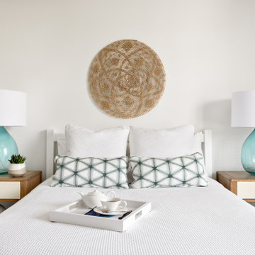
This beautiful bedroom is another manifestation of Jeremy and Cynthia’s favourite experiences: hiking the rainforest trails and enjoying the spray of the sea. The blue-and-green branching pattern found in the window treatments and pillows ground the space, while bright turquoise lamps — akin to sea glass — infuse the room with a touch of coastal vibrance.
Similar to the living area, we added comfort through texture and warm tones, incorporating oak end tables, natural woven wall decor above the headboard, knitted ottomans at the foot of the bed, a textured duvet, and an extra plush area rug.
A Loft Inspired by Flora & Fauna:
For the loft space, we moved away from coastal elements and decided to ground the space in the more earthy elements of nature: flora and fauna. We selected an umber-hued sofa complemented by floral decorative pillows and walls adorned with botanical prints by Heather Johnston.
This multi-purpose space serves as a reprieve for our clients to read, practice yoga, and relax. Alternatively, a Frame TV intentionally meant to blend as art allows the space to function as a secondary entertainment space or a place for their granddaughter to play and sleep over.
Praise from Our Clients:
This home’s small footprint pushed us to be more resourceful in our furniture sourcing and more creative in our space planning. The result is a home as livable, beautiful, and intentional as any larger home would be. Most importantly, Jeremy and Cynthia love it!
“Lori listened to our love of nature and designed our condo reflecting that love. It is beautiful, serene, and welcoming. We couldn't be happier.”
If you’re ready to uncover the hidden potential in your home, that is what we do best. Contact us here or download our complimentary guide below to discover more.
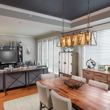

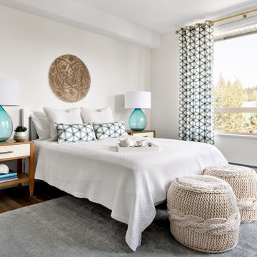 Simply Home Decorating
This penthouse condo in Raven Woods is home to an adventurous, nature-loving couple. With their children grown and starting families of their own, Jeremy and Cynthia (names changed) chose to downsize their livable space and “upsize” in quality and luxury.
The couple hired us to help them achieve several well-defined goals: feeling immersed and connected to nature, having warm and welcoming spaces to host their family and friends, and selecting pieces that would support local makers and artisans. (If you know me, you know that nature, connection, and community are some of my most important values, personally and professionally — the perfect fit!)
Using our comprehensive design process, we spent months designing, procuring, and installing their new, long-time home. The resulting spaces are breathtaking, creating a daily living experience that is full of serenity and bliss.
Welcoming & Bright Home with Forest Views:
Ahhh… can you imagine coming home to a space as bright and soothing as this one? To find inspiration for this home’s interiors, we needed to look no further than out the windows, where mountain views greet us to the north and the ocean beckons from the south.
Paying homage to their locale, we curated a colour palette of subtle blues and grays, warm-toned woods, and natural materials, all set against a crisp, white backdrop. These help us create a seamless visual transition between the interior and exterior. Let’s start our tour in the living area…
A Cozy Living Area with Warmth & Dimension:
In the living area, the fireplace was the starting point for the design, as it determined the size of the space and the scale of our furnishings. To keep this area feeling cozy but not crowded, we selected this soft ottoman to serve as a table surface with a tray or as additional seating when Jeremy and Cynthia host guests. (Multi-purpose items are one of the 5 elements of The Simple Home.)
Additional textures — the sofa, upholstered swivel chairs, pillows, and ceramic wall art reminiscent of sand dollars — offer further depth and dimension in this simple yet layered space. The result is a cozy living room area perfect for a relaxing read on an overcast day or a social evening by the fire.
While daunting at first, this home’s small and open footprint offered a special opportunity for us to design thoughtful “zones”. To create a defined living space, we used an area rug to establish a border and situated the larger seating (the sofa) on the right. Its visual weight serves as a grounding barrier that naturally separates the living and dining areas.
Overhead, the centrally located brass and glass chandelier serves as another focal point, making the entire living area feel like one unit. Last but not least…
Styled with tall decorative lamps, this light oak and rattan console sits just behind the sofa, creating an additional visual barrier between the living and dining areas. We styled it with accessories that complement the overall palette, and it has the added benefit of providing storage right where Jeremy and Cynthia need it, the dining area.
An Art-Infused Dining Area:
The dining area is warm, woodsy, and filled with locally sourced art that Jeremy and Cynthia love. Next to the console is a custom textile piece from Vancouver artist, With Strings Attached, that mimics the scenic, mountain backdrop. The blue hues of the piece work in harmony with the warm wood dining table, cool gray upholstered chairs, and neutral stools at the kitchen bar.
On the other side of the space, is Jeremy’s and Cynthia’s favourite piece, a commissioned work of art by local maker, Katie Napier. Carefully positioned in a central location and framed by two modern sconces, this piece captures the feel of gentle waters on a misty day and evokes calm.
Other curated pieces include this rectangular vessel centrepiece by sculptural artist, Martha Sturdy, bearing a stunning moss arrangement by Soul Roots Moss Art. As this couple can attest, a treasured memento or piece of art can transform your space and your mood, transporting you to a relaxed and peaceful state.
A Bedroom Full of Light & Texture:
This beautiful bedroom is another manifestation of Jeremy and Cynthia’s favourite experiences: hiking the rainforest trails and enjoying the spray of the sea. The blue-and-green branching pattern found in the window treatments and pillows ground the space, while bright turquoise lamps — akin to sea glass — infuse the room with a touch of coastal vibrance.
Similar to the living area, we added comfort through texture and warm tones, incorporating oak end tables, natural woven wall decor above the headboard, knitted ottomans at the foot of the bed, a textured duvet, and an extra plush area rug.
A Loft Inspired by Flora & Fauna:
For the loft space, we moved away from coastal elements and decided to ground the space in the more earthy elements of nature: flora and fauna. We selected an umber-hued sofa complemented by floral decorative pillows and walls adorned with botanical prints by Heather Johnston.
This multi-purpose space serves as a reprieve for our clients to read, practice yoga, and relax. Alternatively, a Frame TV intentionally meant to blend as art allows the space to function as a secondary entertainment space or a place for their granddaughter to play and sleep over.
Praise from Our Clients:
This home’s small footprint pushed us to be more resourceful in our furniture sourcing and more creative in our space planning. The result is a home as livable, beautiful, and intentional as any larger home would be. Most importantly, Jeremy and Cynthia love it!
“Lori listened to our love of nature and designed our condo reflecting that love. It is beautiful, serene, and welcoming. We couldn't be happier.”
If you’re ready to uncover the hidden potential in your home, that is what we do best. Contact us here or download our complimentary guide below to discover more.
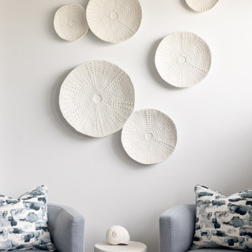 Simply Home Decorating
This penthouse condo in Raven Woods is home to an adventurous, nature-loving couple. With their children grown and starting families of their own, Jeremy and Cynthia (names changed) chose to downsize their livable space and “upsize” in quality and luxury.
The couple hired us to help them achieve several well-defined goals: feeling immersed and connected to nature, having warm and welcoming spaces to host their family and friends, and selecting pieces that would support local makers and artisans. (If you know me, you know that nature, connection, and community are some of my most important values, personally and professionally — the perfect fit!)
Using our comprehensive design process, we spent months designing, procuring, and installing their new, long-time home. The resulting spaces are breathtaking, creating a daily living experience that is full of serenity and bliss.
Welcoming & Bright Home with Forest Views:
Ahhh… can you imagine coming home to a space as bright and soothing as this one? To find inspiration for this home’s interiors, we needed to look no further than out the windows, where mountain views greet us to the north and the ocean beckons from the south.
Paying homage to their locale, we curated a colour palette of subtle blues and grays, warm-toned woods, and natural materials, all set against a crisp, white backdrop. These help us create a seamless visual transition between the interior and exterior. Let’s start our tour in the living area…
A Cozy Living Area with Warmth & Dimension:
In the living area, the fireplace was the starting point for the design, as it determined the size of the space and the scale of our furnishings. To keep this area feeling cozy but not crowded, we selected this soft ottoman to serve as a table surface with a tray or as additional seating when Jeremy and Cynthia host guests. (Multi-purpose items are one of the 5 elements of The Simple Home.)
Additional textures — the sofa, upholstered swivel chairs, pillows, and ceramic wall art reminiscent of sand dollars — offer further depth and dimension in this simple yet layered space. The result is a cozy living room area perfect for a relaxing read on an overcast day or a social evening by the fire.
While daunting at first, this home’s small and open footprint offered a special opportunity for us to design thoughtful “zones”. To create a defined living space, we used an area rug to establish a border and situated the larger seating (the sofa) on the right. Its visual weight serves as a grounding barrier that naturally separates the living and dining areas.
Overhead, the centrally located brass and glass chandelier serves as another focal point, making the entire living area feel like one unit. Last but not least…
Styled with tall decorative lamps, this light oak and rattan console sits just behind the sofa, creating an additional visual barrier between the living and dining areas. We styled it with accessories that complement the overall palette, and it has the added benefit of providing storage right where Jeremy and Cynthia need it, the dining area.
An Art-Infused Dining Area:
The dining area is warm, woodsy, and filled with locally sourced art that Jeremy and Cynthia love. Next to the console is a custom textile piece from Vancouver artist, With Strings Attached, that mimics the scenic, mountain backdrop. The blue hues of the piece work in harmony with the warm wood dining table, cool gray upholstered chairs, and neutral stools at the kitchen bar.
On the other side of the space, is Jeremy’s and Cynthia’s favourite piece, a commissioned work of art by local maker, Katie Napier. Carefully positioned in a central location and framed by two modern sconces, this piece captures the feel of gentle waters on a misty day and evokes calm.
Other curated pieces include this rectangular vessel centrepiece by sculptural artist, Martha Sturdy, bearing a stunning moss arrangement by Soul Roots Moss Art. As this couple can attest, a treasured memento or piece of art can transform your space and your mood, transporting you to a relaxed and peaceful state.
A Bedroom Full of Light & Texture:
This beautiful bedroom is another manifestation of Jeremy and Cynthia’s favourite experiences: hiking the rainforest trails and enjoying the spray of the sea. The blue-and-green branching pattern found in the window treatments and pillows ground the space, while bright turquoise lamps — akin to sea glass — infuse the room with a touch of coastal vibrance.
Similar to the living area, we added comfort through texture and warm tones, incorporating oak end tables, natural woven wall decor above the headboard, knitted ottomans at the foot of the bed, a textured duvet, and an extra plush area rug.
A Loft Inspired by Flora & Fauna:
For the loft space, we moved away from coastal elements and decided to ground the space in the more earthy elements of nature: flora and fauna. We selected an umber-hued sofa complemented by floral decorative pillows and walls adorned with botanical prints by Heather Johnston.
This multi-purpose space serves as a reprieve for our clients to read, practice yoga, and relax. Alternatively, a Frame TV intentionally meant to blend as art allows the space to function as a secondary entertainment space or a place for their granddaughter to play and sleep over.
Praise from Our Clients:
This home’s small footprint pushed us to be more resourceful in our furniture sourcing and more creative in our space planning. The result is a home as livable, beautiful, and intentional as any larger home would be. Most importantly, Jeremy and Cynthia love it!
“Lori listened to our love of nature and designed our condo reflecting that love. It is beautiful, serene, and welcoming. We couldn't be happier.”
If you’re ready to uncover the hidden potential in your home, that is what we do best. Contact us here or download our complimentary guide below to discover more.
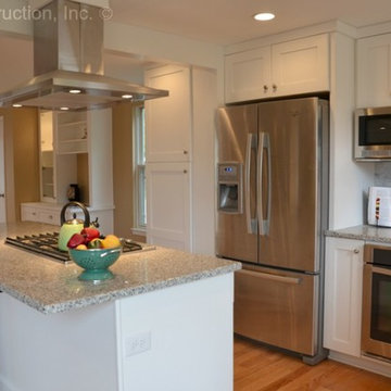 Skill Construction & Design, LLC
There are so many design elements to this kitchen, I almost don’t know where to start. Bright and airy with crisp clean white cabinets, the kitchen is open and welcoming. Still crisp but gently contrasting, the stainless steel appliance add depth amid the white. To keep this kitchen warm, natural oak covers the floors and a toasted wheat color washes the walls. And then there is the architectural elements. You know. That post and beam in the middle of the room. It’s the center of attention.
When you walk into a room your eyes roam around, establishing the size and shape of the room as your feet take you forward. From the front door of this home straight ahead you encountered this wall. The dining area to the right gives you a glimpse of things to come. Where there is a dining room you will usually find a kitchen.
The architecture of years gone by consistently hides the kitchen, the heart of the home, behind walls. I sympathize with my Mom, and all the other Moms, who have had to spend so much time tucked into a tight kitchen, away from the family. This wall had to go, but it was structural. We needed its support but not its bulk.
So we got rid of the bulk and only the bulk. Instead of a wall we have a post and beam, offering all of the structure we need. We could have installed a huge steel beam and reconfigure the joists to upset the beam, but why? The small beam and post add an incredible architectural element. It’s turning lemons into lemon, we simply made the most of what we had. It may be functional but it’s so fantastic. It looks like we created the effect just for the drama.
The original kitchen may have had a working triangle and some counter space, but it was fairly small, with each area only a step or two away. The dark cabinets made the space feel even smaller and the butcher block patterned laminate counter tops were very dated. The appliances were feeling their age as well, from a coil burner electric stove to a top freezer refrigerator. To keep this kitchen within its space, a half wall separated it from the dining area.
With the wall gone we borrowed some space from the living room and extended what was a U shaped kitchen into an L. At the living room window we start our new kitchen. We kept a small part of the wall to support the other end of our decorative beam. Sandwiched between a large pantry and our new French door refrigerator, the wall disappears. With our new open floor plan a sizable island was in order.
We split our cooking areas and installed a continuous grill gas cooktop into the island. A sleek island hood takes care of exhaust and adds an extra element to our architectural feature. Under the cooktop we added over-sized drawers for pots and pan storage. The frameless cabinets from New River Cabinetry are maple, painted white, with the Herndon door style. With the cooktop safely nestled into our island, we still had to add an oven.
We used the space where the old range sat for a large single oven of stainless steel and glass. If it worked for one, why not two? We created a home for a microwave in the wall cabinets. It’s perfect for heating leftovers so close to the refrigerator.
An important consideration for hot spots in your kitchen is landing zones. Each of our cooking areas have generous landing zones, one on each side of the cooktop and an entire counter area above or below the ovens, depending on which one you’re using.
We wanted to give the sink area more room so the half wall had to come out. We moved the trash and recycle cans into a cabinet, removed the heavy soffits and kept the sink under the window.
With that little bit of extra space we were able to add a larger cabinet above the dishwasher and slide it all down. This used to be where the carpeting met the vinyl floor, but all of it is gone. Long oak planks eliminate that final divide between the kitchen and the dining area, while adding visual length to the area. White wall cabinets on each side of the window reflect the sunlight for a brighter view.
With all of the darker cabinetry the backsplash walls had been painted white. Even still, there was a darkness in the corners and it wasn’t very exciting. We wanted to add visual interest and reflect the new under-cabinet lighting, eliminating the shadows in this corner.
With 1″x 2″ Arabescato Honed marble mosaics and those under-cabinet lights, we achieved the perfect balance. The marble has subtle swirls in gray and beige on a clean white background, but with the honed finish the light is softly reflected instead of glaring. For granite, we chose the soft gray tones of Luna Pearl. The speckles of gray and beige are a gentle contrast to the white cabinets and emulate the color of the stainless steel.
Between the carpet, red half wall, dark railing and dated light fixture, the dining area felt tired. Since the kitchen lacked sufficient storage, a large utility cabinet crowded the table space without adding any decorate elements.
Although it didn’t get any bigger, our dining area feels fresher and more open too. With the oak flooring joining the area to the rest of our space and the toasted wheat on the walls, the white table and chairs compliment the cabinetry while contrasting the warmer colors. We replaced the chandelier with recessed lighting and changed that railing too.
With our new open floor plan, we ended up with a fairly open area in between our foyer closet and the living room window. Not one to miss an opportunity, we filled the space with a multi-functional work space.
With the sunlight streaming in this bright corner works for anything this family needs.
There’s plenty of space for a chair under this large desk drawer. A closed cabinet below, glass doors above and lots of open shelving let you store and or showcase your belongings. We added a lite area at the top to keep away the darker corners.
The transformation is complete. This kitchen and all of its features are truly the center of attention in this home.
http://www.designsbyskill.com/
http://www.rjkconstructioninc.com/
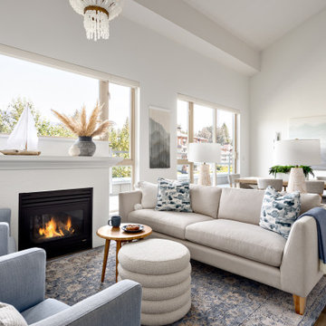 Simply Home Decorating
This penthouse condo in Raven Woods is home to an adventurous, nature-loving couple. With their children grown and starting families of their own, Jeremy and Cynthia (names changed) chose to downsize their livable space and “upsize” in quality and luxury.
The couple hired us to help them achieve several well-defined goals: feeling immersed and connected to nature, having warm and welcoming spaces to host their family and friends, and selecting pieces that would support local makers and artisans. (If you know me, you know that nature, connection, and community are some of my most important values, personally and professionally — the perfect fit!)
Using our comprehensive design process, we spent months designing, procuring, and installing their new, long-time home. The resulting spaces are breathtaking, creating a daily living experience that is full of serenity and bliss.
Welcoming & Bright Home with Forest Views:
Ahhh… can you imagine coming home to a space as bright and soothing as this one? To find inspiration for this home’s interiors, we needed to look no further than out the windows, where mountain views greet us to the north and the ocean beckons from the south.
Paying homage to their locale, we curated a colour palette of subtle blues and grays, warm-toned woods, and natural materials, all set against a crisp, white backdrop. These help us create a seamless visual transition between the interior and exterior. Let’s start our tour in the living area…
A Cozy Living Area with Warmth & Dimension:
In the living area, the fireplace was the starting point for the design, as it determined the size of the space and the scale of our furnishings. To keep this area feeling cozy but not crowded, we selected this soft ottoman to serve as a table surface with a tray or as additional seating when Jeremy and Cynthia host guests. (Multi-purpose items are one of the 5 elements of The Simple Home.)
Additional textures — the sofa, upholstered swivel chairs, pillows, and ceramic wall art reminiscent of sand dollars — offer further depth and dimension in this simple yet layered space. The result is a cozy living room area perfect for a relaxing read on an overcast day or a social evening by the fire.
While daunting at first, this home’s small and open footprint offered a special opportunity for us to design thoughtful “zones”. To create a defined living space, we used an area rug to establish a border and situated the larger seating (the sofa) on the right. Its visual weight serves as a grounding barrier that naturally separates the living and dining areas.
Overhead, the centrally located brass and glass chandelier serves as another focal point, making the entire living area feel like one unit. Last but not least…
Styled with tall decorative lamps, this light oak and rattan console sits just behind the sofa, creating an additional visual barrier between the living and dining areas. We styled it with accessories that complement the overall palette, and it has the added benefit of providing storage right where Jeremy and Cynthia need it, the dining area.
An Art-Infused Dining Area:
The dining area is warm, woodsy, and filled with locally sourced art that Jeremy and Cynthia love. Next to the console is a custom textile piece from Vancouver artist, With Strings Attached, that mimics the scenic, mountain backdrop. The blue hues of the piece work in harmony with the warm wood dining table, cool gray upholstered chairs, and neutral stools at the kitchen bar.
On the other side of the space, is Jeremy’s and Cynthia’s favourite piece, a commissioned work of art by local maker, Katie Napier. Carefully positioned in a central location and framed by two modern sconces, this piece captures the feel of gentle waters on a misty day and evokes calm.
Other curated pieces include this rectangular vessel centrepiece by sculptural artist, Martha Sturdy, bearing a stunning moss arrangement by Soul Roots Moss Art. As this couple can attest, a treasured memento or piece of art can transform your space and your mood, transporting you to a relaxed and peaceful state.
A Bedroom Full of Light & Texture:
This beautiful bedroom is another manifestation of Jeremy and Cynthia’s favourite experiences: hiking the rainforest trails and enjoying the spray of the sea. The blue-and-green branching pattern found in the window treatments and pillows ground the space, while bright turquoise lamps — akin to sea glass — infuse the room with a touch of coastal vibrance.
Similar to the living area, we added comfort through texture and warm tones, incorporating oak end tables, natural woven wall decor above the headboard, knitted ottomans at the foot of the bed, a textured duvet, and an extra plush area rug.
A Loft Inspired by Flora & Fauna:
For the loft space, we moved away from coastal elements and decided to ground the space in the more earthy elements of nature: flora and fauna. We selected an umber-hued sofa complemented by floral decorative pillows and walls adorned with botanical prints by Heather Johnston.
This multi-purpose space serves as a reprieve for our clients to read, practice yoga, and relax. Alternatively, a Frame TV intentionally meant to blend as art allows the space to function as a secondary entertainment space or a place for their granddaughter to play and sleep over.
Praise from Our Clients:
This home’s small footprint pushed us to be more resourceful in our furniture sourcing and more creative in our space planning. The result is a home as livable, beautiful, and intentional as any larger home would be. Most importantly, Jeremy and Cynthia love it!
“Lori listened to our love of nature and designed our condo reflecting that love. It is beautiful, serene, and welcoming. We couldn't be happier.”
If you’re ready to uncover the hidden potential in your home, that is what we do best. Contact us here or download our complimentary guide below to discover more.

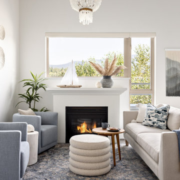 Simply Home Decorating
This penthouse condo in Raven Woods is home to an adventurous, nature-loving couple. With their children grown and starting families of their own, Jeremy and Cynthia (names changed) chose to downsize their livable space and “upsize” in quality and luxury.
The couple hired us to help them achieve several well-defined goals: feeling immersed and connected to nature, having warm and welcoming spaces to host their family and friends, and selecting pieces that would support local makers and artisans. (If you know me, you know that nature, connection, and community are some of my most important values, personally and professionally — the perfect fit!)
Using our comprehensive design process, we spent months designing, procuring, and installing their new, long-time home. The resulting spaces are breathtaking, creating a daily living experience that is full of serenity and bliss.
Welcoming & Bright Home with Forest Views:
Ahhh… can you imagine coming home to a space as bright and soothing as this one? To find inspiration for this home’s interiors, we needed to look no further than out the windows, where mountain views greet us to the north and the ocean beckons from the south.
Paying homage to their locale, we curated a colour palette of subtle blues and grays, warm-toned woods, and natural materials, all set against a crisp, white backdrop. These help us create a seamless visual transition between the interior and exterior. Let’s start our tour in the living area…
A Cozy Living Area with Warmth & Dimension:
In the living area, the fireplace was the starting point for the design, as it determined the size of the space and the scale of our furnishings. To keep this area feeling cozy but not crowded, we selected this soft ottoman to serve as a table surface with a tray or as additional seating when Jeremy and Cynthia host guests. (Multi-purpose items are one of the 5 elements of The Simple Home.)
Additional textures — the sofa, upholstered swivel chairs, pillows, and ceramic wall art reminiscent of sand dollars — offer further depth and dimension in this simple yet layered space. The result is a cozy living room area perfect for a relaxing read on an overcast day or a social evening by the fire.
While daunting at first, this home’s small and open footprint offered a special opportunity for us to design thoughtful “zones”. To create a defined living space, we used an area rug to establish a border and situated the larger seating (the sofa) on the right. Its visual weight serves as a grounding barrier that naturally separates the living and dining areas.
Overhead, the centrally located brass and glass chandelier serves as another focal point, making the entire living area feel like one unit. Last but not least…
Styled with tall decorative lamps, this light oak and rattan console sits just behind the sofa, creating an additional visual barrier between the living and dining areas. We styled it with accessories that complement the overall palette, and it has the added benefit of providing storage right where Jeremy and Cynthia need it, the dining area.
An Art-Infused Dining Area:
The dining area is warm, woodsy, and filled with locally sourced art that Jeremy and Cynthia love. Next to the console is a custom textile piece from Vancouver artist, With Strings Attached, that mimics the scenic, mountain backdrop. The blue hues of the piece work in harmony with the warm wood dining table, cool gray upholstered chairs, and neutral stools at the kitchen bar.
On the other side of the space, is Jeremy’s and Cynthia’s favourite piece, a commissioned work of art by local maker, Katie Napier. Carefully positioned in a central location and framed by two modern sconces, this piece captures the feel of gentle waters on a misty day and evokes calm.
Other curated pieces include this rectangular vessel centrepiece by sculptural artist, Martha Sturdy, bearing a stunning moss arrangement by Soul Roots Moss Art. As this couple can attest, a treasured memento or piece of art can transform your space and your mood, transporting you to a relaxed and peaceful state.
A Bedroom Full of Light & Texture:
This beautiful bedroom is another manifestation of Jeremy and Cynthia’s favourite experiences: hiking the rainforest trails and enjoying the spray of the sea. The blue-and-green branching pattern found in the window treatments and pillows ground the space, while bright turquoise lamps — akin to sea glass — infuse the room with a touch of coastal vibrance.
Similar to the living area, we added comfort through texture and warm tones, incorporating oak end tables, natural woven wall decor above the headboard, knitted ottomans at the foot of the bed, a textured duvet, and an extra plush area rug.
A Loft Inspired by Flora & Fauna:
For the loft space, we moved away from coastal elements and decided to ground the space in the more earthy elements of nature: flora and fauna. We selected an umber-hued sofa complemented by floral decorative pillows and walls adorned with botanical prints by Heather Johnston.
This multi-purpose space serves as a reprieve for our clients to read, practice yoga, and relax. Alternatively, a Frame TV intentionally meant to blend as art allows the space to function as a secondary entertainment space or a place for their granddaughter to play and sleep over.
Praise from Our Clients:
This home’s small footprint pushed us to be more resourceful in our furniture sourcing and more creative in our space planning. The result is a home as livable, beautiful, and intentional as any larger home would be. Most importantly, Jeremy and Cynthia love it!
“Lori listened to our love of nature and designed our condo reflecting that love. It is beautiful, serene, and welcoming. We couldn't be happier.”
If you’re ready to uncover the hidden potential in your home, that is what we do best. Contact us here or download our complimentary guide below to discover more.
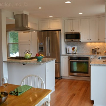 Skill Construction & Design, LLC
There are so many design elements to this kitchen, I almost don’t know where to start. Bright and airy with crisp clean white cabinets, the kitchen is open and welcoming. Still crisp but gently contrasting, the stainless steel appliance add depth amid the white. To keep this kitchen warm, natural oak covers the floors and a toasted wheat color washes the walls. And then there is the architectural elements. You know. That post and beam in the middle of the room. It’s the center of attention.
When you walk into a room your eyes roam around, establishing the size and shape of the room as your feet take you forward. From the front door of this home straight ahead you encountered this wall. The dining area to the right gives you a glimpse of things to come. Where there is a dining room you will usually find a kitchen.
The architecture of years gone by consistently hides the kitchen, the heart of the home, behind walls. I sympathize with my Mom, and all the other Moms, who have had to spend so much time tucked into a tight kitchen, away from the family. This wall had to go, but it was structural. We needed its support but not its bulk.
So we got rid of the bulk and only the bulk. Instead of a wall we have a post and beam, offering all of the structure we need. We could have installed a huge steel beam and reconfigure the joists to upset the beam, but why? The small beam and post add an incredible architectural element. It’s turning lemons into lemon, we simply made the most of what we had. It may be functional but it’s so fantastic. It looks like we created the effect just for the drama.
The original kitchen may have had a working triangle and some counter space, but it was fairly small, with each area only a step or two away. The dark cabinets made the space feel even smaller and the butcher block patterned laminate counter tops were very dated. The appliances were feeling their age as well, from a coil burner electric stove to a top freezer refrigerator. To keep this kitchen within its space, a half wall separated it from the dining area.
With the wall gone we borrowed some space from the living room and extended what was a U shaped kitchen into an L. At the living room window we start our new kitchen. We kept a small part of the wall to support the other end of our decorative beam. Sandwiched between a large pantry and our new French door refrigerator, the wall disappears. With our new open floor plan a sizable island was in order.
We split our cooking areas and installed a continuous grill gas cooktop into the island. A sleek island hood takes care of exhaust and adds an extra element to our architectural feature. Under the cooktop we added over-sized drawers for pots and pan storage. The frameless cabinets from New River Cabinetry are maple, painted white, with the Herndon door style. With the cooktop safely nestled into our island, we still had to add an oven.
We used the space where the old range sat for a large single oven of stainless steel and glass. If it worked for one, why not two? We created a home for a microwave in the wall cabinets. It’s perfect for heating leftovers so close to the refrigerator.
An important consideration for hot spots in your kitchen is landing zones. Each of our cooking areas have generous landing zones, one on each side of the cooktop and an entire counter area above or below the ovens, depending on which one you’re using.
We wanted to give the sink area more room so the half wall had to come out. We moved the trash and recycle cans into a cabinet, removed the heavy soffits and kept the sink under the window.
With that little bit of extra space we were able to add a larger cabinet above the dishwasher and slide it all down. This used to be where the carpeting met the vinyl floor, but all of it is gone. Long oak planks eliminate that final divide between the kitchen and the dining area, while adding visual length to the area. White wall cabinets on each side of the window reflect the sunlight for a brighter view.
With all of the darker cabinetry the backsplash walls had been painted white. Even still, there was a darkness in the corners and it wasn’t very exciting. We wanted to add visual interest and reflect the new under-cabinet lighting, eliminating the shadows in this corner.
With 1″x 2″ Arabescato Honed marble mosaics and those under-cabinet lights, we achieved the perfect balance. The marble has subtle swirls in gray and beige on a clean white background, but with the honed finish the light is softly reflected instead of glaring. For granite, we chose the soft gray tones of Luna Pearl. The speckles of gray and beige are a gentle contrast to the white cabinets and emulate the color of the stainless steel.
Between the carpet, red half wall, dark railing and dated light fixture, the dining area felt tired. Since the kitchen lacked sufficient storage, a large utility cabinet crowded the table space without adding any decorate elements.
Although it didn’t get any bigger, our dining area feels fresher and more open too. With the oak flooring joining the area to the rest of our space and the toasted wheat on the walls, the white table and chairs compliment the cabinetry while contrasting the warmer colors. We replaced the chandelier with recessed lighting and changed that railing too.
With our new open floor plan, we ended up with a fairly open area in between our foyer closet and the living room window. Not one to miss an opportunity, we filled the space with a multi-functional work space.
With the sunlight streaming in this bright corner works for anything this family needs.
There’s plenty of space for a chair under this large desk drawer. A closed cabinet below, glass doors above and lots of open shelving let you store and or showcase your belongings. We added a lite area at the top to keep away the darker corners.
The transformation is complete. This kitchen and all of its features are truly the center of attention in this home.
http://www.designsbyskill.com/
http://www.rjkconstructioninc.com/
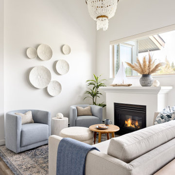 Simply Home Decorating
This penthouse condo in Raven Woods is home to an adventurous, nature-loving couple. With their children grown and starting families of their own, Jeremy and Cynthia (names changed) chose to downsize their livable space and “upsize” in quality and luxury.
The couple hired us to help them achieve several well-defined goals: feeling immersed and connected to nature, having warm and welcoming spaces to host their family and friends, and selecting pieces that would support local makers and artisans. (If you know me, you know that nature, connection, and community are some of my most important values, personally and professionally — the perfect fit!)
Using our comprehensive design process, we spent months designing, procuring, and installing their new, long-time home. The resulting spaces are breathtaking, creating a daily living experience that is full of serenity and bliss.
Welcoming & Bright Home with Forest Views:
Ahhh… can you imagine coming home to a space as bright and soothing as this one? To find inspiration for this home’s interiors, we needed to look no further than out the windows, where mountain views greet us to the north and the ocean beckons from the south.
Paying homage to their locale, we curated a colour palette of subtle blues and grays, warm-toned woods, and natural materials, all set against a crisp, white backdrop. These help us create a seamless visual transition between the interior and exterior. Let’s start our tour in the living area…
A Cozy Living Area with Warmth & Dimension:
In the living area, the fireplace was the starting point for the design, as it determined the size of the space and the scale of our furnishings. To keep this area feeling cozy but not crowded, we selected this soft ottoman to serve as a table surface with a tray or as additional seating when Jeremy and Cynthia host guests. (Multi-purpose items are one of the 5 elements of The Simple Home.)
Additional textures — the sofa, upholstered swivel chairs, pillows, and ceramic wall art reminiscent of sand dollars — offer further depth and dimension in this simple yet layered space. The result is a cozy living room area perfect for a relaxing read on an overcast day or a social evening by the fire.
While daunting at first, this home’s small and open footprint offered a special opportunity for us to design thoughtful “zones”. To create a defined living space, we used an area rug to establish a border and situated the larger seating (the sofa) on the right. Its visual weight serves as a grounding barrier that naturally separates the living and dining areas.
Overhead, the centrally located brass and glass chandelier serves as another focal point, making the entire living area feel like one unit. Last but not least…
Styled with tall decorative lamps, this light oak and rattan console sits just behind the sofa, creating an additional visual barrier between the living and dining areas. We styled it with accessories that complement the overall palette, and it has the added benefit of providing storage right where Jeremy and Cynthia need it, the dining area.
An Art-Infused Dining Area:
The dining area is warm, woodsy, and filled with locally sourced art that Jeremy and Cynthia love. Next to the console is a custom textile piece from Vancouver artist, With Strings Attached, that mimics the scenic, mountain backdrop. The blue hues of the piece work in harmony with the warm wood dining table, cool gray upholstered chairs, and neutral stools at the kitchen bar.
On the other side of the space, is Jeremy’s and Cynthia’s favourite piece, a commissioned work of art by local maker, Katie Napier. Carefully positioned in a central location and framed by two modern sconces, this piece captures the feel of gentle waters on a misty day and evokes calm.
Other curated pieces include this rectangular vessel centrepiece by sculptural artist, Martha Sturdy, bearing a stunning moss arrangement by Soul Roots Moss Art. As this couple can attest, a treasured memento or piece of art can transform your space and your mood, transporting you to a relaxed and peaceful state.
A Bedroom Full of Light & Texture:
This beautiful bedroom is another manifestation of Jeremy and Cynthia’s favourite experiences: hiking the rainforest trails and enjoying the spray of the sea. The blue-and-green branching pattern found in the window treatments and pillows ground the space, while bright turquoise lamps — akin to sea glass — infuse the room with a touch of coastal vibrance.
Similar to the living area, we added comfort through texture and warm tones, incorporating oak end tables, natural woven wall decor above the headboard, knitted ottomans at the foot of the bed, a textured duvet, and an extra plush area rug.
A Loft Inspired by Flora & Fauna:
For the loft space, we moved away from coastal elements and decided to ground the space in the more earthy elements of nature: flora and fauna. We selected an umber-hued sofa complemented by floral decorative pillows and walls adorned with botanical prints by Heather Johnston.
This multi-purpose space serves as a reprieve for our clients to read, practice yoga, and relax. Alternatively, a Frame TV intentionally meant to blend as art allows the space to function as a secondary entertainment space or a place for their granddaughter to play and sleep over.
Praise from Our Clients:
This home’s small footprint pushed us to be more resourceful in our furniture sourcing and more creative in our space planning. The result is a home as livable, beautiful, and intentional as any larger home would be. Most importantly, Jeremy and Cynthia love it!
“Lori listened to our love of nature and designed our condo reflecting that love. It is beautiful, serene, and welcoming. We couldn't be happier.”
If you’re ready to uncover the hidden potential in your home, that is what we do best. Contact us here or download our complimentary guide below to discover more.
17