
Search results for "Dismissing" in Home Design Ideas
 Donald Lococo Architects
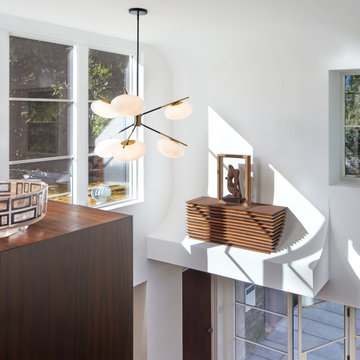
Designed in 1970 for an art collector, the existing referenced 70’s architectural principles. With its cadence of ‘70’s brick masses punctuated by a garage and a 4-foot-deep entrance recess. This recess, however, didn’t convey to the interior, which was occupied by disjointed service spaces. To solve, service spaces are moved and reorganized in open void in the garage. (See plan) This also organized the home: Service & utility on the left, reception central, and communal living spaces on the right.
To maintain clarity of the simple one-story 70’s composition, the second story add is recessive. A flex-studio/extra bedroom and office are designed ensuite creating a slender form and orienting them front to back and setting it back allows the add recede. Curves create a definite departure from the 70s home and by detailing it to "hover like a thought" above the first-floor roof and mentally removable sympathetic add.Existing unrelenting interior walls and a windowless entry, although ideal for fine art was unconducive for the young family of three. Added glass at the front recess welcomes light view and the removal of interior walls not only liberate rooms to communicate with each other but also reinform the cleared central entry space as a hub.
Even though the renovation reinforms its relationship with art, the joy and appreciation of art was not dismissed. A metal sculpture lost in the corner of the south side yard bumps the sculpture at the front entrance to the kitchen terrace over an added pedestal. (See plans) Since the roof couldn’t be railed without compromising the one-story '70s composition, the sculpture garden remains physically inaccessible however mirrors flanking the chimney allow the sculptures to be appreciated in three dimensions. The mirrors also afford privacy from the adjacent Tudor's large master bedroom addition 16-feet away.
 Donald Lococo Architects
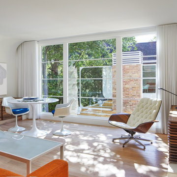
Designed in 1970 for an art collector, the existing referenced 70’s architectural principles. With its cadence of ‘70’s brick masses punctuated by a garage and a 4-foot-deep entrance recess. This recess, however, didn’t convey to the interior, which was occupied by disjointed service spaces. To solve, service spaces are moved and reorganized in open void in the garage. (See plan) This also organized the home: Service & utility on the left, reception central, and communal living spaces on the right.
To maintain clarity of the simple one-story 70’s composition, the second story add is recessive. A flex-studio/extra bedroom and office are designed ensuite creating a slender form and orienting them front to back and setting it back allows the add recede. Curves create a definite departure from the 70s home and by detailing it to "hover like a thought" above the first-floor roof and mentally removable sympathetic add.Existing unrelenting interior walls and a windowless entry, although ideal for fine art was unconducive for the young family of three. Added glass at the front recess welcomes light view and the removal of interior walls not only liberate rooms to communicate with each other but also reinform the cleared central entry space as a hub.
Even though the renovation reinforms its relationship with art, the joy and appreciation of art was not dismissed. A metal sculpture lost in the corner of the south side yard bumps the sculpture at the front entrance to the kitchen terrace over an added pedestal. (See plans) Since the roof couldn’t be railed without compromising the one-story '70s composition, the sculpture garden remains physically inaccessible however mirrors flanking the chimney allow the sculptures to be appreciated in three dimensions. The mirrors also afford privacy from the adjacent Tudor's large master bedroom addition 16-feet away.
 Donald Lococo Architects
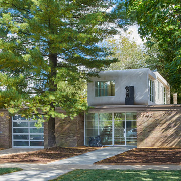
Designed in 1970 for an art collector, the existing referenced 70’s architectural principles. With its cadence of ‘70’s brick masses punctuated by a garage and a 4-foot-deep entrance recess. This recess, however, didn’t convey to the interior, which was occupied by disjointed service spaces. To solve, service spaces are moved and reorganized in open void in the garage. (See plan) This also organized the home: Service & utility on the left, reception central, and communal living spaces on the right.
To maintain clarity of the simple one-story 70’s composition, the second story add is recessive. A flex-studio/extra bedroom and office are designed ensuite creating a slender form and orienting them front to back and setting it back allows the add recede. Curves create a definite departure from the 70s home and by detailing it to "hover like a thought" above the first-floor roof and mentally removable sympathetic add.Existing unrelenting interior walls and a windowless entry, although ideal for fine art was unconducive for the young family of three. Added glass at the front recess welcomes light view and the removal of interior walls not only liberate rooms to communicate with each other but also reinform the cleared central entry space as a hub.
Even though the renovation reinforms its relationship with art, the joy and appreciation of art was not dismissed. A metal sculpture lost in the corner of the south side yard bumps the sculpture at the front entrance to the kitchen terrace over an added pedestal. (See plans) Since the roof couldn’t be railed without compromising the one-story '70s composition, the sculpture garden remains physically inaccessible however mirrors flanking the chimney allow the sculptures to be appreciated in three dimensions. The mirrors also afford privacy from the adjacent Tudor's large master bedroom addition 16-feet away.
Find the right local pro for your project
 Donald Lococo Architects
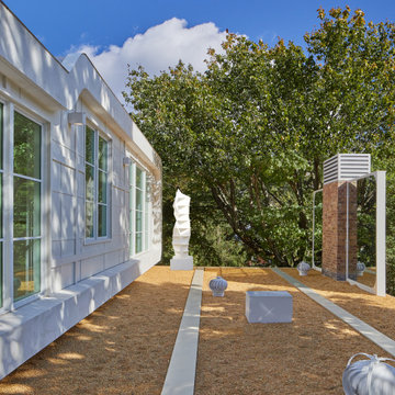
Designed in 1970 for an art collector, the existing referenced 70’s architectural principles. With its cadence of ‘70’s brick masses punctuated by a garage and a 4-foot-deep entrance recess. This recess, however, didn’t convey to the interior, which was occupied by disjointed service spaces. To solve, service spaces are moved and reorganized in open void in the garage. (See plan) This also organized the home: Service & utility on the left, reception central, and communal living spaces on the right.
To maintain clarity of the simple one-story 70’s composition, the second story add is recessive. A flex-studio/extra bedroom and office are designed ensuite creating a slender form and orienting them front to back and setting it back allows the add recede. Curves create a definite departure from the 70s home and by detailing it to "hover like a thought" above the first-floor roof and mentally removable sympathetic add.Existing unrelenting interior walls and a windowless entry, although ideal for fine art was unconducive for the young family of three. Added glass at the front recess welcomes light view and the removal of interior walls not only liberate rooms to communicate with each other but also reinform the cleared central entry space as a hub.
Even though the renovation reinforms its relationship with art, the joy and appreciation of art was not dismissed. A metal sculpture lost in the corner of the south side yard bumps the sculpture at the front entrance to the kitchen terrace over an added pedestal. (See plans) Since the roof couldn’t be railed without compromising the one-story '70s composition, the sculpture garden remains physically inaccessible however mirrors flanking the chimney allow the sculptures to be appreciated in three dimensions. The mirrors also afford privacy from the adjacent Tudor's large master bedroom addition 16-feet away.
 Donald Lococo Architects
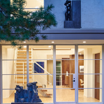
Designed in 1970 for an art collector, the existing referenced 70’s architectural principles. With its cadence of ‘70’s brick masses punctuated by a garage and a 4-foot-deep entrance recess. This recess, however, didn’t convey to the interior, which was occupied by disjointed service spaces. To solve, service spaces are moved and reorganized in open void in the garage. (See plan) This also organized the home: Service & utility on the left, reception central, and communal living spaces on the right.
To maintain clarity of the simple one-story 70’s composition, the second story add is recessive. A flex-studio/extra bedroom and office are designed ensuite creating a slender form and orienting them front to back and setting it back allows the add recede. Curves create a definite departure from the 70s home and by detailing it to "hover like a thought" above the first-floor roof and mentally removable sympathetic add.Existing unrelenting interior walls and a windowless entry, although ideal for fine art was unconducive for the young family of three. Added glass at the front recess welcomes light view and the removal of interior walls not only liberate rooms to communicate with each other but also reinform the cleared central entry space as a hub.
Even though the renovation reinforms its relationship with art, the joy and appreciation of art was not dismissed. A metal sculpture lost in the corner of the south side yard bumps the sculpture at the front entrance to the kitchen terrace over an added pedestal. (See plans) Since the roof couldn’t be railed without compromising the one-story '70s composition, the sculpture garden remains physically inaccessible however mirrors flanking the chimney allow the sculptures to be appreciated in three dimensions. The mirrors also afford privacy from the adjacent Tudor's large master bedroom addition 16-feet away.
 Donald Lococo Architects
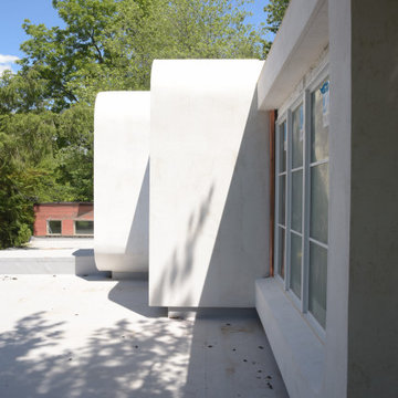
Designed in 1970 for an art collector, the existing referenced 70’s architectural principles. With its cadence of ‘70’s brick masses punctuated by a garage and a 4-foot-deep entrance recess. This recess, however, didn’t convey to the interior, which was occupied by disjointed service spaces. To solve, service spaces are moved and reorganized in open void in the garage. (See plan) This also organized the home: Service & utility on the left, reception central, and communal living spaces on the right.
To maintain clarity of the simple one-story 70’s composition, the second story add is recessive. A flex-studio/extra bedroom and office are designed ensuite creating a slender form and orienting them front to back and setting it back allows the add recede. Curves create a definite departure from the 70s home and by detailing it to "hover like a thought" above the first-floor roof and mentally removable sympathetic add.Existing unrelenting interior walls and a windowless entry, although ideal for fine art was unconducive for the young family of three. Added glass at the front recess welcomes light view and the removal of interior walls not only liberate rooms to communicate with each other but also reinform the cleared central entry space as a hub.
Even though the renovation reinforms its relationship with art, the joy and appreciation of art was not dismissed. A metal sculpture lost in the corner of the south side yard bumps the sculpture at the front entrance to the kitchen terrace over an added pedestal. (See plans) Since the roof couldn’t be railed without compromising the one-story '70s composition, the sculpture garden remains physically inaccessible however mirrors flanking the chimney allow the sculptures to be appreciated in three dimensions. The mirrors also afford privacy from the adjacent Tudor's large master bedroom addition 16-feet away.
 Donald Lococo Architects
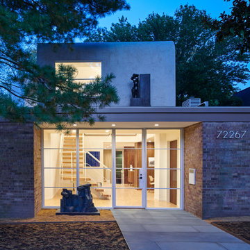
Designed in 1970 for an art collector, the existing referenced 70’s architectural principles. With its cadence of ‘70’s brick masses punctuated by a garage and a 4-foot-deep entrance recess. This recess, however, didn’t convey to the interior, which was occupied by disjointed service spaces. To solve, service spaces are moved and reorganized in open void in the garage. (See plan) This also organized the home: Service & utility on the left, reception central, and communal living spaces on the right.
To maintain clarity of the simple one-story 70’s composition, the second story add is recessive. A flex-studio/extra bedroom and office are designed ensuite creating a slender form and orienting them front to back and setting it back allows the add recede. Curves create a definite departure from the 70s home and by detailing it to "hover like a thought" above the first-floor roof and mentally removable sympathetic add.Existing unrelenting interior walls and a windowless entry, although ideal for fine art was unconducive for the young family of three. Added glass at the front recess welcomes light view and the removal of interior walls not only liberate rooms to communicate with each other but also reinform the cleared central entry space as a hub.
Even though the renovation reinforms its relationship with art, the joy and appreciation of art was not dismissed. A metal sculpture lost in the corner of the south side yard bumps the sculpture at the front entrance to the kitchen terrace over an added pedestal. (See plans) Since the roof couldn’t be railed without compromising the one-story '70s composition, the sculpture garden remains physically inaccessible however mirrors flanking the chimney allow the sculptures to be appreciated in three dimensions. The mirrors also afford privacy from the adjacent Tudor's large master bedroom addition 16-feet away.
 Donald Lococo Architects
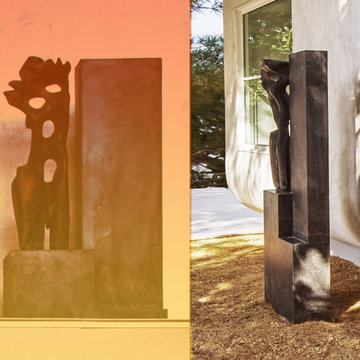
Designed in 1970 for an art collector, the existing referenced 70’s architectural principles. With its cadence of ‘70’s brick masses punctuated by a garage and a 4-foot-deep entrance recess. This recess, however, didn’t convey to the interior, which was occupied by disjointed service spaces. To solve, service spaces are moved and reorganized in open void in the garage. (See plan) This also organized the home: Service & utility on the left, reception central, and communal living spaces on the right.
To maintain clarity of the simple one-story 70’s composition, the second story add is recessive. A flex-studio/extra bedroom and office are designed ensuite creating a slender form and orienting them front to back and setting it back allows the add recede. Curves create a definite departure from the 70s home and by detailing it to "hover like a thought" above the first-floor roof and mentally removable sympathetic add.Existing unrelenting interior walls and a windowless entry, although ideal for fine art was unconducive for the young family of three. Added glass at the front recess welcomes light view and the removal of interior walls not only liberate rooms to communicate with each other but also reinform the cleared central entry space as a hub.
Even though the renovation reinforms its relationship with art, the joy and appreciation of art was not dismissed. A metal sculpture lost in the corner of the south side yard bumps the sculpture at the front entrance to the kitchen terrace over an added pedestal. (See plans) Since the roof couldn’t be railed without compromising the one-story '70s composition, the sculpture garden remains physically inaccessible however mirrors flanking the chimney allow the sculptures to be appreciated in three dimensions. The mirrors also afford privacy from the adjacent Tudor's large master bedroom addition 16-feet away.
 Donald Lococo Architects
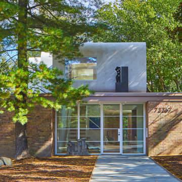
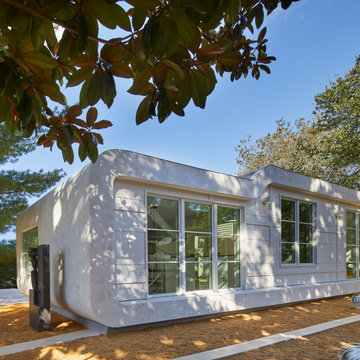
Designed in 1970 for an art collector, the existing referenced 70’s architectural principles. With its cadence of ‘70’s brick masses punctuated by a garage and a 4-foot-deep entrance recess. This recess, however, didn’t convey to the interior, which was occupied by disjointed service spaces. To solve, service spaces are moved and reorganized in open void in the garage. (See plan) This also organized the home: Service & utility on the left, reception central, and communal living spaces on the right.
To maintain clarity of the simple one-story 70’s composition, the second story add is recessive. A flex-studio/extra bedroom and office are designed ensuite creating a slender form and orienting them front to back and setting it back allows the add recede. Curves create a definite departure from the 70s home and by detailing it to "hover like a thought" above the first-floor roof and mentally removable sympathetic add.Existing unrelenting interior walls and a windowless entry, although ideal for fine art was unconducive for the young family of three. Added glass at the front recess welcomes light view and the removal of interior walls not only liberate rooms to communicate with each other but also reinform the cleared central entry space as a hub.
Even though the renovation reinforms its relationship with art, the joy and appreciation of art was not dismissed. A metal sculpture lost in the corner of the south side yard bumps the sculpture at the front entrance to the kitchen terrace over an added pedestal. (See plans) Since the roof couldn’t be railed without compromising the one-story '70s composition, the sculpture garden remains physically inaccessible however mirrors flanking the chimney allow the sculptures to be appreciated in three dimensions. The mirrors also afford privacy from the adjacent Tudor's large master bedroom addition 16-feet away.
 Donald Lococo Architects
Designed in 1970 for an art collector, the existing referenced 70’s architectural principles. With its cadence of ‘70’s brick masses punctuated by a garage and a 4-foot-deep entrance recess. This recess, however, didn’t convey to the interior, which was occupied by disjointed service spaces. To solve, service spaces are moved and reorganized in open void in the garage. (See plan) This also organized the home: Service & utility on the left, reception central, and communal living spaces on the right.
To maintain clarity of the simple one-story 70’s composition, the second story add is recessive. A flex-studio/extra bedroom and office are designed ensuite creating a slender form and orienting them front to back and setting it back allows the add recede. Curves create a definite departure from the 70s home and by detailing it to "hover like a thought" above the first-floor roof and mentally removable sympathetic add.Existing unrelenting interior walls and a windowless entry, although ideal for fine art was unconducive for the young family of three. Added glass at the front recess welcomes light view and the removal of interior walls not only liberate rooms to communicate with each other but also reinform the cleared central entry space as a hub.
Even though the renovation reinforms its relationship with art, the joy and appreciation of art was not dismissed. A metal sculpture lost in the corner of the south side yard bumps the sculpture at the front entrance to the kitchen terrace over an added pedestal. (See plans) Since the roof couldn’t be railed without compromising the one-story '70s composition, the sculpture garden remains physically inaccessible however mirrors flanking the chimney allow the sculptures to be appreciated in three dimensions. The mirrors also afford privacy from the adjacent Tudor's large master bedroom addition 16-feet away.

 Miller-Roodell Architects Ltd
Set in Montana's tranquil Shields River Valley, the Shilo Ranch Compound is a collection of structures that were specifically built on a relatively smaller scale, to maximize efficiency. The main house has two bedrooms, a living area, dining and kitchen, bath and adjacent greenhouse, while two guest homes within the compound can sleep a total of 12 friends and family. There's also a common gathering hall, for dinners, games, and time together. The overall feel here is of sophisticated simplicity, with plaster walls, concrete and wood floors, and weathered boards for exteriors. The placement of each building was considered closely when envisioning how people would move through the property, based on anticipated needs and interests. Sustainability and consumption was also taken into consideration, as evidenced by the photovoltaic panels on roof of the garage, and the capability to shut down any of the compound's buildings when not in use.

 Project Guru
The recaptured powder room space allowed the refrigerator and cabinetry to be set back, enlarging the work U of this kitchen. A lazy- susan corner cabinet utilizes wasted corner space and resulting countertop space is spacious. Photography Timothy Manning of Manning Magic.

 Raad Studio
Daniel Shea
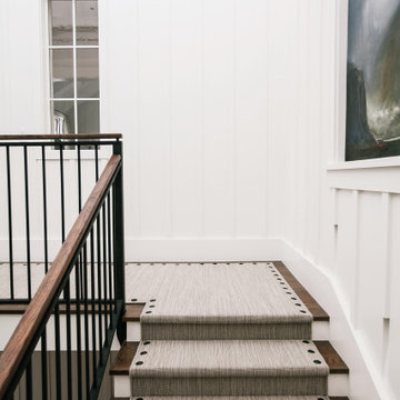
Inspiration for a mid-sized contemporary medium tone wood floor hallway remodel in New York with white walls
Inspiration for a mid-sized contemporary medium tone wood floor hallway remodel in New York with white walls

 Accoya Wood
DILLON KYLE ARCHITECTS OFFICE BUILDING GIVES THE WOW FACTOR WITH ACCOYA
PROJECT DETAILS
Building Type: Office Building
Completed: 2018
Architect: Dillon Kyle Architects
Supplier: Universal Forest Products
Millwork Shop: S&S Constructors
Installer: Arista Construction
Over the years, the Houston Museum District located in the Montrose neighborhood has morphed from a residential area into a lively art district, home to art galleries, museums, and aesthetically distinct buildings. When Dillon Kyle Architects set out to design their new office space across the street from the Houston Center for Photography, they needed creative solutions to fit a 5,000 square foot building plus parking on the lot’s small unique space.
The three-story building takes the form of an inverted L, a configuration that allows for maximized parking on the narrow corner lot. The cantilever space was built to shade the cars from the hot Texas sun, while also creating a semi-public place that invites pedestrians to interact with the space and peer inside as they walk through the neighborhood.
The interior design includes open ceilings, concrete walls, wood floors, residential scale furnishings and rugs and warm, neutral colors for a more industrial tone. The exterior has a commercial boxy look, so the team looked for creative cladding finishes to wrap the building and also serve as a rainscreen. After dismissing glass and papier-mâché options, the team settled on wood – Accoya® wood. “The idea was to use a material where you couldn’t tell where the patterns started and stopped, just one big continuous object,” said Peter Klein, architect at DKA.
An abstract leaf-like pattern is carved into 2,500 eight-foot long by eight-inches tall and 11/16-inches in depth, Accoya wood boards wrapping the entire building. The leaf pattern serves as a gentle reference to the live oak trees that line the neighborhood. The rainscreen is made of G80 galvanized steel sheets offset from the building with the Accoya leaf boards attached to it. “We settled on wood, and specifically Accoya wood, because it is easy to mill, and we knew we were going to leave it unsealed,” said Klein.
Because DKA had time, they inadvertantly put Accoya wood to the test by installing a four foot by eight foot sample wall on site. They watched the sample weather to a nice gray patina, which was the desired result. “Even left untreated, it didn’t warp or mildew or mold, and that let us know we were on the right path,” added Klein. The neutral gray tones coupled with its longterm durability, resistance to rot and insects made Accoya wood the ideal material for this project.
The Accoya wood pieces were milled using a CNC machine, which programmed the patterns. Arista Construction and its crew installed the pieces and they “knocked it out of the park,” according to DKA Architects
 Accoya Wood
DILLON KYLE ARCHITECTS OFFICE BUILDING GIVES THE WOW FACTOR WITH ACCOYA
PROJECT DETAILS
Building Type: Office Building
Completed: 2018
Architect: Dillon Kyle Architects
Supplier: Universal Forest Products
Millwork Shop: S&S Constructors
Installer: Arista Construction
Over the years, the Houston Museum District located in the Montrose neighborhood has morphed from a residential area into a lively art district, home to art galleries, museums, and aesthetically distinct buildings. When Dillon Kyle Architects set out to design their new office space across the street from the Houston Center for Photography, they needed creative solutions to fit a 5,000 square foot building plus parking on the lot’s small unique space.
The three-story building takes the form of an inverted L, a configuration that allows for maximized parking on the narrow corner lot. The cantilever space was built to shade the cars from the hot Texas sun, while also creating a semi-public place that invites pedestrians to interact with the space and peer inside as they walk through the neighborhood.
The interior design includes open ceilings, concrete walls, wood floors, residential scale furnishings and rugs and warm, neutral colors for a more industrial tone. The exterior has a commercial boxy look, so the team looked for creative cladding finishes to wrap the building and also serve as a rainscreen. After dismissing glass and papier-mâché options, the team settled on wood – Accoya® wood. “The idea was to use a material where you couldn’t tell where the patterns started and stopped, just one big continuous object,” said Peter Klein, architect at DKA.
An abstract leaf-like pattern is carved into 2,500 eight-foot long by eight-inches tall and 11/16-inches in depth, Accoya wood boards wrapping the entire building. The leaf pattern serves as a gentle reference to the live oak trees that line the neighborhood. The rainscreen is made of G80 galvanized steel sheets offset from the building with the Accoya leaf boards attached to it. “We settled on wood, and specifically Accoya wood, because it is easy to mill, and we knew we were going to leave it unsealed,” said Klein.
Because DKA had time, they inadvertantly put Accoya wood to the test by installing a four foot by eight foot sample wall on site. They watched the sample weather to a nice gray patina, which was the desired result. “Even left untreated, it didn’t warp or mildew or mold, and that let us know we were on the right path,” added Klein. The neutral gray tones coupled with its longterm durability, resistance to rot and insects made Accoya wood the ideal material for this project.
The Accoya wood pieces were milled using a CNC machine, which programmed the patterns. Arista Construction and its crew installed the pieces and they “knocked it out of the park,” according to DKA Architects


 a.d.d. concept + design
Large cottage black two-story mixed siding exterior home photo in San Francisco

 contact7524
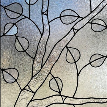
This stained glass window was created as part of our signature Aspen Stained Glass line. These windows look beautiful in cottage style or contemporary homes and are a great way for outdoor enthusiasts to celebrate their love of nature. The textured appearance of the glass provides the homeowners with a high level of privacy and comfort.

5