
Search results for "Distinct strategy" in Home Design Ideas

Mid-sized beach style bathroom photo in Austin with white cabinets, multicolored walls, an undermount sink and shaker cabinets

 building Lab, inc.
The remodeling of the kitchen and bathroom forms the core of this interior renovation.
The existing peninsula design and cabinetry broke up the ‘great room’ and stood the kitchen as a distinct element within the room. Our design strategy operates more on a principle of integration. As such, we created a galley condition with a spine of cabinetry and appliances that anchors to the long wall of the room. The feature design element is the solid Caesarstone backsplash which appears to be carved from the wall itself.
The particular challenge in the windowless bathroom was how to create an inviting, expanded sense of depth without a resulting cave-like feel. Removal of a half wall, soffit and tub unified the space overall. We reinforced the unification with the deployment of a single large format tile spec. Smaller details such as touch latch cabinetry hardware and flush conditions between tile, wall and mirror further the principle that simpler is bigger, deeper and more inviting.
We were also charged with elevating what was a pedestrian 1990’s townhouse to something more sophisticated and engaging. Our approach was to first remove builder grade detailing around windows and railings. Then, we introduced simplified profiles and glass guardrails that would extend a consistency established in the new kitchen and bathroom designs.
photo by Scott Hargis

 The Brooklyn Studio
This residence was a complete gut renovation of a 4-story row house in Park Slope, and included a new rear extension and penthouse addition. The owners wished to create a warm, family home using a modern language that would act as a clean canvas to feature rich textiles and items from their world travels. As with most Brooklyn row houses, the existing house suffered from a lack of natural light and connection to exterior spaces, an issue that Principal Brendan Coburn is acutely aware of from his experience re-imagining historic structures in the New York area. The resulting architecture is designed around moments featuring natural light and views to the exterior, of both the private garden and the sky, throughout the house, and a stripped-down language of detailing and finishes allows for the concept of the modern-natural to shine.
Upon entering the home, the kitchen and dining space draw you in with views beyond through the large glazed opening at the rear of the house. An extension was built to allow for a large sunken living room that provides a family gathering space connected to the kitchen and dining room, but remains distinctly separate, with a strong visual connection to the rear garden. The open sculptural stair tower was designed to function like that of a traditional row house stair, but with a smaller footprint. By extending it up past the original roof level into the new penthouse, the stair becomes an atmospheric shaft for the spaces surrounding the core. All types of weather – sunshine, rain, lightning, can be sensed throughout the home through this unifying vertical environment. The stair space also strives to foster family communication, making open living spaces visible between floors. At the upper-most level, a free-form bench sits suspended over the stair, just by the new roof deck, which provides at-ease entertaining. Oak was used throughout the home as a unifying material element. As one travels upwards within the house, the oak finishes are bleached to further degrees as a nod to how light enters the home.
The owners worked with CWB to add their own personality to the project. The meter of a white oak and blackened steel stair screen was designed by the family to read “I love you” in Morse Code, and tile was selected throughout to reference places that hold special significance to the family. To support the owners’ comfort, the architectural design engages passive house technologies to reduce energy use, while increasing air quality within the home – a strategy which aims to respect the environment while providing a refuge from the harsh elements of urban living.
This project was published by Wendy Goodman as her Space of the Week, part of New York Magazine’s Design Hunting on The Cut.
Photography by Kevin Kunstadt
Find the right local pro for your project
 The Brooklyn Studio
This residence was a complete gut renovation of a 4-story row house in Park Slope, and included a new rear extension and penthouse addition. The owners wished to create a warm, family home using a modern language that would act as a clean canvas to feature rich textiles and items from their world travels. As with most Brooklyn row houses, the existing house suffered from a lack of natural light and connection to exterior spaces, an issue that Principal Brendan Coburn is acutely aware of from his experience re-imagining historic structures in the New York area. The resulting architecture is designed around moments featuring natural light and views to the exterior, of both the private garden and the sky, throughout the house, and a stripped-down language of detailing and finishes allows for the concept of the modern-natural to shine.
Upon entering the home, the kitchen and dining space draw you in with views beyond through the large glazed opening at the rear of the house. An extension was built to allow for a large sunken living room that provides a family gathering space connected to the kitchen and dining room, but remains distinctly separate, with a strong visual connection to the rear garden. The open sculptural stair tower was designed to function like that of a traditional row house stair, but with a smaller footprint. By extending it up past the original roof level into the new penthouse, the stair becomes an atmospheric shaft for the spaces surrounding the core. All types of weather – sunshine, rain, lightning, can be sensed throughout the home through this unifying vertical environment. The stair space also strives to foster family communication, making open living spaces visible between floors. At the upper-most level, a free-form bench sits suspended over the stair, just by the new roof deck, which provides at-ease entertaining. Oak was used throughout the home as a unifying material element. As one travels upwards within the house, the oak finishes are bleached to further degrees as a nod to how light enters the home.
The owners worked with CWB to add their own personality to the project. The meter of a white oak and blackened steel stair screen was designed by the family to read “I love you” in Morse Code, and tile was selected throughout to reference places that hold special significance to the family. To support the owners’ comfort, the architectural design engages passive house technologies to reduce energy use, while increasing air quality within the home – a strategy which aims to respect the environment while providing a refuge from the harsh elements of urban living.
This project was published by Wendy Goodman as her Space of the Week, part of New York Magazine’s Design Hunting on The Cut.
Photography by Kevin Kunstadt
 CB Architecture + Design
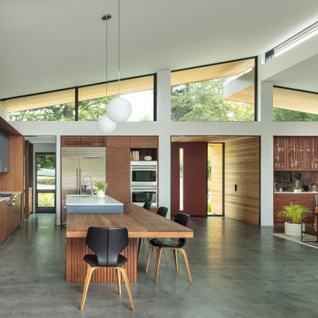
Great room interior of a new construction single-level home. The signature butterfly shed roofline is fully expressed inside as a series of black-framed clerestory windows running the full width of the great room, admitting a continuous band of natural light and redwood canopy views above the interior wall line while maintaining privacy at eye level. Warm walnut flat-front cabinetry runs the full perimeter of the kitchen at left, with slate blue upper cabinets visible beyond and a full-height walnut appliance tower with integrated stainless steel refrigerator and double oven anchoring the center. A blue kitchen island with white quartz countertop extends into a cantilevered walnut butcher block dining table with a distinctive slatted walnut fluted base. Black molded shell chairs with oak legs surround the dining extension. Single white globe pendant hangs above. The terracotta red front entry door with cedar-clad entry volume is visible through the interior opening at center, connecting the street threshold to the deepest interior space in one axial view. Family room with cognac leather sofa, walnut credenza, and slatted walnut room divider panels visible to the right. Charcoal polished concrete radiant slab floors extend throughout.

 Mark Brand Architecture
For this kitchen and bath remodel in San Francisco's Cole Valley, our client wanted us to open the kitchen up to the living room and create a new modern feel for all of the remodeled areas. Opening the kitchen to the living area provided a structural challenge as the wall we had to remove was load-bearing and there was a separately owned condo on the floor below. Working closely with a structural engineer, we created a strategy to carry the weight to the exterior walls of the building. In order to do this we had to tear off the entire roof and rebuild it with new structural joists which could span from property line to property line. To achieve a dramatic daylighting effect, we created a slot skylight over the back wall of the kitchen with the beams running through the skylight. Cerulean blue, back-painted glass for the backsplash and a thick waterfall edge for the island add more distinctive touches to this kitchen design. In the master bath we created a sinuous counter edge which tracks its way to the floor to create a curb for the shower. Green tile imported from Morocco adds a pop of color in the shower and a custom built indirect LED lighting cove creates a glow of light around the mirror. Photography by Christopher Stark.

 Mittendorf Quality Construction
Inspiration for a rustic brown one-story wood gable roof remodel in Seattle

 Axis Mundi
When the Gimbels department store chain closed in 1986, many of its selling floors were converted into luxury apartments, including those of this branch at 86th Street and Lexington Avenue. The retailer’s soaring ceilings allowed Axis Mundi to create bedroom mezzanine spaces overlooking the living and dining rooms. Defining them with translucent glass welcomed natural light while retaining privacy. Downstairs, spaces bleed one into another, their basic monochromatic black-and-white palette acting as a unifying leitmotif. Yet each space feels distinct, with its own programmatic purpose, a feat largely achieved by varying floor and wall treatments—a graphic tile pattern in the entry, a red wall in the hall leading to the master suite, a colorful area rug in the living room. In the retailer’s heyday, the then-common saying, “Would Macy’s tell Gimbels?” implied the strategies the competitors kept from each other to gain the upper hand. Here, a structure iconic in its day also conceals something: a handsome, wholly contemporary repurposing that represents just the sort of innovation that made Gimbels the celebrated name that it was.
 TreHus Architects+Interior Designers+Builders
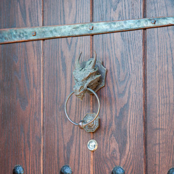
Set near Lake of the Isles in Minneapolis’s Kenwood neighborhood, this Tudor-inspired custom home blends medieval character with thoughtful craftsmanship. Exposed timber framing, stained glass, and hand-forged ironwork introduce warmth and story throughout the interior. A two-story library with nature-inspired motifs, a light-filled conservatory, and a centrally placed soapstone stove create gathering spaces that feel both timeless and imaginative. Subtle sustainable strategies, including super-insulated construction and solar orientation, support long-term comfort and efficiency.
 Benjamin Berk
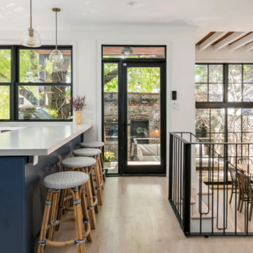
The kitchen sits one step above the breakfast nook — a deliberate multilevel strategy that creates distinct zones while keeping the house visually open from living room through kitchen through nook to backyard beyond. Navy cabinetry; custom wood range hood built from salvaged kitchen wall planks (not pictured); brass hardware.
 Axis Mundi
When the Gimbels department store chain closed in 1986, many of its selling floors were converted into luxury apartments, including those of this branch at 86th Street and Lexington Avenue. The retailer’s soaring ceilings allowed Axis Mundi to create bedroom mezzanine spaces overlooking the living and dining rooms. Defining them with translucent glass welcomed natural light while retaining privacy. Downstairs, spaces bleed one into another, their basic monochromatic black-and-white palette acting as a unifying leitmotif. Yet each space feels distinct, with its own programmatic purpose, a feat largely achieved by varying floor and wall treatments—a graphic tile pattern in the entry, a red wall in the hall leading to the master suite, a colorful area rug in the living room. In the retailer’s heyday, the then-common saying, “Would Macy’s tell Gimbels?” implied the strategies the competitors kept from each other to gain the upper hand. Here, a structure iconic in its day also conceals something: a handsome, wholly contemporary repurposing that represents just the sort of innovation that made Gimbels the celebrated name that it was.
 The Brooklyn Studio
This residence was a complete gut renovation of a 4-story row house in Park Slope, and included a new rear extension and penthouse addition. The owners wished to create a warm, family home using a modern language that would act as a clean canvas to feature rich textiles and items from their world travels. As with most Brooklyn row houses, the existing house suffered from a lack of natural light and connection to exterior spaces, an issue that Principal Brendan Coburn is acutely aware of from his experience re-imagining historic structures in the New York area. The resulting architecture is designed around moments featuring natural light and views to the exterior, of both the private garden and the sky, throughout the house, and a stripped-down language of detailing and finishes allows for the concept of the modern-natural to shine.
Upon entering the home, the kitchen and dining space draw you in with views beyond through the large glazed opening at the rear of the house. An extension was built to allow for a large sunken living room that provides a family gathering space connected to the kitchen and dining room, but remains distinctly separate, with a strong visual connection to the rear garden. The open sculptural stair tower was designed to function like that of a traditional row house stair, but with a smaller footprint. By extending it up past the original roof level into the new penthouse, the stair becomes an atmospheric shaft for the spaces surrounding the core. All types of weather – sunshine, rain, lightning, can be sensed throughout the home through this unifying vertical environment. The stair space also strives to foster family communication, making open living spaces visible between floors. At the upper-most level, a free-form bench sits suspended over the stair, just by the new roof deck, which provides at-ease entertaining. Oak was used throughout the home as a unifying material element. As one travels upwards within the house, the oak finishes are bleached to further degrees as a nod to how light enters the home.
The owners worked with CWB to add their own personality to the project. The meter of a white oak and blackened steel stair screen was designed by the family to read “I love you” in Morse Code, and tile was selected throughout to reference places that hold special significance to the family. To support the owners’ comfort, the architectural design engages passive house technologies to reduce energy use, while increasing air quality within the home – a strategy which aims to respect the environment while providing a refuge from the harsh elements of urban living.
This project was published by Wendy Goodman as her Space of the Week, part of New York Magazine’s Design Hunting on The Cut.
Photography by Kevin Kunstadt
 Axis Mundi
When the Gimbels department store chain closed in 1986, many of its selling floors were converted into luxury apartments, including those of this branch at 86th Street and Lexington Avenue. The retailer’s soaring ceilings allowed Axis Mundi to create bedroom mezzanine spaces overlooking the living and dining rooms. Defining them with translucent glass welcomed natural light while retaining privacy. Downstairs, spaces bleed one into another, their basic monochromatic black-and-white palette acting as a unifying leitmotif. Yet each space feels distinct, with its own programmatic purpose, a feat largely achieved by varying floor and wall treatments—a graphic tile pattern in the entry, a red wall in the hall leading to the master suite, a colorful area rug in the living room. In the retailer’s heyday, the then-common saying, “Would Macy’s tell Gimbels?” implied the strategies the competitors kept from each other to gain the upper hand. Here, a structure iconic in its day also conceals something: a handsome, wholly contemporary repurposing that represents just the sort of innovation that made Gimbels the celebrated name that it was.
 Axis Mundi
When the Gimbels department store chain closed in 1986, many of its selling floors were converted into luxury apartments, including those of this branch at 86th Street and Lexington Avenue. The retailer’s soaring ceilings allowed Axis Mundi to create bedroom mezzanine spaces overlooking the living and dining rooms. Defining them with translucent glass welcomed natural light while retaining privacy. Downstairs, spaces bleed one into another, their basic monochromatic black-and-white palette acting as a unifying leitmotif. Yet each space feels distinct, with its own programmatic purpose, a feat largely achieved by varying floor and wall treatments—a graphic tile pattern in the entry, a red wall in the hall leading to the master suite, a colorful area rug in the living room. In the retailer’s heyday, the then-common saying, “Would Macy’s tell Gimbels?” implied the strategies the competitors kept from each other to gain the upper hand. Here, a structure iconic in its day also conceals something: a handsome, wholly contemporary repurposing that represents just the sort of innovation that made Gimbels the celebrated name that it was.
 Mark Brand Architecture
For this kitchen and bath remodel in San Francisco's Cole Valley, our client wanted us to open the kitchen up to the living room and create a new modern feel for all of the remodeled areas. Opening the kitchen to the living area provided a structural challenge as the wall we had to remove was load-bearing and there was a separately owned condo on the floor below. Working closely with a structural engineer, we created a strategy to carry the weight to the exterior walls of the building. In order to do this we had to tear off the entire roof and rebuild it with new structural joists which could span from property line to property line. To achieve a dramatic daylighting effect, we created a slot skylight over the back wall of the kitchen with the beams running through the skylight. Cerulean blue, back-painted glass for the backsplash and a thick waterfall edge for the island add more distinctive touches to this kitchen design. In the master bath we created a sinuous counter edge which tracks its way to the floor to create a curb for the shower. Green tile imported from Morocco adds a pop of color in the shower and a custom built indirect LED lighting cove creates a glow of light around the mirror. Photography by Christopher Stark.
 Axis Mundi
When the Gimbels department store chain closed in 1986, many of its selling floors were converted into luxury apartments, including those of this branch at 86th Street and Lexington Avenue. The retailer’s soaring ceilings allowed Axis Mundi to create bedroom mezzanine spaces overlooking the living and dining rooms. Defining them with translucent glass welcomed natural light while retaining privacy. Downstairs, spaces bleed one into another, their basic monochromatic black-and-white palette acting as a unifying leitmotif. Yet each space feels distinct, with its own programmatic purpose, a feat largely achieved by varying floor and wall treatments—a graphic tile pattern in the entry, a red wall in the hall leading to the master suite, a colorful area rug in the living room. In the retailer’s heyday, the then-common saying, “Would Macy’s tell Gimbels?” implied the strategies the competitors kept from each other to gain the upper hand. Here, a structure iconic in its day also conceals something: a handsome, wholly contemporary repurposing that represents just the sort of innovation that made Gimbels the celebrated name that it was.

 DesignARC
LOS ANGELES, CA / SINGLE FAMILY RESIDENTIAL
The commission for this 4,300-square-foot residence came with significant challenges for the architects – a house had once existed on the lot but had burned down and the attempt to replace the house had stalled, leading to an abatement order and a lapse of permits.
Our first challenge was to revive the lapsed construction permit by proposing to “modify” the existing structure. The practical effect this had was to fix the footprint of the new home to the existing structure’s plan outline. Having thereby inherited the large, dense block of the original house, the new strategy became one of substituting selective areas of indoor space for outdoor courtyard.
This strategy of trading indoor space for outdoor courtyard allowed an erosion of the formerly monolithic structure into a series of distinct volumetric elements, and further suggested that the architectural pieces could cohere as a “village.” The main level is further eroded by large, glazed planes, merging indoor with outdoor, and virtually stretching the landscape across interior space. Moving the detached garage from the rear yard to beneath the new living space allowed for a 75-meter lap pool and a shaded olive garden.
The gardens include built-in seating, extensive use of ornamental grasses and Zen-like interior courtyards. A material palette of fossilized stone, bonderized-galvanized metal, and natural Douglas fir allows for the warmth desired by the wife, while providing the modernity required by the husband. Programmatically, her music room borrows from the calm and protected olive court in the rear, while his office becomes a pavilion set in the landscape, which both addresses the street and acts as a sheltering monument for the terraced entry garden.
 DesignARC
LOS ANGELES, CA / SINGLE FAMILY RESIDENTIAL
The commission for this 4,300-square-foot residence came with significant challenges for the architects – a house had once existed on the lot but had burned down and the attempt to replace the house had stalled, leading to an abatement order and a lapse of permits.
Our first challenge was to revive the lapsed construction permit by proposing to “modify” the existing structure. The practical effect this had was to fix the footprint of the new home to the existing structure’s plan outline. Having thereby inherited the large, dense block of the original house, the new strategy became one of substituting selective areas of indoor space for outdoor courtyard.
This strategy of trading indoor space for outdoor courtyard allowed an erosion of the formerly monolithic structure into a series of distinct volumetric elements, and further suggested that the architectural pieces could cohere as a “village.” The main level is further eroded by large, glazed planes, merging indoor with outdoor, and virtually stretching the landscape across interior space. Moving the detached garage from the rear yard to beneath the new living space allowed for a 75-meter lap pool and a shaded olive garden.
The gardens include built-in seating, extensive use of ornamental grasses and Zen-like interior courtyards. A material palette of fossilized stone, bonderized-galvanized metal, and natural Douglas fir allows for the warmth desired by the wife, while providing the modernity required by the husband. Programmatically, her music room borrows from the calm and protected olive court in the rear, while his office becomes a pavilion set in the landscape, which both addresses the street and acts as a sheltering monument for the terraced entry garden.
 DesignARC
LOS ANGELES, CA / SINGLE FAMILY RESIDENTIAL
The commission for this 4,300-square-foot residence came with significant challenges for the architects – a house had once existed on the lot but had burned down and the attempt to replace the house had stalled, leading to an abatement order and a lapse of permits.
Our first challenge was to revive the lapsed construction permit by proposing to “modify” the existing structure. The practical effect this had was to fix the footprint of the new home to the existing structure’s plan outline. Having thereby inherited the large, dense block of the original house, the new strategy became one of substituting selective areas of indoor space for outdoor courtyard.
This strategy of trading indoor space for outdoor courtyard allowed an erosion of the formerly monolithic structure into a series of distinct volumetric elements, and further suggested that the architectural pieces could cohere as a “village.” The main level is further eroded by large, glazed planes, merging indoor with outdoor, and virtually stretching the landscape across interior space. Moving the detached garage from the rear yard to beneath the new living space allowed for a 75-meter lap pool and a shaded olive garden.
The gardens include built-in seating, extensive use of ornamental grasses and Zen-like interior courtyards. A material palette of fossilized stone, bonderized-galvanized metal, and natural Douglas fir allows for the warmth desired by the wife, while providing the modernity required by the husband. Programmatically, her music room borrows from the calm and protected olive court in the rear, while his office becomes a pavilion set in the landscape, which both addresses the street and acts as a sheltering monument for the terraced entry garden.
 DesignARC
LOS ANGELES, CA / SINGLE FAMILY RESIDENTIAL
The commission for this 4,300-square-foot residence came with significant challenges for the architects – a house had once existed on the lot but had burned down and the attempt to replace the house had stalled, leading to an abatement order and a lapse of permits.
Our first challenge was to revive the lapsed construction permit by proposing to “modify” the existing structure. The practical effect this had was to fix the footprint of the new home to the existing structure’s plan outline. Having thereby inherited the large, dense block of the original house, the new strategy became one of substituting selective areas of indoor space for outdoor courtyard.
This strategy of trading indoor space for outdoor courtyard allowed an erosion of the formerly monolithic structure into a series of distinct volumetric elements, and further suggested that the architectural pieces could cohere as a “village.” The main level is further eroded by large, glazed planes, merging indoor with outdoor, and virtually stretching the landscape across interior space. Moving the detached garage from the rear yard to beneath the new living space allowed for a 75-meter lap pool and a shaded olive garden.
The gardens include built-in seating, extensive use of ornamental grasses and Zen-like interior courtyards. A material palette of fossilized stone, bonderized-galvanized metal, and natural Douglas fir allows for the warmth desired by the wife, while providing the modernity required by the husband. Programmatically, her music room borrows from the calm and protected olive court in the rear, while his office becomes a pavilion set in the landscape, which both addresses the street and acts as a sheltering monument for the terraced entry garden.
1