
Search results for "Efficacy" in Home Design Ideas




Find the right local pro for your project

 Ollin Stone
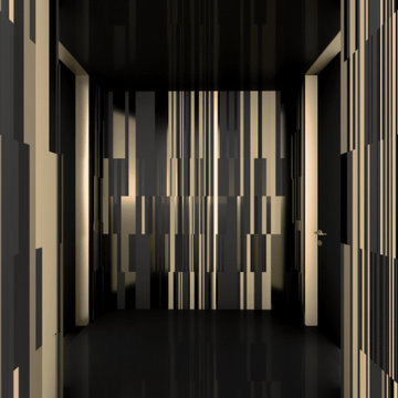
Seta was coined with the desire to experiment and the intention of astounding the end users as they observe and touch it. Its name is due to a thread which is repeated on all the surfaces, to produce the perception of scratches on plain-coloured slabs. The concept is very similar to that of the Collection line, but in this case the material involvement is different.



 Gallerique
"Fault" by Constance Edwards Scopelitis. Now avaliable for purchase: http://connect.gallerique.com/gallery/old-masters/fault.html
 Jessica Dauray Interiors/Elements Of Style
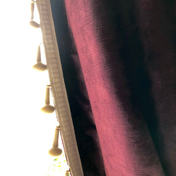
Aubergine Silk velvet drapes with ivory wood tassels
Dining room - traditional dining room idea in Raleigh
Dining room - traditional dining room idea in Raleigh





 Laidlaw Schultz architects
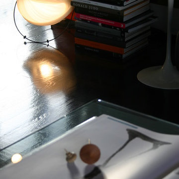
The project’s starting point was to understand the building’s original post and beam structure and to use that internal logic to formulate a sympathetic remodel. With an emphasis on the upper back unit, the owner’s private residence within this recently purchased Edward Killingsworth triplex, the first order of business was to strip the excess out and to return the complex to something that resembled the original. With a limited budget, the tact was to restore where possible, and to insert where needed, but always with a sympathetic eye. The kitchen quickly became the primary focus and it was soon realized that by removing the division between the existing galley and family room that the essence of the structural system could be revealed. Once opened the datum of the layered beams was adhered to with the kitchen reinforcing this overhead water line. The primary internal wall was then highlighted with a new wood veneer with the refrigerator recessed (borrowing a bit of space from the master closet) and the existing heater chromed.

 Artwork by Cynthia Ligeros
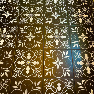
The artfully inspired Structured Toffee Abstract Tile is a striking yet simple accent. Customize to any size or tile. Hand painted.
Inspiration for a 14 to 17 inch wide and 24 to 31 inch long contemporary porcelain abstract home design remodel in Denver
Inspiration for a 14 to 17 inch wide and 24 to 31 inch long contemporary porcelain abstract home design remodel in Denver

 BE Landscape Design
Donovan Novotny
Inspiration for a mid-sized coastal drought-tolerant and partial sun landscaping in Los Angeles.
Inspiration for a mid-sized coastal drought-tolerant and partial sun landscaping in Los Angeles.
 Curtain Call
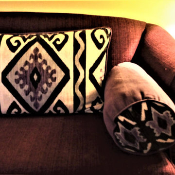
I have been a custom window treatment professional for sixteen years, have fabricated lots of draperies, valances and Roman shades and sold a lot of Hunter Douglas blinds, shades and shutters. I thought of pillows as accessories, as a sort of add on or didn't think about them much at all until I started to update the decor in my own home. We built our house 22 years ago, and after two decades of kids, dogs and elderly parents, things were starting to look a little shabby. I'm very fortunate to have accounts with a number of decorator fabric distributors and fortunate to work with my upholsterer, the Custom Shoppe in Ansonia CT and with my designer friend, Lynda Reid. At a charity fund raiser event I fell in love with a multi-colored kilim. Didn't get it but found another; that was the first piece in our decor update for our family room. We put it on top of an old berber rug, and of course. it didn't go with the furniture, which was getting pretty Old. My upholsterer, Andy Apuzzo, suggested it look for vintage pieces of furniture at a Goodwill Super Store in Bridgeport CT. Over time I found three pieces, a sofa, loveseat and ottoman. I was determined to have a purple couch and. after ordering several samples and half yards, found just the one I wanted; very durable. With the help of my friend, designer Lynda Reid of Lynda Reid Designs in Shelton CT, I chose a teal velvet, also very durable and also from Kasmir for the loveseat. I upholstered the ottoman in the purple fabric, partly in an effort to make the sofa look bigger (Lynda's suggestion). Next I looked for fabric for pillows. I found some fabulous fabrics from Vervain (purchased from Fabricut, and also used a Romo fabric for the bolsters. Eventually, we had the ugly old berber replaced with a hardware floor. Next years project in her: new paint, draperies and wall art.






 Loft Kolasinski
Karolina Bąk www.karolinabak.com
Study room - small mid-century modern freestanding desk light wood floor study room idea with white walls
Study room - small mid-century modern freestanding desk light wood floor study room idea with white walls

 KURV Architecture DPC (Alex Hughes Architects)
Located in the heart of Manhattan’s Lower East Side, the building was erected on a shallow commercial lot between two 120 year old masonry buildings and a new residential rental building. 330 Grand Street is a mix of 725 SF 1BRs and 1050 SF 2BR apartments. It also contains a 1100 SF two story duplex as well as private and public rooftop space, large private balconies for most units and two large private terraces for the ground floor units.
330 Grand Street was originally designed and approved at the NYC DOB as a prefabricated modular building. During the pandemic, as shipping costs skyrocketed putting the project at risk, we suggested redesigning the building as a reinforced cast-in-place concrete structure. Concrete was readily available and prices had not been affected by the demand increase that many other materials suffered in the pandemic. We took this opportunity to raise floor to ceiling heights, enlarge high performance windows and redistribute the buildings MEPFS and Structural Systems to create very open floor plans.
The challenge was to create a luxurious sensorial living experience with very limited means. In a city with very high construction costs, low cost residential buildings in the area are usually devoid of good quality, design and character. Our approach was to aim high for the end user, prioritizing natural light, open space with long visual perspectives, high ceilings and as always, rejecting the use of predefined building templates.
Our biggest challenge was to ensure that the small spaces feel as clean cut, large and bright as possible. Several unique design decisions were made to ensure low cost and high quality;
Floor plans were laid out so that spaces were wide open and free of clutter from mechanical or structural interruptions. Therefore all infrastructure was placed in lateral demising walls, which in turn act as the unit’s storage and kitchen. The apartments feel wide open, are super quiet and have more storage space than any other comparable apartment in the city.
To solve the problem of the site’s shallow commercial lot which is typically prone to dark interior spaces we focused our attention on the building’s envelope. Instead of the usual small punched window openings, oversized high performance windows were designed to ensure that light penetrated as far as possible into the units. In the smaller 1BR units, the full 50’ depth of the lot is perceived by partitioning spaces with sliding pocket doors that can be retracted to allow deep visual perspectives, making the sight lines in the space feel longer, larger, more ample than normal. In addition to the full height glazing, each unit above the 2nd floor receives a 7 foot covered balcony, adding 120 to 240 sf to each apartment, something unusual in New York City buildings. The space is large enough for a full size dining table, when the weather permits being outside.
We also worked hard to ensure modularity. For example, all kitchen units are all identical throughout the building. The idea of modularity and the economy of the repetitive unit is exercised to the maximum through the building.
Hardware, appliances, flooring, wall coverings and material finishes are all carefully selected to feel bespoke, high quality and unique.
It was important to KURV that the result of this work manifest into something that would deeply connect with the end user and sustain relationships with the consumers of this space.
All images by KURV Architecture ©
38