
Search results for "Evolving" in Home Design Ideas

 Erin Roberts Design
California Home + Design, Jan 2012 Issue. Pink Chinoiserie Mural featured with Redmond Aldrich Design in "In a Different Light"
Entryway - eclectic entryway idea in San Francisco
Entryway - eclectic entryway idea in San Francisco
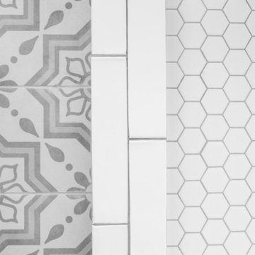
 6th Ave Homes
Perfect tile combination you have been looking for! We are obsessed with these neutral but stately tile combos!
Bathroom - craftsman ceramic tile and white floor bathroom idea in Dallas with white walls
Bathroom - craftsman ceramic tile and white floor bathroom idea in Dallas with white walls

Find the right local pro for your project

 Vision Design
What had been a very cramped, awkward master bathroom layout that barely accommodated one person became a spacious double vanity, double shower and master closet.
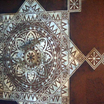
 ValHolla LLC
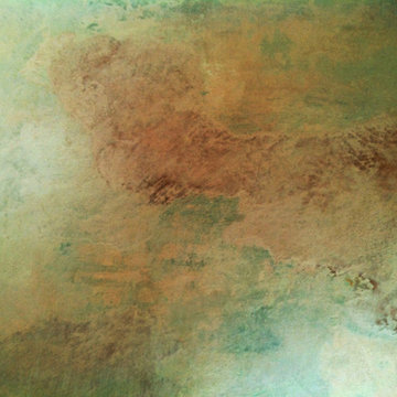
Valerie Holland- This project was done with the Faux Touch. My Mom. Pat Holland and I had a faux painting company from 2004-2008. This was not done with ValHolla painting; however, it is a good example of the detail and quality of work I can do.
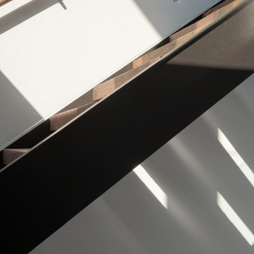


 CITYDESKSTUDIO, Inc.
Built in 1949, this Edina home had a strong horizontal presence on the site, but through subsequent renovations the overall massing was lacking clarity and refinement and the entry was diminutive and uninviting. The roof and siding materials were aging, and important interior spaces were cramped and closed in. The house needed better light, better connection internally and out, and exterior updates to clarify and enhance the strengths of the home.
The primary design evolved out of a celebration of the existing horizontality of the home and a recognition that a bigger home was not needed. By layering materiality and color, a new identity was created. A new cedar entry canopy slips out from under the previous roof line, extending further towards the street. This added warmth at the entry is echoed along the facade, creating a graceful rhythm and texture. The previous additions were re-clad with a darker material palette in order to anchor and unify the ends of the home. As the grade slopes down towards the back yard, horizontal bands are exposed, revealing the layering top to bottom. Combined, these few shifts in color and materiality allowed for a complete transformation of the home.
The interior is reflective of the material and color palette used outside. The main living spaces are opened up and connected while strengthening the original symmetry of the more formal linear alignment of rooms. A whole new kitchen relocates the center of the home and makes more fluid the daily life of this young family. The house is fully transformed inside and out, all without adding more square feet.
Project Team:
Ben Awes, AIA, Principal-in-Charge
Nate Dodge


 Karo Studios
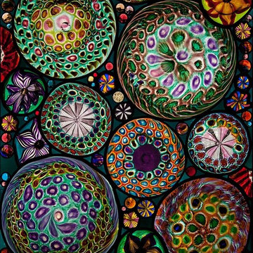
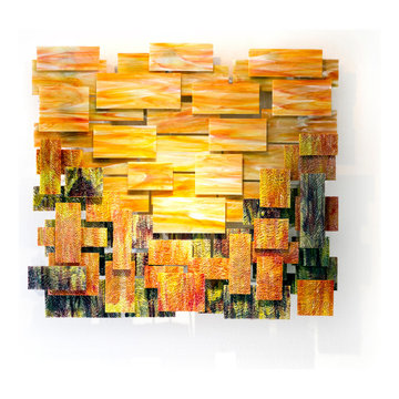
"Autumn" is an all glass and steel wall sculpture that is made out of 67 pieces of individually hand cut art glass. The steel is prepared and welded with each joint forming the foundation for the precise placement of the glass above it, creating a dynamic yet harmonious composition.

 Donohoe Living Landscapes
The landscape design for this private residence brings together a diverse array of elements to create an ethereal, multi-sensory experience where sound, movement, colour and scent are simultaneously evoked. Shielded by a forty foot hedge, the site challenged us to create an exterior, yet interior, world where Asian and Western influences intersect. In honouring the traditions of Feng Shui, the retaining wall does not sit directly on the entrance. Meditation pathways lead to areas of retreat and socialization (including an outdoor fire, a restored pool and covered seating area). An ergonomic garden and potting station lined with fruit trees allows the client to grow her own plants and vegetables. A multi-leveled water feature is framed with lush camellias and peonies; the landscape is lined with evergreens and decorated with Chinese basalt and local granite. The multi-sensory design comes to life in the grove of Shirofugen cherry trees as it sheds its petals to the music of a custom Corten steel wind chime sculpture made by English artist David Harber. A weather station was placed on site for a month to determine the weight of the chimes—each one set to the pentatonic scale. This is a space where our clients can grow and evolve their lives with the seasons.

 Wahoo Walls
Finishing and trimming wall panels to cover seams.
Example of a classic basement design in Detroit
Example of a classic basement design in Detroit

 User
Craftsman Corners fit well with Pac Trim's Pioneer Series PIO190
Entryway - entryway idea in Sacramento
Entryway - entryway idea in Sacramento

 The Aldrich Company - Landscape Design
Vivid colors of yellow, blue and green compliment this Mediterranean vignette.
Photo of a mid-sized mediterranean full sun landscaping in Santa Barbara for summer.
Photo of a mid-sized mediterranean full sun landscaping in Santa Barbara for summer.

 PI Photography Wall Art & Fine Art
Beautiful wall art and fine art that will bring the beauty of the outdoors into your living rooms, bedrooms, dining rooms, office and more. These photos are printed on high quality photo paper with the highest quality ink & finished off with a soft UV luster coating. Prints are available in 5 sizes right here on Houzz. ***Frame displayed in this photo is for demonstration only.*** About: "Calm Passion Sepia Floral Photo" is a beautiful close-up (macros) nature photograph of the stigmas, of a Tiger lily while the flower was in full bloom. A sepia aging effect was added to this photograph to create a romantic feel to the image.



 CITYDESKSTUDIO, Inc.
Built in 1949, this Edina home had a strong horizontal presence on the site, but through subsequent renovations the overall massing was lacking clarity and refinement and the entry was diminutive and uninviting. The roof and siding materials were aging, and important interior spaces were cramped and closed in. The house needed better light, better connection internally and out, and exterior updates to clarify and enhance the strengths of the home.
The primary design evolved out of a celebration of the existing horizontality of the home and a recognition that a bigger home was not needed. By layering materiality and color, a new identity was created. A new cedar entry canopy slips out from under the previous roof line, extending further towards the street. This added warmth at the entry is echoed along the facade, creating a graceful rhythm and texture. The previous additions were re-clad with a darker material palette in order to anchor and unify the ends of the home. As the grade slopes down towards the back yard, horizontal bands are exposed, revealing the layering top to bottom. Combined, these few shifts in color and materiality allowed for a complete transformation of the home.
The interior is reflective of the material and color palette used outside. The main living spaces are opened up and connected while strengthening the original symmetry of the more formal linear alignment of rooms. A whole new kitchen relocates the center of the home and makes more fluid the daily life of this young family. The house is fully transformed inside and out, all without adding more square feet.
Project Team:
Ben Awes, AIA, Principal-in-Charge
Nate Dodge
247