
Search results for "Exploitation" in Home Design Ideas
 Brooks + Scarpa Architects
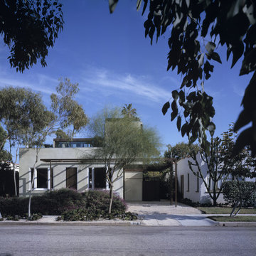
Nestled amidst a neighborhood of single story bungalows in Venice, California, the Solar Umbrella Residence boldly establishes a precedent for the next generation of California modernist architecture. Located on a 41’ wide x 100’-0” long through lot, the Solar Umbrella addition transforms the architects’ existing 650 square foot bungalow into a 1900 square foot residence equipped for responsible living in the twenty-first century.
Inspired by Paul Rudolph’s Umbrella House of 1953, the Solar Umbrella provides a contemporary reinvention of the solar canopy—a strategy that provides thermal protection in climates with intense exposures. In establishing the program for their residence, which accommodates the couple and their one child chose to integrate into the design, principles of sustainability that they strive to achieve in their own practice. The architects carefully considered the entire site, taking advantage of as many opportunities for sustainable living as possible. Passive and active solar design strategies render the residence 100% energy neutral. Recycled, renewable, and high performance materials and products are specified throughout. Hardscape and landscape treatments are considered for their aesthetic and actual impact on the land. The Brooks Scarpa Residence elegantly crafts each of these strategies and materials, exploiting the potential for performance and sensibility while achieving a rich and interesting sensory and aesthetic experience.
 User
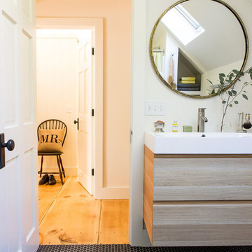
UserDesigned as a country retreat for a young couple from New York City, this compact project plays with the idea of a modern cabin. Containing 3 bedrooms and 2 full bathrooms in under 2,000 sqft, the house exploits the use of glass and outdoors rooms to expand its virtual space and connection to nature.
The aesthetics of the house reflect the nature of its owners; while very modest and private on the outside, it is full of light and openness on the inside.
The project's interior design creates a youthful and relaxed atmosphere, while maintaining a timelessness and simplicity appropriate to its New England heritage.
http://chattmanphotography.com/
 Brooks + Scarpa Architects
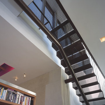
Nestled amidst a neighborhood of single story bungalows in Venice, California, the Solar Umbrella Residence boldly establishes a precedent for the next generation of California modernist architecture. Located on a 41’ wide x 100’-0” long through lot, the Solar Umbrella addition transforms the architects’ existing 650 square foot bungalow into a 1900 square foot residence equipped for responsible living in the twenty-first century.
Inspired by Paul Rudolph’s Umbrella House of 1953, the Solar Umbrella provides a contemporary reinvention of the solar canopy—a strategy that provides thermal protection in climates with intense exposures. In establishing the program for their residence, which accommodates the couple and their one child chose to integrate into the design, principles of sustainability that they strive to achieve in their own practice. The architects carefully considered the entire site, taking advantage of as many opportunities for sustainable living as possible. Passive and active solar design strategies render the residence 100% energy neutral. Recycled, renewable, and high performance materials and products are specified throughout. Hardscape and landscape treatments are considered for their aesthetic and actual impact on the land. The Brooks Scarpa Residence elegantly crafts each of these strategies and materials, exploiting the potential for performance and sensibility while achieving a rich and interesting sensory and aesthetic experience.
Find the right local pro for your project
 User
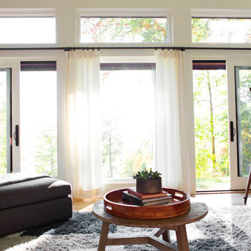
UserDesigned as a country retreat for a young couple from New York City, this compact project plays with the idea of a modern cabin. Containing 3 bedrooms and 2 full bathrooms in under 2,000 sqft, the house exploits the use of glass and outdoors rooms to expand its virtual space and connection to nature.
The aesthetics of the house reflect the nature of its owners; while very modest and private on the outside, it is full of light and openness on the inside.
The project's interior design creates a youthful and relaxed atmosphere, while maintaining a timelessness and simplicity appropriate to its New England heritage.
http://chattmanphotography.com/
 Nautilus Architects
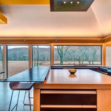
Located on a marsh in the upper reaches of the Lieutenant River in Old Lyme, the existing house was well-sited and well-built, but the design failed to exploit the views and more importantly was a confused combination of contemporary and traditional elements. The new homeowners, a successful businesswoman and an accomplished artist and photographer, were interested in creating a fully-contemporary environment to open up space, connect indoors with outdoors, display artwork and showcase the husband’s distinctive photographs.
One glaring deficiency was the curb appeal and approach sequence: the grade sloped down and the path to the house followed, but this led to an uncomfortable dip and abrupt rise to the front door. By creating a virtual “moat,” occupied by a grid of raised-bed grasses contained in aluminum-clad boxes, and spanning the moat with an ipe bridge, the approach becomes level and engaging. The façade of the existing house was blank and bland, and with no cover. Adding a deep overhang with a wide porch creates a welcoming, covered condition, accentuated by a 6’ wide pivoting front door that feels more like a moving piece of wall.
Another deficiency was the connection to the outdoors. By adding glass to the front and back of the house, and removing interior walls selectively, the house takes on a diaphanous quality that allows one to see through to the marsh beyond, even when in the driveway. The raised-bed grasses act as abstract, geometric versions of the marsh beyond. A large, pyramidal skylight establishes a spatial hierarchy around which the rooms revolve.
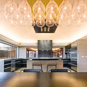
The house featured several tray-ceilinged spaces – living room, kitchen, and master bedroom – that were poorly-proportioned and with panels at the top that resembled inset flat panel doors. The solution was to use a different strategy for each: the bedroom turns the ceiling into an eggshell through the use of a creative trim detail; the living room has an oversized sculptural, backlit lighting element; and the kitchen has a collage of painted rectangular forms that support or include lighting pieces.
A palette of concrete, blackened steel, stainless steel and colors carefully chosen by homeowner and architect create an interior and exterior environment punctuated by moments that are as artistic as the featured works in the black-ceilinged gallery.
 User
UserMatthew Niemann
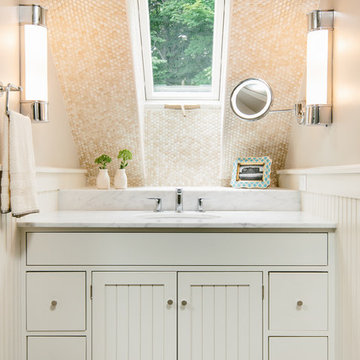
Bathroom - transitional beige tile and mosaic tile bathroom idea in Other with beige walls
Bathroom - transitional beige tile and mosaic tile bathroom idea in Other with beige walls
 Exclusive Home Interiors
Make a dream of your world
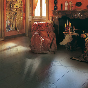
Unico is an amazing new collection reborn from the traditional Provençal Tile.
Angelo Marchesi’s idea was to re-propose the antique size exploiting the most modern technologies used for the biggest sizes in ceramic. The result is a collection of unbelievable aesthetical innovation. The echo of the ancient style becomes wider and wider and finds a new strong expression, and becomes almost honiric suggestion.
 Exclusive Home Interiors
Make a dream of your world
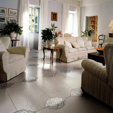
Unico is an amazing new collection reborn from the traditional Provençal Tile.
Angelo Marchesi’s idea was to re-propose the antique size exploiting the most modern technologies used for the biggest sizes in ceramic. The result is a collection of unbelievable aesthetical innovation. The echo of the ancient style becomes wider and wider and finds a new strong expression, and becomes almost honiric suggestion.
 Nautilus Architects
Located on a marsh in the upper reaches of the Lieutenant River in Old Lyme, the existing house was well-sited and well-built, but the design failed to exploit the views and more importantly was a confused combination of contemporary and traditional elements. The new homeowners, a successful businesswoman and an accomplished artist and photographer, were interested in creating a fully-contemporary environment to open up space, connect indoors with outdoors, display artwork and showcase the husband’s distinctive photographs.
One glaring deficiency was the curb appeal and approach sequence: the grade sloped down and the path to the house followed, but this led to an uncomfortable dip and abrupt rise to the front door. By creating a virtual “moat,” occupied by a grid of raised-bed grasses contained in aluminum-clad boxes, and spanning the moat with an ipe bridge, the approach becomes level and engaging. The façade of the existing house was blank and bland, and with no cover. Adding a deep overhang with a wide porch creates a welcoming, covered condition, accentuated by a 6’ wide pivoting front door that feels more like a moving piece of wall.
Another deficiency was the connection to the outdoors. By adding glass to the front and back of the house, and removing interior walls selectively, the house takes on a diaphanous quality that allows one to see through to the marsh beyond, even when in the driveway. The raised-bed grasses act as abstract, geometric versions of the marsh beyond. A large, pyramidal skylight establishes a spatial hierarchy around which the rooms revolve.
The house featured several tray-ceilinged spaces – living room, kitchen, and master bedroom – that were poorly-proportioned and with panels at the top that resembled inset flat panel doors. The solution was to use a different strategy for each: the bedroom turns the ceiling into an eggshell through the use of a creative trim detail; the living room has an oversized sculptural, backlit lighting element; and the kitchen has a collage of painted rectangular forms that support or include lighting pieces.
A palette of concrete, blackened steel, stainless steel and colors carefully chosen by homeowner and architect create an interior and exterior environment punctuated by moments that are as artistic as the featured works in the black-ceilinged gallery.
 Teakwood Builders, Inc.
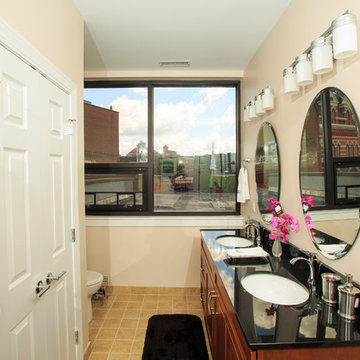
Large maple vanities are positioned to exploit the light and view.
Joe Elario Photography
Bathroom - mid-sized modern master beige tile ceramic tile bathroom idea in Boston with shaker cabinets, medium tone wood cabinets, a two-piece toilet, beige walls, an undermount sink and quartzite countertops
Bathroom - mid-sized modern master beige tile ceramic tile bathroom idea in Boston with shaker cabinets, medium tone wood cabinets, a two-piece toilet, beige walls, an undermount sink and quartzite countertops
 PropertyPhotos.ca
PropertyPhotos.ca
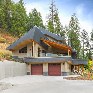
Example of a trendy beige two-story exterior home design in Vancouver
Example of a trendy beige two-story exterior home design in Vancouver
 Plexwood
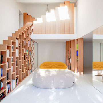
Project: Private house, Antony, FR
Application: Bookcases
Kind of wood: Beech
Product: Panel two-sided
Design and realisation: Andrea Mosca Creative studio
(link should be: http://www.andreamosca.com/), Paris, FR


 Eminent Interior Design
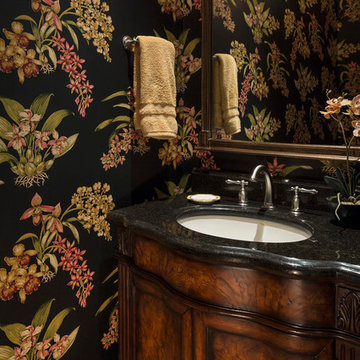
In this formal Powder Room a large scale floral pattern was used to add drama to the small space. The Black granite matches the background of this botanical paper. A scalloped bow front sink cabinet offers both function and beauty with storage below and carved wood details on the columns.
Troy Thies Photography
 Get My Rugs LLC
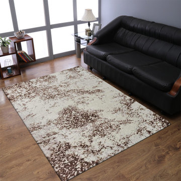
Add a way of calmness to your luxurious life with this refined transformation pattern and sober beige blue colored, machine woven area rug from Rugsotic Carpets. The area rug is created in numerous sizes exploitation prime quality material to create it last long and therefore the plush pile makes it additional comfy. Keep it clean and off from water. Grab this machine created high style sizes and affordable worth.
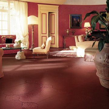 Exclusive Home Interiors
Make a dream of your world
Unico is an amazing new collection reborn from the traditional Provençal Tile.
Angelo Marchesi’s idea was to re-propose the antique size exploiting the most modern technologies used for the biggest sizes in ceramic. The result is a collection of unbelievable aesthetical innovation. The echo of the ancient style becomes wider and wider and finds a new strong expression, and becomes almost honiric suggestion.
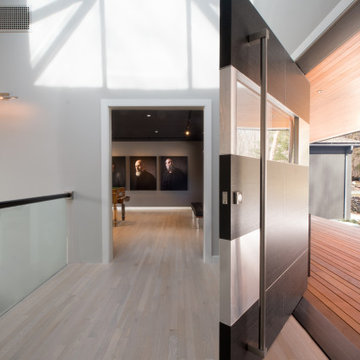 Nautilus Architects
Located on a marsh in the upper reaches of the Lieutenant River in Old Lyme, the existing house was well-sited and well-built, but the design failed to exploit the views and more importantly was a confused combination of contemporary and traditional elements. The new homeowners, a successful businesswoman and an accomplished artist and photographer, were interested in creating a fully-contemporary environment to open up space, connect indoors with outdoors, display artwork and showcase the husband’s distinctive photographs.
One glaring deficiency was the curb appeal and approach sequence: the grade sloped down and the path to the house followed, but this led to an uncomfortable dip and abrupt rise to the front door. By creating a virtual “moat,” occupied by a grid of raised-bed grasses contained in aluminum-clad boxes, and spanning the moat with an ipe bridge, the approach becomes level and engaging. The façade of the existing house was blank and bland, and with no cover. Adding a deep overhang with a wide porch creates a welcoming, covered condition, accentuated by a 6’ wide pivoting front door that feels more like a moving piece of wall.
Another deficiency was the connection to the outdoors. By adding glass to the front and back of the house, and removing interior walls selectively, the house takes on a diaphanous quality that allows one to see through to the marsh beyond, even when in the driveway. The raised-bed grasses act as abstract, geometric versions of the marsh beyond. A large, pyramidal skylight establishes a spatial hierarchy around which the rooms revolve.
The house featured several tray-ceilinged spaces – living room, kitchen, and master bedroom – that were poorly-proportioned and with panels at the top that resembled inset flat panel doors. The solution was to use a different strategy for each: the bedroom turns the ceiling into an eggshell through the use of a creative trim detail; the living room has an oversized sculptural, backlit lighting element; and the kitchen has a collage of painted rectangular forms that support or include lighting pieces.
A palette of concrete, blackened steel, stainless steel and colors carefully chosen by homeowner and architect create an interior and exterior environment punctuated by moments that are as artistic as the featured works in the black-ceilinged gallery.
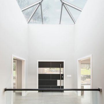 Nautilus Architects
Located on a marsh in the upper reaches of the Lieutenant River in Old Lyme, the existing house was well-sited and well-built, but the design failed to exploit the views and more importantly was a confused combination of contemporary and traditional elements. The new homeowners, a successful businesswoman and an accomplished artist and photographer, were interested in creating a fully-contemporary environment to open up space, connect indoors with outdoors, display artwork and showcase the husband’s distinctive photographs.
One glaring deficiency was the curb appeal and approach sequence: the grade sloped down and the path to the house followed, but this led to an uncomfortable dip and abrupt rise to the front door. By creating a virtual “moat,” occupied by a grid of raised-bed grasses contained in aluminum-clad boxes, and spanning the moat with an ipe bridge, the approach becomes level and engaging. The façade of the existing house was blank and bland, and with no cover. Adding a deep overhang with a wide porch creates a welcoming, covered condition, accentuated by a 6’ wide pivoting front door that feels more like a moving piece of wall.
Another deficiency was the connection to the outdoors. By adding glass to the front and back of the house, and removing interior walls selectively, the house takes on a diaphanous quality that allows one to see through to the marsh beyond, even when in the driveway. The raised-bed grasses act as abstract, geometric versions of the marsh beyond. A large, pyramidal skylight establishes a spatial hierarchy around which the rooms revolve.
The house featured several tray-ceilinged spaces – living room, kitchen, and master bedroom – that were poorly-proportioned and with panels at the top that resembled inset flat panel doors. The solution was to use a different strategy for each: the bedroom turns the ceiling into an eggshell through the use of a creative trim detail; the living room has an oversized sculptural, backlit lighting element; and the kitchen has a collage of painted rectangular forms that support or include lighting pieces.
A palette of concrete, blackened steel, stainless steel and colors carefully chosen by homeowner and architect create an interior and exterior environment punctuated by moments that are as artistic as the featured works in the black-ceilinged gallery.
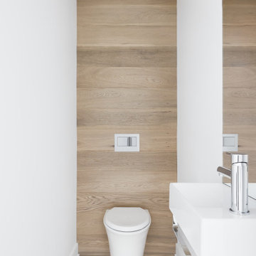
 catlin stothers design
The decision to either renovate the upper and lower units of a duplex or convert them into a single-family home was a no-brainer. Situated on a quiet street in Montreal, the home was the childhood residence of the homeowner, where many memories were made and relationships formed within the neighbourhood. The prospect of living elsewhere wasn’t an option.
A complete overhaul included the re-configuration of three levels to accommodate the dynamic lifestyle of the empty nesters. The potential to create a luminous volume was evident from the onset. With the home backing onto a park, westerly views were exploited by oversized windows and doors. A massive window in the stairwell allows morning sunlight to filter in and create stunning reflections in the open concept living area below.
The staircase is an architectural statement combining two styles of steps, with the extended width of the lower staircase creating a destination to read, while making use of an otherwise awkward space.
White oak dominates the entire home to create a cohesive and natural context. Clean lines, minimal furnishings and white walls allow the small space to breathe.
7