
Search results for "Favored choice" in Home Design Ideas
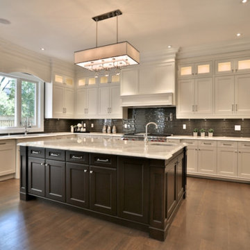
 Super Choice Kitchen Inc.
Contemporary kitchen cabinets are generally composed of minimal ornamentation and flat surfaces. The cabinetry style is intentionally non-traditional, avoiding decorative moldings in favor of simplicity and function.
Many contemporary kitchens have monochromatic color schemes, featuring various combinations of black, white, and gray. These kitchens tend to look very modern and sharp. Some contemporary designs, however, incorporate unique colors or exotic wood in order to create a visual impact and showcase the homeowner's favorite materials or hues.
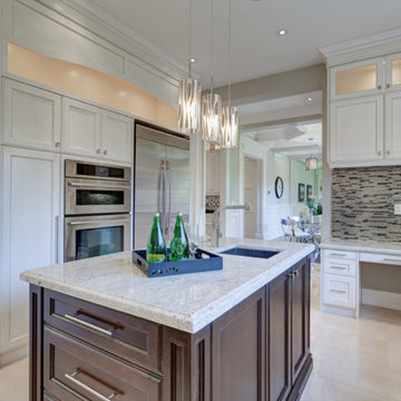 Super Choice Kitchen Inc.
Contemporary kitchen cabinets are generally composed of minimal ornamentation and flat surfaces. The cabinetry style is intentionally non-traditional, avoiding decorative moldings in favor of simplicity and function.
Many contemporary kitchens have monochromatic color schemes, featuring various combinations of black, white, and gray. These kitchens tend to look very modern and sharp. Some contemporary designs, however, incorporate unique colors or exotic wood in order to create a visual impact and showcase the homeowner's favorite materials or hues.
 Zepboo
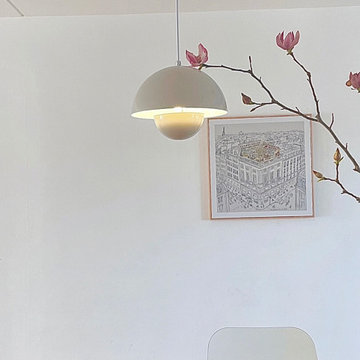
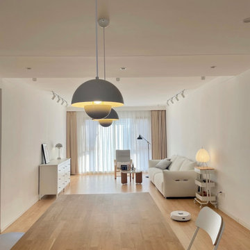
This is a case study of a client living in Hong Kong. The client's residence is an 80-square-meter home. The client has a preference for a modern minimalist Scandinavian style, with an overall white color scheme complemented by colorful decorations. The client's objective was to select a pendant light for the dining area, specifically in white color, and not too large in size. The client favored small and simple designs.
After careful consideration, we recommended the elegant and compact bud-shaped white Macaron pendant light, which is one of the most popular choices for Nordic-style small pendant lights. Given the size of the dining area, we suggested the client purchase two of these pendant lights to achieve better lighting effects. Upon receiving the products, the client expressed their satisfaction, as the pendant lights perfectly matched their requirements.
We are delighted to share this case study with everyone, hoping to provide inspiration and ideas for their own home renovations.
Find the right local pro for your project
 Zepboo
This is a case study of a client living in Hong Kong. The client's residence is an 80-square-meter home. The client has a preference for a modern minimalist Scandinavian style, with an overall white color scheme complemented by colorful decorations. The client's objective was to select a pendant light for the dining area, specifically in white color, and not too large in size. The client favored small and simple designs.
After careful consideration, we recommended the elegant and compact bud-shaped white Macaron pendant light, which is one of the most popular choices for Nordic-style small pendant lights. Given the size of the dining area, we suggested the client purchase two of these pendant lights to achieve better lighting effects. Upon receiving the products, the client expressed their satisfaction, as the pendant lights perfectly matched their requirements.
We are delighted to share this case study with everyone, hoping to provide inspiration and ideas for their own home renovations.
 Zepboo
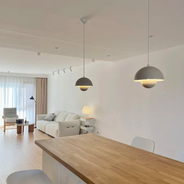
This is a case study of a client living in Hong Kong. The client's residence is an 80-square-meter home. The client has a preference for a modern minimalist Scandinavian style, with an overall white color scheme complemented by colorful decorations. The client's objective was to select a pendant light for the dining area, specifically in white color, and not too large in size. The client favored small and simple designs.
After careful consideration, we recommended the elegant and compact bud-shaped white Macaron pendant light, which is one of the most popular choices for Nordic-style small pendant lights. Given the size of the dining area, we suggested the client purchase two of these pendant lights to achieve better lighting effects. Upon receiving the products, the client expressed their satisfaction, as the pendant lights perfectly matched their requirements.
We are delighted to share this case study with everyone, hoping to provide inspiration and ideas for their own home renovations.
 Zepboo
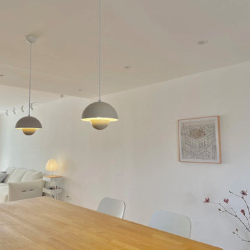
This is a case study of a client living in Hong Kong. The client's residence is an 80-square-meter home. The client has a preference for a modern minimalist Scandinavian style, with an overall white color scheme complemented by colorful decorations. The client's objective was to select a pendant light for the dining area, specifically in white color, and not too large in size. The client favored small and simple designs.
After careful consideration, we recommended the elegant and compact bud-shaped white Macaron pendant light, which is one of the most popular choices for Nordic-style small pendant lights. Given the size of the dining area, we suggested the client purchase two of these pendant lights to achieve better lighting effects. Upon receiving the products, the client expressed their satisfaction, as the pendant lights perfectly matched their requirements.
We are delighted to share this case study with everyone, hoping to provide inspiration and ideas for their own home renovations.
 Super Choice Kitchen Inc.
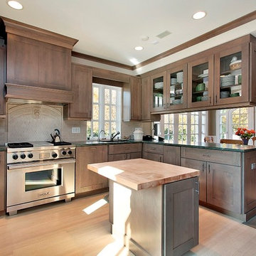
Contemporary kitchen cabinets are generally composed of minimal ornamentation and flat surfaces. The cabinetry style is intentionally non-traditional, avoiding decorative moldings in favor of simplicity and function.
Many contemporary kitchens have monochromatic color schemes, featuring various combinations of black, white, and gray. These kitchens tend to look very modern and sharp. Some contemporary designs, however, incorporate unique colors or exotic wood in order to create a visual impact and showcase the homeowner's favorite materials or hues.

Sponsored
Delaware, OH

Buckeye Basements, Inc.
Central Ohio's Basement Finishing ExpertsBest Of Houzz '13-'21
 Super Choice Kitchen Inc.
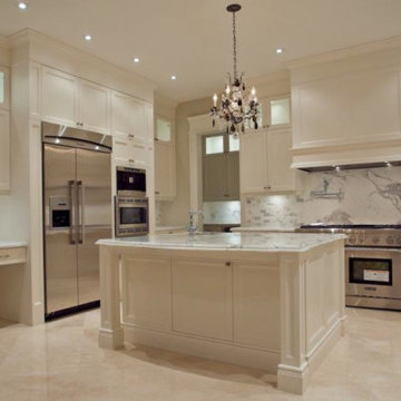
Contemporary kitchen cabinets are generally composed of minimal ornamentation and flat surfaces. The cabinetry style is intentionally non-traditional, avoiding decorative moldings in favor of simplicity and function.
Many contemporary kitchens have monochromatic color schemes, featuring various combinations of black, white, and gray. These kitchens tend to look very modern and sharp. Some contemporary designs, however, incorporate unique colors or exotic wood in order to create a visual impact and showcase the homeowner's favorite materials or hues.
 Walczak Design And Build
When our clients came to us, their master bathroom was doing them no favors. An awkwardly oversized corner tub that hadn't seen a bubble bath in years, a shower barely large enough to turn around in, and a color palette best described as "contractor default." The bones were there — a generously sized footprint — but the space had zero personality and even less function.
Our first move was rethinking how the square footage was being used. Out went the hulking corner tub, and in its place: a spa-worthy walk-in shower that finally earns the space it occupies. Classic white subway tile with soft gray grout lines gives it a timeless foundation, while dual showerheads — a traditional wall-mount and a ceiling-mounted rain shower — turn every morning into something worth waking up for. Built-in niches keep everything organized without interrupting the clean aesthetic.
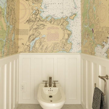
The commode room got a full character transplant. Wainscoting grounds the space with architectural detail, while a custom nautical map wallcovering wraps the room in something deeply personal — a curated cartographic love letter to the waterways and places that matter most to this family. The addition of a traditional pedestal bidet elevates both the function and the feeling of the space.
Back in the main bathroom, the clients' personality finally has a place to live. A bold, saturated blue on the custom double vanity cabinetry makes an unapologetic statement — the kind that makes you smile every time you walk in. Wall-mounted brushed nickel faucets and coordinating hardware keep the look polished and cohesive throughout. A heated towel rack and radiant heated floors are the quiet luxuries that tip this bathroom from "really nice" into "I never want to leave."
New windows flood the space with natural light, making the already generous footprint feel even more expansive and bringing out the best in every finish and material choice.
The result is a bathroom that works as hard as it looks good — and one that finally, unmistakably, feels like them.
 JRW Construction LLC
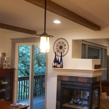
Craftsman-style wrapped beams are architectural elements that bring warmth and character to any room, reflecting the craftsmanship of the Arts and Crafts movement. These beams, made of stained wood, showcase their natural grain and enhance the overall design. Designed to give the appearance of supporting the ceiling, they create a visually striking effect that boosts the rustic charm of the space, making them a favored choice in homes that prioritize natural materials and intricate details.
 Almesedoors
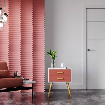
THE DOOR NAME ORIGIN - "ALLUMINIO ELIVIA PAINT 4HS"
One feature of this interior door model stands out among all others, to wit, the fact that here at Almese Doors we can work with pretty much any kind of budget. Allow me another intriguing observation: this one (this interior door, that is) is best suited to bulk orders. Which isn’t to say this one does not fall into the category of affordable luxury (just something we specialize in here at Almese Doors). It certainly does. It has most of the wonderful features characteristic of the brand to recommend it. It was lovingly and imaginatively designed. The name, should you be wondering, is a variation of that of the lovable, honest and faithful Shakespearean heroine (the play, of course, would be The Twelfth Night, one of the happiest and light-hearted comedies the bright British wordsmith ever composed, and arguably the most popular). Only natural wood is used to put it together, which is both aesthetically pleasant and env... Show more!
FINISH: WHITE
This is a bit tricky. Isn’t White the default finish that would look great on any interior door? Well, not quite.
W. is the color most often associated with perfection, honesty, cleanliness, newness, neutrality, and exactitude. The pigment has been known and used by humans since prehistoric times. In ancient Egypt, W. symbolized purity. Roman patricians paraded around in W. togas to distinguish themselves from the common folk. It was the color of choice of French monarchs. Architects of all epochs used W., with considerable enthusiasm, in various projects and for various reasons. In the United States, architects favored it when designing churches, capitols, and municipal buildings – which is, in fact, a tradition they inherited from classical and Renaissance architecture. According to some experts, most of the buildings in the celebrated Forum were either made of, or clad in, W. marble. In Taoism, it represents the yang or masculine energy, one of the two complementary natures of the universe. Many authors, both classical and contemporary, have referred to W. as a sign of purity, either physical (like William Shakespeare, whose treacherous usurper monarch wishes a heavenly rain would cleanse his blood-stained hand, washing it “white as snow”) or spiritual (like Tennessee Williams, who named his lead character Blanche (derived, incidentally, from the Germanic word blanc)) as a symbol of her innocent child-like spirit, perceptible from the moment she makes her first entrance (through the interior door stage-left).
Back in the Seventeenth Century, Sir Isaac Newton discovered that sunlight is composed of light with wavelengths across the visible spectrum which the human eye perceives as W. It is the lightest of the spectrum, and achromatic (hue-less) to boot, because it fully reflects and scatters all visible wavelengths of light, absorbing none. W. objects stand out in the dark. Depending on the surroundings, an interior door with W. finish might come off as emphatic or tactful, dominant or complementary. It blends seamlessly into most types of decor and, once the owner’s needs and disposition are taken into account, can symbolize - oh, so many different things, while bringing back a myriad memories: from those glorious snowy Alpine slopes and peaks to the fluffy tops of the wayward herd of cumulus cloud heap over the horizon on a balmy afternoon in the Caribbean. Tropical sand beaches are W. due to the high quantity of calcium carbonate they get from tiny bits of seashells ground to powder by the waves. In a number of cultures W. can also symbolize festivity, and be used lavishly to brighten up weddings, birthdays, and anniversaries. It is beautiful. Make sure it goes well with your interior door model, though.
 Drury Design
The Setup
The homeowners of this Barrington Hills residence approached Drury Design with a clear vision: transform their existing kitchen into a space that would better serve their active family of four. With two young children who are homeschooled and love to bake with their mom, plus two dogs, this kitchen needed to function as the true heart of the home.
The existing kitchen was functional but didn’t maximize the potential of the beautiful natural light and scenic views available through the floor-to-ceiling windows. The space was locked between the dining room and family room, which limited structural modifications, but the homeowners wanted to create a more family-friendly environment that would complement the warm walnut built-ins and furnishings in the adjacent dining room while staying true to the home’s overall aesthetic.
Design Objectives:
Create a highly functional workspace that accommodates multiple family members cooking and gathering simultaneously
Maximize the connection to the beautiful outdoor scenery and natural light through thoughtful design choices
Establish a cohesive color palette that complements the existing walnut elements in the adjacent dining room without becoming too tone-on-tone (aka “matchy matchy”)
Improve the seating arrangement to take advantage of the stunning views (rather than facing away from the windows)
Work within the existing architectural constraints, including a curved soffit that could not be removed
Increase storage capacity while maintaining clean, uncluttered sightlines throughout the space
Design Challenges:
The curved soffit presented a design dilemma of whether to echo the curve throughout the kitchen or work with it in a more subtle way
The relatively low ceiling height required careful consideration to avoid making the space feel cramped or cave-like
The existing hardwood floor could not be refinished, which meant the new kitchen footprint had to match or exceed the original layout exactly
Finding the right balance of warm and neutral tones to complement both the existing walnut elements nearby and the natural outdoor views proved challenging
The refrigerator placement was constrained by door swing requirements, which affected the entire layout and prevented centering the sink on the back wall
Rethinking the original seating, which faced inward toward the kitchen (turning backs to the beautiful windows and outdoor views)
Pendant lighting from the previous kitchen obstructed views to the outdoors despite the abundant natural light available
The Renewed Space
Design Solutions:
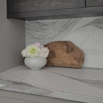
The curved soffit was embraced subtly through the full slab backsplash, which echoes the curve without requiring curved cabinetry or architectural elements that might feel forced
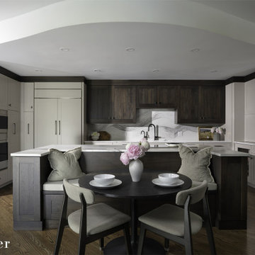
Low ceiling challenges were addressed by using lighter painted cabinets for some tall elements, including the double oven, pantries, and refrigerator area, creating an airy feel while reserving the darker stained walnut for the center section and island
The floor constraint was managed by designing the new layout to cover all previously unfinished areas while maintaining the exact footprint, with only minor touch-ups needed in a few areas
The color palette balances warm walnut stain (harmonizing with the dining room built-ins) with soft, neutral painted cabinets – avoiding stark white that wouldn’t complement the home’s warm aesthetic
Refrigerator placement was optimized with a slim pullout pantry to the left, allowing proper door clearance while maintaining the desired layout flow and enabling the main pantry to be positioned adjacently
The seating was completely reimagined with a built-in banquette facing the windows, allowing diners to enjoy the outdoor views while providing flexible seating for two to four people
Decorative pendant lighting was eliminated in favor of recessed can lights, preserving the unobstructed views to the beautiful outdoor scenery
This kitchen transformation demonstrates how thoughtful design can dramatically improve functionality for a busy family while honoring existing architectural elements. The children immediately began cooking and baking with their mother in the new space, and the window-facing banquette has become a favorite gathering spot where the family can enjoy both meals and the beautiful outdoor views.
 Drury Design
The Setup
The homeowners of this Barrington Hills residence approached Drury Design with a clear vision: transform their existing kitchen into a space that would better serve their active family of four. With two young children who are homeschooled and love to bake with their mom, plus two dogs, this kitchen needed to function as the true heart of the home.
The existing kitchen was functional but didn’t maximize the potential of the beautiful natural light and scenic views available through the floor-to-ceiling windows. The space was locked between the dining room and family room, which limited structural modifications, but the homeowners wanted to create a more family-friendly environment that would complement the warm walnut built-ins and furnishings in the adjacent dining room while staying true to the home’s overall aesthetic.
Design Objectives:
Create a highly functional workspace that accommodates multiple family members cooking and gathering simultaneously
Maximize the connection to the beautiful outdoor scenery and natural light through thoughtful design choices
Establish a cohesive color palette that complements the existing walnut elements in the adjacent dining room without becoming too tone-on-tone (aka “matchy matchy”)
Improve the seating arrangement to take advantage of the stunning views (rather than facing away from the windows)
Work within the existing architectural constraints, including a curved soffit that could not be removed
Increase storage capacity while maintaining clean, uncluttered sightlines throughout the space
Design Challenges:
The curved soffit presented a design dilemma of whether to echo the curve throughout the kitchen or work with it in a more subtle way
The relatively low ceiling height required careful consideration to avoid making the space feel cramped or cave-like
The existing hardwood floor could not be refinished, which meant the new kitchen footprint had to match or exceed the original layout exactly
Finding the right balance of warm and neutral tones to complement both the existing walnut elements nearby and the natural outdoor views proved challenging
The refrigerator placement was constrained by door swing requirements, which affected the entire layout and prevented centering the sink on the back wall
Rethinking the original seating, which faced inward toward the kitchen (turning backs to the beautiful windows and outdoor views)
Pendant lighting from the previous kitchen obstructed views to the outdoors despite the abundant natural light available
The Renewed Space
Design Solutions:
The curved soffit was embraced subtly through the full slab backsplash, which echoes the curve without requiring curved cabinetry or architectural elements that might feel forced
Low ceiling challenges were addressed by using lighter painted cabinets for some tall elements, including the double oven, pantries, and refrigerator area, creating an airy feel while reserving the darker stained walnut for the center section and island
The floor constraint was managed by designing the new layout to cover all previously unfinished areas while maintaining the exact footprint, with only minor touch-ups needed in a few areas
The color palette balances warm walnut stain (harmonizing with the dining room built-ins) with soft, neutral painted cabinets – avoiding stark white that wouldn’t complement the home’s warm aesthetic
Refrigerator placement was optimized with a slim pullout pantry to the left, allowing proper door clearance while maintaining the desired layout flow and enabling the main pantry to be positioned adjacently
The seating was completely reimagined with a built-in banquette facing the windows, allowing diners to enjoy the outdoor views while providing flexible seating for two to four people
Decorative pendant lighting was eliminated in favor of recessed can lights, preserving the unobstructed views to the beautiful outdoor scenery
This kitchen transformation demonstrates how thoughtful design can dramatically improve functionality for a busy family while honoring existing architectural elements. The children immediately began cooking and baking with their mother in the new space, and the window-facing banquette has become a favorite gathering spot where the family can enjoy both meals and the beautiful outdoor views.

 TaylorPro Design and Remodeling, Inc.
"We would definitely look TaylorPro up for future remodeling projects. We would also not hesitate to recommend TaylorPro's services based on our experience with our bathroom remodeling project.
Even prior to signing a contract with us, Mr Taylor (Kerry) was very patient with us and generous in sharing information pertaining to remodel options, material choices and general advice. At least one other dedicated 'Remodeler' we contacted thought we were too much of a nuisance and suggested we sign up before he could spend more time with us.
Kerry has a very transparent pricing policy, which allows someone unfamiliar with the scope of the work ( us) to understand the cost implications of each step or feature. His style allows complete flexibility in material choice. He also has a roster of 'favored suppliers' who extend sensible pricing to his clients.
Kerry also accommodates change requests at reasonable cost, while only requiring sufficient advance notice. Further, he was honest about not having expertise in certain features I wanted implemented - he executed them well anyway.
The job was very well planned and executed, with perhaps only one silent day in over 8 weeks of effort. We are very happy with this aspect also. Kerry remained very responsive to any issues or requests through the duration of the project.
We of course had set backs and surprises (+$) through the course of this project, but perhaps that is par for course.
Finally, a word about his crew: They were all courteous, trustworthy, efficient and pleasant. We were comfortable with their presence at home. "
~ Uma & Sumant I, Clients
Photo By: Kerry W. Taylor
 Drury Design
The Setup
The homeowners of this Barrington Hills residence approached Drury Design with a clear vision: transform their existing kitchen into a space that would better serve their active family of four. With two young children who are homeschooled and love to bake with their mom, plus two dogs, this kitchen needed to function as the true heart of the home.
The existing kitchen was functional but didn’t maximize the potential of the beautiful natural light and scenic views available through the floor-to-ceiling windows. The space was locked between the dining room and family room, which limited structural modifications, but the homeowners wanted to create a more family-friendly environment that would complement the warm walnut built-ins and furnishings in the adjacent dining room while staying true to the home’s overall aesthetic.
Design Objectives:
Create a highly functional workspace that accommodates multiple family members cooking and gathering simultaneously
Maximize the connection to the beautiful outdoor scenery and natural light through thoughtful design choices
Establish a cohesive color palette that complements the existing walnut elements in the adjacent dining room without becoming too tone-on-tone (aka “matchy matchy”)
Improve the seating arrangement to take advantage of the stunning views (rather than facing away from the windows)
Work within the existing architectural constraints, including a curved soffit that could not be removed
Increase storage capacity while maintaining clean, uncluttered sightlines throughout the space
Design Challenges:
The curved soffit presented a design dilemma of whether to echo the curve throughout the kitchen or work with it in a more subtle way
The relatively low ceiling height required careful consideration to avoid making the space feel cramped or cave-like
The existing hardwood floor could not be refinished, which meant the new kitchen footprint had to match or exceed the original layout exactly
Finding the right balance of warm and neutral tones to complement both the existing walnut elements nearby and the natural outdoor views proved challenging
The refrigerator placement was constrained by door swing requirements, which affected the entire layout and prevented centering the sink on the back wall
Rethinking the original seating, which faced inward toward the kitchen (turning backs to the beautiful windows and outdoor views)
Pendant lighting from the previous kitchen obstructed views to the outdoors despite the abundant natural light available
The Renewed Space
Design Solutions:
The curved soffit was embraced subtly through the full slab backsplash, which echoes the curve without requiring curved cabinetry or architectural elements that might feel forced
Low ceiling challenges were addressed by using lighter painted cabinets for some tall elements, including the double oven, pantries, and refrigerator area, creating an airy feel while reserving the darker stained walnut for the center section and island
The floor constraint was managed by designing the new layout to cover all previously unfinished areas while maintaining the exact footprint, with only minor touch-ups needed in a few areas
The color palette balances warm walnut stain (harmonizing with the dining room built-ins) with soft, neutral painted cabinets – avoiding stark white that wouldn’t complement the home’s warm aesthetic
Refrigerator placement was optimized with a slim pullout pantry to the left, allowing proper door clearance while maintaining the desired layout flow and enabling the main pantry to be positioned adjacently
The seating was completely reimagined with a built-in banquette facing the windows, allowing diners to enjoy the outdoor views while providing flexible seating for two to four people
Decorative pendant lighting was eliminated in favor of recessed can lights, preserving the unobstructed views to the beautiful outdoor scenery
This kitchen transformation demonstrates how thoughtful design can dramatically improve functionality for a busy family while honoring existing architectural elements. The children immediately began cooking and baking with their mother in the new space, and the window-facing banquette has become a favorite gathering spot where the family can enjoy both meals and the beautiful outdoor views.
 Rocky Tops Granite & Marble LLC
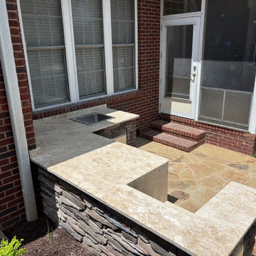
This outdoor kitchen in Lexington is built around 3cm unfilled travertine, and that's a material choice that says a lot about what this space is meant to do. Unfilled travertine keeps its natural pits and texture instead of having them smoothed over with resin, which means the surface reads as raw and organic rather than polished. Out here, under open sky and full sun, that texture works in the stone's favor. It doesn't glare back at you at midday and it doesn't get slick when a hose or a rain shower hits it.
The layout is an L-shaped countertop set over a stacked stone veneer base, with stainless steel drawers and cabinets tucked underneath and a built-in grill anchoring one leg of the L. There's a cutout in the counter for a sink or a cooler, which is the kind of detail that takes real planning at the template stage. You can't cut that opening freehand on site and expect clean lines. We measure twice, dry-fit the appliance or basin, and cut the stone to match before it ever leaves the shop.
Travertine outdoors is a practical call as much as a good-looking one. It handles heat well, which matters right next to a grill, and it won't crack or discolor the way some engineered materials can when they take direct sun for years. Unfilled travertine in particular breathes a little more than the filled version, so it doesn't trap moisture the way a sealed slab might. We finished the edges eased, which keeps the whole thing feeling soft and unfussy, no sharp lines to bang a hip on when you're moving between the grill and the prep space.
Outdoor kitchens take a beating that indoor ones never see: pollen, humidity, the occasional hard freeze here in the Midlands, direct sun for months at a stretch. Travertine's been used outdoors for centuries for exactly that reason, it ages instead of failing. Sealing it now and then keeps water from sitting in the pits, but even bare it holds up. This one in Lexington is set up to be used hard, grilled on, gathered around, and to look better for the wear rather than worse.
 Drury Design
The Setup
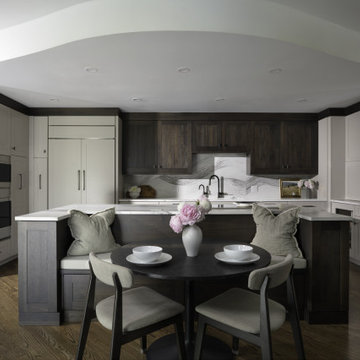
The homeowners of this Barrington Hills residence approached Drury Design with a clear vision: transform their existing kitchen into a space that would better serve their active family of four. With two young children who are homeschooled and love to bake with their mom, plus two dogs, this kitchen needed to function as the true heart of the home.
The existing kitchen was functional but didn’t maximize the potential of the beautiful natural light and scenic views available through the floor-to-ceiling windows. The space was locked between the dining room and family room, which limited structural modifications, but the homeowners wanted to create a more family-friendly environment that would complement the warm walnut built-ins and furnishings in the adjacent dining room while staying true to the home’s overall aesthetic.
Design Objectives:
Create a highly functional workspace that accommodates multiple family members cooking and gathering simultaneously
Maximize the connection to the beautiful outdoor scenery and natural light through thoughtful design choices
Establish a cohesive color palette that complements the existing walnut elements in the adjacent dining room without becoming too tone-on-tone (aka “matchy matchy”)
Improve the seating arrangement to take advantage of the stunning views (rather than facing away from the windows)
Work within the existing architectural constraints, including a curved soffit that could not be removed
Increase storage capacity while maintaining clean, uncluttered sightlines throughout the space
Design Challenges:
The curved soffit presented a design dilemma of whether to echo the curve throughout the kitchen or work with it in a more subtle way
The relatively low ceiling height required careful consideration to avoid making the space feel cramped or cave-like
The existing hardwood floor could not be refinished, which meant the new kitchen footprint had to match or exceed the original layout exactly
Finding the right balance of warm and neutral tones to complement both the existing walnut elements nearby and the natural outdoor views proved challenging
The refrigerator placement was constrained by door swing requirements, which affected the entire layout and prevented centering the sink on the back wall
Rethinking the original seating, which faced inward toward the kitchen (turning backs to the beautiful windows and outdoor views)
Pendant lighting from the previous kitchen obstructed views to the outdoors despite the abundant natural light available
The Renewed Space
Design Solutions:
The curved soffit was embraced subtly through the full slab backsplash, which echoes the curve without requiring curved cabinetry or architectural elements that might feel forced
Low ceiling challenges were addressed by using lighter painted cabinets for some tall elements, including the double oven, pantries, and refrigerator area, creating an airy feel while reserving the darker stained walnut for the center section and island
The floor constraint was managed by designing the new layout to cover all previously unfinished areas while maintaining the exact footprint, with only minor touch-ups needed in a few areas
The color palette balances warm walnut stain (harmonizing with the dining room built-ins) with soft, neutral painted cabinets – avoiding stark white that wouldn’t complement the home’s warm aesthetic
Refrigerator placement was optimized with a slim pullout pantry to the left, allowing proper door clearance while maintaining the desired layout flow and enabling the main pantry to be positioned adjacently
The seating was completely reimagined with a built-in banquette facing the windows, allowing diners to enjoy the outdoor views while providing flexible seating for two to four people
Decorative pendant lighting was eliminated in favor of recessed can lights, preserving the unobstructed views to the beautiful outdoor scenery
This kitchen transformation demonstrates how thoughtful design can dramatically improve functionality for a busy family while honoring existing architectural elements. The children immediately began cooking and baking with their mother in the new space, and the window-facing banquette has become a favorite gathering spot where the family can enjoy both meals and the beautiful outdoor views.
 Walczak Design And Build
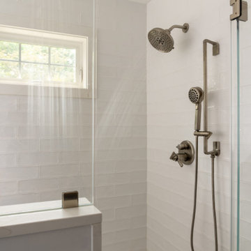
When our clients came to us, their master bathroom was doing them no favors. An awkwardly oversized corner tub that hadn't seen a bubble bath in years, a shower barely large enough to turn around in, and a color palette best described as "contractor default." The bones were there — a generously sized footprint — but the space had zero personality and even less function.
Our first move was rethinking how the square footage was being used. Out went the hulking corner tub, and in its place: a spa-worthy walk-in shower that finally earns the space it occupies. Classic white subway tile with soft gray grout lines gives it a timeless foundation, while dual showerheads — a traditional wall-mount and a ceiling-mounted rain shower — turn every morning into something worth waking up for. Built-in niches keep everything organized without interrupting the clean aesthetic.
The commode room got a full character transplant. Wainscoting grounds the space with architectural detail, while a custom nautical map wallcovering wraps the room in something deeply personal — a curated cartographic love letter to the waterways and places that matter most to this family. The addition of a traditional pedestal bidet elevates both the function and the feeling of the space.
Back in the main bathroom, the clients' personality finally has a place to live. A bold, saturated blue on the custom double vanity cabinetry makes an unapologetic statement — the kind that makes you smile every time you walk in. Wall-mounted brushed nickel faucets and coordinating hardware keep the look polished and cohesive throughout. A heated towel rack and radiant heated floors are the quiet luxuries that tip this bathroom from "really nice" into "I never want to leave."
New windows flood the space with natural light, making the already generous footprint feel even more expansive and bringing out the best in every finish and material choice.
The result is a bathroom that works as hard as it looks good — and one that finally, unmistakably, feels like them.
 Drury Design
The Setup
The homeowners of this Barrington Hills residence approached Drury Design with a clear vision: transform their existing kitchen into a space that would better serve their active family of four. With two young children who are homeschooled and love to bake with their mom, plus two dogs, this kitchen needed to function as the true heart of the home.
The existing kitchen was functional but didn’t maximize the potential of the beautiful natural light and scenic views available through the floor-to-ceiling windows. The space was locked between the dining room and family room, which limited structural modifications, but the homeowners wanted to create a more family-friendly environment that would complement the warm walnut built-ins and furnishings in the adjacent dining room while staying true to the home’s overall aesthetic.
Design Objectives:
Create a highly functional workspace that accommodates multiple family members cooking and gathering simultaneously
Maximize the connection to the beautiful outdoor scenery and natural light through thoughtful design choices
Establish a cohesive color palette that complements the existing walnut elements in the adjacent dining room without becoming too tone-on-tone (aka “matchy matchy”)
Improve the seating arrangement to take advantage of the stunning views (rather than facing away from the windows)
Work within the existing architectural constraints, including a curved soffit that could not be removed
Increase storage capacity while maintaining clean, uncluttered sightlines throughout the space
Design Challenges:
The curved soffit presented a design dilemma of whether to echo the curve throughout the kitchen or work with it in a more subtle way
The relatively low ceiling height required careful consideration to avoid making the space feel cramped or cave-like
The existing hardwood floor could not be refinished, which meant the new kitchen footprint had to match or exceed the original layout exactly
Finding the right balance of warm and neutral tones to complement both the existing walnut elements nearby and the natural outdoor views proved challenging
The refrigerator placement was constrained by door swing requirements, which affected the entire layout and prevented centering the sink on the back wall
Rethinking the original seating, which faced inward toward the kitchen (turning backs to the beautiful windows and outdoor views)
Pendant lighting from the previous kitchen obstructed views to the outdoors despite the abundant natural light available
The Renewed Space
Design Solutions:
The curved soffit was embraced subtly through the full slab backsplash, which echoes the curve without requiring curved cabinetry or architectural elements that might feel forced
Low ceiling challenges were addressed by using lighter painted cabinets for some tall elements, including the double oven, pantries, and refrigerator area, creating an airy feel while reserving the darker stained walnut for the center section and island
The floor constraint was managed by designing the new layout to cover all previously unfinished areas while maintaining the exact footprint, with only minor touch-ups needed in a few areas
The color palette balances warm walnut stain (harmonizing with the dining room built-ins) with soft, neutral painted cabinets – avoiding stark white that wouldn’t complement the home’s warm aesthetic
Refrigerator placement was optimized with a slim pullout pantry to the left, allowing proper door clearance while maintaining the desired layout flow and enabling the main pantry to be positioned adjacently
The seating was completely reimagined with a built-in banquette facing the windows, allowing diners to enjoy the outdoor views while providing flexible seating for two to four people
Decorative pendant lighting was eliminated in favor of recessed can lights, preserving the unobstructed views to the beautiful outdoor scenery
This kitchen transformation demonstrates how thoughtful design can dramatically improve functionality for a busy family while honoring existing architectural elements. The children immediately began cooking and baking with their mother in the new space, and the window-facing banquette has become a favorite gathering spot where the family can enjoy both meals and the beautiful outdoor views.
9