
Search results for "Feel established" in Home Design Ideas
 D. A. Dunlevy
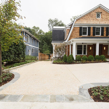
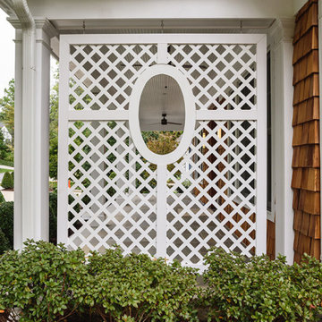
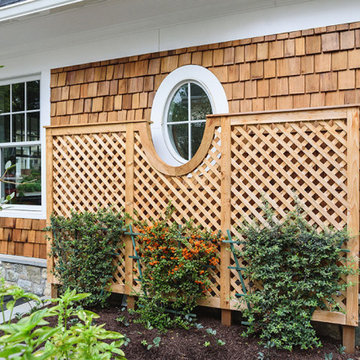
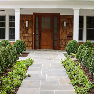
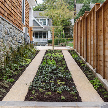
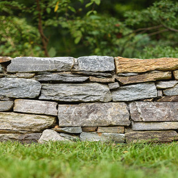
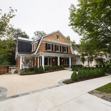
When new homes are put up in an older neighborhood, thoughtful landscape design can provide a more established feel. Our clients wanted beautiful plantings and aesthetically pleasing access to the garage behind the home. D. A. Dunlevy installed a heated parking area that leads to the subtle driveway. A stunning entry gate is trellised for ivy to eventually cover it, which will create a secret garden feel to an otherwise everyday feature. A unique trellised hydrangea curtain lines the drive and will add lush and shady beauty as the plants mature. More custom touches include a traditionally-stacked stone wall, porthole trellis screens that reflect the home’s architecture, and a cedar trellis with espaliered pyracantha. Every detail of this project served to create a well-established, inviting, and old-world feel to a new build.
 SM Design
St. Andrews Project — Primary Bathroom & Spa Retreat
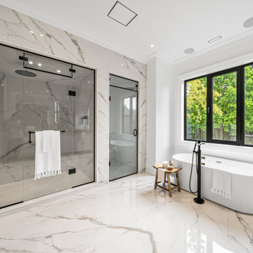
This St. Andrews primary bathroom is conceived as a private spa retreat, where material continuity, sculptural forms, and architectural restraint create a sense of understated luxury. The design intentionally avoids visual clutter, allowing the quality of the materials and precision of the detailing to define the space.
The room is anchored by a dramatic marble-look stone that extends continuously across the shower enclosure and floor, creating a seamless visual envelope. The expressive veining introduces movement and natural variation, transforming what could otherwise be a minimal white bathroom into a richly layered composition. Carrying the stone through multiple surfaces also gives the room a sense of scale and architectural cohesion.
The freestanding bathtub is treated as a sculptural object rather than simply a functional fixture. Its softly curved silhouette and vertically fluted exterior introduce an organic counterpoint to the linear geometry of the surrounding architecture. Positioned directly beneath the large black-framed window, the tub becomes a quiet focal point while taking advantage of abundant natural light and views toward the greenery beyond.
Black-framed glass creates another important layer of contrast. The expansive shower enclosure and adjacent glazed opening establish a crisp graphic framework against the pale stone, while black plumbing fixtures and hardware reinforce the same architectural language. This repeated use of black creates visual continuity without overwhelming the light palette.
The oversized window is particularly important to the atmosphere of the room. Instead of treating the bathroom as an enclosed, highly private environment, the design establishes a connection to nature, allowing daylight and greenery to become part of the experience. The result is a space that feels bright, open, and restorative.
A restrained wooden stool introduces warmth and an organic material note against the stone and glass. Its natural finish prevents the monochromatic palette from feeling overly clinical, while the simple form complements the sculptural bathtub.
The overall design is based on material continuity, contrast, and calm geometry. Veined stone provides movement, fluted surfaces provide texture, black metal provides definition, and natural wood introduces warmth. The result is a contemporary luxury bathroom that feels architectural, serene, and highly considered, more like a private wellness retreat than a conventional ensuite.
 Simply Perfect
With Pinterest, Houzz and HGTV, homeowners have more sources for inspiration than ever before. You may have found, however, that replicating what you see online or on TV isn’t always that simple. Mastering proportion and scale can be especially challenging.
Let’s say you fall in love with an oversized vase which looks like it will fit with the colors and textures in your living room. But once it’s there, the vase doesn’t look the way you expected and you don’t know now to make it work.
Fortunately, designers are experienced not only in dealing with proportion and scale, but in handling multiple elements at once.
In the meantime, here are a few tips to help you understand some of the considerations regarding size.
Proportion Tips
1. Less is more
In the home shown here, the rooms are on the smaller side, where it would seem counterintuitive to use oversized pieces. But using smaller pieces can look busy—and can actually make the rooms feel smaller, especially when you add personal belongings to the space.
2. Keep it simple
Several oversized pieces can create clean, simple lines. We put this principle to work using oversized items as anchors on both sides of the fireplace in the living room.
On one side, we have two oversized blown-glass vases with amber, silver and purple tones. The irregular shapes in these beautiful pieces create interest and contrast; you can see through them and you can see the room reflected in them.
On the other side of the fireplace sit two oversized brass lanterns filled with driftwood and greenery; the contents can be switched out seasonally, as well.
The vases on one side and lanterns on the other side establish pattern (two of each, in descending order), balance and simplicity.
3. Embrace the unexpected
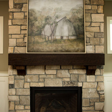
On the mantle above the fireplace rests another oversized piece—a painting of a barn. Its neutral colors pick up the tones in the stone behind it and again, it works to bring simplicity to the space, rather than overly fussy detail.
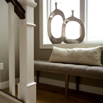
Nearby, just up the stairs, is an unusually spacious landing. A bench and pillows transform it into a special reading or conversation spot. The pair of hammered nickel vases on the window sill repeats the pattern established on either side of the fireplace. Using oversized vases in lieu of a window treatment is unexpected—as is incorporating sleek, modern-shaped vases like these in a farmhouse-style home. Yet because of the other oversized objects nearby, the vases feel distinctive and delightful.
4. Coordinate pattern and rhythm
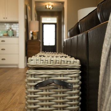
Another oversized item is the table lamp in the living room. It’s a powerful light; aside from the overhead can lights, it’s the room’s only light source. The ridges on its ceramic base echo the pieces of wicker in the stunning basket behind the sofa.
This oversized wicker basket, which we’re a bit in love with, features a very large weave along with elegant leather straps. It’s ideal for storing throws, cushions, board games or anything else you want out of sight.
5. Proximity matters
This home’s dining room is just to the right of the entry. An immense floor mirror—double-framed in weathered wood—is placed opposite the front windows. Measuring seven feet high, it’s a bold piece. And it works perfectly in this space to reflect light and make the room feel larger.
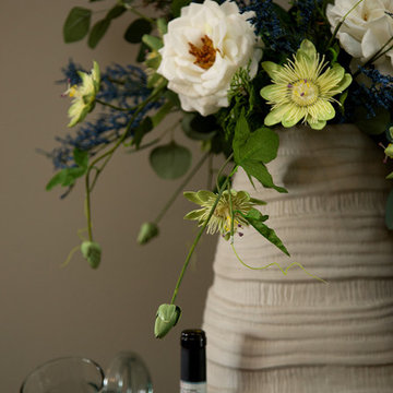
An oversized ceramic vase, with a porous, matte-stone finish, sits atop a table next to the mirror. Other regular-sized items share the small table, including a bottle of wine and a glass vase. But because of the enormous mirror, it was important to have one oversized item on that table, for balance.
Find the right local pro for your project
 D. A. Dunlevy
When new homes are put up in an older neighborhood, thoughtful landscape design can provide a more established feel. Our clients wanted beautiful plantings and aesthetically pleasing access to the garage behind the home. D. A. Dunlevy installed a heated parking area that leads to the subtle driveway. A stunning entry gate is trellised for ivy to eventually cover it, which will create a secret garden feel to an otherwise everyday feature. A unique trellised hydrangea curtain lines the drive and will add lush and shady beauty as the plants mature. More custom touches include a traditionally-stacked stone wall, porthole trellis screens that reflect the home’s architecture, and a cedar trellis with espaliered pyracantha. Every detail of this project served to create a well-established, inviting, and old-world feel to a new build.
 D. A. Dunlevy
When new homes are put up in an older neighborhood, thoughtful landscape design can provide a more established feel. Our clients wanted beautiful plantings and aesthetically pleasing access to the garage behind the home. D. A. Dunlevy installed a heated parking area that leads to the subtle driveway. A stunning entry gate is trellised for ivy to eventually cover it, which will create a secret garden feel to an otherwise everyday feature. A unique trellised hydrangea curtain lines the drive and will add lush and shady beauty as the plants mature. More custom touches include a traditionally-stacked stone wall, porthole trellis screens that reflect the home’s architecture, and a cedar trellis with espaliered pyracantha. Every detail of this project served to create a well-established, inviting, and old-world feel to a new build.
 Simply Perfect
With Pinterest, Houzz and HGTV, homeowners have more sources for inspiration than ever before. You may have found, however, that replicating what you see online or on TV isn’t always that simple. Mastering proportion and scale can be especially challenging.
Let’s say you fall in love with an oversized vase which looks like it will fit with the colors and textures in your living room. But once it’s there, the vase doesn’t look the way you expected and you don’t know now to make it work.
Fortunately, designers are experienced not only in dealing with proportion and scale, but in handling multiple elements at once.
In the meantime, here are a few tips to help you understand some of the considerations regarding size.
Proportion Tips
1. Less is more
In the home shown here, the rooms are on the smaller side, where it would seem counterintuitive to use oversized pieces. But using smaller pieces can look busy—and can actually make the rooms feel smaller, especially when you add personal belongings to the space.
2. Keep it simple
Several oversized pieces can create clean, simple lines. We put this principle to work using oversized items as anchors on both sides of the fireplace in the living room.
On one side, we have two oversized blown-glass vases with amber, silver and purple tones. The irregular shapes in these beautiful pieces create interest and contrast; you can see through them and you can see the room reflected in them.
On the other side of the fireplace sit two oversized brass lanterns filled with driftwood and greenery; the contents can be switched out seasonally, as well.
The vases on one side and lanterns on the other side establish pattern (two of each, in descending order), balance and simplicity.
3. Embrace the unexpected
On the mantle above the fireplace rests another oversized piece—a painting of a barn. Its neutral colors pick up the tones in the stone behind it and again, it works to bring simplicity to the space, rather than overly fussy detail.
Nearby, just up the stairs, is an unusually spacious landing. A bench and pillows transform it into a special reading or conversation spot. The pair of hammered nickel vases on the window sill repeats the pattern established on either side of the fireplace. Using oversized vases in lieu of a window treatment is unexpected—as is incorporating sleek, modern-shaped vases like these in a farmhouse-style home. Yet because of the other oversized objects nearby, the vases feel distinctive and delightful.
4. Coordinate pattern and rhythm
Another oversized item is the table lamp in the living room. It’s a powerful light; aside from the overhead can lights, it’s the room’s only light source. The ridges on its ceramic base echo the pieces of wicker in the stunning basket behind the sofa.
This oversized wicker basket, which we’re a bit in love with, features a very large weave along with elegant leather straps. It’s ideal for storing throws, cushions, board games or anything else you want out of sight.
5. Proximity matters
This home’s dining room is just to the right of the entry. An immense floor mirror—double-framed in weathered wood—is placed opposite the front windows. Measuring seven feet high, it’s a bold piece. And it works perfectly in this space to reflect light and make the room feel larger.
An oversized ceramic vase, with a porous, matte-stone finish, sits atop a table next to the mirror. Other regular-sized items share the small table, including a bottle of wine and a glass vase. But because of the enormous mirror, it was important to have one oversized item on that table, for balance.
 D. A. Dunlevy
When new homes are put up in an older neighborhood, thoughtful landscape design can provide a more established feel. Our clients wanted beautiful plantings and aesthetically pleasing access to the garage behind the home. D. A. Dunlevy installed a heated parking area that leads to the subtle driveway. A stunning entry gate is trellised for ivy to eventually cover it, which will create a secret garden feel to an otherwise everyday feature. A unique trellised hydrangea curtain lines the drive and will add lush and shady beauty as the plants mature. More custom touches include a traditionally-stacked stone wall, porthole trellis screens that reflect the home’s architecture, and a cedar trellis with espaliered pyracantha. Every detail of this project served to create a well-established, inviting, and old-world feel to a new build.

Sponsored
Delaware, OH

Buckeye Basements, Inc.
Central Ohio's Basement Finishing ExpertsBest Of Houzz '13-'21
 D. A. Dunlevy
When new homes are put up in an older neighborhood, thoughtful landscape design can provide a more established feel. Our clients wanted beautiful plantings and aesthetically pleasing access to the garage behind the home. D. A. Dunlevy installed a heated parking area that leads to the subtle driveway. A stunning entry gate is trellised for ivy to eventually cover it, which will create a secret garden feel to an otherwise everyday feature. A unique trellised hydrangea curtain lines the drive and will add lush and shady beauty as the plants mature. More custom touches include a traditionally-stacked stone wall, porthole trellis screens that reflect the home’s architecture, and a cedar trellis with espaliered pyracantha. Every detail of this project served to create a well-established, inviting, and old-world feel to a new build.
 D. A. Dunlevy
When new homes are put up in an older neighborhood, thoughtful landscape design can provide a more established feel. Our clients wanted beautiful plantings and aesthetically pleasing access to the garage behind the home. D. A. Dunlevy installed a heated parking area that leads to the subtle driveway. A stunning entry gate is trellised for ivy to eventually cover it, which will create a secret garden feel to an otherwise everyday feature. A unique trellised hydrangea curtain lines the drive and will add lush and shady beauty as the plants mature. More custom touches include a traditionally-stacked stone wall, porthole trellis screens that reflect the home’s architecture, and a cedar trellis with espaliered pyracantha. Every detail of this project served to create a well-established, inviting, and old-world feel to a new build.
 Simply Perfect
With Pinterest, Houzz and HGTV, homeowners have more sources for inspiration than ever before. You may have found, however, that replicating what you see online or on TV isn’t always that simple. Mastering proportion and scale can be especially challenging.
Let’s say you fall in love with an oversized vase which looks like it will fit with the colors and textures in your living room. But once it’s there, the vase doesn’t look the way you expected and you don’t know now to make it work.
Fortunately, designers are experienced not only in dealing with proportion and scale, but in handling multiple elements at once.
In the meantime, here are a few tips to help you understand some of the considerations regarding size.
Proportion Tips
1. Less is more
In the home shown here, the rooms are on the smaller side, where it would seem counterintuitive to use oversized pieces. But using smaller pieces can look busy—and can actually make the rooms feel smaller, especially when you add personal belongings to the space.
2. Keep it simple
Several oversized pieces can create clean, simple lines. We put this principle to work using oversized items as anchors on both sides of the fireplace in the living room.
On one side, we have two oversized blown-glass vases with amber, silver and purple tones. The irregular shapes in these beautiful pieces create interest and contrast; you can see through them and you can see the room reflected in them.
On the other side of the fireplace sit two oversized brass lanterns filled with driftwood and greenery; the contents can be switched out seasonally, as well.
The vases on one side and lanterns on the other side establish pattern (two of each, in descending order), balance and simplicity.
3. Embrace the unexpected
On the mantle above the fireplace rests another oversized piece—a painting of a barn. Its neutral colors pick up the tones in the stone behind it and again, it works to bring simplicity to the space, rather than overly fussy detail.
Nearby, just up the stairs, is an unusually spacious landing. A bench and pillows transform it into a special reading or conversation spot. The pair of hammered nickel vases on the window sill repeats the pattern established on either side of the fireplace. Using oversized vases in lieu of a window treatment is unexpected—as is incorporating sleek, modern-shaped vases like these in a farmhouse-style home. Yet because of the other oversized objects nearby, the vases feel distinctive and delightful.
4. Coordinate pattern and rhythm
Another oversized item is the table lamp in the living room. It’s a powerful light; aside from the overhead can lights, it’s the room’s only light source. The ridges on its ceramic base echo the pieces of wicker in the stunning basket behind the sofa.
This oversized wicker basket, which we’re a bit in love with, features a very large weave along with elegant leather straps. It’s ideal for storing throws, cushions, board games or anything else you want out of sight.
5. Proximity matters
This home’s dining room is just to the right of the entry. An immense floor mirror—double-framed in weathered wood—is placed opposite the front windows. Measuring seven feet high, it’s a bold piece. And it works perfectly in this space to reflect light and make the room feel larger.
An oversized ceramic vase, with a porous, matte-stone finish, sits atop a table next to the mirror. Other regular-sized items share the small table, including a bottle of wine and a glass vase. But because of the enormous mirror, it was important to have one oversized item on that table, for balance.
 Simply Perfect
With Pinterest, Houzz and HGTV, homeowners have more sources for inspiration than ever before. You may have found, however, that replicating what you see online or on TV isn’t always that simple. Mastering proportion and scale can be especially challenging.
Let’s say you fall in love with an oversized vase which looks like it will fit with the colors and textures in your living room. But once it’s there, the vase doesn’t look the way you expected and you don’t know now to make it work.
Fortunately, designers are experienced not only in dealing with proportion and scale, but in handling multiple elements at once.
In the meantime, here are a few tips to help you understand some of the considerations regarding size.
Proportion Tips
1. Less is more
In the home shown here, the rooms are on the smaller side, where it would seem counterintuitive to use oversized pieces. But using smaller pieces can look busy—and can actually make the rooms feel smaller, especially when you add personal belongings to the space.
2. Keep it simple
Several oversized pieces can create clean, simple lines. We put this principle to work using oversized items as anchors on both sides of the fireplace in the living room.
On one side, we have two oversized blown-glass vases with amber, silver and purple tones. The irregular shapes in these beautiful pieces create interest and contrast; you can see through them and you can see the room reflected in them.
On the other side of the fireplace sit two oversized brass lanterns filled with driftwood and greenery; the contents can be switched out seasonally, as well.
The vases on one side and lanterns on the other side establish pattern (two of each, in descending order), balance and simplicity.
3. Embrace the unexpected
On the mantle above the fireplace rests another oversized piece—a painting of a barn. Its neutral colors pick up the tones in the stone behind it and again, it works to bring simplicity to the space, rather than overly fussy detail.
Nearby, just up the stairs, is an unusually spacious landing. A bench and pillows transform it into a special reading or conversation spot. The pair of hammered nickel vases on the window sill repeats the pattern established on either side of the fireplace. Using oversized vases in lieu of a window treatment is unexpected—as is incorporating sleek, modern-shaped vases like these in a farmhouse-style home. Yet because of the other oversized objects nearby, the vases feel distinctive and delightful.
4. Coordinate pattern and rhythm
Another oversized item is the table lamp in the living room. It’s a powerful light; aside from the overhead can lights, it’s the room’s only light source. The ridges on its ceramic base echo the pieces of wicker in the stunning basket behind the sofa.
This oversized wicker basket, which we’re a bit in love with, features a very large weave along with elegant leather straps. It’s ideal for storing throws, cushions, board games or anything else you want out of sight.
5. Proximity matters
This home’s dining room is just to the right of the entry. An immense floor mirror—double-framed in weathered wood—is placed opposite the front windows. Measuring seven feet high, it’s a bold piece. And it works perfectly in this space to reflect light and make the room feel larger.
An oversized ceramic vase, with a porous, matte-stone finish, sits atop a table next to the mirror. Other regular-sized items share the small table, including a bottle of wine and a glass vase. But because of the enormous mirror, it was important to have one oversized item on that table, for balance.
 D. A. Dunlevy
When new homes are put up in an older neighborhood, thoughtful landscape design can provide a more established feel. Our clients wanted beautiful plantings and aesthetically pleasing access to the garage behind the home. D. A. Dunlevy installed a heated parking area that leads to the subtle driveway. A stunning entry gate is trellised for ivy to eventually cover it, which will create a secret garden feel to an otherwise everyday feature. A unique trellised hydrangea curtain lines the drive and will add lush and shady beauty as the plants mature. More custom touches include a traditionally-stacked stone wall, porthole trellis screens that reflect the home’s architecture, and a cedar trellis with espaliered pyracantha. Every detail of this project served to create a well-established, inviting, and old-world feel to a new build.
 SM Design
Bridle Path Residence — Primary Bedroom Suite
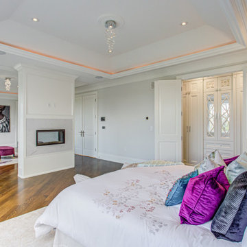
This Bridle Path Residence primary bedroom is designed as a quietly luxurious private retreat, balancing the architectural formality of the home with a softer, more intimate residential atmosphere. The space demonstrates how classical detailing can be paired with expressive colour, layered textiles, and contemporary lighting to create a bedroom that feels both elegant and personal.
The architecture establishes a calm, cohesive backdrop. Crisp white wall panelling, substantial crown moulding, and a carefully detailed recessed ceiling create a sense of proportion and permanence. Rather than competing with the furnishings, these architectural elements provide a restrained framework that allows texture, colour, and light to become the defining layers.
A custom fireplace creates an architectural focal point within the bedroom. Its clean, linear treatment is deliberately understated, allowing the fire itself to introduce warmth and atmosphere without overwhelming the room. The fireplace also visually connects the bedroom to the adjoining sitting area, creating a sense of continuity across the suite.
The recessed ceiling is an important design feature. Layered moulding frames the central ceiling plane, while concealed perimeter lighting creates a soft architectural glow. This indirect illumination gives the room a warmer evening character and highlights the geometry of the ceiling without relying solely on decorative fixtures.
The upholstered bed provides a substantial yet comfortable centrepiece. Its tall, softly rounded headboard introduces a tactile quality against the crisp architectural envelope, while the layered bedding and collection of jewel-toned cushions bring personality into the otherwise neutral setting.
Colour is used selectively but confidently. Deep fuchsia, sapphire blue, plum, and charcoal accents create a sophisticated jewel-tone palette that contrasts with the white architecture and pale textiles. These richer colours make the room feel curated and expressive while maintaining an overall sense of serenity.
The adjoining sitting area extends the bedroom beyond its sleeping function. A pair of sculptural upholstered chairs and a richly coloured ottoman create a small private lounge, allowing the suite to function as a complete retreat rather than simply a bedroom. Artwork introduces another layer of personality and creates a visual transition between the two spaces.
The hardwood flooring provides warmth and continuity, grounding the predominantly light palette and connecting the bedroom with the rest of the residence. The combination of wood, upholstered surfaces, reflective accents, architectural millwork, and soft lighting creates a carefully balanced sensory experience.
Overall, the design is an expression of refined residential luxury with a more personal and intimate character. Classical millwork establishes timelessness, while jewel-toned textiles, sculptural furnishings, contemporary lighting, and curated artwork prevent the room from feeling overly traditional. The result is a sophisticated primary suite designed for comfort, privacy, and understated glamour.


 Devine Bath & Kitchen
Northeast Portland is full of great old neighborhoods and houses bursting with character. The owners of this particular home had enjoyed their pink and blue bathroom’s quirky charm for years, but had finally outgrown its awkward layout and lack of functionality.
The Goal: Create a fresh, bright look for this bathroom that is both functional and fits the style of the home.
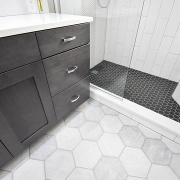
Step one was to establish the color scheme and style for our clients’ new bathroom. Bright whites and classic elements like marble, subway tile and penny-rounds helped establish a transitional style that didn’t feel “too modern” for the home.
When it comes to creating a more functional space, storage is key. The original bathroom featured a pedestal sink with no practical storage options. We designed a custom-built vanity with plenty of storage and useable counter space. And by opting for a durable, low-maintenance quartz countertop, we were able to create a beautiful marble-look without the hefty price-tag.
Next, we got rid of the old tub (and awkward shower outlet), and moved the entire shower-area to the back wall. This created a far more practical layout for this bathroom, providing more space for the large new vanity and the open, walk-in shower our clients were looking for.
 TAM INTERIORS LLC
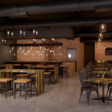
Renovated an optometry office into a casual quick service restaurant.
Minimalist home design photo in Denver
Minimalist home design photo in Denver



 Clark Design Build, LLC
This home is located on a one acre parcel of land near the banks of the Milwaukee River in the older established subdivision of Sleepy Hollow Estates in Mequon, Wisconsin. The inspiration for this Glen Cove Residence was to bring the desired by many, contemporary and modern lifestyle of a down town loft and establish it in a neighborhood in the suburbs amongst traditional style homes.
Sleepy Hollow Estates like many older established neighborhoods throughout the North shore and Westside communities of Milwaukee had great local architects such as John Randall McDonald and Russell Barr Williamson, who built contemporary master pieces amongst very traditional style homes. This created diversity in the style of homes in these neighborhoods which for the people living in them and the people just passing by, an experience of harmony and cultural lifestyle.
Unfortunately today, many new neighborhood developments lack harmony and cultural lifestyle and don’t allow for homes such as this Glen Cove Residence to be built. And for that matter many of the homes built by John Randall McDonald and Russell Barr Williamson back in the 1950’s. When driving through these new developments, one would experience beautiful traditional style homes, but all the homes tend to look the same. There is no diversity in the styles of homes thus these neighborhoods lack the harmony and a cultural life style for the people who live there or what people are looking for when buying a home that reflects their lifestyle. This Glen Cove Residence is an example that a contemporary home which offers a modern lifestyle that many desires can be established amongst traditional homes while blending in with the neighborhood.
Don’t be fooled by the flat roof of this home, building technology has come a long way since Frank Lloyd Wright! The roof system on this home is more energy efficient than most roof systems builders are putting on traditional homes today and it doesn’t leak! This Glen Cove Residence was built using all traditional building materials that you would see in homes being built in new developments today. There is a misconception out there that modern homes are expensive to build. That is not true! This Glen Cove Residence was built for roughly $130 per square foot which is the same price one would pay for a similar builder’s model traditional style home with the same upgrades.
This Glen Cove Residence consists of three bedrooms and three and one half baths. All bedrooms are located on second floor with laundry, guest bath and a master suite. Located between the first and second floors off of the landing is an office/den space. The first floor is open concept with the kitchen, dining and living areas located at the rear of the home with expansive windows allowing a great connection to back yard area and outdoors. On the back of the home is a covered deck area allowing for outdoor entertaining without the worry of the elements. The first floor also offers a powder room, mudroom and walk-in pantry off the kitchen area. From the mudroom there is access to an attached four car tandem garage. From the first floor to the finished basement is an open stair allowing the basement area to feel as part of the house and not just a basement? The basement consists of a main living area, game area with wet bar, exercise room, kids play room with 14’ ceilings, full bathroom and mechanical room with storage closets throughout.
 Storie Collective
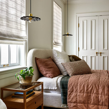
Stripped of its original charm with sagging floors and water leaks, this 1900 row house was prime for a full renovation. While the staircase and marble fireplace are original, everything from the white oak flooring, crown, applied, and base moldings, to the archways and brass door hardware is new; yet they all feel original to the house. Other projects included removing soffits and tucking away randomly placed support beams and posts, relocating and expanding the kitchen, renovating each bathroom – and adding a new one, upgrading all the mechanical, electric and plumbing systems, removing a fireplace, and regrading the back patio for proper drainage and added greenery. The project is a perfect study of juxtaposing new and old, classic and modern.
Photography Stacy Zarin Goldberg
 Devine Bath & Kitchen
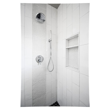
Northeast Portland is full of great old neighborhoods and houses bursting with character. The owners of this particular home had enjoyed their pink and blue bathroom’s quirky charm for years, but had finally outgrown its awkward layout and lack of functionality.
The Goal: Create a fresh, bright look for this bathroom that is both functional and fits the style of the home.
Step one was to establish the color scheme and style for our clients’ new bathroom. Bright whites and classic elements like marble, subway tile and penny-rounds helped establish a transitional style that didn’t feel “too modern” for the home.
When it comes to creating a more functional space, storage is key. The original bathroom featured a pedestal sink with no practical storage options. We designed a custom-built vanity with plenty of storage and useable counter space. And by opting for a durable, low-maintenance quartz countertop, we were able to create a beautiful marble-look without the hefty price-tag.
Next, we got rid of the old tub (and awkward shower outlet), and moved the entire shower-area to the back wall. This created a far more practical layout for this bathroom, providing more space for the large new vanity and the open, walk-in shower our clients were looking for.
20