
Search results for "Feel inviting" in Home Design Ideas
 LU Design Build
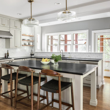
Our clients bought a beautiful century home in Historical Webster Groves, but it was in need of a modern day facelift. We took down dated walls in the kitchen and let the light in.
This family loves to cook and the old kitchen layout was closed in and choppy. The new layout is stocked with storage, professional appliances and plenty of sunlit workspace.
In the family room, the wood wainscoting was original and dark. We lightened up the room by painting everything a clean, clear white. The hardwood floors warm up the room and now it feels welcoming, bright and inviting.
Our last stop was the sunroom. It had baseboard heaters, old blue carpet and did not feel cozy and inviting! We replaced the carpet with Spanish clay tile that brings back the character of the old home - but includes a modern update - in floor heat.
We love how it turned out!
 TVL Creative Ltd.
Our clients had just recently closed on their new house in Stapleton and were excited to transform it into their perfect forever home. They wanted to remodel the entire first floor to create a more open floor plan and develop a smoother flow through the house that better fit the needs of their family. The original layout consisted of several small rooms that just weren’t very functional, so we decided to remove the walls that were breaking up the space and restructure the first floor to create a wonderfully open feel.
After removing the existing walls, we rearranged their spaces to give them an office at the front of the house, a large living room, and a large dining room that connects seamlessly with the kitchen. We also wanted to center the foyer in the home and allow more light to travel through the first floor, so we replaced their existing doors with beautiful custom sliding doors to the back yard and a gorgeous walnut door with side lights to greet guests at the front of their home.
Living Room
Our clients wanted a living room that could accommodate an inviting sectional, a baby grand piano, and plenty of space for family game nights. So, we transformed what had been a small office and sitting room into a large open living room with custom wood columns. We wanted to avoid making the home feel too vast and monumental, so we designed custom beams and columns to define spaces and to make the house feel like a home. Aesthetically we wanted their home to be soft and inviting, so we utilized a neutral color palette with occasional accents of muted blues and greens.
Dining Room
Our clients were also looking for a large dining room that was open to the rest of the home and perfect for big family gatherings. So, we removed what had been a small family room and eat-in dining area to create a spacious dining room with a fireplace and bar. We added custom cabinetry to the bar area with open shelving for displaying and designed a custom surround for their fireplace that ties in with the wood work we designed for their living room. We brought in the tones and materiality from the kitchen to unite the spaces and added a mixed metal light fixture to bring the space together
Kitchen
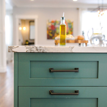
We wanted the kitchen to be a real show stopper and carry through the calm muted tones we were utilizing throughout their home. We reoriented the kitchen to allow for a big beautiful custom island and to give us the opportunity for a focal wall with cooktop and range hood. Their custom island was perfectly complimented with a dramatic quartz counter top and oversized pendants making it the real center of their home. Since they enter the kitchen first when coming from their detached garage, we included a small mud-room area right by the back door to catch everyone’s coats and shoes as they come in. We also created a new walk-in pantry with plenty of open storage and a fun chalkboard door for writing notes, recipes, and grocery lists.
Office
We transformed the original dining room into a handsome office at the front of the house. We designed custom walnut built-ins to house all of their books, and added glass french doors to give them a bit of privacy without making the space too closed off. We painted the room a deep muted blue to create a glimpse of rich color through the french doors
Powder Room
The powder room is a wonderful play on textures. We used a neutral palette with contrasting tones to create dramatic moments in this little space with accents of brushed gold.
Master Bathroom
The existing master bathroom had an awkward layout and outdated finishes, so we redesigned the space to create a clean layout with a dream worthy shower. We continued to use neutral tones that tie in with the rest of the home, but had fun playing with tile textures and patterns to create an eye-catching vanity. The wood-look tile planks along the floor provide a soft backdrop for their new free-standing bathtub and contrast beautifully with the deep ash finish on the cabinetry.
 dezign interiors, llc
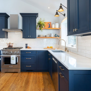
Small but mighty. This cramped, dark kitchen got a modern update. The ceiling was raised to give the small footprint a larger feel. The custom blue cabinets and special touches give it its warm, inviting feel.
Find the right local pro for your project
 Rockwood Cabinetry
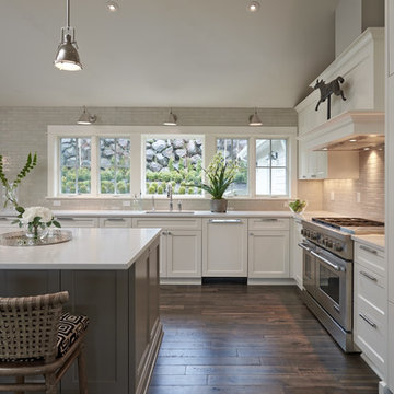
Remodel by Ostmo Construction
Design by Stephanie Tottingham, architect & Heidi Semler Interior Design
Photos by Dale Lang of NW Architectural Photography
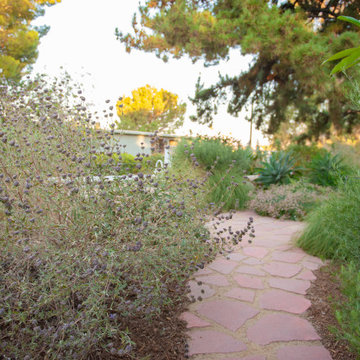
 FormLA Landscaping
At times, natural pavers reinforce the decomposed granite path as it weaves through foliage and over bioswales and active water features. The owners remove dry leaves from the native sages but keep seed heads to feed the birds. This garden sings!

 Twelve Stones Designs, LLC
The owners of this kitchen had spent the money to upgrade the finishes in their kitchen upon building the home 12 years ago, but after living in the space for several years they realized how nonfunctional the layout really was. The (then) two preschool aged children had grown into busy, hungry teenagers with many friends who also liked to hang out at the house. So the family needed a more functional kitchen with better traffic flow, space for daily activities revolving around the kitchen at different times of day, and a kitchen that could accommodate cooking for and serving large groups. Furthermore, the dark, traditional finishes no longer reflected the homeowners’ style. They requested a brighter, more relaxed, coastal style that reflected their love of the seaside cities they like to visit.
Originally, the kitchen was U-shaped with a narrow island in the middle. The island created narrow aisles that bottle-necked at the dishwasher, refrigerator, and cooktop areas. There was a pass-through from the foyer into the kitchen, but the owners never liked that the pass-through was also located so close to the powder room. The awkward proximity was unappealing and made guests feel uncomfortable.
The kitchen’s storage was made up of lots of narrow cabinets, apothecary drawers, clipped corner units, and very few drawers. It lacked useful storage for the larger items the family used on a daily basis. And the kitchen’s only pantry was small closet that had only builder-grade, narrow shelving with no illumination to be able to see the contents inside.
Overall, the kitchen’s lighting plan was poorly executed. Only six recessed cans illuminated the entire kitchen and nook areas. The under cabinet lighting was not evenly distributed either. In fact, the builder had mis-placed the under cabinet lighting around the decorative pilasters which made for choppy, dark cubbies. Further, the builder didn’t include any lighting over the sink or the bar area, which meant whoever was doing the dishes was always in their own shadow. That, coupled with the steep overhang of the game room above made the bar area feel like a dim, cavernous space that wasn’t inviting or task oriented. The kitchen looked out into the main living space, but the raised bar and a narrow wall (which held the only large cabinet in the kitchen) created more of a barrier than a relationship to the living room or breakfast nook. In fact, one couldn’t even see the breakfast nook from the cooktop or sink areas due to its orientation. The raised bar top was too narrow to comfortably sit to either dine at or chat from due to the lack of knee space. The the homeowners confided that the kitchen felt more like a dark, dirty prison than place where the family, or their guests, wanted to gather and commune.
The clients' needs and desires were:
➢ to create a kitchen that would be a space the family loved to be in; to relate to the adjacent spaces all around, and to have better flow for entertaining large groups
➢ to remove the walls between the breakfast nook and living area and to be able to utilize the natural light from the windows in both those areas
➢ to incorporate a functional chopping block for prepping fresh food for home cooked meals, an island with a large sink and drain board, 2 pull out trash cans, and seating for at least the 2 teens to eat or do homework
➢ to design a kitchen and breakfast nook with an airy, coastal, relaxed vibe that blended with the rest of the house's coastal theme
➢ to integrate a layered lighting plan which would include ample general illumination, specific task lighting, decorative lighting, and lots of illuminated storage
➢ to design a kitchen with not only more storage for all the husband’s kitchen gadgets and collection of oils and spices, but smart storage, including a coffee/breakfast bar and a place to store and conceal the toaster oven and microwave
➢ to find a way to utilize the large open space between the kitchen, pantry area, and breakfast nook
Twelve Stones Designs achieved the owner's goals by:
➢ removing the walls between the kitchen and living room to allow the natural light to filter in from the adjacent rooms and to create a connection between the kitchen, nook, and living spaces for a sense of unity and communion
➢ removing the existing pantry and designing 3 large pantry style cabinets with LED tape lights and rollout drawers to house lots of kitchen appliances, gadgets, and tons of groceries. We also took the cabinets all the way up to the 9’ ceiling for additional storage for seasonal items and bulk storage.
➢ designing 2 islands - 1 with a gorgeous black walnut chopping block that houses a drawer for chopping and carving knives and a custom double pull out trash unit for point of use utilization - and 1 that houses the dishwasher, a large Blanco Gourmet sink with integrated drain board, woven baskets for fresh root vegetables and kitchen towels, plenty of drawer storage for kitchen items, and bar seating for up to 4 diners.
➢ closing off the space between the kitchen and the powder room to create a beautiful new private alcove for the powder room as well as adding some decorative storage. This also gave us space to include more tall storage near the new range for precision placement of the husband’s extensive oil and spice collection as well as a location for a combo-steam oven the wife wanted for baking and cooking healthy meals.
The project is enhanced functionally by:
➢ incorporated USB and standard receptacles for the kids’ laptops and phone charging in the large island
➢ designing the small island to include additional open shelving for items used on a daily basis such as a variety of bowls, plates, and colanders. This set up also works well for the husband who prefers to “plate” his dinners in restaurant-style fashion before presenting them to the table.
➢ the integration of specific storage units, such as double stacked cutlery drawers, a custom spice pull-out, a Kuerig coffee and tea pod drawer, and custom double stacked utensil drawers
➢ moving the refrigerator to the old oven location - this eliminated the bottle neck as well as created a better relationship to the eating table. It also utilizes the floor space between the pantry, nook, and kitchen
➢ creating a banquet style breakfast nook - this banquette seating not only doubles the amount of seating for large gatherings but it better utilizes the odd space between the kitchen and the previous nook area. It also helps to create a distinct pathway from the mudroom room through the pantry area, kitchen, nook, and living room.
➢ the coffee/breakfast bar area which includes the perfect location for the concealed microwave and toaster oven, convenient storage for the coffee pods and tea accoutrements. Roll-out drawers below also house the smoothie maker, hot water kettle, and a plethora of smoothie-making ingredients such as protein powders, smoothie additives, etc. Furthermore, the drawers below the Keurig house measuring utensil, cutlery, baking supplies and tupperware storage.
➢ incorporating lots of wide drawers and pullouts to accommodate large cookware.
➢ utilizing as much vertical space as possible by building storage to the ceiling which accommodates the family’s abundant amount of serving platters, baking sheets, bakeware, casserole dishes, and additional cutting boards.
The project is enhanced aesthetically by:
➢ new 5-piece Versailles pattern porcelain tile that now seamlessly joins the entire down stairs area together creating a bright, cohesiveness feeling instead of choppy separated spaces - it also adds a coastal feeling
➢ designing a cabinet to conceal the microwave and toaster oven
➢ the coastal influenced light fixtures over the nook table and island
➢ the sandy colors of the Langdon Cambria countertops. The swirling pattern and sparkling quartz pieces remind the homeowner of black-and-tan sandy beaches
➢ the striped banquet seating whose creamy white background and blue-green stripes were the inspiration for the cabinet and wall colors.
➢ All the interior doors were painted black to coordinate with the blacks and grays in the backsplash tile and countertop. This also adds a hint of tailored formality to an otherwise casual space.
➢ the use of WAC's Oculux small aperture LED units for the overhead lighting complimented with Diode LED strips for task lighting under the cabinets and inside the pantry and glass wall cabinets. All of the lighting applications are on separate dimmer switches.
Innovative uses of materials or construction methods by Realty Restoration LLC:
➢ Each 1-1/2” x 3” block of reclaimed end-grain black walnut that makes up the center island chopping block was hand milled and built in the shop. It was designed to look substantial and proportional to the surrounding elements, executed by creating the 4 inch tall top with a solid wood chamfered edge band.
➢ The metal doors on either side of the vent hood were also custom designed for this project and built in the Realty Restoration LLC shop. They are made 1x2, 11-gauge mild steel with ribbed glass. Weighing 60 lbs a piece, heavy duty cabinet hinges were added to support the weight of the door and keep them from sagging.
➢ Under-cabinet receptacles were added along the range wall in order to have a clean, uninterrupted backsplash.
Design obstacles to overcome:
➢ Because we were removing the demising walls between the kitchen and living room, we had to find a way to plumb and vent the new island. We did this by tunneling through the slab (the slab had post tension cables which prevented us from just trenching) to run a new wet vent through a nearby structural wall. We pulled the existing hot and cold lines between upper floor joists and ran them down the structural wall as well and up through a conduit in the tunnel.
➢ Since we were converting from wall overs to a gas range it allowed us to utilize the 220 feed for the wall ovens to provide a new sub panel for all the new kitchen circuits
➢ Due to framing deficiencies inherited from the original build there was a 1-1/2” differential in the floor-to-ceiling height over a 20 foot span; by utilizing the process of cutting and furring coupled with the crown moulding details on the cabinet elevations we were able to mask the problem and provide seamless transitions between the cabinet components.
Evidence of superior craftsmanship:
➢ uniquely designed, one-of-a-kind metal “X” end panels on the large island. The end panels were custom made in the Realty Restoration LLC shop and fitted to the exact dimensions of the island. The welding seams are completely indistinguishable - the posts look like they are cut from a single sheet of metal
➢ square metal posts on the small island were also custom made and designed to compliment and carry through the metal element s throughout the kitchen
➢ the beautiful, oversized end panels on the pantry cabinets which give the breakfast nook a tailored look
➢ integrating a large format 5 piece Versailles tile pattern to seamlessly flow from the existing spaces into the new kitchen space
➢ By constructing a custom cabinet that jogged around a corner we could not remodel (housing the entry way coat closet) we were able to camouflage the adjacent wall offset within the upper and lower cabinets. By designing around the existing jog in the structural walls we accomplished a few things: we were able to find the space to house, and hide, the microwave and toaster oven yet still have a clean cohesive appearance from the kitchen side. Additionally, the owners were able to keep their much needed coat closet and we didn’t have to increase the budget with unnecessary structural work.
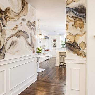
 House of L
A 1927 colonial home in Shaker Heights, Ohio, received a breathtaking renovation that required extensive work, transforming it from a tucked away, utilitarian space, to an all-purpose gathering room, a role that most kitchens embrace in a home today. The scope of work changed over the course of the project, starting more minimalistically and then quickly becoming the main focus of the house's remodeling, resulting in a staircase being relocated and walls being torn down to create an inviting focal point to the home where family and friends could connect. The focus of the functionality was to allow for multiple prep areas with the inclusion of two islands and sinks, two eating areas (one for impromptu snacking and small meals of younger family members and friends on island no. two and a built-in bench seat for everyday meals in the immediate family). The kitchen was equipped with all Subzero and Wolf appliances, including a 48" range top with a 12" griddle, two double ovens, a 42" built-in side by side refrigerator and freezer, a microwave drawer on island no. one and a beverage center and icemaker in island no. two. The aesthetic feeling embraces the architectural feel of the home while adding a modern sensibility with the revamped layout and graphic elements that tie the color palette of whites, chocolate and charcoal. The cabinets were custom made and outfitted with beaded inset doors with a Shaker panel frame and finished in Benjamin Moore's OC-17 White Dove, a soft white that allowed for the kitchen to feel warm while still maintaining its brightness. Accents of walnut were added to create a sense of warmth, including a custom premium grade walnut countertop on island no. one from Brooks Custom and a TV cabinet with a doggie feeding station beneath. Bringing the cabinet line to the 8'6" ceiling height helps the room feel taller and bold light fixtures at the islands and eating area add detail to an otherwise simpler ceiling detail. The 1 1/4" countertops feature Calacatta Gold Marble with an ogee edge detail. Special touches on the interiors include secret storage panels, an appliance garage, breadbox, pull-out drawers behind the cabinet doors and all soft-close hinges and drawer glides. A kneading area was made as a part of island no. one for the homeowners' love of baking, complete with a stone top allowing for dough to stay cool. Baskets beneath store kitchen essentials that need air circulation. The room adjacent to the kitchen was converted to a hearth room (from a formal dining room) to extend the kitchen's living space and allow for a natural spillover for family and guests to spill into.
Jason Miller, Pixelate


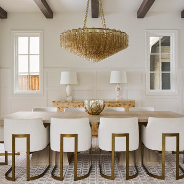
 Le Belle Maison Interiors Inc.
Inspiration for a large transitional light wood floor enclosed dining room remodel in Dallas with white walls
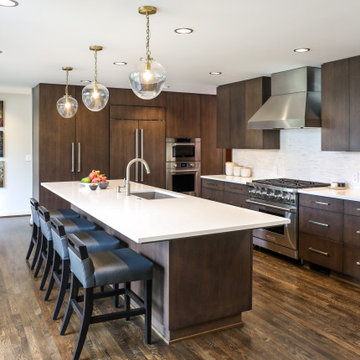
 Wendy O'Brien Interior Planning & Design
This was a full remodel of a classic Mid-Century home in the sought after Bridlemile neighborhood in Portland, OR. We specified updated yet timeless materials, finishes and custom furnishings respectful of the era and architecture of the home. The home was featured in House Beautiful in 1969 and Oregon Home in 2018, almost 50 years later. Be sure to take a look at the "before" photos to see the transformation.
For more photos of this project visit our website: https://wendyobrienid.com.
Photography by Valve Interactive: https://valveinteractive.com/
 Twelve Stones Designs, LLC
The owners of this kitchen had spent the money to upgrade the finishes in their kitchen upon building the home 12 years ago, but after living in the space for several years they realized how nonfunctional the layout really was. The (then) two preschool aged children had grown into busy, hungry teenagers with many friends who also liked to hang out at the house. So the family needed a more functional kitchen with better traffic flow, space for daily activities revolving around the kitchen at different times of day, and a kitchen that could accommodate cooking for and serving large groups. Furthermore, the dark, traditional finishes no longer reflected the homeowners’ style. They requested a brighter, more relaxed, coastal style that reflected their love of the seaside cities they like to visit.
Originally, the kitchen was U-shaped with a narrow island in the middle. The island created narrow aisles that bottle-necked at the dishwasher, refrigerator, and cooktop areas. There was a pass-through from the foyer into the kitchen, but the owners never liked that the pass-through was also located so close to the powder room. The awkward proximity was unappealing and made guests feel uncomfortable.
The kitchen’s storage was made up of lots of narrow cabinets, apothecary drawers, clipped corner units, and very few drawers. It lacked useful storage for the larger items the family used on a daily basis. And the kitchen’s only pantry was small closet that had only builder-grade, narrow shelving with no illumination to be able to see the contents inside.
Overall, the kitchen’s lighting plan was poorly executed. Only six recessed cans illuminated the entire kitchen and nook areas. The under cabinet lighting was not evenly distributed either. In fact, the builder had mis-placed the under cabinet lighting around the decorative pilasters which made for choppy, dark cubbies. Further, the builder didn’t include any lighting over the sink or the bar area, which meant whoever was doing the dishes was always in their own shadow. That, coupled with the steep overhang of the game room above made the bar area feel like a dim, cavernous space that wasn’t inviting or task oriented. The kitchen looked out into the main living space, but the raised bar and a narrow wall (which held the only large cabinet in the kitchen) created more of a barrier than a relationship to the living room or breakfast nook. In fact, one couldn’t even see the breakfast nook from the cooktop or sink areas due to its orientation. The raised bar top was too narrow to comfortably sit to either dine at or chat from due to the lack of knee space. The the homeowners confided that the kitchen felt more like a dark, dirty prison than place where the family, or their guests, wanted to gather and commune.
The clients' needs and desires were:
➢ to create a kitchen that would be a space the family loved to be in; to relate to the adjacent spaces all around, and to have better flow for entertaining large groups
➢ to remove the walls between the breakfast nook and living area and to be able to utilize the natural light from the windows in both those areas
➢ to incorporate a functional chopping block for prepping fresh food for home cooked meals, an island with a large sink and drain board, 2 pull out trash cans, and seating for at least the 2 teens to eat or do homework
➢ to design a kitchen and breakfast nook with an airy, coastal, relaxed vibe that blended with the rest of the house's coastal theme
➢ to integrate a layered lighting plan which would include ample general illumination, specific task lighting, decorative lighting, and lots of illuminated storage
➢ to design a kitchen with not only more storage for all the husband’s kitchen gadgets and collection of oils and spices, but smart storage, including a coffee/breakfast bar and a place to store and conceal the toaster oven and microwave
➢ to find a way to utilize the large open space between the kitchen, pantry area, and breakfast nook
Twelve Stones Designs achieved the owner's goals by:
➢ removing the walls between the kitchen and living room to allow the natural light to filter in from the adjacent rooms and to create a connection between the kitchen, nook, and living spaces for a sense of unity and communion
➢ removing the existing pantry and designing 3 large pantry style cabinets with LED tape lights and rollout drawers to house lots of kitchen appliances, gadgets, and tons of groceries. We also took the cabinets all the way up to the 9’ ceiling for additional storage for seasonal items and bulk storage.
➢ designing 2 islands - 1 with a gorgeous black walnut chopping block that houses a drawer for chopping and carving knives and a custom double pull out trash unit for point of use utilization - and 1 that houses the dishwasher, a large Blanco Gourmet sink with integrated drain board, woven baskets for fresh root vegetables and kitchen towels, plenty of drawer storage for kitchen items, and bar seating for up to 4 diners.
➢ closing off the space between the kitchen and the powder room to create a beautiful new private alcove for the powder room as well as adding some decorative storage. This also gave us space to include more tall storage near the new range for precision placement of the husband’s extensive oil and spice collection as well as a location for a combo-steam oven the wife wanted for baking and cooking healthy meals.
The project is enhanced functionally by:
➢ incorporated USB and standard receptacles for the kids’ laptops and phone charging in the large island
➢ designing the small island to include additional open shelving for items used on a daily basis such as a variety of bowls, plates, and colanders. This set up also works well for the husband who prefers to “plate” his dinners in restaurant-style fashion before presenting them to the table.
➢ the integration of specific storage units, such as double stacked cutlery drawers, a custom spice pull-out, a Kuerig coffee and tea pod drawer, and custom double stacked utensil drawers
➢ moving the refrigerator to the old oven location - this eliminated the bottle neck as well as created a better relationship to the eating table. It also utilizes the floor space between the pantry, nook, and kitchen
➢ creating a banquet style breakfast nook - this banquette seating not only doubles the amount of seating for large gatherings but it better utilizes the odd space between the kitchen and the previous nook area. It also helps to create a distinct pathway from the mudroom room through the pantry area, kitchen, nook, and living room.
➢ the coffee/breakfast bar area which includes the perfect location for the concealed microwave and toaster oven, convenient storage for the coffee pods and tea accoutrements. Roll-out drawers below also house the smoothie maker, hot water kettle, and a plethora of smoothie-making ingredients such as protein powders, smoothie additives, etc. Furthermore, the drawers below the Keurig house measuring utensil, cutlery, baking supplies and tupperware storage.
➢ incorporating lots of wide drawers and pullouts to accommodate large cookware.
➢ utilizing as much vertical space as possible by building storage to the ceiling which accommodates the family’s abundant amount of serving platters, baking sheets, bakeware, casserole dishes, and additional cutting boards.
The project is enhanced aesthetically by:
➢ new 5-piece Versailles pattern porcelain tile that now seamlessly joins the entire down stairs area together creating a bright, cohesiveness feeling instead of choppy separated spaces - it also adds a coastal feeling
➢ designing a cabinet to conceal the microwave and toaster oven
➢ the coastal influenced light fixtures over the nook table and island
➢ the sandy colors of the Langdon Cambria countertops. The swirling pattern and sparkling quartz pieces remind the homeowner of black-and-tan sandy beaches
➢ the striped banquet seating whose creamy white background and blue-green stripes were the inspiration for the cabinet and wall colors.
➢ All the interior doors were painted black to coordinate with the blacks and grays in the backsplash tile and countertop. This also adds a hint of tailored formality to an otherwise casual space.
➢ the use of WAC's Oculux small aperture LED units for the overhead lighting complimented with Diode LED strips for task lighting under the cabinets and inside the pantry and glass wall cabinets. All of the lighting applications are on separate dimmer switches.
Innovative uses of materials or construction methods by Realty Restoration LLC:
➢ Each 1-1/2” x 3” block of reclaimed end-grain black walnut that makes up the center island chopping block was hand milled and built in the shop. It was designed to look substantial and proportional to the surrounding elements, executed by creating the 4 inch tall top with a solid wood chamfered edge band.
➢ The metal doors on either side of the vent hood were also custom designed for this project and built in the Realty Restoration LLC shop. They are made 1x2, 11-gauge mild steel with ribbed glass. Weighing 60 lbs a piece, heavy duty cabinet hinges were added to support the weight of the door and keep them from sagging.
➢ Under-cabinet receptacles were added along the range wall in order to have a clean, uninterrupted backsplash.
Design obstacles to overcome:
➢ Because we were removing the demising walls between the kitchen and living room, we had to find a way to plumb and vent the new island. We did this by tunneling through the slab (the slab had post tension cables which prevented us from just trenching) to run a new wet vent through a nearby structural wall. We pulled the existing hot and cold lines between upper floor joists and ran them down the structural wall as well and up through a conduit in the tunnel.
➢ Since we were converting from wall overs to a gas range it allowed us to utilize the 220 feed for the wall ovens to provide a new sub panel for all the new kitchen circuits
➢ Due to framing deficiencies inherited from the original build there was a 1-1/2” differential in the floor-to-ceiling height over a 20 foot span; by utilizing the process of cutting and furring coupled with the crown moulding details on the cabinet elevations we were able to mask the problem and provide seamless transitions between the cabinet components.
Evidence of superior craftsmanship:
➢ uniquely designed, one-of-a-kind metal “X” end panels on the large island. The end panels were custom made in the Realty Restoration LLC shop and fitted to the exact dimensions of the island. The welding seams are completely indistinguishable - the posts look like they are cut from a single sheet of metal
➢ square metal posts on the small island were also custom made and designed to compliment and carry through the metal element s throughout the kitchen
➢ the beautiful, oversized end panels on the pantry cabinets which give the breakfast nook a tailored look
➢ integrating a large format 5 piece Versailles tile pattern to seamlessly flow from the existing spaces into the new kitchen space
➢ By constructing a custom cabinet that jogged around a corner we could not remodel (housing the entry way coat closet) we were able to camouflage the adjacent wall offset within the upper and lower cabinets. By designing around the existing jog in the structural walls we accomplished a few things: we were able to find the space to house, and hide, the microwave and toaster oven yet still have a clean cohesive appearance from the kitchen side. Additionally, the owners were able to keep their much needed coat closet and we didn’t have to increase the budget with unnecessary structural work.
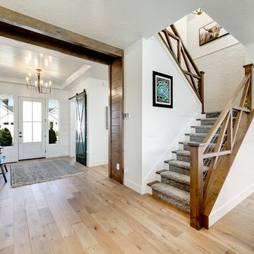
 Solitude Homes
Mid-sized farmhouse carpeted u-shaped wood railing staircase photo in Boise with carpeted risers
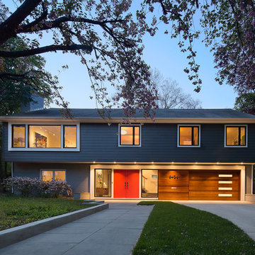
 Balodemas Architects
Anice Hoachlander, Hoachlander Davis Photography
Large mid-century modern gray split-level mixed siding gable roof idea in DC Metro
Large mid-century modern gray split-level mixed siding gable roof idea in DC Metro
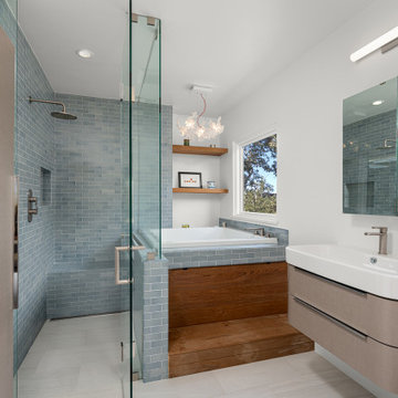
 Diane Waingrow Architect AIA
Trendy master subway tile wood-look tile floor, beige floor and single-sink bathroom photo in Los Angeles with flat-panel cabinets, beige cabinets, white walls, an integrated sink, a hinged shower door, white countertops and a floating vanity

Sponsored
Delaware, OH

Buckeye Basements, Inc.
Central Ohio's Basement Finishing ExpertsBest Of Houzz '13-'21
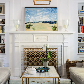
 Safferstone Interiors
Meet Meridith: a super-mom who’s as busy as she is badass — and easily my favorite overachiever. She slays her office job and comes home to an equally high-octane family life.
We share a love for city living with farmhouse aspirations. There’s a vegetable garden in the backyard, a black cat, and a floppy eared rabbit named Rocky. There has been a mobile chicken coop and a colony of bees in the backyard. At one point they even had a pregnant hedgehog on their hands!
Between gardening, entertaining, and helping with homework, Meridith has zero time for interior design. Spending several days a week in New York for work, she has limited amount of time at home with her family. My goal was to let her make the most of it by taking her design projects off her to do list and let her get back to her family (and rabbit).
I wanted her to spend her weekends at her son's baseball games, not shopping for sofas. That’s my cue!
Meridith is wonderful. She is one of the kindest people I know. We had so much fun, it doesn’t seem fair to call this “work”. She is loving, and smart, and funny. She’s one of those girlfriends everyone wants to call their own best friend. I wanted her house to reflect that: to feel cozy and inviting, and encourage guests to stay a while.
Meridith is not your average beige person, and she has excellent taste. Plus, she was totally hands-on with design choices. It was a true collaboration. We played up her quirky side and built usable, inspiring spaces one lightbulb moment at a time.
I took her love for color (sacré blue!) and immediately started creating a plan for her space and thinking about her design wish list. I set out hunting for vibrant hues and intriguing patterns that spoke to her color palette and taste for pattern.
I focused on creating the right vibe in each space: a bit of drama in the dining room, a bit more refined and quiet atmosphere for the living room, and a neutral zen tone in their master bedroom.
Her stuff. My eye.
Meridith’s impeccable taste comes through in her art collection. The perfect placement of her beautiful paintings served as the design model for color and mood.
We had a bit of a chair graveyard on our hands, but we worked with some key pieces of her existing furniture and incorporated other traditional pieces, which struck a pleasant balance. French chairs, Asian-influenced footstools, turned legs, gilded finishes, glass hurricanes – a wonderful mash-up of traditional and contemporary.
Some special touches were custom-made (the marble backsplash in the powder room, the kitchen banquette) and others were happy accidents (a wallpaper we spotted via Pinterest). They all came together in a design aesthetic that feels warm, inviting, and vibrant — just like Meridith!
We built her space based on function.
We asked ourselves, “how will her family use each room on any given day?” Meridith throws legendary dinner parties, so we needed curated seating arrangements that could easily switch from family meals to elegant entertaining. We sought a cozy eat-in kitchen and decongested entryways that still made a statement. Above all, we wanted Meredith’s style and panache to shine through every detail. From the pendant in the entryway, to a wild use of pattern in her dining room drapery, Meredith’s space was a total win. See more of our work at www.safferstone.com. Connect with us on Facebook, get inspired on Pinterest, and share modern musings on life & design on Instagram. Or, share what's on your plate with us at hello@safferstone.com.
Photo: Angie Seckinger
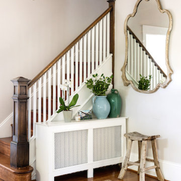 Safferstone Interiors
Meet Meridith: a super-mom who’s as busy as she is badass — and easily my favorite overachiever. She slays her office job and comes home to an equally high-octane family life.
We share a love for city living with farmhouse aspirations. There’s a vegetable garden in the backyard, a black cat, and a floppy eared rabbit named Rocky. There has been a mobile chicken coop and a colony of bees in the backyard. At one point they even had a pregnant hedgehog on their hands!
Between gardening, entertaining, and helping with homework, Meridith has zero time for interior design. Spending several days a week in New York for work, she has limited amount of time at home with her family. My goal was to let her make the most of it by taking her design projects off her to do list and let her get back to her family (and rabbit).
I wanted her to spend her weekends at her son's baseball games, not shopping for sofas. That’s my cue!
Meridith is wonderful. She is one of the kindest people I know. We had so much fun, it doesn’t seem fair to call this “work”. She is loving, and smart, and funny. She’s one of those girlfriends everyone wants to call their own best friend. I wanted her house to reflect that: to feel cozy and inviting, and encourage guests to stay a while.
Meridith is not your average beige person, and she has excellent taste. Plus, she was totally hands-on with design choices. It was a true collaboration. We played up her quirky side and built usable, inspiring spaces one lightbulb moment at a time.
I took her love for color (sacré blue!) and immediately started creating a plan for her space and thinking about her design wish list. I set out hunting for vibrant hues and intriguing patterns that spoke to her color palette and taste for pattern.
I focused on creating the right vibe in each space: a bit of drama in the dining room, a bit more refined and quiet atmosphere for the living room, and a neutral zen tone in their master bedroom.
Her stuff. My eye.
Meridith’s impeccable taste comes through in her art collection. The perfect placement of her beautiful paintings served as the design model for color and mood.
We had a bit of a chair graveyard on our hands, but we worked with some key pieces of her existing furniture and incorporated other traditional pieces, which struck a pleasant balance. French chairs, Asian-influenced footstools, turned legs, gilded finishes, glass hurricanes – a wonderful mash-up of traditional and contemporary.
Some special touches were custom-made (the marble backsplash in the powder room, the kitchen banquette) and others were happy accidents (a wallpaper we spotted via Pinterest). They all came together in a design aesthetic that feels warm, inviting, and vibrant — just like Meridith!
We built her space based on function.
We asked ourselves, “how will her family use each room on any given day?” Meridith throws legendary dinner parties, so we needed curated seating arrangements that could easily switch from family meals to elegant entertaining. We sought a cozy eat-in kitchen and decongested entryways that still made a statement. Above all, we wanted Meredith’s style and panache to shine through every detail. From the pendant in the entryway, to a wild use of pattern in her dining room drapery, Meredith’s space was a total win. See more of our work at www.safferstone.com. Connect with us on Facebook, get inspired on Pinterest, and share modern musings on life & design on Instagram. Or, share what's on your plate with us at hello@safferstone.com.
Photo: Angie Seckinger
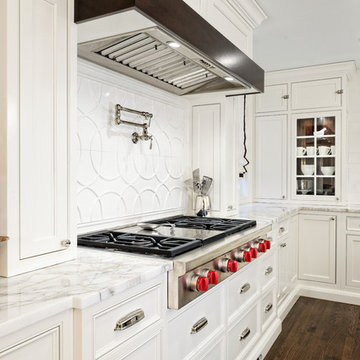 House of L
A 1927 colonial home in Shaker Heights, Ohio, received a breathtaking renovation that required extensive work, transforming it from a tucked away, utilitarian space, to an all-purpose gathering room, a role that most kitchens embrace in a home today. The scope of work changed over the course of the project, starting more minimalistically and then quickly becoming the main focus of the house's remodeling, resulting in a staircase being relocated and walls being torn down to create an inviting focal point to the home where family and friends could connect. The focus of the functionality was to allow for multiple prep areas with the inclusion of two islands and sinks, two eating areas (one for impromptu snacking and small meals of younger family members and friends on island no. two and a built-in bench seat for everyday meals in the immediate family). The kitchen was equipped with all Subzero and Wolf appliances, including a 48" range top with a 12" griddle, two double ovens, a 42" built-in side by side refrigerator and freezer, a microwave drawer on island no. one and a beverage center and icemaker in island no. two. The aesthetic feeling embraces the architectural feel of the home while adding a modern sensibility with the revamped layout and graphic elements that tie the color palette of whites, chocolate and charcoal. The cabinets were custom made and outfitted with beaded inset doors with a Shaker panel frame and finished in Benjamin Moore's OC-17 White Dove, a soft white that allowed for the kitchen to feel warm while still maintaining its brightness. Accents of walnut were added to create a sense of warmth, including a custom premium grade walnut countertop on island no. one from Brooks Custom and a TV cabinet with a doggie feeding station beneath. Bringing the cabinet line to the 8'6" ceiling height helps the room feel taller and bold light fixtures at the islands and eating area add detail to an otherwise simpler ceiling detail. The 1 1/4" countertops feature Calacatta Gold Marble with an ogee edge detail. Special touches on the interiors include secret storage panels, an appliance garage, breadbox, pull-out drawers behind the cabinet doors and all soft-close hinges and drawer glides. A kneading area was made as a part of island no. one for the homeowners' love of baking, complete with a stone top allowing for dough to stay cool. Baskets beneath store kitchen essentials that need air circulation. The room adjacent to the kitchen was converted to a hearth room (from a formal dining room) to extend the kitchen's living space and allow for a natural spillover for family and guests to spill into.
Jason Miller, Pixelate
 Teracottage-Limited Edition Artisan Sheds & Such
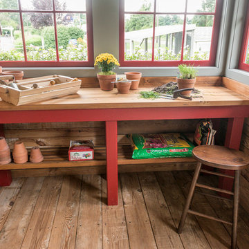
Interior view of the potting bench in the Teracottage "Fancy That" potting shed. This custom potting bench has a reclaimed Douglas Fir top with cedar legs painted in Teracottage Red. photo by DJS photographty

 My Bali Living
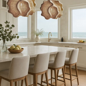
Incorporating organic-shaped lighting into monochrome interior design is a transformative strategy that adds depth, character, and warmth to spaces that might otherwise feel flat or overly structured.
Monochrome interiors, often defined by their clean lines and uniform tones, can sometimes feel too stark or clinical. Organic-shaped lighting, like the sculptural woven pendants in the coastal kitchen you provided, introduces visual softness and fluidity, gently breaking up the monotony without disrupting the minimalist color story.
Lighting with irregular, nature-inspired forms becomes an instant conversation piece. In a monochromatic setting, where variation is subtle, organic lighting stands out as a focal element, guiding the eye and adding architectural intrigue without the need for bold color contrasts.
Monochrome designs rely heavily on texture to evoke emotion and interest. Organic lighting—especially when crafted from natural materials like rattan, wicker, or woven fibers—adds a tactile dimension that contrasts beautifully with sleek countertops, smooth cabinetry, and polished finishes.
Designers aiming to create serene, grounding environments can use organic lighting to subtly reference the outdoors. The flowing, shell-like shapes in the image evoke the natural rhythm of the sea—perfectly complementing the ocean view. This connection to nature fosters a calming, biophilic effect within even the most curated, color-restricted spaces.
Beyond aesthetics, organic-shaped fixtures often diffuse light in a more gentle, ambient manner due to their irregular forms and natural materials. This soft lighting effect supports the calm, cohesive tone of a monochrome interior while making the space feel more inviting and livable.
For designers striving to balance form, function, and feeling within a limited color range, organic lighting is a powerful tool. It’s not just decorative—it’s atmospheric, sculptural, and emotionally resonant. In short, it’s the poetic contrast every monochrome room needs.
 Sosna Inc
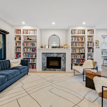
For years, this family felt like their main floor was working against them. The kitchen was a tight galley where only one person could comfortably stand at a time. An old addition felt disconnected and awkward, making everyday life a struggle.
Rethinking the Space
They thought the only solution was a big, expensive addition. But after walking through the home and completing a feasibility study, we found that the square footage was already there. It just needed a smarter plan.
Designing a Floor That Works
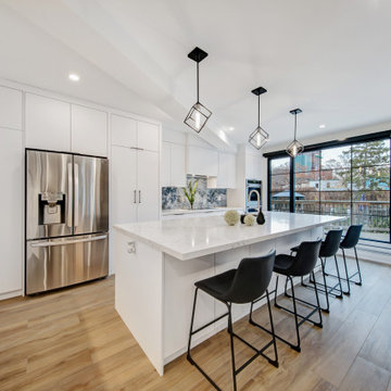
We reimagined how the home works day to day. The kitchen became a bright, open hub with a generous island perfect for cooking, homework, and family time. Awkward corners were given clear and useful purposes. A long steel span replaced an exterior wall that could not carry the load, opening the space safely and effectively.
Personal Touches
We made sure the house reflected the family. A custom basement door with a built-in cat door adds charm and function, and cat-shaped handles in the laundry room bring personality throughout the home. Even the piano room feels warm, inviting, and easy to live in.
A Home That Flows
Now, multiple people can cook together comfortably. The rooms feel connected and welcoming. The previously awkward addition feels fully integrated. Daily life flows naturally, and the house finally supports the family instead of working against them.
Discover the Potential in Your Home
If your kitchen does not work or a space feels off, there may be more potential than you realize. Sometimes the right solution is already within your walls. Reach out to us, and see what your home could become!
Sosna Incorporated
7250 Keele Street, Unit 372
Vaughan, ON L4K 1Z8
Phone: 416-888-7366 extension 1
Email: contact@sosna.ca
 Sosna Inc
For years, this family felt like their main floor was working against them. The kitchen was a tight galley where only one person could comfortably stand at a time. An old addition felt disconnected and awkward, making everyday life a struggle.
Rethinking the Space
They thought the only solution was a big, expensive addition. But after walking through the home and completing a feasibility study, we found that the square footage was already there. It just needed a smarter plan.
Designing a Floor That Works
We reimagined how the home works day to day. The kitchen became a bright, open hub with a generous island perfect for cooking, homework, and family time. Awkward corners were given clear and useful purposes. A long steel span replaced an exterior wall that could not carry the load, opening the space safely and effectively.
Personal Touches
We made sure the house reflected the family. A custom basement door with a built-in cat door adds charm and function, and cat-shaped handles in the laundry room bring personality throughout the home. Even the piano room feels warm, inviting, and easy to live in.
A Home That Flows
Now, multiple people can cook together comfortably. The rooms feel connected and welcoming. The previously awkward addition feels fully integrated. Daily life flows naturally, and the house finally supports the family instead of working against them.
Discover the Potential in Your Home
If your kitchen does not work or a space feels off, there may be more potential than you realize. Sometimes the right solution is already within your walls. Reach out to us, and see what your home could become!
Sosna Incorporated
7250 Keele Street, Unit 372
Vaughan, ON L4K 1Z8
Phone: 416-888-7366 extension 1
Email: contact@sosna.ca
60