
Search results for "Feel safe" in Home Design Ideas
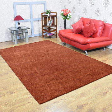
 Get My Rugs LLC
Creating a dream bedroom involves more than just selecting furniture and color schemes; it’s about curating every detail to reflect your personal style and provide comfort. One of the most impactful elements in achieving this is choosing the right area rug. Whether you envision a serene sanctuary or a chic retreat, the perfect rug can enhance your bedroom decor and make a striking statement.
Imagine stepping into a bedroom where the first thing that greets you is a luxurious hand-tufted rug, its rich textures and plush pile inviting you to sink your toes into its softness. Hand-tufted rugs offer not only comfort but also a touch of artistry, with designs that can range from contemporary geometric patterns to traditional motifs. For those who appreciate the craftsmanship of a bygone era, hand-knotted rugs bring an unparalleled level of detail and durability, making them timeless treasures in any bedroom setting.
If a more modern or transitional look is what you’re after, machine-woven and heat-set rugs provide both style and practicality. These rugs, available in various patterns and vibrant colors, are designed to maintain their appearance and texture with minimal maintenance. Machine-washable options add an extra layer of convenience, ensuring that your rug remains fresh and clean even in the most active spaces.
For a touch of classic elegance, consider flat-woven rugs such as kilims, known for their reversible design and lightweight feel. These rugs offer a textured look and can seamlessly blend into both traditional and contemporary decors. Hand-loomed rugs also fall into this category, offering a handcrafted quality that adds uniqueness to your bedroom while maintaining a sophisticated edge.
Shag and flokati rugs are perfect for those who value comfort and a cozy ambiance. Their long, plush fibers create a sumptuous feel underfoot, making them ideal for creating a warm and inviting space. Meanwhile, braided and hand-hooked rugs add an artisanal charm and a bit of rustic flair, while organic and distressed designs bring a natural, lived-in feel to the room.
When selecting your area rug, it’s important to consider practical features to enhance both safety and durability. Non-slip and adhesive backings ensure that your rug stays securely in place, protecting hardwood floors from potential damage. Water-resistant and stain-resistant properties make these rugs practical choices for busy bedrooms, while cushioned options add an extra layer of comfort.
Personalization is key in making a space uniquely yours. Rug sets, including options sized like 8x10, allow you to create a cohesive look that fits perfectly within your room's dimensions. Whether you opt for contemporary designs with fringe details or traditional patterns with intricate textures, there’s a rug that can meet your needs.
In summary, the 15 best area rugs are not just about covering the floor; they’re about adding personality and comfort to your bedroom. With a variety of styles ranging from modern to traditional, and features that cater to both aesthetic and functional needs, the right rug can transform your bedroom into a personal oasis of style and comfort.
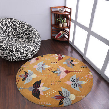 Get My Rugs LLC
Improve your bedroom decor with the perfect area rug, a crucial element that can define the style and comfort of your space. From luxurious textures to practical features, the right rug can elevate your bedroom and tie the entire look together.
For a touch of elegance and artisanal quality, hand-tufted and hand-knotted rugs offer exceptional craftsmanship. Hand-tufted rugs provide a dense, plush feel that adds comfort and warmth, making your bedroom inviting and cozy. Hand-knotted rugs, known for their intricate patterns and durability, bring a timeless charm that can complement both traditional and modern interiors.
If you prefer a more contemporary and practical solution, machine-woven rugs are an excellent choice. These rugs come in a variety of modern designs and are often heat-set to enhance their durability. Many are machine washable, making them easy to maintain while providing a stylish addition to your bedroom.
For a versatile and lightweight option, consider flat-woven rugs such as kilims. Their reversible design and textured surface make them suitable for various decor styles, while their ease of maintenance adds to their appeal. Hand-loomed rugs also offer unique textures and a handcrafted quality that can add a special touch to your space.
If comfort is your priority, shag and flokati rugs are perfect for creating a plush, cozy environment. Their long, soft fibers provide a luxurious feel underfoot, making them ideal for a relaxing bedroom retreat. Similarly, cushioned rugs add extra comfort and can make your bedroom feel even more inviting.
Explore the charm of braided and hand-hooked rugs for a touch of rustic or artisanal flair. These rugs bring a handcrafted quality and unique texture that can enhance your bedroom's character. For a more natural look, organic rugs with textured patterns offer a subtle, yet stylish, addition to your decor.
Practical features are also important when selecting a rug. Non-slip rugs with adhesive backings ensure safety on hardwood floors, while stain-resistant and water-resistant materials protect your rug from spills and wear. A rug with these features can maintain its beauty and functionality over time.
Personalize your space with custom or personalized rug sets. An 8x10 area rug provides ample coverage and can be tailored to fit your room’s dimensions and decor. Whether you opt for a rug with fringe for added detail or a reversible design for versatility, customization allows you to create a rug that perfectly suits your style and needs.
From contemporary and modern to traditional and mid-century modern, the 15 best area rugs offer a range of styles to fit any decor. Transitional rugs, which blend elements of different styles, offer versatility and can adapt to various decorating themes.
In summary, the right area rug can enhance your bedroom decor with both beauty and functionality. With a wide selection of styles, materials, and practical features, you can find the perfect rug to elevate your space and create a cozy, stylish retreat.
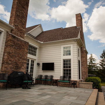
 A/V Multimedia Solutions LLC
Every summer your watching your favorite show, and you see the weather. You feel like you're missing out, because you are. Maybe you're at the park, and you know you can't check social media because of all of the spoiler alerts! Problem solved, no cheating, get the best of both worlds, let the kids be kids, spend time with them, and be outside where the weather is perfect!
Find the right local pro for your project
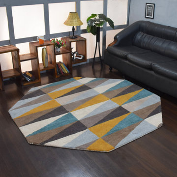 Get My Rugs LLC
Improve your bedroom decor with the perfect area rug, a crucial element that can define the style and comfort of your space. From luxurious textures to practical features, the right rug can elevate your bedroom and tie the entire look together.
For a touch of elegance and artisanal quality, hand-tufted and hand-knotted rugs offer exceptional craftsmanship. Hand-tufted rugs provide a dense, plush feel that adds comfort and warmth, making your bedroom inviting and cozy. Hand-knotted rugs, known for their intricate patterns and durability, bring a timeless charm that can complement both traditional and modern interiors.
If you prefer a more contemporary and practical solution, machine-woven rugs are an excellent choice. These rugs come in a variety of modern designs and are often heat-set to enhance their durability. Many are machine washable, making them easy to maintain while providing a stylish addition to your bedroom.
For a versatile and lightweight option, consider flat-woven rugs such as kilims. Their reversible design and textured surface make them suitable for various decor styles, while their ease of maintenance adds to their appeal. Hand-loomed rugs also offer unique textures and a handcrafted quality that can add a special touch to your space.
If comfort is your priority, shag and flokati rugs are perfect for creating a plush, cozy environment. Their long, soft fibers provide a luxurious feel underfoot, making them ideal for a relaxing bedroom retreat. Similarly, cushioned rugs add extra comfort and can make your bedroom feel even more inviting.
Explore the charm of braided and hand-hooked rugs for a touch of rustic or artisanal flair. These rugs bring a handcrafted quality and unique texture that can enhance your bedroom's character. For a more natural look, organic rugs with textured patterns offer a subtle, yet stylish, addition to your decor.
Practical features are also important when selecting a rug. Non-slip rugs with adhesive backings ensure safety on hardwood floors, while stain-resistant and water-resistant materials protect your rug from spills and wear. A rug with these features can maintain its beauty and functionality over time.
Personalize your space with custom or personalized rug sets. An 8x10 area rug provides ample coverage and can be tailored to fit your room’s dimensions and decor. Whether you opt for a rug with fringe for added detail or a reversible design for versatility, customization allows you to create a rug that perfectly suits your style and needs.
From contemporary and modern to traditional and mid-century modern, the 15 best area rugs offer a range of styles to fit any decor. Transitional rugs, which blend elements of different styles, offer versatility and can adapt to various decorating themes.
In summary, the right area rug can enhance your bedroom decor with both beauty and functionality. With a wide selection of styles, materials, and practical features, you can find the perfect rug to elevate your space and create a cozy, stylish retreat.
 Skill Construction & Design, LLC
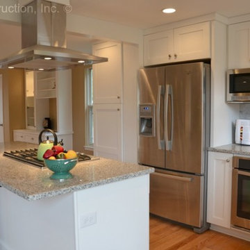
There are so many design elements to this kitchen, I almost don’t know where to start. Bright and airy with crisp clean white cabinets, the kitchen is open and welcoming. Still crisp but gently contrasting, the stainless steel appliance add depth amid the white. To keep this kitchen warm, natural oak covers the floors and a toasted wheat color washes the walls. And then there is the architectural elements. You know. That post and beam in the middle of the room. It’s the center of attention.
When you walk into a room your eyes roam around, establishing the size and shape of the room as your feet take you forward. From the front door of this home straight ahead you encountered this wall. The dining area to the right gives you a glimpse of things to come. Where there is a dining room you will usually find a kitchen.
The architecture of years gone by consistently hides the kitchen, the heart of the home, behind walls. I sympathize with my Mom, and all the other Moms, who have had to spend so much time tucked into a tight kitchen, away from the family. This wall had to go, but it was structural. We needed its support but not its bulk.
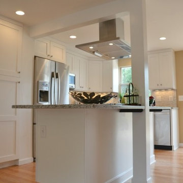
So we got rid of the bulk and only the bulk. Instead of a wall we have a post and beam, offering all of the structure we need. We could have installed a huge steel beam and reconfigure the joists to upset the beam, but why? The small beam and post add an incredible architectural element. It’s turning lemons into lemon, we simply made the most of what we had. It may be functional but it’s so fantastic. It looks like we created the effect just for the drama.
The original kitchen may have had a working triangle and some counter space, but it was fairly small, with each area only a step or two away. The dark cabinets made the space feel even smaller and the butcher block patterned laminate counter tops were very dated. The appliances were feeling their age as well, from a coil burner electric stove to a top freezer refrigerator. To keep this kitchen within its space, a half wall separated it from the dining area.
With the wall gone we borrowed some space from the living room and extended what was a U shaped kitchen into an L. At the living room window we start our new kitchen. We kept a small part of the wall to support the other end of our decorative beam. Sandwiched between a large pantry and our new French door refrigerator, the wall disappears. With our new open floor plan a sizable island was in order.
We split our cooking areas and installed a continuous grill gas cooktop into the island. A sleek island hood takes care of exhaust and adds an extra element to our architectural feature. Under the cooktop we added over-sized drawers for pots and pan storage. The frameless cabinets from New River Cabinetry are maple, painted white, with the Herndon door style. With the cooktop safely nestled into our island, we still had to add an oven.
We used the space where the old range sat for a large single oven of stainless steel and glass. If it worked for one, why not two? We created a home for a microwave in the wall cabinets. It’s perfect for heating leftovers so close to the refrigerator.
An important consideration for hot spots in your kitchen is landing zones. Each of our cooking areas have generous landing zones, one on each side of the cooktop and an entire counter area above or below the ovens, depending on which one you’re using.
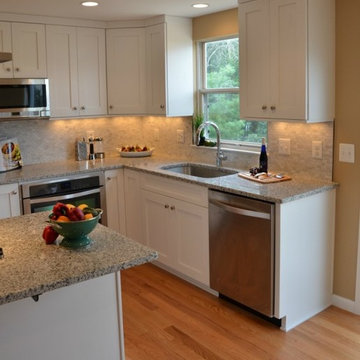
We wanted to give the sink area more room so the half wall had to come out. We moved the trash and recycle cans into a cabinet, removed the heavy soffits and kept the sink under the window.
With that little bit of extra space we were able to add a larger cabinet above the dishwasher and slide it all down. This used to be where the carpeting met the vinyl floor, but all of it is gone. Long oak planks eliminate that final divide between the kitchen and the dining area, while adding visual length to the area. White wall cabinets on each side of the window reflect the sunlight for a brighter view.
With all of the darker cabinetry the backsplash walls had been painted white. Even still, there was a darkness in the corners and it wasn’t very exciting. We wanted to add visual interest and reflect the new under-cabinet lighting, eliminating the shadows in this corner.
With 1″x 2″ Arabescato Honed marble mosaics and those under-cabinet lights, we achieved the perfect balance. The marble has subtle swirls in gray and beige on a clean white background, but with the honed finish the light is softly reflected instead of glaring. For granite, we chose the soft gray tones of Luna Pearl. The speckles of gray and beige are a gentle contrast to the white cabinets and emulate the color of the stainless steel.
Between the carpet, red half wall, dark railing and dated light fixture, the dining area felt tired. Since the kitchen lacked sufficient storage, a large utility cabinet crowded the table space without adding any decorate elements.
Although it didn’t get any bigger, our dining area feels fresher and more open too. With the oak flooring joining the area to the rest of our space and the toasted wheat on the walls, the white table and chairs compliment the cabinetry while contrasting the warmer colors. We replaced the chandelier with recessed lighting and changed that railing too.
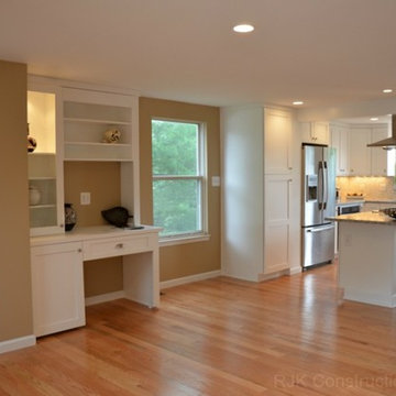
With our new open floor plan, we ended up with a fairly open area in between our foyer closet and the living room window. Not one to miss an opportunity, we filled the space with a multi-functional work space.
With the sunlight streaming in this bright corner works for anything this family needs.
There’s plenty of space for a chair under this large desk drawer. A closed cabinet below, glass doors above and lots of open shelving let you store and or showcase your belongings. We added a lite area at the top to keep away the darker corners.
The transformation is complete. This kitchen and all of its features are truly the center of attention in this home.
http://www.designsbyskill.com/
http://www.rjkconstructioninc.com/
 Get My Rugs LLC
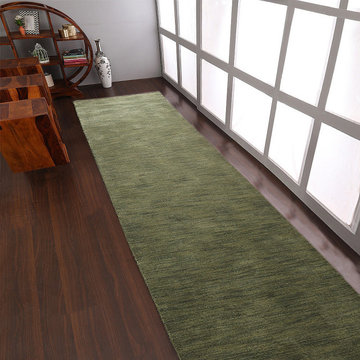
Decorate your living space with an exceptional area rug that brings both elegance and comfort to your home. Rugs are fundamental in interior design, providing not only visual appeal but also warmth and texture to any room. Whether you're enhancing a cozy living room or adding a sophisticated touch to your bedroom, selecting the right rug can profoundly impact your home’s ambiance.
When considering living room rugs, you have a multitude of options to choose from. For expansive spaces, oversized rugs or large carpets are perfect for creating a cohesive and inviting atmosphere. These substantial pieces can anchor a room, offering both style and function. Opting for a huge carpet for the living room adds a layer of luxury and comfort, making your space feel more grand and sumptuous.
For a more customized touch, explore large living room carpet rugs. These generously sized rugs provide extensive coverage and are ideal for adding a plush, cushioned feel to your floor. The scale of these rugs makes them perfect for enhancing the comfort and visual interest of larger rooms, creating a welcoming environment for relaxation and social gatherings.
In addition to traditional living room options, consider floor carpets and mats for the kitchen. These practical yet stylish additions can infuse your kitchen with warmth and coziness. Kitchen mats, in particular, are designed to handle spills and stains, ensuring they remain both functional and aesthetically pleasing.
When selecting rugs, pay attention to the material and maintenance needs. For high-traffic areas like the living room, durability and ease of cleaning are key. Look for rugs with stain-resistant properties or those that are machine washable to ensure they stay looking fresh. Non-slip or adhesive backings are also important, particularly for hardwood or tile floors, to prevent slips and ensure stability.
Additionally, consider the comfort factor. Cushioned rugs can enhance the overall feel of your space, making it more inviting and enjoyable. Personalized or custom rugs allow you to select specific designs, colors, and sizes that perfectly match your decor and preferences. An 8x10 rug, for example, offers ample coverage for larger rooms and adds versatility to your decorating options.
A well-chosen rug is not just a decorative element but also a practical investment in your home’s comfort and style. Whether you’re choosing a large rug for a spacious living room, a floor carpet for the kitchen, or a big carpet to make a bold statement, the right rug can transform your living environment into a stylish and comfortable retreat. Discover a variety of styles, materials, and sizes to find the ideal rug that complements your decor and enhances the functionality of your space.
 Skill Construction & Design, LLC
There are so many design elements to this kitchen, I almost don’t know where to start. Bright and airy with crisp clean white cabinets, the kitchen is open and welcoming. Still crisp but gently contrasting, the stainless steel appliance add depth amid the white. To keep this kitchen warm, natural oak covers the floors and a toasted wheat color washes the walls. And then there is the architectural elements. You know. That post and beam in the middle of the room. It’s the center of attention.
When you walk into a room your eyes roam around, establishing the size and shape of the room as your feet take you forward. From the front door of this home straight ahead you encountered this wall. The dining area to the right gives you a glimpse of things to come. Where there is a dining room you will usually find a kitchen.
The architecture of years gone by consistently hides the kitchen, the heart of the home, behind walls. I sympathize with my Mom, and all the other Moms, who have had to spend so much time tucked into a tight kitchen, away from the family. This wall had to go, but it was structural. We needed its support but not its bulk.
So we got rid of the bulk and only the bulk. Instead of a wall we have a post and beam, offering all of the structure we need. We could have installed a huge steel beam and reconfigure the joists to upset the beam, but why? The small beam and post add an incredible architectural element. It’s turning lemons into lemon, we simply made the most of what we had. It may be functional but it’s so fantastic. It looks like we created the effect just for the drama.
The original kitchen may have had a working triangle and some counter space, but it was fairly small, with each area only a step or two away. The dark cabinets made the space feel even smaller and the butcher block patterned laminate counter tops were very dated. The appliances were feeling their age as well, from a coil burner electric stove to a top freezer refrigerator. To keep this kitchen within its space, a half wall separated it from the dining area.
With the wall gone we borrowed some space from the living room and extended what was a U shaped kitchen into an L. At the living room window we start our new kitchen. We kept a small part of the wall to support the other end of our decorative beam. Sandwiched between a large pantry and our new French door refrigerator, the wall disappears. With our new open floor plan a sizable island was in order.
We split our cooking areas and installed a continuous grill gas cooktop into the island. A sleek island hood takes care of exhaust and adds an extra element to our architectural feature. Under the cooktop we added over-sized drawers for pots and pan storage. The frameless cabinets from New River Cabinetry are maple, painted white, with the Herndon door style. With the cooktop safely nestled into our island, we still had to add an oven.
We used the space where the old range sat for a large single oven of stainless steel and glass. If it worked for one, why not two? We created a home for a microwave in the wall cabinets. It’s perfect for heating leftovers so close to the refrigerator.
An important consideration for hot spots in your kitchen is landing zones. Each of our cooking areas have generous landing zones, one on each side of the cooktop and an entire counter area above or below the ovens, depending on which one you’re using.
We wanted to give the sink area more room so the half wall had to come out. We moved the trash and recycle cans into a cabinet, removed the heavy soffits and kept the sink under the window.
With that little bit of extra space we were able to add a larger cabinet above the dishwasher and slide it all down. This used to be where the carpeting met the vinyl floor, but all of it is gone. Long oak planks eliminate that final divide between the kitchen and the dining area, while adding visual length to the area. White wall cabinets on each side of the window reflect the sunlight for a brighter view.
With all of the darker cabinetry the backsplash walls had been painted white. Even still, there was a darkness in the corners and it wasn’t very exciting. We wanted to add visual interest and reflect the new under-cabinet lighting, eliminating the shadows in this corner.
With 1″x 2″ Arabescato Honed marble mosaics and those under-cabinet lights, we achieved the perfect balance. The marble has subtle swirls in gray and beige on a clean white background, but with the honed finish the light is softly reflected instead of glaring. For granite, we chose the soft gray tones of Luna Pearl. The speckles of gray and beige are a gentle contrast to the white cabinets and emulate the color of the stainless steel.
Between the carpet, red half wall, dark railing and dated light fixture, the dining area felt tired. Since the kitchen lacked sufficient storage, a large utility cabinet crowded the table space without adding any decorate elements.
Although it didn’t get any bigger, our dining area feels fresher and more open too. With the oak flooring joining the area to the rest of our space and the toasted wheat on the walls, the white table and chairs compliment the cabinetry while contrasting the warmer colors. We replaced the chandelier with recessed lighting and changed that railing too.
With our new open floor plan, we ended up with a fairly open area in between our foyer closet and the living room window. Not one to miss an opportunity, we filled the space with a multi-functional work space.
With the sunlight streaming in this bright corner works for anything this family needs.
There’s plenty of space for a chair under this large desk drawer. A closed cabinet below, glass doors above and lots of open shelving let you store and or showcase your belongings. We added a lite area at the top to keep away the darker corners.
The transformation is complete. This kitchen and all of its features are truly the center of attention in this home.
http://www.designsbyskill.com/
http://www.rjkconstructioninc.com/

Sponsored
Delaware, OH

Buckeye Basements, Inc.
Central Ohio's Basement Finishing ExpertsBest Of Houzz '13-'21
 Thinkterior LLC
Contemporary Clubhouse
Bringing the outdoors inside for a bright and colorful indoor playroom perfect for playtime, arts and crafts or schoolwork.
Theme:
The theme for this inviting and playful space is a creative take on a functional playroom blending the contemporary and functional base of the room with the playful and creative spirit that will engage these lucky children.
Focus:
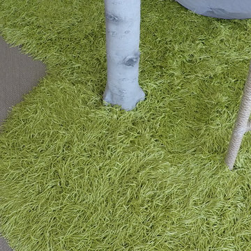
The playroom centers on an amazing lofted clubhouse perched against a custom painted pasture and perched on makeshift trees boasting the perfect place for creative adventures or quiet reading and setting the inviting feel for the entire room. The creative and playful feeling is expanded throughout the space with bright green patches of shag carpet invoking the feel of the pasture continuing off the wall and through the room. The space is then flanked with more contemporary and functional elements perfect for children ages 2-12 offering endless hours of play.
Storage:
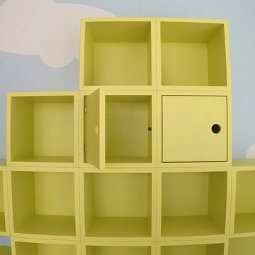
This playroom offers storage options on every wall, in every corner and even on the floor. The myWall storage and entertainment unit offers countless storage options and configurations along the main wall with open shelving, hanging buckets, closed shelves and pegs, anything you want to store or hang can find a home. Even the floor under the myWall panel is a custom floordrobe perfect for all those small floor toys or blankets. The pasture wall has a shelving unit cloaked as another tree in the field offering opened and closed cubbies for books or toys. The sink and craft area offers a home to all the kids craft supplies nestled right into the countertop with colorful containers and buckets.
Growth:
While this playroom provides fun and creative options for children from 2-12 it can adapt and grow with this family as their children grow and their interests or needs change. The myWall system is developed to offer easy and immediate customization with simple adjustments every element of the wall can be moved offering endless possibilities. The full myWall structure can be moved along with the family if necessary. The sink offers steps for the small children but as they grow they can be removed.
Safety:
The playroom is designed to keep the main space open to allow for creative and safe playtime without obstacles. The myWall system uses a custom locking mechanism to ensure that all elements are securely locked into place not to fall or become loose from wear. Custom cushioned floor rugs offer another level of safety and comfort to the little ones playing on the floor.
 Pro-Tile & Marble
Pro-Tile & Marble, Inc.
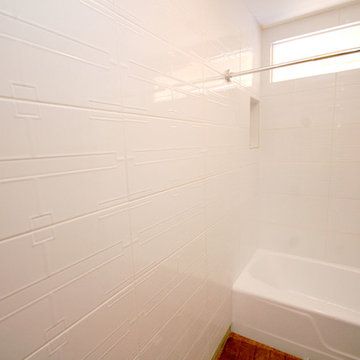
Light colors can make the space feel bigger
As a general rule it’s safe to say that light colors make a space feel bigger, but nowhere is this more true than in a bathroom. Bathrooms tend to be small, and sometimes they’re without windows, so it’s up to the décor and lighting to make the space feel open and airy. When picking your bathroom tile colors keep this in mind.
 Casework Inter Design
WALL TILE: Pratt & Larson
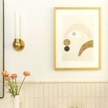
Pratt & Larson - Cream Wall Tile - C200
When selecting a palette, I wanted to use colors from traditional Ranch and Bungalow/Craftsman style homes then balance with silhouettes that are more current. For my own bath, I opted for a cream tile. I wanted cream tile that doesn’t feel dingy or dated and Pratt and Larson has the perfect glossy cream that’s slightly iridescent. The idea of testing cream on a client doesn’t feel right since I wasn’t 100% confident with the idea but in my own home, it felt like a safe place to explore. The modern 2x6 tile stacked then paired with the handmade cream tile is the most unexpected surprise to me. I absolutely love this and can’t imagine a white tile in this room. It would feel pretty boring.
 Skill Construction & Design, LLC
There are so many design elements to this kitchen, I almost don’t know where to start. Bright and airy with crisp clean white cabinets, the kitchen is open and welcoming. Still crisp but gently contrasting, the stainless steel appliance add depth amid the white. To keep this kitchen warm, natural oak covers the floors and a toasted wheat color washes the walls. And then there is the architectural elements. You know. That post and beam in the middle of the room. It’s the center of attention.
When you walk into a room your eyes roam around, establishing the size and shape of the room as your feet take you forward. From the front door of this home straight ahead you encountered this wall. The dining area to the right gives you a glimpse of things to come. Where there is a dining room you will usually find a kitchen.
The architecture of years gone by consistently hides the kitchen, the heart of the home, behind walls. I sympathize with my Mom, and all the other Moms, who have had to spend so much time tucked into a tight kitchen, away from the family. This wall had to go, but it was structural. We needed its support but not its bulk.
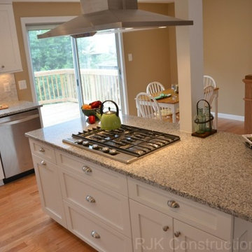
So we got rid of the bulk and only the bulk. Instead of a wall we have a post and beam, offering all of the structure we need. We could have installed a huge steel beam and reconfigure the joists to upset the beam, but why? The small beam and post add an incredible architectural element. It’s turning lemons into lemon, we simply made the most of what we had. It may be functional but it’s so fantastic. It looks like we created the effect just for the drama.
The original kitchen may have had a working triangle and some counter space, but it was fairly small, with each area only a step or two away. The dark cabinets made the space feel even smaller and the butcher block patterned laminate counter tops were very dated. The appliances were feeling their age as well, from a coil burner electric stove to a top freezer refrigerator. To keep this kitchen within its space, a half wall separated it from the dining area.
With the wall gone we borrowed some space from the living room and extended what was a U shaped kitchen into an L. At the living room window we start our new kitchen. We kept a small part of the wall to support the other end of our decorative beam. Sandwiched between a large pantry and our new French door refrigerator, the wall disappears. With our new open floor plan a sizable island was in order.
We split our cooking areas and installed a continuous grill gas cooktop into the island. A sleek island hood takes care of exhaust and adds an extra element to our architectural feature. Under the cooktop we added over-sized drawers for pots and pan storage. The frameless cabinets from New River Cabinetry are maple, painted white, with the Herndon door style. With the cooktop safely nestled into our island, we still had to add an oven.
We used the space where the old range sat for a large single oven of stainless steel and glass. If it worked for one, why not two? We created a home for a microwave in the wall cabinets. It’s perfect for heating leftovers so close to the refrigerator.
An important consideration for hot spots in your kitchen is landing zones. Each of our cooking areas have generous landing zones, one on each side of the cooktop and an entire counter area above or below the ovens, depending on which one you’re using.
We wanted to give the sink area more room so the half wall had to come out. We moved the trash and recycle cans into a cabinet, removed the heavy soffits and kept the sink under the window.
With that little bit of extra space we were able to add a larger cabinet above the dishwasher and slide it all down. This used to be where the carpeting met the vinyl floor, but all of it is gone. Long oak planks eliminate that final divide between the kitchen and the dining area, while adding visual length to the area. White wall cabinets on each side of the window reflect the sunlight for a brighter view.
With all of the darker cabinetry the backsplash walls had been painted white. Even still, there was a darkness in the corners and it wasn’t very exciting. We wanted to add visual interest and reflect the new under-cabinet lighting, eliminating the shadows in this corner.
With 1″x 2″ Arabescato Honed marble mosaics and those under-cabinet lights, we achieved the perfect balance. The marble has subtle swirls in gray and beige on a clean white background, but with the honed finish the light is softly reflected instead of glaring. For granite, we chose the soft gray tones of Luna Pearl. The speckles of gray and beige are a gentle contrast to the white cabinets and emulate the color of the stainless steel.
Between the carpet, red half wall, dark railing and dated light fixture, the dining area felt tired. Since the kitchen lacked sufficient storage, a large utility cabinet crowded the table space without adding any decorate elements.
Although it didn’t get any bigger, our dining area feels fresher and more open too. With the oak flooring joining the area to the rest of our space and the toasted wheat on the walls, the white table and chairs compliment the cabinetry while contrasting the warmer colors. We replaced the chandelier with recessed lighting and changed that railing too.
With our new open floor plan, we ended up with a fairly open area in between our foyer closet and the living room window. Not one to miss an opportunity, we filled the space with a multi-functional work space.
With the sunlight streaming in this bright corner works for anything this family needs.
There’s plenty of space for a chair under this large desk drawer. A closed cabinet below, glass doors above and lots of open shelving let you store and or showcase your belongings. We added a lite area at the top to keep away the darker corners.
The transformation is complete. This kitchen and all of its features are truly the center of attention in this home.
http://www.designsbyskill.com/
http://www.rjkconstructioninc.com/
 Lux Interiors & Landscape Design Co
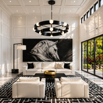
Designed for a modern couple with a sharp eye and a love for clean, intentional living, this home is a study in contrast—where black and white are anything but simple. Their vision was clear: a space that feels elevated, architectural, and undeniably refined, yet still warm enough to live in and entertain effortlessly. Every detail was curated to create balance—bold without being overwhelming, minimal without ever feeling empty. Crisp lines, layered textures, and high-contrast elements define the aesthetic, creating a home that feels polished, confident, and distinctly modern. This is not about playing it safe. It’s about precision, presence, and a point of view. A home for those who understand that simplicity—when done right—is the ultimate luxury.
 deborah garth interior design
Ivan Muller Photography
A garage with a twist - still safe for parking that very expensive vehicle but in terms of design value, an outstanding space worthy of a proper stare... yes, lets linger for a moment shall we?
The garage – noun – a building for housing a motor vehicle or vehicles. That’s it? Really? No features?
*Usually not decorated and possibly quite boring.
*A room with a large door allowing a car to safely enter and exit the space.
*May be purposed for storing other items beside vehicles.
*May be a very neat, organised space with loads of shelving and cabinets.
*Can also be an unorganized space filled with clutter.
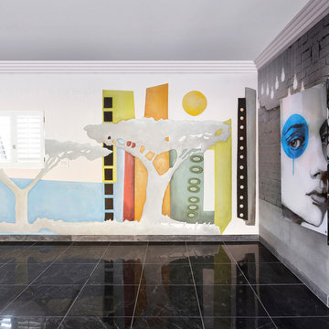
In this case the focus is on art. It is just about too beautiful to be a garage. One almost get the feeling that you want to linger in the open door for a while longer to appreciate the splendor before safely parking the car.
Collaboration is key! It takes the vision of a single person setting a snowball into motion, delivering an outcome that is above and beyond all expectation. Do you need more reason to be convinced of the benefits of having an Interior Designer on speed dial?
The [colored] back wall was done by The Singing Palette company – an abstract of Johannesburg skyline built up with 4mm plaster to create a 3D effect.
The [black and white with blue] side wall is covered in a street scene wallpaper with digitally printed photographic images applied to two perspex panels, manufactured by The Cow Artworks and Just-Us Crafts.
Who would have thought that art belongs in a garage? Only an Interior Designer? Deborah perhaps?
Now, which car would YOU leave in this garage? I have my favorite, what is yours?


 Thinkterior LLC
Contemporary Clubhouse
Bringing the outdoors inside for a bright and colorful indoor playroom perfect for playtime, arts and crafts or schoolwork.
Theme:
The theme for this inviting and playful space is a creative take on a functional playroom blending the contemporary and functional base of the room with the playful and creative spirit that will engage these lucky children.
Focus:
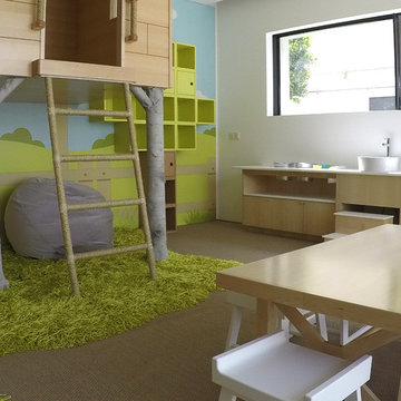
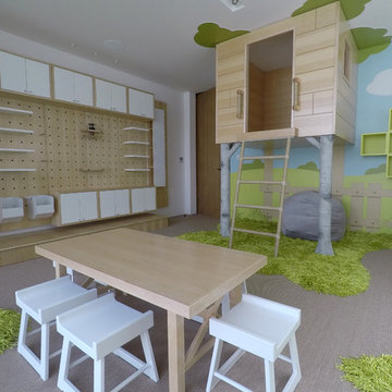
The playroom centers on an amazing lofted clubhouse perched against a custom painted pasture and perched on makeshift trees boasting the perfect place for creative adventures or quiet reading and setting the inviting feel for the entire room. The creative and playful feeling is expanded throughout the space with bright green patches of shag carpet invoking the feel of the pasture continuing off the wall and through the room. The space is then flanked with more contemporary and functional elements perfect for children ages 2-12 offering endless hours of play.
Storage:
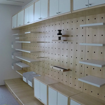
This playroom offers storage options on every wall, in every corner and even on the floor. The myWall storage and entertainment unit offers countless storage options and configurations along the main wall with open shelving, hanging buckets, closed shelves and pegs, anything you want to store or hang can find a home. Even the floor under the myWall panel is a custom floordrobe perfect for all those small floor toys or blankets. The pasture wall has a shelving unit cloaked as another tree in the field offering opened and closed cubbies for books or toys. The sink and craft area offers a home to all the kids craft supplies nestled right into the countertop with colorful containers and buckets.
Growth:
While this playroom provides fun and creative options for children from 2-12 it can adapt and grow with this family as their children grow and their interests or needs change. The myWall system is developed to offer easy and immediate customization with simple adjustments every element of the wall can be moved offering endless possibilities. The full myWall structure can be moved along with the family if necessary. The sink offers steps for the small children but as they grow they can be removed.
Safety:
The playroom is designed to keep the main space open to allow for creative and safe playtime without obstacles. The myWall system uses a custom locking mechanism to ensure that all elements are securely locked into place not to fall or become loose from wear. Custom cushioned floor rugs offer another level of safety and comfort to the little ones playing on the floor.
 Thinkterior LLC
Contemporary Clubhouse
Bringing the outdoors inside for a bright and colorful indoor playroom perfect for playtime, arts and crafts or schoolwork.
Theme:
The theme for this inviting and playful space is a creative take on a functional playroom blending the contemporary and functional base of the room with the playful and creative spirit that will engage these lucky children.
Focus:
The playroom centers on an amazing lofted clubhouse perched against a custom painted pasture and perched on makeshift trees boasting the perfect place for creative adventures or quiet reading and setting the inviting feel for the entire room. The creative and playful feeling is expanded throughout the space with bright green patches of shag carpet invoking the feel of the pasture continuing off the wall and through the room. The space is then flanked with more contemporary and functional elements perfect for children ages 2-12 offering endless hours of play.
Storage:
This playroom offers storage options on every wall, in every corner and even on the floor. The myWall storage and entertainment unit offers countless storage options and configurations along the main wall with open shelving, hanging buckets, closed shelves and pegs, anything you want to store or hang can find a home. Even the floor under the myWall panel is a custom floordrobe perfect for all those small floor toys or blankets. The pasture wall has a shelving unit cloaked as another tree in the field offering opened and closed cubbies for books or toys. The sink and craft area offers a home to all the kids craft supplies nestled right into the countertop with colorful containers and buckets.
Growth:
While this playroom provides fun and creative options for children from 2-12 it can adapt and grow with this family as their children grow and their interests or needs change. The myWall system is developed to offer easy and immediate customization with simple adjustments every element of the wall can be moved offering endless possibilities. The full myWall structure can be moved along with the family if necessary. The sink offers steps for the small children but as they grow they can be removed.
Safety:
The playroom is designed to keep the main space open to allow for creative and safe playtime without obstacles. The myWall system uses a custom locking mechanism to ensure that all elements are securely locked into place not to fall or become loose from wear. Custom cushioned floor rugs offer another level of safety and comfort to the little ones playing on the floor.
 Thinkterior LLC
Contemporary Clubhouse
Bringing the outdoors inside for a bright and colorful indoor playroom perfect for playtime, arts and crafts or schoolwork.
Theme:
The theme for this inviting and playful space is a creative take on a functional playroom blending the contemporary and functional base of the room with the playful and creative spirit that will engage these lucky children.
Focus:
The playroom centers on an amazing lofted clubhouse perched against a custom painted pasture and perched on makeshift trees boasting the perfect place for creative adventures or quiet reading and setting the inviting feel for the entire room. The creative and playful feeling is expanded throughout the space with bright green patches of shag carpet invoking the feel of the pasture continuing off the wall and through the room. The space is then flanked with more contemporary and functional elements perfect for children ages 2-12 offering endless hours of play.
Storage:
This playroom offers storage options on every wall, in every corner and even on the floor. The myWall storage and entertainment unit offers countless storage options and configurations along the main wall with open shelving, hanging buckets, closed shelves and pegs, anything you want to store or hang can find a home. Even the floor under the myWall panel is a custom floordrobe perfect for all those small floor toys or blankets. The pasture wall has a shelving unit cloaked as another tree in the field offering opened and closed cubbies for books or toys. The sink and craft area offers a home to all the kids craft supplies nestled right into the countertop with colorful containers and buckets.
Growth:
While this playroom provides fun and creative options for children from 2-12 it can adapt and grow with this family as their children grow and their interests or needs change. The myWall system is developed to offer easy and immediate customization with simple adjustments every element of the wall can be moved offering endless possibilities. The full myWall structure can be moved along with the family if necessary. The sink offers steps for the small children but as they grow they can be removed.
Safety:
The playroom is designed to keep the main space open to allow for creative and safe playtime without obstacles. The myWall system uses a custom locking mechanism to ensure that all elements are securely locked into place not to fall or become loose from wear. Custom cushioned floor rugs offer another level of safety and comfort to the little ones playing on the floor.
 Skill Construction & Design, LLC
There are so many design elements to this kitchen, I almost don’t know where to start. Bright and airy with crisp clean white cabinets, the kitchen is open and welcoming. Still crisp but gently contrasting, the stainless steel appliance add depth amid the white. To keep this kitchen warm, natural oak covers the floors and a toasted wheat color washes the walls. And then there is the architectural elements. You know. That post and beam in the middle of the room. It’s the center of attention.
When you walk into a room your eyes roam around, establishing the size and shape of the room as your feet take you forward. From the front door of this home straight ahead you encountered this wall. The dining area to the right gives you a glimpse of things to come. Where there is a dining room you will usually find a kitchen.
The architecture of years gone by consistently hides the kitchen, the heart of the home, behind walls. I sympathize with my Mom, and all the other Moms, who have had to spend so much time tucked into a tight kitchen, away from the family. This wall had to go, but it was structural. We needed its support but not its bulk.
So we got rid of the bulk and only the bulk. Instead of a wall we have a post and beam, offering all of the structure we need. We could have installed a huge steel beam and reconfigure the joists to upset the beam, but why? The small beam and post add an incredible architectural element. It’s turning lemons into lemon, we simply made the most of what we had. It may be functional but it’s so fantastic. It looks like we created the effect just for the drama.
The original kitchen may have had a working triangle and some counter space, but it was fairly small, with each area only a step or two away. The dark cabinets made the space feel even smaller and the butcher block patterned laminate counter tops were very dated. The appliances were feeling their age as well, from a coil burner electric stove to a top freezer refrigerator. To keep this kitchen within its space, a half wall separated it from the dining area.
With the wall gone we borrowed some space from the living room and extended what was a U shaped kitchen into an L. At the living room window we start our new kitchen. We kept a small part of the wall to support the other end of our decorative beam. Sandwiched between a large pantry and our new French door refrigerator, the wall disappears. With our new open floor plan a sizable island was in order.
We split our cooking areas and installed a continuous grill gas cooktop into the island. A sleek island hood takes care of exhaust and adds an extra element to our architectural feature. Under the cooktop we added over-sized drawers for pots and pan storage. The frameless cabinets from New River Cabinetry are maple, painted white, with the Herndon door style. With the cooktop safely nestled into our island, we still had to add an oven.
We used the space where the old range sat for a large single oven of stainless steel and glass. If it worked for one, why not two? We created a home for a microwave in the wall cabinets. It’s perfect for heating leftovers so close to the refrigerator.
An important consideration for hot spots in your kitchen is landing zones. Each of our cooking areas have generous landing zones, one on each side of the cooktop and an entire counter area above or below the ovens, depending on which one you’re using.
We wanted to give the sink area more room so the half wall had to come out. We moved the trash and recycle cans into a cabinet, removed the heavy soffits and kept the sink under the window.
With that little bit of extra space we were able to add a larger cabinet above the dishwasher and slide it all down. This used to be where the carpeting met the vinyl floor, but all of it is gone. Long oak planks eliminate that final divide between the kitchen and the dining area, while adding visual length to the area. White wall cabinets on each side of the window reflect the sunlight for a brighter view.
With all of the darker cabinetry the backsplash walls had been painted white. Even still, there was a darkness in the corners and it wasn’t very exciting. We wanted to add visual interest and reflect the new under-cabinet lighting, eliminating the shadows in this corner.
With 1″x 2″ Arabescato Honed marble mosaics and those under-cabinet lights, we achieved the perfect balance. The marble has subtle swirls in gray and beige on a clean white background, but with the honed finish the light is softly reflected instead of glaring. For granite, we chose the soft gray tones of Luna Pearl. The speckles of gray and beige are a gentle contrast to the white cabinets and emulate the color of the stainless steel.
Between the carpet, red half wall, dark railing and dated light fixture, the dining area felt tired. Since the kitchen lacked sufficient storage, a large utility cabinet crowded the table space without adding any decorate elements.
Although it didn’t get any bigger, our dining area feels fresher and more open too. With the oak flooring joining the area to the rest of our space and the toasted wheat on the walls, the white table and chairs compliment the cabinetry while contrasting the warmer colors. We replaced the chandelier with recessed lighting and changed that railing too.
With our new open floor plan, we ended up with a fairly open area in between our foyer closet and the living room window. Not one to miss an opportunity, we filled the space with a multi-functional work space.
With the sunlight streaming in this bright corner works for anything this family needs.
There’s plenty of space for a chair under this large desk drawer. A closed cabinet below, glass doors above and lots of open shelving let you store and or showcase your belongings. We added a lite area at the top to keep away the darker corners.
The transformation is complete. This kitchen and all of its features are truly the center of attention in this home.
http://www.designsbyskill.com/
http://www.rjkconstructioninc.com/

Sponsored
Columbus, OH
Free consultation for landscape design!

Peabody Landscape Group
Franklin County's Reliable Landscape Design & Contracting
 Thinkterior LLC
Contemporary Clubhouse
Bringing the outdoors inside for a bright and colorful indoor playroom perfect for playtime, arts and crafts or schoolwork.
Theme:
The theme for this inviting and playful space is a creative take on a functional playroom blending the contemporary and functional base of the room with the playful and creative spirit that will engage these lucky children.
Focus:
The playroom centers on an amazing lofted clubhouse perched against a custom painted pasture and perched on makeshift trees boasting the perfect place for creative adventures or quiet reading and setting the inviting feel for the entire room. The creative and playful feeling is expanded throughout the space with bright green patches of shag carpet invoking the feel of the pasture continuing off the wall and through the room. The space is then flanked with more contemporary and functional elements perfect for children ages 2-12 offering endless hours of play.
Storage:
This playroom offers storage options on every wall, in every corner and even on the floor. The myWall storage and entertainment unit offers countless storage options and configurations along the main wall with open shelving, hanging buckets, closed shelves and pegs, anything you want to store or hang can find a home. Even the floor under the myWall panel is a custom floordrobe perfect for all those small floor toys or blankets. The pasture wall has a shelving unit cloaked as another tree in the field offering opened and closed cubbies for books or toys. The sink and craft area offers a home to all the kids craft supplies nestled right into the countertop with colorful containers and buckets.
Growth:
While this playroom provides fun and creative options for children from 2-12 it can adapt and grow with this family as their children grow and their interests or needs change. The myWall system is developed to offer easy and immediate customization with simple adjustments every element of the wall can be moved offering endless possibilities. The full myWall structure can be moved along with the family if necessary. The sink offers steps for the small children but as they grow they can be removed.
Safety:
The playroom is designed to keep the main space open to allow for creative and safe playtime without obstacles. The myWall system uses a custom locking mechanism to ensure that all elements are securely locked into place not to fall or become loose from wear. Custom cushioned floor rugs offer another level of safety and comfort to the little ones playing on the floor.
 Skill Construction & Design, LLC
There are so many design elements to this kitchen, I almost don’t know where to start. Bright and airy with crisp clean white cabinets, the kitchen is open and welcoming. Still crisp but gently contrasting, the stainless steel appliance add depth amid the white. To keep this kitchen warm, natural oak covers the floors and a toasted wheat color washes the walls. And then there is the architectural elements. You know. That post and beam in the middle of the room. It’s the center of attention.
When you walk into a room your eyes roam around, establishing the size and shape of the room as your feet take you forward. From the front door of this home straight ahead you encountered this wall. The dining area to the right gives you a glimpse of things to come. Where there is a dining room you will usually find a kitchen.
The architecture of years gone by consistently hides the kitchen, the heart of the home, behind walls. I sympathize with my Mom, and all the other Moms, who have had to spend so much time tucked into a tight kitchen, away from the family. This wall had to go, but it was structural. We needed its support but not its bulk.
So we got rid of the bulk and only the bulk. Instead of a wall we have a post and beam, offering all of the structure we need. We could have installed a huge steel beam and reconfigure the joists to upset the beam, but why? The small beam and post add an incredible architectural element. It’s turning lemons into lemon, we simply made the most of what we had. It may be functional but it’s so fantastic. It looks like we created the effect just for the drama.
The original kitchen may have had a working triangle and some counter space, but it was fairly small, with each area only a step or two away. The dark cabinets made the space feel even smaller and the butcher block patterned laminate counter tops were very dated. The appliances were feeling their age as well, from a coil burner electric stove to a top freezer refrigerator. To keep this kitchen within its space, a half wall separated it from the dining area.
With the wall gone we borrowed some space from the living room and extended what was a U shaped kitchen into an L. At the living room window we start our new kitchen. We kept a small part of the wall to support the other end of our decorative beam. Sandwiched between a large pantry and our new French door refrigerator, the wall disappears. With our new open floor plan a sizable island was in order.
We split our cooking areas and installed a continuous grill gas cooktop into the island. A sleek island hood takes care of exhaust and adds an extra element to our architectural feature. Under the cooktop we added over-sized drawers for pots and pan storage. The frameless cabinets from New River Cabinetry are maple, painted white, with the Herndon door style. With the cooktop safely nestled into our island, we still had to add an oven.
We used the space where the old range sat for a large single oven of stainless steel and glass. If it worked for one, why not two? We created a home for a microwave in the wall cabinets. It’s perfect for heating leftovers so close to the refrigerator.
An important consideration for hot spots in your kitchen is landing zones. Each of our cooking areas have generous landing zones, one on each side of the cooktop and an entire counter area above or below the ovens, depending on which one you’re using.
We wanted to give the sink area more room so the half wall had to come out. We moved the trash and recycle cans into a cabinet, removed the heavy soffits and kept the sink under the window.
With that little bit of extra space we were able to add a larger cabinet above the dishwasher and slide it all down. This used to be where the carpeting met the vinyl floor, but all of it is gone. Long oak planks eliminate that final divide between the kitchen and the dining area, while adding visual length to the area. White wall cabinets on each side of the window reflect the sunlight for a brighter view.
With all of the darker cabinetry the backsplash walls had been painted white. Even still, there was a darkness in the corners and it wasn’t very exciting. We wanted to add visual interest and reflect the new under-cabinet lighting, eliminating the shadows in this corner.
With 1″x 2″ Arabescato Honed marble mosaics and those under-cabinet lights, we achieved the perfect balance. The marble has subtle swirls in gray and beige on a clean white background, but with the honed finish the light is softly reflected instead of glaring. For granite, we chose the soft gray tones of Luna Pearl. The speckles of gray and beige are a gentle contrast to the white cabinets and emulate the color of the stainless steel.
Between the carpet, red half wall, dark railing and dated light fixture, the dining area felt tired. Since the kitchen lacked sufficient storage, a large utility cabinet crowded the table space without adding any decorate elements.
Although it didn’t get any bigger, our dining area feels fresher and more open too. With the oak flooring joining the area to the rest of our space and the toasted wheat on the walls, the white table and chairs compliment the cabinetry while contrasting the warmer colors. We replaced the chandelier with recessed lighting and changed that railing too.
With our new open floor plan, we ended up with a fairly open area in between our foyer closet and the living room window. Not one to miss an opportunity, we filled the space with a multi-functional work space.
With the sunlight streaming in this bright corner works for anything this family needs.
There’s plenty of space for a chair under this large desk drawer. A closed cabinet below, glass doors above and lots of open shelving let you store and or showcase your belongings. We added a lite area at the top to keep away the darker corners.
The transformation is complete. This kitchen and all of its features are truly the center of attention in this home.
http://www.designsbyskill.com/
http://www.rjkconstructioninc.com/
 Dixie Belle Paint Company
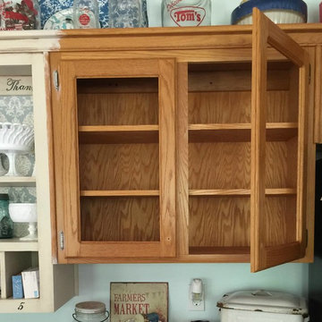
To achieve a professional appearance, choose to remove your cabinet doors, this will make painting the back side of the cabinet doors easy as well as the inside frame. We recommend labeling your doors and hardware so that it’s easy to put back together afterwards! Any loose pieces like screws or knobs place in a plastic bag or safe spot so you don’t lose them! First assess the cabinets and ask yourself If you are dealing with “high gloss finish” such as laminate. If so sand the high gloss area to scuff the surface. If the surface is not glossy, skip the sanding! Next, clean the surface with Dixie Belle Paint’s White Lightning a cleaner to rid grime, grease and dirt! Wipe down again with clean warm water and allow everything to completely dry.
32