
Search results for "Folks dont" in Home Design Ideas
 Almesedoors
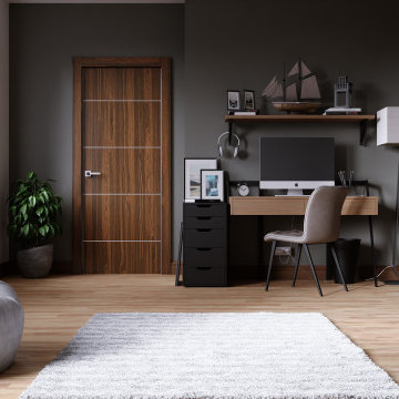
THE DOOR NAME ORIGIN - "ALLUMINIO ELIVIA VERTICAL WOOD GRAIN 4HS"
Of all the interior door models in the Elivia collection, this one is perhaps the most unapologetically elegant. Why? Hmm … That which is self-evident can be the most difficult to explain. Is it because it is built using the latest breakthroughs in interior door making technology? Look at the finish: the process of applying it utilizes something called “stretching” by professionals, which is to say that instead of simply slapping the finish on top of the interior door’s surface, our company fuses (for lack of a better word) the materials (on molecular level, no less), the result being that the finished product is more warp-resistant, scratch-resistant, and fade-proof than any interior door put together in the past. This is especially important in climates known for their high humidity levels. Yes, but this has more to do with engineering than aesthetics, right? Okay, so, is this interior door super-elegant because ... Show more!
FINISH: WALNUT
When it comes to interior door finishes, walnut may not be king per se, since “different folk have different views,” as the poet said, and it behooves a proper collection of finishes to be thoroughly democratic; but, but … you could view walnut as an important majority leader descended from royalty – like, say, Louis Napoleon back when he was still an elected official and not, as he eventually came to style himself, Napoleon III.
Strictly speaking, a walnut is the seed of a drupaceous nut, and not a true nut in the botanical sense. It is native to Persia (walnut oil is a staple in Iranian cuisine to this day) and North America, even though approximately one half of the world’s production today is done in China.
That said, one of its more historically curious uses would be the production of ink and dyes. Those are made, or used to be made, at least, from the husk surrounding the nut. The ink could be used to produce drawings – or darken paper to make it look older. It has (as it turned out by the by) excellent archival properties. It was used liberally by many capable and honest artists in the past.
A keen observer of the human condition, a Florentine named Leonardo da Vinci never left his house (which featured some pretty interesting interior doors, but that’s a story for another day) … never left it without a vial – and a sketch book.
As he took leisurely strolls around the streets and piazzas, he observed folks – socializing, arguing, fighting, striking bargains, and gossiping. Let us mention in passing – and this is merely an opinion, mind you – that his sketches seem to be a great deal livelier than his portraits, which for the most part adhere to the epoch’s somewhat mawkish standards and the algebraic, rather than harmonious, approach to depicting humans. The perpetual beguiling mystery of Mona Lisa’s smile is undoubtedly magnificent, but it is the Tuscan polymath’s quick yet amazingly insightful drawings that give us an idea – oftentimes a very comprehensive one – of what everyday life was truly like in Florence in the Sixteenth Century. An old man gloating at someone’s misfortune, two passionate merchants arguing over the price of some highly important delivery, a young woman lamenting the lack of decent men whom a reasonable person could view as husband material, and on and on – it’s all there in Leonardo’s sketches characterized by masterful lines and elegant shading despite the obvious – and necessary – impetuosity of each sketch. So precious and brilliant are those casual masterpieces that, had the scientifically inclined fellow eliminated the need for outdoor sketching by inventing photography, it would have been an historian’s immeasurable gain, certainly, but also an art lover’s great loss.
The idea behind our Walnut Finish is to invoke in the interior door owner a feeling of timeless historicity. Some things change, but others are forever. Stability is an important quality in an interior door, is it not?
Rembrandt van Rijn, who also used walnut ink extensively, was a studio artist, with only a few outdoor paintings in his legacy. Truth be told, he was a better draftsman than Leonardo, at least as far as technique goes (don’t let this get around). Well. He lived a century later and had the benefit of all the development art had undergone since the great Italian master. Just like these interior doors – your interior doors – are a huge improvement on anything that was available only twenty years ago, never mind a hundred years ago.
The “oscillation” of Rembrandt’s line, the delightful shift from the descriptive to the aesthetic stroke, makes his production in that category quite unique. Upon reaching artistic maturity, the stubborn Dutch master began to shun the unbroken contour line, which caused a lot of trouble for his drawings a century later, when dealers and collectors who wished to “update” his sketches to fit the current fashion had the audacity to “complete” Rembrandt’s pen-and-inks. Fortunately, some of the sketches escaped this sorry fate and have been preserved in their original glorious state to this day. Rembrandt’s mastery is yet another thing this interior door finish might remind you of each time you look at your doors.
 Kraft Custom Construction
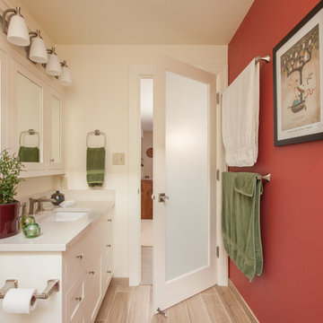
For this small cottage near Bush Park in Salem, we redesigned the kitchen, pantry and laundry room configuration to provide more efficient storage and workspace while keeping the integrity and historical accuracy of the home. In the bathroom we improved the skylight in the shower, installed custom glass doors and set the tile in a herringbone pattern to create an expansive feel that continues to reflect the home’s era. In addition to the kitchen and bathroom remodel, we updated the furnace, created a vibrant custom fireplace mantel in the living room, and rebuilt the front steps and porch overhang.
 Eagle Photography, LLC
Jerry Bilton/Eagle Photography, LLC
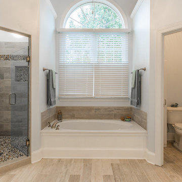
Example of a classic pebble tile bathroom design in Other with a two-piece toilet
Example of a classic pebble tile bathroom design in Other with a two-piece toilet
Find the right local pro for your project
 Sidney Cardel's
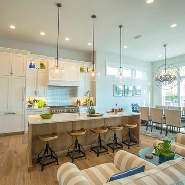
Inspiration for a large coastal l-shaped light wood floor open concept kitchen remodel in Jacksonville with a farmhouse sink, recessed-panel cabinets, white cabinets, quartzite countertops, white backsplash, subway tile backsplash, paneled appliances and an island
 Edgewater Design Group
As written in Northern Home & Cottage by Elizabeth Edwards
In general, Bryan and Connie Rellinger loved the charm of the old cottage they purchased on a Crooked Lake peninsula, north of Petoskey. Specifically, however, the presence of a live-well in the kitchen (a huge cement basin with running water for keeping fish alive was right in the kitchen entryway, seriously), rickety staircase and green shag carpet, not so much. An extreme renovation was the only solution. The downside? The rebuild would have to fit into the smallish nonconforming footprint. The upside? That footprint was built when folks could place a building close enough to the water to feel like they could dive in from the house. Ahhh...
Stephanie Baldwin of Edgewater Design helped the Rellingers come up with a timeless cottage design that breathes efficiency into every nook and cranny. It also expresses the synergy of Bryan, Connie and Stephanie, who emailed each other links to products they liked throughout the building process. That teamwork resulted in an interior that sports a young take on classic cottage. Highlights include a brass sink and light fixtures, coffered ceilings with wide beadboard planks, leathered granite kitchen counters and a way-cool floor made of American chestnut planks from an old barn.
Thanks to an abundant use of windows that deliver a grand view of Crooked Lake, the home feels airy and much larger than it is. Bryan and Connie also love how well the layout functions for their family - especially when they are entertaining. The kids' bedrooms are off a large landing at the top of the stairs - roomy enough to double as an entertainment room. When the adults are enjoying cocktail hour or a dinner party downstairs, they can pull a sliding door across the kitchen/great room area to seal it off from the kids' ruckus upstairs (or vice versa!).
From its gray-shingled dormers to its sweet white window boxes, this charmer on Crooked Lake is packed with ideas!
- Jacqueline Southby Photography
 San Luis Kitchen Co.
Surrounded by vineyards, horse ranches, and open land, the home is in a great location that is reasonably close to town while retaining a secluded air.
Our homeowners have enjoyed their country retreat for many years. They are blessed with a large extended family and love to host gatherings and entertain weekend guests. The only drawback to their gracious home was the drab and malfunctioning kitchen. First off, the cabinets were an out-dated whitewashed oak. Uggh! High ceilings were a plus feature that was negated by bizarrely stacked wall cabinets – making you think that maybe the original “designer” forgot about the 9 foot ceiling height. More likely, the original cabinets were stock items that didn’t come in the right size for the house. You can also see the lovely fluorescent light box tacked to the middle of the ceiling over the island. Why? Was there no thought to the style shown in the rest of the house?
Secondly, the homeowners were fighting with a poor kitchen layout. The large built-in refrigerator and separate freezer were placed right in the main traffic flow from the hall, there was not enough counter space to the right of the sink, the dishwasher was crammed right next to the fridge, and a broom closet took up prime real estate next to the cook-top. Now, remember, guests are frequent in this home and often several people were trying to use the kitchen at one time. Cross traffic and outright pile-ups were inevitable as some folks gathered veggies from the fridge to sauté at the cook-top while others were rinsing used dishes for the dishwasher and still others were taking frozen items to the prep sink and then the microwave. Don’t get me started about the trash and recycling receptacles – complete inconvenience to all!
So, our homeowners – the poor, benighted souls – were desperate for a remodel when they found San Luis Kitchen. On their first visit to our showroom, the couple fell in love with our French Country display. The display features soft white cabinets in a distressed cottage finish with a contrasting dark island and armoire; our homeowners were smitten. We knew everyone was up to the challenge and so we got right down to work.
We visited their home and measured their kitchen. While we were there, we took stock of the house’s overall style and the homeowner’s décor. We asked what they liked best about their home, what worked well and what didn’t. We found that they loved their arched passageways, the trim details on their mantle and the soft curves of the posts at their stair rail. They also showed us many photos of kitchens that they liked – both from magazines and on-line. Using this information, we went back to the office and pulled together a design.
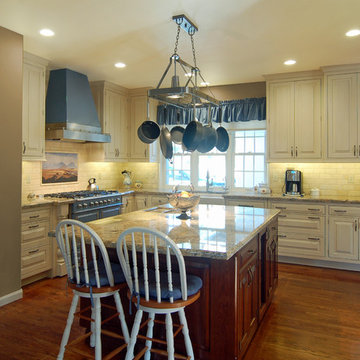
We suggested swinging the refrigerator and freezer 90 degrees and setting them in place of the existing oven and hutch area. This brings them out of the traffic flow and into a comfortable relationship to the island counter. The fridge and freezer the homeowners chose were mismatched in width – we disguised the difference using custom detailing on the decorative panels. Deep storage cabinets above fill out the space.
Moving the fridge/freezer gained lots of luxurious counter space to the right of the new farmhouse sink. We placed the broom closet near the hall and tucked the microwave behind closed cabinet doors (which tuck away when open) to the left of it. The beautiful existing wood floor insisted that the island remain in the same location, however we replaced it with luscious cherry cabinets in an antique burnished finish. The island retained its prep sink and gained a wine refrigerator and both a trash compactor and double bin recycling cabinet. A decorative pot rack now hangs in place of the ugly old fluorescent lights.
The highlight of the new kitchen is the La Cornue range in a bright and bold blue! The homeowners traveled to a Bay area appliance showroom to see the ranges in person before purchasing to make sure that the ovens were of suitable size and that blue was truly the right color. The range was perfect, so it was purchased. The matching blue hood was created on site using a standard stainless hood as the base and painting a tapered drywall cover. To either side of the range we placed pullout base cabinets for oils and spices and such, each fronted with a turned post chosen to echo their stairway balusters. We also chose cabinet trim (crown, light rail and toe base) to harmonize with the homes existing details.
We knew for sure that the completed kitchen was a success when the happy homeowners reported to us that over Thanksgiving they had five cooks working in the space with no conflict whatsoever. That’s a true complement to our design – Thank You!
 Vanities for Bathrooms
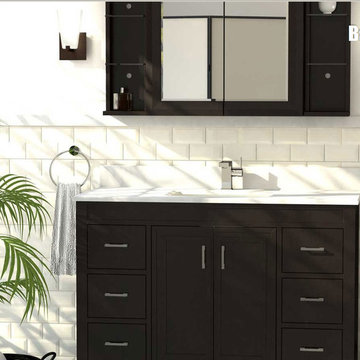
Around of these were good-looking and even Quality Bathroom Vanities, and it's a style many folks still choose in the present day. But, manufacturers are now as well present more modern and contemporary takes on a quality bathroom vanity in addition to the more old-fashioned styles. Folks are finding all brands of ways to make their bathrooms appearance less like the useful spaces they were factually created to be. With charming styles of Quality Bathroom Vanities, mirrors, and other bath fixtures, your bathroom can expression just as good as any other fragment of any home.
Sponsored
Sunbury, OH

J.Holderby - Renovations
Franklin County's Leading General Contractors - 2X Best of Houzz!
 My LA Organizer
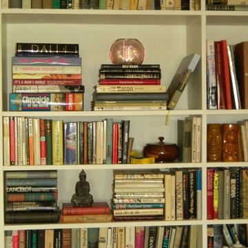
My Clients here have excellent taste and a beautiful home. I organized many rooms in this home, but my favorite photos are of the bookcase. This built-in bookcase was organized by genre and styled like a piece of art in the room. So many folks line their books on the shelves like a library. I say, lets have fun with it and add another piece of art to the room.
 Taylordesign + BUILD
bill timmerman
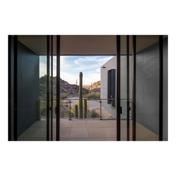
This is an example of a mid-sized contemporary concrete paver screened-in side porch design in Phoenix with a roof extension.
This is an example of a mid-sized contemporary concrete paver screened-in side porch design in Phoenix with a roof extension.
 Sunset Construction & Design
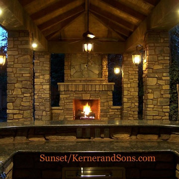
The secret to a beautiful and functional backyard design is planning. Don't just start putting the pieces in place randomly. Decide what you want. Think long term. Most of the time folks don't do everything at once - and that can be part of the fun. It's fine and normal to do a little at a time. But you still need to add those pieces with the overall design in mind.
Sunset Construction and Design specializes in creating residential patio retreats, outdoor kitchens with fireplaces and luxurious outdoor living rooms. Our design-build service can turn an ordinary back yard into a natural extension of your home giving you a whole new dimension for entertaining or simply unwinding at the end of the day. If you’re interested in converting a boring back yard or starting from scratch in a new home, give us a call today! A great patio and outdoor living area can easily be yours.
 Tabor Design Build, Inc.
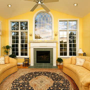
The large Palladian style windows allow for breathtaking views on the sunset while curled up on the comfy curved sofas. As the sun sets, the cozy gas fireplace with green slate tile and colonial style surround becomes the focal point of the room.
 WSM Craft
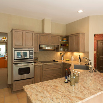
Embracing the notion of commissioning artists and hiring a General Contractor in a single stroke, the new owners of this Grove Park condo hired WSM Craft to create a space to showcase their collection of contemporary folk art. The entire home is trimmed in repurposed wood from the WNC Livestock Market, which continues to become headboards, custom cabinetry, mosaic wall installations, and the mantle for the massive stone fireplace. The sliding barn door is outfitted with hand forged ironwork, and faux finish painting adorns walls, doors, and cabinetry and furnishings, creating a seamless unity between the built space and the décor.
Michael Oppenheim Photography
 Bill Fry Construction - Wm. H. Fry Const. Co.
Covid During Construction and Making Face Masks
Dear Houzz Folks,
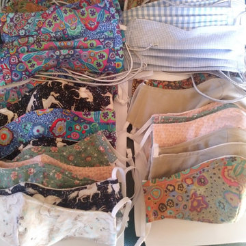
We've started getting back to work and are educating everyone at our projects on how to be safe during COVID, posting signage, and we've been making masks for our employees, colleagues, friends, family etc... Here's some information on what I've learned so far in sewing the best fitting face mask for COVID.
1. Put in a wire at the nose bridge (about 3.5 inches) - it helps with fit and if you wear glasses, it keeps them from fogging up. I found that doorbell wire, available at the hardware store, seems to work well. It isn't too thin or too fat, bends easily and holds its shape. I attach it by using a zigzag stitch on the interior seam of the outside of the mask (so there's a bit more cushion on the inside).
2. For the shaped masks, I make a pocket in case my friends, family, colleagues, want to insert a filter - it also allows for three layers of fabric in the breathing area and less bulk where the ties go. For patterns that don't offer pockets, I just make my own pattern pocket. I also first baste the two inside pieces first and then sew the front on. This way, there's no worries about slipping. No pins are needed and no pins minimizes the number of extra air holes in the fabric.
3. So that the ties/loops can be replaced or modified, I make a channel for rather than sewing it in permanently. Many videos show using a safety pin to pull the elastic through. If you sew much, you might have a bodkin in your sewing box, but it might be a bit too wide. Instead, I use a long hairpin (you could probably make a long loop with a paper clip). I run the hairpin through the channel, loop the elastic through the end of the pin and pull through. That takes much less time than piercing it with a safety-pin.
4. For the inside of the masks, it is nice to have softer fabric inside, so high-thread-count sheets purchased on sale work great. Then you can easily tell what is inside as well.
5. For surgical-style masks, there's a pattern with a pocket on the inside and a wire. I like the ideas in this video but use 2 fabrics and make them bigger. About a 9x9 inch for the outside and 9x8 inch for the inside. 5/8 seam on the nose and 1/4 seam on the bottom.
6. For the fitted masks, there are two patterns that I like. For this one, https://moinliz.de/mundschutz-naehen-mit-schnittmuster it expects you to print on European-sized paper, so if you want to get the size right, print at 100%
I also really like this pattern and I added a pocket and lengthened the ends to make channels https://intermountainhealthcare.org/covid19-coronavirus/homemade-cloth-face-coverings/ (scroll down to a link to download the pdf) Lots of folks sew craftpassion, but I like the fit of these patterns better. There are still some other patterns I have left to try!
6. After breaking lots of needles, I realized that I really didn't need to topstich the fitted masks over the bridge, so I just started skipping the bridge.
7. If you're going to wear a face-covering for a really long time, you might want to skip the ear hangers and go for ties behind the head. Instead of two ties, I'll use one long one so that the bottom one is a loop and the top one ties. Bungee cord works nice.
Happy Sewing!
: ) Rhoda Fry, Bill Fry Construction

Sponsored
Columbus, OH
Free consultation for landscape design!

Peabody Landscape Group
Franklin County's Reliable Landscape Design & Contracting
 sirboom
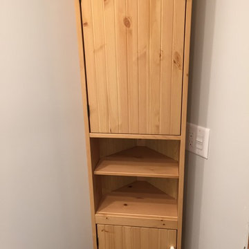
Owner designed and remodeled small half-bathroom in south Atlanta suburb. Gut remodel with updated (corrected) electrical, updated (corrected) plumbing, Kohler toilet, IKEA Silveran vanity (partial-wall mount; mounted to be 37" high to top of sink, my preference), IKEA Silveran medicine cabinet, IKEA Silveran cabinet, and retrofitted an IKEA Lillangen sink (which normally goes with a different vanity). Paint is Olympic One "Thin Ice" (paint not recommended, was disappointing for the "best" Olympic sells at Lowe's; color is great, though). Chrome fixtures with faucet by Glacier Bay (unknown model; Home Depot clearance find) and chrome door knobs (also from Home Depot). Blinds are from SelectBlinds.com and are Bamboo 1" faux wood. Wall art is from Etsy.com (look up dictionary prints if you want to find similar). Tile is from Lowe's, by Style Selections, and called Skyros Gray (highly recommended, good quality). Grout color is Silver by MAPEI (Lowe's). Silver MAPEI grout-look cauking along top and bottom of baseboard tiles (upper floor home so can't use grout). Unfortunately the sink and toilet were a different shade of white but the toilets were all fairly new and it's more noticeable in the photo than in real life. Used 3 LED new work IC recessed lights, LED under-cabinet light from Home Depot off of same switch as the lights but with a switch on-board, and a basic contractor-grade ceiling fan with some Dynamat-like material applied to the casing which reduces its noise significantly off of its own switch. GFCI outlet has a nightlight built in and, not shown, is another GFCI outlet retrofitted into the medicine cabinet. Don't worry, that silicone caulking around the toilet has been improved to a professional look with the Silver caulking over it to blend better since this photo, so don't hold that against me! In fact, don't hold anything you don't like against me... just posting this to give folks some ideas WITH the actual units used, unlike most postings on Houzz.
©Kil|Photography
 TaylorPro Design and Remodeling, Inc.
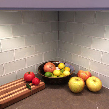
"We took bids from seven or eight companies to remodel our kitchen and bathroom. We had a whole list of improvements we wanted, from 'must-haves' to 'might be nice someday'. We selected TaylorPro Home Services for several reasons, but foremost among those reasons was that the owner, Kerry Taylor, provided us with a detailed breakout of labor/material costs for every option. Nearly every other contractor bundled up the costs of our optional tasks into a single number, which made it quite difficult to select the best options based on our priorities and budget. Kerry's highly detailed proposal wasn't the least expensive we received, but it was organized, thorough, and competitive.
The second reason we selected TaylorPro was the demeanor and experience of Kerry himself. It was refreshing to talk to someone who actually gets his hands dirty rather than yet another designer with his head in a computer. (God bless the designers, though -- we had helpful conversations with many!) Kerry has a good design aesthetic, make no mistake, but it was clear that when problems inevitably popped up, Kerry would know how to address them. He is calm, personable, and competent. In other words, he is just the sort of person you want to work with.
We can't forget to mention the TaylorPro crew. The first thing you notice is how youthful they are. Not a single gray hair among them. Yet after watching them work awhile, you begin to notice how extraordinarily skilful they are. It doesn't matter what is on the day's agenda -- electrical, paint, plumbing, drywall -- these guys tackle it all and do it exceedingly well. They aren't just putting in their time and collecting a check. They take terrific pride in the work they do, a quality that seems more and more difficult to find these days. They are pleasant to be around and I never heard a cross word among them. They took pains to keep the noise and dust to a minimum. They cleaned up at the end of every day, even those days when they put in extra hours and were obviously very tired. This is easily the best work crew we've ever had at our house.
We should also mention that the subcontractors that TaylorPro uses are top-notch. The folks who laid down our new tile floor (Jeff) had every bit as much expertise and integrity as TaylorPro. They did an excellent job on both the flooring and the tile backsplash. These two elements receive compliments from everyone who visits our remodeled kitchen. (We wish Jeff would put his company on Angie's List so that we could give him the recognition he deserves!) In addition, the fellows who fabricated our Caesarstone countertop were also great craftsmen. They did a beautiful job. When we noticed a small blemish a few days after the countertop was installed, they came out immediately and corrected the problem. Nice!
In summary, TaylorPro has lived up to all the glowing recommendations here on Angie's List. Our experience with TaylorPro is right in line with the others. They stayed on task, they communicated well, they stayed on budget, and they gave us more than we had any right to expect. We don't know a better compliment to give Kerry and company than this: when it comes time to remodel the upstairs bathrooms, we won't need to solicit seven or eight bids. We'll just call TaylorPro. "
~ Lysa & Mark W, Clients
Photos by: Kerry W. Taylor
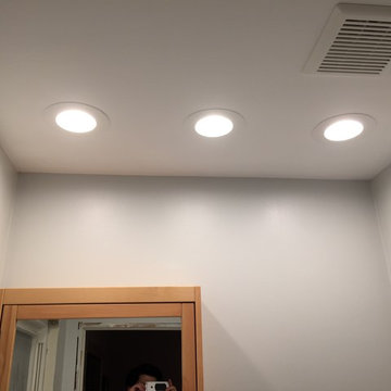 sirboom
Owner designed and remodeled small half-bathroom in south Atlanta suburb. Gut remodel with updated (corrected) electrical, updated (corrected) plumbing, Kohler toilet, IKEA Silveran vanity (partial-wall mount; mounted to be 37" high to top of sink, my preference), IKEA Silveran medicine cabinet, IKEA Silveran cabinet, and retrofitted an IKEA Lillangen sink (which normally goes with a different vanity). Paint is Olympic One "Thin Ice" (paint not recommended, was disappointing for the "best" Olympic sells at Lowe's; color is great, though). Chrome fixtures with faucet by Glacier Bay (unknown model; Home Depot clearance find) and chrome door knobs (also from Home Depot). Blinds are from SelectBlinds.com and are Bamboo 1" faux wood. Wall art is from Etsy.com (look up dictionary prints if you want to find similar). Tile is from Lowe's, by Style Selections, and called Skyros Gray (highly recommended, good quality). Grout color is Silver by MAPEI (Lowe's). Silver MAPEI grout-look cauking along top and bottom of baseboard tiles (upper floor home so can't use grout). Unfortunately the sink and toilet were a different shade of white but the toilets were all fairly new and it's more noticeable in the photo than in real life. Used 3 LED new work IC recessed lights, LED under-cabinet light from Home Depot off of same switch as the lights but with a switch on-board, and a basic contractor-grade ceiling fan with some Dynamat-like material applied to the casing which reduces its noise significantly off of its own switch. GFCI outlet has a nightlight built in and, not shown, is another GFCI outlet retrofitted into the medicine cabinet. Don't worry, that silicone caulking around the toilet has been improved to a professional look with the Silver caulking over it to blend better since this photo, so don't hold that against me! In fact, don't hold anything you don't like against me... just posting this to give folks some ideas WITH the actual units used, unlike most postings on Houzz.
©Kil|Photography
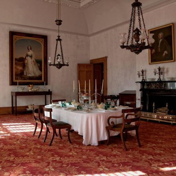
 Langhorne Carpet Company
Langhorne Carpet Company proudly announces its latest collaboration with Vermont Custom Rug Company’s David Hunt on an elegant reproduction of the early 19th century worsted wool carpet for the dining room of historic Hyde Hall.
A National Historic Landmark and New York State Historic Site in Springfield, NY, eight miles north of Cooperstown, Hyde Hall is considered “one of the finest examples of the neoclassical country houses in the United States.” The agricultural estate was the project and prize of wealthy British-born landowner George Clarke (1768-1835). Clarke owned 120,000 acres in New York’s Leatherstocking Region and designed Hyde Hall on the bank of Otsego Lake with Albany architect Philip Hooker. The mansion, the estate’s centerpiece, was constructed from 1817 to 1835. Today, Hyde Hall resides within Glimmerglass State Park.
Recent years have brought Hyde Hall a meticulous, history-driven, artisan-fueled restoration to recreate Clarke’s precise original vision.
David Hunt chose Langhorne Carpet Company to recreate the Brussels looped pile carpet for the property’s dining room. Made from the finest worsted wool, a yarn used today almost exclusively in apparel, Brussels carpets were a 19th-century status symbol among America’s wealthiest citizens, including presidents and major landowners. According to Clarke’s scrupulously kept ledgers, in 1831 he purchased “122 linear yards of Brussels body carpet, along with 24 yards of Brussels border carpet from the showroom of Lowe & Connah in New York City for the sum of $308.00. A hefty amount for the period,” said Hunt.
The carpet—which, Hunt said, may well be one of the first examples Wilton carpet woven in the United States—remained in the dining room through the end of the 19th century. As for the two tuffets? They not only survive—they also remain covered in the original textile.
This existence of these original tuffets for nearly two centuries, said Hunt, is both incredibly rare and fortuitous. “Having a documented portion of the original carpet, intact 186 years after manufacture, is, for the textile historian, a gold mine of information. Although the border portion of the design remains most visible, having the ability to document and verify the yarn quality, sett (pattern) of the weave and most importantly the original colors is huge.”
Hunt “dissected” the tuffets to reveal the yarn that, like in all Wilton weaves, is buried beneath the textile’s back, unexposed to sunlight, air, or cleaning agents. When he did, he found the carpet’s original colors and pattern. From there, he and Langhorne used a black-and-white photograph of the original carpet to create a botanical pattern for the field that would, he said, “honor the style of the border.”
He then turned over the work to Langhorne, to create the patterns, match the dye colors, and weave the carpets on narrow looms much like the ones used 200 years ago. Langhorne, he added, is the only mill in the United States—and one of very few in the entire world—capable of doing such a job.
“Langhorne has this wonderful capability to do all sorts of different things. I don’t think a lot of people understand that option is out there, and it’s a lot easier than you think to do it,” he said. What’s more, “They’re real people, working people—the folks on the loom, the weavers, the folks in the office: Except for the clothing, they’re the same type of people you would have found in a mill 200 years ago. It takes special people to do this, and that’s Langhorne.”
Sponsored
Sunbury, OH
J.Holderby - Renovations
Franklin County's Leading General Contractors - 2X Best of Houzz!
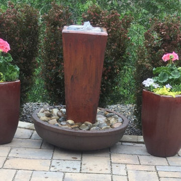
 Boise Pottery
Flanked by two of our "square top, round bottom" pots, this tall square-topped pottery piece was made into an impressive fountain feature with an above ground bowl as a catch basin. While we don't usually recommend this setup because of excessive loss of splashing on the rocks, these folks have made it work beautifully!
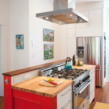


 Charmean Neithart Interiors
The homeowners of this California Cottage wanted a beach vibe in their 1700 sq. ft. home. They wanted to make the most of their spaces by widening doorways, adding wood floors throughout the house, and adding a skylight. The result is cozy, casual California living at its best with frequent family dinners and celebrations with friends.
Photos by Erika Bierman www.erikabiermanphotography.com
7