
Search results for "Fostering collaboration" in Home Design Ideas
 Shirlee Interiors
Just because it's an office, doesn't mean it has to feel cold and sterile.
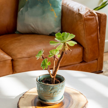
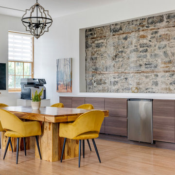
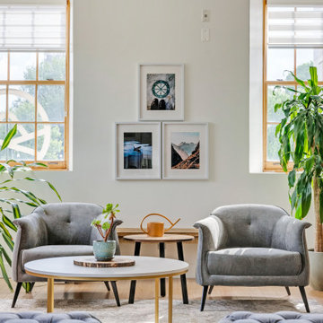
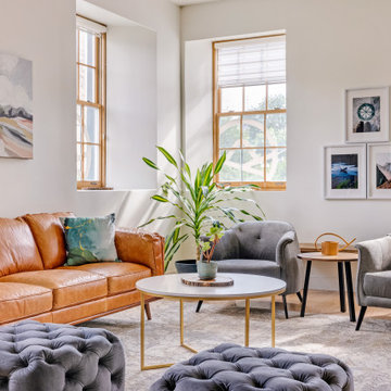
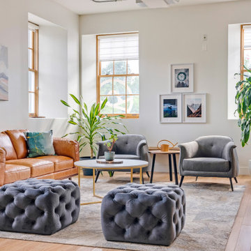
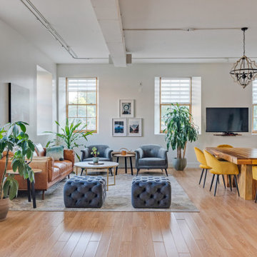
This stunning loft-style space in Ottawa's Byward Market was the perfect canvas to transform into a comfortable, relaxed yet sophisticated space for boutique public affairs firm Compass Rose. The clients wanted a refreshed space that reflected the growing company's culture and values.
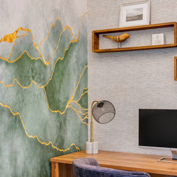
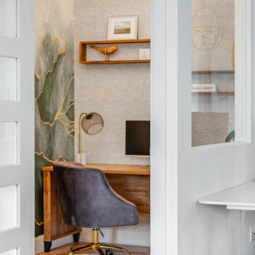
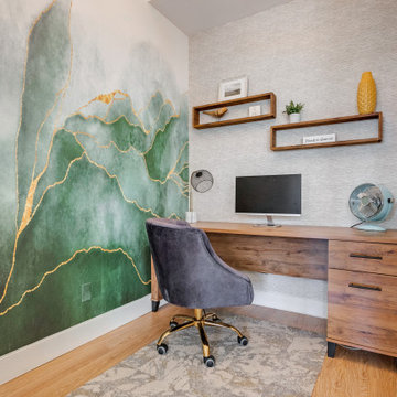
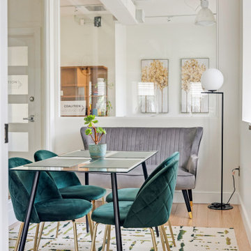
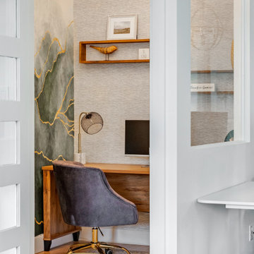
The company's brand colours, including forest green, copper, brown, black and white are incorporated throughout all the furnishings and decor, including the stunning mural wall in a private office that we created from a storage closet. The wall art includes scenes depicting the brand story, as well imagery symbolic of the work done in this space.
We also added an airy boardroom that incorporates floor-to-ceiling windows to avoid disrupting the flow of the open concept space. The result is a stunning and relaxing atmosphere that fosters creativity, collaboration and, of course, a backdrop for the amazing social events this firm is known for.
 Shirlee Interiors
Just because it's an office, doesn't mean it has to feel cold and sterile.
This stunning loft-style space in Ottawa's Byward Market was the perfect canvas to transform into a comfortable, relaxed yet sophisticated space for boutique public affairs firm Compass Rose. The clients wanted a refreshed space that reflected the growing company's culture and values.
The company's brand colours, including forest green, copper, brown, black and white are incorporated throughout all the furnishings and decor, including the stunning mural wall in a private office that we created from a storage closet. The wall art includes scenes depicting the brand story, as well imagery symbolic of the work done in this space.
We also added an airy boardroom that incorporates floor-to-ceiling windows to avoid disrupting the flow of the open concept space. The result is a stunning and relaxing atmosphere that fosters creativity, collaboration and, of course, a backdrop for the amazing social events this firm is known for.
 Shirlee Interiors
Just because it's an office, doesn't mean it has to feel cold and sterile.
This stunning loft-style space in Ottawa's Byward Market was the perfect canvas to transform into a comfortable, relaxed yet sophisticated space for boutique public affairs firm Compass Rose. The clients wanted a refreshed space that reflected the growing company's culture and values.
The company's brand colours, including forest green, copper, brown, black and white are incorporated throughout all the furnishings and decor, including the stunning mural wall in a private office that we created from a storage closet. The wall art includes scenes depicting the brand story, as well imagery symbolic of the work done in this space.
We also added an airy boardroom that incorporates floor-to-ceiling windows to avoid disrupting the flow of the open concept space. The result is a stunning and relaxing atmosphere that fosters creativity, collaboration and, of course, a backdrop for the amazing social events this firm is known for.
Find the right local pro for your project
 Shirlee Interiors
Just because it's an office, doesn't mean it has to feel cold and sterile.
This stunning loft-style space in Ottawa's Byward Market was the perfect canvas to transform into a comfortable, relaxed yet sophisticated space for boutique public affairs firm Compass Rose. The clients wanted a refreshed space that reflected the growing company's culture and values.
The company's brand colours, including forest green, copper, brown, black and white are incorporated throughout all the furnishings and decor, including the stunning mural wall in a private office that we created from a storage closet. The wall art includes scenes depicting the brand story, as well imagery symbolic of the work done in this space.
We also added an airy boardroom that incorporates floor-to-ceiling windows to avoid disrupting the flow of the open concept space. The result is a stunning and relaxing atmosphere that fosters creativity, collaboration and, of course, a backdrop for the amazing social events this firm is known for.
 Shirlee Interiors
Just because it's an office, doesn't mean it has to feel cold and sterile.
This stunning loft-style space in Ottawa's Byward Market was the perfect canvas to transform into a comfortable, relaxed yet sophisticated space for boutique public affairs firm Compass Rose. The clients wanted a refreshed space that reflected the growing company's culture and values.
The company's brand colours, including forest green, copper, brown, black and white are incorporated throughout all the furnishings and decor, including the stunning mural wall in a private office that we created from a storage closet. The wall art includes scenes depicting the brand story, as well imagery symbolic of the work done in this space.
We also added an airy boardroom that incorporates floor-to-ceiling windows to avoid disrupting the flow of the open concept space. The result is a stunning and relaxing atmosphere that fosters creativity, collaboration and, of course, a backdrop for the amazing social events this firm is known for.
 Shirlee Interiors
Just because it's an office, doesn't mean it has to feel cold and sterile.
This stunning loft-style space in Ottawa's Byward Market was the perfect canvas to transform into a comfortable, relaxed yet sophisticated space for boutique public affairs firm Compass Rose. The clients wanted a refreshed space that reflected the growing company's culture and values.
The company's brand colours, including forest green, copper, brown, black and white are incorporated throughout all the furnishings and decor, including the stunning mural wall in a private office that we created from a storage closet. The wall art includes scenes depicting the brand story, as well imagery symbolic of the work done in this space.
We also added an airy boardroom that incorporates floor-to-ceiling windows to avoid disrupting the flow of the open concept space. The result is a stunning and relaxing atmosphere that fosters creativity, collaboration and, of course, a backdrop for the amazing social events this firm is known for.
 Shirlee Interiors
Just because it's an office, doesn't mean it has to feel cold and sterile.
This stunning loft-style space in Ottawa's Byward Market was the perfect canvas to transform into a comfortable, relaxed yet sophisticated space for boutique public affairs firm Compass Rose. The clients wanted a refreshed space that reflected the growing company's culture and values.
The company's brand colours, including forest green, copper, brown, black and white are incorporated throughout all the furnishings and decor, including the stunning mural wall in a private office that we created from a storage closet. The wall art includes scenes depicting the brand story, as well imagery symbolic of the work done in this space.
We also added an airy boardroom that incorporates floor-to-ceiling windows to avoid disrupting the flow of the open concept space. The result is a stunning and relaxing atmosphere that fosters creativity, collaboration and, of course, a backdrop for the amazing social events this firm is known for.
 Shirlee Interiors
Just because it's an office, doesn't mean it has to feel cold and sterile.
This stunning loft-style space in Ottawa's Byward Market was the perfect canvas to transform into a comfortable, relaxed yet sophisticated space for boutique public affairs firm Compass Rose. The clients wanted a refreshed space that reflected the growing company's culture and values.
The company's brand colours, including forest green, copper, brown, black and white are incorporated throughout all the furnishings and decor, including the stunning mural wall in a private office that we created from a storage closet. The wall art includes scenes depicting the brand story, as well imagery symbolic of the work done in this space.
We also added an airy boardroom that incorporates floor-to-ceiling windows to avoid disrupting the flow of the open concept space. The result is a stunning and relaxing atmosphere that fosters creativity, collaboration and, of course, a backdrop for the amazing social events this firm is known for.
 Shirlee Interiors
Just because it's an office, doesn't mean it has to feel cold and sterile.
This stunning loft-style space in Ottawa's Byward Market was the perfect canvas to transform into a comfortable, relaxed yet sophisticated space for boutique public affairs firm Compass Rose. The clients wanted a refreshed space that reflected the growing company's culture and values.
The company's brand colours, including forest green, copper, brown, black and white are incorporated throughout all the furnishings and decor, including the stunning mural wall in a private office that we created from a storage closet. The wall art includes scenes depicting the brand story, as well imagery symbolic of the work done in this space.
We also added an airy boardroom that incorporates floor-to-ceiling windows to avoid disrupting the flow of the open concept space. The result is a stunning and relaxing atmosphere that fosters creativity, collaboration and, of course, a backdrop for the amazing social events this firm is known for.
 Shirlee Interiors
Just because it's an office, doesn't mean it has to feel cold and sterile.
This stunning loft-style space in Ottawa's Byward Market was the perfect canvas to transform into a comfortable, relaxed yet sophisticated space for boutique public affairs firm Compass Rose. The clients wanted a refreshed space that reflected the growing company's culture and values.
The company's brand colours, including forest green, copper, brown, black and white are incorporated throughout all the furnishings and decor, including the stunning mural wall in a private office that we created from a storage closet. The wall art includes scenes depicting the brand story, as well imagery symbolic of the work done in this space.
We also added an airy boardroom that incorporates floor-to-ceiling windows to avoid disrupting the flow of the open concept space. The result is a stunning and relaxing atmosphere that fosters creativity, collaboration and, of course, a backdrop for the amazing social events this firm is known for.
 Shirlee Interiors
Just because it's an office, doesn't mean it has to feel cold and sterile.
This stunning loft-style space in Ottawa's Byward Market was the perfect canvas to transform into a comfortable, relaxed yet sophisticated space for boutique public affairs firm Compass Rose. The clients wanted a refreshed space that reflected the growing company's culture and values.
The company's brand colours, including forest green, copper, brown, black and white are incorporated throughout all the furnishings and decor, including the stunning mural wall in a private office that we created from a storage closet. The wall art includes scenes depicting the brand story, as well imagery symbolic of the work done in this space.
We also added an airy boardroom that incorporates floor-to-ceiling windows to avoid disrupting the flow of the open concept space. The result is a stunning and relaxing atmosphere that fosters creativity, collaboration and, of course, a backdrop for the amazing social events this firm is known for.
 team3
team3The A18 Residence is a townhouse renovation project located in the southern part of New Delhi. team3 was tasked with transforming the facade while minimising modifications to create a visually appealing and functional space that provides residents with a sense of peace and tranquillity.
Blurring the Boundaries Between Indoors and Outdoors
The driving force behind the project was to seamlessly infuse green elements into the building’s living spaces. This was achieved through a transparent living space that harmoniously bridges the divide between the interiors and the natural surroundings. Floor-to-ceiling windows and sliding doors allow for maximum natural light and ventilation, creating a sense of openness and connection to the outdoors. These windows are double-paned to help reduce noise pollution.
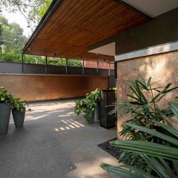
A defining feature of the project is its fully planted facade. A pragmatic approach was adopted to ensure the vitality of the greens. Plants are placed to be accessed via the staircase with landings to the balconies, avoiding the need to cross through the rooms for maintenance and sharing the responsibility of upkeep.
Effective Zoning to Enhance Functionality
The property's strategic location presented a dual-faced scenario, overlooking a small park at the rear and fronting a busy main road. To address the latter, a green strip and a service road were introduced as buffers to minimise noise intrusion. The green strip was designed to be unobtrusive, using low-maintenance materials and native plants that require minimal watering. The planted facade also adds a level of protection shielding the indoor environment from the noise and pollution of the adjoining road.
Sustainable Design with Shared Amenities and Accessible Maintenance
The A18 Residence is a single-family home designed for a family of four. The design process was collaborative, with the clients deeply engaged due to their keen interest in architectural aesthetics and sustainability. This collaboration led to the introduction of shared, energy-efficient amenities and resources, fostering efficiency. A terrace garden maintained with harvested rainwater also acts as a communal area for the family.
The balconies have been thoughtfully designed with an external staircase for convenient access and maintenance without compromising residents' privacy. The project unfolded organically across its various levels. On the ground floor, residents enjoy greenery from both front and rear gardens, offering a dynamic connection with nature. The first floor features a continuous living space that seamlessly merges with the lush surroundings. On the third floor, a strategically positioned courtyard artfully links to the rooftop terrace garden, extending the green narrative and providing panoramic views and a tangible connection to nature.
Solar panels on the roof provide electricity for common areas, while a rainwater harvesting system collects rainwater for irrigation. These features help to reduce the project's environmental impact and create a more sustainable urban lifestyle for its residents.
Blending Simplicity, Functionality, and Natural Light
The interiors of the A18 Residence are designed to complement the overall aesthetic of the project, with a focus on simplicity and functionality. The open-plan living space is flooded with natural light, thanks to the floor-to-ceiling windows. Spacious, well-lit bedrooms feature private balconies that offer stunning views of the surrounding greenery. The landscape is an integral part of the design, providing residents with a tranquil oasis in the city.
The A18 Residence stands as an example of how innovative design and a collaborative approach can transform an existing building into a thriving urban oasis. Its focus on sustainability, functionality, and connection to nature makes it a model for sustainable living in the city.
 Klopf Architecture
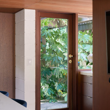
Nestled in the hills of Orinda, California, this 1951 residence is one of only seven extant homes, now known as “The Magnificent Seven”, designed by architect Olof Dahlstrand, a protégé of Frank Lloyd Wright. With its low-slung rooflines, natural materials, and deep integration with the sloping landscape, the home is a pristine example of mid-century modern design inspired by Wright’s organic principles. Over the years, prior homeowners have emphasized preservation, ensuring that the house remained relatively untouched. Each owner has respected the original architecture and stayed true to Dahlstrand’s intent. When a family of five—two college-aged sons and a middle school-aged daughter—acquired the property, they were captivated by its history, legacy of care, and architectural significance. While they appreciated Dahlstrand’s original vision, they also recognized the need to adapt the home for contemporary living while preserving its design integrity.
The remodel was conceived as a thoughtful response to the past—an effort to bring the house into the 21st century without compromising its soul. The primary mandate was to maintain architectural continuity while improving the functionality, comfort, and livability for a modern family. The design team—architects and contractor alike—worked with a shared reverence for the original architecture, allowing that mindset to guide even the most technical or pragmatic decisions.
A key objective was to increase natural light in the kitchen—a departure from Wrightian principles of enclosed, intimate cooking spaces—while maintaining the home’s architectural language. The kitchen was reconfigured to foster a stronger connection to adjacent living spaces while retaining the underlying concept of spatial separation. One of the most transformative architectural changes was the removal of a ridge beam that was originally planned to remain visible through the kitchen. During construction, the team collaborated on a better solution: a wide-flanged steel beam concealed within the roof envelope. This subtle move preserved the clean lines and ceiling continuity, a modern update carried out with utmost respect for the existing framework.
The home’s original powder room, previously accessible only through the kitchen, was relocated for better flow and privacy. A new powder room was carved out of former kitchen cabinetry—a narrow, interior space that could have felt dark and enclosed. To avoid this, the design extended the line of original transom windows into the new powder room and added a skylight above the vanity. The result is a bright and airy space that feels consistent with the rest of the home. Other updates included the installation of new solid-core interior doors with veneers carefully matched to the original mahogany, enhancing the continuity of the interiors. Even smaller decisions, such as placing the door knobs at 42 inches high, mirrored the original proportions. Every choice reflected a shared belief between the architect, contractor, and client: that new work should serve the integrity of the old.
The home’s extensive interior redwood millwork and paneling was meticulously restored. Where new materials were introduced—such as the replacement redwood soffit paneling—the contractor took pains to find finish nails that matched the original, rather than using modern equivalents. This level of craftsmanship and collaboration defined the project. It extended even to the detailing of a blind door to the new powder room, which had to disappear into the existing redwood board-and-batten wall. It was a team effort: the owner found a suitable handle, the architects devised the custom in-swing mechanism, and the contractor executed it so the door aligned precisely with the battens. Throughout, the homeowners were deeply engaged in the design process. One, a meticulous design enthusiast, focused on aesthetic integrity and historic detail. The other brought a practical and function-driven perspective, ensuring that new fixtures and materials would be durable and require minimal maintenance.
While the home’s location posed no major site challenges, sustainability was a key concern. The team upgraded the roof insulation, installed solar panels with battery storage, and added ductless mini-split cooling systems. Lighting was another area where modern technology was woven into a historic framework: new square LED fixtures echo the original custom perimeter soffit lights, maintaining the design language while offering advanced performance.
A planned expansion of a bedroom into suite with a bathroom had to be shelved due to budget constraints and the high cost of below-grade foundation work. Still, the team focused their efforts on making the most of the existing footprint, resolving constraints through design ingenuity rather than adding square footage. This renovation represents a collaborative achievement in preserving and evolving a historically significant home. Every decision was shaped by a shared ethos among clients, architects, and contractor: to maintain the home’s architectural soul while updating it for contemporary life. The result is a timeless modernist residence that continues Olof Dahlstrand’s legacy, remaining grounded in nature, craftsmanship, and human-scale design.
Klopf Architecture Team: John Klopf, AIA, Klara Kevane, Fernanda Bernardes
Interior Architectural Design: Klopf Architecture
Structural Engineer: Daniel Bastiao
Contractor: Don Larwood, Larwood Construction
Photography: Mariko Reed
Year Completed: 2022
 Klopf Architecture
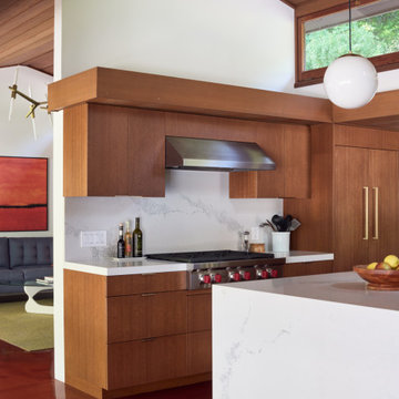
Nestled in the hills of Orinda, California, this 1951 residence is one of only seven extant homes, now known as “The Magnificent Seven”, designed by architect Olof Dahlstrand, a protégé of Frank Lloyd Wright. With its low-slung rooflines, natural materials, and deep integration with the sloping landscape, the home is a pristine example of mid-century modern design inspired by Wright’s organic principles. Over the years, prior homeowners have emphasized preservation, ensuring that the house remained relatively untouched. Each owner has respected the original architecture and stayed true to Dahlstrand’s intent. When a family of five—two college-aged sons and a middle school-aged daughter—acquired the property, they were captivated by its history, legacy of care, and architectural significance. While they appreciated Dahlstrand’s original vision, they also recognized the need to adapt the home for contemporary living while preserving its design integrity.
The remodel was conceived as a thoughtful response to the past—an effort to bring the house into the 21st century without compromising its soul. The primary mandate was to maintain architectural continuity while improving the functionality, comfort, and livability for a modern family. The design team—architects and contractor alike—worked with a shared reverence for the original architecture, allowing that mindset to guide even the most technical or pragmatic decisions.
A key objective was to increase natural light in the kitchen—a departure from Wrightian principles of enclosed, intimate cooking spaces—while maintaining the home’s architectural language. The kitchen was reconfigured to foster a stronger connection to adjacent living spaces while retaining the underlying concept of spatial separation. One of the most transformative architectural changes was the removal of a ridge beam that was originally planned to remain visible through the kitchen. During construction, the team collaborated on a better solution: a wide-flanged steel beam concealed within the roof envelope. This subtle move preserved the clean lines and ceiling continuity, a modern update carried out with utmost respect for the existing framework.
The home’s original powder room, previously accessible only through the kitchen, was relocated for better flow and privacy. A new powder room was carved out of former kitchen cabinetry—a narrow, interior space that could have felt dark and enclosed. To avoid this, the design extended the line of original transom windows into the new powder room and added a skylight above the vanity. The result is a bright and airy space that feels consistent with the rest of the home. Other updates included the installation of new solid-core interior doors with veneers carefully matched to the original mahogany, enhancing the continuity of the interiors. Even smaller decisions, such as placing the door knobs at 42 inches high, mirrored the original proportions. Every choice reflected a shared belief between the architect, contractor, and client: that new work should serve the integrity of the old.
The home’s extensive interior redwood millwork and paneling was meticulously restored. Where new materials were introduced—such as the replacement redwood soffit paneling—the contractor took pains to find finish nails that matched the original, rather than using modern equivalents. This level of craftsmanship and collaboration defined the project. It extended even to the detailing of a blind door to the new powder room, which had to disappear into the existing redwood board-and-batten wall. It was a team effort: the owner found a suitable handle, the architects devised the custom in-swing mechanism, and the contractor executed it so the door aligned precisely with the battens. Throughout, the homeowners were deeply engaged in the design process. One, a meticulous design enthusiast, focused on aesthetic integrity and historic detail. The other brought a practical and function-driven perspective, ensuring that new fixtures and materials would be durable and require minimal maintenance.
While the home’s location posed no major site challenges, sustainability was a key concern. The team upgraded the roof insulation, installed solar panels with battery storage, and added ductless mini-split cooling systems. Lighting was another area where modern technology was woven into a historic framework: new square LED fixtures echo the original custom perimeter soffit lights, maintaining the design language while offering advanced performance.
A planned expansion of a bedroom into suite with a bathroom had to be shelved due to budget constraints and the high cost of below-grade foundation work. Still, the team focused their efforts on making the most of the existing footprint, resolving constraints through design ingenuity rather than adding square footage. This renovation represents a collaborative achievement in preserving and evolving a historically significant home. Every decision was shaped by a shared ethos among clients, architects, and contractor: to maintain the home’s architectural soul while updating it for contemporary life. The result is a timeless modernist residence that continues Olof Dahlstrand’s legacy, remaining grounded in nature, craftsmanship, and human-scale design.
Klopf Architecture Team: John Klopf, AIA, Klara Kevane, Fernanda Bernardes
Interior Architectural Design: Klopf Architecture
Structural Engineer: Daniel Bastiao
Contractor: Don Larwood, Larwood Construction
Photography: Mariko Reed
Year Completed: 2022
 Smart Remodeling LLC
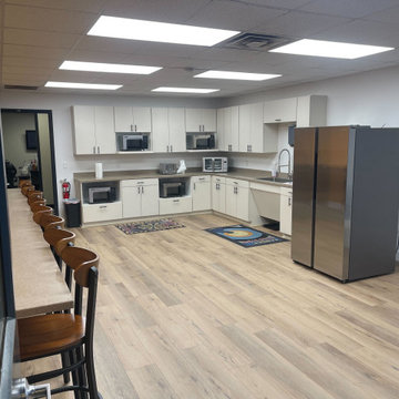
The Break Room Remodeling Project for Emerson Company aimed to transform the existing break room into a modern, functional, and aesthetically pleasing space. The comprehensive renovation included countertop replacement, flooring installation, cabinet refurbishment, and a fresh coat of paint. The goal was to create an inviting and comfortable environment that enhanced employee well-being, fostered collaboration, and aligned with Emerson Company's image.
Scope of Work:
Countertop Replacement, Flooring Installation, Cabinet Refurbishment, Painting, Lighting Enhancement, Furniture and Fixtures, Design and Layout, Timeline and Project Management
Benefits and Outcomes:
Enhanced Employee Experience, Improved Productivity, Enhanced Company Image, Higher Retention Rates
The Break Room Remodeling Project at Emerson Company successfully elevated the break room into a modern and functional space that aligned with the company's values and enhanced the overall work environment.
 KSI Kitchen & Bath
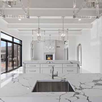
"KSI partnered with builder Cranbrook Custom Homes to bring this space to life, with KSI providing the cabinetry and design layout. The Silverton Panel door style in the White paint finish provides a timeless look. We made sure to include elegant details throughout the design. The luxury French range by La Cornue with a custom hood is a focal point. The refrigerator and freezer are adorned with custom mirrored appliance panels, while the glass cabinetry with mullions, moldings, and island waterfall edges further embellish the space.
The space lends itself well to a two-island design. This arrangement creates extra counter space and storage while allowing for increased traffic flow throughout the kitchen. The first island has a secondary sink and an under-counter fridge, creating the perfect prep space. We designed the second island at a taller height with built-in bench seating where the homeowner plans to add cushions and a table for an ideal seating area. This dual-island design provides for increased functionality in the kitchen whether preparing meals, entertaining, or both!" - Amanda Cerra, KSI Designer

 Michael Boice Collaborations
June - Giant Coneflower among Karl Foster Feather Reed Grass, Black Eyed Susan in the foreground, Helianthus angustifolius to the left
This is an example of a craftsman landscaping in New York.
This is an example of a craftsman landscaping in New York.
 KSI Kitchen & Bath
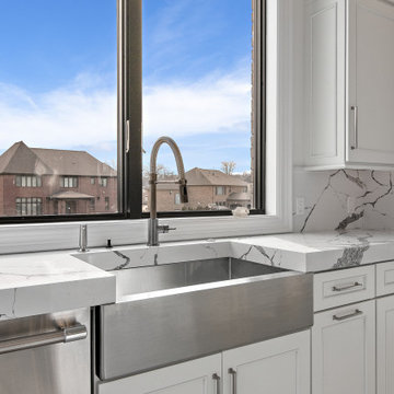
"KSI partnered with builder Cranbrook Custom Homes to bring this space to life, with KSI providing the cabinetry and design layout. The Silverton Panel door style in the White paint finish provides a timeless look. We made sure to include elegant details throughout the design. The luxury French range by La Cornue with a custom hood is a focal point. The refrigerator and freezer are adorned with custom mirrored appliance panels, while the glass cabinetry with mullions, moldings, and island waterfall edges further embellish the space.
The space lends itself well to a two-island design. This arrangement creates extra counter space and storage while allowing for increased traffic flow throughout the kitchen. The first island has a secondary sink and an under-counter fridge, creating the perfect prep space. We designed the second island at a taller height with built-in bench seating where the homeowner plans to add cushions and a table for an ideal seating area. This dual-island design provides for increased functionality in the kitchen whether preparing meals, entertaining, or both!" - Amanda Cerra, KSI Designer
 KSI Kitchen & Bath
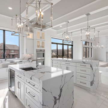
"KSI partnered with builder Cranbrook Custom Homes to bring this space to life, with KSI providing the cabinetry and design layout. The Silverton Panel door style in the White paint finish provides a timeless look. We made sure to include elegant details throughout the design. The luxury French range by La Cornue with a custom hood is a focal point. The refrigerator and freezer are adorned with custom mirrored appliance panels, while the glass cabinetry with mullions, moldings, and island waterfall edges further embellish the space.
The space lends itself well to a two-island design. This arrangement creates extra counter space and storage while allowing for increased traffic flow throughout the kitchen. The first island has a secondary sink and an under-counter fridge, creating the perfect prep space. We designed the second island at a taller height with built-in bench seating where the homeowner plans to add cushions and a table for an ideal seating area. This dual-island design provides for increased functionality in the kitchen whether preparing meals, entertaining, or both!" - Amanda Cerra, KSI Designer
 Smart Remodeling LLC
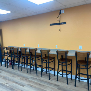
The Break Room Remodeling Project for Emerson Company aimed to transform the existing break room into a modern, functional, and aesthetically pleasing space. The comprehensive renovation included countertop replacement, flooring installation, cabinet refurbishment, and a fresh coat of paint. The goal was to create an inviting and comfortable environment that enhanced employee well-being, fostered collaboration, and aligned with Emerson Company's image.
Scope of Work:
Countertop Replacement, Flooring Installation, Cabinet Refurbishment, Painting, Lighting Enhancement, Furniture and Fixtures, Design and Layout, Timeline and Project Management
Benefits and Outcomes:
Enhanced Employee Experience, Improved Productivity, Enhanced Company Image, Higher Retention Rates
The Break Room Remodeling Project at Emerson Company successfully elevated the break room into a modern and functional space that aligned with the company's values and enhanced the overall work environment.
9