
Search results for "Gesture" in Home Design Ideas
 Eugene Pintail LLC
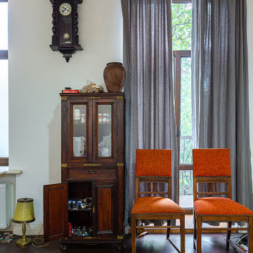
This project involved a complete transformation of both an apartment and the studio of the celebrated painter Alexander Roytburd. The renovation went beyond surface changes, reimagining every aspect of the space to create an environment that balances living, working, and artistic inspiration.
The design approach preserved a sense of intimacy and authenticity while introducing a contemporary rhythm. Architectural clarity, updated finishes, and custom solutions were carefully integrated to meet modern standards while respecting the spirit of its owner’s creative world. The interiors are rich in contrasts—elegant restraint set against expressive gestures, muted tones elevated by bold accents, and functional planning intertwined with atmospheric depth.
The result is more than just a renovated apartment; it is a deeply personal environment where art, life, and space are inseparable. Every corner speaks to the dual identity of home and studio, reflecting Roytburd’s legacy as an artist and thinker while offering a renewed sense of comfort and purpose

 Corpift Gift Ideas
Corpift turns every gesture into a memorable experience with Corpift unique corporate gift ideas, blending creativity and elegance to delight employees and clients alike.
 Salt + Dirt | Outside Design
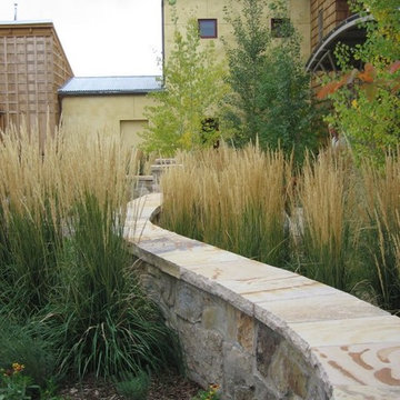
Architect Ron Robertson held a place in the hearts of the Carbondale community. This was one of his last projects prior to moving on to his next higher evolution in the Universe. As a designer, looking at what he created, I felt he was putting his life's work into this home, exploring all the mediums and iterations of his New West palette.
I felt a grand sweeping serpentine gesture- this stone wall spec'd to match pillars at the entry- would tie it all together, wedding the home to the landscape.
Gigi
Find the right local pro for your project
 EAG Studio
Reimagining an Urban Classic
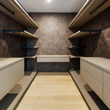
Perched high above San Francisco’s Cow Hollow neighborhood, this meticulously reimagined residence represents a thoughtful transformation of a classic urban home into a contemporary, light-filled sanctuary. The project involved a comprehensive renovation paired with both vertical and horizontal expansion, dramatically increasing the home’s footprint while enhancing its relationship to sweeping views of the Bay, the Palace of Fine Arts, and the surrounding hillside neighborhoods.
The design strategy focused on opening the home to light, air, and vistas—elements often constrained in the dense urban fabric of San Francisco. By extending the structure upward and outward, the architects created a dynamic four-level residence that unfolds gradually, culminating in expansive living spaces and rooftop terraces oriented toward panoramic city and water views.
Architecture that Frames the View
At the heart of the design is a careful orchestration of sightlines and natural light. Large black-framed windows punctuate the façade and interior spaces, deliberately positioned to capture iconic San Francisco vistas while flooding the home with daylight. The architecture prioritizes openness, allowing rooms to flow seamlessly while maintaining a strong visual connection to the surrounding landscape.
A dramatic skylight above the central stairwell anchors the vertical circulation of the home. This architectural gesture not only brings daylight deep into the interior but also reinforces the sense of spatial continuity between floors.
Warm Modern Interiors
Inside, the home balances architectural clarity with warm materiality. Wide-plank oak floors run throughout the residence, creating visual cohesion and grounding the interiors with natural warmth. Custom walnut millwork—integrated shelving, cabinetry, and wall panels—introduces depth and texture while complementing the clean lines of the architecture.
The interiors are intentionally restrained yet richly layered. Contemporary furnishings, sculptural lighting, and curated artwork add personality while maintaining the calm, sophisticated palette that defines the home.
The Social Heart of the Home
The main living level serves as the social centerpiece of the residence. An open-plan kitchen, dining area, and lounge space unfold toward the view, creating an environment that feels both expansive and intimate.
A sculptural marble island anchors the kitchen, functioning as both workspace and gathering hub. Surrounded by walnut cabinetry and professional-grade appliances, the kitchen merges elegance with functionality. Above, a cascading chandelier introduces a sense of vertical movement, reflecting the home’s emphasis on light and architectural rhythm.
Living areas are arranged to encourage conversation and connection. Generous seating, layered rugs, and thoughtful lighting define distinct zones within the open plan while maintaining uninterrupted sightlines toward the cityscape beyond.
Private Retreats Above the City
Upper levels of the home are dedicated to quieter, more intimate spaces. The primary suite is conceived as a private retreat, where expansive windows frame treetop views and invite natural light throughout the day.
The accompanying bathroom continues the home’s refined material palette. Marble surfaces, warm wood cabinetry, and brushed brass fixtures create a spa-like environment that balances luxury with tranquility.
Additional bedrooms and flexible living spaces offer comfort for family and guests, each designed with the same attention to light, proportion, and material richness.
Spaces for Entertaining
Lower levels provide additional areas for gathering and entertaining. A lounge and bar area offer a relaxed setting for hosting, while custom wine storage adds a sophisticated touch for collectors and enthusiasts.
These spaces transition easily to outdoor areas, reinforcing the home’s emphasis on indoor-outdoor living.
A Rooftop Above the Neighborhood
The transformation extends beyond the interior to include thoughtfully designed outdoor spaces. A landscaped rear yard introduces greenery and privacy at ground level, offering a serene urban escape.
Above it all, the rooftop terrace becomes the crown jewel of the residence. Elevated above the neighborhood, it provides sweeping views of the San Francisco Bay and the Palace of Fine Arts. Comfortable seating areas, lush planters, and open sky create an ideal setting for outdoor entertaining, sunset gatherings, or quiet moments overlooking the city.
A Contemporary Urban Sanctuary
The completed residence demonstrates the power of thoughtful renovation and expansion within a historic urban neighborhood. By combining contemporary architecture, warm materiality, and an intentional relationship to the surrounding landscape, the project transforms a traditional San Francisco home into a modern sanctuary above the city.
 Owings Brothers Contracting
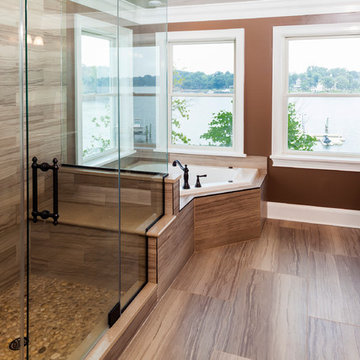
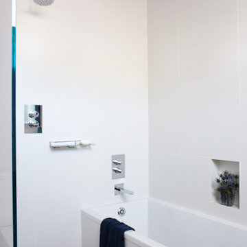
Whirlpool Water Tech Spa Tub and Steam Shower with bench. Emser Motion tile in the color Gesture grace the walls of the shower and bathroom floor and the floor of the shower is Emser Natural Stone Collection-Rivera Flat Pebbles. Koch Hastings collection double vanity in Stone.

 Turner Design Firm
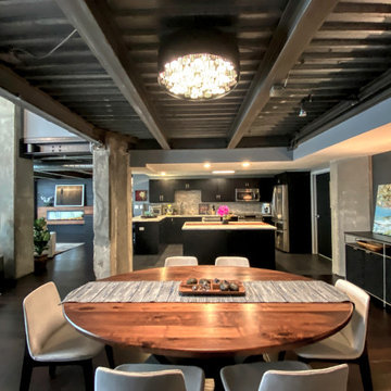
Organic Contemporary Design in an Industrial Setting… Organic Contemporary elements in an industrial building is a natural fit. Turner Design Firm designers Tessea McCrary and Jeanine Turner created a warm inviting home in the iconic Silo Point Luxury Condominiums.
Industrial Features Enhanced… Neutral stacked stone tiles work perfectly to enhance the original structural exposed steel beams. Our lighting selection were chosen to mimic the structural elements. Charred wood, natural walnut and steel-look tiles were all chosen as a gesture to the industrial era’s use of raw materials.
Creating a Cohesive Look with Furnishings and Accessories… Designer Tessea McCrary added luster with curated furnishings, fixtures and accessories. Her selections of color and texture using a pallet of cream, grey and walnut wood with a hint of blue and black created an updated classic contemporary look complimenting the industrial vide.
 Turner Design Firm
Organic Contemporary Design in an Industrial Setting… Organic Contemporary elements in an industrial building is a natural fit. Turner Design Firm designers Tessea McCrary and Jeanine Turner created a warm inviting home in the iconic Silo Point Luxury Condominiums.
Industrial Features Enhanced… Our lighting selection were chosen to mimic the structural elements. Charred wood, natural walnut and steel-look tiles were all chosen as a gesture to the industrial era’s use of raw materials.
Creating a Cohesive Look with Furnishings and Accessories… Designer Tessea McCrary added luster with curated furnishings, fixtures and accessories. Her selections of color and texture using a pallet of cream, grey and walnut wood with a hint of blue and black created an updated classic contemporary look complimenting the industrial vide.
 Dale Cohen Designstudio
Asked by her client to review a typically mundane South Hampton ‘50s saltbox because “the last designer they talked to said they would have to add on to make the house anything,” Ms. Cohen approached the renovation in exactly the opposite manner. To refine the small building footprint, precise architectural gestures were used with a series of finely calibrated moments make the space more gracious and welcoming. Architectural acts were bold in concept but not in actual construction work; such as capturing the car garage to add a hyper modern sunroom/den along with a powder room and laundry. Reconfiguring one side of the house’s roofline to manipulate the space into a sensational master suite saved the north side of the house from remaining an un-useful attic space. This inner sanctum of bedroom and master bath is reminiscent of a Hampton’s beachscape in all its elegance and minimalism. The only square footage actually added was a tiny 4X4 corner as an addition to the front entry, oddly an essential piece of real estate to make an actual vestibule. All these refinements make for a crafted, articulate result rather than bowing to the bigger is better theme, which is more prevalent in the Hamptons.
The function of the plan and the accompanying finishes are impressive. The Jack and Jill bathroom, an invention of the American post-war housing boom, was outfitted in handsome walnut Duravit vanity cabinets and neutral finishes. The master bath, with its expansive skylights, might be mistaken for a conceptual art installation due to its evocative marble countertop in striped ethereal hues. Finally, Ms. Cohen uses wallpaper like a museum curator, hanging an iconic Knoll pattern to punctuate the dining/media space.
Each room in the house was sculpted via a palette of watercolor blue of varying saturations. Fabrics were culled from the greats of modernist textiles, Maharam’s Quatrefoil pattern in blue and Knoll classic Sway pattern in sea shades. The blue on white “beach” scheme runs from a soft cotton candy sky in the girl’s room to an immersive David Sutherland Park Bark wallpaper in the powder room. This intellectual inquiry as to what are the true colors at the beach belays the sophistication that surpasses the usual nautical curse of the average beach house. Out of the corner of your eye, in almost every quadrant of the house, is a burst of colorful expression and delight; this serves as Ms. Cohen’s painterly gift to the client.
Ms. Cohen’s hidden strength is her ability to choreograph a seating area. Whether it is a formal living room or the ultimate hang out spot, each space has the right amount of distance, intimacy and dare I say intrigue to make the arrangements inviting. Each conversation, because it really looks like a fine chat can be had, has an elegant side table ready for duty and all tête-à-têtes are regulated to a sumptuous area rugs. Habitants in Ms. Cohen’s world only work through deep discourse.
 HJT Landscape Architects, LLC
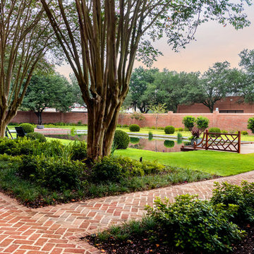
As simple as four plant types, indica azaleas, irises, mondo grass and boxwood and as pure as the ‘golden ratio’ that drove the pond’s shape, the evolution of this garden was driven by simple gestures. Located east of downtown Houston in the Buffalo Heights district and adjacent to a midcentury brick & stucco building, the casting garden serves a hunting and fishing retail outfitter. The conceptual approach for the garden was inspired by the southern sensibilities of Middleton Place on the Ashley River with its beautiful drifts of azaleas, live oaks, and hidden reflecting pond.
 Slow Flowers LLC
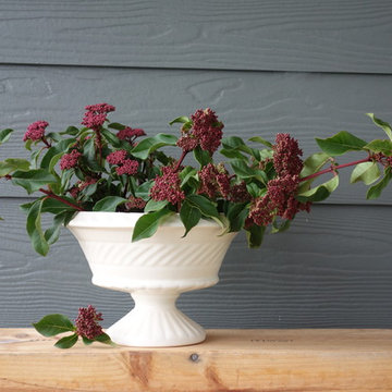
Start with foliage and woody branch stems. Note how the Viburnum tinus is a broadleaf evergreen shrub with wine-colored stems and buds. Placement creates the lines that will ultimately take shape as the arrangement progresses. I love to choose one longer stem to "reach out" to the right as an asymmetrical gesture. Design & photography (c) Debra Prinzing, Slow Flowers LLC
 Turner Design Firm
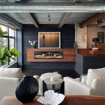
Organic Contemporary Design in an Industrial Setting… Organic Contemporary elements in an industrial building is a natural fit. Turner Design Firm designers Tessea McCrary and Jeanine Turner created a warm inviting home in the iconic Silo Point Luxury Condominiums.
Transforming the Least Desirable Feature into the Best… We pride ourselves with the ability to take the least desirable feature of a home and transform it into the most pleasant. This condo is a perfect example. In the corner of the open floor living space was a large drywalled platform. We designed a fireplace surround and multi-level platform using warm walnut wood and black charred wood slats. We transformed the space into a beautiful and inviting sitting area with the help of skilled carpenter, Jeremy Puissegur of Cajun Crafted and experienced installer, Fred Schneider
Industrial Features Enhanced… Neutral stacked stone tiles work perfectly to enhance the original structural exposed steel beams. Our lighting selection were chosen to mimic the structural elements. Charred wood, natural walnut and steel-look tiles were all chosen as a gesture to the industrial era’s use of raw materials.
Creating a Cohesive Look with Furnishings and Accessories… Designer Tessea McCrary added luster with curated furnishings, fixtures and accessories. Her selections of color and texture using a pallet of cream, grey and walnut wood with a hint of blue and black created an updated classic contemporary look complimenting the industrial vide.
 Dale Cohen Designstudio
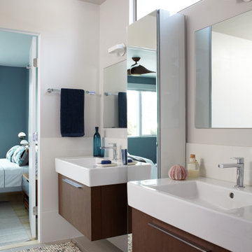
Asked by her client to review a typically mundane South Hampton ‘50s saltbox because “the last designer they talked to said they would have to add on to make the house anything,” Ms. Cohen approached the renovation in exactly the opposite manner. To refine the small building footprint, precise architectural gestures were used with a series of finely calibrated moments make the space more gracious and welcoming. Architectural acts were bold in concept but not in actual construction work; such as capturing the car garage to add a hyper modern sunroom/den along with a powder room and laundry. Reconfiguring one side of the house’s roofline to manipulate the space into a sensational master suite saved the north side of the house from remaining an un-useful attic space. This inner sanctum of bedroom and master bath is reminiscent of a Hampton’s beachscape in all its elegance and minimalism. The only square footage actually added was a tiny 4X4 corner as an addition to the front entry, oddly an essential piece of real estate to make an actual vestibule. All these refinements make for a crafted, articulate result rather than bowing to the bigger is better theme, which is more prevalent in the Hamptons.
The function of the plan and the accompanying finishes are impressive. The Jack and Jill bathroom, an invention of the American post-war housing boom, was outfitted in handsome walnut Duravit vanity cabinets and neutral finishes. The master bath, with its expansive skylights, might be mistaken for a conceptual art installation due to its evocative marble countertop in striped ethereal hues. Finally, Ms. Cohen uses wallpaper like a museum curator, hanging an iconic Knoll pattern to punctuate the dining/media space.
Each room in the house was sculpted via a palette of watercolor blue of varying saturations. Fabrics were culled from the greats of modernist textiles, Maharam’s Quatrefoil pattern in blue and Knoll classic Sway pattern in sea shades. The blue on white “beach” scheme runs from a soft cotton candy sky in the girl’s room to an immersive David Sutherland Park Bark wallpaper in the powder room. This intellectual inquiry as to what are the true colors at the beach belays the sophistication that surpasses the usual nautical curse of the average beach house. Out of the corner of your eye, in almost every quadrant of the house, is a burst of colorful expression and delight; this serves as Ms. Cohen’s painterly gift to the client.
Ms. Cohen’s hidden strength is her ability to choreograph a seating area. Whether it is a formal living room or the ultimate hang out spot, each space has the right amount of distance, intimacy and dare I say intrigue to make the arrangements inviting. Each conversation, because it really looks like a fine chat can be had, has an elegant side table ready for duty and all tête-à-têtes are regulated to a sumptuous area rugs. Habitants in Ms. Cohen’s world only work through deep discourse.
 Klopf Architecture
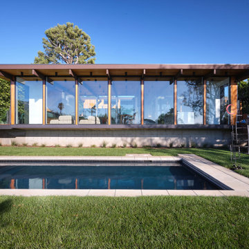
Malibu Glass Box House by Klopf Architecture
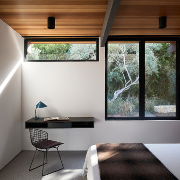
Following the devastating Woolsey Fire of 2018, the site in Malibu offered a unique opportunity to rebuild not just a home, but a new architectural composition that highlighted the property’s potential while navigating strict fire-rebuild codes in the area. Designed by Klopf Architecture, this project embraced a set of limitations and translated them into an architectural asset.
The city’s fire-rebuild process required the new structure to remain close to the original footprint, size and bulk, a constraint that ultimately clarified the architectural direction. Perched near the front of a long, narrow lot, the new home frames and overlooks a private, park-like rear expanse, an uncommon luxury especially in this part of Malibu .
Without a fixed program, the design process allowed for a different kind of creative focus allowing Klopf Architecture the opportunity to explore how a modernist home could best respond to this site. The team approached the project not with a list of requirements, but with a question: How might a modernist live here? What spatial qualities would inspire calm, connection, and a sense of wonder in this setting? The process became less about problem-solving and more about architectural storytelling—letting the site, the light, and the principles of modern design guide the form and flow of the home.
The response emerged in the form of a glass-box pavilion, an open, Mid-Century Modern inspired living, dining, and kitchen space that floats at the edge of the property’s natural descent. Connected to the more enclosed, private areas of the home by a glass-walled hallway, the living pavilion becomes a distinct centerpiece of the design. It opens on all four sides to the landscape with decks and patios on the flanks, an internal garden and water feature to the north, and a dramatic unguarded view of the expansive backyard and ocean horizon to the south.
Because of the mandated footprint, careful planning was required to ensure every space could still engage with light, landscape, or both. Strategic voids in the form of atriums and courtyards allow daylight to filter deep into the home’s core, while offering moments of surprise and retreat. These design gestures allow natural light to filter deep into the interior, creating a sense of brightness and openness throughout the day. At the same time, they expand the perceptual boundaries between inside and out, making the home feel more expansive while anchoring its connection to the surrounding landscape.
The siting of the house is what gives it its unique character. Rather than receding into the backyard like the neighboring homes, the house holds a slight prominence. From the central living pavilion, stepping down into the landscape feels more like entering a secluded park where a separate existing accessory structure, trail, and recreational areas await. The home’s modest street presence gives way to this unfolding drama of space, view, and nature.
Fire-resilient materials and assemblies are integrated seamlessly throughout including triple-pane glazing, under-slab and roof insulation, and locally sourced fire-rated cladding ensure the house not only meets Calfornia’s rigorous wildland-urban interface (WUI) standards, but feels effortlessly aligned with them. While technical decisions like fire-hardening and mechanical systems presented some construction challenges, particularly around the cantilevered glass box, the team found a functional compromise that preserved the integrity of the design.
Inside, a restrained palette and exposed post and beam design celebrate the ethos of mid-century modernism. A central circulation spine extends from the entry to the rear glass wall, offering a continuous visual link from street to ocean. Spaces such as the library and office, though more intimate in scale, are never cut off from nature as each opens to its own unique courtyard or garden view.
Though born out of a strict regulatory framework and developed without a specific client, the rebuild design unfolded with remarkable clarity. Grounded in site logic, refined by limitations and an emphasis on timeless spatial relationships – light, proportion, and a strong connection to nature, the resulting design feels both effortless and uplifting. The home lives lightly on the land, opens generously to its surroundings, and strikes a careful balance between privacy, openness, and calm. For Klopf Architecture, it stands as a compelling case study in how site, code, and circumstantial constraints can inspire enduring, modernist architecture. With years of experience reimagining mid-century modern design for how people live today, the firm took the project’s limitations as an opportunity. The result is a home shaped by open, flowing spaces, strong indoor-outdoor connections, and a calm, clear sense of structure. It’s a good reminder that even with strict constraints, there’s still room for architecture to breathe—and for modernism to keep moving forward.
Klopf Architecture project team: Geoff Campen, John Klopf, AIA, and Sherry Tan
Structural Engineer: ZFA
Contractor: Maison D’Artiste
Photography: ©2025 Mariko Reed
Year Completed: 2023
 Wright Architecture
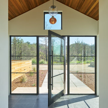
After losing their family home in the Tubbs fire, our clients were determined to rebuild in a way that honors the place they have called home for most of their lives.
Perched on a hill just off-of Mark West Springs Road in Sonoma County wine country, this single-story home, curves around the site in a welcoming gesture. Walking through the house, you discover varied outdoor spaces which echo cozy, light-filled interiors. The design utilizes traditional forms, modern lines and natural materials to create a serene dwelling.
 Klopf Architecture
Malibu Glass Box House by Klopf Architecture
Following the devastating Woolsey Fire of 2018, the site in Malibu offered a unique opportunity to rebuild not just a home, but a new architectural composition that highlighted the property’s potential while navigating strict fire-rebuild codes in the area. Designed by Klopf Architecture, this project embraced a set of limitations and translated them into an architectural asset.
The city’s fire-rebuild process required the new structure to remain close to the original footprint, size and bulk, a constraint that ultimately clarified the architectural direction. Perched near the front of a long, narrow lot, the new home frames and overlooks a private, park-like rear expanse, an uncommon luxury especially in this part of Malibu .
Without a fixed program, the design process allowed for a different kind of creative focus allowing Klopf Architecture the opportunity to explore how a modernist home could best respond to this site. The team approached the project not with a list of requirements, but with a question: How might a modernist live here? What spatial qualities would inspire calm, connection, and a sense of wonder in this setting? The process became less about problem-solving and more about architectural storytelling—letting the site, the light, and the principles of modern design guide the form and flow of the home.
The response emerged in the form of a glass-box pavilion, an open, Mid-Century Modern inspired living, dining, and kitchen space that floats at the edge of the property’s natural descent. Connected to the more enclosed, private areas of the home by a glass-walled hallway, the living pavilion becomes a distinct centerpiece of the design. It opens on all four sides to the landscape with decks and patios on the flanks, an internal garden and water feature to the north, and a dramatic unguarded view of the expansive backyard and ocean horizon to the south.
Because of the mandated footprint, careful planning was required to ensure every space could still engage with light, landscape, or both. Strategic voids in the form of atriums and courtyards allow daylight to filter deep into the home’s core, while offering moments of surprise and retreat. These design gestures allow natural light to filter deep into the interior, creating a sense of brightness and openness throughout the day. At the same time, they expand the perceptual boundaries between inside and out, making the home feel more expansive while anchoring its connection to the surrounding landscape.
The siting of the house is what gives it its unique character. Rather than receding into the backyard like the neighboring homes, the house holds a slight prominence. From the central living pavilion, stepping down into the landscape feels more like entering a secluded park where a separate existing accessory structure, trail, and recreational areas await. The home’s modest street presence gives way to this unfolding drama of space, view, and nature.
Fire-resilient materials and assemblies are integrated seamlessly throughout including triple-pane glazing, under-slab and roof insulation, and locally sourced fire-rated cladding ensure the house not only meets Calfornia’s rigorous wildland-urban interface (WUI) standards, but feels effortlessly aligned with them. While technical decisions like fire-hardening and mechanical systems presented some construction challenges, particularly around the cantilevered glass box, the team found a functional compromise that preserved the integrity of the design.
Inside, a restrained palette and exposed post and beam design celebrate the ethos of mid-century modernism. A central circulation spine extends from the entry to the rear glass wall, offering a continuous visual link from street to ocean. Spaces such as the library and office, though more intimate in scale, are never cut off from nature as each opens to its own unique courtyard or garden view.
Though born out of a strict regulatory framework and developed without a specific client, the rebuild design unfolded with remarkable clarity. Grounded in site logic, refined by limitations and an emphasis on timeless spatial relationships – light, proportion, and a strong connection to nature, the resulting design feels both effortless and uplifting. The home lives lightly on the land, opens generously to its surroundings, and strikes a careful balance between privacy, openness, and calm. For Klopf Architecture, it stands as a compelling case study in how site, code, and circumstantial constraints can inspire enduring, modernist architecture. With years of experience reimagining mid-century modern design for how people live today, the firm took the project’s limitations as an opportunity. The result is a home shaped by open, flowing spaces, strong indoor-outdoor connections, and a calm, clear sense of structure. It’s a good reminder that even with strict constraints, there’s still room for architecture to breathe—and for modernism to keep moving forward.
Klopf Architecture project team: Geoff Campen, John Klopf, AIA, and Sherry Tan
Structural Engineer: ZFA
Contractor: Maison D’Artiste
Photography: ©2025 Mariko Reed
Year Completed: 2023
 NIMMO Architecture
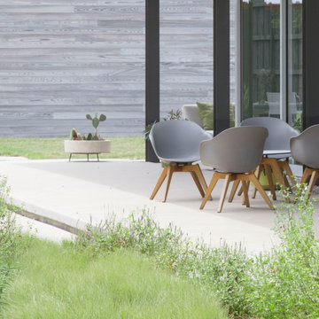
Modern renovation of a ranch style home in Dallas, Texas that included an addition, pool, detached pool cabana, and detached studio and workshop. Creating a quiet gesture to the neighborhood and utilizing the entirety of the lot were high priorities for the client. Sho sugi ban (charred) cypress cladding with a simple roof form created a backdrop for the variety of native plantings toward the street. With the addition of a steel and timber structure, along with expanses of floor to ceiling windows, the team made it a priority to transform the somewhat gloomy, compartmental space to one that was flowing and connected to the pool and landscape.
 Assembledge
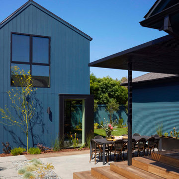
Set in Hancock Park, a historic residential enclave in central Los Angeles, the St. Andrews Accessory Dwelling Unit is designed in concert with an addition to the main house.
Richly colored, V-groove fiber cement panels provide a visual connection between the new two-story ADU and the existing 1916 craftsman bungalow. Yet, the ADU also expresses contemporary features through its distilled sculptural form. Clean lines and simple geometry emphasize the modern gestures while large windows and pocketing glass doors allow for plenty of natural light and connectivity to the exterior, producing a kind of courtyard in relation to the main home.
The compact size required an efficient approach. Downstairs, a kitchenette and living space give definition to an open floor plan. The upper level is reserved for a full bathroom and bedroom with vaulted ceilings. Polished concrete, white oak, and black granite enrich the interiors.
A primary suite addition to the main house blends seamlessly with the original. Hallway arches echo the original craftsman interior, connecting the existing living spaces to the lower addition which opens at ground level to the rear yard.
Together, the ADU, main house, and a newly constructed patio with a steel trellis create an indoor/outdoor ensemble. Warm and inviting project results from the careful balance of historical and contemporary, minimalist and eclectic.
 Klopf Architecture
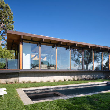
Malibu Glass Box House by Klopf Architecture
Following the devastating Woolsey Fire of 2018, the site in Malibu offered a unique opportunity to rebuild not just a home, but a new architectural composition that highlighted the property’s potential while navigating strict fire-rebuild codes in the area. Designed by Klopf Architecture, this project embraced a set of limitations and translated them into an architectural asset.
The city’s fire-rebuild process required the new structure to remain close to the original footprint, size and bulk, a constraint that ultimately clarified the architectural direction. Perched near the front of a long, narrow lot, the new home frames and overlooks a private, park-like rear expanse, an uncommon luxury especially in this part of Malibu .
Without a fixed program, the design process allowed for a different kind of creative focus allowing Klopf Architecture the opportunity to explore how a modernist home could best respond to this site. The team approached the project not with a list of requirements, but with a question: How might a modernist live here? What spatial qualities would inspire calm, connection, and a sense of wonder in this setting? The process became less about problem-solving and more about architectural storytelling—letting the site, the light, and the principles of modern design guide the form and flow of the home.
The response emerged in the form of a glass-box pavilion, an open, Mid-Century Modern inspired living, dining, and kitchen space that floats at the edge of the property’s natural descent. Connected to the more enclosed, private areas of the home by a glass-walled hallway, the living pavilion becomes a distinct centerpiece of the design. It opens on all four sides to the landscape with decks and patios on the flanks, an internal garden and water feature to the north, and a dramatic unguarded view of the expansive backyard and ocean horizon to the south.
Because of the mandated footprint, careful planning was required to ensure every space could still engage with light, landscape, or both. Strategic voids in the form of atriums and courtyards allow daylight to filter deep into the home’s core, while offering moments of surprise and retreat. These design gestures allow natural light to filter deep into the interior, creating a sense of brightness and openness throughout the day. At the same time, they expand the perceptual boundaries between inside and out, making the home feel more expansive while anchoring its connection to the surrounding landscape.
The siting of the house is what gives it its unique character. Rather than receding into the backyard like the neighboring homes, the house holds a slight prominence. From the central living pavilion, stepping down into the landscape feels more like entering a secluded park where a separate existing accessory structure, trail, and recreational areas await. The home’s modest street presence gives way to this unfolding drama of space, view, and nature.
Fire-resilient materials and assemblies are integrated seamlessly throughout including triple-pane glazing, under-slab and roof insulation, and locally sourced fire-rated cladding ensure the house not only meets Calfornia’s rigorous wildland-urban interface (WUI) standards, but feels effortlessly aligned with them. While technical decisions like fire-hardening and mechanical systems presented some construction challenges, particularly around the cantilevered glass box, the team found a functional compromise that preserved the integrity of the design.
Inside, a restrained palette and exposed post and beam design celebrate the ethos of mid-century modernism. A central circulation spine extends from the entry to the rear glass wall, offering a continuous visual link from street to ocean. Spaces such as the library and office, though more intimate in scale, are never cut off from nature as each opens to its own unique courtyard or garden view.
Though born out of a strict regulatory framework and developed without a specific client, the rebuild design unfolded with remarkable clarity. Grounded in site logic, refined by limitations and an emphasis on timeless spatial relationships – light, proportion, and a strong connection to nature, the resulting design feels both effortless and uplifting. The home lives lightly on the land, opens generously to its surroundings, and strikes a careful balance between privacy, openness, and calm. For Klopf Architecture, it stands as a compelling case study in how site, code, and circumstantial constraints can inspire enduring, modernist architecture. With years of experience reimagining mid-century modern design for how people live today, the firm took the project’s limitations as an opportunity. The result is a home shaped by open, flowing spaces, strong indoor-outdoor connections, and a calm, clear sense of structure. It’s a good reminder that even with strict constraints, there’s still room for architecture to breathe—and for modernism to keep moving forward.
Klopf Architecture project team: Geoff Campen, John Klopf, AIA, and Sherry Tan
Structural Engineer: ZFA
Contractor: Maison D’Artiste
Photography: ©2025 Mariko Reed
Year Completed: 2023
 Klopf Architecture
Malibu Glass Box House by Klopf Architecture
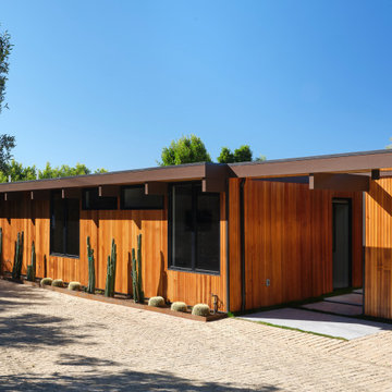
Following the devastating Woolsey Fire of 2018, the site in Malibu offered a unique opportunity to rebuild not just a home, but a new architectural composition that highlighted the property’s potential while navigating strict fire-rebuild codes in the area. Designed by Klopf Architecture, this project embraced a set of limitations and translated them into an architectural asset.
The city’s fire-rebuild process required the new structure to remain close to the original footprint, size and bulk, a constraint that ultimately clarified the architectural direction. Perched near the front of a long, narrow lot, the new home frames and overlooks a private, park-like rear expanse, an uncommon luxury especially in this part of Malibu .
Without a fixed program, the design process allowed for a different kind of creative focus allowing Klopf Architecture the opportunity to explore how a modernist home could best respond to this site. The team approached the project not with a list of requirements, but with a question: How might a modernist live here? What spatial qualities would inspire calm, connection, and a sense of wonder in this setting? The process became less about problem-solving and more about architectural storytelling—letting the site, the light, and the principles of modern design guide the form and flow of the home.
The response emerged in the form of a glass-box pavilion, an open, Mid-Century Modern inspired living, dining, and kitchen space that floats at the edge of the property’s natural descent. Connected to the more enclosed, private areas of the home by a glass-walled hallway, the living pavilion becomes a distinct centerpiece of the design. It opens on all four sides to the landscape with decks and patios on the flanks, an internal garden and water feature to the north, and a dramatic unguarded view of the expansive backyard and ocean horizon to the south.
Because of the mandated footprint, careful planning was required to ensure every space could still engage with light, landscape, or both. Strategic voids in the form of atriums and courtyards allow daylight to filter deep into the home’s core, while offering moments of surprise and retreat. These design gestures allow natural light to filter deep into the interior, creating a sense of brightness and openness throughout the day. At the same time, they expand the perceptual boundaries between inside and out, making the home feel more expansive while anchoring its connection to the surrounding landscape.
The siting of the house is what gives it its unique character. Rather than receding into the backyard like the neighboring homes, the house holds a slight prominence. From the central living pavilion, stepping down into the landscape feels more like entering a secluded park where a separate existing accessory structure, trail, and recreational areas await. The home’s modest street presence gives way to this unfolding drama of space, view, and nature.
Fire-resilient materials and assemblies are integrated seamlessly throughout including triple-pane glazing, under-slab and roof insulation, and locally sourced fire-rated cladding ensure the house not only meets Calfornia’s rigorous wildland-urban interface (WUI) standards, but feels effortlessly aligned with them. While technical decisions like fire-hardening and mechanical systems presented some construction challenges, particularly around the cantilevered glass box, the team found a functional compromise that preserved the integrity of the design.
Inside, a restrained palette and exposed post and beam design celebrate the ethos of mid-century modernism. A central circulation spine extends from the entry to the rear glass wall, offering a continuous visual link from street to ocean. Spaces such as the library and office, though more intimate in scale, are never cut off from nature as each opens to its own unique courtyard or garden view.
Though born out of a strict regulatory framework and developed without a specific client, the rebuild design unfolded with remarkable clarity. Grounded in site logic, refined by limitations and an emphasis on timeless spatial relationships – light, proportion, and a strong connection to nature, the resulting design feels both effortless and uplifting. The home lives lightly on the land, opens generously to its surroundings, and strikes a careful balance between privacy, openness, and calm. For Klopf Architecture, it stands as a compelling case study in how site, code, and circumstantial constraints can inspire enduring, modernist architecture. With years of experience reimagining mid-century modern design for how people live today, the firm took the project’s limitations as an opportunity. The result is a home shaped by open, flowing spaces, strong indoor-outdoor connections, and a calm, clear sense of structure. It’s a good reminder that even with strict constraints, there’s still room for architecture to breathe—and for modernism to keep moving forward.
Klopf Architecture project team: Geoff Campen, John Klopf, AIA, and Sherry Tan
Structural Engineer: ZFA
Contractor: Maison D’Artiste
Photography: ©2025 Mariko Reed
Year Completed: 2023
 New Explode Construction
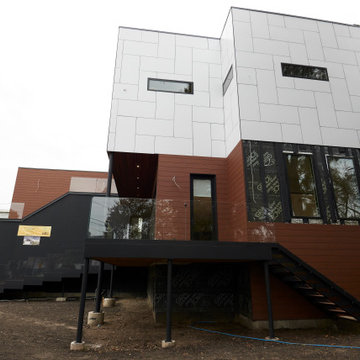
From the street, the Bowmanville House commands attention with its confident interplay of form, color, and texture. The design alternates between light and dark volumes, with white Trespa panels stacked above deep brown cladding and black accents. This layering not only enhances the home's visual depth but also anchors the structure firmly to its double-lot site.
The elevated glass-fronted deck on the upper level creates a striking focal point, projecting outward as both an architectural feature and a functional living space. Beneath it, sheltered ground-level space adds versatility, offering shade and protection while reinforcing the building's sense of proportion.
The black vertical stair at the side provides a crisp architectural line, while the arrangement of windows punctuates the facade with rhythm and balance. Every choice—from material selection to massing—reflects a modernist ethos tailored for family living in an urban neighborhood.
This home doesn't just sit on the lot—it defines it. It's a bold gesture of contemporary design in a context where few homes push boundaries this way, setting a new precedent for how form and function can coexist beautifully.
18