
Search results for "Guide people" in Home Design Ideas
 Ferriss - Architectural Renderings
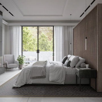
7 mistakes in bedroom design and ways to avoid them.
ERROR # 1 - Incorrect bed size.
This is a problem with any furniture in principle. When, according to the plan and ergonomic calculations, it becomes size to size, but in fact, it looks cumbersome, visually overflowing the space or, on the contrary, turns out to be too small and looks awkward.
How to avoid: Always be guided by the proportions of the size of the furniture in the room. Try to choose as big a bed as possible, but stay realistic. The main thing is that the width of the passageways in the bedroom should not be less than 70cm, and for comfortable movement, it is better to do everything 100cm.
ERROR # 2 - Poor lighting and switches.
Even in a small bedroom, you need multiple light sources. A single chandelier in the center of the ceiling is not enough, because it creates the effect of darkening the corners, and the room seems uncomfortable.
How to avoid: Hang a sconce over your headboard. Don't forget to light up the space next to the mirror and wardrobe. And be sure to place switches close to the bed so that you don't have to go to the other end of the room after an evening with a book in bed.
Do not forget about a sufficient number of outlets, this should be done even at the planning stage.
ERROR # 3 - Few storage locations
The fewer well-thought-out cabinets and shelving, the more things are visible. And the clutter spoils even the most stylish and expensive interior.
How to avoid: In addition to bedside tables, a chest of drawers (for storing small things) and a built-in wardrobe can be placed in a small bedroom: unlike a usual one, it takes up space from floor to ceiling, thereby accommodating more items. In addition, the built-in structure looks more solid and often merges with the walls, making the setting complete.
ERROR # 4 - Carpet of the wrong size.
The carpet in the bedroom is a great addition, and sometimes the final touch of the whole composition. But often people choose the wrong size or do not use it at all.
How to avoid: Choosing the right size can be guided by the unspoken rule, according to which the carpet should be 1 meter larger than the bed, both lengthwise and across. If the room is large, then it is recommended that the indentation of the carpet from the wall is 45-50 cm, if it is small, then 20-30 cm can be dispensed with.
ERROR # 5 Typical design.
If you buy a typical bed, bedside tables, and wardrobe from one manufacturer, then the interior will turn out to be formulaic and impersonal. No accessories and color schemes will help him.
How to avoid: The interior should reflect the character of its owner, and the person living in it will feel comfortable. Explore different collections of furniture and try to assemble a capsule in the same color scheme, but at the same time different in texture and shape.
ERROR # 6 Empty walls.
Even if the bedroom is a room for relaxation, it would be a mistake to make a space out of it that is intended solely for sleeping. Ascetic furnishings, unadorned walls, boring furniture, and bed linen - all this does not improve the mood at all, but, on the contrary, creates a gloomy mood.
How to avoid: The walls in the bedroom are a blank slate that you can transform into something original, beautiful, and unique to your liking. Even if you just paint one of the walls in a contrasting color, and decorate the other with several photos from the Internet, printed and inserted into frames, you can transform the atmosphere of the room as a whole.
ERROR # 7 Too dark interior.
One should not be deceived by the beauty of the thick dark tones of interior paint. It has long been known that dark blue, burgundy, blueberry, chocolate, and black for the bedroom should not be used in large quantities, since such an environment will have a tangible effect and interfere with a vigorous awakening in the morning.
How to avoid: If you like a rich range, try choosing derived shades a few tones lighter, for example, instead of black or graphite, choose gray-brown, dove-gray for the walls, and blue can be replaced with cornflower blue or azure.
Don't forget to combine dark tones with lots of whites, creams, complementing shimmery accessories, and vibrant décor.
https://www.ferriss.co/
#ferriss #We_bring_objects_to_life #3drendering #architecture #San_Francisco
 M Atelier
Lighting fixtures come in different forms and styles, and they are used to provide a source of light in the home. Indeed, if you are to take photos of your rooms, you will see that they contribute to the style implemented by your interior designer. However, these lighting fixtures do more than add to a home’s aesthetic; they are placed in such positions, in such forms, to perform a specific function.
Every interior design company in Singapore knows that lighting design comes in three forms: ambient or general lighting, task lighting, and accent lighting. Accent lights are often seen to support both ambient and task lighting sources, but how do you maximise their features?
According to interior design companies in Singapore, lamps are used to accentuate homes in various ways, such as the following:
1. Accent lighting brings out the function of space.
As homeowners, we do not always realise the true function of space apart from its semantic or aesthetic value. By strategically placing an accent light, we can see, feel, and utilise the purpose of a specific area of the house. For example, corridors leading to bedrooms are often empty and left unattended.
However, with recessive lights installed, we can better see that these passageways direct us to different rooms where we find comfort. Lights in corridors also give us the freedom of movement, as the illumination guides us when moving from one part of the house to the other.
2. Accent lights help build the ambiance in the room.
Another important aspect of home interiors is the ambiance. The right ambiance gives you as the homeowner, as sense of belongingness in your own space. Ambiance is an underlying reason people hire interior designers to renovate their homes –they want to make their space liveable, and at it all begins by achieving the right environment.
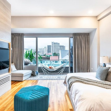
While ambient lighting provides the general illumination around the room, accent lights support them by boosting the level of surrounding ambiance. You may notice these when you switch on the corner lights or the frosted wall lamps instead of the centre light; your room becomes cosier and indulging, allowing you to relax feel at ease.
An excellent type of accent lighting are backlights. They keep the room lit without having to brighten up the entire space. Interior designers use these in areas of the house where a cosy or comforting ambiance is most wanted, such as the bedroom. They also use it in kitchens and living rooms to maintain a peaceful vibe at night without making the space dark.
3. Accent lighting also creates balance between pattern, texture, and form in the home.
Accent lighting likewise creates balance between the different elements of interior design. These include pattern, texture, and form. While ambient lighting illuminates the entire room space, accent lights on the other hand help make the space look wider at certain situations. They can also be used to tone down sharp textures in between the spaces, from ceilings to walls to floors. In a way, accent lights create harmony and continuity across the home’s interiors.
Overall, accent lighting is all about amplifying a chosen mood for the room. Using the right fixtures, you can achieve the kind of atmosphere you want not only in your specific places but for your entire house.

 Zelaya Properties LLC
We used: Custom cherry cabinetry in Arts & Crafts Shaker style by Kabinart in Boulder and Espresso stains. Liberty Hardware Venetian bronze 1-1/2" cabinet knobs. KitchenAid Architect II Series 22 CF counter-depth French door refrigerator. KitchenAid Architect Series II 27" convection single wall oven. KitchenAid 36" 6-burner dual fuel freestanding commercial-style range. KitchenAid Architect II Series 24" dishwasher. Sharp Insight Pro Series 24" built-in microwave drawer (Model #KB6524PS). Crystorama Solaris 12" wide pendant lights in English bronze. Granite countertops in Brown Fantasy. 3"x6" polished marble backsplash.
Paint colors:
Walls: Glidden Silver Cloud 30YY 63/024
Ceilings/Trims/Doors: Glidden Swan White GLC23
Robert B. Narod Photography
Find the right local pro for your project


 Moderne Builders
Gorgeous master bath with dramatic retro "wave" tile. Peak Photography
Example of a 1950s bathroom design in Los Angeles
Example of a 1950s bathroom design in Los Angeles
 INSPIRED KITCHEN DESIGN
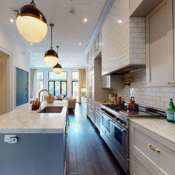
To that end, the space features IKEA SEKTION cabinetry framework and light gray custom fronts from Semihandmade along the perimeter base and upper cabinetry. This provides ample storage options and also complements the Carrara marble countertops.
“I had a custom piece of glass put on top of the marble, because I knew our boys would be using the table to draw and I thought it would get trashed!” she adds. This look is enhanced even more by engineered wood flooring as well as a custom vent hood that features subway tile to give the impression of brick.
And, she adds, this was all accomplished for a budget around $10,000.
However, the project wasn’t without its design challenges; namely, designing around the unique footprint of the space and storage concerns as the family keeps kosher.
“We were confined to the amount of square footage, so the layout had to remain long and narrow. We couldn’t make the space any wider, for instance. But we were able to fit everything that we wanted,” she says. In fact, they also added a custom pantry pullout from Rev-A-Shelf.
“I really wanted this kitchen to be beautiful because it was the center of our home. It’s on the main floor when you walk in, right between the family room and the dining room. I can imagine lots of family gatherings,” she concludes.
Although Elisia researched examples of kitchen designs on HOUZZ and Pinterest she was also a first-time remodeler and — admittedly — a bit overwhelmed by IKEA’s Home Planner.
She explains: “We had never done this before but I had read lots of blogs and seen some amazing kitchens that looked custom using IKEA. But I also found the IKEA software a bit daunting. I wanted help to make it easier and to make sure I got it right in terms of measurements and what we needed.”
Enter IKD’s design team, which guided her through the design process and product selection, and also honored that the family keeps kosher.
“Storage was a big concern. We keep kosher so we have two sets of dishes – for milk and meat – and we wanted to make sure we had lots of storage. Previously we had been living in small NYC apartments and storage was limited,” she notes.
She adds: “I actually had a custom cabinet maker come see our raw space and told him what I wanted to do and the quote he gave me was 10 times more than I ended up paying with IKEA — so it was a no-brainer.”
Specifically, the kitchen features a variety of high-end appliances, including a built-in Sub-Zero refrigerator; a Bertazzoni six-burner range with an oven and griddle; a KitchenAid panel-ready dishwasher, and a Sharp microwave drawer.
“We chose custom Semihandmade doors because it was a panel-ready fridge and it turned out really beautifully. The Sharp microwave drawer is hidden in the island because I wanted to preserve the traditional Brownstone feel.The microwave is hidden in the drawer to the right of the sink and we had pull-out trash bins to the right of the sink as well. We also incorporated a custom table at the end of the island, which was basically a marble slab that could seat up to five people,” she explains.Adding to the look are Thomas O’Brien Hicks Bronze pendant lights with antique brass as well as IKEA’s cabinet lighting system — and plenty of natural lighting too.

 Joe Gray's Flooring
Staircase - large modern wooden curved metal railing staircase idea in Miami with painted risers
Sponsored
Columbus, OH

Wannemacher Interiors
Customized Award-Winning Interior Design Solutions in Franklin Cnty OH
 Prime Design and Build
Designing with Intent: Creating Homes That Tell a Story
Have you ever stepped into a home and felt an instant connection, as if the space itself welcomed you? That’s the power of designing with intent—a thoughtful approach that blends beauty with purpose, ensuring every detail has meaning.
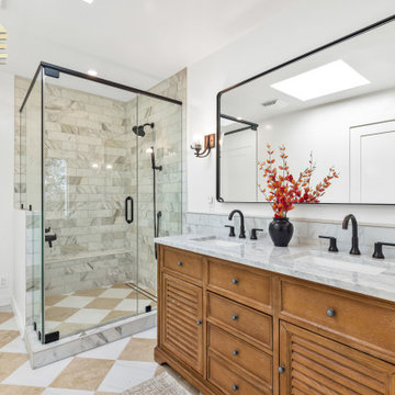
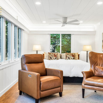
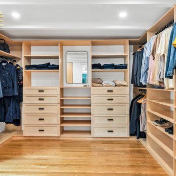
We recently worked on a remarkable 1937 home in Palomar Park, California. The project involved reimagining the second floor to create a master bedroom with a walk in closet and master bathroom while preserving the home’s traditional charm. For the homeowners, this house held decades of memories, and our goal was to honor its legacy while creating a space ready for the next chapter.
The Challenge: Balancing Tradition and Modernity
The homeowners wanted their remodeled space to feel fresh and functional without losing its historic character. This meant every decision, from the layout to the materials, had to strike the perfect balance.
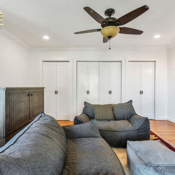
We rebuilt the upstairs including reconstruction of the existing bathroom to make an impressive master bathroom and dressing room, and refinished the hardwood floors to preserve the details that tied back to the home’s 1937 roots. By incorporating traditional elements like marble floors and walls in the bathroom , aged wood vanities and new crown molding for the whole upstairs, we ensured the updated design felt authentic and timeless.
3 Tips for Designing with Intent
Whether you’re working with a historic home or starting a new build, designing with intent can elevate your project. Here are three practical tips to help you create a space that’s as meaningful as it is beautiful:
1. Embrace the Home’s Character
Every home has unique features that tell a story. Whether it’s an original fireplace, old wood floors, or a quirky architectural detail, look for ways to celebrate and integrate these elements into your design.
2. Let Function Drive the Design
No matter how stunning a space looks, it needs to work for your lifestyle. Think about how you use each area and design accordingly. A thoughtful layout, smart storage solutions, and durable materials can transform a home from simply beautiful to truly livable.
In this project, reconfiguring the upstairs wasn’t just about aesthetics—it was about creating a layout that served the family’s everyday needs.
3. Personalize Your Space
The best designs reflect the people who live in them. Incorporate personal touches, such as family heirlooms, meaningful colors, or custom features, to make the space truly yours.
For this home, the homeowners were involved in selecting fixtures and materials that resonated with their style, ensuring the final design felt deeply personal.
Why Intentional Design Matters
Designing with intent transforms a house into a home. It’s about more than just aesthetics—it’s about creating a space that feels deeply connected to your story and needs.
At Prime Design and Build, we believe every project should start with understanding your vision. We work closely with our clients to ensure the design reflects their personality, values, and lifestyle.
Let’s Bring Your Vision to Life
If you’ve been dreaming of a home that feels like a true reflection of you, let’s make it happen. Whether it’s updating a historic property or starting fresh, we’re here to guide you through the process with expertise and care.
As I said in our Palomar Park video, “When we come over to your house, we will get to know you so that we can make your home feel like home too.”
Ready to start your journey? Reach out today for a consultation, and let’s design with intent.
 Prime Design and Build
Designing with Intent: Creating Homes That Tell a Story
Have you ever stepped into a home and felt an instant connection, as if the space itself welcomed you? That’s the power of designing with intent—a thoughtful approach that blends beauty with purpose, ensuring every detail has meaning.
We recently worked on a remarkable 1937 home in Palomar Park, California. The project involved reimagining the second floor to create a master bedroom with a walk in closet and master bathroom while preserving the home’s traditional charm. For the homeowners, this house held decades of memories, and our goal was to honor its legacy while creating a space ready for the next chapter.
The Challenge: Balancing Tradition and Modernity
The homeowners wanted their remodeled space to feel fresh and functional without losing its historic character. This meant every decision, from the layout to the materials, had to strike the perfect balance.
We rebuilt the upstairs including reconstruction of the existing bathroom to make an impressive master bathroom and dressing room, and refinished the hardwood floors to preserve the details that tied back to the home’s 1937 roots. By incorporating traditional elements like marble floors and walls in the bathroom , aged wood vanities and new crown molding for the whole upstairs, we ensured the updated design felt authentic and timeless.
3 Tips for Designing with Intent
Whether you’re working with a historic home or starting a new build, designing with intent can elevate your project. Here are three practical tips to help you create a space that’s as meaningful as it is beautiful:
1. Embrace the Home’s Character
Every home has unique features that tell a story. Whether it’s an original fireplace, old wood floors, or a quirky architectural detail, look for ways to celebrate and integrate these elements into your design.
2. Let Function Drive the Design
No matter how stunning a space looks, it needs to work for your lifestyle. Think about how you use each area and design accordingly. A thoughtful layout, smart storage solutions, and durable materials can transform a home from simply beautiful to truly livable.
In this project, reconfiguring the upstairs wasn’t just about aesthetics—it was about creating a layout that served the family’s everyday needs.
3. Personalize Your Space
The best designs reflect the people who live in them. Incorporate personal touches, such as family heirlooms, meaningful colors, or custom features, to make the space truly yours.
For this home, the homeowners were involved in selecting fixtures and materials that resonated with their style, ensuring the final design felt deeply personal.
Why Intentional Design Matters
Designing with intent transforms a house into a home. It’s about more than just aesthetics—it’s about creating a space that feels deeply connected to your story and needs.
At Prime Design and Build, we believe every project should start with understanding your vision. We work closely with our clients to ensure the design reflects their personality, values, and lifestyle.
Let’s Bring Your Vision to Life
If you’ve been dreaming of a home that feels like a true reflection of you, let’s make it happen. Whether it’s updating a historic property or starting fresh, we’re here to guide you through the process with expertise and care.
As I said in our Palomar Park video, “When we come over to your house, we will get to know you so that we can make your home feel like home too.”
Ready to start your journey? Reach out today for a consultation, and let’s design with intent.
 Prime Design and Build
Designing with Intent: Creating Homes That Tell a Story
Have you ever stepped into a home and felt an instant connection, as if the space itself welcomed you? That’s the power of designing with intent—a thoughtful approach that blends beauty with purpose, ensuring every detail has meaning.
We recently worked on a remarkable 1937 home in Palomar Park, California. The project involved reimagining the second floor to create a master bedroom with a walk in closet and master bathroom while preserving the home’s traditional charm. For the homeowners, this house held decades of memories, and our goal was to honor its legacy while creating a space ready for the next chapter.
The Challenge: Balancing Tradition and Modernity
The homeowners wanted their remodeled space to feel fresh and functional without losing its historic character. This meant every decision, from the layout to the materials, had to strike the perfect balance.
We rebuilt the upstairs including reconstruction of the existing bathroom to make an impressive master bathroom and dressing room, and refinished the hardwood floors to preserve the details that tied back to the home’s 1937 roots. By incorporating traditional elements like marble floors and walls in the bathroom , aged wood vanities and new crown molding for the whole upstairs, we ensured the updated design felt authentic and timeless.
3 Tips for Designing with Intent
Whether you’re working with a historic home or starting a new build, designing with intent can elevate your project. Here are three practical tips to help you create a space that’s as meaningful as it is beautiful:
1. Embrace the Home’s Character
Every home has unique features that tell a story. Whether it’s an original fireplace, old wood floors, or a quirky architectural detail, look for ways to celebrate and integrate these elements into your design.
2. Let Function Drive the Design
No matter how stunning a space looks, it needs to work for your lifestyle. Think about how you use each area and design accordingly. A thoughtful layout, smart storage solutions, and durable materials can transform a home from simply beautiful to truly livable.
In this project, reconfiguring the upstairs wasn’t just about aesthetics—it was about creating a layout that served the family’s everyday needs.
3. Personalize Your Space
The best designs reflect the people who live in them. Incorporate personal touches, such as family heirlooms, meaningful colors, or custom features, to make the space truly yours.
For this home, the homeowners were involved in selecting fixtures and materials that resonated with their style, ensuring the final design felt deeply personal.
Why Intentional Design Matters
Designing with intent transforms a house into a home. It’s about more than just aesthetics—it’s about creating a space that feels deeply connected to your story and needs.
At Prime Design and Build, we believe every project should start with understanding your vision. We work closely with our clients to ensure the design reflects their personality, values, and lifestyle.
Let’s Bring Your Vision to Life
If you’ve been dreaming of a home that feels like a true reflection of you, let’s make it happen. Whether it’s updating a historic property or starting fresh, we’re here to guide you through the process with expertise and care.
As I said in our Palomar Park video, “When we come over to your house, we will get to know you so that we can make your home feel like home too.”
Ready to start your journey? Reach out today for a consultation, and let’s design with intent.
 Prime Design and Build
Designing with Intent: Creating Homes That Tell a Story
Have you ever stepped into a home and felt an instant connection, as if the space itself welcomed you? That’s the power of designing with intent—a thoughtful approach that blends beauty with purpose, ensuring every detail has meaning.
We recently worked on a remarkable 1937 home in Palomar Park, California. The project involved reimagining the second floor to create a master bedroom with a walk in closet and master bathroom while preserving the home’s traditional charm. For the homeowners, this house held decades of memories, and our goal was to honor its legacy while creating a space ready for the next chapter.
The Challenge: Balancing Tradition and Modernity
The homeowners wanted their remodeled space to feel fresh and functional without losing its historic character. This meant every decision, from the layout to the materials, had to strike the perfect balance.
We rebuilt the upstairs including reconstruction of the existing bathroom to make an impressive master bathroom and dressing room, and refinished the hardwood floors to preserve the details that tied back to the home’s 1937 roots. By incorporating traditional elements like marble floors and walls in the bathroom , aged wood vanities and new crown molding for the whole upstairs, we ensured the updated design felt authentic and timeless.
3 Tips for Designing with Intent
Whether you’re working with a historic home or starting a new build, designing with intent can elevate your project. Here are three practical tips to help you create a space that’s as meaningful as it is beautiful:
1. Embrace the Home’s Character
Every home has unique features that tell a story. Whether it’s an original fireplace, old wood floors, or a quirky architectural detail, look for ways to celebrate and integrate these elements into your design.
2. Let Function Drive the Design
No matter how stunning a space looks, it needs to work for your lifestyle. Think about how you use each area and design accordingly. A thoughtful layout, smart storage solutions, and durable materials can transform a home from simply beautiful to truly livable.
In this project, reconfiguring the upstairs wasn’t just about aesthetics—it was about creating a layout that served the family’s everyday needs.
3. Personalize Your Space
The best designs reflect the people who live in them. Incorporate personal touches, such as family heirlooms, meaningful colors, or custom features, to make the space truly yours.
For this home, the homeowners were involved in selecting fixtures and materials that resonated with their style, ensuring the final design felt deeply personal.
Why Intentional Design Matters
Designing with intent transforms a house into a home. It’s about more than just aesthetics—it’s about creating a space that feels deeply connected to your story and needs.
At Prime Design and Build, we believe every project should start with understanding your vision. We work closely with our clients to ensure the design reflects their personality, values, and lifestyle.
Let’s Bring Your Vision to Life
If you’ve been dreaming of a home that feels like a true reflection of you, let’s make it happen. Whether it’s updating a historic property or starting fresh, we’re here to guide you through the process with expertise and care.
As I said in our Palomar Park video, “When we come over to your house, we will get to know you so that we can make your home feel like home too.”
Ready to start your journey? Reach out today for a consultation, and let’s design with intent.
 Prime Design and Build
Designing with Intent: Creating Homes That Tell a Story
Have you ever stepped into a home and felt an instant connection, as if the space itself welcomed you? That’s the power of designing with intent—a thoughtful approach that blends beauty with purpose, ensuring every detail has meaning.
We recently worked on a remarkable 1937 home in Palomar Park, California. The project involved reimagining the second floor to create a master bedroom with a walk in closet and master bathroom while preserving the home’s traditional charm. For the homeowners, this house held decades of memories, and our goal was to honor its legacy while creating a space ready for the next chapter.
The Challenge: Balancing Tradition and Modernity
The homeowners wanted their remodeled space to feel fresh and functional without losing its historic character. This meant every decision, from the layout to the materials, had to strike the perfect balance.
We rebuilt the upstairs including reconstruction of the existing bathroom to make an impressive master bathroom and dressing room, and refinished the hardwood floors to preserve the details that tied back to the home’s 1937 roots. By incorporating traditional elements like marble floors and walls in the bathroom , aged wood vanities and new crown molding for the whole upstairs, we ensured the updated design felt authentic and timeless.
3 Tips for Designing with Intent
Whether you’re working with a historic home or starting a new build, designing with intent can elevate your project. Here are three practical tips to help you create a space that’s as meaningful as it is beautiful:
1. Embrace the Home’s Character
Every home has unique features that tell a story. Whether it’s an original fireplace, old wood floors, or a quirky architectural detail, look for ways to celebrate and integrate these elements into your design.
2. Let Function Drive the Design
No matter how stunning a space looks, it needs to work for your lifestyle. Think about how you use each area and design accordingly. A thoughtful layout, smart storage solutions, and durable materials can transform a home from simply beautiful to truly livable.
In this project, reconfiguring the upstairs wasn’t just about aesthetics—it was about creating a layout that served the family’s everyday needs.
3. Personalize Your Space
The best designs reflect the people who live in them. Incorporate personal touches, such as family heirlooms, meaningful colors, or custom features, to make the space truly yours.
For this home, the homeowners were involved in selecting fixtures and materials that resonated with their style, ensuring the final design felt deeply personal.
Why Intentional Design Matters
Designing with intent transforms a house into a home. It’s about more than just aesthetics—it’s about creating a space that feels deeply connected to your story and needs.
At Prime Design and Build, we believe every project should start with understanding your vision. We work closely with our clients to ensure the design reflects their personality, values, and lifestyle.
Let’s Bring Your Vision to Life
If you’ve been dreaming of a home that feels like a true reflection of you, let’s make it happen. Whether it’s updating a historic property or starting fresh, we’re here to guide you through the process with expertise and care.
As I said in our Palomar Park video, “When we come over to your house, we will get to know you so that we can make your home feel like home too.”
Ready to start your journey? Reach out today for a consultation, and let’s design with intent.

 RetractableAwnings.com Inc.
PROJECT DESCRIPTION
The customer requested a gargantuan 39 ½ foot wide x 11 ½ foot projection, attached 3 span (2 post) water proof retractable dining area patio cover system with front water drainage. The plan was to have rain water drain through the optional downpipes and off the 3rd story deck. The entire system used one continuous piece of fabric and one motor. The system frame and guides are made entirely of non-rusting aluminum (unit is close to the Caribbean Sea) which is powder coated using the Qualicoat® powder coating process. Frame color chosen was RAL 1013 Ivory. The stainless steel components used were Inox (470LI and 316) which are of the highest quality and have an extremely high corrosion resistance (unit is near the sea). In fact, the components meet the European salt spray corrosion test as tested by Centro Sviluppo Materiali in Italy.
Fabric specified was Ferrari 302 Precontraint Color Salmone, a PVC fabric that is self-extinguishing (fire retardant) and totally water-proof (not water-resistant). This retracting patio cover system has a Beaufort wind load rating Scale 8 (up to 46mph) with the fabric fully extended and in use. This Beaufort wind load requirement was important due to high winds coming off the sea.
A brown hood with end caps was also used to prevent rain water, leaves and debris from collecting in the folds of fabric when not in use. A motor safety box with motor was attached to the wall. The client chose to control the system with a Somfy remote control.
PURPOSE OF THE PROJECT
The purpose of the project was to design and cover an elegant dining area, which can now be used 24/7/365 allowing for breakfast, lunch, dinner, parties, entertainment and at the same time not blocking the incredible Belize mountain views and enjoying the cool trade wind breezes. The Sleeping Giant Rainforest Lodge is known worldwide for its outstanding hospitality and service and was included in an online Belize travel story completed by Justin Balog a photographer, filmmaker, storyteller, and explorer of the creative frontier - freelancer for National Geographic. Click on the link below:
http://www.hossedia.com/travel/photographers-guide-to-belize/
The Sleeping Giant Rainforest Lodge is tourist friendly and offers intimate dining areas, such as under their retractable deck cover system. You can sit on the deck and listen to the sounds of the creek and watch the birds come alive. The lodge is in the perfect location on a gently sloping terrace along the Sibun River basin and surrounded by the Maya Mountains. Prominently overlooking the site is the majestic Sleeping Giant Mountain from where the lodge gets its name.
Belize is a fascinating melting pot of people and that is reflected in the food, a delicious blend of Belizean, Central and North American cuisine. Now the food can be enjoyed under a waterproof (not water resistant) retractable cover system that provides heat, glare, UV, sun and heavy rain protection and most importantly shade protection.
PROJECT COMPLEXITY AND UNIQUENESS
The project, product and installation were not complicated. What was a challenge was the location. The restaurant is located in gorgeous Belmopan, Belize, Central America. Since ocean freight is not available from Europe directly to Belize the product had to be shipped to Miami, Florida, unloaded and then re-shipped to Belize. The other challenge was hoisting all the extrusions and fabric to the 3rd floor of the lodge without damaging the wood or construction of the lodge.
PROJECT RESULTS
The client is ecstatic with the results of their retractable patio cover system. The retractable patio cover now makes it possible for the client and the lodge patrons to use a very large deck area throughout the year as the area is now protected from sun, UV, glare, heat, heavy rains and even hail. All customer requirements and goals were achieved within budget and on time.
Sponsored
Columbus, OH
Wannemacher Interiors
Customized Award-Winning Interior Design Solutions in Franklin Cnty OH

 Santa Barbara Home Design
Design Consultant Jeff Doubét is the author of Creating Spanish Style Homes: Before & After – Techniques – Designs – Insights. The 240 page “Design Consultation in a Book” is now available. Please visit SantaBarbaraHomeDesigner.com for more info.
Jeff Doubét specializes in Santa Barbara style home and landscape designs. To learn more info about the variety of custom design services I offer, please visit SantaBarbaraHomeDesigner.com
Jeff Doubét is the Founder of Santa Barbara Home Design - a design studio based in Santa Barbara, California USA.
 Klopf Architecture
Malibu Glass Box House by Klopf Architecture
Following the devastating Woolsey Fire of 2018, the site in Malibu offered a unique opportunity to rebuild not just a home, but a new architectural composition that highlighted the property’s potential while navigating strict fire-rebuild codes in the area. Designed by Klopf Architecture, this project embraced a set of limitations and translated them into an architectural asset.
The city’s fire-rebuild process required the new structure to remain close to the original footprint, size and bulk, a constraint that ultimately clarified the architectural direction. Perched near the front of a long, narrow lot, the new home frames and overlooks a private, park-like rear expanse, an uncommon luxury especially in this part of Malibu .
Without a fixed program, the design process allowed for a different kind of creative focus allowing Klopf Architecture the opportunity to explore how a modernist home could best respond to this site. The team approached the project not with a list of requirements, but with a question: How might a modernist live here? What spatial qualities would inspire calm, connection, and a sense of wonder in this setting? The process became less about problem-solving and more about architectural storytelling—letting the site, the light, and the principles of modern design guide the form and flow of the home.
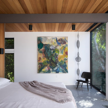
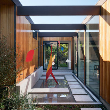
The response emerged in the form of a glass-box pavilion, an open, Mid-Century Modern inspired living, dining, and kitchen space that floats at the edge of the property’s natural descent. Connected to the more enclosed, private areas of the home by a glass-walled hallway, the living pavilion becomes a distinct centerpiece of the design. It opens on all four sides to the landscape with decks and patios on the flanks, an internal garden and water feature to the north, and a dramatic unguarded view of the expansive backyard and ocean horizon to the south.
Because of the mandated footprint, careful planning was required to ensure every space could still engage with light, landscape, or both. Strategic voids in the form of atriums and courtyards allow daylight to filter deep into the home’s core, while offering moments of surprise and retreat. These design gestures allow natural light to filter deep into the interior, creating a sense of brightness and openness throughout the day. At the same time, they expand the perceptual boundaries between inside and out, making the home feel more expansive while anchoring its connection to the surrounding landscape.
The siting of the house is what gives it its unique character. Rather than receding into the backyard like the neighboring homes, the house holds a slight prominence. From the central living pavilion, stepping down into the landscape feels more like entering a secluded park where a separate existing accessory structure, trail, and recreational areas await. The home’s modest street presence gives way to this unfolding drama of space, view, and nature.
Fire-resilient materials and assemblies are integrated seamlessly throughout including triple-pane glazing, under-slab and roof insulation, and locally sourced fire-rated cladding ensure the house not only meets Calfornia’s rigorous wildland-urban interface (WUI) standards, but feels effortlessly aligned with them. While technical decisions like fire-hardening and mechanical systems presented some construction challenges, particularly around the cantilevered glass box, the team found a functional compromise that preserved the integrity of the design.
Inside, a restrained palette and exposed post and beam design celebrate the ethos of mid-century modernism. A central circulation spine extends from the entry to the rear glass wall, offering a continuous visual link from street to ocean. Spaces such as the library and office, though more intimate in scale, are never cut off from nature as each opens to its own unique courtyard or garden view.
Though born out of a strict regulatory framework and developed without a specific client, the rebuild design unfolded with remarkable clarity. Grounded in site logic, refined by limitations and an emphasis on timeless spatial relationships – light, proportion, and a strong connection to nature, the resulting design feels both effortless and uplifting. The home lives lightly on the land, opens generously to its surroundings, and strikes a careful balance between privacy, openness, and calm. For Klopf Architecture, it stands as a compelling case study in how site, code, and circumstantial constraints can inspire enduring, modernist architecture. With years of experience reimagining mid-century modern design for how people live today, the firm took the project’s limitations as an opportunity. The result is a home shaped by open, flowing spaces, strong indoor-outdoor connections, and a calm, clear sense of structure. It’s a good reminder that even with strict constraints, there’s still room for architecture to breathe—and for modernism to keep moving forward.
Klopf Architecture project team: Geoff Campen, John Klopf, AIA, and Sherry Tan
Structural Engineer: ZFA
Contractor: Maison D’Artiste
Photography: ©2025 Mariko Reed
Year Completed: 2023
 Klopf Architecture
Malibu Glass Box House by Klopf Architecture
Following the devastating Woolsey Fire of 2018, the site in Malibu offered a unique opportunity to rebuild not just a home, but a new architectural composition that highlighted the property’s potential while navigating strict fire-rebuild codes in the area. Designed by Klopf Architecture, this project embraced a set of limitations and translated them into an architectural asset.
The city’s fire-rebuild process required the new structure to remain close to the original footprint, size and bulk, a constraint that ultimately clarified the architectural direction. Perched near the front of a long, narrow lot, the new home frames and overlooks a private, park-like rear expanse, an uncommon luxury especially in this part of Malibu .
Without a fixed program, the design process allowed for a different kind of creative focus allowing Klopf Architecture the opportunity to explore how a modernist home could best respond to this site. The team approached the project not with a list of requirements, but with a question: How might a modernist live here? What spatial qualities would inspire calm, connection, and a sense of wonder in this setting? The process became less about problem-solving and more about architectural storytelling—letting the site, the light, and the principles of modern design guide the form and flow of the home.
The response emerged in the form of a glass-box pavilion, an open, Mid-Century Modern inspired living, dining, and kitchen space that floats at the edge of the property’s natural descent. Connected to the more enclosed, private areas of the home by a glass-walled hallway, the living pavilion becomes a distinct centerpiece of the design. It opens on all four sides to the landscape with decks and patios on the flanks, an internal garden and water feature to the north, and a dramatic unguarded view of the expansive backyard and ocean horizon to the south.
Because of the mandated footprint, careful planning was required to ensure every space could still engage with light, landscape, or both. Strategic voids in the form of atriums and courtyards allow daylight to filter deep into the home’s core, while offering moments of surprise and retreat. These design gestures allow natural light to filter deep into the interior, creating a sense of brightness and openness throughout the day. At the same time, they expand the perceptual boundaries between inside and out, making the home feel more expansive while anchoring its connection to the surrounding landscape.
The siting of the house is what gives it its unique character. Rather than receding into the backyard like the neighboring homes, the house holds a slight prominence. From the central living pavilion, stepping down into the landscape feels more like entering a secluded park where a separate existing accessory structure, trail, and recreational areas await. The home’s modest street presence gives way to this unfolding drama of space, view, and nature.
Fire-resilient materials and assemblies are integrated seamlessly throughout including triple-pane glazing, under-slab and roof insulation, and locally sourced fire-rated cladding ensure the house not only meets Calfornia’s rigorous wildland-urban interface (WUI) standards, but feels effortlessly aligned with them. While technical decisions like fire-hardening and mechanical systems presented some construction challenges, particularly around the cantilevered glass box, the team found a functional compromise that preserved the integrity of the design.
Inside, a restrained palette and exposed post and beam design celebrate the ethos of mid-century modernism. A central circulation spine extends from the entry to the rear glass wall, offering a continuous visual link from street to ocean. Spaces such as the library and office, though more intimate in scale, are never cut off from nature as each opens to its own unique courtyard or garden view.
Though born out of a strict regulatory framework and developed without a specific client, the rebuild design unfolded with remarkable clarity. Grounded in site logic, refined by limitations and an emphasis on timeless spatial relationships – light, proportion, and a strong connection to nature, the resulting design feels both effortless and uplifting. The home lives lightly on the land, opens generously to its surroundings, and strikes a careful balance between privacy, openness, and calm. For Klopf Architecture, it stands as a compelling case study in how site, code, and circumstantial constraints can inspire enduring, modernist architecture. With years of experience reimagining mid-century modern design for how people live today, the firm took the project’s limitations as an opportunity. The result is a home shaped by open, flowing spaces, strong indoor-outdoor connections, and a calm, clear sense of structure. It’s a good reminder that even with strict constraints, there’s still room for architecture to breathe—and for modernism to keep moving forward.
Klopf Architecture project team: Geoff Campen, John Klopf, AIA, and Sherry Tan
Structural Engineer: ZFA
Contractor: Maison D’Artiste
Photography: ©2025 Mariko Reed
Year Completed: 2023


Sponsored
Columbus, OH
Wannemacher Interiors
Customized Award-Winning Interior Design Solutions in Franklin Cnty OH

 In Detail Interiors
Cozy and Colorful Beach House Remodel!
When you think funky little house by the beach – images like what you are about to see may not be what you would have anticipated. This furnishings project aimed to capture a colorful, fun, active space for a family who wanted to feel at home .Thus, creating casual and comfortable but not boring in the least. A little traveled, a lot of texture, and not much clutter!
From the start, the space was not much to write home about!
The common living areas were boxy with lower ceilings. Quirky ins and outs needed to be optimized. Overall, this project was a prime opportunity for us to really dig in. From treating each room top to bottom and finding the client’s mojo when it came to wallcoverings. Selecting funky lighting and the right mix and match of bold colors and more natural, organic textures.
We came in too late to get involved with the kitchen but helped the client with a few little accents and color choices. Thus, acting as a jumping off point for the large dining space featuring a beautiful (and resilient!) wooden trestle table. We created a mix of seating that offers a little funk, and the fun additional cabinet storage to each end which offered a hideaway. We loved that this vista had such opportunity for great lighting and art, also!
A Colorful, Cozy Living Room
We knew we needed a cozy, lower profile seating area but also some sort of great reading nook by the fireplace. With the large windows and the main entry just off this space, a traffic pattern was delianted that helped guide decisions with the furniture. A funky, nubbier woven fabric on the sectional that hinted towards mid-century modern. The irregular shaped, petrified wood coffee table. The bold statement and colors carried through in the wallcovering and area rug. Jumping to the fireplace area where you can lounge or read with those gorgeous cognac leather recliners. This space needed to feel separate and the same all at once. The balance of scale and colors really helped achieve this!
Can’t forget the bedrooms!
Of course we can’t get by without mentioning a little bedroom love, either.
In the master the overall designs dictated by a bold, saturated woven wood cloth on the headboard wall. We love the mix of color and pattern in here. The bold, sexier mood is 100% a byproduct of the level of rich colors and unusual combinations. Those bold hand-glazed ceramic lamps against those strict geo-pattern bed pillows – so good!
Our sweet tween bedroom that should grow with her for a good, long time. All in all, filled with original art and layered in a softer palette. There was a lot of matching in here at first, but once we convinced her to trust us she started to understand why adding in the unexpected hit of bright coral and spring green made everything sing!
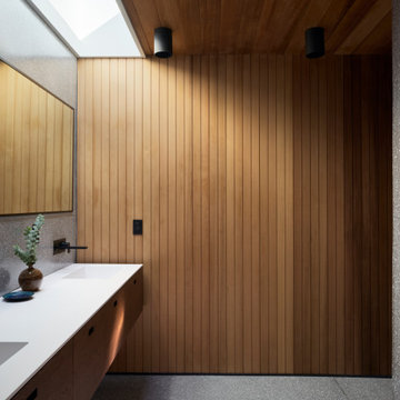 Klopf Architecture
Malibu Glass Box House by Klopf Architecture
Following the devastating Woolsey Fire of 2018, the site in Malibu offered a unique opportunity to rebuild not just a home, but a new architectural composition that highlighted the property’s potential while navigating strict fire-rebuild codes in the area. Designed by Klopf Architecture, this project embraced a set of limitations and translated them into an architectural asset.
The city’s fire-rebuild process required the new structure to remain close to the original footprint, size and bulk, a constraint that ultimately clarified the architectural direction. Perched near the front of a long, narrow lot, the new home frames and overlooks a private, park-like rear expanse, an uncommon luxury especially in this part of Malibu .
Without a fixed program, the design process allowed for a different kind of creative focus allowing Klopf Architecture the opportunity to explore how a modernist home could best respond to this site. The team approached the project not with a list of requirements, but with a question: How might a modernist live here? What spatial qualities would inspire calm, connection, and a sense of wonder in this setting? The process became less about problem-solving and more about architectural storytelling—letting the site, the light, and the principles of modern design guide the form and flow of the home.
The response emerged in the form of a glass-box pavilion, an open, Mid-Century Modern inspired living, dining, and kitchen space that floats at the edge of the property’s natural descent. Connected to the more enclosed, private areas of the home by a glass-walled hallway, the living pavilion becomes a distinct centerpiece of the design. It opens on all four sides to the landscape with decks and patios on the flanks, an internal garden and water feature to the north, and a dramatic unguarded view of the expansive backyard and ocean horizon to the south.
Because of the mandated footprint, careful planning was required to ensure every space could still engage with light, landscape, or both. Strategic voids in the form of atriums and courtyards allow daylight to filter deep into the home’s core, while offering moments of surprise and retreat. These design gestures allow natural light to filter deep into the interior, creating a sense of brightness and openness throughout the day. At the same time, they expand the perceptual boundaries between inside and out, making the home feel more expansive while anchoring its connection to the surrounding landscape.
The siting of the house is what gives it its unique character. Rather than receding into the backyard like the neighboring homes, the house holds a slight prominence. From the central living pavilion, stepping down into the landscape feels more like entering a secluded park where a separate existing accessory structure, trail, and recreational areas await. The home’s modest street presence gives way to this unfolding drama of space, view, and nature.
Fire-resilient materials and assemblies are integrated seamlessly throughout including triple-pane glazing, under-slab and roof insulation, and locally sourced fire-rated cladding ensure the house not only meets Calfornia’s rigorous wildland-urban interface (WUI) standards, but feels effortlessly aligned with them. While technical decisions like fire-hardening and mechanical systems presented some construction challenges, particularly around the cantilevered glass box, the team found a functional compromise that preserved the integrity of the design.
Inside, a restrained palette and exposed post and beam design celebrate the ethos of mid-century modernism. A central circulation spine extends from the entry to the rear glass wall, offering a continuous visual link from street to ocean. Spaces such as the library and office, though more intimate in scale, are never cut off from nature as each opens to its own unique courtyard or garden view.
Though born out of a strict regulatory framework and developed without a specific client, the rebuild design unfolded with remarkable clarity. Grounded in site logic, refined by limitations and an emphasis on timeless spatial relationships – light, proportion, and a strong connection to nature, the resulting design feels both effortless and uplifting. The home lives lightly on the land, opens generously to its surroundings, and strikes a careful balance between privacy, openness, and calm. For Klopf Architecture, it stands as a compelling case study in how site, code, and circumstantial constraints can inspire enduring, modernist architecture. With years of experience reimagining mid-century modern design for how people live today, the firm took the project’s limitations as an opportunity. The result is a home shaped by open, flowing spaces, strong indoor-outdoor connections, and a calm, clear sense of structure. It’s a good reminder that even with strict constraints, there’s still room for architecture to breathe—and for modernism to keep moving forward.
Klopf Architecture project team: Geoff Campen, John Klopf, AIA, and Sherry Tan
Structural Engineer: ZFA
Contractor: Maison D’Artiste
Photography: ©2025 Mariko Reed
Year Completed: 2023
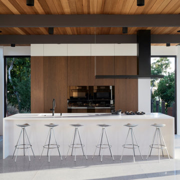 Klopf Architecture
Malibu Glass Box House by Klopf Architecture
Following the devastating Woolsey Fire of 2018, the site in Malibu offered a unique opportunity to rebuild not just a home, but a new architectural composition that highlighted the property’s potential while navigating strict fire-rebuild codes in the area. Designed by Klopf Architecture, this project embraced a set of limitations and translated them into an architectural asset.
The city’s fire-rebuild process required the new structure to remain close to the original footprint, size and bulk, a constraint that ultimately clarified the architectural direction. Perched near the front of a long, narrow lot, the new home frames and overlooks a private, park-like rear expanse, an uncommon luxury especially in this part of Malibu .
Without a fixed program, the design process allowed for a different kind of creative focus allowing Klopf Architecture the opportunity to explore how a modernist home could best respond to this site. The team approached the project not with a list of requirements, but with a question: How might a modernist live here? What spatial qualities would inspire calm, connection, and a sense of wonder in this setting? The process became less about problem-solving and more about architectural storytelling—letting the site, the light, and the principles of modern design guide the form and flow of the home.
The response emerged in the form of a glass-box pavilion, an open, Mid-Century Modern inspired living, dining, and kitchen space that floats at the edge of the property’s natural descent. Connected to the more enclosed, private areas of the home by a glass-walled hallway, the living pavilion becomes a distinct centerpiece of the design. It opens on all four sides to the landscape with decks and patios on the flanks, an internal garden and water feature to the north, and a dramatic unguarded view of the expansive backyard and ocean horizon to the south.
Because of the mandated footprint, careful planning was required to ensure every space could still engage with light, landscape, or both. Strategic voids in the form of atriums and courtyards allow daylight to filter deep into the home’s core, while offering moments of surprise and retreat. These design gestures allow natural light to filter deep into the interior, creating a sense of brightness and openness throughout the day. At the same time, they expand the perceptual boundaries between inside and out, making the home feel more expansive while anchoring its connection to the surrounding landscape.
The siting of the house is what gives it its unique character. Rather than receding into the backyard like the neighboring homes, the house holds a slight prominence. From the central living pavilion, stepping down into the landscape feels more like entering a secluded park where a separate existing accessory structure, trail, and recreational areas await. The home’s modest street presence gives way to this unfolding drama of space, view, and nature.
Fire-resilient materials and assemblies are integrated seamlessly throughout including triple-pane glazing, under-slab and roof insulation, and locally sourced fire-rated cladding ensure the house not only meets Calfornia’s rigorous wildland-urban interface (WUI) standards, but feels effortlessly aligned with them. While technical decisions like fire-hardening and mechanical systems presented some construction challenges, particularly around the cantilevered glass box, the team found a functional compromise that preserved the integrity of the design.
Inside, a restrained palette and exposed post and beam design celebrate the ethos of mid-century modernism. A central circulation spine extends from the entry to the rear glass wall, offering a continuous visual link from street to ocean. Spaces such as the library and office, though more intimate in scale, are never cut off from nature as each opens to its own unique courtyard or garden view.
Though born out of a strict regulatory framework and developed without a specific client, the rebuild design unfolded with remarkable clarity. Grounded in site logic, refined by limitations and an emphasis on timeless spatial relationships – light, proportion, and a strong connection to nature, the resulting design feels both effortless and uplifting. The home lives lightly on the land, opens generously to its surroundings, and strikes a careful balance between privacy, openness, and calm. For Klopf Architecture, it stands as a compelling case study in how site, code, and circumstantial constraints can inspire enduring, modernist architecture. With years of experience reimagining mid-century modern design for how people live today, the firm took the project’s limitations as an opportunity. The result is a home shaped by open, flowing spaces, strong indoor-outdoor connections, and a calm, clear sense of structure. It’s a good reminder that even with strict constraints, there’s still room for architecture to breathe—and for modernism to keep moving forward.
Klopf Architecture project team: Geoff Campen, John Klopf, AIA, and Sherry Tan
Structural Engineer: ZFA
Contractor: Maison D’Artiste
Photography: ©2025 Mariko Reed
Year Completed: 2023
17