
Search results for "High ceiling lighting" in Home Design Ideas
 Spire North
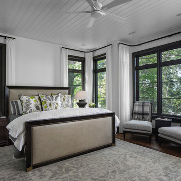
Tucked away in the backwoods of Torch Lake, this home marries “rustic” with the sleek elegance of modern. The combination of wood, stone and metal textures embrace the charm of a classic farmhouse. Although this is not your average farmhouse. The home is outfitted with a high performing system that seamlessly works with the design and architecture.
The tall ceilings and windows allow ample natural light into the main room. Spire Integrated Systems installed Lutron QS Wireless motorized shades paired with Hartmann & Forbes windowcovers to offer privacy and block harsh light. The custom 18′ windowcover’s woven natural fabric complements the organic esthetics of the room. The shades are artfully concealed in the millwork when not in use.
Spire installed B&W in-ceiling speakers and Sonance invisible in-wall speakers to deliver ambient music that emanates throughout the space with no visual footprint. Spire also installed a Sonance Landscape Audio System so the homeowner can enjoy music outside.
Each system is easily controlled using Savant. Spire personalized the settings to the homeowner’s preference making controlling the home efficient and convenient.
 Décor Aid
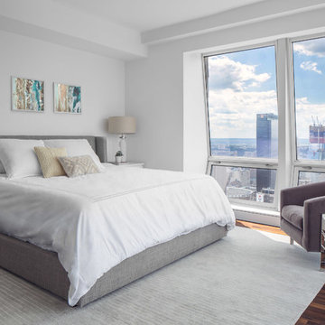
When a family living in Singapore decided to purchase a New York City pied-à-terre, they settled on the historic Langham Place, a 60-floor building along 5th Ave which features a mixture of permanent residencies and 5-star hotel suites. Immediately after purchasing the condo, they reached out to Decor Aid, and tasked us with designing a home that would reflect their jet-setting lifestyle and chic sensibility.
Book Your Free In-Home Consultation
Connecting to the historic Tiffany Building at 404 5th Ave, the exterior of Langham Place is a combination of highly contemporary architecture and 1920’s art deco design. And with this highly unique architecture, came highly angular, outward leaning floor-to-ceiling windows, which would prove to be our biggest design challenge.
One of the apartment’s quirks was negotiating an uneven balance of natural light throughout the space. Parts of the apartment, such one of the kids’ bedrooms, feature floor-to-ceiling windows and an abundance of natural light, while other areas, such as one corner of the living room, receive little natural light.
By sourcing a combination of contemporary, low-profile furniture pieces and metallic accents, we were able to compensate for apartment’s pockets of darkness. A low-profile beige sectional from Room & Board was an obvious choice, which we complemented with a lucite console and a bronze Riverstone coffee table from Mitchell Gold+Bob Williams.
Circular tables were placed throughout the apartment in order to establish a design scheme that would be easy to walk through. A marble tulip table from Sit Down New York provides an opulent dining room space, without crowding the floor plan. The finishing touches include a sumptuous swivel chair from Safavieh, to create a sleek, welcoming vacation home for this international client.
 Anderson Shirley Architects
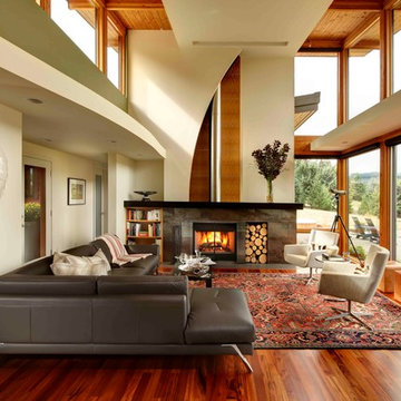
Lorie Gleichman wrote in Portrait of Portland magazine - "the curve of the dropped ceiling over the corridor mimics the curve on the fireplace wall. Both soften the straight lines of the windows and framing, the sharp angles of the roofline, and the structured furnishings."
Find the right local pro for your project
 Blue Heron
Trent Bell Photography
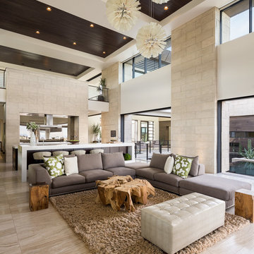
Huge trendy open concept living room photo in Las Vegas with white walls
Huge trendy open concept living room photo in Las Vegas with white walls
 Pavonetti Architecture
Photo by Amanda Kirkpatrick
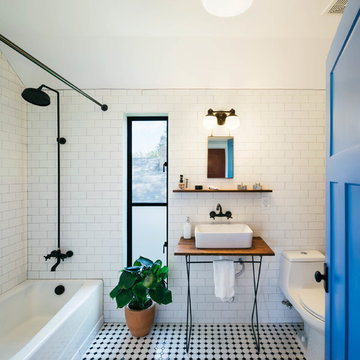
Example of an urban white tile and subway tile multicolored floor bathroom design in Austin with a vessel sink, wood countertops, a one-piece toilet and brown countertops
Example of an urban white tile and subway tile multicolored floor bathroom design in Austin with a vessel sink, wood countertops, a one-piece toilet and brown countertops
 Town Line Wallpaper & Paint Inc.
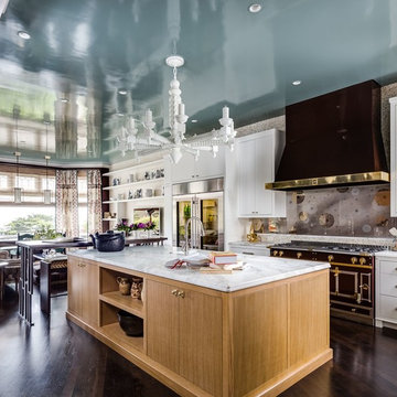
Kitchen painted with full-spectrum C2 Paint featuring a high gloss ceiling.
Large transitional single-wall dark wood floor and brown floor open concept kitchen photo in Boston with flat-panel cabinets, white cabinets, multicolored backsplash, black appliances, an island, marble countertops and glass sheet backsplash
Large transitional single-wall dark wood floor and brown floor open concept kitchen photo in Boston with flat-panel cabinets, white cabinets, multicolored backsplash, black appliances, an island, marble countertops and glass sheet backsplash
 House of L
A 1927 colonial home in Shaker Heights, Ohio, received a breathtaking renovation that required extensive work, transforming it from a tucked away, utilitarian space, to an all-purpose gathering room, a role that most kitchens embrace in a home today. The scope of work changed over the course of the project, starting more minimalistically and then quickly becoming the main focus of the house's remodeling, resulting in a staircase being relocated and walls being torn down to create an inviting focal point to the home where family and friends could connect. The focus of the functionality was to allow for multiple prep areas with the inclusion of two islands and sinks, two eating areas (one for impromptu snacking and small meals of younger family members and friends on island no. two and a built-in bench seat for everyday meals in the immediate family). The kitchen was equipped with all Subzero and Wolf appliances, including a 48" range top with a 12" griddle, two double ovens, a 42" built-in side by side refrigerator and freezer, a microwave drawer on island no. one and a beverage center and icemaker in island no. two. The aesthetic feeling embraces the architectural feel of the home while adding a modern sensibility with the revamped layout and graphic elements that tie the color palette of whites, chocolate and charcoal. The cabinets were custom made and outfitted with beaded inset doors with a Shaker panel frame and finished in Benjamin Moore's OC-17 White Dove, a soft white that allowed for the kitchen to feel warm while still maintaining its brightness. Accents of walnut were added to create a sense of warmth, including a custom premium grade walnut countertop on island no. one from Brooks Custom and a TV cabinet with a doggie feeding station beneath. Bringing the cabinet line to the 8'6" ceiling height helps the room feel taller and bold light fixtures at the islands and eating area add detail to an otherwise simpler ceiling detail. The 1 1/4" countertops feature Calacatta Gold Marble with an ogee edge detail. Special touches on the interiors include secret storage panels, an appliance garage, breadbox, pull-out drawers behind the cabinet doors and all soft-close hinges and drawer glides. A kneading area was made as a part of island no. one for the homeowners' love of baking, complete with a stone top allowing for dough to stay cool. Baskets beneath store kitchen essentials that need air circulation. The room adjacent to the kitchen was converted to a hearth room (from a formal dining room) to extend the kitchen's living space and allow for a natural spillover for family and guests to spill into.
Jason Miller, Pixelate
Sponsored
Fredericksburg, OH

High Point Cabinets
Columbus' Experienced Custom Cabinet Builder | 4x Best of Houzz Winner
 Deborah Leamann
Tom Grimes photography.
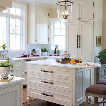
Ten foot high Bead board ceiling, star etched bell jar pendant and calacatta honed marble customize this look.
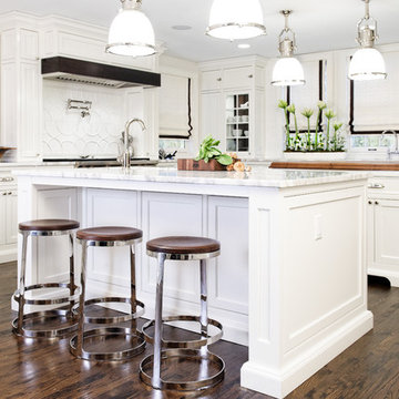
Inspiration for a timeless u-shaped dark wood floor kitchen remodel in New York with an undermount sink, recessed-panel cabinets, white cabinets, white backsplash, paneled appliances and an island
Inspiration for a timeless u-shaped dark wood floor kitchen remodel in New York with an undermount sink, recessed-panel cabinets, white cabinets, white backsplash, paneled appliances and an island
 Mark Brand Architecture
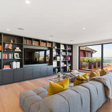
For our client, who had previous experience working with architects, we enlarged, completely gutted and remodeled this Twin Peaks diamond in the rough. The top floor had a rear-sloping ceiling that cut off the amazing view, so our first task was to raise the roof so the great room had a uniformly high ceiling. Clerestory windows bring in light from all directions. In addition, we removed walls, combined rooms, and installed floor-to-ceiling, wall-to-wall sliding doors in sleek black aluminum at each floor to create generous rooms with expansive views. At the basement, we created a full-floor art studio flooded with light and with an en-suite bathroom for the artist-owner. New exterior decks, stairs and glass railings create outdoor living opportunities at three of the four levels. We designed modern open-riser stairs with glass railings to replace the existing cramped interior stairs. The kitchen features a 16 foot long island which also functions as a dining table. We designed a custom wall-to-wall bookcase in the family room as well as three sleek tiled fireplaces with integrated bookcases. The bathrooms are entirely new and feature floating vanities and a modern freestanding tub in the master. Clean detailing and luxurious, contemporary finishes complete the look.
 Advance Design Studio, Ltd.
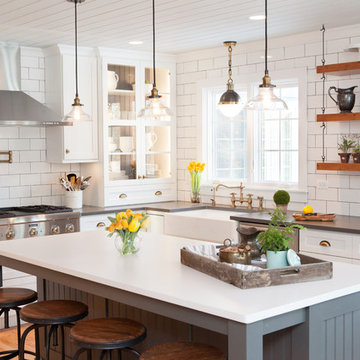
When this suburban family decided to renovate their kitchen, they knew that they wanted a little more space. Advance Design worked together with the homeowner to design a kitchen that would work for a large family who loved to gather regularly and always ended up in the kitchen! So the project began with extending out an exterior wall to accommodate a larger island and more moving-around space between the island and the perimeter cabinetry.
Style was important to the cook, who began collecting accessories and photos of the look she loved for months prior to the project design. She was drawn to the brightness of whites and grays, and the design accentuated this color palette brilliantly with the incorporation of a warm shade of brown woods that originated from a dining room table that was a family favorite. Classic gray and white cabinetry from Dura Supreme hits the mark creating a perfect balance between bright and subdued. Hints of gray appear in the bead board detail peeking just behind glass doors, and in the application of the handsome floating wood shelves between cabinets. White subway tile is made extra interesting with the application of dark gray grout lines causing it to be a subtle but noticeable detail worthy of attention.
Suede quartz Silestone graces the countertops with a soft matte hint of color that contrasts nicely with the presence of white painted cabinetry finished smartly with the brightness of a milky white farm sink. Old melds nicely with new, as antique bronze accents are sprinkled throughout hardware and fixtures, and work together unassumingly with the sleekness of stainless steel appliances.
The grace and timelessness of this sparkling new kitchen maintains the charm and character of a space that has seen generations past. And now this family will enjoy this new space for many more generations to come in the future with the help of the team at Advance Design Studio.
Photographer: Joe Nowak
Dura Supreme Cabinetry
 Besch Architecture
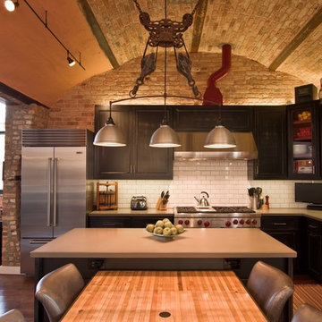
Arched brick ceiling with a custom made light fixture. The owners found the parts for this light fixture over the island and had a local artist create this one of a kind fixture. The table with the seating is made from an old bowling alley lane. The pin placement marks can still be seen on the table top. The table is free standing so it can be moved off the island if desired.
A reclaimed scupper box is the transition piece from the range hood to the duct work with red accent paint.
Peter Nilson Photography
 Dynia Architects
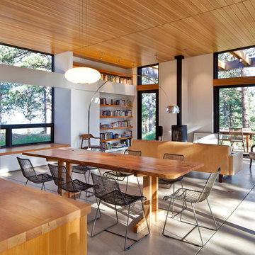
This residence sits atop a precipice with views to the metropolitan Denver valley to the east and the iconic Flatiron peaks to the west. The two sides of this linear scheme respond independently to the site conditions. The east has a high band of glass for morning light infiltration, with a thick zone of storage below. Dividing the storage areas, a rhythm of intermittent windows provide views to the entry court and distant city. On the opposite side, full height sliding glass panels extend the length of the house embracing the best views. After entering through the solid east wall, the amazing mountain peaks are revealed.
For this residence, simplicity and restraint are the innovation. Materials are limited to wood structure and ceilings, concrete floors, and oxidized steel cladding. The roof extension provides sun shading for the west facing glass and shelter for the end terrace. The house’s modest form and palate of materials place it unpretentiously within its surroundings, allowing the natural environment to carry the day.
A.I.A. Wyoming Chapter Design Award of Merit 2011
Project Year: 2009
 Anne Sneed Architectural Interiors
Jim Brady Architectural Photography
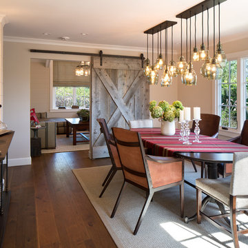
Example of a cottage medium tone wood floor dining room design in San Diego with beige walls
Example of a cottage medium tone wood floor dining room design in San Diego with beige walls

Sponsored
Sunbury, OH

J.Holderby - Renovations
Franklin County's Leading General Contractors - 2X Best of Houzz!
 Thyme & Place Design LLC
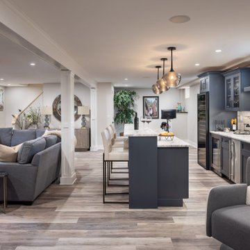
When my client had to move from her company office to work at home, she set up in the dining room. Despite her best efforts, this was not the long-term solution she was looking for. My client realized she needed a dedicated space not on the main floor of the home. On one hand, having your office space right next to the kitchen is handy. On the other hand, it made separating work and home life was not that easy.
The house was a ranch. In essence, the basement would run entire length of the home. As we came down the steps, we entered a time capsule. The house was built in the 1950’s. The walls were covered with original knotty pine paneling. There was a wood burning fireplace and considering this was a basement, high ceilings. In addition, there was everything her family could not store at their own homes. As we wound though the space, I though “wow this has potential”, Eventually, after walking through the laundry room we came to a small nicely lit room. This would be the office.
My client looked at me and asked what I thought. Undoubtedly, I said, this can be a great workspace, but do you really want to walk through this basement and laundry to get here? Without reservation, my client said where do we start?
Once the design was in place, we started the renovation. The knotty pine paneling had to go. Specifically, to add some insulation and control the dampness and humidity. The laundry room wall was relocated to create a hallway to the office.
At the far end of the room, we designated a workout zone. Weights, mats, exercise bike and television are at the ready for morning or afternoon workouts. The space can be concealed by a folding screen for party time. Doors to an old closet under the stairs were relocated to the workout area for hidden storage. Now we had nice wall for a beautiful console and mirror for storage and serving during parties.
In order to add architectural details, we covered the old ugly support columns with simple recessed millwork panels. This detail created a visual division between the bar area and the seating area in front of the fireplace. The old red brick on the fireplace surround was replaced with stack stone. A mantle was made from reclaimed wood. Additional reclaimed wood floating shelves left and right of the fireplace provides decorative display while maintaining a rustic element balancing the copper end table and leather swivel rocker.
We found an amazing rug which tied all of the colors together further defining the gathering space. Russet and burnt orange became the accent color unifying each space. With a bit of whimsy, a rather unusual light fixture which looks like roots from a tree growing through the ceiling is a conversation piece.
The office space is quite and removed from the main part of the basement. There is a desk large enough for multiple screens, a small bookcase holding office supplies and a comfortable chair for conference calls. Because working from home requires many online meetings, we added a shiplap wall painted in Hale Navy to contrast with the orange fabric on the chair. We finished the décor with a painting from my client’s father. This is the background online visitors will see.
The last and best part of the renovation is the beautiful bar. My client is an avid collector of wine. She already had the EuroCave refrigerator, so I incorporated it into the design. The cabinets are painted Temptation Grey from Benjamin Moore. The counter tops are my favorite hard working quartzite Brown Fantasy. The backsplash is a combination of rustic wood and old tin ceiling like porcelain tiles. Together with the textures of the reclaimed wood and hide poofs balanced against the smooth finish of the cabinets, we created a comfortable luxury for relaxing.
There is ample storage for bottles, cans, glasses, and anything else you can think of for a great party. In addition to the wine storage, we incorporated a beverage refrigerator, an ice maker, and a sink. Floating shelves with integrated lighting illuminate the back bar. The raised height of the front bar provides the perfect wine tasting and paring spot. I especially love the pendant lights which look like wine glasses.
Finally, I selected carpet for the stairs and office. It is perfect for noise reduction. Meanwhile for the overall flooring, I specifically selected a high-performance vinyl plank floor. We often use this product as it is perfect to install on a concrete floor. It is soft to walk on, easy to clean and does not reduce the overall height of the space.
 Covenant LLC
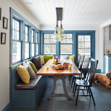
Seating area featuring built in bench seating and plenty of natural light. Table top is made of reclaimed lumber done by Longleaf Lumber. The bottom table legs are reclaimed Rockford Lathe Legs.
 User
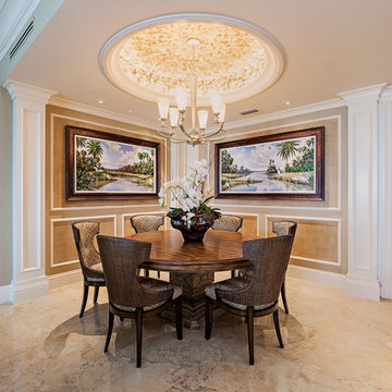
Usercircular ceiling dome, nook lighting, crown molding, round dining room table, wicker dining room chairs, marble floor, wainscoting, beige walls, framed tropical art, faux columns, high ceilings, open concept, recessed lights
 Lawlor Architects
Stacy Zarin Goldberg
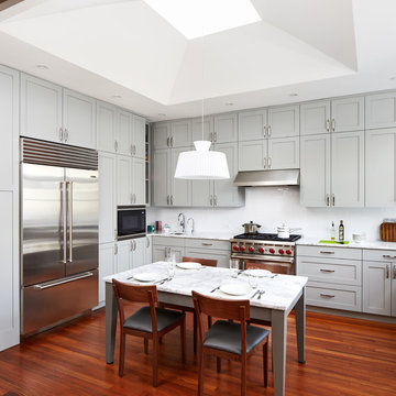
Transitional medium tone wood floor and brown floor eat-in kitchen photo in DC Metro with shaker cabinets, gray cabinets, white backsplash, stainless steel appliances and no island
Transitional medium tone wood floor and brown floor eat-in kitchen photo in DC Metro with shaker cabinets, gray cabinets, white backsplash, stainless steel appliances and no island


 Barron Designs
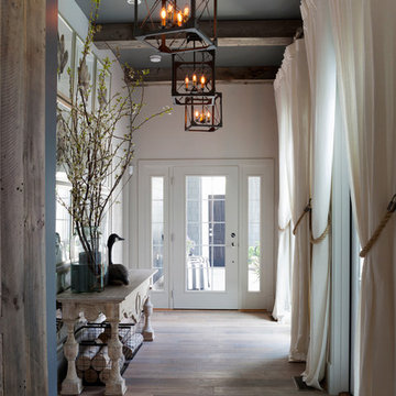
Reclaimed wood beams are used to trim the ceiling as well as vertically to cover support beams in this Delaware beach house.
Large beach style light wood floor and gray floor hallway photo in Charlotte with white walls
Large beach style light wood floor and gray floor hallway photo in Charlotte with white walls
 DHD Architecture and Interior Design
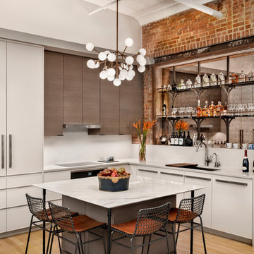
The Broome Street Loft is a beautiful example of a classic Soho loft conversion. The design highlights its historic architecture of the space while integrating modern elements. The 14-foot-high tin ceiling, metal Corinthian columns and iconic brick wall are contrasted with clean lines and modern profiles, creating a captivating dialogue between the old and the new.
The plan was completely revised: the bedroom was shifted to the side area to combine the living room and kitchen spaces into a larger, open plan space. The bathroom and laundry also shifted to a more efficient layout, which both widened the main living space and created the opportunity to add a new Powder Room. The high ceilings allowed for the creation of a new storage space above the laundry and bathroom, with a sleek, modern stair to provide access.
The kitchen seamlessly blends modern detailing with a vintage style. An existing recess in the brick wall serves as a focal point for the relocated Kitchen with the addition of custom bronze, steel and glass shelves. The kitchen island anchors the space, and the knife-edge stone countertop and custom metal legs make it feel more like a table than a built-in piece.
The bathroom features the brick wall which runs through the apartment, creating a uniquely Soho experience. The cove lighting throughout creates a bright interior space, and the white and grey tones of the tile provide a neutral counterpoint to the red brick. The space has beautiful stone accents, such as the custom-built tub deck, shower, vanity, and niches.
Photo: David Joseph Photography

 TKS Design Group
Download our free ebook, Creating the Ideal Kitchen. DOWNLOAD NOW
For many, extra time at home during COVID left them wanting more from their homes. Whether you realized the shortcomings of your space or simply wanted to combat boredom, a well-designed and functional home was no longer a want, it became a need. Tina found herself wanting more from her Old Irving Park home and reached out to The Kitchen Studio about adding function to her kitchen to make the most of the available real estate.
At the end of the day, there is nothing better than returning home to a bright and happy space you love. And this kitchen wasn’t that for Tina. Dark and dated, with a palette from the past and features that didn’t make the most of the available square footage, this remodel required vision and a fresh approach to the space. Lead designer, Stephanie Cole’s main design goal was better flow, while adding greater functionality with organized storage, accessible open shelving, and an overall sense of cohesion with the adjoining family room.
The original kitchen featured a large pizza oven, which was rarely used, yet its footprint limited storage space. The nearby pantry had become a catch-all, lacking the organization needed in the home. The initial plan was to keep the pizza oven, but eventually Tina realized she preferred the design possibilities that came from removing this cumbersome feature, with the goal of adding function throughout the upgraded and elevated space. Eliminating the pantry added square footage and length to the kitchen for greater function and more storage. This redesigned space reflects how she lives and uses her home, as well as her love for entertaining.
The kitchen features a classic, clean, and timeless palette. White cabinetry, with brass and bronze finishes, contrasts with rich wood flooring, and lets the large, deep blue island in Woodland’s custom color Harbor – a neutral, yet statement color – draw your eye.
The kitchen was the main priority. In addition to updating and elevating this space, Tina wanted to maximize what her home had to offer. From moving the location of the patio door and eliminating a window to removing an existing closet in the mudroom and the cluttered pantry, the kitchen footprint grew. Once the floorplan was set, it was time to bring cohesion to her home, creating connection between the kitchen and surrounding spaces.
The color palette carries into the mudroom, where we added beautiful new cabinetry, practical bench seating, and accessible hooks, perfect for guests and everyday living. The nearby bar continues the aesthetic, with stunning Carrara marble subway tile, hints of brass and bronze, and a design that further captures the vibe of the kitchen.
Every home has its unique design challenges. But with a fresh perspective and a bit of creativity, there is always a way to give the client exactly what they want [and need]. In this particular kitchen, the existing soffits and high slanted ceilings added a layer of complexity to the lighting layout and upper perimeter cabinets.
While a space needs to look good, it also needs to function well. This meant making the most of the height of the room and accounting for the varied ceiling features, while also giving Tina everything she wanted and more. Pendants and task lighting paired with an abundance of natural light amplify the bright aesthetic. The cabinetry layout and design compliments the soffits with subtle profile details that bring everything together. The tile selections add visual interest, drawing the eye to the focal area above the range. Glass-doored cabinets further customize the space and give the illusion of even more height within the room.
While her family may be grown and out of the house, Tina was focused on adding function without sacrificing a stunning aesthetic and dreamy finishes that make the kitchen the gathering place of any home. It was time to love her kitchen again, and if you’re wondering what she loves most, it’s the niche with glass door cabinetry and open shelving for display paired with the marble mosaic backsplash over the range and complimenting hood. Each of these features is a stunning point of interest within the kitchen – both brag-worthy additions to a perimeter layout that previously felt limited and lacking.
Whether your remodel is the result of special needs in your home or simply the excitement of focusing your energy on creating a fun new aesthetic, we are here for it. We love a good challenge because there is always a way to make a space better – adding function and beauty simultaneously.
18