
Search results for "Implement impactful" in Home Design Ideas
 Crespo Design Group
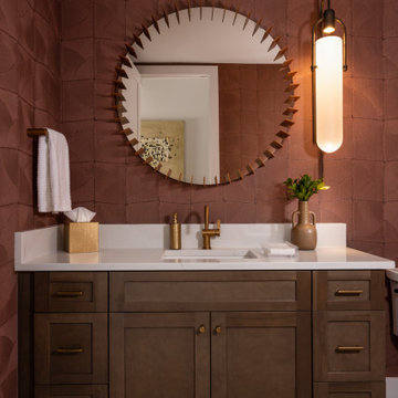
This custom luxury powder room showcases how bold design choices can transform a small space into a dramatic focal point. Designed by Crespo Design Group, the room pairs rich terracotta textured wallcovering with warm walnut cabinetry, brushed brass fixtures, and sculptural lighting to create an atmosphere that is both sophisticated and inviting. Every detail was carefully selected to deliver maximum visual impact while maintaining timeless elegance.
A striking round sunburst mirror serves as the centerpiece above a custom floating vanity topped with a sleek quartz countertop. Contemporary brass plumbing fixtures and designer sconces provide a warm glow that enhances the room's earthy color palette and layered textures. The combination of natural materials, custom millwork, and artisan finishes creates a powder room that feels luxurious, intimate, and highly personalized.
Designed for entertaining, this elegant guest bathroom demonstrates how thoughtful interior design can elevate even the smallest spaces into unforgettable experiences. From the custom cabinetry and statement wallcovering to the refined lighting and premium finishes, every element reflects Crespo Design Group's commitment to creating bespoke luxury interiors tailored to each client's lifestyle.
As a premier luxury interior design firm in Tampa, Florida, Crespo Design Group specializes in custom bathroom design, powder rooms, luxury home renovations, and high-end residential interiors throughout Florida, the United States, and the Bahamas. Our interiors combine timeless design, exceptional craftsmanship, and personalized details that create beautiful, enduring spaces.
 Inside Stories
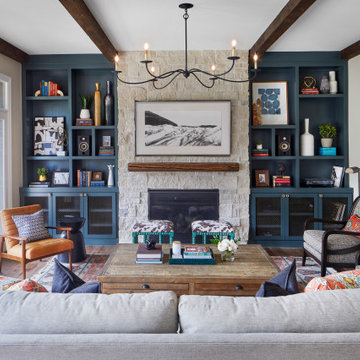
Eclectic & Transitional Home, Family Room, Photography by Susie Brenner
Living room - large transitional open concept medium tone wood floor and brown floor living room idea in Denver with gray walls, a standard fireplace, a stone fireplace and a wall-mounted tv
Living room - large transitional open concept medium tone wood floor and brown floor living room idea in Denver with gray walls, a standard fireplace, a stone fireplace and a wall-mounted tv
 Advance Design Studio, Ltd.
Scott and Janet of Elgin have had four design to build renovations with Advance Design over the last decade. We got the chance to sit down and talk with Janet about her experience working with Advance Design on so many different areas of her home. Starting with her kitchen in 2009, Janet proclaimed, “The reason we kept coming back is because our first [renovation] went so extremely well, exceeding all of my expectations.”
Since their kitchen renovation with Advance Design ten years ago, Scott and Janet have also worked with Advance to remodel their master bedroom, their power room, a wet bar, and most recently their master bath. Having renovated practically every major room in the house with the team, we asked Janet what made her experience with Advance Design so special. “We went with Advance Design because we trusted them so much more, their experience, and everything that they brought. We were confident they were giving us what we wanted for the money we were spending.”
For their most recent renovation, Scott and Janet clearly knew what to expect going into their master bath renovation. They were familiar with Advance’s step by step design process that epitomizes the “Common Sense Remodeling” philosophy applied in every project Advance creates. After once again experiencing the careful budgeting analysis, the pointed design meetings, and the clear documentation that leads up the a thoroughly managed installation, Janet’s simple summary of their experience is this; “The word I would use to describe the process is – collaboration!”
Working closely with Advance Design kitchen designer Michelle Lecinski, together they were able to develop a new master bath design that not only worked with their investment goal, but also made sense for their lifestyle. “Oh Michelle, my designer! I connected with her immediately. She spent time getting to know us, our lifestyle, even the setting of our house.” The threesome had a great experience designing and producing yet another successful project together.
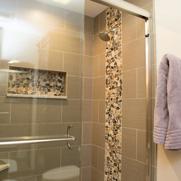
When it came to their new project plans, Scott and Janet were interested in creating a relaxing “spa-like” experience in their master bath. One of the many ideas Michelle introduced during the design process was installing a Kohler Alteo series showerhead for a rain-like shower experience. This designer showerhead, mixed with the warm ambiance of the lighting and pebble accent running throughout the shower make for what Janet calls a “luxury spa essence”. From the oversized glass sliding door to the recessed niche for accessories, each special detail was considered and implemented intentionally so as to create the maximumly optimized use of the compact space. Not only was this transformation one of beauty and luxury, but special attention was given to every way possible to provide additional storage to maximize the functionality of the bath area as a whole.
Once design was complete and the bath construction project began in their home, making sure everything happened efficiently and on schedule became new priority number one. “Having a project manager made an enormous difference,” Janet said, “It was so worth it to hire professionals that knew exactly what they were doing. Even after all of these years, I wouldn’t change a thing.”
“It was a pleasure working together with Janet and Scott to create this beautiful space that will enhance their lives for many years,” says Michelle. “It is so much fun to get to do this job every day, I love that I can have this sort of impact on their lives by doing something for them [Janet & Scott] that comes so naturally to me!”
After reviewing the long-term relationship with clients like Scott and Janet, owner Todd Jurs had this to say, “Clients returning and asking us to transform that next area of their home really warms my heart. It reaffirms that every decision to please clients no matter what is always the right choice, and that our honesty and integrity along with the immense collective talent of this team is recognized and appreciated by those who continue to return to us year after year.” He continued to say, “I always say how blessed we truly are to be able to do what we do, and experiences like this one put a smile on my face every time.”
Find the right local pro for your project
 Michael Nash Design, Build & Homes
2011 NARI CAPITAL COTY FINALIST AWARD WINNER
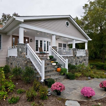
This Cape Cod home located in Great Falls, VA, was in need of a major face lift. The front elevation had no defining character. Because the homeowners have three young active boys, their outdoor living space is important. They wanted to be able to have a porch to relax on while watching over the kids, have them hold a camp fire outdoors, and be able to entertain on the new side patio. Also the home’s entrance needed to be much more appealing.
The new design included a new front covered porch made out of solid concrete walls with crawl space underneath for shed storage. Entire walls, floor, steps and walkway were done in flagstone. The half columns and patio with its retaining walls were also done in the same flagstone.
The entire front face of old home was demolished. Then a 10’x30’ covered porch was framed-up to match the existing front elevation. Matching siding and roofing tied this look together. The front entrance was widened and includes a new mahogany door with leaded glass. A new bow window was added to bring more daylight into living room.
Inside, a new kitchen with blond cabinetry, dark granite counters and rich wood floors has become a central gathering place. New stainless steel appliances, including a range hood, form a highly efficient work triangle. A tile backsplash and recessed lighting complete the redesign.
The Arts & Crafts front porch with wide columns and railing, beaded ceiling panel, embedded lighting and ceiling fan made the front appearance a delightful place for the family to hang out. Implementing this front porch into the existing flat front Cape Cod had a major impact on the total appearance of this home. Now it looks like a brand new home has been added to the neighborhood.
 ZeroEnergy Design
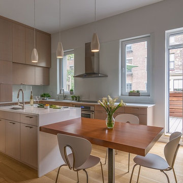
This renovated brick rowhome in Boston’s South End offers a modern aesthetic within a historic structure, creative use of space, exceptional thermal comfort, a reduced carbon footprint, and a passive stream of income.
DESIGN PRIORITIES. The goals for the project were clear - design the primary unit to accommodate the family’s modern lifestyle, rework the layout to create a desirable rental unit, improve thermal comfort and introduce a modern aesthetic. We designed the street-level entry as a shared entrance for both the primary and rental unit. The family uses it as their everyday entrance - we planned for bike storage and an open mudroom with bench and shoe storage to facilitate the change from shoes to slippers or bare feet as they enter their home. On the main level, we expanded the kitchen into the dining room to create an eat-in space with generous counter space and storage, as well as a comfortable connection to the living space. The second floor serves as master suite for the couple - a bedroom with a walk-in-closet and ensuite bathroom, and an adjacent study, with refinished original pumpkin pine floors. The upper floor, aside from a guest bedroom, is the child's domain with interconnected spaces for sleeping, work and play. In the play space, which can be separated from the work space with new translucent sliding doors, we incorporated recreational features inspired by adventurous and competitive television shows, at their son’s request.
MODERN MEETS TRADITIONAL. We left the historic front facade of the building largely unchanged - the security bars were removed from the windows and the single pane windows were replaced with higher performing historic replicas. We designed the interior and rear facade with a vision of warm modernism, weaving in the notable period features. Each element was either restored or reinterpreted to blend with the modern aesthetic. The detailed ceiling in the living space, for example, has a new matte monochromatic finish, and the wood stairs are covered in a dark grey floor paint, whereas the mahogany doors were simply refinished. New wide plank wood flooring with a neutral finish, floor-to-ceiling casework, and bold splashes of color in wall paint and tile, and oversized high-performance windows (on the rear facade) round out the modern aesthetic.
RENTAL INCOME. The existing rowhome was zoned for a 2-family dwelling but included an undesirable, single-floor studio apartment at the garden level with low ceiling heights and questionable emergency egress. In order to increase the quality and quantity of space in the rental unit, we reimagined it as a two-floor, 1 or 2 bedroom, 2 bathroom apartment with a modern aesthetic, increased ceiling height on the lowest level and provided an in-unit washer/dryer. The apartment was listed with Jackie O'Connor Real Estate and rented immediately, providing the owners with a source of passive income.
ENCLOSURE WITH BENEFITS. The homeowners sought a minimal carbon footprint, enabled by their urban location and lifestyle decisions, paired with the benefits of a high-performance home. The extent of the renovation allowed us to implement a deep energy retrofit (DER) to address air tightness, insulation, and high-performance windows. The historic front facade is insulated from the interior, while the rear facade is insulated on the exterior. Together with these building enclosure improvements, we designed an HVAC system comprised of continuous fresh air ventilation, and an efficient, all-electric heating and cooling system to decouple the house from natural gas. This strategy provides optimal thermal comfort and indoor air quality, improved acoustic isolation from street noise and neighbors, as well as a further reduced carbon footprint. We also took measures to prepare the roof for future solar panels, for when the South End neighborhood’s aging electrical infrastructure is upgraded to allow them.
URBAN LIVING. The desirable neighborhood location allows the both the homeowners and tenant to walk, bike, and use public transportation to access the city, while each charging their respective plug-in electric cars behind the building to travel greater distances.
OVERALL. The understated rowhouse is now ready for another century of urban living, offering the owners comfort and convenience as they live life as an expression of their values.
Photography: Eric Roth Photo

 Officine Gullo
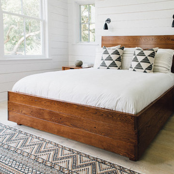
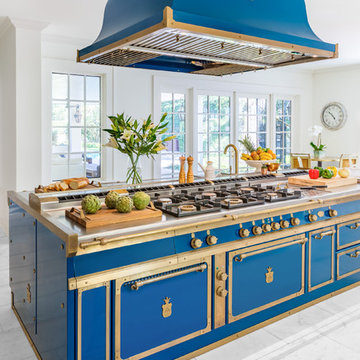
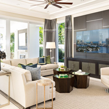
Blue, in the deep and bright shade of ocean, is the leading colour of the new “tailor-made” project by Officine Gullo and implemented at Clearwater in Florida. It is a solution with a remarkable visual impact and with top level performances; it is able to enhance with style and elegance the surrounding space, particularly if it is characterized by light colours and natural finishing.

Sponsored
Delaware, OH

Buckeye Basements, Inc.
Central Ohio's Basement Finishing ExpertsBest Of Houzz '13-'21
 Officine Gullo
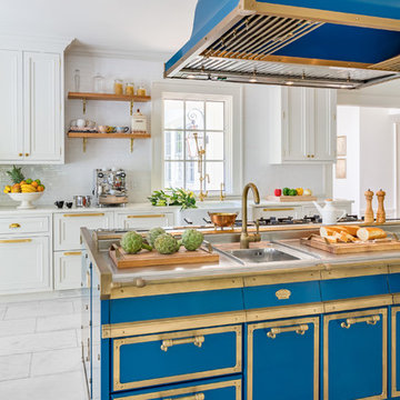
Blue, in the deep and bright shade of ocean, is the leading colour of the new “tailor-made” project by Officine Gullo and implemented at Clearwater in Florida. It is a solution with a remarkable visual impact and with top level performances; it is able to enhance with style and elegance the surrounding space, particularly if it is characterized by light colours and natural finishing.

 Niche Interiors
Brad Knipstein Photography
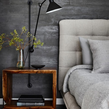
Bedroom - contemporary dark wood floor and black floor bedroom idea in San Francisco with gray walls
Bedroom - contemporary dark wood floor and black floor bedroom idea in San Francisco with gray walls
 BANDD DESIGN
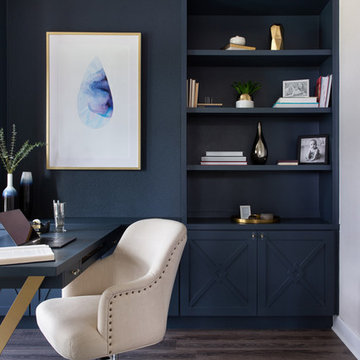
Rich colors, minimalist lines, and plenty of natural materials were implemented to this Austin home.
Project designed by Sara Barney’s Austin interior design studio BANDD DESIGN. They serve the entire Austin area and its surrounding towns, with an emphasis on Round Rock, Lake Travis, West Lake Hills, and Tarrytown.
For more about BANDD DESIGN, click here: https://bandddesign.com/
To learn more about this project, click here: https://bandddesign.com/dripping-springs-family-retreat/
 JMDG Architecture | Planning + Interiors
Front Elevation
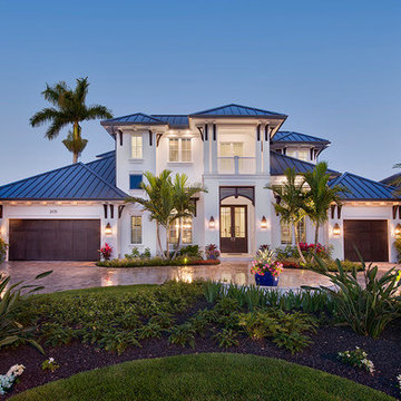
Example of a beach style two-story concrete house exterior design in Miami with a hip roof and a metal roof
Example of a beach style two-story concrete house exterior design in Miami with a hip roof and a metal roof
 RTH Building Company
Kyle Caldwell
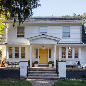
Elegant white two-story exterior home photo in New York with a shingle roof
Elegant white two-story exterior home photo in New York with a shingle roof
 Craig Allen Designs
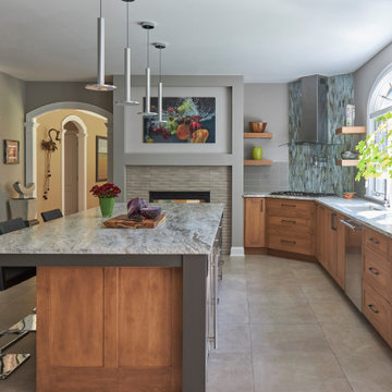
Transitional u-shaped gray floor kitchen photo in New York with an undermount sink, shaker cabinets, medium tone wood cabinets, gray backsplash, stainless steel appliances, an island and gray countertops

 Housetrends Magazine
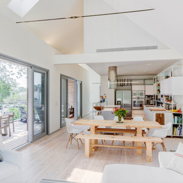
Since moving into her Dublin home two and a half years ago, Nancy Sanford has been peeling off the decades—quite literally. Built in the 1980s, the home was “very well-maintained, but very little had been done to it” in terms of updating the finishes or style, Sanford says. Plush white carpet ran from wall-to-wall-to-wall, almond-colored laminate coated the kitchen cabinets and wallpaper ran rampant—even covering some ceilings.
Despite her efforts, Sanford knew it was going to take more than cosmetic editing to shake the ‘80s and make the home her own. Although she lives in the traditional-leaning Muirfield community, Sanford adores a minimalist, contemporary style—and admits to devouring design magazines “ad nauseam.”
To implement her thoroughly modern vision, Sanford turned to Brigid Norton, an interior designer and family friend, and Kristi Youles, a kitchen designer with The JAE Company. Working together, the trio created a carefully considered contemporary design that’s easy on the eyes, and the body.
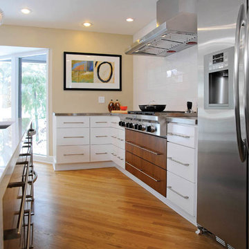
In addition to improving the flow of the kitchen—by removing a V-shaped peninsula that angled out into the room—and adding appliances like a stainless steel refrigerator, Sanford’s short list of must-haves included clean, uncluttered lines and no wall cabinets over the countertops. “I’ve found as I’ve aged, I’ve gotten shorter and just don’t use the upper cabinets,” Sanford explains.
Easy-access, smooth-slide drawers with clean slab fronts were the answer—resulting in strong visual lines, an open, airy feel and enhanced ergonomics. Starting with a “needs assessment,” Youles and Norton designed the space quite literally around Nancy. By looking at factors such as her height and which items she uses most frequently, they were able to determine the optimum placement for everything from canned goods in the pantry to cutlery, pans and plates in the customized drawers, all of which helped to achieve the ultimate kitchen organization.
But there’s more to the kitchen cabinets smooth façade than clean-lined storage. Walnut drawer fronts—found on the oven and the base of the island—are book-matched, allowing the grain to continue from drawer to drawer. And even in spaces where drawers weren’t feasible, beneath the sink and in a desk area, the designers continued the look with cabinet doors crafted to resemble drawers.
The visual continuity of these lines might not be as impactful if it weren’t for the careful selection of contrasting finishes. The designers filled the space with pure, glossy white—using a specific type of quartz, White Cliff by Cambria, to accent the bold rectangular design of the island. Then, to break up the expanse of accompanying white painted drawers, walnut was selected to bring the contrasting warmth and grain of wood without red undertones. It is commonly found in modern furniture design, as well as current productions of mid-century designs like the iconic Eames Lounge Chair from Herman Miller, Youles says.
 EK ARCHITECTURE, PLLC
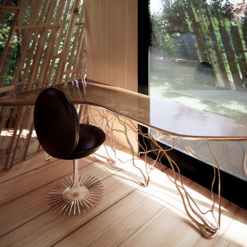
Discover our revolutionary line of customizable biophilic home-office furniture WellthyFlex. WellthyFlex is crafted from natural stone and carbon-fiber-reinforced plastic with its tree branch-inspired form. It brings the beauty of nature indoors. Each piece is thoughtfully designed to create a harmonious and soothing environment, allowing you to thrive in your work. Immerse yourself in the tranquility of your surroundings as our furniture's gentle curves and organic textures evoke a sense of calm and balance. Experience the power of biophilia as you tap into the therapeutic qualities of nature, boosting your focus, creativity, and overall well-being. Embrace the future of work with our biophilic home workplace furniture and create a sanctuary that inspires success.
Lightweight carbon-fiber-reinforced plastic, which would be algae-based in the near future, is used for table structure. With tensile strength at one-quarter the weight of steel, and lighter than aluminum, carbon-fiber-reinforced plastic legs are further optimized with generative design algorithms to use less material.
Algae-based carbon fiber:
https://www.compositesworld.com/articles/technical-university-of-munich-researchers-explore-using-algae-to-make-carbon-fiber
 Housetrends Magazine
Since moving into her Dublin home two and a half years ago, Nancy Sanford has been peeling off the decades—quite literally. Built in the 1980s, the home was “very well-maintained, but very little had been done to it” in terms of updating the finishes or style, Sanford says. Plush white carpet ran from wall-to-wall-to-wall, almond-colored laminate coated the kitchen cabinets and wallpaper ran rampant—even covering some ceilings.
Despite her efforts, Sanford knew it was going to take more than cosmetic editing to shake the ‘80s and make the home her own. Although she lives in the traditional-leaning Muirfield community, Sanford adores a minimalist, contemporary style—and admits to devouring design magazines “ad nauseam.”
To implement her thoroughly modern vision, Sanford turned to Brigid Norton, an interior designer and family friend, and Kristi Youles, a kitchen designer with The JAE Company. Working together, the trio created a carefully considered contemporary design that’s easy on the eyes, and the body.
In addition to improving the flow of the kitchen—by removing a V-shaped peninsula that angled out into the room—and adding appliances like a stainless steel refrigerator, Sanford’s short list of must-haves included clean, uncluttered lines and no wall cabinets over the countertops. “I’ve found as I’ve aged, I’ve gotten shorter and just don’t use the upper cabinets,” Sanford explains.
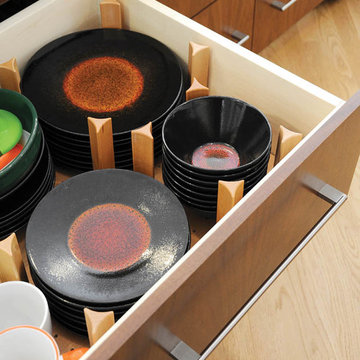
Easy-access, smooth-slide drawers with clean slab fronts were the answer—resulting in strong visual lines, an open, airy feel and enhanced ergonomics. Starting with a “needs assessment,” Youles and Norton designed the space quite literally around Nancy. By looking at factors such as her height and which items she uses most frequently, they were able to determine the optimum placement for everything from canned goods in the pantry to cutlery, pans and plates in the customized drawers, all of which helped to achieve the ultimate kitchen organization.
But there’s more to the kitchen cabinets smooth façade than clean-lined storage. Walnut drawer fronts—found on the oven and the base of the island—are book-matched, allowing the grain to continue from drawer to drawer. And even in spaces where drawers weren’t feasible, beneath the sink and in a desk area, the designers continued the look with cabinet doors crafted to resemble drawers.
The visual continuity of these lines might not be as impactful if it weren’t for the careful selection of contrasting finishes. The designers filled the space with pure, glossy white—using a specific type of quartz, White Cliff by Cambria, to accent the bold rectangular design of the island. Then, to break up the expanse of accompanying white painted drawers, walnut was selected to bring the contrasting warmth and grain of wood without red undertones. It is commonly found in modern furniture design, as well as current productions of mid-century designs like the iconic Eames Lounge Chair from Herman Miller, Youles says.
 Advance Design Studio, Ltd.
Scott and Janet of Elgin have had four design to build renovations with Advance Design over the last decade. We got the chance to sit down and talk with Janet about her experience working with Advance Design on so many different areas of her home. Starting with her kitchen in 2009, Janet proclaimed, “The reason we kept coming back is because our first [renovation] went so extremely well, exceeding all of my expectations.”
Since their kitchen renovation with Advance Design ten years ago, Scott and Janet have also worked with Advance to remodel their master bedroom, their power room, a wet bar, and most recently their master bath. Having renovated practically every major room in the house with the team, we asked Janet what made her experience with Advance Design so special. “We went with Advance Design because we trusted them so much more, their experience, and everything that they brought. We were confident they were giving us what we wanted for the money we were spending.”
For their most recent renovation, Scott and Janet clearly knew what to expect going into their master bath renovation. They were familiar with Advance’s step by step design process that epitomizes the “Common Sense Remodeling” philosophy applied in every project Advance creates. After once again experiencing the careful budgeting analysis, the pointed design meetings, and the clear documentation that leads up the a thoroughly managed installation, Janet’s simple summary of their experience is this; “The word I would use to describe the process is – collaboration!”
Working closely with Advance Design kitchen designer Michelle Lecinski, together they were able to develop a new master bath design that not only worked with their investment goal, but also made sense for their lifestyle. “Oh Michelle, my designer! I connected with her immediately. She spent time getting to know us, our lifestyle, even the setting of our house.” The threesome had a great experience designing and producing yet another successful project together.
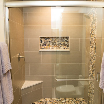
When it came to their new project plans, Scott and Janet were interested in creating a relaxing “spa-like” experience in their master bath. One of the many ideas Michelle introduced during the design process was installing a Kohler Alteo series showerhead for a rain-like shower experience. This designer showerhead, mixed with the warm ambiance of the lighting and pebble accent running throughout the shower make for what Janet calls a “luxury spa essence”. From the oversized glass sliding door to the recessed niche for accessories, each special detail was considered and implemented intentionally so as to create the maximumly optimized use of the compact space. Not only was this transformation one of beauty and luxury, but special attention was given to every way possible to provide additional storage to maximize the functionality of the bath area as a whole.
Once design was complete and the bath construction project began in their home, making sure everything happened efficiently and on schedule became new priority number one. “Having a project manager made an enormous difference,” Janet said, “It was so worth it to hire professionals that knew exactly what they were doing. Even after all of these years, I wouldn’t change a thing.”
“It was a pleasure working together with Janet and Scott to create this beautiful space that will enhance their lives for many years,” says Michelle. “It is so much fun to get to do this job every day, I love that I can have this sort of impact on their lives by doing something for them [Janet & Scott] that comes so naturally to me!”
After reviewing the long-term relationship with clients like Scott and Janet, owner Todd Jurs had this to say, “Clients returning and asking us to transform that next area of their home really warms my heart. It reaffirms that every decision to please clients no matter what is always the right choice, and that our honesty and integrity along with the immense collective talent of this team is recognized and appreciated by those who continue to return to us year after year.” He continued to say, “I always say how blessed we truly are to be able to do what we do, and experiences like this one put a smile on my face every time.”
 Housetrends Magazine
Since moving into her Dublin home two and a half years ago, Nancy Sanford has been peeling off the decades—quite literally. Built in the 1980s, the home was “very well-maintained, but very little had been done to it” in terms of updating the finishes or style, Sanford says. Plush white carpet ran from wall-to-wall-to-wall, almond-colored laminate coated the kitchen cabinets and wallpaper ran rampant—even covering some ceilings.
Despite her efforts, Sanford knew it was going to take more than cosmetic editing to shake the ‘80s and make the home her own. Although she lives in the traditional-leaning Muirfield community, Sanford adores a minimalist, contemporary style—and admits to devouring design magazines “ad nauseam.”
To implement her thoroughly modern vision, Sanford turned to Brigid Norton, an interior designer and family friend, and Kristi Youles, a kitchen designer with The JAE Company. Working together, the trio created a carefully considered contemporary design that’s easy on the eyes, and the body.
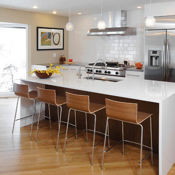
In addition to improving the flow of the kitchen—by removing a V-shaped peninsula that angled out into the room—and adding appliances like a stainless steel refrigerator, Sanford’s short list of must-haves included clean, uncluttered lines and no wall cabinets over the countertops. “I’ve found as I’ve aged, I’ve gotten shorter and just don’t use the upper cabinets,” Sanford explains.
Easy-access, smooth-slide drawers with clean slab fronts were the answer—resulting in strong visual lines, an open, airy feel and enhanced ergonomics. Starting with a “needs assessment,” Youles and Norton designed the space quite literally around Nancy. By looking at factors such as her height and which items she uses most frequently, they were able to determine the optimum placement for everything from canned goods in the pantry to cutlery, pans and plates in the customized drawers, all of which helped to achieve the ultimate kitchen organization.
But there’s more to the kitchen cabinets smooth façade than clean-lined storage. Walnut drawer fronts—found on the oven and the base of the island—are book-matched, allowing the grain to continue from drawer to drawer. And even in spaces where drawers weren’t feasible, beneath the sink and in a desk area, the designers continued the look with cabinet doors crafted to resemble drawers.
The visual continuity of these lines might not be as impactful if it weren’t for the careful selection of contrasting finishes. The designers filled the space with pure, glossy white—using a specific type of quartz, White Cliff by Cambria, to accent the bold rectangular design of the island. Then, to break up the expanse of accompanying white painted drawers, walnut was selected to bring the contrasting warmth and grain of wood without red undertones. It is commonly found in modern furniture design, as well as current productions of mid-century designs like the iconic Eames Lounge Chair from Herman Miller, Youles says.
1