
Search results for "Important note" in Home Design Ideas
 Smithwood Builders Inc.
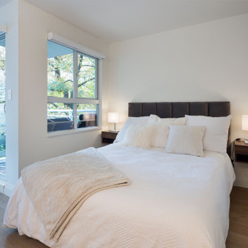
A small and elegant condominium rises out of a 90’s era building. Turning a dated studio apartment into a luxury short-term rental property alleviates the stress that tourists experience when booking accommodations in Vancouver. Rivaling any 5-star downtown hotel this gem, across from the Seabreeze Walkway, was renovated to attract tourists from all over the world.
The floor plan was kept intact and given a much-needed facelift. The dated flooring was removed and durable vinyl-plank flooring was put in its place. The custom cabinetry in the kitchen has a fresh feel with ivory flush doors juxtaposed with walnut cubbies and accents. Quartz, Stratuarietto counters with an elegant waterfall peninsula partition the kitchen from the living room. The peninsula island was deepened to accommodate seating. “It’s important to use the same materials throughout a small space, notes the designer, as you don’t want to overstimulate the senses”. The same walnut millwork and quartz are seen again in the bathroom. The tub was removed to make way for a walk-in shower, tiled in a floral and herringbone pattern. Plumbing fixtures and accessories are in brass or flat black finishes giving this space the perfect balance of femininity and masculinity. Complete with a washer and dryer and storage room, a small space designed right, can feel grandiose.
 Byggmeister Inc
Photo by Jim Raycroft
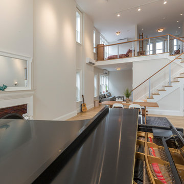
Our client for this project, an amateur pianist, wanted to create a music room for a nice new piano he was planning to purchase. The project scope would also include a new kitchen, bathroom, bedroom and living space, but the new piano was the priority.
LIFTING THE CEILING
The client was moving into a row house, and hoped to accommodate occasional gatherings of musician friends for informal recitals. Because acoustics were important we asked sound engineers from Acentech to visit the site. They noted that the ideal space would have higher ceilings and would be more like a cube than the “half a cube” we were dealing with. “How can we raise the ceiling and make the space a cube?” our client asked.
Designer Josy Raycroft started to explore the possibility of combining the second and third floor units by removing the front half of second floor ceiling, thereby opening up a 2-story music space in the shape of a nearly perfect cube. Thus, the project turned from a straightforward floor plan modification into a complete reimagining of the whole row house, with the client’s new Steinway D as the focal point. Josy and the client started with the piano and created the space around it.
ADDRESSING EVERYDAY NEEDS
For the client’s more mundane needs, Josy switched the location of the bathroom and kitchen—moving the bathroom towards the middle of the second floor where it would be convenient to the rest of the spaces, and placing the kitchen towards the back. The remainder of the third floor was transformed into bedroom and office space open to the music room below.
Products and finishes coordinator Karin Mahdavi worked with the client to select understated finishes for the living spaces so that they would support the piano room without competing with it. As a result the living spaces flow seamlessly into the piano space, creating a coherent whole out of the different parts, kind of like a Schubert piano sonata.
 AIBD - American Institute of Building Design
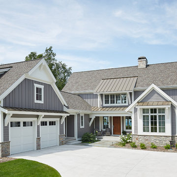
This sunny design aims to capture amazing views as well as every ray of sunlight throughout the day. Architectural accents of the past give this modern barn-inspired design a historical look and importance. Custom details enhance both the exterior and interior, giving this home real curb appeal. Decorative brackets and large windows surround the main entrance, welcoming friends and family to the handsome board and batten exterior, which also features a solid stone foundation, varying symmetrical roof lines with interesting pitches, trusses, and a charming cupola over the garage.
An ARDA for Published Designs goes to
Visbeen Architects, Inc.
Designers: Visbeen Architects, Inc. with Vision Interiors by Visbeen
From: East Grand Rapids, Michigan
Find the right local pro for your project


 Room & Board
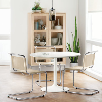
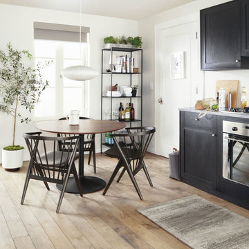
Simple and elegant, our mid-century-inspired Aria counter table is handmade in Wisconsin. The pedestal is crafted from one piece of spun steel, so there are no seams or joints to spoil the look. Plus, the pedestal maximizes seating and frees up leg space, especially important in small spaces. With a wide range of top and size options to choose from, Aria is a modern dining table you can personalize for your needs. Please note: overall height may vary slightly depending on the top material you select.
 Aura Design Build
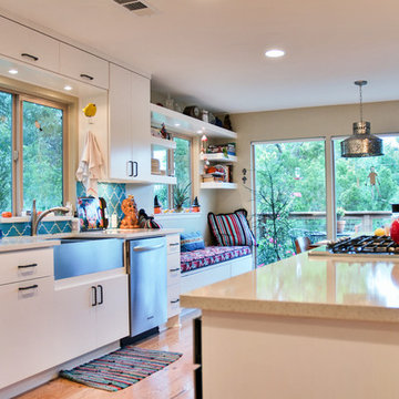
This Austin family wanted an updated kitchen in their Highland Hills home. We added a gorgeous blue Moroccan tile backsplash for a burst of color and built-in cabinetry and shelving for storage galore.
The white cabinets are a nice contrast to the blue tile and new stainless appliances (plus a stainless farmhouse sink!). Picture frame windows open up the space, and there's plenty of seating at the island, which is also tiled.
Let us help you transform your kitchen—contact us! http://www.auradesignbuild.com/contact/


Sponsored
Columbus, OH
Free consultation for landscape design!

Peabody Landscape Group
Columbus' Reliable Landscape Design & Contracting
 Madson Design
Two features here to note:
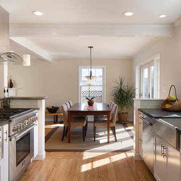
One: Alignments (sight lines) are essential for a sense of flow, ease, and peaceful balance in a space. Sight lines are especially important in interior remodels, where we have only the existing space to work with: where creating the impression of spaciousness within a defined square footage is the goal. Here the dining room and kitchen are brought into alignment: Kitchen aisle, dining chandelier, table, and window beyond.
Two: Existing walls are removed, but a sense of definition between spaces remains, avoiding the undefined, cavernous 'great room' effect. Kitchen, dining, and living room all contiguous and open to each other, but clear in their function. Spatial definition within open areas both increases the sense of space and facilitates the comfort of limits.
 serrao design/architecture
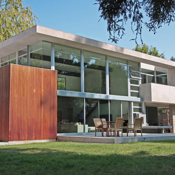
Understanding that renovations can be the ultimate in Sustainable Architecture, the center portion of the house was carefully dismantled and repurposed while leaving the ends of the original to be restored as private spaces and allowing the expansion of the public spaces: entry, kitchen, dining and living in the middle. Taking advantage of the temperate climate of Menlo Park, the modern ideal of indoor/outdoor living is achieved at every important private and public space. Generous glazed window walls and doors allow view and access to private gardens and yards. The second floor suite is provided access to a private sun deck while the double height great room: an open plan encompassing the kitchen, dining and living spaces; completely opens to a patio with the help of a large 7’ tall by 22’ long multi-panel pocket sliding glass door.
©serrao design/architecture, unless otherwise noted
 Tile Doctor Ltd
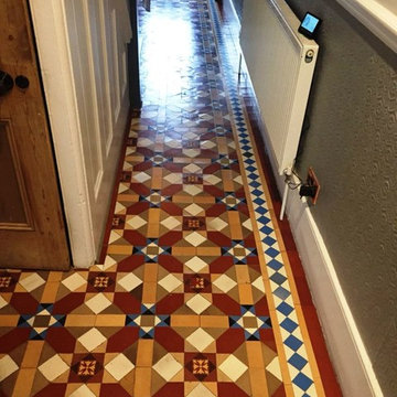
This detailed Victorian tiled hallway at a property in Camden was overdue some much-needed repair and maintenance. The owners of the property appreciated that original period features like this add a lot of value to a property and asked me to visit the property to quote for renovating it. The property was in a terrace of similar properties most of which appeared to have retained their Victorian character.
I inspected the floor and found there were a couple of loose, cracked, worn and broken tiles that needed to be replaced. In addition, the floor tiles needed a deep clean and then seal to bring back the wow factor. I was confident we could renovate the floor but at that point unsure if we would be able to find exact match replacements for the damaged tiles. Fortunately, Victorian tiles are still in demand and I knew of several companies I could check with so I was confident they could be found.
We discussed how long the work would take and assuming I could source the replacements agreed a price for the full restoration of the floor. After doing some research I managed to find suitable replacements with a company called Original Style and the work was scheduled for the following month.
Firstly, we prepared all areas with protective tapes to threshold edges and skirting.
This was followed by spaying the tiles with a strong dilution of Tile Doctor Remove & Go which is product designed to remove old sealers and coatings. After about ten minutes the tiles were scrubbed with black scrubbing pads and scrubbing brushes. Fresh water was used to rinse the floor and the slurry was extracted using a wet vacuum.
The floor was inspected and then a second clean carried out, this time using Tile Doctor Pro-Clean which is a Tile and Grout cleaning agent. The same process of application was used and after rinsing and extracting the dirt the tiles were given a steam clean. This ensured all the dirt was lifted out of the pores of the tile and the floor was now as clean as it possible could be.
The next step was the remove the loose and cracked tiles using the reclaimed tiles we had sourced earlier. Some cuts were necessary to get the replacements to match the originals but overall the plan worked. A quick drying adhesive was used to secure the tiles so we could apply the grout shortly after. The whole floor was then re-grouted and cleaned off to ensure a good match. The floor was left to dry off overnight, and you could already see it was now looking considerably improved.
Returning the next morning we checked the floor was dry using a moisture meter, this is important as to apply a sealer to damp tiles will lead to a patchy experience. All was well so we were ready to apply the sealer.
To start a single base coat of Tile Doctor Colour Grow sealer was applied to the floor and left to dry. This sealer is an impregnator that protects from within by occupying the pores in the clay tile improving colour in the process. This sealer does leave a matt finish however and the client wanted a subtle shine so one dry it was followed by four coats of Tile Doctor Seal & Go. The combination of the two sealers works really well to add long lasting protection to the tiles and provide the desired finish to the floor.
The floor was much improved, and the client was delighted. The detailed pattern and colours were now much more prominent, and the hallway looked much more inviting for both the owner and their guests. For the aftercare of Victorian tiles, I recommended the use of Tile Doctor Neutral Cleaner which is pH neutral and won’t prematurely erode the life of the sealer.
Nigel Voyce
North London Tile Doctor
 Byggmeister Inc
Photo by Jim Raycroft
Our client for this project, an amateur pianist, wanted to create a music room for a nice new piano he was planning to purchase. The project scope would also include a new kitchen, bathroom, bedroom and living space, but the new piano was the priority.
LIFTING THE CEILING
The client was moving into a row house, and hoped to accommodate occasional gatherings of musician friends for informal recitals. Because acoustics were important we asked sound engineers from Acentech to visit the site. They noted that the ideal space would have higher ceilings and would be more like a cube than the “half a cube” we were dealing with. “How can we raise the ceiling and make the space a cube?” our client asked.
Designer Josy Raycroft started to explore the possibility of combining the second and third floor units by removing the front half of second floor ceiling, thereby opening up a 2-story music space in the shape of a nearly perfect cube. Thus, the project turned from a straightforward floor plan modification into a complete reimagining of the whole row house, with the client’s new Steinway D as the focal point. Josy and the client started with the piano and created the space around it.
ADDRESSING EVERYDAY NEEDS
For the client’s more mundane needs, Josy switched the location of the bathroom and kitchen—moving the bathroom towards the middle of the second floor where it would be convenient to the rest of the spaces, and placing the kitchen towards the back. The remainder of the third floor was transformed into bedroom and office space open to the music room below.
Products and finishes coordinator Karin Mahdavi worked with the client to select understated finishes for the living spaces so that they would support the piano room without competing with it. As a result the living spaces flow seamlessly into the piano space, creating a coherent whole out of the different parts, kind of like a Schubert piano sonata.

 Wine Cellar Specialists
Most often, wine bottles should be stored horizontally, so that the liquid remains in contact with the cork.
This prevents said cork from drying out, as well as preserves its sealing quality.
In this case, since wine goes quickly in a commercial wine store, a few of the most popular types were displayed in an upright, label-forward fashion, thus improving the aesthetics and ease-of-perusal in the space.
The racks are of Premium Redwood.
Wine Cellar Specialists
1134 Commerce Drive
Richardson
(972)454-0480
75081
winecellarspec.com
 Smithwood Builders Inc.
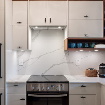
A small and elegant condominium rises out of a 90’s era building. Turning a dated studio apartment into a luxury short-term rental property alleviates the stress that tourists experience when booking accommodations in Vancouver. Rivaling any 5-star downtown hotel this gem, across from the Seabreeze Walkway, was renovated to attract tourists from all over the world.
The floor plan was kept intact and given a much-needed facelift. The dated flooring was removed and durable vinyl-plank flooring was put in its place. The custom cabinetry in the kitchen has a fresh feel with ivory flush doors juxtaposed with walnut cubbies and accents. Quartz, Stratuarietto counters with an elegant waterfall peninsula partition the kitchen from the living room. The peninsula island was deepened to accommodate seating. “It’s important to use the same materials throughout a small space, notes the designer, as you don’t want to overstimulate the senses”. The same walnut millwork and quartz are seen again in the bathroom. The tub was removed to make way for a walk-in shower, tiled in a floral and herringbone pattern. Plumbing fixtures and accessories are in brass or flat black finishes giving this space the perfect balance of femininity and masculinity. Complete with a washer and dryer and storage room, a small space designed right, can feel grandiose.
Sponsored
Fredericksburg, OH

High Point Cabinets
Columbus' Experienced Custom Cabinet Builder | 4x Best of Houzz Winner
 Fisher Custom Homes
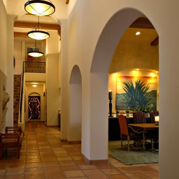
Arches adorning entrances to each room and throughout the hallway lined with simple, bold light fixtures adds to the Mexican Villa design of this home.

 VISTA TILES
Made by VISTATILES
Ships from a small business in Pennsylvania
. 6 tiles = one square ft $32.99 per square ft
. There are 50 ceramic-based glazed tiles in 39,37 inch (1 m2. )
. The product size is 2,75 x 8,26 inch (7x 21 cm). It is sent without a file.
. The back is serrated with a matte ceramic base and the front is glazed and glossy polished.
. It is normal for the products to have tints in colors since they are produced by handwork.
. 2,75 x 8,26 inch(7x21 cm) Ceramic-based glazed tile features
. The color element with the decorative art of tile glazed tiles is a dimension that joins the architectural expression in multicolor.
. Ceramic-based tiles are resistant to water and chemical cleaning materials, as their water absorption is close to zero.
. Ceramic-based tile glazed tile preserves its appearance for many years. There is no loss of color and pattern.
. Water and moisture proof thanks to its glossy glazed polished surface.
. For this reason, it does not hold water on its surface, prevents the formation of bacteria and mold.
. Ceramic-based shaped ceramic-based glazed tiles are suitable for use as wall tiles in bathrooms.
. Pool porcelain tiles are used in the interior flooring of the pools. Production is made in the desired color and pattern.
. For floor coverings, production is made using matte glaze by printing on the floor tiles.
. It can be used in Turkish bath, basin back panel decoration and bath decoration in wet places.
. Width : 7 cm
. Height 21 cm
. Thickness : 0.7 cm
. 1 m2 Weight: 16 kg.
. 1 m2 Quantity: 50 pcs
Please note that international buyers are responsible for any duties/customs charges and import taxes associated with shipping to their respective countries. These fees are calculated and imposed by your country when the item arrives in the country.
 Fabco Sanctuary
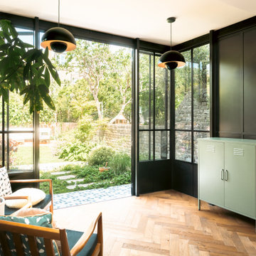
The architect and designer Guy Derwent was approached by his client with a clear and compelling brief: to completely transform a grand Victorian terrace house they were planning to renovate. The client envisioned something far beyond a standard renovation – this was to be a bold and dramatic reimagining of a family home that could grow with them over time.
With the property having remained largely untouched for more than fifty years, the architects saw an opportunity to unlock its potential and deliver a contemporary design that would contrast beautifully with its Victorian heritage.
The existing layout consisted of a series of small, disconnected rooms to the rear of the house. To respond to the client’s need for openness and flexibility, the architect proposed a radical restructuring of the ground floor:
The rear rooms were completely removed
Suspended timber floors were lowered by up to two metres to align with the garden
Two bold extensions were added
The first extension filled in the side return with a London stock brick facade and a glazed roof, while the second – a striking black steel and glass pavilion was glazed on three sides and placed along the garden elevation.
This new pavilion redefined the building’s relationship with the garden. Its steel-framed glazing created a seamless dialogue between interior and exterior, offering a sense of immersion in the surrounding landscape.
At the heart of the plan sits a dramatic, five-metre-tall dining space that acts as a transition from the original entrance hall into the new addition. A large, circular cast-glass window, framed in steel, provides a visual and spatial link between old and new, allowing light and movement to travel through the depth of the home.
Throughout the project, a series of black metal elements were introduced as sculptural interventions – each marking moments of transformation within the house. These included the bespoke steel framed circular window, a custom metal staircase, a cylindrical support column, and the striking steel and glass garden pavilion. Together, they formed a coherent architectural language that underscored the project’s bold intent.
Our steel windows and doors played a vital role in delivering the project’s vision. The architects chose steel for its refined sight lines and distinctive material character, which helped bridge the gap between the historical context of the building and the bold new additions.
The black steel frames provided a crisp contrast to the pale London stock brick and added definition to the glazed pavilion, reinforcing the sense of architectural precision. In particular, the fine steel profiles of the garden room allowed the extension to feel both lightweight and immersive, blurring the boundary between the house and its garden.
The architect drew inspiration from the Bauhaus Movement, particularly the work of Walter Gropius, whose approach to functional beauty and industrial materials informed the design of the garden pavilion.
Here, our glazing system was used not just for transparency, but as an expressive architectural element. The carefully proportioned panels help to conceal the roof thickness and reinforce the pavilion’s industrial yet abstract character – a deliberate nod to product design and modernist detailing.
Sustainability was an important factor in the selection of materials. Our steel systems, made from 99% recycled content and 100% recyclable, aligned with the project’s broader environmental goals.
The architects noted that this commitment to material longevity and circularity was central to their decision to use steel. The durability and recyclability of the windows and doors ensured the project met both aesthetic and ethical criteria.
This London terrace house now stands as a celebration of contrast – between heritage and innovation, solidity and transparency, tradition and transformation. Our steel windows and doors were not simply components; they were essential tools in crafting a home that is as bold and expressive as it is functional.
The result is a home designed for modern family life, where light, space, and materiality come together in perfect harmony.
 Riverside Construction, LLC
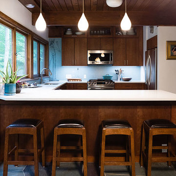
When our clients approached us with this kitchen renovation project, their wishes were to have an open, fluid space with more room for storage, upgraded appliances and modern amenities. It was also important to make sure the renovation matched the style and character of the home. Before the kitchen remodel, the kitchen was walled off from the rest of the living area. Riverside Construction knocked down a wall and opened up the space so that the homeowners could enjoy abundant natural light and the beautiful view outside their windows. Ensuring the home’s architectural integrity, we used Mid Century inspired materials that complimented the original wood color and style of the home, taking full advantage of the high ceilings to add more storage. Damaged wood in the kitchen was replaced with new unfinished hardwood that was expertly stained to match the existing hardwood in the nearby hallway. Other key features in this gorgeous kitchen remodel include a porcelain mosaic tile backsplash, Wellborn Milan cabinets in Cherry with light stain and new task and ambient lighting.

Sponsored
Delaware, OH

Buckeye Basements, Inc.
Central Ohio's Basement Finishing ExpertsBest Of Houzz '13-'21

 Bill miller
Nobody would be foolish enough to knowingly purchase PIZZA using a third party call-center middleman.But every day, thousands of people do exactly that when they purchase flowers for delivery!
That’s because a NEW TYPE of “florist” has appeared on the scene. And that means most flower buyers pay as much as 50% MORE than they should pay!
Finding A Floral Supplier
When a prospective flower buyer wants to buy flowers, his first stop is usually the internet. The author’s flower shop is in Charlotte, NC and the two most widely used search terms in this area are: “Charlotte flowers” and “Charlotte florist.”
When the customer searches for either of these terms, he will get a list of results. Paid results (advertising) are usually shown first. Organic (website) results come after the advertisements.
When a customer clicks on an advertisement, he is usually taken to a beautiful website owned by a call-center floral middleman offering beautiful flowers, hand-delivered by a LOCAL florist. And the products are sales TAX FREE.
But what is not revealed is that the middle man does not actually have a flower shop in Charlotte!
The Difference Between Toasters and Flowers
With “durable” products like toasters and sweaters, the location of the seller isn’t terribly important. That’s because the products will be shipped from a warehousevia USPS, UPS or FedEx. But flower arrangements are *fragile* and cannot be shipped that way!
Instead, they must be locally custom-hand-crafted and hand-delivered! And this means that if a customer orders from a middleman’s website, the order must – somehow – be passed from the middleman’s company to a REAL local florist in, for example, Charlotte, NC.
This “order transfer” is done by one of the three florist-to-florist networks: FTD, Teleflora and Bloomnet (1-800-Flowers).
Too Many FEES and COMMISSIONS
Membership in these networks is not free, so the middleman always adds a “handling charge” – typically about $15 -- to the customer’s bill to help pay for hiscosts to access to the network.
Please note that the $15 handling charge usually far exceedsany TAX FREE “savings!”
But the “handling charge” only helps pay for *access* to the network. The florist-to-florist network also takes a 7% commission, and also credits a 20% selling commission back to the middleman!
What this means is that, for a typical online floral purchase, just under HALF of the customer’s money vanishes in unnecessary FEES and COMMISSIONS. By comparison, when a customer buys a toaster from an independent business listing it on Amazon, only a few percent of the purchase price goes to fees and commissions.
With this huge profit potential available to third party floral marketers, it is not surprising that these middlemen spend huge sums on advertising and sales promotion. A few years back, one even took an ad during the Super Bowl!
Buy Direct For Better Value
Clearly, the consumer will always get His Best Floral Value by placing his floral order DIRECT with a Real Florist n the City where the flowers will be delivered.
Sometimes it may be difficult to tell whether a Flower Supplier is located “in town.”Here are three easy ways to separate a “real” florist from a floral middleman:
1. Look for the street address, city and state on the website. Often this will be found on a tab labeled “About Us” or “Contact Us.” If you cannot find an address at all, then this is almost certainly a middleman!
2. Look at the telephone number. If the only number on the website is a TOLL FREE “800” number, then the floral supplier is probably not local.
3. Look at the invoice (before you click the BUY NOW button!) for any “Handling” or “Service” charges. A REAL florist will never add these charges to your bill!
For more information about Charlotte Flowers and Charlotte Florist, please visit the author’s Flower Hut website at http://flowerhut.com.
BUT, if you do not want flowers delivered to Charlotte, Matthews, Mint Hill or Pineville, NC, please do NOT order from us! Take the time to find a REAL florist in the town where you need flowers delivered. You’ll be glad you did!
 Michael Nash Design, Build & Homes
2011 NARI CAPITAL COTY MERIT AWARD WINNER
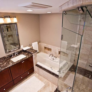
This couple lived in their colonial home in Burke, Virginia, for more than 20 years. Now that their children were grown and gone, it was time for them to pay more attention to their home. First on their list was to renovate their master bathroom. Tight and dysfunctional is how they described the existing space.
The homeowners always dreamed of having a whirlpool, a large steam shower and a private toilet area. Importantly, they wanted to use the latest products and materials to bring the bathroom into the 21st Century.
Starting with exotic granite and porcelain tile from floor to ceiling, the new design does just that. Then, a highly sophisticated steam shower using granite benches, a heavy glass enclosure, chrome faucets and a rain shower head was installed. Modern body spray heads are embedded in the wall tiles. The shower is complemented by a bubble, jetted whirlpool tub with granite surrounds.
A modern double vanity with vessel sinks, a granite countertop, high end cabinets and stylish faucets rest along one wall. Custom-built, recessed mirrored medicine cabinets provide storage for necessities.
In the end, the homeowners are thrilled with the outcome and never imagined that their old and dark looking small bath could ever be transformed into such beautiful bathroom.
 Room & Board
Simple and elegant, our mid-century-inspired Aria counter table is handmade in Wisconsin. The pedestal is crafted from one piece of spun steel, so there are no seams or joints to spoil the look. Plus, the pedestal maximizes seating and frees up leg space, especially important in small spaces. With a wide range of top and size options to choose from, Aria is a modern dining table you can personalize for your needs. Please note: overall height may vary slightly depending on the top material you select.
34